Mortgage Arrears Move Higher, Again

Standard & Poor’s Performance Index (SPIN) for May 2016 shows that 1.21% of high quality residential mortgage-backed securities (RMBS) were in arrears during the month, which is higher than the 1.14% reported in April. In fact this is the seventh month in a row that arrears have lifted. A year back the index was standing at 1.07%.

House-and-ArrowThe index covers the universe of Australian RMBS rated by S&P.  It measures the weighted-average arrears more than 30 days past due on loans in RMBS transactions. It is worth highlighting that it does not necessarily represent the entire market, as specific loan portfolios will be selected to package up and sell.

S&P says that the larger upward movements were in the major banks and other bank categories, while non-bank financial institutions was the only sector to see a decline in arrears. Most of the increase in arrears for the month was in the more severe category of 90-plus days overdue. The major banks’ 90 day-plus arrears rose four basis points to 0.48%, while non-banks fell a point to 17 basis points. This is an interesting observation as the major banks, in theory at least should have more sophisticated risk assessment capabilities.

They also say that the proportion of non-conforming loans in arrears increased to 4.71 per cent during the month from 4.25 per cent in April. However, note the non-conforming measure tends to exhibit some volatility from month to month and remains low by historical standards and well below the peak of 17 per cent in 2009.


Mortgage Stress Falls As Rates Are Cut

We have run our mortgage stress models, using data from our latest household surveys. At the moment, 21.73% of households are in difficulty (a fall thanks to lower rates from last years), though some locations and segments are above 30%. You can read about how we calculate mortgage stress in the Anatomy of Mortgage Stress.

Households in stress are having to cut back spending, are likely to be putting more on credit cards, will have refinanced to reduce payments, may be in arrears, or are taking to a broker about refinancing.  The stress model has been updated with the latest survey data, and recent mortgage repricing. This covers owner occupied loans only. In our experience, stressed households, in a flat income environment do not recover, and grind on into greater difficulty later – also of course they are very exposed should rates rise.

Our first chart shows the proportion of households in stress by age of loan. (Of course most loans are just a few years old, so there are more households in recent years. We still see the impact of high first time buyer volumes in 2010 flowing though to higher stress levels, still.

Stress-June-2016-By-Loan-Age

Stress is not just the domain of the young. In fact proportionally, older households with loans are more likely to be stressed – though the numbers with a mortgage are much lower – this is because incomes are squeezed, and households have outstanding mortgages for longer.

Stress-Aged-June-2016

Our master household segmentation shows that younger families, and disadvantaged households are more likely to be in stress. The affluent are least impacted.

Segment-Stress-Data-June-2016

Finally, we have a view by state and region. There are considerable differences across the states and by location. Again, this does not show the relative count by area, but remember half of all loans reside in NSW and VIC.

Stress-Regions-June-2016Overall we conclude that the cash rate cuts and deep discounts on refinanced loans have eased the pain for many households, despite static incomes. This chimes with recent improved household finance confidence levels.

Provided rates stay low, or go lower, stress levels will remain contained provided employment rates do not rise. Of course the real killer would be interest rate rises. But we are now not expecting lifts in rates anytime soon.

DFA Analysis Of Highly Leveraged Households Featured In Nine News Segment

Nine News tonight, using data from the DFA household research programme, highlighted the highly leveraged status of many households who have bought into the property market in the past couple of years.

Our research has shown that in some eastern suburbs within the Sydney area for example, many households would find even a small rise in mortgage interest rates would create significant financial headaches. The most exposed suburbs nationally are listed below.

Affluent-STressThe analysis is based on responses to our survey which asks whether households feel they could cope with covering the costs of an additional 1% on their mortgage. Given that many have mortgages of more than $500,000, even a small rise is enough to create problems, especially given static income. Note also that more affluent segments are more at risk.

Read more about our research in our recent blog posts.

Mortgage Stressed Household Count In Melbourne

Continuing our series of the number of households experiencing mortgage stress by post code, today we look at Melbourne. Here is the geo-map showing the relative number of households in each post code district.  We have not shown this distribution before.

Current-Stress-Count-Melbourne

The areas with the highest count are listed below. Note the DFA segment distribution represented in each one. Whilst many are young families, or disadvantaged, many are more wealthy, and these have had access to larger loans, and more valuable property. But as a result they are more exposed, especially as incomes are static and costs are rising. Some are also getting squeezed by lower returns from savings and deposits with the banks.

Melbourne-Stress-CountWe will post Brisbane next time.

Mortgage Stressed Household Count In Sydney

Continuing our analysis of mortgage stress (one of the drivers of our estimation of the probability of default), we have estimated the actual number of households in each post code who are experiencing stress currently. To recap, Mortgage stress is a poorly defined term. The RBA tends to equate stress with defaults (which remain at low levels on an international basis). A wider definition is 30% of income going on mortgage repayments (not consistently pre-or-post tax). This stems from the guidelines of affordability some banks used in 1980’s and 1990’s, when economic conditions were different from today. This is a blunt instrument. DFA does not think there is a good indicator of mortgage stress, so we use a series of questions to diagnose mortgage stress focusing on owner occupied households. Through these questions we identify two levels of stress – Mild and Severe.

  • Mild = households maintaining repayments, but by reprioritising expenditure, borrowing more on loans or cards, and refinancing
  • Severe = households who are behind with their repayments, are trying to sell, are trying to refinance, or who are being foreclosed

We maintain a rolling sample of 26,000 statistically representative households using a custom segment model nationally. Each month we execute omnibus surveys to 2,000 households. Our questions provide a current assessment of mortgage stress. We also model and project likely mortgage stress given the current and expected economic conditions. You can read about the methodology here. The map shows the number of households who are currently in mortgage stress.

Current-Stress-Count-SydneyThis is an interesting view because it shows the absolute estimated number, not the percentage of households. We have not published this view before.

Sydney-Stress-CountMost striking is the range of master household segments which are represented. An indication that stress is not directly correlated with affluence.  We will post data for some of the other regions another time.

Households Necks In The Debt Noose

The ABS data released yesterday, highlights that overall household debt is sky high, much of it linked to mortgage borrowing. Whilst household net worth is over $8 trillion, its mainly thanks to house price inflation (and stock market holdings inflated by ultra low interest rates and QE). The RBA data tells the story. Using their data, (E2 HOUSEHOLD FINANCES – SELECTED RATIOS) we see that the ratio of housing debt to income is rising, in fact both the ratio covering owner occupied housing, and that covering both owner occupied housing and investment housing has risen significantly.

Household-Debt-Ratio-1Of course, interest rates are low, so the ratio of interest payments to income are lower than when interest rates were at their peak in 2008. So the common assumption is that whilst debt is high, households can service it, and those with higher incomes have the greatest debt exposure.

Household-Debt-Ratio-2 In addition, banks are now “required” by APRA to use an interest rate of 7% when considering a loan application, higher than the common practice of a number of banks. APRA highlighted recently the range of rates banks were using for serviceability testing.

Chart 4: Existing mortgage debt shows interest rate used in investor serviceability assessment between 4%-9%

Some banks were underwriting loans with a very small serviceability buffer, so will have loans on book at greater risk, but at the moment serviceability is not required to be marked to market on an ongoing basis (though that may change under Basel IV).

This takes us to mortgage stress. Now, DFA has been tracking mortgage stress for year. Low interest rates have got many out of difficulty.

Mortgage stress is a poorly defined term. The RBA tends to equate stress with defaults (which remain at low levels on an international basis). A wider definition is 30% of income going on mortgage repayments (not consistently pre-or post tax). This stems from the guidelines of affordability some banks used in 1980’s and 1990’s, when economic conditions were different from today. This is a blunt instrument. DFA does not think there is a good indicator of mortgage stress, so we use a series of questions to diagnose mortgage stress focusing on owner occupied households. Through these questions we identify two levels of stress – Mild and Severe.

  • Mild = households maintaining repayments, but by reprioritising expenditure, borrowing more on loans or cards, and refinancing
  • Severe = households who are behind with their repayments, or are trying to sell, or are trying to refinance, or who are being foreclosed

In our latest data on stress we have noted some concerning trends. Despite the ultra-low interest rates, the proportion of households in some degree of mortgage stress is rising. This is because incomes are static, household expenses are rising and the average mortgage is larger, especially in some centres like Sydney. So if we look at segmented data we see that for some borrowing households, as many as 10% are registering in the severe category, and many more in the mild category. Many are just, and only just keeping their heads above water. Larger loans means they are more leveraged.

Stress-June-2015If we look at the severe stress by segment, by when the loan was last drawn down, we see significant peaks in more recent years (when loans were larger) than older loans. Typically in in years 2 and 3 of a loans life that stress is highest.

Loan-Age-and-StressNow consider this. Assuming an average $350,000 mortgage over 30 years, if rates were to rise 1%, the average monthly costs for a p&i loan would rise by $220 and for an interest only loan $291. Such a rise would likely lift the proportion of households with mortgage stress from 35% of all borrowing households to close to 50% in our modelling.  Interest only loans are more sensitive to rises.

We conclude that many households are a hair’s breadth away from difficulty. Another way of asking a similar question is how much free cash is available at the end of the month. For many households with large mortgages and average incomes, the short answer is nothing. No flex. No safety net.  Whilst in the early 2000’s incomes were rising fast there is not easy exit this time. Many households are in the debt noose. Let’s hope no-one pulls the rope.

Repayment-Table

Bubble Smuzzle

The sudden talk of bubbles in the property market, by the regulators and treasury, looks like an attempt to talk the housing market down whilst not really doing that much in reality, and leaving space for more rate cuts in the cash rate as broader economic activity slows. The RBA’s low rate strategy is partly to blame. But, is it really a bubble? Well. If you look at the growth in house prices now compared with a decade or more ago, growth in the past three years in every capital city is lower than it was in the period 2001-2004. Darwin and Hobart are the centres with growth which most closely match the ramp up in 2001 onwards and the current rises.

We did not have the 20-40% corrections post the GFC that the USA and UK had, prices tended to stall, or rise slowly, but we started the current run-up from a higher base position.

The next point is that household debt is higher compared with GDP than it has ever been, and whilst the savings ratio is high, it is now actually falling. The current low interest rates are encouraging people to grab a loan, and buy a property, especially investment property. It’s simple, low interest rates, negative gearing to offset costs, and the prospect of capital growth makes property investment compelling, as it is in a number of other countries. Indeed, overseas investors are joining in the fun (and FIRB has not tackled the issue). First time buyers are going direct to the investment sector, and down traders are selling up, releasing cash and investing in leveraged property. It’s all very logical.

Demand is also being stoked by population growth, including migration, and the expanding number of households in Australia. We have not built enough property for more than a decade, so there is more demand against supply. Also, we have more single person families (thanks to relationship breakup, older singles, and other people preferring to live alone). So we need different types of property, and more of it.

Because supply/demand is out of kilter, prices are rising, it’s not a bubble, its fundamental economics. We need to think about three factors, first, interest rates are low and will at some time rise, many people who have borrowed today and can afford repayments will find it increasingly difficult if rates rise, mortgage stress is quite high today, at low rates, and will rise. Second, income growth is flat, and this means that people won’t get out of jail as they did in 2001+, because incomes rose faster then, and helped to ease the pain when rates rose. Also, rentals are more linked to incomes than house prices, so rental income wont lift much. Third, on any absolute measure, (Loan to income, Prices to GDP) we are 25-30% above the long term norm. At some point it will correct – but it’s a structural problem not a bubble. This is true in all major centres, and is also spilling out into the regional areas. It’s not just a Sydney-Melbourne thing.

The solution requires joined up thinking. We need to revisit negative gearing. Plan better to build more houses, tighten lending and capital rules to restrict bank lending, tackle foreign purchasers and provide innovative options to assist first time buyers back into the owner occupied sector (joint equity share arrangements is my bet). Finally, and desperately, we need to deflect the banks appetite to lend to housing towards productive lending to business because this will give productive growth, not useless asset price growth and bank balance sheet growth. We need to ease price growth, and get back to trend. This will be painful and politically charged. On the supply side, we need to build more, reduce new development taxes and change planning regulations.

Meantime we have property which is chronically overvalued. Not a bubble, a structural problem. I doubt Canberra will do much more than hold yet another inquiry into housing (Oh, Hockey kicked one off a couple of weeks ago!)

Stress Testing Households – RBA Paper

The RBA published a Research Discussion Paper “Stress Testing the Australian Household Sector Using the HILDA Survey”.  They use data from the Household, Income and Labour Dynamics in Australia (HILDA) Survey to quantify the household sector’s financial resilience to macroeconomic shocks.

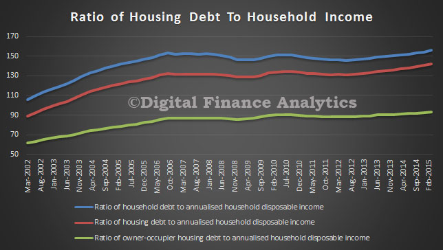
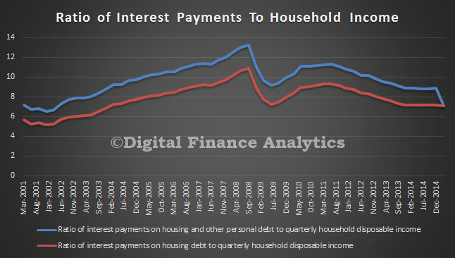
Given high household indebtedness, large mortgages and high house prices, estimating the potential impact of changes to interest rates and unemployment are important. Especially so when so much of banks lending is property related, and capital ratios are lower than pre-GFC. DFA of course models mortgage stress in our own surveys, so we have an interest in this work.

Their model suggests that through the 2000s the household sector remained resilient to scenarios involving asset price, interest rate and unemployment rate shocks, and the associated increases in household loan losses under these scenarios were limited. Indeed, the results suggest that, despite rising levels of household indebtedness in aggregate, the distribution of household debt has remained concentrated among households that are well placed to service it. In turn, this suggests that aggregate measures of household indebtedness may be misleading indicators of the household sector’s financial fragility. The results also highlight the potential for expansionary monetary policy to offset the effects of increases in unemployment and decreases in asset prices on household loan losses.

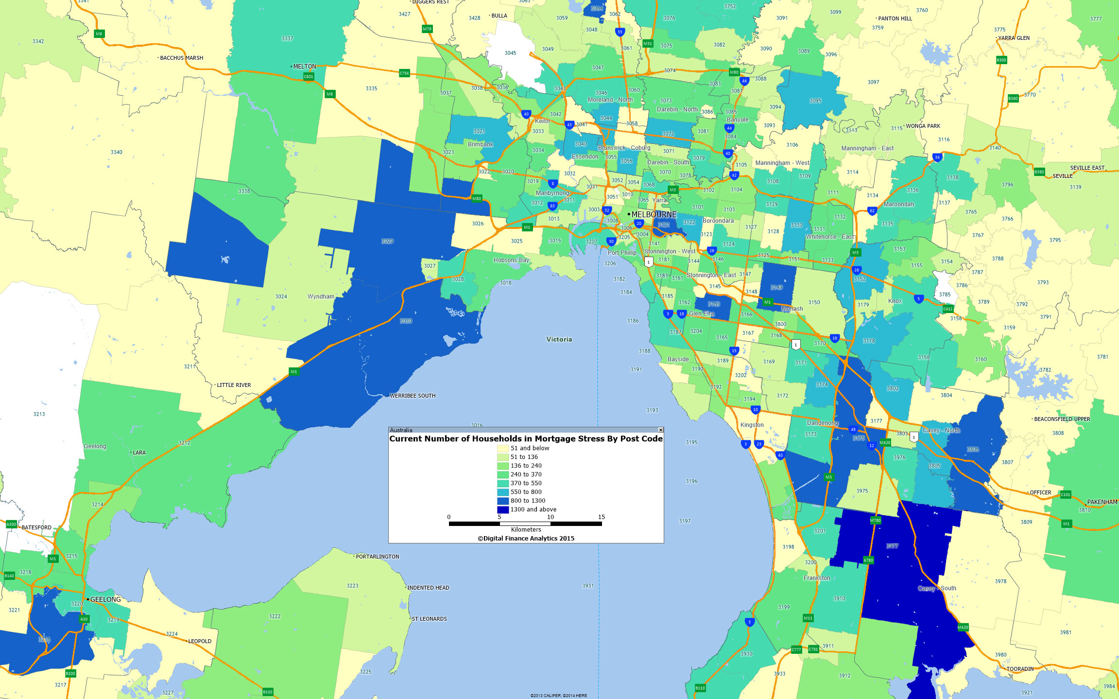
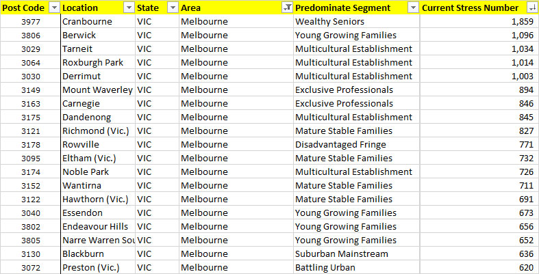
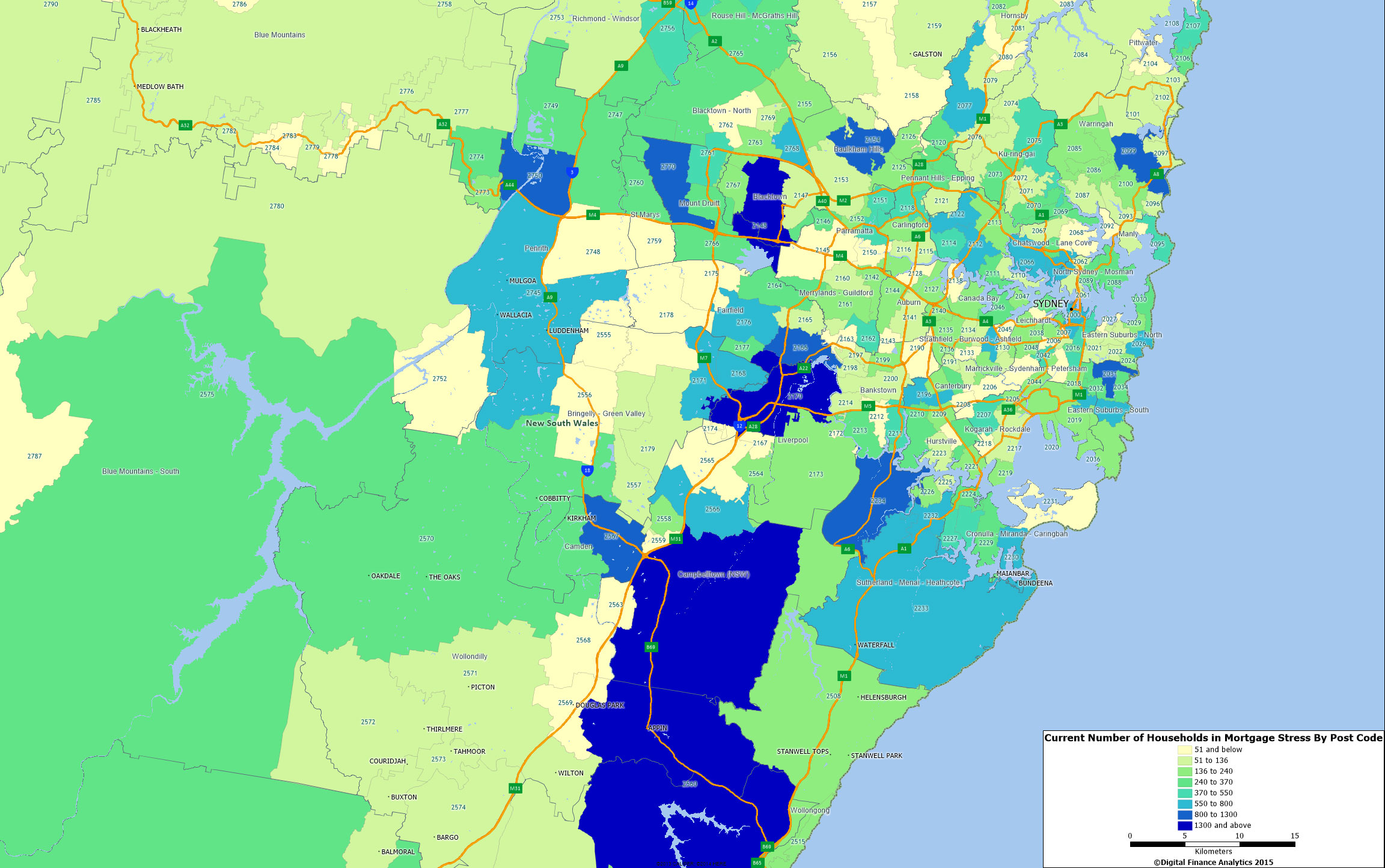
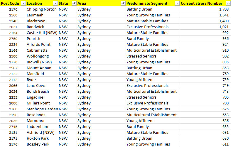
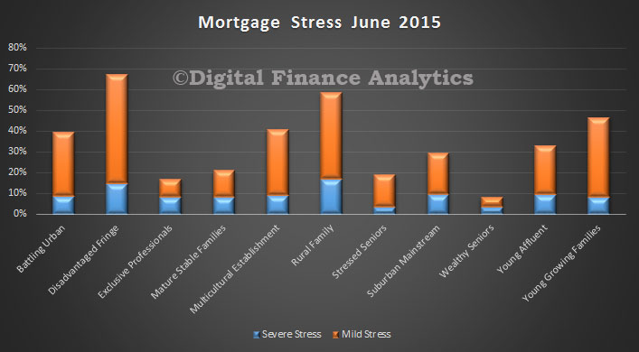
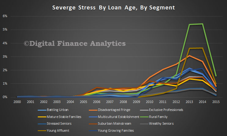
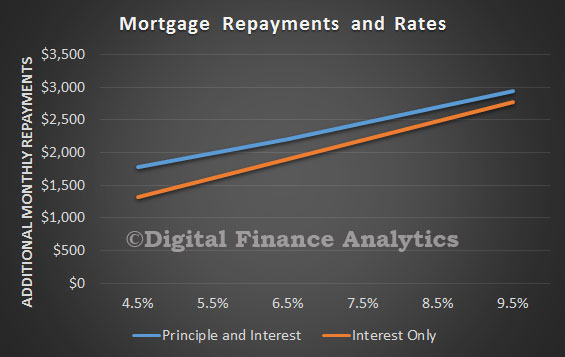
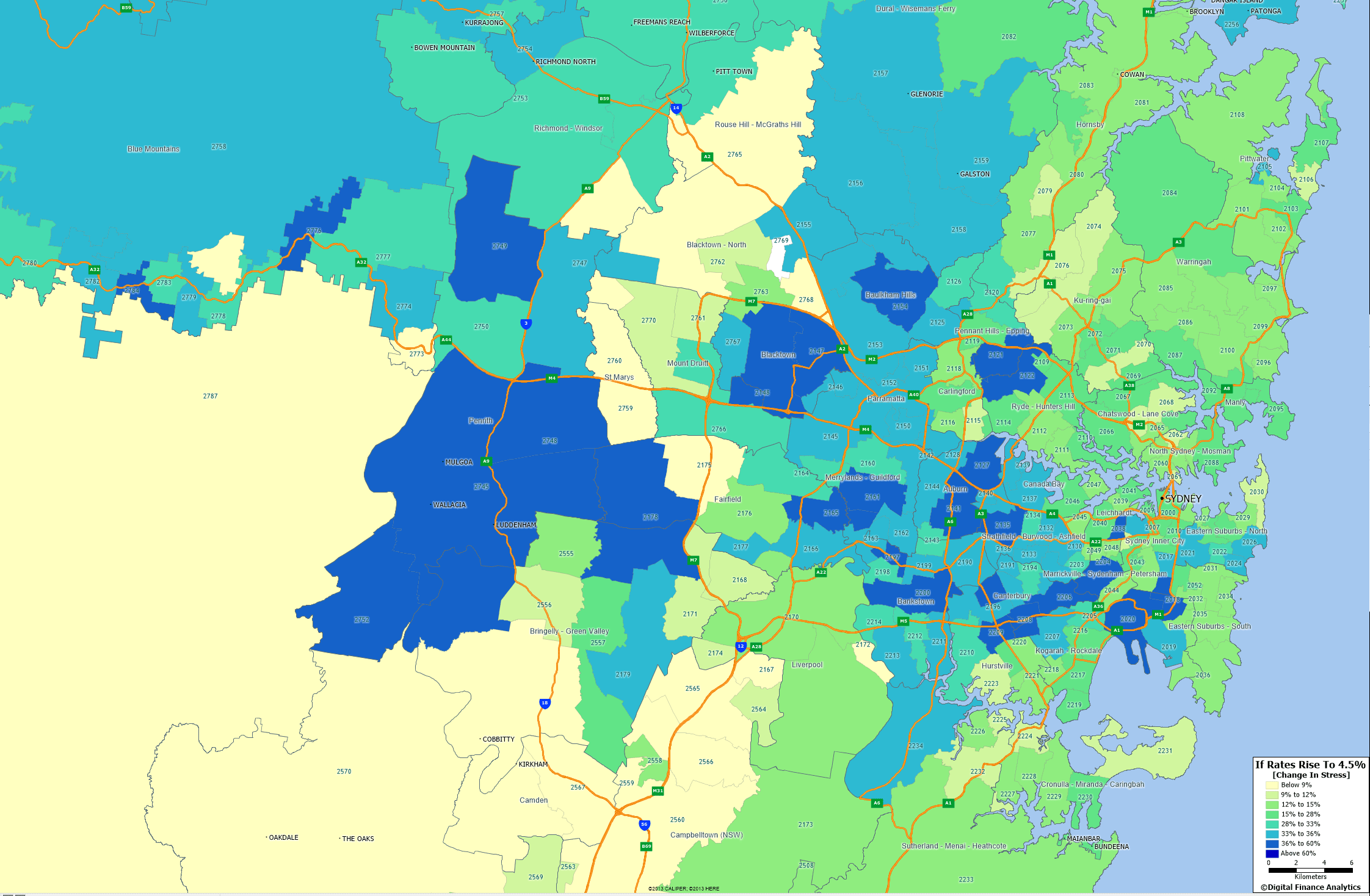
Our perspective is that the household analysis they are using is not granular enough to get at the differential stress across households, and how potential interest rate rises or unemployment will impact. In addition, interest rates are low today, so it is not possible to extrapolate from events in 2000’s. Given the larger loans, adverse interest rate movements will impact harder and faster, especially amongst households with high loan to income ratios. Therefore the results should not be used as justification for further easing of monetary policy.

Some additional points to note:

The stress-testing model uses data from the HILDA Survey, is a nationally representative household-based longitudinal study collected annually since 2001. The survey asks questions about household and individual characteristics, financial conditions, employment and wellbeing. Modules providing additional information on household wealth (‘wealth modules’) are available every four years (2002, 2006 and 2010). So some data elements are not that recent.

As they rely on information from the HILDA Survey’s wealth modules, they had to impute responses to minimise the number of missing responses and thus increase the sample size. The total sample size for each year is around 6 500 households. Individual respondent data were used to estimate probabilities of unemployment; this part of the model is based on a sample of around 9 000 individuals each year. DFA uses 26,000 households each year, our sample is larger.

How then do they estimate potential household stress? Their model uses the financial margin approach where each household is assigned a financial margin, usually the difference between each household’s income and estimated minimum expenses. This is different from a ‘threshold’ approach, where each household is assumed to default when a certain financial threshold is breached (for example, when total debt-servicing costs exceed 40 per cent of income). DFA captures data on the precursors of stress, and models the cash flow changes as unemployment and interest rates move. We also model the cumulative impact of stress which builds over time (typically households survive for 18-24 months, before having to take more drastic action).

Looking at the potential economic shocks, they examined how an increase in interest rates leads to an increase in debt-servicing costs for indebted households, by lowering their financial margins. Interest rate rises tend to increase the share of households with negative financial margins, and thus the share of households assumed to default. Interest rate shocks are assumed to pass through in equal measure to all household loans.

Falling asset prices have no effect on the share of households with negative financial margins. They assume that a given asset price shock applies equally to all households.

A rise in the unemployment rate causes the income of those individuals becoming unemployed to fall to an estimate of the unemployment benefits that they would qualify for, lowering the financial margins of the affected households. Their approach uses a logit model to estimate the probability of individuals becoming unemployed. This means that unemployment shocks in the model will tend to affect individuals with characteristics that have historically been associated with a greater likelihood of being unemployed.

In their most extreme example, households in the middle of the income distribution and renters are the most affected. Households with younger heads are also affected, while household with older heads are not especially affected in any year, suggesting that the increase in indebtedness among these households through the 2000s did not significantly expose the household sector to additional risks. Households with debt are more likely to be impacted by the scenario than those without debt. However, of those households with debt, the impact of the scenario is greatest on those with relatively little debt.

Their results from the hypothetical scenario suggest that the household sector would have remained fairly resilient to macroeconomic shocks during the 2000s, and that the households that held the bulk of debt tended to be well placed to service it, even during macroeconomic shocks. However, based on this scenario, the effect of macroeconomic shocks appears to have increased over the 2000s. This suggests that household vulnerability to shocks may have risen a little. This might be because some households were in a less sound financial position following the global financial crisis (for instance, because the labour market had weakened and the prices of some assets had declined). As a consequence, shocks of a magnitude that previously would have left these households with a positive financial margin and/or sufficient collateral so as not to generate loan losses for lenders may, following the crisis, have been large enough to push these households into having a negative financial margin and/or insufficient collateral.

The results imply that expected losses (under the scenario outlined) on banks’ household loans were equivalent to a little less than 10 per cent of total bank capital (on a licensed ADI basis), assuming that eligible collateral consists of housing assets only. This result assumes that banks have already provisioned for pre-stress losses, but this may not always be the case, as the deterioration in asset quality may surprise some institutions or may take place before objective evidence of impairment has been obtained. Assuming pre-stress losses are not provisioned for, potential losses as a share of total bank capital roughly double. It is important to reiterate that these estimates are simplistic and could differ to actual losses incurred in reality under this scenario by a large margin. For example, some of these loan losses may be absorbed by lenders mortgage insurance.

DFA On Ross Greenwood’s Money Show Discussing Mortgage Stress

Following on from the Nine coverage of our mortgage stress analysis, Ross Greenwood and I discussed our stress findings last night on his 2GB radio show. You can hear the entire discussion, courtesy of 2GB.

Here is the stress map for the Sydney region, showing the changes in stress levels from today, compared with an average mortgage rate sitting at 7%. The darker blue colours are where the most significant changes are expected to impact. You can read about the DFA modelling approach to mortgage stress here.

SydneyStressChange