The wind appears to be changing. First the new head of APRA warned at a CEDA event they were watching the mortgage lending of the banks closely, “The Australian banking system clearly has a concentration of risk in housing. If anything was to go wrong in the housing market it would have very severe impact on the viability and health of the banking system, so it’s naturally something we watch very carefully.” Meantime in London, Treasury Secretary Martin Parkinson spoke to Chatham House where he mused on the low interest rate strategies being adopted by many countries, the limits of monetary policy and the potential for macroprudential measures. Locally, whilst fixed rate mortgages are being offered at record lows below 5%, the consensus appears to be shifting towards a lift in rates in Australia, partly as a result of rising inflation, although timing is not certain. So, what is the potential impact of a rate rise on Australian mortgage holders, bearing in mind that the average loan to income is stretched? How far would rates rise? Where would the pain be felt most?
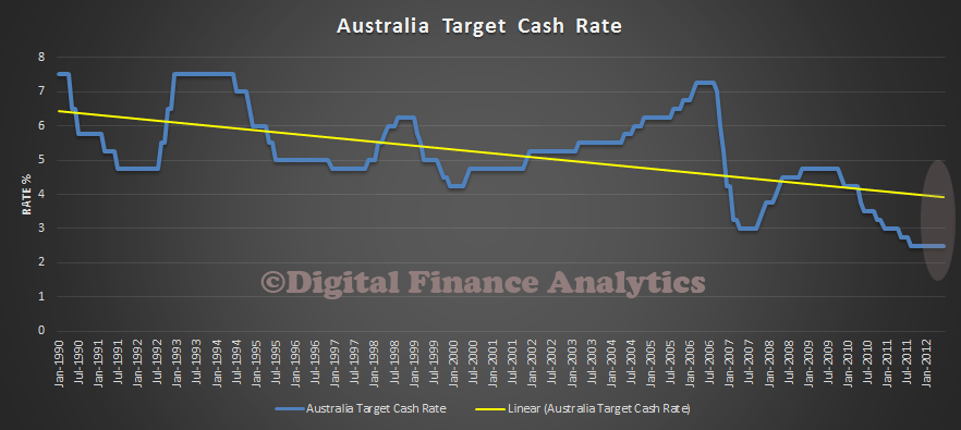
To answer these questions, we have examined interest rate trends, and incorporated a rising rate scenario into our mortgage stress models. First, let’s look at rate trends. This is a plot of the RBA target rate since 1990. If we take a linear average, we see that currently we are well below the “neutral” range. An RBA rate of 4-4.5% would on this basis be a neutral rate. This is the first assumption I have made in my stress modelling.
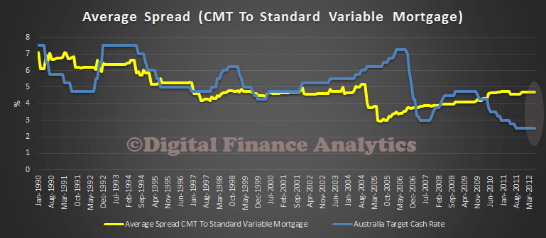
 Then we have to estimate the spread above the target rate the variable rate mortgage will be coming in at. We still have most households on a floating rate, although 15% are locking in fixed at the moment. This plot shows the target cash rate, against the spread between a CMT deposit account and a standard variable mortgage. Lets assume an average uplift of 300 basis points. That would put the mortgage rate at about 7%.
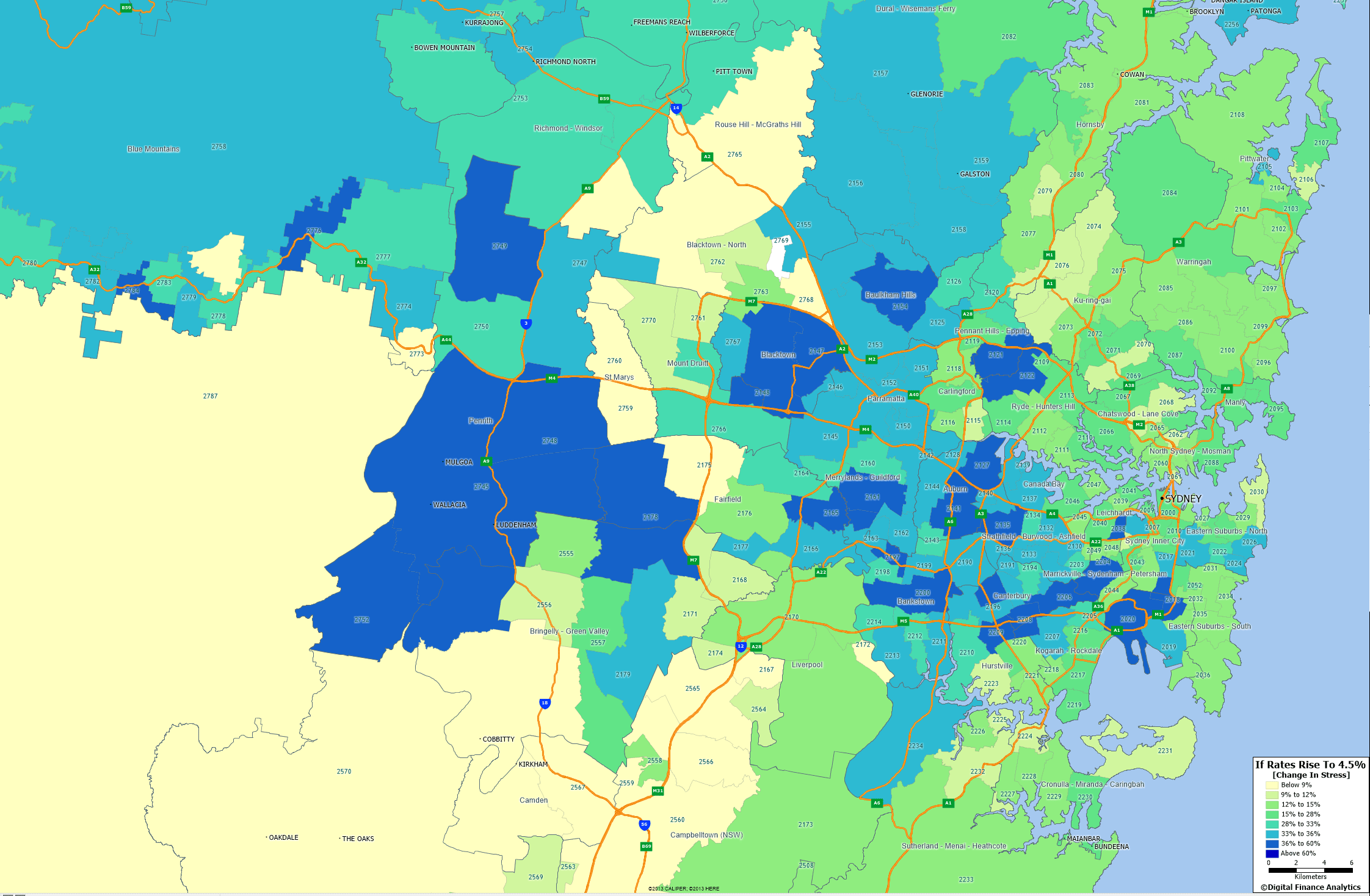
 Now, we will assume rates will be lifted to this level in the next 12-15 months. We will also assume that income rises at the level it has in the past 2 years, and that unemployment stays at 6% (to isolate the effect of the rate movement). We then calculate for the 26,000 households in our survey the impact on their income/expenditure if their mortgages do rise. The impact is of course immediate, unless households are on a fixed loan. This is incorporated in the modelling. Now, we calculate the proportion of households which will be in mortgage stress in 18 months time (see the definitions we use here). Lets take Sydney as an example. This geo-mapping shows where the main movements are in terms of increases in mortgage stress. The blue postcodes are worst hit. Many of these households are in the western suburbs, and are typically younger, and on lower incomes. Many are first time buyers.
 Mortgage stress does not mean an immediate crisis, but households hunker down short term, and it is a warning of trouble ahead because many households who get into difficulty are ultimately forced to sell. My read on this modelling is that if rates rise, the impact on the property market could be quite profound. This in turn does indeed lay potential bear traps for the banks, because of their high leverage into property. There is a strong case to lift the currently relatively low capital rules for the big four, to provide a buttress against rising rates, and to avoid financial stability issues. The recent FSI interim report touched on this. If rates do indeed start to rise, we will need to be alert to the issues. Actually, the regulators should have been acting sooner, as the genie is now out of the bottle. We will publish data on this scenario for other states another day.

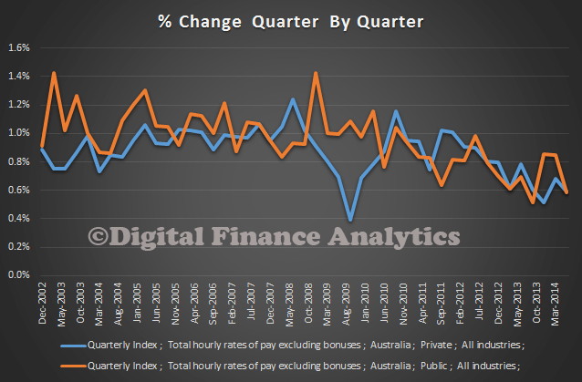 Looking at the impact after adjusting for inflation, real effective incomes are now falling.
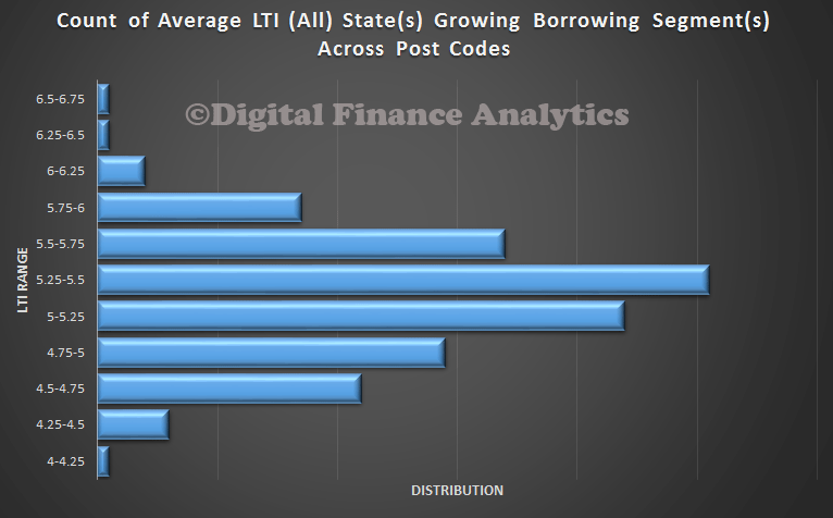
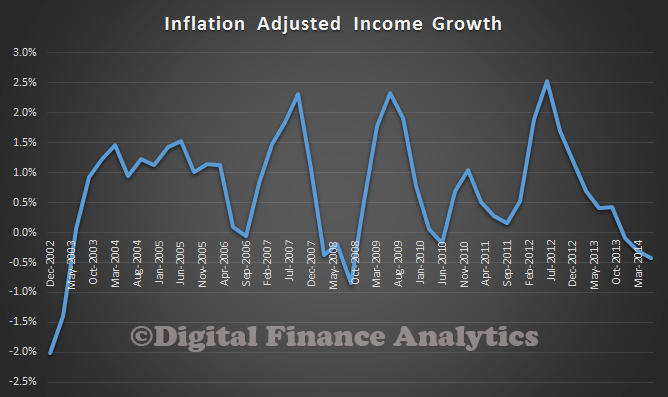 This is significant and serious. Many households have taken on the burden of large mortgages assuming that whilst they will experience short term pain, their incomes would grow, so easing spending pressures. This however is just not happening. Consider this updated data on household Loan To Income ratios (LTI). Some households have an effective LTI about 5 times. This is very high.
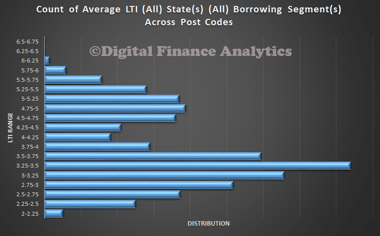 In our surveys, we find that some segments are particularly exposed. The worst is in our Growing segment, these are younger families, many of whom are first time buyers, or recent up graders. As a result mortgage stress is high, and growing in this group, even at current low interest rates.