Bubble Smuzzle

The sudden talk of bubbles in the property market, by the regulators and treasury, looks like an attempt to talk the housing market down whilst not really doing that much in reality, and leaving space for more rate cuts in the cash rate as broader economic activity slows. The RBA’s low rate strategy is partly to blame. But, is it really a bubble? Well. If you look at the growth in house prices now compared with a decade or more ago, growth in the past three years in every capital city is lower than it was in the period 2001-2004. Darwin and Hobart are the centres with growth which most closely match the ramp up in 2001 onwards and the current rises.

We did not have the 20-40% corrections post the GFC that the USA and UK had, prices tended to stall, or rise slowly, but we started the current run-up from a higher base position.

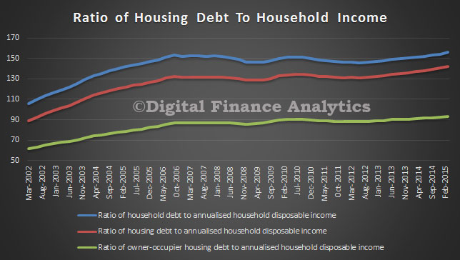
The next point is that household debt is higher compared with GDP than it has ever been, and whilst the savings ratio is high, it is now actually falling. The current low interest rates are encouraging people to grab a loan, and buy a property, especially investment property. It’s simple, low interest rates, negative gearing to offset costs, and the prospect of capital growth makes property investment compelling, as it is in a number of other countries. Indeed, overseas investors are joining in the fun (and FIRB has not tackled the issue). First time buyers are going direct to the investment sector, and down traders are selling up, releasing cash and investing in leveraged property. It’s all very logical.

Demand is also being stoked by population growth, including migration, and the expanding number of households in Australia. We have not built enough property for more than a decade, so there is more demand against supply. Also, we have more single person families (thanks to relationship breakup, older singles, and other people preferring to live alone). So we need different types of property, and more of it.

Because supply/demand is out of kilter, prices are rising, it’s not a bubble, its fundamental economics. We need to think about three factors, first, interest rates are low and will at some time rise, many people who have borrowed today and can afford repayments will find it increasingly difficult if rates rise, mortgage stress is quite high today, at low rates, and will rise. Second, income growth is flat, and this means that people won’t get out of jail as they did in 2001+, because incomes rose faster then, and helped to ease the pain when rates rose. Also, rentals are more linked to incomes than house prices, so rental income wont lift much. Third, on any absolute measure, (Loan to income, Prices to GDP) we are 25-30% above the long term norm. At some point it will correct – but it’s a structural problem not a bubble. This is true in all major centres, and is also spilling out into the regional areas. It’s not just a Sydney-Melbourne thing.

The solution requires joined up thinking. We need to revisit negative gearing. Plan better to build more houses, tighten lending and capital rules to restrict bank lending, tackle foreign purchasers and provide innovative options to assist first time buyers back into the owner occupied sector (joint equity share arrangements is my bet). Finally, and desperately, we need to deflect the banks appetite to lend to housing towards productive lending to business because this will give productive growth, not useless asset price growth and bank balance sheet growth. We need to ease price growth, and get back to trend. This will be painful and politically charged. On the supply side, we need to build more, reduce new development taxes and change planning regulations.

Meantime we have property which is chronically overvalued. Not a bubble, a structural problem. I doubt Canberra will do much more than hold yet another inquiry into housing (Oh, Hockey kicked one off a couple of weeks ago!)

Stress Testing Households – RBA Paper

The RBA published a Research Discussion Paper “Stress Testing the Australian Household Sector Using the HILDA Survey”.  They use data from the Household, Income and Labour Dynamics in Australia (HILDA) Survey to quantify the household sector’s financial resilience to macroeconomic shocks.

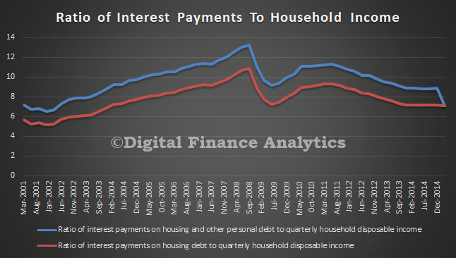
Given high household indebtedness, large mortgages and high house prices, estimating the potential impact of changes to interest rates and unemployment are important. Especially so when so much of banks lending is property related, and capital ratios are lower than pre-GFC. DFA of course models mortgage stress in our own surveys, so we have an interest in this work.

Their model suggests that through the 2000s the household sector remained resilient to scenarios involving asset price, interest rate and unemployment rate shocks, and the associated increases in household loan losses under these scenarios were limited. Indeed, the results suggest that, despite rising levels of household indebtedness in aggregate, the distribution of household debt has remained concentrated among households that are well placed to service it. In turn, this suggests that aggregate measures of household indebtedness may be misleading indicators of the household sector’s financial fragility. The results also highlight the potential for expansionary monetary policy to offset the effects of increases in unemployment and decreases in asset prices on household loan losses.

Our perspective is that the household analysis they are using is not granular enough to get at the differential stress across households, and how potential interest rate rises or unemployment will impact. In addition, interest rates are low today, so it is not possible to extrapolate from events in 2000’s. Given the larger loans, adverse interest rate movements will impact harder and faster, especially amongst households with high loan to income ratios. Therefore the results should not be used as justification for further easing of monetary policy.

Some additional points to note:

The stress-testing model uses data from the HILDA Survey, is a nationally representative household-based longitudinal study collected annually since 2001. The survey asks questions about household and individual characteristics, financial conditions, employment and wellbeing. Modules providing additional information on household wealth (‘wealth modules’) are available every four years (2002, 2006 and 2010). So some data elements are not that recent.

As they rely on information from the HILDA Survey’s wealth modules, they had to impute responses to minimise the number of missing responses and thus increase the sample size. The total sample size for each year is around 6 500 households. Individual respondent data were used to estimate probabilities of unemployment; this part of the model is based on a sample of around 9 000 individuals each year. DFA uses 26,000 households each year, our sample is larger.

How then do they estimate potential household stress? Their model uses the financial margin approach where each household is assigned a financial margin, usually the difference between each household’s income and estimated minimum expenses. This is different from a ‘threshold’ approach, where each household is assumed to default when a certain financial threshold is breached (for example, when total debt-servicing costs exceed 40 per cent of income). DFA captures data on the precursors of stress, and models the cash flow changes as unemployment and interest rates move. We also model the cumulative impact of stress which builds over time (typically households survive for 18-24 months, before having to take more drastic action).

Looking at the potential economic shocks, they examined how an increase in interest rates leads to an increase in debt-servicing costs for indebted households, by lowering their financial margins. Interest rate rises tend to increase the share of households with negative financial margins, and thus the share of households assumed to default. Interest rate shocks are assumed to pass through in equal measure to all household loans.

Falling asset prices have no effect on the share of households with negative financial margins. They assume that a given asset price shock applies equally to all households.

A rise in the unemployment rate causes the income of those individuals becoming unemployed to fall to an estimate of the unemployment benefits that they would qualify for, lowering the financial margins of the affected households. Their approach uses a logit model to estimate the probability of individuals becoming unemployed. This means that unemployment shocks in the model will tend to affect individuals with characteristics that have historically been associated with a greater likelihood of being unemployed.

In their most extreme example, households in the middle of the income distribution and renters are the most affected. Households with younger heads are also affected, while household with older heads are not especially affected in any year, suggesting that the increase in indebtedness among these households through the 2000s did not significantly expose the household sector to additional risks. Households with debt are more likely to be impacted by the scenario than those without debt. However, of those households with debt, the impact of the scenario is greatest on those with relatively little debt.

Their results from the hypothetical scenario suggest that the household sector would have remained fairly resilient to macroeconomic shocks during the 2000s, and that the households that held the bulk of debt tended to be well placed to service it, even during macroeconomic shocks. However, based on this scenario, the effect of macroeconomic shocks appears to have increased over the 2000s. This suggests that household vulnerability to shocks may have risen a little. This might be because some households were in a less sound financial position following the global financial crisis (for instance, because the labour market had weakened and the prices of some assets had declined). As a consequence, shocks of a magnitude that previously would have left these households with a positive financial margin and/or sufficient collateral so as not to generate loan losses for lenders may, following the crisis, have been large enough to push these households into having a negative financial margin and/or insufficient collateral.

The results imply that expected losses (under the scenario outlined) on banks’ household loans were equivalent to a little less than 10 per cent of total bank capital (on a licensed ADI basis), assuming that eligible collateral consists of housing assets only. This result assumes that banks have already provisioned for pre-stress losses, but this may not always be the case, as the deterioration in asset quality may surprise some institutions or may take place before objective evidence of impairment has been obtained. Assuming pre-stress losses are not provisioned for, potential losses as a share of total bank capital roughly double. It is important to reiterate that these estimates are simplistic and could differ to actual losses incurred in reality under this scenario by a large margin. For example, some of these loan losses may be absorbed by lenders mortgage insurance.

DFA On Ross Greenwood’s Money Show Discussing Mortgage Stress

Following on from the Nine coverage of our mortgage stress analysis, Ross Greenwood and I discussed our stress findings last night on his 2GB radio show. You can hear the entire discussion, courtesy of 2GB.

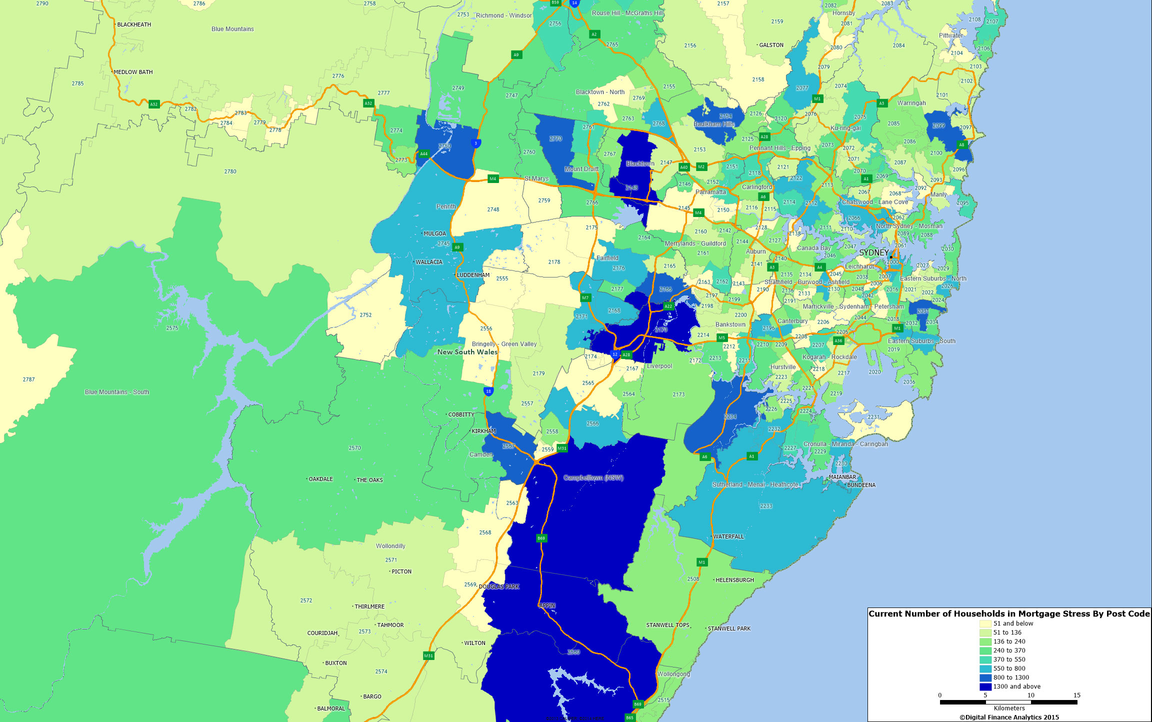
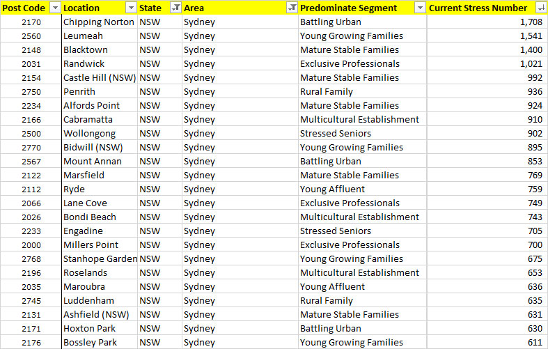
Here is the stress map for the Sydney region, showing the changes in stress levels from today, compared with an average mortgage rate sitting at 7%. The darker blue colours are where the most significant changes are expected to impact. You can read about the DFA modelling approach to mortgage stress here.

SydneyStressChange

Mortgage Stress Coverage on Nine

Last night Ross Greenwood ran a piece on Mortgage Stress, using the DFA Mortgage Stress Data, which we had recently updated to take account of the latest economic data and surveys. You can watch a video of the report, courtesy of NineMSN.

I covered the results of the updated modelling recently, and you can view some of the stress maps on the blog.

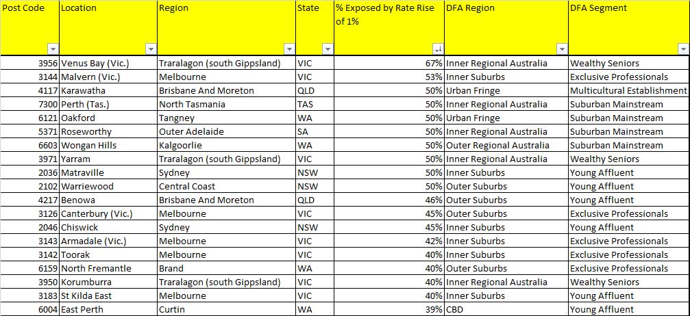
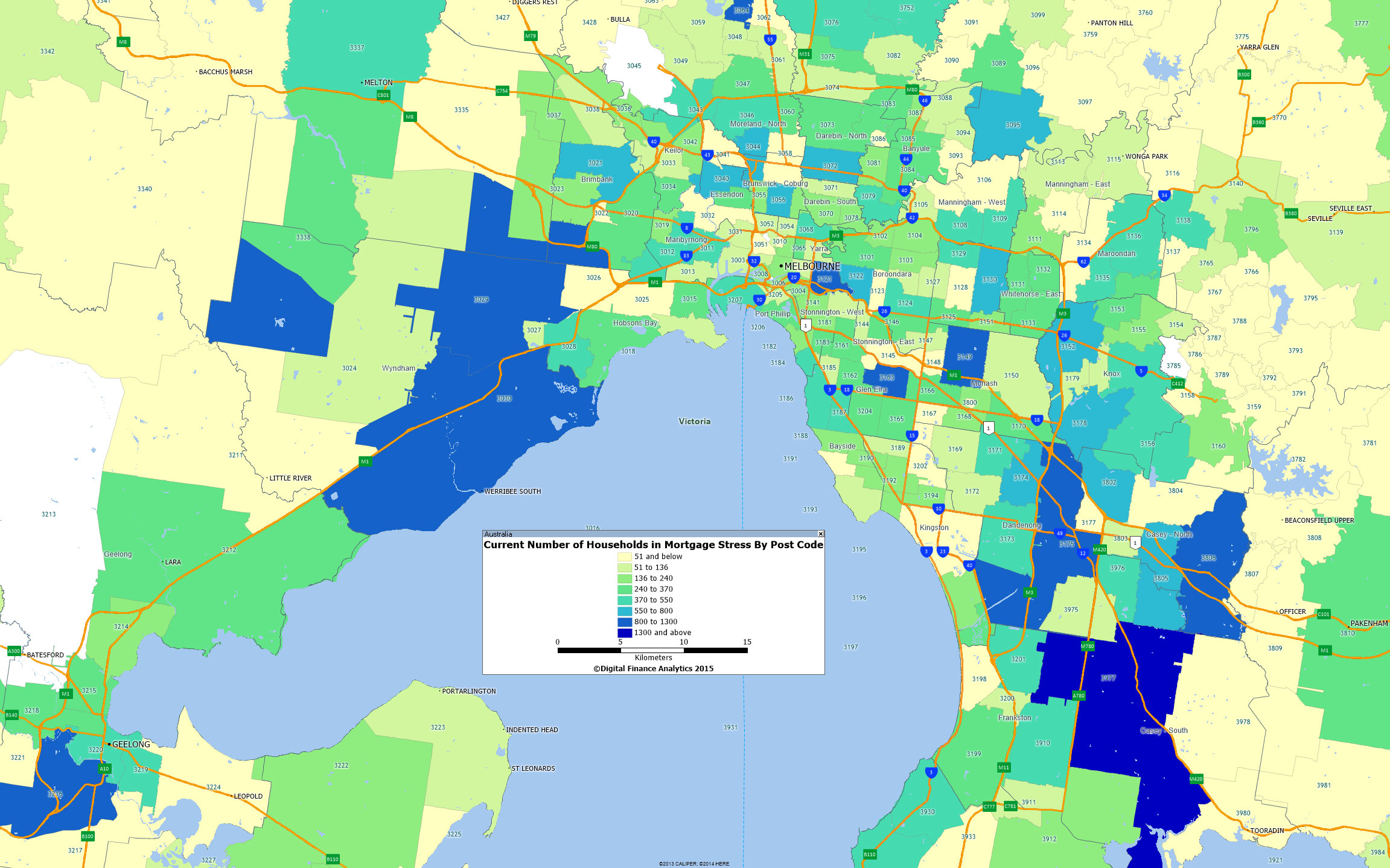
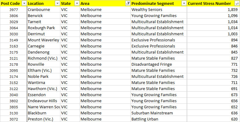
MortgageStressSept2014My point is that even at current low interest rates, some households today are already finding it hard to make ends meet, but should mortgage rates rise, (the long term average is a rate of around 7%, not the current 4.5%), then the number of households in difficulty would increase significantly in specific areas of some Australian cities. This flows on to dampening economic activity, and lower house prices, and links directly back to yesterdays data on real income falls in some segments. Those who are first time buyers, or young families are most exposed. In our surveys we found that less than half these households had a firm grip on their income and expenditure, and many of these did not run a household budget, relying on credit cards to plug the gap. Recent media coverage of DFA work is listed elsewhere on the blog.

Mortgage Stress Coming To A Household Near You

We have updated our mortgage stress models, to take account of the latest tranche of economic data, including falling real incomes, potential uplifts in capital requirements and inflation running hot, so creating the need to lift interest rates; and demand for property continuing to go ahead of supply. Our recent post the Anatomy of Mortgage Stress explains our modelling assumptions, and importantly the definitions of stress we are using. We also explained why households are highly vulnerable to mortgage stress, because of larger loans, and flat incomes in our article If The Worm Turns. Today we will look at our projections out to 2017, once we factor in these various drivers. It is only one scenario, but this is our central case.

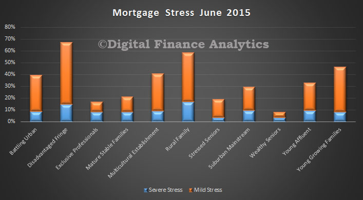
We use a series of questions to diagnose mortgage stress focusing on owner occupied households. Through these questions we identify two levels of stress – Mild and Severe.

  • Mild = households maintaining repayments, but by reprioritising expenditure, borrowing more on loans or cards, and refinancing
  • Severe = households who are behind with their repayments, are trying to sell, are trying to refinance, or who are being foreclosed

First we will look at the Australia-wide projections. We expect to see stress amongst first time buyers lift considerably from its current relative low levels. If rates do rise, unemployment stays high, and incomes continue to languish, then by 2017, we think that 40% of first time buyers will be in mortgage stress. Many who brought in the 2008-2009 boom are likely to be hardest hit. More recently the number of first time buyers has fallen to a long term low, so the number of more recent first time buyer households in stress will be lower.

MortgageStressSept2014We can look at the state variations. We see that VIC and QLD first time buyers are more likely to be impacted, whilst SA households less so, with WA and NSW first time buyer households sitting in the middle. This is partly a function of absolute house prices, and partly a function of income and unemployment trends across the states. We did not include the smaller states on the chart, but they are included in the average.

MortgageStressFTBSept2014Finally, we look at the other, non-first time buyer households. Many continue to pay more than the minimum monthly mortgage repayments, taking advantage of the current low rates so they have some protection. However, as rates and unemployment bites, some households who have held property for some time will also experience stress. By 2017 up to 15% of established households will be in stress in our central scenario.

Our research suggests there is an 18 month to 2 year grind between the onset of stress and households taking bold steps (or forced to) like selling up. Before that, they often get into the debt cycle of more credit card debt, refinancing, and a general hunkering down to try and keep the mortgage payments going. It is the broader economic impact of this refusal spend which will have a significant dampening impact on economic growth. In addition the outworking of stress leads to selling a property, so we would expect to being to see some forced sales in 2017 and beyond, another reason why we think house prices are likely to correct to more normal loan to income ratios.

In coming posts, we will look further at the state and postcode level data.

NSW First Time Buyer Trends From 2002

As part of our household surveys we have been examining the state of play for NSW first time buyers since 2002. In our research we have identified the year in which they purchased, whether they subsequently refinanced, or moved on, and how many of these households are currently having difficulty in finding a lender to refinance with. To be clear, this is a snapshot, as at August 2014, across multiple cohorts.

The data shows, firstly the monthly volume of loans written for first time buyers, peaking in 2009, and now languishing at a 20 year low. Next we plot, by age of the purchase, what proportion of households have subsequently either refinanced an existing loan, or sold and bought elsewhere. Perhaps it is not surprising that loans which are older, are more likely to be churned. The yellow trend line shows the proportion of households, by year of origination who have tried, but have not so far been able to refinance their loan. We see a significant peak in loans written in the 2009 boom time (when first time buyer incentives were at their peak, both at a federal and state level in a response to the GFC). More recent loans are less likely to be churned, so we see the drop in recent month. This suggests that there are a number of households in the 2009 and 2010 cohort who are in some strife.

First-Time-Buyers-NSWWe also analysed data on their current levels of mortgage stress, and their loan to income (LTI) ratios. We found that the average LTI grew steadily through the 2007-2012 cohorts, and currently stands at close to 6 times current gross income. We also see a peak in mortgage stress, in those households who took a loan in the 2009-2012 period. The proportion in mortgage stress are lower in the cohorts before and after this period. Once again the data highlights potential issues in specific cohorts, who are highly sensitive to unemploymentfalling income or rising rates.

First-Time-Buyers-LTI-NSWThis data also is a warning, that first time buyer incentives can pull households into the market, and lay potential long term problems for them.

Real Incomes Go Backwards

The ABS published their Wage Price Index to June 2014. In seasonally adjusted terms, both the Private and Public sector wage price indexes rose 0.6%. The rises in indexes at the industry level (in original terms) ranged from 0.1% for Accommodation and food services, Public administration and safety, and Arts and recreation services to 0.9% for Mining. The trend index and the seasonally adjusted index for Australia rose 2.6% through the year to the June quarter 2014.  Rises in the original indexes through the year to the June quarter 2014 at the industry level ranged from 2.0% for both Wholesale trade and Professional, scientific and technical services to 3.2% for Education and training.

We see a consistent falling trend in income growth, since 2010.

 
Income-Growth-to-June2014Looking at the impact after adjusting for inflation, real effective incomes are now falling.

Adjusted-Income-Growth-to-June2014This is significant and serious. Many households have taken on the burden of large mortgages assuming that whilst they will experience short term pain, their incomes would grow, so easing spending pressures. This however is just not happening. Consider this updated data on household Loan To Income ratios (LTI). Some households have an effective LTI about 5 times. This is very high.

LTIAllStatesUpdatedIn our surveys, we find that some segments are particularly exposed. The worst is in our Growing segment, these are younger families, many of whom are first time buyers, or recent up graders. As a result mortgage stress is high, and growing in this group, even at current low interest rates.

LTIAllStatesGrowingUpdated2

These pressures help to explain why many households are not feeling very confident, and are reacting to rising energy, child care and school fees, falling real incomes, and rising mortgage stress. The most affluent households are least impacted.

If The Worm Turns, What Happens To Household Mortgage Stress?

The wind appears to be changing. First the new head of APRA warned at a CEDA event they were watching the mortgage lending of the banks closely, “The Australian banking system clearly has a concentration of risk in housing. If anything was to go wrong in the housing market it would have very severe impact on the viability and health of the banking system, so it’s naturally something we watch very carefully.” Meantime in London, Treasury Secretary Martin Parkinson spoke to Chatham House where he mused on the low interest rate strategies being adopted by many countries, the limits of monetary policy and the potential for macroprudential measures. Locally, whilst fixed rate mortgages are being offered at record lows below 5%, the consensus appears to be shifting towards a lift in rates in Australia, partly as a result of rising inflation, although timing is not certain. So, what is the potential impact of a rate rise on Australian mortgage holders, bearing in mind that the average loan to income is stretched? How far would rates rise? Where would the pain be felt most?

To answer these questions, we have examined interest rate trends, and incorporated a rising rate scenario into our mortgage stress models. First, let’s look at rate trends. This is a plot of the RBA target rate since 1990. If we take a linear average, we see that currently we are well below the “neutral” range. An RBA rate of 4-4.5% would on this basis be a neutral rate. This is the first assumption I have made in my stress modelling.

RateTrendThen we have to estimate the spread above the target rate the variable rate mortgage will be coming in at. We still have most households on a floating rate, although 15% are locking in fixed at the moment. This plot shows the target cash rate, against the spread between a CMT deposit account and a standard variable mortgage. Lets assume an average uplift of 300 basis points. That would put the mortgage rate at about 7%.

RateSpreadTrendNow, we will assume rates will be lifted to this level in the next 12-15 months. We will also assume that income rises at the level it has in the past 2 years, and that unemployment stays at 6% (to isolate the effect of the rate movement). We then calculate for the 26,000 households in our survey the impact on their income/expenditure if their mortgages do rise. The impact is of course immediate, unless households are on a fixed loan. This is incorporated in the modelling. Now, we calculate the proportion of households which will be in mortgage stress in 18 months time (see the definitions we use here). Lets take Sydney as an example.  This geo-mapping shows where the main movements are in terms of increases in mortgage stress. The blue postcodes are worst hit. Many of these households are in the western suburbs, and are typically younger, and on lower incomes. Many are first time buyers.

SydneyStressChangeMortgage stress does not mean an immediate crisis, but households hunker down short term, and it is a warning of trouble ahead because many households who get into difficulty are ultimately forced to sell. My read on this modelling is that if rates rise, the impact on the property market could be quite profound. This in turn does indeed lay potential bear traps for the banks, because of their high leverage into property. There is a strong case to lift the currently relatively low capital rules for the big four, to provide a buttress against rising rates, and to avoid financial stability issues. The recent FSI interim report touched on this. If rates do indeed start to rise, we will need to be alert to the issues. Actually, the regulators should have been acting sooner, as the genie is now out of the bottle. We will publish data on this scenario for other states another day.