Australia burns while politicians fiddle with the leadership

From The Conversation.

With swathes of New South Wales still smouldering and temperature records tumbling all over the world, Malcolm Turnbull is losing his grip on the prime ministership, partly because of his inability to land a very modest emissions policy. His is the latest failure in a decade-long story of broken climate policy in Australia.

Like most voters, scientists are tired of these political games when clearly so much more is on the line.

That’s because what is happening now with extreme weather events and longer fire seasons is exactly what we forecast a decade ago. This isn’t breaking news. In fact, the science around the role of climate change in extreme temperatures is so solid that the editors of the world-leading Bulletin of the American Meteorological Society have discouraged scientists from researching extreme temperatures in its annual extreme events issue.

Why? Because, according to the journal’s editors, the scientific value of these studies is now “limited”. The climate signal in extreme heat events has become so clear that it is no longer a novel line of investigation. In short, climate change now plays a role in every extreme heat event.

Contrast this with the equivocation of our political leaders. Turnbull claimed in March this year that “you can’t attribute any particular event – whether it’s a flood or fire or a drought or a storm — to climate change”. He made this statement after 69 houses in Tathra in southern NSW were destroyed by an unseasonably late bushfire during a heatwave – and heatwaves are clearly linked to climate change.

Former prime minister Tony Abbott made an almost identical claim back in 2013, after an early season bushfire in the Blue Mountains destroyed 196 homes, during a succession of hot days in a warmer than average October.

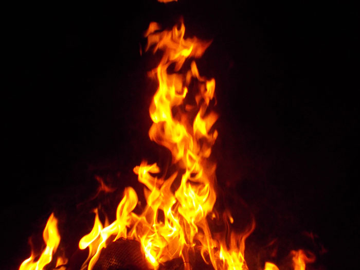
Just this month, drought was declared for all of NSW and the bushfire season began two months early. The state had its earliest ever total fire ban, and fires have already burned through large parts of coastal southern NSW.

Australia’s fire season is now so long, it overlaps with California’s, stretching our resources and our ability to prepare for and respond to catastrophic fires.

Clear evidence

In light of the clear evidence, it takes a very special kind of politician to ignore the role of climate change in extreme weather events. It’s hard to imagine why anyone would choose to play party political games as whole townships are threatened by fire and drought extends through NSW and Queensland.

And yet Turnbull has dumped plans to legislate even the lower boundary of Australia’s Paris Agreement emissions target as part of the National Energy Guarantee. The result is that Australia is once again left without a sensible climate policy.

Turnbull’s backdown also tells us exactly how far his and his colleagues’ political vision extends into the future: as far ahead as the next election. But while our leaders struggle with political myopia, the heart of climate science remains a big-vision, long-term approach.

Decades ago climate scientists told us that the first signs of climate change would appear in the temperature record, and extreme heat events would become more common and more extreme. This is exactly what has happened, only much faster than projected.

The first study to tease out the climate change component in an extreme heat event was an examination by the UK Met Office of the 2003 European heatwave that killed an estimated 70,000 people. It took almost two years to produce that result.

Today, scientific advances mean that researchers can do this kind of attribution study in mere days. As a result of these improvements, the attribution of climate change’s role in many extreme temperatures is now unequivocal. More recent research shows that some 2016 events across the world, including the extended mass bleaching on the Great Barrier Reef, could not conceivably have happened without climate change.

Turning our focus to the coming decades, we find that even if the world meets the more generous Paris goal of keeping global warming below 2℃, Sydney and Melbourne could see 50℃ days and 25 more heatwave days every summer. Worryingly, right now we are on track to exceed 3℃ of warming.Now let’s add some perspective about what we are currently experiencing. Australia’s supercharged heatwaves and winter bushfires have occurred with just 1℃ of global warming.

Yet even with this small amount the climate signal is so clear that when one of the authors of this article was asked by a reporter if there was likely a climate change influence on our hot April, she confidently replied, “I would bet my house on it”. Four months later, the bet is still on.

It is time to stop dismissing our record-breaking temperatures, droughts and winter bushfires as natural variability. The role of climate change in extreme heat is now so pervasive that it is almost a given.

Asking climate scientists whether global warming plays a role in extreme temperature events is like asking a medical researcher whether a case of the ‘flu might just be linked to the influenza virus. The answer is obvious.

Any politician who ignores the clear link between weather extremes and climate change – choosing instead to trot out platitudes about how Australia’s climate has always been tough, or quote Dorothea Mackellar (who, surprisingly enough, was not a climate scientist) – is effectively saying “let’s do nothing about this growing problem”.

An attitude of “nothing to see here” from our leaders, when all the evidence says otherwise, leaves our health sector, economy, ecosystems and, as we see now, our struggling farmers exposed to climate change impacts.

It may also leave those politicians and industry leaders making such claims wide open to potential liability for future loss and damages, if recent legal cases are any guide.


For almost a decade, most of our politicians have been so busy bickering over who gets to be leader that they have failed to show the real leadership required to look at Australia’s future beyond the next election cycle.

Enough. Most Australian voters surely care less about who is running the country than they do about making sure our country is still a habitable place to live in the future.

Authors: Sophie Lewis ARC DECRA Fellow, UNSW, Sarah Perkins-Kirkpatrick Research Fellow, UNSW

This is what policymakers can and can’t do about low wage growth

From The Conversation.

This is longer than the usual Conversation article, so allow some time to read and enjoy.


The crisis really is in real wage growth. – Reserve Bank Governor Philip Lowe, 2017

Increased inequality and low wage growth are constraining economic growth. But why is wage growth so low? And how should policymakers respond?

Income inequality has increased significantly in most advanced economies since the early 1980s. In particular, very low rates of wage increase are widely blamed for the weak growth in aggregate demand this century and secular stagnation since the Global Financial Crisis. The GFC was itself brought on by the rise in consumer debt that was used at first to support demand in an attempt to offset the impact of weak wage growth.

Fairfax columnist Ross Gittins recently noted that “many economists were disappointed by this week’s news … that consumer prices rose only 2.1%”. That was because low inflation is “usually a symptom of weak growth in economic activity and, in particular, of weak growth in wages”.

Thus, today it is widely agreed that wages need to increase faster. The OECD, the IMF, leading US scholars, former US Treasury Secretary Larry Summers, Nobel prize winner Joseph Stiglitz and most recently Stephen Bell and I in our book, Fair Share, have all argued that increasing inequality is bad for economic growth.

To solve this problem, the critical issue for policymakers is what is causing this rising inequality and weak wage growth? Unless we better understand the causes, we are unlikely to achieve an effective policy solution.

First, we can quickly dismiss the explanation offered by federal Treasurer Scott Morrison, whose so-called “economic plan” assumes present low wage growth will respond positively to higher company profits. According to Morrison, a company tax cut will lead to more investment and thus more jobs, so eventually the benefits will trickle down and increase wages.

Unfortunately, this logic is the reverse of reality. It ignores the evidence that slow wage growth across all the developed economies has been a problem over a couple of decades now.

Slow wage growth is a continuing long-term problem in the developed economies. CC BY-ND


In fact, the evidence strongly suggests higher profits will not drive higher wages. The benefits of a company tax cut will largely be returned to shareholders, while the only wages that increase will be those of senior management.

Instead, higher investment will require increased consumer demand. And that in turn depends on stronger wage growth. In short, aggregate demand in a flat economy, like ours, is wages-led. Wages drive investment, not the other way around.

Broadly speaking, there are two serious schools of thought about what is causing weak wage growth and rising inequality.

One explanation puts most of the blame on a weakening of trade-union power.

The other explanation emphasises the impacts of technological change and, to a lesser extent, globalisation on the labour market. Together technology and globalisation are said to have changed job structures and demands for skills. They have reduced the share of middle-level jobs, which has directly increased income inequality, and they can depress the demand for labour more generally and thus wages in developed countries, but especially for less skilled labour.

These two explanations are not mutually exclusive – both may have played a role. However, I want to consider their relative significance as the basis for arguing which policy responses should be given priority.

Trade union power in Australia and its impact

A very distinguished professor of labour economics and former Industrial Relations Commission deputy president, Joe Isaac, recently argued persuasively that an important explanation of slow wage growth is “to be found in the change in the balance of power in favour of employers and against workers and unions”.

Isaac starts by noting that union membership in Australia has fallen from about 50% of all employees in the 1970s to the present 15%. This is one of the lowest rates in the OECD.

Isaac also finds some correlation between income inequality (measured by the Gini coefficient) and trade union density for 11 OECD countries. More relevant, though, would be the change in inequality relative to the change in union membership, especially as Australia has always had a relatively high Gini coefficient.

Isaac argues that this loss of membership and the reduced authority of the Fair Work Commission has weakened the bargaining power of organised labour in Australia. Employers are now able “to determine no wage increase or an increase less than their profits would warrant, with less resistance from workers and unions”. Although Isaac admits that “this conclusion is based on the association over time of union power decline and slow wages growth”, he concludes that “it seems reasonable to claim, at least prima facie, a causal connection between them”.

I am more sceptical. While I wouldn’t rule out any impact on wages and employee conditions from a decline in trade union membership and the possibly associated changes in the power of the Fair Work Commission, I question Isaac’s analysis for the following reasons.

First, it is uncertain how much trade union power has declined as a result of loss of membership. Another test of trade union power is the proportion of wages determined by awards and collective agreements – as Isaac shows, this proportion has largely remained the same in Australia. Indeed, in some countries, such as France, trade union membership has always been very low, but they have a highly centralised system of wage determination, which allows the unions a lot of influence.

Second, other countries have also experienced increases in inequality – much greater than in Australia in most cases – but don’t seem to have experienced any notable loss of union power. For example, some of the biggest increases in inequality over the last 30 years, as measured by the Gini coefficient for final disposable income, have occurred in countries like Sweden, Finland and Germany, which are not associated with any loss of trade union power.

Third, Isaac’s analysis of wage inequality focuses entirely on a decline in the wage share of total factor income. This ignores changes within the distribution of earnings. These latter changes are more important in many countries, and certainly for Australia.

While the wage share in Australia has declined since the 1970s and early 1980s, this was at least partly a result of deliberate policy under the Hawke/Keating governments’ Accord with the trade unions, when it was accepted that the wage share had been too high. Even today the wage share is still higher than in 1960, when the economy was generally considered to be performing exceptionally well.

Fourth, the changes in the distribution of earnings largely reflect changes in the structure of occupations rather than changes in relative wage rates. But trade unions seek to influence wage rates, and it is difficult to see how they can exert much direct influence over the structure of jobs.

For these various reasons, I don’t think the loss, if any, of trade union power can explain much of the increase in inequality in most countries over the last 30 years. It is necessary to look elsewhere for the explanation, and the main driver seems to have been the impact of technological change.

Impacts of technology and globalisation

In Fair Share, Stephen Bell and I examine the causes of increased inequality over the last 30 years in most of the advanced economies. A critical starting point is to distinguish between changes in the job structure and changes in relative wage rates. As we note:

Even if there were no change in relative wage rates, but employment increased faster for both high-paid and low-paid jobs, the earnings distribution would show up as more unequal. What would have happened is that the composition of the top and lowest deciles of earnings would have altered, which would increase the median income of the top decile and reduce the median income of the lowest decile, which would in turn be reported as an increase in the inequality of earnings.

The consensus in the studies we reviewed is that increased inequality of earnings largely reflects the impact of technological change. Globalisation and increased participation in global value chains may also have played a role, but less so in Australia, which we attribute to Australia having a more flexible labour market than, say, America.

We also surmise that increased financialisation and the capture of rents generated by technological change may help explain the very large increase in remuneration for the top 1%.

Interestingly, the OECD specifically rejected the hypothesis that regulatory changes have helped drive any significant increase in inequality. It found that “the net effect of regulatory reforms on trends in ‘overall earnings inequality’ remains indeterminant in most cases”.

The principal impact of technological change, and globalisation to a lesser extent, has been to reduce the share of middle-level jobs. In particular, new information and communications technology has had its greatest impact on relatively routine tasks involving middle-level jobs, such as clerical occupations and the operation of basic machinery.

Technological change has also driven the fall in the relative price of capital goods. This has led to some substitution of capital for labour. Again, this is “particularly pronounced in industries with a high predominance of routine tasks”, as the OECD notes.

These changes in job structure and the relative decline in the middle-level jobs have been the most important cause of increasing inequality in many countries, including Australia. Technological progress has also led to an increase in the demand for skills. In some countries that has increased the premium paid for skilled labour, but the extent of this depends upon the policy response affecting the supply of skills.

In Australia’s case, Bell and I find that the premium for skills, and consequently relative wage rates, did not change much because of the increase in education and training effort. Accordingly, much of the increase in earnings inequality in Australia reflects changes in the job structure rather than changes in relative wage rates (see also Keating and Coelli & Borland).

So what does this mean for policy?

Consistent with his view that a weakening of trade union power has driven the increase in inequality, Isaac recommends changing the Fair Work Act to rectify “the unbalanced industrial power in the labour market”. I can support most of Isaac’s recommended changes, and especially greater rights of union entry, which should help better police adherence to awards and wage agreements.

I also agree that Isaac’s recommended legislative changes are unlikely to result in unions abusing their increased power. This is because, as he puts it, “there are now prevailing forces, such as global competition and structural changes, which will continue to keep union power in check”.

However, these “prevailing forces” are what really caused most of the increase in inequality, as discussed above. I therefore doubt that these legislative changes will do much to reverse the increase in earnings inequality.

Instead, the best way to respond to the impact of technological change on the job structure and possible associated changes in wage premiums is to improve education and training. Enhanced education, training and labour market policies will help workers adjust to the challenges posed by new technologies and will also spur the adoption of those technologies.

In addition, if the supply of skills thereby increases in line with the increase in their demand, there should not need to be any change in relative wage rates. Although these types of reforms take time, in the end they can boost both aggregate demand and potential output, with benefits all round.

In short, as Thomas Piketty, in his major study on inequality, concluded:

To sum up: the best way to increase wages and reduce wage inequalities in the long run is to invest in education and skills.

Author: Michael Keating Visiting Fellow, College of Business & Economics, Australian National University

Turkey shows the economic pain of global democratic backsliding

As American baseball legend Yogi Berra once supposedly quipped, “It’s déjà vu all over again.” Three years ago the crisis was in Greece, now it’s Turkey. Another European summer and another European economic crisis.

It’s tempting to say that being in Europe is all the two situations have in common. Greece’s population is a little over 10 million; Turkey’s is nearly 80 million. Greece’s troubles were triggered by out-of-control government debt; Turkey’s government debt-to-GDP ratio is quite low. The Greek government was on the loopy left; Turkey’s ruling Justice and Development Party is on the conservative right.

But the similarities between the Greek and Turkish crises are deeper than the differences.

Both were brought about by decades of ignorant, populist economics. When crisis hit, both countries had leaders who instantly made things worse. And in both cases the world’s global capital capital markets have proved to be an unforgiving judge.

Erdogan’s voodoo economics

Turkey finds itself in crisis not because of massive government debt – although it has been rising pretty rapidly of late and private-sector debt is a real issue – but because of a large current account deficit.

The current account deficit – roughly the difference between the value of what it imports and what it exports – is running at more than US$60 billion at an annualised rate.

This means Turkey is a large net borrower from the rest of the world.

President Recep Tayyip Erdogan has goosed GDP through cheap foreign credit and low real interest rates. But unlike tinpot strongmen who worry mainly about holding onto power tomorrow, global markets look far into the future.

And this year markets decided that Turkey’s economic future looked pretty bleak.

A plummeting lira

The Turkish currency, the lira, has fallen by more than 40% against the US dollar this year. Since more than half of Turkey’s foreign debt (government plus private) is denominated in foreign currencies, this is a big problem.

It is estimated that there is more than US$200 billion of dollar-denominated Turkish corporate debt. When the lira falls, foreign-denominated debt rises, making it hard to service, let alone repay.

At the same time, the inflationary spiral this sets off does huge damage to the domestic economy. It is estimated that Turkey’s annual inflation rate is running at more than 100%.

Erdogan doesn’t want interest rates to rise – and he has bullied the central bank into doing so later and less than the bank otherwise might have. He is on record as saying that higher interest rates increase inflation, rather than the opposite, as every first-year economics student knows.

To Erdogan, black is white, night is day, up is down.

US President Donald Trump announced last week that “Aluminum will now be 20% and steel 50%. Our relations with Turkey are not good at this time!” Erdogan’s response has been to call for a boycott of iPhones and enact retaliatory tariffs of as much as 140% on a range of US goods.

Erdogan did secure US$15 billion in foreign investment from Qatar, after meeting Emir Sheikh Tamim Bin Hamad Bin Al Thani in Ankara on Wednesday. That might stop some of the bleeding for now, but this gives Qatar tremendous leverage.

The real cost of this support won’t be measured in basis points.

Global contagion?

The big risk here is that the foreign holders of all this dollar-denominated Turkish debt get into trouble as Turkey struggles to repay or defaults. Even the Bank of International Settlements doesn’t easily know who all these debt holders are, but banks in Spain and France appear to be significantly exposed – especially Spain.

A run on the Turkish currency could turn into damage to balance sheets of banks across Europe, triggering a potential debt crisis in countries like Spain.

That’s some distance off for now. But it looms.

All this will likely end in some kind of International Monetary Fund assistance package – but that’s going to come with conditions. Folks who like to use the term “neoliberal” will dub such conditions as brutal austerity.

Others will consider the conditions the cost of stabilising an economy pushed to the brink by a financially illiterate megalomaniac.

Economics in a world of democratic backsliding

Turkey may be at the centre of the crisis du jour, but Erdogan is but one of a cast of nasty, illiberal characters. Although they occupy varying positions on the ideological spectrum, from Poland to Hungary to Latin America, there has been significant democratic backsliding in recent years.

These strongmen do violence to principles of liberal democracy – often literally. They also damage their economies and, as a consequence, their people.

Institutions like the International Monetary Fund will probably handle the problem in Turkey, although it would be a lot simpler if Erdogan just allowed interest rates to increase and solve the problem directly.

But sadly we can expect more illiberal and nonsensical economics from these illiberal strongmen. It is contagious populist ideology more than financial contagion that should scare us right now.

Author: Richard Holden Professor of Economics and PLuS Alliance Fellow, UNSW

What if we expected financial services to be more like health services?

From The Conversation.

Earlier this year the chief of a financial planning firm collapsed in the witness stand during Australia’s ongoing royal commission into misconduct in the financial services industry. He had to be taken to hospital in an ambulance – some would say a fitting metaphor for the state of the industry.

Fortunately for him the health care system doesn’t operate like the financial planning industry. If it did he might have been “treated” according to what was most profitable for the ambulance service rather than what was best for his well-being.

The Financial Services Royal Commission is exposing abundant evidence of unethical misconduct. Customers are being charged fees for services they never get or ever need, getting inappropriate advice, being offered irresponsible loans and sold worthless insurance contracts. It shows up an industry riddled with conflicts of interest and obsessed with extracting profits from customers in any way conceivable.

Sound familiar? The 2007-09 Global Financial Crisis was in large part caused by the same “profit at all costs” culture. It fuelled high-risk home lending to ordinary people who couldn’t afford it. Why haven’t things changed?

Despite the lessons of the GFC and a regulatory crackdown, the central problem with the global financial services industry is that, unlike the health industry, it has long stopped caring about its customers’ well-being.

Financial services, such as payments and basic forms of credit and insurance, are now essential for the economy and society to function. For this reason, the large financial services firms often receive privileges such as market protection and implicit government guarantees worth billions of dollars, underwritten by taxpayers. So how has the bar been allowed to sink so low?

The mindset behind the scandals

At the heart of the problem lies the mental model that the finance industry applies to itself and the world around it.

This thinking is dominated by the neoclassical model of economics in which people are “rational actors” who always do what is best for them. And they supposedly interact with each other through perfect markets, leading to the efficient allocation of resources.

While everyone understands this as an idealised abstraction, the impact of this working assumption is profound. It has led to an “input-oriented” model. Banks and other financial services companies are exclusively concerned with providing whatever inputs – financial products and services – their customers demand.

Bewildering arrays of products are sold using state-of-the-art marketing techniques, irrespective of whether the customers actually need them.

Undesired outcomes are often considered to be the customer’s responsibility. If the customer ends up with too much credit card debt, possibly as a result of aggressive marketing, don’t blame the bank.

Regulatory and public policy responses are also premised on this model. The dominant approach in financial regulation focuses on disclosure, requiring firms to provide more and more information about their financial products.

Product disclosure statements are now often hundreds or thousands of pages long. These are littered with legal and financial jargon that is often incomprehensible even to experts. Rather than clarifying the nature of financial products, disclosure requirements have only made them more opaque.

This rationalist approach has led the industry and regulators to promote financial literacy education as a solution to the problem. The idea is to educate consumers about financial products and services to help them navigate the financial system and make good decisions.

The Australian government spends tens of millions of dollars on financial literacy programs such as its MoneySmart program. The Bank of England recently launched econoME, a program with very similar aims.

This approach ignores a core aspect of finance. Many financial problems that consumers face are highly complex. For example, determining a person’s optimal lifetime saving and investment strategy to provide an adequate income in retirement is a formidable problem, even for a finance expert with a supercomputer.

It is beyond the capability of the average person to work out many financial decisions on their own, and we shouldn’t expect people to do so – just as we don’t expect the average person to perform brain surgery.

Focus needs to shift to financial well-being

If we accept that many aspects of finance are hard, we will need to give up on the rationalist model. Instead we need to switch to an outcome-focused model in which, as with the health care system, the primary concern is for people to reach a set of outcomes or goals – a certain level of financial well-being, for example.

Services offered by banks and regulations imposed by governments would then be evaluated on the extent to which they offer to improve people’s financial well-being. Banks would only offer services that have been shown to improve one or more dimensions of their customers’ financial well-being, aligning their interests more closely with those of their customers.

Financial services and their regulation would look radically different. For example, fewer decision options and simpler products would be more effective in improving financial well-being. New technologies such as artificial intelligence could likely play an important role in this new world of finance.

Importantly, both the development of services and their regulation should be based on evidence and delivered under a set of professional standards monitored by an independent standards-setting body. This would be similar to the processes and institutions used in the health system. Providers of financial services would then be subject to both a fiduciary duty and product liability.

The future of finance doesn’t lie in ever more regulation, or ever more sophisticated technology to squeeze higher margins out of legacy products. The future of finance lies in the rediscovery of what finance is for – to improve the financial and economic well-being of society.

Authors: Paul Kofman Professor of Finance, University of Melbourne;
Carsten Murawski Associate Professor in the Department of Finance and co-director of the Brain, Mind & Markets Laboratory, University of Melbourne.

Finance drives everything — including your insecurity at work

From The Conversation.

There’s a common link between the many things that have promoted insecurity at work: the growth of franchising; labour hire; contracting out; spin-off firms; outsourcing; global supply chains; the gig economy; and so on. It’s money.

At first, that seems too obvious to say. But I’m talking about the way financial concerns have taken control of seemingly every aspect of organisational decision-making.

And behind that lies the rise and rise of finance capital.

Over the past three decades there has been a shift in resources from the rest of the economy to finance. Specifically, to finance capital.

One way to see this is in the chart below. It shows the income shares of labour and capital, and the breakdown for each between the finance and non-finance (“industrial”) sectors, in two four-year periods. They were 1990-91 to 1993-94 (when the ABS started publishing income by industry) and, most recently, 2013-14 to 2016-17. (I use four-year periods to reduce annual fluctuations and show the longer-term trends. Here is more detail and explanation of methods.)

Income shares of labour and capital

Factor shares by industry, 1990-94 and 2013-17. Source: ABS Cat No 5206.0

The key thing to notice in the chart is that finance capital’s share of national income doubled (it’s the dark red boxes in the lower right-hand side of the chart), while everyone else’s went down.

So, over that quarter-century, the share of labour income (wages, salaries and supplements) in national income fell. In the early 1990s it totalled 55.02% — that’s what you get when you add labour income in finance, 3.21%, to labour income in “industrial” sectors, 51.81%. In recent years this fell to 53.58%. There were falls in both finance labour income (from 3.81 to 2.83% of national income) and industrial labour income.

The total share of profits and “mixed income” accordingly rose from 44.99% to 46.42%. The thing is, all of that increase (and a bit more) went to finance capital. Profits in finance went from 3.16% to 6.16% of the economy.

At the same time there has been a large increase in the share of national income going to the very wealthy — the top 0.1% — in Australia and many other countries.

This shift in resources does not reflect more people being needed to do important finance jobs. Nor is it higher rewards for workers in finance. The portion of national income, and for that matter employment, devoted to labour in the financial sector actually fell from 3.21% to 2.83%.

The economy devotes proportionately no more labour time now to financial services than it did a quarter century ago. Yet rewards to finance have increased immensely. The share of national income going to “industrial” sector profits and “mixed income” has declined.

In short, the widely recognised shift in income from labour to capital is really a net shift in income from labour, and from capital (including unincorporated enterprises) in other industries, to finance capital.

Finance matters

You may have heard about “financialisation”. It’s not really about more financial activity. It is about the growth of finance capital and its impact on the behaviour of other actors.

Financialisation has led to finance capital taking the lead shareholdings in most large corporations, not just in Australia but in other major countries (to varying degrees) as well.

This role as main shareholder and, of course, chief lender to industrial capital has driven the corporate restructuring over the past three decades that has led to greater worker insecurity and low wages growth (as I recently discussed here).

When “industrial capital” has been restructured over recent decades — to promote franchising, labour hire, contracting out, spin-off firms, outsourcing, global supply chains, and even the emergence of the gig economy — it has been driven by the demands of finance capital. Casualisation is just one manifestation of this.

Short-term logic

Now there’s no conspiracy here (or, at least, the system doesn’t rely on one). There is actually a lot of competitive mindset in the financial sector. This is just the logic of how the system increasingly has come to work. Financial returns, particularly over the short term, have become the principal (really, the only) fact driving corporate behaviour.

This has come at the expense of human considerations.

That same logic is behind resistance to action on climate change. Continuing carbon emissions are the perfect, and deadly, example of short-term profits overriding longer-term interests.

Yet even finance capital is not monolithic. There are parts of finance capital that have a longer-term perspective (“there’s no business on a dead planet”). So they are effectively in battle with those parts of finance capital for which the short term is everything. The former want governments to intervene in, for example, carbon pricing.

Policy questions

All this leaves some big questions for policymakers about how to redress the new imbalance of power.

In part, it requires changing institutional arrangements (including industrial relations laws) that in recent years have made it much harder for workers to obtain a fair share of increases in national income. It requires rethinking of how we regulate work.

But it also requires rethinking of how we regulate product markets and financial markets.

The almost global reduction in regulation of the financial sector over three decades ago has ultimately led to this imbalance. It is time to rethink all of that.

Author: David Peetz Professor of Employment Relations, Centre for Work, Organisation and Wellbeing, Griffith University

How have your family’s fortunes changed?

From The Conversation.

Do you feel that, overall, you’re “better off” than you were in the past? Or that things are getting worse, or have plateaued?

We now have the data to get us a pretty good answer to that question, right down to the detail by “family types”, as categorised by the Household, Income and Labour Dynamics in Australia (HILDA) Survey. Starting in 2001, this longitudinal survey now tracks more than 17,500 people in 9,500 households.

The interactive below lets you drag and drop your family members into the house to see what the HILDA data reveal.

One measure we’re showing is what economists call “equivalised income”. That’s different to your total household income; here’s how the HILDA report explains it:

Overall, median equivalised incomes have gone up since 2001 for all family types, but some have fared better than others, as this chart from the full HILDA report shows:

For the purposes of interpreting the HILDA data, you might need to be a bit flexible when deciding which “family type” applies to you. For example, a household with two single, adult sisters living together will be classified as two single-person “families”, even though they might see themselves as a family unit.

And it’s worth remembering, as the HILDA report notes:

… some households will contain multiple “families”. For example, a household containing a non-elderly couple living with a non-dependent son will contain a non-elderly couple family and a non-elderly single male. Both of these families will, of course, have the same household equivalised income. Also note that, to be classified as having dependent children, the children must live with the parent or guardian at least 50% of the time. Consequently, individuals with dependent children who reside with them less than 50% of the time will not be classified as having resident dependent children.


FactCheck: GetUp! on the impact of US corporate tax cuts on wages

From The Conversation.

Debate continues over the Turnbull government’s proposal to cut the corporate tax rate from 30% to 25% for businesses with turnover of more than A$50 million.

One major point of contention is the possible effect of the tax cuts on Australian wages.

A social media post shared by lobby group GetUp! Australia argued against the tax cuts, suggesting that US real wages fell after the Trump administration cut corporate tax rates from 35% to 21%.

Let’s take a closer look.

Checking the source

The Conversation requested sources and comment from GetUp! to support the data used in the graph, and the suggestion that there had been a causal relationship between the enactment of corporate tax cuts in the US and a reduction in real wages.

We first found the graph in Bloomberg in this article by economics blogger and former Assistant Professor of Finance at Stony Brook University, Noah Smith.

The underlying data comes from the Payscale Real Wage Index – adjusted for inflation. We noted that percentage change since 2006 is an unorthodox Y axis for a wages graph, but that’s what the Payscale Index tracks.

We added the marker of the corporate tax rate being cut in the United States, which while passed in Q4 [the fourth quarter] of 2017, came into effect in Q1 [the first quarter] of 2018.

Note that in the Instagram image, we attributed Payrole.com as the source, instead of Payscale.com. This was a drafting error on our part.

Proponents of corporate tax cuts both in the US and Australia have asserted that there is a causal relationship between a lower corporate tax rate and higher wages (see US example and Australian example). The graph we posted in Instagram demonstrates that, in the US experience, that has not been the case.

This suggests that there is no causal relationship between a lower corporate tax rate and higher wages, and that cutting the corporate tax rate based on an expected flow on effect to wages would be a mistake.


Verdict

The social media post shared by GetUp! Australia, which could be read by many as suggesting that US corporate tax cuts caused wages to fall, is problematic and potentially misleading for two reasons.

Firstly: charts constructed with data from the US Bureau of Labor Statistics suggest that the chart used by GetUp! overestimates the drop in wage growth in the US between the first and second quarters of 2018.

According to the Bureau of Labor Statistics data, wage growth over that period declined slightly (rather than significantly), or was moderately positive, depending on the measure used.

Secondly, and most importantly: the chart used by GetUp! can’t conclusively establish any causal relationship between the enactment of US corporate tax cuts in January 2018 and any drop in wage growth.

While the chart does not support the argument that corporate tax cuts cause higher wages, it also cannot conclusively reject it.


What does the GetUp! chart show and suggest?

The social media post shared by GetUp! has the title: “This is what happened to wages when Donald Trump cut corporate tax in America.”

It shows a line chart with the heading: “United States real wages.” The reference to “real wages” means the index has been adjusted for inflation. A note below the chart says the wage changes are relative to 2006 levels.

The line chart depicts US real wages rising from minus 8.50% of 2006 levels in Q2 2016, to minus 7.70% in Q1 2018. A vertical line marks the point in Q1 2018 when the tax cuts were enacted. The line then shows a drop to minus 9.30% of 2006 levels in Q2 2018.

A reader could quite easily interpret the chart as meaning the enactment of corporate tax cuts in the US had an immediate and negative effect on real wage growth.

The subtitle reads: “Let’s not make the same mistake here.”

Are the data used in the chart appropriate?

As noted by GetUp! in their response to The Conversation, the source for the data used in the chart is Payscale, not payrole.com, as stated in the post.

Payscale is a US commercial company that provides information about salaries. The company publishes a quarterly wage index based on its own data, which it says is based on more than 300,000 employee profiles in each quarter, capturing the total cash compensation of full time employees in private industry and education professionals in the US.

Given the commercial nature of Payscale data, I don’t have access to their primary dataset, and can only rely on the description of the methodology reported on their website. I have no reason to doubt the validity of the data and/or the methodology.

I do, however, suggest that presenting the data in the form of percentage changes from 2006 is not ideal for an assessment of wage dynamics around the time of the enactment of corporate tax cuts.

In their response to The Conversation, GetUp! did acknowledge that “percentage change since 2006 is an unorthodox Y axis for a wages graph”.

It would be more informative to present the data as percentage changes between one quarter and the same quarter of the previous year, or between two consecutive quarters. I have done this in the two charts below, using the data publicly available from Payscale.

The story is qualitatively similar to that shown in the chart presented by GetUp!. Therefore, we can say that – based on the Payscale data – real wages seem to have dropped between the first and second quarters of 2018.

Is Payscale the best source for this kind of analysis?

While there is no reason to believe that the Payscale data are incorrect, it is worth considering a more standard statistical source.

Earnings data for the US are available from a variety of institutions. The difficulty, in this case, is that there are many different statistical definitions of earnings and wages depending on which sectors, geographical areas, and types of employees are observed.

One of the most commonly used definitions is the “average hourly earnings of production and non-supervisory employees on private payrolls”, with monthly data supplied by the US Bureau of Labor Statistics.

Using these data, I have recomputed changes in real wages (adjusted for inflation) between one quarter to the same quarter of the previous year and between two consecutive quarters.

These two charts based on US Bureau of Labor Statistics data tell a different story from the charts based on the Payscale data.

In particular, the change in wages between the first and second quarters of 2018 is moderately positive (+0.4%) rather than significantly negative (minus 1.7% based on the Payscale data).

The drop in wages between the second quarter of 2017 and the second quarter of 2018 is also less sharp (minus 0.11%, compared to minus 1.4% from the Payscale data).

These differences may be determined by the different coverage and/or statistical definitions used by Payscale and the US Bureau of Labor Statistics to measure wages and compensation.

The story the GetUp! chart suggests: is it correct?

The combination of the words and the image could suggest to some that there was a causal relationship between the enactment of corporate tax cuts and a drop in real wages in the US.

But the chart used in the post isn’t suited to provide any evidence on causality.

That’s because changes in real wages can be determined by a variety of economic factors, such as changes in the makeup of the labour force and business cycle fluctuations. A chart like the one published by GetUp! can’t possibly isolate the impact of just one factor.

The observation that wage growth dropped around the time of the enactment of the corporate tax cuts doesn’t automatically imply that this drop was caused by the tax cuts. At best, a correlation between the two events can be established, not a causal effect.

We also need to keep in mind that the relationship between tax cuts and wages is likely to involve time lags. The effect of corporate tax cuts on wages, or any other economic variable, takes time to feed through the economic system and to show up in the data. This reinforces the argument that the chart demonstrates correlation, rather than causality.

Having said that, while the data used cannot provide evidence for the argument that corporate tax cuts lead to lower wages, it cannot conclusively reject the argument, either. – Fabrizio Carmignani


Blind review

The GetUp! chart is captioned: “This is what happened when Donald Trump cut corporate tax in America.” Strictly speaking, GetUp! don’t actually claim that the corporate tax cut caused the wage to fall, but it is certainly what the reader is led to believe.

The author has identified the key problem with the GetUp! chart, which is that there is no evidence that the fall in real wages was caused by the enactment of corporate tax cuts. In fact, the chart provides no evidence to either support or reject the premise that a corporate tax cut would have any effect on wages.

The alternative data sourced by the author from the US Bureau of Labor Statistics cast some doubt on the accuracy of the data used by GetUp!, yet this is a distraction from the main argument that neither chart proves causality between corporate tax cuts and wage growth.

As the author says, there are many factors that influence real wage growth. Some examples include changes in the skills and experience of the working population, changes in government expenditure, and of course, changes to tax policy. It would be a mistake to attribute the recent decline in US wages to any single factor, such as the cut to the corporate tax rate.

This is why economic modelling is so powerful. In a “laboratory”, economic modellers can build two versions of the world: one with a tax cut and one without. With all other things held equal, the only differences between these two worlds must be a consequence of the tax cut.

Economic modelling produced by Victoria University’s Centre of Policy Studies (and of which I was an author) finds that despite stimulating growth in pre-tax real wages, a company tax cut would cause a fall in the average incomes of the Australian population.

So while this FactCheck shows that the wage chart from GetUp! is inconclusive, my view (based on the Victoria University modelling) is that company tax cuts could be a “mistake” where wages are concerned. – Janine Dixon

Author: Fabrizio Carmignani Professor, Griffith Business School, Griffith University; Reviewer: Janine Dixon Economist at Centre of Policy Studies, Victoria University

Has Australia’s net debt doubled under the current government?

From The Conversation.

On Q&A, shadow minister for finance Jim Chalmers claimed that “under the current Government, we have had net debt double”. Is that right?

Checking the source

In response to The Conversation’s request, a spokesperson for Chalmers provided the following sources:

According to the government’s Monthly Financial Statements, in September 2013 (the month of the 2013 federal election), net debt was under A$175 billion (A$174,577m).

Net debt reached more than A$350 billion in December 2017 (A$350,245m), and was above A$350 billion in January 2018 (A$353,359m), and March 2018 (A$350,717m).

Also, on the government’s own budget numbers, net debt for this financial year is A$349.9 billion (2018-19 Budget, BP1 3-16, Table 3).

So whether you look at the government’s Monthly Financial Statements or its budget, we’ve had net debt double under this government.

Chalmers told The Conversation:

The Liberals used to bang on about a so-called “budget emergency” and a “debt and deficit disaster”, but you don’t hear a peep from them anymore.

Not only has net debt doubled on the Liberals’ watch, but gross debt has crashed through half a trillion dollars for the first time ever, and their own budget papers expect it to remain well above half a trillion dollars every year for the next decade.


Verdict

Shadow minister for finance Jim Chalmers quoted his numbers (broadly) correctly when he said that “under the current government we have had net debt double”.

As at July 1, 2018, the budget estimate of net debt in Australia was about A$341.0 billion, up from A$174.5 billion in September 2013, when the Coalition took office. That’s an increase of A$166.5 billion, or roughly 95%.

To put that in context, in Labor’s last term (2007-13, a period that included the Global Financial Crisis), net debt rose by about A$197 billion – around A$30 billion more than has been the case under the current Coalition government.

It’s worth remembering that over time, a government’s debt position will reflect deficits (or surpluses) of past governments.


What is ‘net debt’?

Gross debt is the total amount of money a government owes to other parties. Net debt is gross debt, adjusted for some of the assets a government owns and earns interest on.

Not all government assets are included in the calculation of net debt. For example, the equity holdings of Australia’s sovereign wealth fund – the Future Fund – are excluded.

It’s worth noting that net debt doesn’t give the full picture of a government’s balance sheet.

If the government borrows A$1 (by issuing bonds) to buy A$1 worth of equity (investment in another asset), net debt will rise. That’s because bond issuance (debt) will rise by A$1, without an accompanying increase in investments that pay interest.

In Australia’s case, this distinction is relevant, because the government currently has about A$50 billion of investments in shares (which aren’t considered interest bearing for accounting purposes), and around A$50 billion in equity in public sector entities (like schools, hospitals and infrastructure).

Over time, a government’s debt position will reflect deficits of past governments, with budget deficits increasing the total debt, and surpluses reducing it.

Has net debt doubled under the current government?

The chart below shows net debt for Australia from 2001-02 to 2018-19. The 2017-18 and 2018-19 numbers are estimates, but all earlier numbers are actual net debt numbers.

As you can see from the chart, net debt has risen under both Coalition and Labor governments since 2008.

The Department of Finance publishes Australian Government Monthly Financial Statements, which can be used to get a picture of net debt levels during election months.

On July 1, 2007, in the final year of the Howard Coalition government, net debt was minus A$24.2 billion. The government’s financial assets, such as those held in the Future Fund, were greater than government bonds on issuance, putting the government in a net asset (positive) position.

At the time of the election of the Labor government in November 2007, Australia’s net debt position was still negative (at minus A$22.1 billion) – meaning the government held A$22.1 billion more than it owed. By July 1, 2013, in the final months of the last Labor government, net debt had risen to A$159.6 billion.

The Liberal-National Coalition won the federal election held on September 7, 2013. At September 30, net debt was A$174.5 billion (meaning that net debt rose by about A$5 billion per month in the three months before the 2013 election).

As at July 1, 2018, the budget estimate of net debt in Australia was about A$341.0 billion. That’s roughly a 95% rise since the Coalition took office in 2013, making Chalmers’ statement about net debt having doubled under the current government broadly correct.

What can we take from this?

In terms of economic management, not a great deal.

Rather than being concerned about the level of debt, most economists would be concerned about the level of debt relative to gross domestic product (GDP), or the size of the population. On these measures, the rises in net debt under the current government have been less significant.

Let’s take the net debt to GDP ratio.

It rose from about 11.3% in September 2013 (when the Coalition was elected), to 18.3% in July 2016, at which point the ratio roughly stabilised. The net debt to GDP ratio now stands at 18.6% and is predicted to fall in the next few years.

It’s also worth noting that during Labor’s most recent period of government, net debt rose by around A$197 billion – about A$30 billion more than has been the case under the current Coalition government.

My own research on the effects of political parties in Australia on the economy found that, historically, economic growth and other important economic outcomes have had little to do with which party is in power. – Mark Crosby

Blind review

The author has a done a very competent job in analysing Jim Chalmers’ statement regarding net debt under the current government.

What the analysis shows is how complex the issue is, and that the argument over which major party is the better economic manager cannot be encapsulated simply by one number.

The net debt figures can be interpreted in a number of different ways, pointing to different assessments of a particular government’s economic management.

As the author notes, the net debt position depends not just on the current government’s actions, but also on the legacy inherited from previous governments. That’s because debt is used to finance borrowings, which are largely the result of previous governments’ fiscal policies.

An assessment of a government’s macro-economic management depends on analysis of several different factors, of which debt is only one. –Phil Lewis

Author: Mark Crosby Associate Professor of Economics, Monash University;
Reviewer: Phil Lewis Professor of Economics, University of Canberra

Why rents, not property prices, are best to assess housing supply and need-driven demand

From The Conversation.

If property prices are rising, it is commonly assumed we must be facing a shortage of supply relative to demand. So if we’re ever going to reduce housing affordability problems, we’re simply going to have to build our way out of it. After all, as anyone who’s sat in an introductory economics class would tell you, basic economics is sufficient to at least suggest that if prices are rising in the long term, then supply must be lagging behind demand.

It’s true the housing market is largely subject to the forces of supply and demand. The deficiency of this argument lies, not so much in any perceived cracks in the supply-demand framework taught in Economics 101, but in the fact that the appropriate “price” indicator is not property prices. It’s rent.

What’s the ‘price’ of housing?

The problem with relying on rising property prices as a “price” signal of a supply shortage is that the dwelling an owner-occupier buys is both a consumption and an investment good. It offers a place to live as well as an asset in which the owner invests a substantial part of their wealth. Hence, property prices are at best a murky indicator of the balance of supply and demand for housing as a home to live in and an asset to own.

It is well established in the housing economics literature that the “price” signal for the adequacy of supply relative to demand for housing services is rent. Rent reflects the cost of consuming housing or, to put it another way, the cost of living in a home. So if housing supply is lagging behind demand for housing as a place to live in, we should expect to see rents rise.

Are rents keeping pace with property prices?

Property prices have clearly surged over the long term in Australia, as the chart below shows.

The Residential Property Price Index (RPPI), adjusted for inflation and averaged across all capital cities, climbed by nearly 30% from 2008-18. Property prices in Sydney and Melbourne, where the real RPPI surged by 54% and 43% respectively, largely drove this average increase.

But housing economics principles tell us this can only be attributed to a supply shortage if rents have also soared.

It turns out real rents have remained relatively flat in most capital cities over the last decade. The chart below shows the real weekly rent of three-bedroom houses across all capital cities over the past decade. The weighted average has shifted upwards by a mere 10%, from $389 to $429.

For two-bedroom units, the average real weekly rent has also shifted slightly from $393 to $446. That’s a mild 13% increase over a decade.

The real rent increases have been relatively minor compared to the nearly 30% surge in real RPPI across all capital cities. There are again some differences between cities, but only Sydney had a noticeable increase in real rents. This still lagged behind the spike in real RPPI in the city.

Dealing with the crux of the affordability crisis

Overall, rent increases are clearly not keeping pace with soaring property prices in all major capital cities in Australia. So claims that a housing shortage is the principal cause of a lack of affordable housing are unfounded. Supply-side solutions, while important, will need to be targeted directly at low-income groups who find it difficult to compete in private rental markets to meet housing needs.

On the other hand, successive governments have offered preferential tax treatments of housing assets. These have encouraged a significant build-up of wealth in housing assets.

Some of these favourable tax advantages have undoubtedly been capitalised into rising property prices. That has made it harder and harder for renters to break into the home ownership market.

These are structural problems embedded within our tax policy settings. Hence, their impacts on house prices will not magically disappear any time soon unless policymakers are willing to undertake meaningful tax reform that shifts the emphasis away from treating housing as a commodity back to affordable housing as a fundamental right of all Australians.

Authors: Rachel Ong, Professor of Economics, School of Economics and Finance, Curtin University

Inflation misses again, so where does the RBA go next?

From The Conversation.

The disturbing trend of persistently low inflation continues, as Wednesday’s data release shows.

Headline inflation was 2.1% for the last 12 months. But the more relevant “underlying” rate came in at 1.9%. This is even below the 2.0% the RBA forecast in May.

Given that the RBA’s target band for inflation is 2-3%, and that inflation has barely touched the bottom of that band over a protracted period, there are implications for monetary policy.

But, before we get to that, the obvious question to ask is: why is inflation so low?

One strand of thinking involves the “Philips Curve”. This basically says that low unemployment pushes up wages growth and hence inflation.

We could get into a long discussion of whether the current 5.4% unemployment rate is “low”. And whether the effective rate really is 5.4% given anecdotal evidence about “underemployment”, the impact of recent decisions on penalty rates and minimum wage rises, and the robot revolution as a backdrop to the whole labour market.

But we don’t need to go there. There is barely any evidence of the Philips Curve in the data over the past quarter century, so let’s just reject that theory and move on.

Plausible factors keeping a lid on inflation

  1. Technology. The information technology and internet revolution has made lots of things much cheaper. Take music. Gone are the days of paying A$20-plus for a CD with maybe 16 songs on it. Streaming services like Apple Music and Spotify give access to literally millions of songs for a small monthly fee.
  2. China. The rise of Chinese manufacturing has led to everything from kids’ toys to cell phones being produced vastly more cheaply than if those things were manufactured with higher-cost labour.
  3. Globalisation and trade. The world has become radically more connected, and so have company supply chains. This not only allows access to lower-cost manufacturing but also leads to better specialisation through the principle of comparative advantage. This means that high-labour-cost countries like Australia can specialise in other components of goods and services, get better at producing those components, and reduce overall costs further.
  4. Wages. Wage growth has been subdued for a long time now. Since labour costs are an important component of many goods and services, this has served to tame inflation. One potential reason for low wage growth is that automation sits as a background threat to human labour. If labour costs get too high then processes get automated, which serves to keep wages in check.
  5. Leverage and consumer spending. A final factor is that given how heavily indebted Australian households are –largely through mortgage debt – they simply don’t have a lot of discretionary income. This limits consumer spending and makes price rises in the retail sector less likely.

These factors don’t look likely to change any time soon – with the possible exception of trade due to the Trump trade war. But even if that escalates dramatically it will shrink economic activity, further depressing prices.

So we have long-run, persistently low inflation. Is that a problem?

The major concern is that it could turn into deflation, although that doesn’t look terribly likely right now.

If, however, there was another significant economic downturn then deflation is a very real prospect. That would raise the spectre of Japan’s experience of the 1990s where deflation caused people to hoard money, severely contracting economic activity.

But for now the real impact of low inflation is on the RBA.

Faced with inflation below its target band for an extended period, the standard response would be to cut interest rates. The RBA is clearly worried about doing this.

One reason is housing prices – the RBA is worried about further fuelling the bubble.

With housing prices easing, this may become less of a concern, although household debt levels remain extremely high. Not encouraging households to become further indebted seems like a reasonable concern.

A second reason the RBA may be nervous about cutting rates is that it doesn’t have very far to go with the cash rate at 1.50%. If there is another major economic downturn then the RBA wants to have some firepower left to respond.

If short-term rates were already near zero then the only tools available to the central bank would be non-standard measures such as quantitative easing. That would be uncharted territory for the RBA, which seems reticent to explore that territory.

So, as with economic growth and wage rises, the RBA response seems to involve crossing as many fingers and toes as possible and to publicly proclaim that things are looking good, but may take a while.

We will get a better look into how that strategy is going when wage price index figures are released mid-August.

Author: Richard Holden Professor of Economics and PLuS Alliance Fellow, UNSW