Does Labors $22 Billion Gonski Add Up?

From The Conversation.

School education funding is once again front and centre of Australian politics. Despite historic bipartisan agreement on the concept of needs-based funding, Labor is throwing Gonski 2.0 back in the Coalition’s face.

Labor, backed up by the Australian Education Union, insists that nothing less than “the full Gonski” is worth contemplating. Further, they claim that this requires an extra A$22 billion over the next decade.

Surely more money is a good thing?

Not so fast. Money can’t be spent twice, so funds must be directed where they will have the most impact. Thus, we must analyse why Labor’s plan is so much more expensive than the Coalition’s. Each component can then be considered on its merits.

To save you the trouble, I crunched the numbers. My estimates are necessarily rough, given that the different components cannot always be cleanly separated. But the overall picture is clear. Most of Labor’s extra $22 billion is not directed according to student need, and would have little impact on outcomes.

Over-funded schools – $2 billion wasted

Every school has a target level of government funding, called its Schooling Resource Standard (SRS). Under Labor’s plan, the combined Commonwealth and state funding for nearly all schools would reach at least 95% of target by 2019. (A side deal means that Victorian government schools would get there in 2021).

But about 1% of schools already receive well more than their target, costing about $200 million each year. Under Labor’s model, these schools would get funding increases of 3%, per student, per year.

Separately, Australian Capital Territory (ACT) Catholic schools are over-funded to the tune of about $45 million a year, courtesy of a special deal that treats them as comparable to Catholic schools across the nation, despite the fact that they are considerably more advantaged.

Added together, over-funding schools wastes roughly $2-2.5 billion over a decade.

Indexation is too high – another $2 billion

Every year, per-student costs go up, largely driven by teacher wages. To account for this, both Labor’s plan and Gonski 2.0 include annual indexation of the SRS target.

The problem with Labor’s plan is that the indexation rate was fixed at 3.6% in the 2013 Education Act. As Grattan Institute’s Circuit Breaker report shows, this rate is now too high given historically low wages growth.

Gonski 2.0 removes the fixed indexation rate in 2021, replacing it with a floating indexation rate that is more in line with school costs.

Compared to this, Labor’s plan costs $2-2.5 billion more over a decade. This is enough to hurt government budgets, but the extra money is spread so thinly that it would have minimal impact on student outcomes.

Better than both parties’ approaches is to apply the floating indexation rate from 2018 or 2019. This would save billions, which could be used to fully fund schools more quickly.

Sweetheart deals waste at least $2 billion

Parents who send their kids to non-government schools are expected to pay school fees. Parental capacity to contribute is estimated based on where they live.

Under the current legislation, however, all schools within an education system (for example, Catholic, Anglican or Lutheran schools) are rated as having the same capacity to contribute. This means – for the purposes of calculation – that the parents are treated equally, whether they live in Toorak or Toowoomba.

This “system-weighted average” costs the Commonwealth about $300 million per year. A related quirk in the calculation of capacity to contribute for primary schools adds another $200 million per year.

The main beneficiaries are Catholic primary schools in affluent neighbourhoods, which use the funds to keep their fees artificially low.

Gonski 2.0 removes these sweetheart deals; Labor, which put them in there in the first place, would keep them.

Catholic school leaders say these features are needed to compensate for flaws in the SES score, and the formula does need to be reviewed. But even if they are half right, Labor is wasting about $2 billion over a decade.

Labor’s cash splash puts about $2 billion at risk

Labor back-ended its Gonski funding so heavily that some disadvantaged schools would get huge funding increases in 2018 and 2019.

But much of this money will be wasted if schools chase the same limited pool of resources – speech therapists, instructional leaders etc – without the market having time to adjust.

Delaying by just two years, to 2021, would save about $2 billion, and give schools time to plan how to get the most out of the extra cash.

By contrast, however, the Coalition’s 2027 target is too far away. If Labor wants to invest the extra $7 billion needed to deliver Gonski 2.0 in four years rather than ten, that would be a solid policy argument. Even then, nearly half of this amount could be funded by moving to a floating indexation rate two years sooner.

Commonwealth generosity is a two-edged sword

The last component of Labor’s high-cost model is more subtle. Back in 2013, federal Labor offered to pick up the lion’s share of whatever money was needed to get schools to their target.

This generous approach has perverse impacts. Western Australia, which funds its government schools well, gets nothing extra from the Commonwealth. Victoria, which does not, gets rewarded.

By 2027, these differences are stark. Victoria would get a two-thirds boost in its Commonwealth funding (on top of enrolments and indexation), such that its students get 28% of their SRS target from Canberra. WA students are left languishing at a paltry 13%. These huge differences are not driven by student need, but by discrepancies in state funding.

Commonwealth government funding as a proportion of SRS, by state, government schools, if Commonwealth picks up 65% of the needs-based funding gap in each state. Source: Grattan school funding model, based on analysis of data from the Commonwealth Department of Education and Training

Removing this inequity is a central element of Gonski 2.0: once fully implemented, all government schools will get 20% of their target from the Commonwealth, and all non-government schools 80%.

Labor’s model adds about $8 billion to the Commonwealth’s tab over a decade, money that should be stumped up by states.

Where to from here?

If Labor believes Australian schools need $22 billion more than the Coalition is offering, ambit claims won’t cut it. It must explain how its additional funding will benefit students. And soon.

Author: Peter Goss, School Education Program Director, Grattan Institute

The government will likely get more from the bank levy

From The Conversation.

In this year’s budget papers, Treasury estimated that the bank levy will collect about A$1.5 billion in each of the next four years for the government. But this is actually a conservative estimate.

Labor has argued there will be a A$2 billion dollar hole in the bank tax revenue. This is based on the disclosure to the ASX of four of the five affected banks, on what they will likely pay government.

But the banks’ numbers assume there won’t be change to any decisions in response to the bank levy. Research shows this is highly unlikely, as bank customers have worn the cost for bank taxes like this, imposed after the global financial crisis in the UK.

In fact, if the economy keeps growing as many have predicted, and banks grow too, then the amount of revenue the government collects from the levy may even be bigger than Treasury estimates.

What we know about the bank levy

When it comes to what revenue the government can get from the bank levy, both the taxable sum, and the tax rate applied, determine what gets collected.

The budget papers specify the taxable sum as including “items such as corporate bonds, commercial paper, certificates of deposit, and Tier 2 capital instruments” but not “Tier 1 capital and deposits of individuals, businesses and other entities protected by the Financial Claims Scheme”. The bank levy will be an annualised rate of 0.06%, applicable for all licensed entity liabilities of at least A$100 billion from July 1, 2017. Small banks and foreign banks are exempt.

Although it is possible the bank levy would not be a deductible expense in calculating corporate income, precedent and statements by government indicate the levy will be deductible. Special taxes on the mining industry (including royalties and the petroleum resource rent tax), state payroll, land taxes, stamp duties and indirect taxes such as petroleum excise are all deductions in the calculation of taxable corporate income.

Errors in the assumptions about banks

Labor and banks also assume that the bank levy is a deduction in assessing corporate income. The preliminary data made public by four of the five affected banks indicates the gross revenue gain of the bank levy, less the reduction in corporate tax, will be less than the budget numbers.

That is, the net revenue reflects a 0.042% levy rather than the 0.06% rate. This also assumes shareholders will bear all of the net additional taxation.

But it also assumes the banks will not change any decisions. This is both a simplistic and an unlikely scenario.

In essence, the bank levy is a selective indirect tax on one of the inputs used by the large banks to provide financial services to their customers.

A more likely scenario is that the banks will seek to, and succeed in, passing forward most of the new indirect tax to their customers as a combination of higher interest rates and fees. From past experience, banks pass forward higher Reserve Bank of Australia (RBA) interest rates, just as they pass forward lower rates.

Given that the affected five banks account for over 80% of the market, together with the reluctance of most Australian business and household customers to switch banks, there is a high probability that most of the levy will be passed forward as higher bank interest rates and fees.

Should the banks pass forward most of the levy to their customers, the increase in bank revenue will match the increase of bank costs caused by the levy. That is, taxable corporate income will remain about the same. Then, the overall government revenue gain is given by the gross 0.06% bank levy.

The bank levy could even collect more

If the output and incomes of the five banks to pay the levy expand over the next four years, then we would expect additional revenue to be collected by government to increase over time. The budget papers, the RBA, international agencies and private sector economists all forecast economic growth. It’s unlikely that the big five banks would not also experience economic growth.

So the budget paper forecast that the bank levy revenue collection of about A$1.5 billion a year for each of the next four years, has to be on the conservative side.

The revenue estimates for the levy are forecasts or projections compiled in a world of uncertainty. So a lot is still up for debate, including not only the design of the levy but the future path of the economy in general and for the large banks in particular.

Details and assumptions underlying government estimates of the revenue from the bank levy are unclear. It would be an unusual precedent not to allow the levy to be a deduction in calculating corporate income tax, and so reducing the net revenue gain. But the implicit assumption of the bank released numbers of no decision changes by the banks is unrealistic.

If banks, as businesses in general, pass forward to customers much of an input tax, a large part of the first-round fall in corporate income, is offset by higher revenue. Government forward estimates of additional government tax revenue collected by the levy likely are on the conservative side.

Author: John Freebairn, Professor, Department of Economics, University of Melbourne

Investors are exploiting returns on debt financing to muscle out home buyers

From The Conversation.

Investors have played an increasingly important role in the Australian housing market in recent years. Our new research shows the actual return rate for housing investors almost doubled a layman’s expectation. Experienced investors are taking advantage of the knowledge gap and might continue to price out other housing buyers.

The sharp increase in investor credit in recent years could be partly attributed to the strong growth of housing prices, particularly in Sydney and Melbourne. However, the reported capital gains might not have fully reflected investors’ actual returns as the impact of debt financing in property investment has been neglected.

Since housing investors typically use large amounts of debt to fund their investment, using the return on equity (after adjusting for debt financing) more accurately reflects their actual return.

In recent years, regulators such as the Australian Prudential Regulation Authority and lenders have implemented measures to moderate the growth of investor lending. Despite these efforts, investors have come back into the housing market since the second half of 2016.

Proportion of housing investment loans

ABS, Housing Finance, Australia: February 2017

Higher returns come with greater risk

Our research sampled properties in 14 suburbs across Sydney, using the Property Investors Alliance database. The results provide some empirical evidence to demonstrate the housing return on equity with debt financing is significantly higher, at an annual return of nearly 14% per year, than the housing return on property without debt financing of about 7% per year.

This could explain the increasing proportion of investment loans in the housing market. The knowledge of investors’ advantage should also be used to inform the ongoing debate about regulating investment housing loans to enhance housing affordability for first home buyers in particular.

It is important to highlight the effect of debt financing on decisions to invest in housing. The results clearly show the enhanced returns are likely to have an acute impact.

At the same time, a higher risk level as a result of the use of debt financing has also been documented. This highlights that housing investors should closely manage their exposure to financial risk from using debt financing by using a prudential risk-management tool.

Returns and risk on housing portfolios: 2009-2015

Author provided

Explaining the increased rate of return

We used an assumption of 20% equity to demonstrate the impact of debt financing, which is in line with the current deposit requirement from major banks. Here’s an example to demonstrate the effect of debt financing.

Say an investor buys a house for A$1 million. The investor provides a 20% deposit ($200,000); therefore $800,000 was borrowed. The investor took an “interest-only” loan with an interest rate of 5% per year – so the interest cost is $40,000 per year. The investor also receives a net rental income of $30,000 in Year 1.

A year later, the investor decides to sell the property for $1.1 million (its value having increased by 10% over the year). The traditional performance analysis of property (without debt financing) would show the return on this housing investment is 13%: ($1,100,000-1,000,000+$30,000)/$1,000,000 = 13%.

Given the housing investor used debt financing, 13% is not the actual return for the investor. The investor’s actual return on equity for the investor is 45%: ($300,000-$200,000)+($30,000-$40,000)/$200,000 = 45%.

Property returns vs equity returns

Author provided

Experienced investors exploit their advantage

Overall, the results suggest the actual return rate for housing investors is significantly higher than the layman might expect from the major housing index providers.

The documented returns may not be applicable, however, to owner occupiers who are also using debt financing, via mortgages, to buy their property. There are two main reasons for this:

  • owner occupiers mainly use their houses for their own residency purposes, so no rental income will be generated to offset the mortgage repayment; and
  • housing investors are able to sell their properties whenever they want to realise gains in value, while owner occupiers do not have that flexibility.

Importantly, experienced housing investors, in the current low interest rate environment, have realised the benefits of debt financing and taken advantage of the knowledge gap to exploit the higher returns available to them.

These findings also highlight the need for an innovative product to assist home buyers to enter the housing market.

Author: Chyi Lin Lee , Associate Professor of Property, Western Sydney University

FactCheck: do Australian banks have double the return on equity of banks in other developed economies?

From The Conversation.

The banks in Australia have a return on equity which is about twice, if not more than that, what you see particularly in other parts of the advanced developed economies of the world. Treasurer Scott Morrison, ABC Insiders, May 14, 2017.

In its 2017 federal budget, the Australian government included a 0.06% levy on Australia’s biggest five banks: ANZ, the Commonwealth, NAB, Westpac and Macquarie Bank. The levy will collectively cost the banks A$1.6 billion a year, and by some estimates will raise the overall cost of funding for the affected banks by around 0.03%. Many commentators have suggested this cost will be passed directly onto customers.

In an interview on the ABC’s Insiders program, Treasurer Scott Morrison said the banks could absorb the cost of the levy, given the size of their profits.

He said Australia’s large banks have between a 0.2% to 0.4% advantage because of the way Australia’s regulatory regime works and that Australian banks have a return on equity about twice that of banks in other advanced developed economies.

Is that right?

Checking the source

When asked for sources to support his statement, a spokesperson for Scott Morrison referred The Conversation to evidence presented by the Reserve Bank of Australia to the House of Representatives Standing Committee on Economics at its hearing on September 28, 2016.

In the report, the Reserve Bank included a chart provided below.

The spokesperson added that:

Importantly, the chart doesn’t adjust for M&A [mergers and acquisitions] activity, given NAB’s 2016 sale of Clydesdale brings down average (unadjusted) ROE [return on equity] for Australian banks quite substantially.

Let’s check the facts.

What is the return on equity for Australian banks?

Return on equity, or ROE, is a measure of profit, expressed as a percentage of shareholder equity. It shows how much profit a company generates with the funds invested by its shareholders.

The figure below (from the Reserve Bank’s Financial Stability Review) shows the return on equity of the large banks in Australia was around 15% in 2015.

Including the smaller Australian banks, which have about 20% of the market, the average return on equity is somewhat lower and more variable than for the big four only, but it is above 12%.

Financial Stability Review April 2016, Reserve Bank of Australia, page 12. RBA

A decade ago, Australian bank returns on equity were a few points higher, and not much different from those earned by banks in other developed markets.

However, during the global financial crisis, banks in the US and Europe sustained large losses, leading to negative returns for couple of years. US banks have since recovered somewhat. European and UK banks, however, continue to perform weakly: the returns on equity of large banks in Europe are about 5%, compared to about 3% in the UK. The ROEs of large Canadian banks have, like those of large Australian banks, remained higher and more stable.

Looking ahead, the Reserve Bank notes that:

analysts’ expectations are for Australian banks’ [return on equity] to remain on average around 12.5% over the next couple of years. While this is high by international standards and appears to be above banks’ cost of equity, it is lower than the returns to which Australian banks and their investors have become accustomed.

Do Australia’s biggest banks have an added advantage over smaller rivals?

The treasurer also claimed that “our major banks have about a 20 to 40 basis point [funding cost] advantage because of the nature of the regulation and structure of our financial system”.

Big banks do indeed appear to be able to borrow more cheaply because their lenders expect them to receive government support during crises.

In 2010, the International Monetary Fund (IMF) used a range of approaches to estimate the value of “implicit government support” – such as the bailouts provided to some US banks during the global financial crisis – for banks and other financial institutions in the Group of 20 nations, including Australia.

While the answers from the different approaches varied, the IMF concluded that implicit government support “provides too big to fail financial institutions with a funding benefit between 10 and 50 basis points, with an average of about 20 basis points”.

Here in Australia, the Reserve Bank has concluded that “the major banks have received an unexplained funding advantage over smaller Australian banks of around 20 to 40 basis points on average since 2000”.

Macquarie University researchers James Cummings and Yilian Guo found that the funding cost advantage was about 30 basis points from 2004 to 2013, but has declined to about 16 to 17 basis points since then, in part due to prudential reforms that obliged banks to increase the share of lending contributed by shareholders.

Verdict

Scott Morrison was correct: Australian banks do “have a return on equity which is about twice, if not more than that, what you see particularly in other parts of the advanced developed economies of the world”.

Australian banks currently have higher returns on equity than banks in many other major developed markets. Those returns are about twice as high or more than the returns of the troubled European and UK banks. But returns in Canada are close to the Australian level, and the returns earned by large US banks are only a few points below the Australian level.

The treasurer is also correct to point out that the major banks enjoy a funding cost advantage on the basis of expected government support in financial crises. However, the size of the support is less clear. While IMF and RBA studies are in line with the treasurer’s range, there is some evidence that the funding cost advantage may now be somewhat lower. – Jim Minifie


Review

This FactCheck is clear and accurate. Two other points need to be made.

The first is that the recent data on bank return on equity is a lot weaker than the graph presented. This one comes from the Reserve Bank’s March 2017 Bulletin, authored by David Norman.

Reserve Bank of Australia Bulletin March Qtr 2017.

The second point that needs to be made is that the Macquarie University study referred to in the FactCheck, which examined the possible funding advantages that large banks have over small banks, is calculated as a residual. That means that the studies try all the possible explanations they can think of, and then say the bit they cannot explain must be the result of some implied government subsidy. It may be, but the methodology is very indirect. – Rodney Maddock

Author: Jim Minifie, Productivity Growth Program Director, Grattan Institute
Reviewer: Rodney Maddock, Vice Chancellor’s Fellow at Victoria University and Adjunct Professor of Economics, Monash University

Dismal wages growth makes a joke of budget forecasts

From The Conversation.

Now that Australia’s two major political parties (and the Greens) have decided that robbing banks is legitimate public policy, we return our focus to how the Australian economy is actually functioning.

ABS data released Monday showed that investor housing loans rose slightly, up 0.8% on the previous month. The really interesting figures on this front are still to come, since the Australian Prudential Regulation Authority announced tighter macro-prudential measures – especially on interest-only loans – at the end of March. There are already some anecdotal suggestions that these have started to dampen investor demand, but there is no proper evidence yet. The next round of ABS housing finance data will certainly provide some clues.

The ABS also reported this week that first quarter wage growth was distressingly low, with pay packets rising just 0.5%. That puts private-sector annual wages growth at 1.8%. The main concerns here are, of course, for workers struggling to get by and the fact that rising levels of income inequality are not being dented by robust wage growth.

Added to this, however, is the impact of low wage growth on the budget, and the economy more generally. The RBA has pointed out in recent months that around one-third of mortgage holders have less that one month’s repayment buffer. As the cost of living keeps rising, but wages don’t, people with close to no wiggle room get squeezed more and more.

Last week’s budget, and the forecast return to surplus in 2020-21, was predicated in no small part on very robust wage growth.

On budget night I wrote that these wage growth assumptions were bullish and unlikely to eventuate. 3% going to 3.75% annual wage growth looks really aggressive against a stagnating 1.8 – 1.9% (counting the public sector’s slightly stronger growth). When wage growth is lower than it has been since the mid 1990s, how can one forecast with a straight face that the growth rate will double?

Ratings agency Standard & Poor’s certainly understands this. It almost grudgingly reaffirmed Australia’s AAA credit rating this week, but cast doubt on the projected return to surplus, saying “budget deficits could persist for several years, with little improvement, unless the Parliament implements more forceful fiscal policy decisions”.

Figures released Thursday showed the unemployment rate fell from 5.9% to 5.7%. This is seemingly good news, although this ABS series has been notoriously unreliable in recent times.

The workforce participation rate was steady at 64.8% – and this may be a better and more relevant measure of short-term fluctuations in employment.

There was also a continued shift to part-time employment. Total jobs were up 37,400, but people in full-time work fell by 11,600 and the number of part-time jobs was up 49,000.

Consumer confidence weakened a little in May according to the Westpac-Melbourne Institute Index. It was down a point to 98.0 in May (recall that for indices like these 100 is the level at which optimists and pessimists are in equal supply).

Westpac chief economist Bill Evans said:

Respondents’ confidence in housing and the outlook for house prices deteriorated sharply, while the assessment of the budget around the outlook for family finances was decidedly weaker.

And why wouldn’t it be? The budget contained essentially nothing to address the housing affordability crisis, further fuelling concerns that there will be a messy correction to prices.

Meanwhile, the government’s best ideas for how to grow wages and incomes were to waive a white flag about spending restraint, whine about how the Senate won’t pass their legislation (“this is a Senate tax”, said the treasurer on budget day), and launch a populist attack on our five largest banks.

And that attack – the bank tax – will be passed on to consumers, just like the last increase in regulatory capital required by APRA.

So the government raised the taxes of most Australians and blamed the cross-bench. That doesn’t fill me with confidence. And it seems I am not alone.

Author: Richard Holden, Professor of Economics and PLuS Alliance Fellow, UNSW

Two pictures of rental housing stress and vulnerability zero in on areas of need

From The Conversation.

Two new tools for measuring and visualising problems in our rental housing system are in the media this week. They have similar names – the Rental Affordability Index (RAI) and the Rental Vulnerability Index (RVI) – but use different methods to offer distinct but complementary perspectives. Together they reveal that almost nowhere in our capital cities can low-income households – and those on average incomes in Sydney – afford the median rent. Mapping rental vulnerability reveals households in regional areas are struggling too.

The RAI is a project of National Shelter, the peak housing NGO, and SGS Economics and Planning. It gives us a bird’s-eye view of rental housing costs over most of Australia. It does this by showing how affordable the median rent (the midpoint of all rents) is – or isn’t – relative to incomes in each postcode.

An alternative approach considers where and in what proportion renters are actually in stress. We might also consider a range of other factors that indicate where and in what proportion renters are vulnerable to problems in accessing and keeping decent, secure housing. This is the approach we’ve taken with the RVI.

What does the RAI tell us?

Affordability is a relative concept – it is about costs relative to incomes. The RAI considers median rents higher than 30% of a household’s income to be unaffordable. The index shows other grades either side of this benchmark (very affordable, very unaffordable) too.

The Rental Affordability Index web tool zoomed in on Queensland. SGS Economics and Planning

This is consistent with a widely used benchmark in housing policy, often known as the “30/40 rule”: housing costs should not exceed 30% of income for households in the lowest 40% of incomes.

The rationale is that when low-income households have to spend more than that on housing, they start to go without other things – meals, health care, outings – that they reasonably ought to have. For this reason, low-income households in unaffordable housing are said to be in “housing stress” or “rental stress”.

The RAI looks at median rents, not the rents individual households are paying. This means it doesn’t tell us where or how many households are actually in rental stress. But it does indicate where renters face different degrees of pressure, in terms of either rents or constraints on the size, quality or location of dwellings.

So, looking at the affordability of median rents for a number of typical low-income households – single and couple pensioners, single people on benefits, single-parent part-time workers – the RAI shows that almost nowhere in Australia’s capital cities is the median rent affordable for them.

The RAI also applies the 30% benchmark higher up the income scale. Even for average-income renters, all Sydney postcodes – except for Mt Druitt and in the Blue Mountains – have median rents that are unaffordable or worse.

Of the capitals, Sydney’s affordability problems are deepest and spread furthest, but much of Melbourne and Brisbane is unaffordable to average renters too. Outside the capitals, most of the regions are affordable.

The quick takeaway from this perspective would be support for policies to increase the supply of affordable rental housing, particularly in our capital cities. These measures would include:

  • building more social housing
  • changing planning rules to allow more residential development
  • using inclusionary zoning to ensure a proportion of new development is kept as affordable rental
  • making greater use of land tax, including on owner-occupied housing, to ensure land owners don’t speculatively sit on development opportunities.

What does the RVI tell us?

For a different perspective, the City Futures Research Centre produced the Rental Vulnerability Index (RVI) for Tenants Queensland. This shows (only for Queensland, at this stage) a range of “housing system” and “personal” factors that we know, based on a wider body of research on housing and legal needs, indicate vulnerability to housing problems.

The housing system indicators include: rental stress, availability of rental housing that is affordable on local incomes, social housing and marginal tenures such as boarding houses, as well as personal indicators including unemployment, low education, disability, single-parent households and both young and elderly renters.

As well as mapping each of these indicators, the RVI uses principal component analysis. This enables us to look across the indicators to see where they cluster together as a generalised “rental vulnerability”.

The Rental Vulnerability Index web tool. City Futures Research Centre

Mapping this out we see that rental vulnerability in Queensland is highest in the regions. In particular, it is high around Bundaberg, Fraser Coast and Gympie, with a band of vulnerability skirting the regions west and south of Brisbane. Cairns also has several highly vulnerable postcodes.

These places have high rates of unemployment, disability, low education and older people in rental housing. They also have high incidence of rental stress – even though median rents are low compared to Brisbane.

By contrast, Brisbane generally scores quite low on rental vulnerability. This isn’t because there aren’t any vulnerable households there – there are. But their presence is masked by renter households who are doing well in terms of income, employment, education and other indicators.

There is a substantial body of research on the “suburbanisation of disadvantage”. This is the phenomenon of high housing costs pushing out, and shutting out, low-income and otherwise disadvantaged households from city centres. The RVI indicates that this process, at least in Queensland, is extending into a “regionalisation of disadvantage”.

So what can we do about this?

The takeaway from this? Housing problems are multidimensional and extend beyond the capital cities.

Regional areas have a pressing need for services – such as tenants advice services – that give vulnerable households material assistance in dealing with housing problems.

But more than that, we need to build up the economic and social capital of these places – so that they offer greater opportunities for the vulnerable households who are concentrated there – just as we need policies to increase affordable housing opportunities in our cities.

Authors: Chris Martin, Research Fellow, City Housing, UNSW; Laurence Troy, Research Fellow – City Futures Research Centre, UNSW

Data confirms houses near jobs are too expensive

From The Conversation.

Australia’s capital cities are getting more and more units, that are largely concentrated and come with a hefty price tag, a new report shows. And while these areas also have lots of jobs, the high price for houses means many on low incomes won’t be able to access that employment.

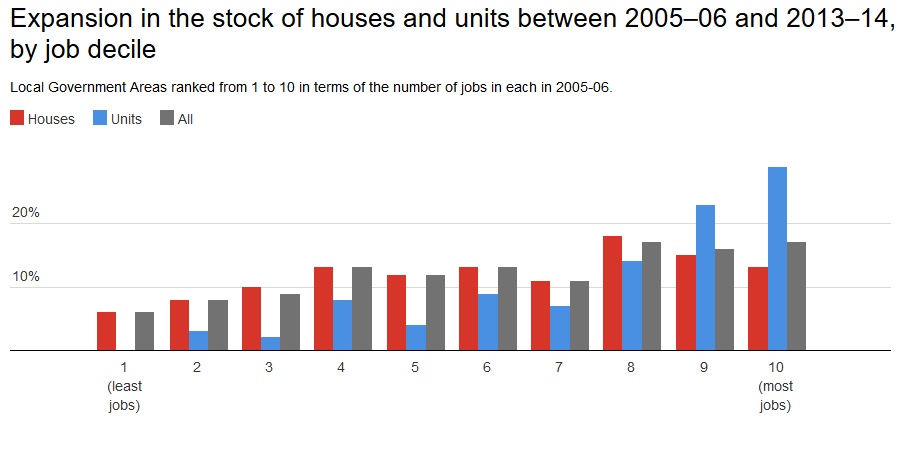
Between 2006 and 2014, more than 50% of new units were built in the 20% of local government areas with the highest number of jobs.

When compared internationally, it would seem that Australian housing supply has not been as weak as is widely believed. However, the report points to some stark differences in housing supply patterns, emerging across Australia’s capital cities.

In Sydney, Perth and Brisbane, new housing supply has lagged slightly behind population growth. In the other capital cities, housing supply actually outpaced population growth between 2006 and 2014.

Housing supply and house prices

The issue of housing affordability has traditionally been pitched in terms of supply failing to keep pace with growing demand, and house prices rising in response to the imbalance.

Yet, house price inflation has surged even in metropolitan areas where housing supply exceeds population growth. The evidence suggests a complex relationship between supply, population growth and price that is shaped by both supply and demand-side factors.

As prices and rents rise, housing costs continue to eat up larger shares of household incomes, particularly in moderate and low-income groups.

The study shows 80% of new unit approvals were located in the top 20% of local government areas with the highest unit prices. This is while 80% of new house approvals were in the top 40% of local government areas with the highest house prices.

There is very little new supply in areas where house prices are lower, where households on low to moderate incomes can afford to live.

Affordable housing, cities and productivity

The lack of affordable housing in the vicinity of employment centres can pose threats to the productivity of our cities. If suburban residents are forced into longer commutes to access employment in the CBD, it can reduce productivity.

A potential consequence is that low-paid workers are deterred from seeking jobs in CBDs. This would then cause certain skills to become unavailable, and businesses to be less efficient, because they cannot quickly fill vacancies with suitable applicants.

Our data shows new units have grown by 30% in areas which have the most jobs, between 2005-06 and 2013-14. In contrast to this new units have only grown by 2.5% in areas with less jobs.

It would appear that unit approvals are concentrated in areas with abundant job opportunities. So productivity could improve, as congestion eases, and commute times lowered, if (and it’s a big if) these dwellings were affordable to those wishing to take advantage of these job opportunities.

New housing supply has grown at a pace that matches population growth rates, at the national level. However, there is plenty of variation across the capital cities.

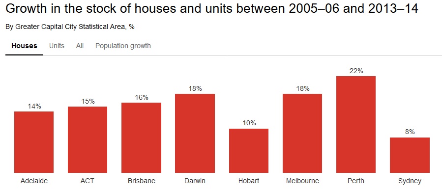
The strongest growth in the number of units has been in the territories (though this is from a low base), followed by Melbourne and Brisbane. However, the strongest growth in the number of houses has been in Perth, at around 22%.

Sydney has experienced much lower growth in its number of houses, at less than 10%. This reflects the very different patterns of development in the two cities.

In Perth, Brisbane and Sydney, increases in the supply of housing didn’t keep pace with population growth during, between 2006 and 2014. However, the drivers of this shortfall are varied.

Perth’s population grew very strongly over the period that we studied. The roughly one-quarter increase in population would stretch the capacity of most housing construction sectors.

However, even though Sydney’s population growth (at 14%) is below the average across all capital cities, its housing supply failed to match this growth. These outcomes highlight the different demand and supply side factors operating across states.

We currently have a national housing policy narrative that is dominated by a consensus view that higher levels of housing supply are the solution to housing affordability problems. While increased supply will always help take steam out of pressured markets, our study suggests a more nuanced approach is needed to the supply side, while not ignoring the demand side pressures.

It’s important that we identify those barriers to expanding affordable housing supply that have been impeded in the majority of our cities, especially for low income households.

Authors: Rachel Ong, Deputy Director, Bankwest Curtin Economics Centre, Curtin University; Christopher Phelps, Research assistant, Curtin University; Gavin Wood, Professor of Housing, RMIT University; Steven Rowley, Director, Australian Housing and Urban Research Institute, Curtin Research Centre, Curtin University

Research shows the banks will pass the bank levy on to customers

From The Conversation.

Studies of European countries show that bank taxes similar to the 0.06% bank levy introduced by the government in the 2017 federal budget will be largely borne by customers, not shareholders.

The levy could also make the banking system more, rather than less risky. The fact that a bank is asked to pay the levy is a confirmation that it is “too big to fail”. This could in turn encourage riskier behaviour. The levy might also trigger a higher probability of default by reducing a bank’s after-tax profitability

But it is difficult to say whether banks will pass the levy on to customers by increasing their loan rates, fees or both.

In its response to the levy, NAB confirmed it will not just be borne by shareholders:

The levy is not just on banks, it is a tax on every Australian who benefits from, and is part of, the banking industry. This includes NAB’s 10 million customers, 570,000 direct NAB shareholders, those who own NAB shares through their superannuation, our 1,700 suppliers and NAB’s 34,000 employees. The levy cannot be absorbed; it will be borne by these people.

Aware of this problem, the government has asked the Australian Competition and Consumer Commission (ACCC) to undertake an inquiry into residential mortgage pricing. The ACCC can require banks to explain changes to mortgage pricing and fees.

When banks pass on these taxes

The bank levy is similar to taxes recently introduced by some G20 economies, including the UK. These had the dual purpose of raising revenues and stabilising the balance sheets of large banks in the aftermath of the global financial crisis.

An analysis of bank taxes in the UK and 13 other European Union countries shows that the extent to which taxes are passed on to customers depends on how concentrated the banking industry is.

The more the industry is dominated by a small number of banks, the greater the share of the tax that is passed on to customers and the less that is borne by shareholders. In more concentrated industries customers have relatively fewer alternative options and therefore tend to be less mobile across banks. This in turn gives the large banks greater market power to increase interest rates and fees without losing customers.

Australia’s banking industry is quite concentrated. In fact, we’re around the middle of the pack of OECD countries, much higher than the US, but lower than some European countries. From this we can surmise that at least some of the cost of the bank levy here will be passed on to borrowers through higher loan rates, fees or both.

An IMF study of G20 countries suggests that a levy of 20 basis points (i.e. 0.2%, approximately three times higher than the Australian government’s bank levy), could lead to an increase in loan rates of between 5 and 10 basis points. This means that the monthly repayment on a loan (assuming an initial rate of 5.5%) would increase by approximately A$6 for every A$100,000 borrowed.

The IMF also found that the bank levy doesn’t just hit customers. A 0.2% levy would reduce banks’ asset growth rate by approximately 0.05% and permanently lower real GDP by 0.3%.

The impact on customers

If the banks pass on the levy to customers then it becomes just another indirect tax, similar to the GST. The question then is whether this is regressive – does it have a greater impact on those on lower incomes than higher incomes.

Lower income earners are likely to borrow less than higher income earners. However, lower income earners are also less able to bear an interest rate increase. They are also more likely to be excluded from borrowing when the cost of borrowing increases.

In this sense, then, if the bank levy is passed on to customers it could become a barrier to home ownership for some lower income borrowers.

More generally, if the value of bank transactions is a higher proportion of low incomes than of high incomes, then the bank levy would operate as a regressive tax and contribute to sharpening (rather than smoothing) inequalities.

Both of these would be unintended, but undesirable, consequences of the levy.

Authors: Fabrizio Carmignani, Professor, Griffith Business School, Griffith University; Ross Guest, Professor of Economics and National Senior Teaching Fellow, Griffith University

Why rent bidding apps will make the rental market even more unaffordable

From The Conversation.

Renters are already the weak party at the negotiating table because they cannot ignore their need for a place to live. But a new series of apps that pit renter against renter will only further tip the balance of power in favour of landlords, making it even harder to get a house.

The fierce competition in the rental market often results in renters paying more than is necessary. Over 150,000 tenants pay more than 50% of their incomes for housing.

These apps may seem like they give renters more power – they are marketed using words like “fairness” and “transparency”, but they also note that landlords are missing out on “millions and millions”.

Renting is a zero-sum game. Every dollar that a landlord gains is a dollar out of the tenant’s pocket. And in a market already tilted in favour of landlords, these apps could further push up rents.

To address the problem of renting affordability we need technologies that promote more cooperation between renters, rather than competition.

The apps

There are several different rent bidding apps, and they all work in different ways.

Live Offer asks prospective tenants to fill out forms and these are then ranked for the landlord to choose. The prospective tenants can see where they are in the rankings, in real time.

Rentberry is more of a real-time auction site. Prospective tenants submit bids, can see what the current highest bid is and how many bids there have been.

With Rentwolf, prospective tenants set up extensive profiles, as they would with AirBnB, and then apply for properties through the marketplace.

What is the right price?

Real estate is worth what people are prepared to pay for it. But tenants will always be the weak party at the negotiating table.

At least as far back as David Ricardo in 1817, economists have theorised that landlords take what is left over once other costs are deducted from the tenant’s income. In other words, rent is as much as tenants are able to pay.

Even before that, Adam Smith recognised that all real estate is a monopoly for landowners. This is because the supply of land is strictly limited, giving excessive negotiating power to whoever owns it.

But these apps overwhelmingly rely on auctions, which can itself be a problem due to what is called the “winner’s curse”.

Studies have shown that so long as there are at least two motivated bidders, the winning bid tends to either equal the value, or be one bid above it. In other words, the winning bidder in an auction will often overpay and will “suffer” for having won.

In the case of renters, this means paying excessive rents throughout the lease. Even worse, as more people bid similarly, the ruinous rents become accepted as normal. They become the market rent.

This same phenomenon has been shown in everything from jars of coins to oil-drilling rights and, yes, real estate.

Some research has further shown that in an auction the second-highest bid could be the “rational price”.

My own controlled experiments have shown that people are easily encouraged by necessity to bid excessively in auctions. This is despite full knowledge of the ruinous consequences.

This is because people have only a limited capacity to vary their needs. We all need to live somewhere, and our culture limits the options. If the option is sharing with relatives or accepting a lower standard of living due to high rents, then our sense of independence will often prompt our willingness to tighten our belts.

These rental apps will play into these stresses and uncertainties, making it more likely people will overbid in the auctions. This is why these rental apps are likely to result in higher rents.

How technology can reduce rents

Some time ago researchers suggested that renters might be able to reduce rents by banding together.

Working together, renters would be able to create the equivalent of there being only one buyer in the market – a monopsony. A monopsony works like a monopoly, but for buyers rather than sellers. For real estate rents, if land owners enjoy a natural monopoly-like advantage, then tenants have to behave like a monopsony to negate the power imbalance.

The current crop of rental apps do not address this imbalance. They only inform bidders as to what other, similarly stressed people, are bidding. It stresses them to bid higher.

Already, we are seeing the power of Facebook to build communities around renting. There are groups that help people find flatmates, for example. If the internet is to tackle the problem of renting affordability, then we need to extend this community, for renters to act in unison on rent.

Without a service that seeks to unite renters, rather than have them compete, housing affordability will only get worse. Rent bidding apps will increase landlord revenues and do so at the expense of tenants.

From ‘white flight’ to ‘bright flight’ – the looming risk for our growing cities

From The Conversation.

If the growth of cities in the 20th century was marked by “white flight”, the 21st century is shaping up to be the era of “bright flight”. The young, highly educated and restless are being priced out of many of the world’s major cities.

They are choosing instead to set themselves up in smaller, regional cities. These offer access to less expensive housing and abundant cheap workspace. The barriers to entering the workforce or starting up a business are lower.

The “metropolitan pressure” of rapid urbanisation is generating a talent spill-over effect, which is setting the stage for a new era of urban winners and losers. This talent leakage is primarily made up of the “forgotten ones” – those who don’t qualify for social housing, but who are unable to afford market-rate housing.

In this age of of hyper-urban migration, where talent goes, capital flows. Cities need to respond to this migration trend and provide adequate housing solutions to retain talent. If not, it could shape up to be a major economic challenge as many are relying on this cohort of knowledge sector and tech-focused workers to lead them into the digital age.

Lessons from the rise of the suburbs

Many will know the urban story, or rather sub-urban story, of the mid-20th century. It was an era marked by “white flight”, the term used to describe the phenomenon of predominantly middle and upper-class Caucasians leaving urban centres to live in the suburbs.

For some, it was a chance to have their dream home in a culturally and ideologically homogeneous neighbourhood replete with white picket fences and enabled by access to cheap debt and favourable tax incentives.

From the cities’ perspective, this migration was devastating. Cities saw their tax revenues drained as higher-income earners fled to the ’burbs. At the same time, these cities required increased investment in social services, housing and education for low-income residents who largely had no choice but to stay in urban centres.

Over a few decades, this exodus led to severe economic and social decay in many of the world’s cities. By the mid-1970s, even New York was on the verge of bankruptcy.

Reversal drives an urban renaissance

This era of “white flight”, however, began to fade in the later part of the 20th century as a new generation of urbanites flocked to cities across the world.

What we are experiencing now is nothing short of a modern urban renaissance. From the very young to the very old, from singles to families, people are moving to cities in droves, drawn by the excitement, cultural diversity, eclecticism and array of employment opportunities that urban living offers.

Global cities like London and New York have rebounded from this era of urban decay better than they could ever have expected. In many ways, however, they have been too successful for their own good. The reverse migration back to the city has placed enormous pressure on our metropolitan regions.

As urban populations grow, so too does the level of investment needed for cities to function well. The investment is required to improve ageing infrastructure, expand mass transit, increase housing supply and extend capacity of civil services.

But making all these upgrades to improve and sustainably grow our cities creates another challenge: it increases competition for space. The more we increase density in our cities, the more expensive land becomes. The more expensive land becomes, the more expensive housing becomes, so people get priced out of their city of choice and move on.

Spilling over to second-tier cities

This pattern has been playing out for a some time now in the US. The spill-over of talent from top-tier cities like New York, Chicago, Los Angeles and San Francisco has flowed into more regional cities such as Seattle, Portland, Austin, Philadelphia and Denver.

Australia doesn’t have many regional cities that, like Minneapolis in the US, offer a place for talented workers to migrate within the country.

These second-tier cities have been the beneficiaries of this new wave of tech-savvy, knowledge sector workers. With all those bright workers around, companies like Google, Facebook, Apple and Amazon soon followed.

As a result, these cities now have some of the hottest property markets in the world. And they are now experiencing their own growing pains as housing prices have soared and the next wave of talent are being priced out.

And so the pattern continues and the talent spills into even more regional cities like Charlotte, Chattanooga and Minneapolis.

What does this mean for Australia?

Today, civic leaders and planning agencies are caught in the vice of balancing the need for increased density and growth while maintaining liveability, affordability and a sense of place.

Unfortunately for many cities, this vice has been tightened too much. We are pushing out the very workers who make our cities function (bus drivers, social workers, teachers), who define their culture (artists, designers, writers, musicians) and who will shape their future (data scientists, software developers, clean tech experts).

For Australia, this issue is much more acute. Unlike the US, which has a multitude of cities for talent to spill into, Australia has only a handful of cities. While places like Parramatta, Geelong and Newcastle will likely benefit from talent capture owing to the pressure build-up in Melbourne and Sydney, many more “bright ones” will likely seek their fortunes overseas and leave the country altogether.

We will rue the day if the companies follow suit, but cities can also take action to relieve some of this affordability pressure. Many cities are enabling innovative housing models such as Baugruppen in Berlin and Pocket Living in London. US cities like Seattle, Austin and Portland are leading the way on inter-generational urban co-housing models.

In Australia, Moreland City Council, birthplace of The Commons and Nightingale housing model, is doing its part to keep talented artists, designers, key workers, young families and downsizers within metro-Melbourne. Co-living models, such as Base Commons in Melbourne, are also making an entry here in Australia as a refreshed, millennial-driven approach to urban co-housing.

Watch this space. And cities: keep enabling housing innovation.

Author: Jason Twill, Innovation Fellow and Senior Lecturer, School of Architecture, University of Technology Sydney