Today we run through some of the latest charts contained in the RBA’s Monthly Chart Pack, released in early April 2018.
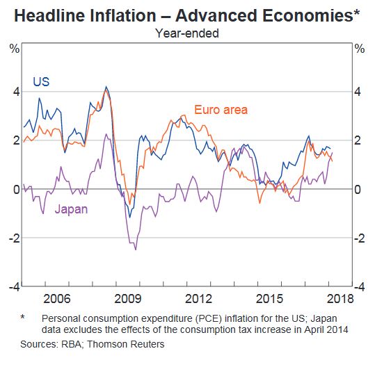
Our first chart is of the headline inflation in advanced economies, where we see that inflation is still sitting below the typical target band of 2-3% in the USA, Euro Area and Japan.
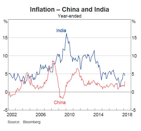
 However, in two of the most populous countries China and India, inflation is higher with India close to 5% from a high of 17% in 2010.
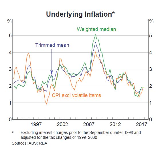
 Inflation in Australia is still sitting below the 2% lower bounds of the RBA 2-3% target range, on both the trimmed mean, their preferred measure and weighted mean basis.
 Now to GDP. World GDP Growth is sitting at around 4%, based on purchasing power weighted figures, of around 85% of world GDP. We could have a separate discussion about whether GDP is a good or adequate measure of growth, but in short, it might work for a manufacturing based economy, but really does not do the job in more advanced and globalised economies, in my view.
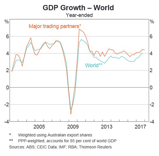 Anyway, in comparison, Australian GDP looks pretty poor, and fell towards 2% in the last quarter.
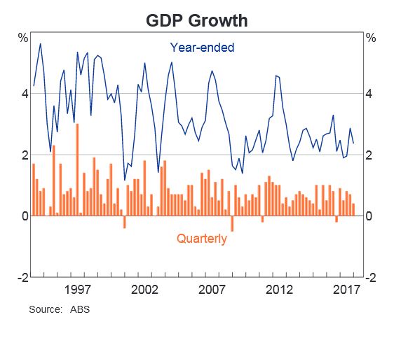 But looking at the contributions to GDP growth, household consumption made the strongest contribution, with non-mining investment and public demand also helping, but dwelling investment, and mining investment fell below zero. Imports also had a negative impact, as you would expect. So the RBA is still over-reliant on the household sector performing, which is a problem.
 This next chart is very relevant. Household consumption is still higher than disposable income, and the gap is being filled by the falling savings ratio. So, we are still spending, but raiding our savings to do so. Which of course is not sustainable.
 Now the other route to fund consumption is debt, so there should be no surprise to see that total household debt rose again (note this is adjusted thanks to changes in the ABS data relating to superannuation, we have previously breached the 200% mark). But on the same chart we see home prices are now falling – already the biggest fall since the GFC in 2007.
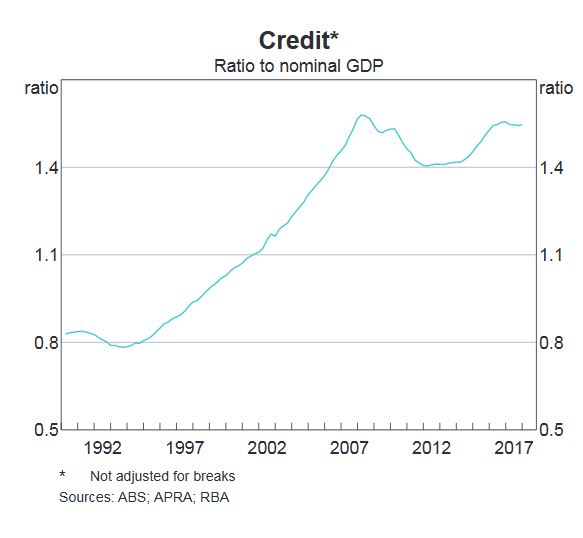
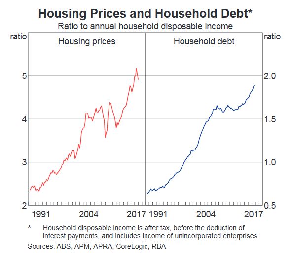 It is worth noting that the ratio of total debt to GDP is also very high, and back up to the pre-GFC levels.
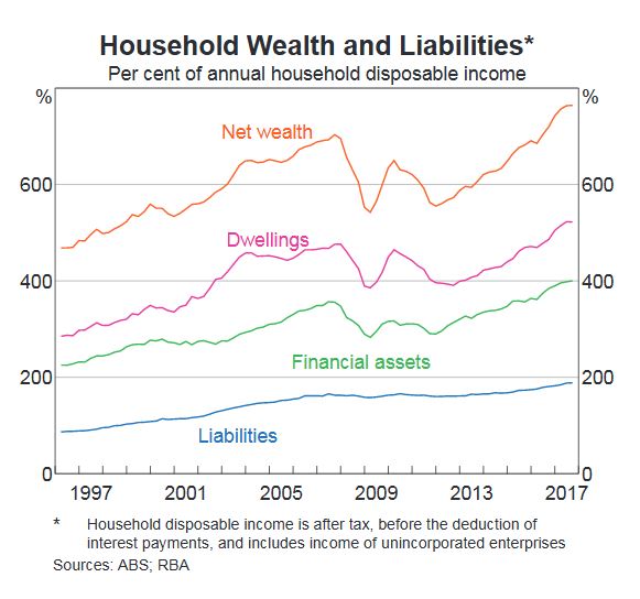
 Debt is a critical factor in the equation, and we have too much of it in the system, as our banking system expanded to fill the never ending demand. As a result, although the debts household hold – liabilities – is sky high, total net wealth has stopped growing, and the value of dwellings has slipped a little. This will be an important chart to watch in the months ahead. Note that financial assets – including shares, and other types of savings, remains at a high. But of course those with high debts tend to be the ones with little or no savings, so this chart does not parse out the segmental differences. I think I may make a separate video on this issue down the track.
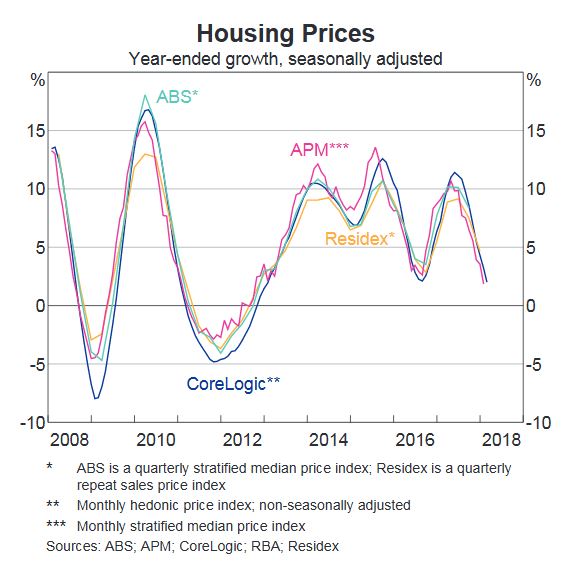
 This chart shows the trajectory of average home price growth across the country. Clearly rates of growth are tumbling, and so we expect the indicator to turn negative soon. Some smaller markets like Adelaide and Hobart are helping to support the figures. Of course the bigger markets like Sydney are already negative.
 The next chart shows the slight rise in unemployment and the fact that underemployment is still sitting above 8%. So while the Government talks up the creation of more than 400,000 jobs recently, the truth is there are many who want more work – and of course many of these jobs created are part-time and or low paid, or even gig-economy jobs. The underemployment number belies the apparent low unemployment figures, which other less official sources suggest is nearer to 9%. It’s a matter of definition, and certainly the ABS data flatters the true state of play, in my book.
 To round out our quick tour we look at housing lending rates.
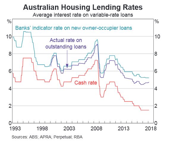 Whilst there has been no recent change in the cash rate – for the past 20 months or so, and bank headline indicator rates for new owner occupied loans have come down, reflecting strong competition for low risk new business, the real rates paid by borrowers continue to rise. And as we know even small rises will put more into mortgage stress – 965,000 households are in this condition, based on our latest research, which equates to 30% of the market. You can watch our separate video on this important topic.
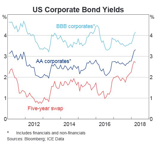 And expect more rate rises, irrespective of what the RBA may do. Here is the US Corporate Bond Yields, which are rising now, in response to the FEDs reversal of QE, and lift in their benchmark rates. And more to come. The latest from the FED today suggested at least three more rate hikes in the next year, which is faster than many were expecting. And inflation is expected to run hot in the US. Ahead.
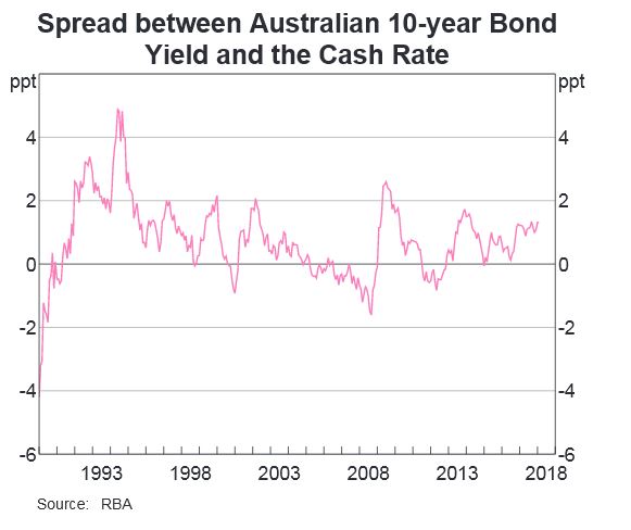 Spreads between the Australian 10-year Bond Yield and the Cash Rate are rising, all of which is putting more funding pressure on the Banks.
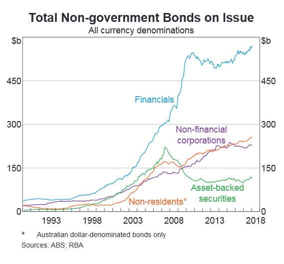 And we can see that Financial companies have been the largest issuer of bonds, with significant rises in recent times. About half of all the bonds from the finance sector are issued abroad, so changes in global interest rates will translate to higher funding costs here, so expect more mortgage repricing upwards. These bond issues of course enabled the banks to lend ever more and so create more deposits, to inflate the economy and their books. You can watch our recent video on this, as well as read the article published in the Australian, under my by-line. You can see the current finance system in action.
So standing back, we see all the signs of issues ahead, with household debt still rising, household consumption relying on debt and savings, and overall growth still over reliant on the poor old household sector. We need a proper plan B, where investment is channelled into productive growth investments, not just more housing loans. Yet regulators and government appear to rely on this sector to make the numbers work – but it is, in my view, lipstick on a pig!
