Research from the USA highlights the fact that when house prices fall, and household debt is high, the rise in defaults is more correlated to the number of households falling behind in their mortgage payments that the debts of those already in default.
The large decrease in US house prices between 2006 and 2011 led to a dramatic increase in mortgage debt defaults. Since then, the share of mortgage debt in default has decreased significantly and is now close to the pre-2006 level. In this essay, we argue that these fluctuations are predominantly the consequence of changes in the number of households falling behind in their mortgage payments (the extensive margin) and not changes in the amount of debt of those in default (the intensive margin). On average, the extensive margin accounts for 78 percent of the increase in the 2006-09 period and 93 percent of the decrease in the 2011-15 period. This information may be useful in designing prudential policies to mitigate mortgage default.
The analysis is performed using data from the Federal Reserve Bank of New York Consumer Credit Panel/Equifax. In our measure of default, we consider all households with mortgage payments 120 or more days late. Figure 1 shows the share of mortgage debt in default, which fluctuated between 0.7 percent and 1 percent in the 1999-2006 period and then jumped to 7.5 percent in 2009. The figure also shows the evolution of house prices, whose collapse coincided with increasing mortgage defaults. In a recent article, Hatchondo, Martinez, and Sánchez (2015) show how these two series are related: A rapid decrease in house prices causes a sharp increase in mortgage defaults because more households find themselves with negative home equity (“under water”), and some of these households find it beneficial to default after a negative shock to income (i.e., unemployment).
We decompose the changes in the share of debt in default into changes in four different components: average debt in default, number of households in default, average debt, and number of households with debt. Basically, since
we can compute the percentage change (%∆) in the share of debt in default as follows:
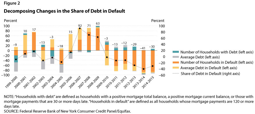
Figure 2 shows the results of the decomposition by year; the four colors in each column represent the changes in the four components. The percentage value (shown on the left vertical axis) illustrates the change in the share of debt in default generated by the changes in a particular component. According to the previous equations, the summation of changes in the four components equals the changes in the share of debt in default (represented by the values for the black dots as shown on the right axis). For example, the black dot for 2006-07 has a value of 92, which indicates that the share of debt in default increased by 92 percent in that time period.
There are three interesting findings. First, and most importantly, we find that fluctuations in the number of households in default accounted for most of the fluctuations in the share of debt in default (shown by the size of the orange part of the bars in Figure 2). The share of households in default was very large not only for the years when defaults were increasing (2006 to 2009), but also for the subsequent years when the share of debt in default decreased slowly but steadily. The changes in the number of households in default confirm our earlier claim that the drastic decline in house prices between 2006 and 2009 caused negative home equity for more households. For some of these households a negative income shock triggered default, thus leading to the sharp increase in mortgage debt default. Another reason for this pattern is the delay in foreclosure proceedings that started during the Great Recession. Chan et al. (2015) show that borrowers’ knowledge of a possible long delay between the formal notice of foreclosure and the actual foreclosure sale date affects the likelihood of default: Borrowers who anticipate a longer period of “free rent” have a greater incentive to default on their mortgages.
Second, our results indicate that from 2003 to 2007 the average amount of debt (the gray part of the bars in Figure 2) exerted downward pressure on the share of debt in default. That is, since the average amount of debt was increasing, if the other three components had not increased, the share of debt in default would have decreased.
Finally, we find that the average amount of debt in default (the yellow part of the bars in Figure 2) was important in the 2006-08 period. This finding indicates that part of the increase in the share of debt in default during that period was actually due to an increase in the amount of the debt of households in default. This increase is in line with the fact that the decline in house prices affected households with larger debt (not necessarily subprime loans) that were not falling into default before 2006. When house prices plummeted in 2006, more households from this group defaulted. Later in the recession, the importance of the average amount of debt was overtaken by the number of households in default as more and more households with similar characteristics chose to default.
To summarize, the rapid increases in mortgage debt in default between 2006 and 2011 captured the attention of the public, policymakers, and researchers. It is important to understand the main forces driving the default increase, especially in designing prudential policies that minimize mortgage default such as those analyzed by Hatchondo, Martinez, and Sánchez (2015). The decomposition exercise in this essay suggests that the evolution of the share of mortgage debt in default can be accounted for mostly by changes in the number of households in default rather than changes in the overall amount of mortgage debt and the number of households with mortgages. Changes in the amount of debt in default also played a nonnegligible role, especially during the pre-crisis to early crisis periods.


