Canadian LMI’s Will Need More Capital

According to Moody’s, Canada’s national banking and insurance regulator, the Office of the Superintendent of Financial Institutions (OSFI), published for comment draft guidelines on changes to capital requirements for mortgage creditor insurers.

The draft advisory provides a new standard approach for residential mortgage insurance that is more risk sensitive and incorporates new key risk and loss drivers including creditworthiness, remaining amortization, and outstanding loan balances.

These new capital requirements, if implemented as drafted, would increase overall capital for Canada’s mortgage insurance industry and Canadian Crown corporation, Canada Mortgage and Housing Corporation, a credit positive.

canadian-lmi

The draft guidelines require a supplemental capital requirement for mortgages insured in Canada’s 11 largest metropolitan areas when those cities show indications of high house prices relative to income levels, similar to bank capital requirements introduced earlier this year. This supplemental charge will create a capital cushion for mortgage insurers’ exposures in cities whose housing markets have had rapid price appreciation, such as Vancouver, British Columbia, and Toronto, Ontario. We believe required capital for mortgages in
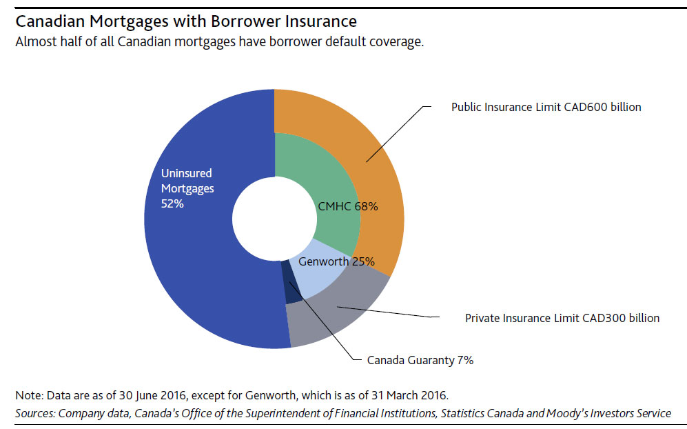
these cities will increase.

Of the CAD1.6 trillion in outstanding Canadian mortgage debt, including home equity lines of the credit, almost half are covered by creditor insurance (see exhibit). This insurance is primarily sold either directly to the borrower, who is legally required under the Bank Act to obtain it if the mortgage’s loan-to-value ratio exceeds 80%, or lenders purchase the insurance on a portfolio basis as a liquidity and capital management tool.

The Canadian government limits its mortgage insurance guarantee to CAD900 billion, which is shared among only three entities. CMHC, which as a crown corporation with government agency status, effectively makes any policies it writes a direct contract with Canadian government. Under legislation, CMHC’s insurance-in-force is limited to CAD600 billion. The Canadian government also provides a 90% guarantee on the insurance in force of two private-sector insurers, Genworth and Canadian Guaranty Insurance Company of Canada, in the event that one of them fails. This CAD300 billion guarantee is shared between the two insurers.

These and other recent actions by Canadian policymakers will assist in slowing rapid house price appreciation and corresponding mortgage growth, reducing the prospect of a sharp housing price correction that would increase credit losses at Canadian banks. Increasingly, elevated housing prices have driven up Canadian household indebtedness, a key threat to the stability of the Canadian banking system. Since 2008, Canadian policymakers have implemented a series of changes to the rules for government-backed insurance, including limitations on amortization, premium increases and elimination of specialized product offerings.

We do not believe this has any credit implications for Canadian banks that hold insured mortgages because their exposures to mortgage insurers are already backstopped by the Canadian government.

Density, sprawl, growth: how Australian cities have changed in the last 30 years

From The Conversation.

Since settlement, Australian cities have been shaped and reshaped by history, infrastructure, natural landscapes and – importantly – policy.

So, have our cities changed much in the last 30 years? Have consolidation policies had any effect? Have we contained sprawl? Yes, probably and maybe, according to our newly published research.

Reviving the centre

The great Australian baby boomer dream of home ownership caused our cities to spread out during the second half of the 20th century. Urban fringes expanded with affordable land releases, large residential blocks and cheap private transport.

By the 1980s, across Australia’s cities, the urban fringes were ever-expanding. Inner areas had become sparsely populated “doughnut cities”.

By the end of that decade urban researchers, planners, geographers and economists began to warn of looming environmental, social and housing affordability problems due to unrestrained sprawling growth.

Governments responded swiftly, focusing policy attention on urban consolidation through programs such as Greenstreet and Building Better Cities. Concerned individuals formed groups such as Smart Growth and New Urbanism to promote inner-city development and increased urban density.

Since this time, large- and small-scale policy interventions have attempted to repopulate the inner- and middle-urban areas. The common policy goal has been to encourage more compact, less sprawling cities. Subdivision, dual occupancy, infill development, smaller block sizes, inner-city apartments and the repurposing of non-residential buildings have all been used.

Mapping the changes

In a newly published paper, we map the changing shape of Australia’s five largest mainland cities from 1981 to 2011.

Across each of these cities, which together are home to 60% of Australians, there has been substantial, suburbanisation and re-urbanisation. In the last 20 years this has resulted in a repopulation of inner cities.

In Melbourne’s case, the return to the inner city has been particularly pronounced in the last decade. Here, the population jumped from around 3,000 to 4,000 people per km². The extent of this change is visualised in the chart below.

melbourne-densityMelbourne may well be the exemplar for inner-city rebirth. More than any other Australian city it demonstrates the 30-year turnaround from inner-city decline to densification.

Between 1981 and 1991 Melbourne became a classic “doughnut city”: population declining in inner areas, density increasing in the middle-ring suburbs, and growth steady in the outer suburbs. For example, in the inner 5km ring there was a decrease during this time of almost 200 people per km².

From 1991 to 2001, even though growth was still focused on the middle and outer areas, the inner area began to be repopulated. Overall, between 1981 and 2011 there were approximately 1,500 more people per square kilometre living in the inner 5km ring.

Over the last decade, greenfield development, infill and urban regeneration have increased urban density throughout Melbourne – as shown in the five-yearly map animation below.

Changes in Melbourne population density over the 30 years to 2011 (red is increasing, blue is decreasing). Author provided

While the turnarounds in Sydney, Brisbane, Adelaide and Perth have been less marked than in Melbourne, they are all no longer “doughnut cities”. This means that where people live in these cities has changed.

Australia’s cities are now more densely populated – and we are much more likely to live in inner areas than we were 30 years ago.

A result of government policy?

We can probably attribute the changes in where urban Australians live to government consolidation policies.

The policy focus throughout the late 1980s and early 1990s was based on incentives to repopulate inner and middle areas.

Policies were changed from 2000 to increase population density across whole metropolitan areas. State and territory strategic plans aimed to promote urban consolidation, with a focus on the inner city.

State and territory plans now focus much more on specific zones throughout the whole of the city, including former industrial areas and surplus government land. New housing development occurs within these defined zones, particularly around transport and areas with urban-renewal potential.

South Australia’s 30-Year Plan for Greater Adelaide targets growth in “current urban lands”, along major transport corridors and hubs. Similarly, the Plan Melbourne – Metropolitan Planning Strategy plans to establish the “20-minute neighbourhood”, contain new housing within existing urban boundaries, and focus development in new urban renewal precincts.

The map visualisations reinforce the scale of this absolute growth across each of the five major Australian cities over the last 30 years.

Have we contained sprawl?

Our research would suggest urban-consolidation policies have slowed but not prevented sprawl, especially in the faster-growing cities like Melbourne, Brisbane, Perth and Sydney.

So, have we reached the point at which our cities are full? How can we accommodate future population growth? And do we need to focus our attention on new urban areas?

Containing and, more importantly, controlling sprawl may present the next big challenge.

Author: Neil Coffee, Senior Research Fellow in Health Geography, University of South Australia; Emma Baker, Associate Professor, School of Architecture and Built Environment, University of Adelaide; Jarrod Lange, Senior Research Consultant (GIS), Hugo Centre for Migration and Population Research, University of Adelaide

Is A European Banking Crisis On The Cards?

From Zero Hedge.

Deutsche Bank, the 11th largest bank in the world, plunged to fresh all time lows on speculation whether the German government would or wouldn’t provide state aid to the bank (if needed), forcing the bank to state it does not need the funds at the same time as the government urged markets that “you can’t compare” Deutsche Bank and that “other” bank, Lehman Brothers, although looking at the chart, one may beg to differ.

However, while DB stock closed at session lows, over 7% lower on the day, with its market cap of $16 billion now rapidly approaching the $14 billion litigation settlement demanded by the DOJ, the bad news did not stop there.

In a report issued by Citigroup titled “Capital, Litigation & AT1 Coupon Risks”, bank analyst Andrew Coombs says that Deutsche reported an end-June CET1 ratio of 11.2% pro-forma for the HXB stake sale, but still only targets c11% by end-2016 as further litigation charges are assumed, with management expecting to resolve four of the five major outstanding litigation cases this year. To this Citi says that it “struggles” to see how Deutsche Bank can reach the fully-loaded SREP requirement of 12.25% in the medium-term.

Meantime, one of the largest derivatives books in the world is imploding. Deutsche Bank has over $61 TRILLION in derivatives on its books. It has lost nearly a quarter of its value in the last three weeks.

 DB is not alone here. Across the board, we’re getting signs of an impending banking crisis in Europe. Credit Suisse (CS) is trading BELOW its 2012 banking crisis lows.

So is Barclays (BCS)

The EU banking system is $46 TRILLION in size. This is THREE TIMES larger than the US banking system, which nearly imploded the markets in 2008.

And the EU banking system as a whole is leveraged at 26 to 1. Lehman Brothers was leveraged only slightly higher than this at 30 to 1.

Indeed, we believe the global markets are on the verge of another Crisis, triggered by a crisis of faith in Central Banks.

2008 was Round 1 triggered by Wall Street banks. This next round, Round 2, will be even worse as faith in Central Banks collapses

If Deutsche Bank went down, and the German Government didn’t step in with a rescue, that would be a huge blow to Europe’s largest economy – and the global financial system. No one really knows where the losses would end up, or what the knock-on impact would be. It would almost certainly land a fatal blow to the Italian banking system, and the French and Spanish banks would be next. Even worse, the euro-zone economy, with France and Italy already back at zero growth, and still struggling with the impact of Brexit, is hardly in any shape to withstand a shock of that magnitude.

What we do know is that if some €42 trillion in derivatives – some three times more than the GDP of the European Union – were to suddenly lose their counterparty, the systemic damage would be unprecedented.

Sydney on The UBS Bubble List

Sydney is on the latest UBS housing bubble list. They say real housing prices peaked in the second half of 2015 after an increase of 45% since mid-2012. Since then, prices have corrected by a low single-digit. Sydney sits alongside London, Stockholm, Munich and Hong Kong. The UBS Global Real Estate Bubble Index is designed to track the risk of housing bubbles in global financial centers.

ubs-bubble

The Australian residential market is influenced by a rapidly growing foreign demand (in particular, Chinese), which has tripled in value over the last three years. Increasing supply and further tax measures to reduce foreign housing investments may end the price boom rather abruptly.

Vancouver tops the index in 2016. Bubble risk also seems eminent in London, Stockholm, Sydney, Munich and Hong Kong. Deviations from the long-term norm point to overvalued housing markets in San Francisco and Amsterdam. Valuations are also stretched, but to a lesser degree, in Zurich, Paris, Geneva, Tokyo and Frankfurt. In contrast, Singapore, Boston, New York and Milan are fairly valued, while Chicago’s housing market remains undervalued relative to its own history.

Out of touch with fundamentals House prices of the cities within the bubble risk zone have increased by almost 50% on average since 2011. In the other financial centers, prices have only risen by less than 15%. This gap is out of proportion to differences in local economic growth and inflation rates.

Elevated risk of a price correction

The discrepancies have emerged out of a mix of optimistic expectations, capital inflows from abroad and loose monetary policy. The weak economic foundations of the latest price boom make the housing markets in those cities vulnerable.

A change in macroeconomic momentum, a shift in investor sentiment or a major supply increase could trigger a rapid decline in house prices. Investors in overvalued markets should not expect real price appreciation in the medium to long run.

Sydney‘s housing market has been overheating since the city became a target for Chinese investors several years ago. While Sydney showed the lowest index score of all our covered APAC cities in 2012, the market now ranks in the bubble risk category and tops all other cities in the region.


NAB’s Latest Financial Advice Customer Response Update

NAB has today provided an update on its financial advice Customer Response Initiative – a commitment made to improve transparency for Wealth advice customers.

Bank-Concept

Since February 2015, NAB has made $6.5 million in payments to 251 customers after resolving their claims for compensation. This uplift in payments to customers follows a significant investment by NAB into its capacity to investigate and resolve customer complaints.

NAB’s public commitments made in 2015 and the current status for each commitment is provided below:

Our commitment: Where there is professional misconduct in wealth advice we will move to write to all customers, where misconduct has occurred in the last five years.
Current status: On 21 October 2015, we announced that we had started to write to customers as part of the Customer Response Initiative. We are writing to groups of customers where there is a concern that they may have received inappropriate advice since 2009.

Our commitment: We will respond to all new customer complaints within 45 days.
Current status: We have committed to responding to new complaints within 45 days, and we are tracking well against this commitment.

Our commitment: We are going to add independence into our complaints and whistleblower process.
Current status: In addition to appointing an independent officer to sit on our own whistleblower committee, we have introduced six different measures to increase independence into our complaints resolution. They are:

  • appointing KPMG to help design the Customer Response Initiative
  • appointing an independent Customer Advocate for wealth advice
  • appointing Deloitte to review and report on our progress
  • Deloitte’s reports to us will be provided to ASIC – the independent regulator
  • offering customers $5000 to source their own additional independent financial advice if they need help understanding the outcomes of the CRI
  • negotiating a streamlined review process by FOS if customers do not accept the outcome of the Customer Response Initiative.

Our commitment: We will advise ASIC of all advisers who leave, with the categorisations and reasons of their departure.
Current status: In addition to our reporting obligations for the ASIC financial adviser register, we have implemented a process to notify ASIC in writing of any adviser departures, where we have had compliance concerns about that adviser.

Our commitment: We committed to look to remove confidentiality orders from settlements and to write to customers to advise them these orders had been lifted.
Current status: While our previous confidentiality obligations did allow customers to talk to the media, ASIC or advocacy groups about the facts leading to their complaint with NAB, we acknowledge they were written in such a way where customers may not have been aware of this. So, as part of our Customer Response Initiative, to remove any ambiguity, we have started to write to appropriate customers to advise them that past confidentiality obligations have been lifted. Furthermore, these clauses are no longer included in NAB Wealth Advice Deeds.

In addition to our 2015 commitments, NAB is committed and progressing to the package of industry initiatives announced by the Australian Bankers’ Association (ABA), aimed at enhancing our customers’ experience with us, and reinforcing the banking sector’s standards of service, integrity, trust and ethics.

When NAB last provided an update on its Customer Response Initiative in October 2015, we explained that since February 2015 to October 2015, NAB had made $1.7 million in payments to 87 customers after resolving their claims for compensation

The Changing Nature of Payments

Malcolm Edey, RBA Assistant Governor (Financial System) spoke at the Australian Financial Review Retail Summit and discussed the changing face of payments, including the relative volume and costs of various payment methods. Cheques are well out of favour.

A good place to start is an observation that will not be lost on anyone here. That is that the nature of the payments we use is changing, and changing quite rapidly at the moment. Probably the clearest example to most people has been the take-up of contactless, or tap-and-go, card payments. These have taken off extraordinarily quickly in Australia, to the point where Australia is thought of as the leading contactless market in the world. This is a technology that offers a benefit to both consumers and merchants in terms of the time taken to process a payment, and as a result it has been embraced – but many merchants might also notice that their payments costs have risen because of the resulting change in their payments mix. This is a good example of the complex dynamics of competition in the retail payments system.

But the rise of contactless payments is only one of a range of changes that have been occurring to the payments system over time – some of which you might have noticed, some of which you have probably never thought about.

Possibly the most important trend we are seeing is the steady decline in the use of traditionally paper-based payments. Think of when was the last time you wrote or received a cheque. In 2000 the average Australian wrote around 35 cheques per year. In 2015/16 that was down to six. What is more, while cheque use has been declining for two decades, the decline if anything is accelerating; after falling by an average of about 13 per cent per year in the preceding five years, the number of cheques written fell by 17 per cent in 2015/16.

Graph 1: Number of Cheque Payments

We have been observing the decline in cheques for many years, but more recently it has been a decline in the use of that other traditionally paper instrument – cash – that has been attracting attention. The only real way to adequately measure the use of cash is to survey the users – something the Reserve Bank does via a consumer diary once every three years. We ran the first of these surveys in 2007, when a large majority of consumer payments – 69 per cent – were made with cash. By 2010, that percentage had fallen to 62 per cent and by 2013, 47 per cent, with the decline occurring across all payment values. We will run the survey again this year, but it seems a safe bet that there will be a further, probably quite large, decline in cash use.

Graph 2: Cash Use by Payment Size

This trend is not all about people falling out of love with cash; a significant factor is the rapid rise in online commerce, where of course cash is not an option.

So what has filled the gap left by our paper instruments? In the retail space it is largely cards, which have grown by an average of 11 per cent per year over the past five years. This reflects cards’ large share in online commerce, as well as their having gained ground at the retail point of sale. Based on the Bank’s consumer survey, card payments made up 43 per cent of all consumer payments in 2013, and 55 per cent of those over 50 dollars. The ubiquity of card payments is one reason we care a lot about how those systems operate, as I will discuss more a bit later.

Graph 3: Use of Payment Methods

It is also worth noting that in the period measured by our survey, BPAY also gained an increasing share of the market, while the relative newcomer, PayPal showed strong growth from a low base.

The Cost of Payments

Of equal interest to these broader trends in payments usage is the cost of payments. The retail sector clearly has a strong interest in the cost of payments to merchants, and while the Reserve Bank is also interested in this, its principal focus when evaluating the efficiency of the payments system is the resource cost of payments – that is, how much it costs the economy in total to produce a payment – abstracting from the various fees that determine the cost to any single party or sector. Determining resource costs is a large job, requiring detailed information on financial institutions’ costs and things like the cost of processing time for merchants.

The Reserve Bank last went through this exercise in 2014. The most comforting news from that study was that the resource cost of consumer to business payments had declined as a percentage of GDP since the previous cost study in 2006, from 0.80 per cent to 0.54 per cent, even though the number of transactions had risen. Despite the favourable trend overall, the mix of payments within the total acted in the direction of increasing costs.

Looking across the main non-cash retail systems, we see that, unsurprisingly, the highest per-transaction resource costs were generated by the cheque system, with each cheque written costing the economy about $5.12, if account overheads are ignored. This is not surprising given the cost of shipping and processing physical cheques, although there have been some efficiency improvements in the cheque system since the time of the study.

Graph 4: Direct Resource Costs

Perhaps of more current interest to the retail sector is the cost of our card systems. Credit cards are quite costly at around 94 cents for the average sized transaction, while MasterCard and Visa debit are less costly and eftpos uses the fewest resources of any of the card systems, at around 45 cents per transaction.

The broad relativities between the resource costs of these systems is similar to those faced by merchants. Another way to think about that is that it is merchants who, by and large, bear the cost of payments. This is largely achieved by the way fees are used in these systems. I think the most telling illustration of that is to compare the actual costs faced by merchants to the costs faced by consumers once fees and benefits to consumers, like interest-free periods and reward points, are taken into account. What you will see is that, despite being more expensive to produce and more costly to merchants, on average a credit card transaction costs a consumer slightly less than a debit card transaction. These are the incentives that shape payment choices by consumers.

Graph 5: Private Net Costs by Sector


Mortgage Broker Commissions On The Up

Mortgage Brokers earnt more than $1.1 billion in new commissions in the last year, as their share of new loans continues to rise according to the latest results from the Digital Finance Analytics Mortgage Industry Model.

The model tracks new loan approvals and channel mix and estimates the commissions earned by brokers from lenders.

The share of loans originated via brokers has reach 50% across the market (some say it is even higher, as much as 60%!)

broker-shares-dfa-sept-2016APRA publishes ADI specific data showing that foreign subsidiary banks originate close to 70% of their loans via brokers, other domestic banks, around half, just above the average of the big four, with credit unions and building societies lower.

broker-shares-apraBrokers can earn an upfront commission on each new loan, as well as a trail. According to a recent MFAA document:

Lenders usually pay upfront and/or trail commissions in respect of the loans, mortgage brokers originate. The upfront remuneration offered by lenders is mostly uniform at 0.65%, and trail remuneration also uniform at 0.15% for the life of the loan. Lenders vary in their application of claw-back, ranging from 12-24 month terms as well as their introduction of trail payments (delayed until the 13mth).

The MFAA would like to note that broker remuneration provided by lenders has reduced over the past ten (10) years from a mostly uniform offering of 0.70% and 0.25% for upfront and trail commissions

There are however some variations between lenders in the absolute percentage applied, reflecting commission tiers, targets and other factors. It is hard to get solid industry data because commission arrangements are bi-lateral commercial agreements, and often not fully disclosed.

However, using data from a range of sources, taking into account commission rates and new loan volumes, we have an estimate of the monthly flow in new commissions earned.  Commissions have been rising in line with loan growth (as it directly related to the size of the loan) as well as rising third party origination. Some lenders have tweaked commission structures recently to incentivise specific types of loans.

broker-commissions-apra So, we estimate over the past year, $1.1 billion of new commissions were paid to brokers. A relevant statistic given the current broker remuneration review by ASIC.

What Was Behind the Boom and Bust in House Prices?

Interesting piece from the St. Louis Federal Reserve On the Economy Blog. House prices fell during the “great recession” in the US by 30% or more. Recent modelling shows that the main reason for the fall was that people’s beliefs about house prices had changed. It was less about a change in the demand for housing or availability of credit. In other words, if enough people think prices will rise, they will rise; but the reverse is also true.

Investment-Pic3In Australia, we still have more households believing home prices will rise in the next year, as explored in the latest Property Imperative, released yesterday. Thus, if the modelling is correct, this expectation becomes self fufilling.

survey-sep-2016-prices

The causes behind the boom and bust of house prices over the past decade or so are generally boiled down to three possible culprits:

  • Fundamental shocks, such as changes in the ability to build houses or in people’s desire to own houses
  • Credit market changes, such as looser lending restrictions allowing more people to purchase houses
  • Beliefs, or house prices increasing simply because people thought they would increase

Recent research points more strongly to one in particular: that people’s beliefs about house prices had changed.

Greg Kaplan, an economics professor at the University of Chicago, discussed this finding in his paper “Consumption and House Prices in the Great Recession: Model Meets Evidence,” presented at the St. Louis Advances in Research (STLAR) Conference on April 7-8

You can watch a video on this research here. Download a summary of the research here.

Is The Bank of Mum and Dad Data Right?

After I posted yesterday on the rise of the Bank of Mum and Dad, this chart has caused quite a stir. A number of people have questioned the data saying it could not possibly be correct (without supporting facts I might add).

So lets look in more detail at the chart.

bank-mum-and-dad-sept-2016-smFirst, the proportion of FTB needing help from the Bank of Mum and Dad have risen from ~5% 6 years ago, to ~50% now. A number of things have changed. First most of the FTB grants which were available  in 2010 have dissipated. Second, home prices are rising much faster than income. Third FTB are desperate to get into the market – either for OO, or as an investment as they see prices running away despite high debt. Banks have tightened their lending criteria. So more are looking to family to help. We have been tracking this rising trend over the years. It has accelerated in the past year or so.

ftb-countsSomething else to bear in mind is that in 2009-2010, the volume of FTB loans being written was higher more than 30% of the market. So the number of FTB in 2010 getting help would be higher for a lower percentage. I think this has been overlooked by those complaining about the post. The data is based on those who have transacted.

Next, the average loan from the Bank of Mum and Dad to those who had access to this source of funds six years ago was ~$30k, today it is ~$88k. This reflects the massive rises in property prices in most states in the past few years. The average dwelling price is $623,000 now, according to the ABS. This rise in capital has also created the opportunity for more families to extract capital from their existing home to help the next generation. In addition, banks have tightened their underwriting criteria recently. As a result, FTB need bigger deposits. Finally, larger prices mean larger transaction fees (and bigger lenders mortgage insurance fees).

These two forces are working together, but you cannot, as some have done, simply multiplied the two elements together. You will get a silly and meaningless number.

The data is the data, and the method has not changed over the period. So we stand by the analysis.


Trading Up and Trading Down

We finish our household survey update by looking at holders, up-traders and down-traders. Importantly, there are more households seeking to trade down compared with those trading up. You can read the full analysis in the Property Imperative 7, released today.

Holders – More than 780,000 households are holding property, with 81% owner occupied and 21% investment. 418,000 of these properties are owned outright and are mortgage free. Of these households 54% expect house prices to rise in the next year, but under 1% would consider using a mortgage broker because they are by definition not intending to transact in the next year (99%).

Up Traders – Our survey identified about 1,045,000 households who are considering buying a larger property. Most (92%) are owner occupied. Of these households 12% are expecting to transact within the next 12 months, whilst 56% of households expect house prices to rise in this period.

survey-sep-2016-uptradeThe main reasons for these households to transact are as a property investment (42% – up from 40% last year), to obtain more space (29% – down from 33% last year), because of a job move (12%) and for a life-style change (13%). Many of these households will require further finance (74% – up from 70% last year) and a quarter will consider using a mortgage broker (22%), whilst 35% of these households are actively saving to facilitate a transaction. We note that prospective future capital gains rated most strongly, the view of property as an investment continues to drive behaviour. The trend is getting stronger.

Down Traders – More than 1.2 million households are considering selling and buying a smaller property, up by 100,000 from last year. Of these 71% are considering an owner occupied property, and 29% an investment property. Of these 680,000 currently have no mortgage and own the property outright. Around 20% of these households expect house prices to rise over the next year, a consistently low figure compared with other segments, whilst 38% expect to transact within 12 months, 10% will consider using a mortgage broker and 8% will need to borrow more. Households will transact to facilitate increased convenience (31%), to release capital for retirement (33%), because of unemployment (2%) or because of illness or death of a spouse (10%).

survey-sep-2016-down-traderWe see a continued sense among down traders that an investment property is likely to be a factor in their ongoing wealth management strategy, especially given the saving crunch underway at the moment, with deposit rates falling, and the inherent quest for yield.