Capital City Home Prices Higher In Sept Quarter

The latest CoreLogic Hedonic Home Value Index reveals further gains across most capital city housing markets last month, taking the current growth phase into its 52nd month. Read here for discussion about the accuracy of the data, as RBA expressed concerns.

Capital city dwelling values continued to show a strong headline rate of growth over the September quarter, with the CoreLogic Hedonic Home Value Index rising 2.9% over the past three months. The combined capital city index, which is heavily weighted towards the Sydney and Melbourne markets, recorded a 1.0% month-on-month gain, taking capital city dwelling values 41.3% higher since the growth cycle commenced in June 2012.

corelogic-oct-3rd

Growth conditions were substantially different from region-to-region. The top performing market was Melbourne where dwelling values pushed 5.0% higher over the third calendar quarter, due largely to a strong rise in house values (+5.2%) which balanced a softer result for the unit market (+2.9%). Canberra showed the second highest rate of growth over the quarter with values up 4.5%, followed by Sydney at 3.5%.

In contrast, the weakest housing market over the quarter was Darwin where dwelling values declined by 4.5%, to be 11.1% lower than the most recent 2014 peak in property values and 13.9% lower than the previous 2010 peak in dwelling values. Perth dwelling values also slipped 3.2% lower over the quarter to take the cumulative decline in values to 10.4% since their December 2014 peak, and 5.2% below the previous peak in 2010. Brisbane dwelling values also slipped lower over the quarter falling by a marginal 0.3%, attributable mostly to larger declines across the unit sector.

The superannuation myth: why it’s a mistake to increase contributions to 12% of earnings

From The Conversation.

So much of the national conversation about superannuation simply assumes that “savings for retirement” is synonymous with “superannuation savings”. This is a big mistake.

This mistake partly explains why we got into such a mess with excessively generous tax breaks for super. It also underlies misguided plans to increase superannuation contributions to 12% of earnings.

Super doesn’t equal retirement savings

Any sensible conversation about superannuation policy must start by recognising how households save for retirement, and why.

It’s become conventional wisdom that people will retire on their superannuation savings, perhaps topped up by the Age Pension. Even ASIC’s retirement savings calculator – which enables people to estimate their future retirement income – presumes that superannuation and the Age Pension alone will fund retirement. The assumption that superannuation accounts for the bulk of households’ retirement savings has underpinned claims that most Australians aren’t saving enough for their retirement.

Yet the stark reality is that superannuation savings account for only a small portion – about 15% – of the wealth of most households. Even without counting the family home, the average Australian saves as much outside as inside the super system. For older households close to retirement, assets other than super are often even larger than the value of their homes.

Super’s modest contribution to retirement savings is true for households of most levels of wealth and income, as confirmed by new analysis for the Grattan Institute of both ABS data and the Melbourne Institute’s HILDA survey.

It is true that many of those with little wealth report a larger share of savings in superannuation than in other assets, but only because their total savings are small. For such low-wealth households, the Age Pension will always be their main source of retirement income.

Even younger households save a lot outside of super

When confronted with facts about the modest contribution of super to retirement savings, super’s cheerleaders point out that the system is immature. Compulsory super only began in 1992, with compulsory contributions of 3% of wages, rising to 9% by 2002 and 9.5% since 2014-15. It will be another two decades before typical retirees will have contributed at least 9% of their wages to super for their entire working lives. So surely super will account for a larger share of household savings in future?

While we might expect younger households to save more in super, and less outside, that’s simply not true. Their assets outside are typically as large as their assets inside superannuation, even without counting home ownership. This is so even for households in the 25-34 and 35-44 age groups who have had high levels of compulsory super for most of their working lives.

Non-super savings will remain large

The enduring importance of non-super savings should come as no surprise. While compulsory superannuation forces people to save more via superannuation, there’s little evidence that non-super savings have fallen very much in response.

A recent Reserve Bank of Australia study found that each extra dollar of compulsory superannuation savings was accompanied by an offsetting fall in non-super savings of only between 10 and 30 cents. As a result, compulsory super has added a lot to private savings in Australia – an estimated 1.5% of GDP a year over the past two decades.

There is little reason to expect this pattern of non-super saving to change radically. Households hold a material portion of their wealth outside of super so that they have an option to use it before turning 60, and because they are nervous that government may change the superannuation rules before they retire.

Other asset classes, such as negatively geared property, are taxed lightly and so will likely remain an attractive vehicle for accumulating wealth. Whatever the motivation, most households heading towards retirement have substantial non-super, non-home assets to draw on.

Super as a proportion of total assets is somewhat higher for 55-64-year-olds when compared to younger households. This is partly because households aged over 55 contribute more voluntarily. They transfer assets they have already accumulated into super to attract a lower tax rate, knowing that if necessary they can withdraw immediately, or within a year or two. While this asset shuffling reduces their tax bills, it adds little to genuine retirement savings.

One implication: super tax breaks should be more limited

Acknowledging super’s more modest contribution to retirement savings has big implications for retirement incomes policy.

Since most Australians will rely upon a range of assets and income sources to support their retirement, we shouldn’t expect superannuation alone to provide an “adequate” or even a “comfortable” retirement, as the super industry demands.

A number of prominent studies claim we face a retirement savings crisis, but they ignore non-super savings. This leads them to advocate ever-more-generous tax breaks so that super alone is enough to provide an adequate retirement income, even though the reality of retirement incomes will be different for most households.

The government plans to legislate that the purpose of superannuation is to provide income to supplement or substitute the Age Pension. This implies that super tax breaks should cut out at the point that people no longer qualify for even a part Age Pension (a pre-tax income of A$75,000 for a couple). If the earnings on non-super savings are ignored, then this leads to super tax breaks for a lot of people unlikely to qualify for an Age Pension.

The next round of reforms to super tax breaks will need to do better on this score.

Another implication: no need to increase the Super Guarantee to 12%

Ignoring non-super savings may also lead policymakers to force people to save too much through superannuation. A common aim of retirement income policy is to support lifetime consumption smoothing: maintaining a more consistent standard of living across people’s lives. Compulsory saving via the Superannuation Guarantee forces people to save while they are working so they have more to spend in retirement.

But there is no magic pudding when it comes to superannuation. Higher compulsory super contributions are ultimately funded by lower wages, which means lower living standards for workers today.

In fact current levels of compulsory super contributions and Age Pension are likely to provide a reasonable retirement for most Australians.

If we project forward the retirement income for a median income earner working for 40 years, and account for just compulsory super contributions – in other words, we ignore any voluntary superannuation contributions and savings outside of super – we find that today’s 9.5% Superannuation Guarantee and the Age Pension would provide the average worker with a retirement income equal to 79% of their pre-retirement wage (also known as a replacement rate).

About two-thirds of income earners can expect a retirement income of at least 70% of their pre-retirement income – the replacement rate for the median earner used by the Mercer Global Pension Index and endorsed by the OECD.

Once non-super savings are taken into account, many workers are likely to have a higher standard of living when they retire in 40 years’ time than during their working life. This is before we consider that people have much lower spending needs in retirement, particularly in the later stages of life when government covers much of their largest costs of health and age care.

This modelling of the future shouldn’t be a surprise. It matches what is already happening today. The non-housing expenditure of retirement-age households today, many of whom did not retire with any super, is typically more than 70% of that of working-age households today.

Current levels of retirement spending appear to be sustainable. Most households in retirement only draw down very slowly on their superannuation and their broader savings. Consequently, most are likely to leave material bequests.

The policy implication is that there is no compelling case to compel households to save 12% of their income through the Super Guarantee as currently legislated. This would effectively compel most people to save for a higher living standard in retirement than they enjoy during their working lives.

In practice, given typical retiree spending patterns, a 12% Super Guarantee will primarily result in larger bequests. It would be better to leave the Super Guarantee where it is – at 9.5% of wages. This is consistent with the 2009 Henry Tax Review, which found that the Super Guarantee of 9% then in force would be enough to give most Australians “a substantial replacement of their income, well above that provided by the Age Pension”.

Ignore the vested interests

Powerful vested interests are pushing the idea that super equals retirement savings. Yet such a view is inconsistent with the facts. Super’s importance to retirement savings has been overblown for far too long.

As the debate heats up over policy for Australia’s A$2 trillion super sector, recognising what households actually save, and why, would be a big step in the right direction.

Authors: John Daley, Chief Executive Officer, Grattan Institute; Brendan Coates, Fellow, Grattan Institute; Hugh Parsonage, Associate, Grattan Institute

Latest Gross and Net Rental Yields Vary; Wildly

We can spot the best and worst investment property returns across the nation, using updated data from our household surveys. The average GROSS rental return in Australia is 3.9%, the NET rental return (after interest costs, management and repair costs etc, but before tax) is 0.4%. The average net equity held in a investment property is $161,798. This is the marked to market value of the property, minus the loans outstanding.

The data takes account of lower interest rates, and changes in rents as well as the latest property values. Things get interesting when we start to look at the segmented data. Not all investment properties are equal. Here is the average by each state.

rental-yield-oct-2016-statesThe left hand scale shows both gross rental yield (blue) and net rental yield (orange), while the line shows the average net equity in the property. We have sorted from lowest net rental return.

In VIC whilst the average gross return is still at 3.3%, the average net return is a 0.2% LOSS, while the average equity is $152,412. Compare this with QLD, with a gross return of 4.5% and a net return of 1.1%, with equity of $154,665. The best net return is to be found in TAS, where gross yield is 5.3%, net yield 1.7% and average equity $141,595.

Another way to look at the data is by our household segments. Here we find more affluent households are getting significantly better net returns (before tax) compared with those with lower incomes, including battlers, those living on the city fringes, and multicultural families.

rental-yield-oct-2016-household-segmentsCutting the data by our property segmentation, we find that portfolio investors are doing the best, with net returns well above 1%.

rental-yield-oct-2016-property-segmentLooking at our geographic bands, we find those on the urban fringe, or suburbs doing the least well. The best returns at a net yield level can be found in the CBD or CBD fringe.

rental-yield-oct-2016-geogFinally, we can drill down to individual postcodes and suburbs. To illustrate this, here is a chart of the 20 worst performers in VIC.  Households in Glenlyon (3461), a suburb of Bendigo about 86 kms from Melbourne are at the bottom.

rental-yield-oct-2016-vic-b20 The average net yield is a LOSS of 3.5%, and a net equity of just $24,000.

Remember that we are looking at the data before tax. Many investors will be willing to wear low net returns on property, to offset other income because of anticipated future capital gains. Negative investment gearing has a big impact on household investment behaviour.

Will European Banks Be Let Off The Capital Hook?

The logic since the GFC is that capital ratios need to be higher, so if a bank gets into difficulty, there is a greater chance it can be managed to an outcome without needing government bail-outs or depositors loosing their shirts. This is one way of managing the “Too Big To Fail” problem. For example, in Australia, the big four have lifted their overall ratios from 10% to 14%. Tier 1 capital has also risen. But of course higher capital costs.

APRA-Majors-June-2016

However, now it seems that European Banks (who have been struggling to lift capital ratios to a reasonable level – The 2016 stress testing is worth reading) may be let off the hook.

A speech by VP Dombrovskis at the European Banking Federation Conference: Embracing Disruption has suggested that revised regulations due soon are likely to water down capital requirements in Europe. Significantly, the speaker is in charge of Financial Stability, Financial Services and Capital Markets Union in the EU.

Equalising average risk weights across the world cannot be the answer, we need an intelligent solution which takes account of the individual banks’ situations and maintains a risk sensitive approach to setting capital requirements.  Different banks have different business models which involve different levels of risk.  This needs to continue to be recognised so as to preserve Europe’s diverse financial landscape.

The Commission remains committed to striking the right balance between supporting reforms at a global level and respecting the diversity of Europe’s financial sector.  We will continue to strive for a financial framework that gives companies enough space to innovate and consumers the certainty they need.  And we will follow through on our work to review our legislative framework and make targeted adjustments to support investment and sustainable growth in Europe.

A solution we could not support is one which would weigh unduly on the financing of the broader economy in Europe.  At a time when we are focused on supporting investment, we want to avoid changes which would lead to a significant increase in the overall capital requirements shouldered by Europe’s banking sector.  This is a clear Commission position. It received strong backing from all EU countries in July.  It is in line with the Basel Committee’s commitment.

With this work in mind, we will come forward with a revision of our own legislation the Capital Requirement Regulation and its sister directive CRD this autumn.  Our aim has not changed.  We want legislation which supports financial stability, but allows banks to lend and support investment in the wider economy.


Can We Trust Price Comparison Websites?

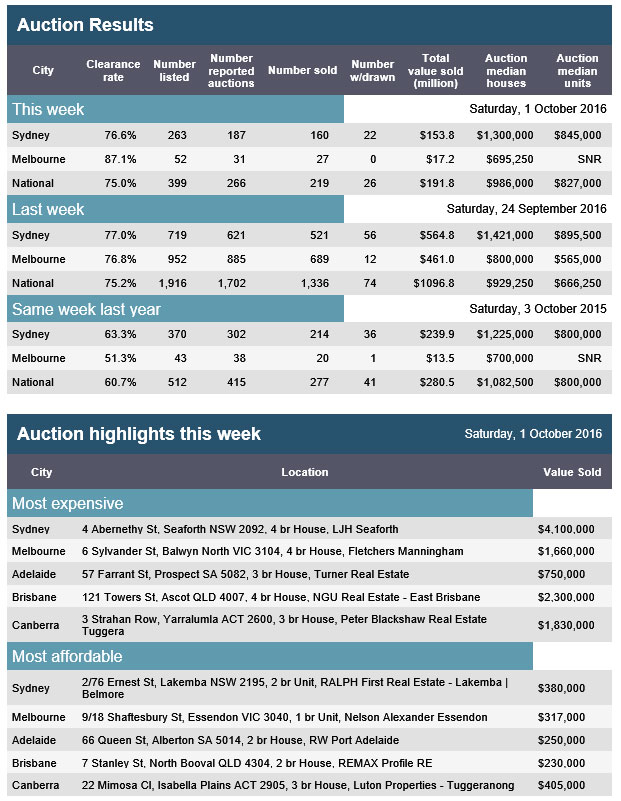
As digital acceptance continues to deepen, more consumers are using Price Comparison Websites (PCW) or Comparator  Websites or apps, to inform their purchasing decisions. From financial services, utilities, phone plans, flights, holidays and shopping, use is on the rise. Clearly such sites have the potential to empower consumers and make choice simplier. But should we trust them? Are they giving truly independent results?

Below the waterline, there are commissions being paid, results filtered based on affiliations and other commercial incentives or targets, and the basis of recommendation is not always clear.

Piggy-Bank-3ASIC highlighted issues with PCW’s in 2012, and with specific Superannuation and Insurance comparison sites.

The ACCC published “The comparator website industry in Australia” report in November 2014. They said:

Comparator websites are almost universally free for consumers to use, with revenue earned through one of the three business models. The two primary means of remuneration are:
• Fee per lead or call (used by ‘lead generation’ sites)—a fee is paid by the service provider for each lead that is generated to the service provider. This model includes a fee per ‘click-through’ where a service provider pays a fee for each customer that is directed to its website from the comparator website.
• Commission on sales (used by ‘end-to-end’ sites)—commission is paid by the service provider for each successful sale. Commission is paid either upfront, on a trailing basis (commission paid over a period of 3−4 years, subject to the customer remaining with the service provider) or through a combination of both.

Comparator website operators and service providers reported that the fee and commission payments received vary depending on the service provider and sector. For example, in the private health insurance sector, commission payments are generally between 20 to 40 per cent of the first year’s premium, with a trailing fee also payable in some cases. Where a trailing fee is payable, the upfront fee tends to be lower. Additional methods of achieving remuneration include charging for advertising on the comparator website or selling customer data. The use of these methods is minimal, with the majority of comparator website operators reviewed by the ACCC focusing on generating revenue via click-through or commission per sale.

Now, in the UK, the UK Regulators Network (UKRN) (a peak body covering a wide range of industry segments) has just published a report looking at UK price comparison websites. In addition, the UK Competition and Markets Authority (CMA) would commence an investigation of digital comparison tools – including PCWs – in the autumn 2016.

Here are some thought provoking comments which I think have relevance to our market too.

Why people use PCWs

Consumers’ stated reasons for using PCWs tend to relate to price, with users indicating that their principal aims are to find the best deal (85%), compare prices for specific products (83%) and save money or reduce costs (79%).

However, price is not the only factor that drives consumer use of PCWs. Studies has found that consumers use PCWs as a research tool to find companies offering relevant services (69%), a significant proportion stated they use PCWs to save time (65%) and to inform them when considering switching providers (62%).

One of the underlying views was that price comparison sites are used to get a ‘better’ deal and not necessarily the ‘best’ deal.

Consumers’ uses of PCWs can vary by sector, as the following examples, from research carried out by Mintel in 2014, illustrates:
home insurance – 33% used a PCW for research, 19% purchased or arranged via a PCW;
broadband, TV, phone – 21% used a PCW for research, 7% purchased or arranged via a PCW;
mortgages – 9% used a PCW for research, 4% purchased or arranged via a PCW.

Evidence on why consumers may differ in their use of PCWs is limited. However, for some products, like insurance for example, consumers may be more likely to use PCWs to make their purchase and complete a transaction. This may be due to two factors: first, with a product like insurance, buyers make frequent choices about their service provider. Second, it may be easier for PCWs to have relationships with insurance providers to complete the transaction. Conversely, products such as mortgages may be more complex, may require professional advice and security checks that are less amenable to being completed in one portal. This may therefore explain why consumers may be less likely to purchase certain products through PCWs and why the use of PCWs in general differs across sectors.

Use of multiple PCWs

When consumers use PCWs to shop around, they often use multiple sites. This is referred to as multi-homing.

Consumers appear to use at least two sites before making a decision. A 2013 study by Consumer Futures found that 16% used one site, 57% used two to three, and 26% more, before making a decision.43 For instance, the FCA’s market study on credit cards found that, of those that took out a credit card in the last 12 months after shopping around, 39% had used one PCW and 27% had used two or more, indicating that consumers not only utilise PCWs to search for suitable credit cards, but also that some are comparing between sites.

Panellists from the Ofgem Consumer First Panel in March 2016 held the underlying view that it was necessary to use multiple PCWs as they offered different ranges and may have commercial relationships with certain suppliers.

Common problems consumers may have with PCWs searches

Whilst PCWs can bring benefits to consumers, research has found there are some common problems that reduce their effectiveness and potentially result in poor outcomes. These issues include the following:

Consumers can become frustrated when there is no ability to customise and personalise searches – users typically desire a large amount of information but want to use filters to reduce the number of results. This function increases confidence, as it reinforces the perception that the results are tailored to the specific needs of the shopper.

Consumers prefer a range of ranking options – studies undertaken by the European Commission indicate that users were less likely to select a PCW when only one default ranking option is offered, as there was a preference for sites that provided a choice of one to three settings in addition to ranking by price only.

Consumers do not always find rankings to be clear – in some studies consumers have found that the presentation of information on PCWs and the criteria used for rankings can be unclear. An FCA report observed a wide variation in how products were displayed on PCWs, with some websites providing less clarity on the criteria used for default rankings.

Fear that sharing personal data could result in unsolicited marketing communications – concern and uncertainty over how PCWs use personal details was often linked to a fear that providing such information would result in unsolicited communication.49 Consumers also expressed concerns over their data being sold onto other companies with some entering fake phone numbers as a precaution against this.  This was also an underlying view of panellists from Ofgem’s March 2016 Consumer First Panel.

Some consumers find the layout of PCWs difficult to navigate – one study found some features created issues for consumers.52 This included: unclear signposting in menus, small text, links and buttons being difficult to identify, creating uncertainty on where to go next, difficulty in locating explanations and definitions of terminology, and the positioning of advertising in such a way that it seems part of the search results.
Consumers rarely understand how PCWs work or generate revenue – when prompted they tend to hypothesise that revenue is drawn from ‘advertising’, ‘commission on sales’, ‘click-through to providers’ sites’ or ‘access or listing fees’.

Some concerns that results may not be impartial due to business models – the impartiality of PCWs is sometimes expressed as an issue amongst consumers. For example, during Ofgem’s Consumer First Panel discussions in March 2016, some panellists were aware that relationships between suppliers and PCWs could be in place, while others were surprised that not all PCWs were independent of suppliers. Those panellists were suspicious about these relationships, and were unsure how or why these were formed; they were cautious about any relationships that might reduce customer choice. Conversely, however, other research shows that few consumers attach any importance to information on PCWs’ business models.

Trust in PCWs

A key potential problem that may limit the use and effectiveness of PCWs is the extent to which consumers trust price comparison sites and have confidence in using them.

Levels of consumer trust in PCWs can differ across sectors. In the energy sector for example, a survey in the CMA Energy Market Investigation identified levels of consumer confidence and trust in PCWs as being a potential issue: 26% were not confident that they could use PCWs to get the best energy deal; of these, 43% said they were not confident because they did not trust or believe PCWs.

However, in another study, it was found that that a large majority (94%) of consumers recalled PCWs that they had used to be either ‘very’ or ‘fairly’ reliable’. Although the majority of consumers use multiple sites, only a small minority do so due to a lack of trust. Instead, consumers normally engage in ‘multi-homing’ to give themselves confidence they have not missed a good deal.

A 2014 study by the FCA60 found consumers to have a high level of confidence in the well-known PCWs to offer dependable insurance quotes. Furthermore, the trust that the users had in these popular comparison tools led to a “halo effect”, whereby even previously unknown providers listed were now seen as trustworthy. This was because of an expectation that these recognised sites would vet and check providers included in their directory.

Ranking

Regulators have identified that:

Rankings may be complex – for example in the credit cards sector, ranking of credit cards and their offers might not always be helpful for consumers – e.g. one PCW’s table ranked in a formula that included the likelihood of acceptance, Balance Transfer Period, Balance Transfer Fee and Representative APR.
Rankings may not be suitable for all customers – PCWs’ rankings are sometimes ordered by ‘popularity’. This may not be helpful for consumers and it could lead to an unfavourable outcome if previous users have made poor choices or if it is not the most relevant factor for them (e.g. if they are looking to save money).

PCWs may give prominence to suppliers they have a commercial relationship with – some PCWs give prominence to certain products because of a sponsorship agreement, instead of displaying options that might be better for consumers based on their search criteria. To ensure results are accurate and unbiased, Ofcom’s Accreditation Scheme requires default ranking to be by price and by a measure of total amount payable for the service. Price ranking means that consumers may avoid the potential risk of using a PCW that ranks deals based on commissions received by Communication Providers (CPs), rather than based on the cheapest total price. The requirement to display a total amount payable can help consumers identify the complete price of their contract. Joint research by the Advertising Standard Authority and Ofcom found that consumers can struggle to identify the total costs of broadband contracts when prices are advertised separately and/or less prominently.

Not all products are presented to consumers because of a lack of commercial relationship – whilst regulators have encountered examples where commercial relationships have given prominence to some results over others, the opposite can also be true. Where a PCW does not have a direct relationship with the supplier, the search results from that supplier can be ‘hidden’ or difficult to find.

The method of ranking may affect which deals consumers use – the method by which the deals are sorted (e.g. price, contract type, customer ratings) can have an impact on the number of consumers that are likely to select the best product for their needs. The strength of this effect depends on precisely how the products are sorted. For example it has been found that the sorting method that resulted in the most customers identifying the best deal displayed the offers sorted by price (with the cheapest deal being ranked on top). A study undertaken as part of the FCA’s work on high-cost short-term credit also highlighted the importance of positioning when consumers used PCWs. When the cheapest deals were listed on top, users selected these deals 63% of the time, compared to 27% of the time when deals were sorted at random.

Accuracy and impartiality

A lack of accuracy on pricing can mean that consumers are not making fully informed decisions. In addition, PCWs do not always provide clarity regarding their role in the distribution of a product or the nature of the services they offer. In a review of annuity comparison sites, the FCA found that PCWs do not always satisfy the key FCA requirement to be ‘fair, clear, and not misleading’. For example, PCWs may describe a service as ‘free’ when commission is actually received by the firm if the user selects that particular product.

Other competition issues

Agreements or commercial relationships between PCWs and product suppliers have the potential to weaken competition between PCWs themselves, between competitors in the upstream markets, or both.

Most Favoured Nation clauses

These are agreements that commit a supplier not to sell the same product more cheaply elsewhere. Such agreements have the potential to distort competition through raising barriers to entry and limiting the commercial freedom of suppliers.

Auction Results Hit By Long Weekend

The latest preliminary results from APM Pricefinder show that there was a high auction clearance rate, though slightly lower than the extraordinary results from last week, but on much lower volumes thanks to the long weekend. Sydney achieved 76.6% on just 263 listings, Melbourne 76.8% on 52 listings, and Nationally, 75% on 399 listings, compared with 1,916 last weekend.  Canberra achieved 58% on 16 listings, Brisbane 56% on 57, and Adelaide did not sell any of the 11 listed (the bad weather may have something to do with this?)

apm-01-10-2016So, we really cannot drawn many conclusions from this set of results.

apm-01-10-2016-1

Securitisation Still In The Doldrums

The RBA statistics gives a view of the state of play of in particular mortgage backed securitisation. Prior to the GFC this form of financing was accelerating, but since then has been less popular – due to higher regulatory requirements, lower overseas demand, and the emergence of other funding structures. The costs of issuance, which before the GFC were significantly lower than more traditional funding alternatives, has largely been negated.

securit-june-2016-assetsAs a result, total mortgage backed assets fell 0.37% month on month to $114 billion. Compare this with a peak of $215 billion in June 2007.

securit-june-2016-adjustRemembering that bank credit has been growing significantly, the fall is, in real terms, even more stark. The chart above depreciates the total securitisation pool of ~$138 billion by credit growth, from its peak in 2007. It shows that in 2007 terms, the fall is even greater, to ~$78 billion, a significant drop from its peak of $274 billion.

securit-june-2016-liabThe other significant fact is that now 94% of securitisation deals are being sold in Australia, of which 75% are short term, and 19% long term.  Overseas issuance, which peaked in 2007, remains close to their lows, at around 1.6%.

Household Debt Further Into The Troposphere

The latest statistical release from the RBA includes data of some key household ratios. Of particular interest is the ratio between income and debt, and income to repayments.

rba-june-household-ratiosThe ratio of household debt to income has risen again now standing at 186, as high as it has ever been. The ratio of income to debt is on average 8.5, and has been tracking lower as interest rates fall.

Or to put it another way, as interest rates fall, households are borrowing more. As we saw yesterday, “other personal credit” fell in August, whilst mortgage debt rose again.

This debt to income ratio puts Australia at the top of league and highlights the potential risks which exist due to excessive leverage should rates rise, employment fall, or from some external shock (e.g. a European bank failing!).

The regulators need to start tightening credit availability, so total household debt begins to align better to income growth. Current credit growth rates, be they lower than last year, are still too high.