Technology is changing the way we live, work, and play. A sector where I believe technology is going to be fundamentally transformative is financial services. In fact, there is a new buzzword: “FinTech” – financial technologies or the integration of finance and technology. Two things are happening.
First, non-financial players are using technology to offer innovative solutions that mirror the services traditionally offered by financial institutions (“FIs”).
- Payments – Apple, Google, Paypal, Amazon, and Alibaba have payment solutions that replace physical wallets and credit cards.
- Lending – Zopa, Lending Club, and Funding Circle offer peer-to-peer lending solutions that match lenders and borrowers on their online platforms.
- Investment – “robo-advisers” like WealthFront use data analytics to dispense online personal financial advice and investment management services.
Indeed, these non-financial firms look set to disrupt the financial industry.
- As a senior banker in the US puts it: “People need banking, not banks”.
The second thing that is happening is that FIs are fighting back.
- As disintermediation threatens FIs, they are being pushed into a rethink of their business models.
- Rising costs, shrinking margins, and the weight of new regulatory requirements are pressing FIs to look into more cost-efficient ways of running their businesses.
- They are increasingly turning towards innovation and technology for solutions.
- In an ironic way, the FinTech insurgency is forcing change among the incumbent FIs.
Leveraging on their size and networks, FIs are using technology much more intensely to enhance their product offerings and service delivery.
- Example: US insurance companies, Progressive and Allstate, are using telematics to develop usage-based motor insurance, also known as Pay-As-You-Drive (or Pay-How-You-Drive).
- Instead of rewarding past good driving behaviour, these insurers are able to price premiums contemporaneously with current driving habits.
What does all this mean? As a powerpoint slide used by a FinTech company in Silicon Valley rather immodestly proclaims: “the geeks shall inherit the earth!”. It is no doubt an exaggeration. But the message is clear:
- In the years ahead, countries, businesses, and people who know how to use technology and innovate will have a keen competitive advantage.
Why this time is different
Now, have we not heard this story before – that technology will transform banking and then nothing changed fundamentally? Indeed there have been false starts in the past.
- In the 1990s, we thought that electronic money would replace cash and cheques. That has not happened.
– In most parts of the world, including the US, Japan, Europe, and Singapore, notes and coins in circulation outside banks has been increasing steadily every year.
- In 2000, some of us were quite sure that Internet-only banks would eventually replace brick-and-mortar branches. This too has not happened.
The most obvious evidence that both beliefs were manifestly wrong occurs year after year, when lines of Singaporeans form at bank branches to obtain new notes for “angpows”, to be given out during the Chinese New Year celebrations.
- But this year, however, we saw “e-angpows” being given out for the first time.
- Could this be a sign of things to come?
Technology takes time to proliferate. More importantly, it is the interaction among related technologies that often creates transformation – and that takes time.
There is reason to believe that this time is different: that technology will indeed transform financial services in a way that has not happened before. It has much to do with the concept of mobility.
First, mobility of technology.
- Mobile devices, such as smartphones and tablets, have become common-place.
- People do not just connect and surf from their home computers anymore – they also do so from their mobile devices, while on the go. This has profound implications for how financial services are offered and consumed.
Second, mobility of ideas.
- Today, online platforms provide a variety of social networking and peer-to-peer services. And people are increasingly comfortable using these services.
- These services have compressed time and space: interaction is real-time and information exchange transcends physical boundaries.
- They allow information, knowledge and ideas to be shared widely across communities and geographies.
Third, mobility of payments.
- In the past, it used to take several days and cost quite a bit to pay someone in another country or currency.
- Today, online payment services have made it possible for people and businesses to transfer funds safely at very low cost.
- This has not only allowed e-commerce to flourish, but also enabled faster and more efficient cross-border financial services, like lending and borrowing.
We are looking at a financial services industry that will be increasingly driven and powered by technology.
The big trends in technology affecting finance
What are the big trends in technology affecting the financial industry? Let me cite six technologies that appear potentially transformative:
- digital and mobile payments
- authentication and biometrics
- block chains and distributed ledgers
- cloud computing
- big data
- learning machines
First, mobile and digital payments.
Payment services are increasingly being enabled by mobile applications and near-field communications (NFC).
- Gone are the days of the clunky cash register.
- Today, accepting payments can be as simple as attaching a small dongle, no bigger than a matchbox, to a tablet or smartphone.
This is only the beginning.
- Payments at stores and restaurants may increasingly not even require physical touch points, and could take place entirely over the Internet, using the customer’s smart device to effect payments.
- Further out, we can look to a future of seamless payments, where technology automatically recognises the customer, checks out the goods, and charges to the customer’s account as he walks out of the store.
Second, authentication and biometrics.
Authenticating one’s identity is critical to gaining access to a variety of financial services and performing many financial transactions. As authentication technology progresses, we can look forward to more secure and efficient solutions to authenticate identity.
Biometric authentication is making good advances.
- In the future, we may not have to remember complex passwords or worry about password compromise.
- Fingerprint, iris, facial and voice recognition, and even palm vein and heartbeat recognition systems are being explored for authentication purposes.
- Biometric ATMs have been deployed in several parts of the world, including the UK, Japan, China, Brazil, and Poland.
- Banks in Singapore have launched mobile applications that utilise the TouchID function of the iPhone for fingerprint authentication.
- Some have also been exploring the use of voice biometrics in their phone banking and call centre services.
For users who are concerned about their privacy or have physical challenges, token-based authentication offers an alternative means of security:
- Tokens embedded within mobile devices, or perhaps on wearable technology, are viable options.
- And where stronger security is required, these could be used together with biometrics to provide multi-factor authentication.
Third, block chains and distributed ledgers.
Digital currencies – like Bitcoins – have attracted much interest.
- Payments using Bitcoins are much faster and potentially cheaper than conventional bank transfers and, its advocates argue, just as safe.
- Whether digital currencies will take off in a big way remains to be seen.
- But it is a phenomenon that many central banks are watching closely, including MAS.
- And if they do take off, one cannot rule out central banks themselves issuing digital currencies some day!
But the bigger impact on financial services, and the broader economy, is likely to come from the technology behind Bitcoins – namely the block-chain or, more generally, the distributed ledger system.
- A block chain is essentially a decentralised ownership record.
- It allows a document or asset to be codified into a digital record that is irrevocable once it has been committed into the system.
- The digital record can be accessed and verified by other parties in the system without going through a central authority.
- The potential benefits of such a distributed ledger system include:
– faster and more efficient processing;
– lower cost of operation; and
– greater resilience against system failure.
There are many potential applications of distributed ledger systems in the financial sector:
- Ripple in the US offers a solution, based on distributed ledgers, for real-time gross settlement, currency exchange, and remittance.
- The same solution could potentially allow regulators to plug into the network to conduct surveillance of risks and to track transactions to detect money laundering or terrorist financing.
In fact – and this would be of interest to the lawyers gathered here – distributed ledger systems could potentially be applied in any area which involves contracts or transactions that currently rely on trusted third parties for verification.
- Honduras is developing a land title registry system based on distributed ledgers
- Other potential applications talked about include registry of intellectual property rights, supply chain management, electronic voting systems, medical records, etc.
Fourth, cloud computing.
Cloud computing is an innovative service and delivery model that enables on-demand access to a shared pool of computing resources. It provides economies of scale, potential cost-savings, as well as the flexibility to scale up or down computing resources as requirements change.
There is a view among some quarters that “MAS does not like the cloud”. This is an urban myth, not true.
- Well, MAS did have concerns about cloud computing previously.
- This was because cloud services were at the time not sufficiently secure to safeguard the sensitive information that FIs held.
- But cloud technology has evolved considerably and there are now solutions available to address these concerns.
– For example, FIs can now implement strong authentication and data encryption to protect their data in the cloud.
– MAS has been in dialogue with both FIs and cloud service providers
– Providers have now become more aware of our security considerations while we have gained a deeper understanding of the safeguards they have put in place.
- I am pleased to say that several FIs in Singapore have successfully rolled out cloud solutions in the past two years.
Fifth, big data.
The world is exploding with information.
- Data generated by online social networking and sensor networks, and data collected by governments and businesses amount to a universe of digital information that is growing at about 60% each year.
- There is also a global trend – including in Singapore – towards “open data” in which data are freely shared beyond their originating organisations
- At the same time, the cost of storing and processing data has been falling dramatically.
- These trends have created the opportunity to use data to understand the world around us with a clarity and depth that was not possible before.
Some FIs are investing in and using this big data to derive useful and actionable insights.
- JP Morgan Chase and MasterCard, to cite two examples, are using big data techniques to derive insights from consumer spending patterns.
- Visa is using big data techniques to detect fraud in financial transactions.
Sixth, learning machines.
This might well be the most impactful technological change of the future – computers that can think.
- Traditional computing machines and algorithms are programmed to carry out specific tasks in response to defined circumstances according to the software programme that is written into them.
- We are now moving into the age of cognitive machines which are designed to learn from the data that they hold and be able to, in a sense, programme themselves to perform new tasks.
- They continuously adapt to new data as well as feedback and inputs gathered from their experiences, including interactions with humans.
We are already beginning to see examples in the financial industry:
- In equity, commodity, and FX markets, some traders are using self-learning algorithms
– they not only analyse historical data, predict price movements and make trading decisions, but continually upgrade and adjust their trading strategies in the light of new evidence and market reactions.
- In lending, learning machines have been used to construct models for consumer credit risk and improve the prediction of loan defaults.
The legal minds assembled here might want to reflect on where the legal liabilities arising from the actions – or inactions – of such learning machines lie.
The six technologies that I have outlined have the potential to transform the financial industry globally. There could well be others that I have not mentioned.
The important thing for our FIs is to be alert to these and other technology trends, understand their possible implications, and seize the opportunity to apply relevant technologies safely and efficiently – to boost productivity, gain competitive advantage, and serve consumers better.
Smart nation needs a smart financial centre
At the national level, Singapore has set its sights on becoming a Smart Nation – one that embraces innovation and harnesses info-comm technology to increase productivity and improve the welfare of Singaporeans. The Smart Nation Programme under the Prime Minister’s Office has brought together stakeholders from the government and the industry to identify issues and develop solutions with this objective in mind.
Government agencies have been rolling out a steady pipeline of Smart Nation initiatives.
- The Housing Development Board has trialled a new system that utilises home sensors to monitor elderly folks who are staying alone and alert caregivers should an emergency arise.
- The Land Transport Authority is studying the use of autonomous vehicles that can self-drive with the help of environmental sensors and navigation systems.
- The Urban Redevelopment Authority has been utilising geospatial information and data analytics for urban design and land-use planning.
A Smart Nation needs a Smart Financial Centre. Indeed, the financial sector is well placed to play a leading role given that financial services offer fertile ground for innovation and the application of technology.
MAS will partner the industry to work towards the vision of a Smart Financial Centre, where innovation is pervasive and technology is used widely to:
- increase efficiency,
- create new opportunities,
- manage risks better, and
- improve people’s lives.
MAS will seek to achieve this vision together with the industry through two broad thrusts:
- a regulatory approach conducive to innovation while fostering safety and security; and
- development initiatives to create a vibrant ecosystem for innovation and the adoption of new technologies.
Smart regulation for a smart financial centre
First and foremost, a smart financial centre must be a safe financial centre. Technology can be a double-edged sword. If not managed well, it can potentially lead to a variety of risks in the financial industry:
- financial crime and illicit transactions;
- loss of data or compromise of confidentiality;
- glitches that damage reputation, disrupt business, or worse, cause systemic crisis.
The first priority on our journey towards a Smart Financial Centre is therefore to continually strengthen the industry’s cyber security.
As more financial services are delivered over the Internet, the frequency, scale, and complexity of cyber attacks on FIs have increased globally. Hackers and cyber criminals are constantly probing IT systems for weaknesses to exploit.
There are two reasons for concern:
- First, the connectedness among FIs mean that a serious cyber breach in one institution can potentially escalate into a more systemic problem.
- Second, repeated cyber breaches could diminish public confidence in online financial services and reduce people’s willingness to use FinTech in general.
MAS and the financial industry in Singapore take cyber security seriously.
– implement controls and measures to preserve the confidentiality of sensitive data
– maintain the integrity and availability of their systems
– conduct regular vulnerability assessments and penetration tests to evaluate the robustness of their cyber defences
- MAS conducts regular onsite inspections of key FIs’ technology risk management processes and controls to check that they meet these requirements.
- FIs have also established Cyber Security Operations Centres to enhance their cyber surveillance and gather cyber intelligence.
But cyber threats will not go away. Like a cat and mouse game, both hackers and cyber defenders have been enhancing their tools and techniques along with advances in technology as well as in response to one another.
- As part of this evolution, a new wave of next-generation cyber security solutions is emerging, in areas such as trusted computing, security analytics, threat intelligence, active breach detection, and intrusion deception.
- The financial industry needs to keep abreast of these developments.
While seeking to ensure cyber security, MAS’s regulatory approach towards fostering innovation and the adoption of new technologies will take three forms.
First, innovation owned by FIs.
In matters of innovation, time to market is critical. FIs are free to launch new ideas without first seeking MAS’ endorsement, as long as they are satisfied with their own due diligence.
- A recent case that went on this approach was a mobile banking application that utilised fingerprint authentication for balance enquiries.
- The bank went ahead, did not need MAS approval.
What does this approach entail?
- FIs’ board and management should take the responsibility to ensure that the risks of new innovative offerings are well identified and managed.
- The compliance people should ideally be involved early in the innovation process. However, they should avoid second-guessing MAS by taking an overly conservative stance that might nip innovation in the bud.
- If the FI encounters a specific issue on which it needs MAS’ guidance, we will be happy to help.
- But the FI must offer its own assessment of the risks in what it proposes to do and take ownership for its decisions.
- It cannot rely on MAS to do its due diligence.
Second, innovation in a “sandbox”.
Sometimes, it is less clear whether a particular innovation complies with regulatory requirements. In such cases, FIs could adopt a “sandbox” approach to launch their innovative products or services within controlled boundaries.
- The intention is to create a safe space for innovation, within which the consequences of failure can be contained.
- FIs can seek MAS’ guidance and concurrence on the boundary conditions – for example, the time period, customer protection requirements, etc.
Third, innovation through co-creation.
MAS has a long tradition of active consultation with industry on proposed new rules or initiatives. More recently, we have engaged industry players more directly to co-create rules and guidance – in other words, to jointly come up with proposals.
- An example is the Private Banking Industry Code – developed by industry practitioners but in close consultation with MAS.
- Such co-creation is particularly relevant for developing rules or guidance on new technologies whose benefits and risks are not fully known and where a more flexible approach may be desired.
A further possibility in co-creation might be MAS and the industry working together to develop common technology infrastructure that meets regulatory requirements. The aim is to clarify and address issues and uncertainties upfront during the course of development.
MAS is not seeking a zero-risk regime. And we understand that failure is part of the learning process.
- If things do go wrong with an innovative product or service, and there will no doubt be some failures, the FI will need to review its implementation and draw lessons.
- MAS will examine the facts to assess if there is any systemic or deeper issue that needs to be addressed, and determine if any action needs to be taken.
Development initiatives for a smart financial centre
Besides providing a conducive regulatory environment, MAS will work closely with the industry to chart strategies for a Smart Financial Centre. Let me sketch some of the initiatives we have embarked on:
- a Financial Sector Technology & Innovation scheme to provide financial support;
- a multi-agency effort to guide the development of efficient digital payments systems;
- a technology-enabled regulatory reporting system and smart surveillance;
- supporting a FinTech ecosystem; and
- building skills and competencies in technology.
First, the Financial Sector Technology & Innovation or “FSTI” scheme.
I am happy to announce that MAS will commit $225 million over the next five years under the “FSTI” scheme to provide support for the creation of a vibrant ecosystem for innovation.
FSTI funds can be used for three purposes:
- innovation centres: to attract FIs to set up their R&D and innovation labs in Singapore.
- institution-level projects: to catalyse the development by FIs of innovative solutions that have the potential to promote growth, efficiency, or competitiveness.
- industry-wide projects: to support the building of industry-wide technology infrastructure that is required for the delivery of new, integrated services.
Several FIs have already set up their innovation centres or labs in Singapore, some under the FSTI:
- DBS, Citibank, Credit Suisse, Metlife, UBS,
- as well as a couple of others that are in the pipeline.
Some examples of FSTI-supported institution-level projects that are ongoing include:
- a decentralised record-keeping system based on block chain technology to prevent duplicate invoicing in trade finance;
- a shared infrastructure for a know-your-client utility;
- a cyber risk test-bed; and
- a natural catastrophe data analytics exchange.
We look forward to see more such innovation projects coming on-board.
Second, digital payments.
Changes in the payments scene in Singapore have picked up pace in recent years:
- Our retail banks have released their own flavours of mobile wallets or mobile payment applications:
– DBS PayLah!, UOB Mobile Cash, OCBC Pay Anyone, StanChart Dash, Maybank Mobile Money
- With the launch of Fast And Secure Transfers or “FAST” in March 2014, we now have a ready infrastructure that allows customers of the participating banks to make domestic fund transfers to one another almost instantaneously from their computers or mobile devices.
But there is a lot more we need to do on the digital payments front.
First, payments at stores and restaurants.
- This is almost a Uniquely Singapore phenomenon
– Many of our stores and restaurants have multiple Points-of-Sale (“POS”) at their payment counters.
– This not only clutters valuable real estate but also makes life difficult for customers and merchants.
- As more stores and restaurants introduce self-checkout facilities to improve productivity, we need a unified POS – a single terminal, preferably mobile – that will:
– allow merchants to enhance efficiency by simplifying front-to-back integration; and
– enhance the shopping or dining experience of customers.
Second, reduce the use of cash and cheques.
- It costs as much as $1.50 to process each cheque.
- The cost of cash is less obvious but just as real: in transportation, collection, delivery and protection.
- We need to promote greater adoption of new payments technologies, including:
– electronic Direct Debit Authorisation; and
– fund transfers using mobile numbers or social networks
MAS and the Ministry of Finance have been co-leading a multi-agency effort to address these issues and guide the development of efficient digital and mobile payment systems.
- The aim is to make payments swift, simple and secure.
- The vision is less cash, less cheques, fewer cards.
Third, regulatory reporting and surveillance.
As the financial system becomes increasingly complex and inter-connected, MAS needs to sharpen its surveillance of the system with more timely, comprehensive and accurate information to identify and mitigate emerging risks.
The vision is an interactive, technology-enabled regulatory reporting framework which will:
- reduce ongoing reporting costs through the use of common data standards and automation;
- enable the dissemination of anonymised information to industry analysts and academics for deeper analysis of the financial system and its risks.
We are still in early days on this initiative and will work with the industry on how best to take this forward.
Fourth, supporting a FinTech ecosystem.
The effort to grow a Smart Financial Centre must go beyond the financial industry, to help nurture a wider FinTech ecosystem. We need a strong FinTech community that can:
- generate ideas and innovations that FIs could adapt and adopt; and
- provide a platform for collaborations with the industry to produce innovative solutions for defined problems and needs.
For those of you who are not aware, we have a pretty vibrant FinTech start-up community that is growing over at the “Launchpad” in Ayer Rajah Industrial Estate. MAS looks forward to engaging FinTech start-ups more actively – to better understand emerging innovations as well to help them design their solutions bearing in mind the regulations and risk considerations that apply to the financial industry.
Fifth, building skills and competencies in technology.
Technology will disintermediate and make obsolete many jobs in the financial sector, but it will also create new ones. Finance professionals will need new capabilities. And the industry will need skills and expertise from other disciplines traditionally not associated with finance.
MAS and the financial industry must work together to prepare for the changes ahead on the jobs and skills front. Building capabilities and opportunities in FinTech will be a key area of focus in the financial sector’s SkillsFuture drive.
- MAS will work with the financial industry, the Institute of Banking and Finance, training providers, and the universities and polytechnics to provide learning pathways relevant for a Smart Financial Centre.
- We will also provide FIs funding and other support for training opportunities, to help our people acquire specialist capabilities in the relevant areas of FinTech.
Conclusion
Let me conclude. I have said much about technology and FinTech. The larger picture is really about promoting a culture of innovation in our financial industry.

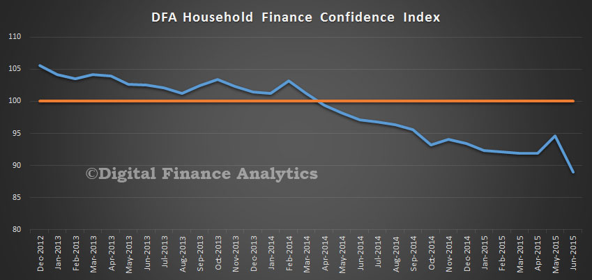
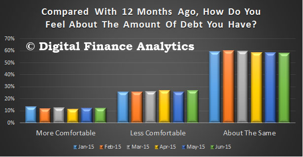
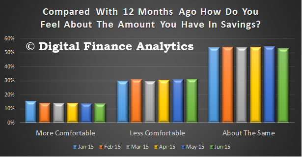
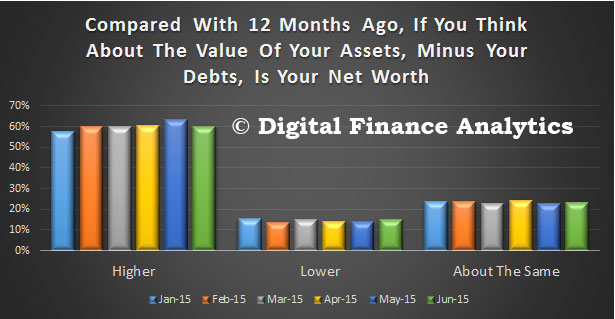
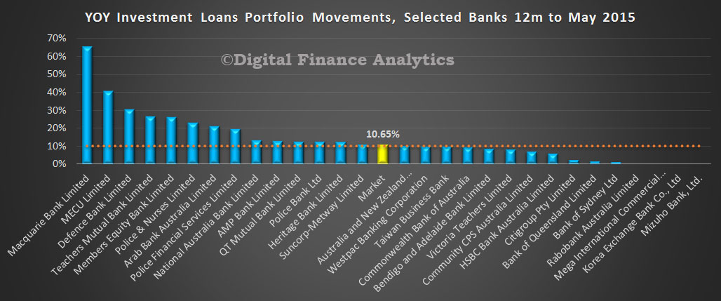 Westpac, the lender with the largest share of investment loans will now limit loan to value ratio (LVR) to no more than 80% down from 95% previously. In addition, they will now use a servicing interest rate benchmark of 7.25%, reducing the real world impact of ultra low interest rates.