Why Enticing First Time Buyers With Super Is A Bad Idea

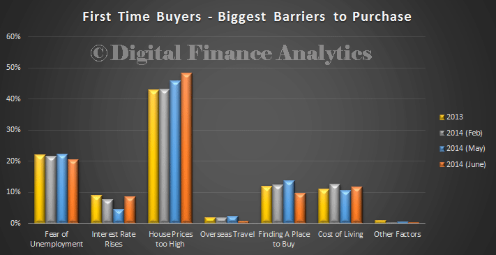
We know that first time buyers are sitting on the sidelines, as shown in our recent surveys. The biggest barrier is price. Many are desperate to enter the market and would jump at any additional incentive.

FTBDFAJun14No surprise then to see proposals popping up from time to time to try and assist first time buyers. Often they are tactical and shorted sighted. The latest is from Nick Xenaphon, the Independent Senator for South Australia “Home affordability: a Super idea“.

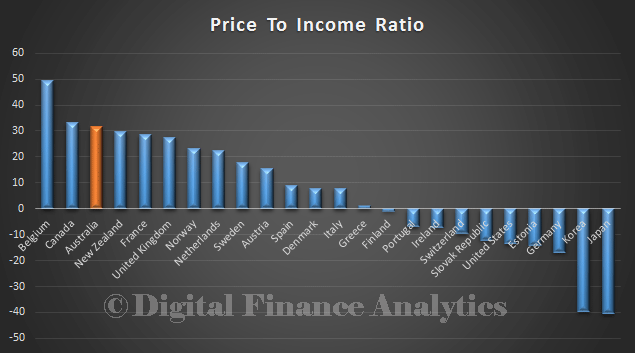
Independent Senator for South Australia, Nick Xenophon, will introduce legislative changes in the Spring session of parliament to allow first home buyers to access their superannuation savings to pay a house deposit. Such a scheme successfully operates in Canada, called Home Buyers’ Plan, leading to improved housing affordability. At a Senate Economics References Committee hearing in Adelaide today, the Inquiry heard from HomeStart Finance (an arm of the South Australian Government) outlining the Canadian scheme. In Canada up to $25,000 can be accessed for a first home, and it’s made a dramatic difference for housing affordability there. However, Senator Xenophon will be moving for changes to Superannuation Act 1976 to allow the release to superannuation funds for a first home, with similar safeguards to the Canadian scheme. In Canada the amount has to be paid back into the super fund within 15 years. “With more and more Australians finding it difficult to break into home ownership, adopting the Canadian scheme would make a difference to many thousands of Australians each year,” Nick said. “As HomeStart Finance said today, there’s something strange about being able to access your super fund if you are about to default on your housing loan, but you can’t access it to put a deposit on a home in the first place.” Housing affordability in Australia has fallen for the past three decades, as house prices outstrip income growth. An annual affordability survey by Demographia this year found Australia had the second-worst housing affordability in the world, behind Hong Kong. All 39 Australian housing markets surveyed were “seriously” or “severely” unaffordable, defined as having average house prices more than four times average income. Senator Xenophon gave credit to his state colleague, John Darley MLC, who has been a long-time advocate for releasing super funds for home buyers.

At least he recognises we have a serious problem in the housing sector. Here is the recent data on the percentage of first time buyers transacting, its pretty much as low as its ever been. OOFTBMay2014
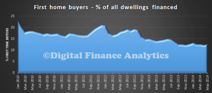
However, we do not think his suggestion has merit. In fact it would be a disaster. His proposal would be, in effect an additional first time over grant, by another name, and we have already shown the first time buyer incentives merely lift prices in the short term, and do nothing to assist long term. You can read our earlier analysis “First Time Buyer Incentives are Bad News” here.

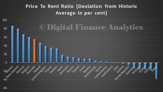
Two additional points, Canada’s housing market is overheating, as shown in our recent comparisons, based on the recent data from the IMF, which we reported here. So their policy settings are not correct.

IMFJun14-2

IMFJun14-1In addition, there is additional risk, especially when prices are higher than they should be, that households will be exposed when rates rise. First time buyers are already highly exposed.  It they also have their hard earned super locked into housing, this is an additional and concerning exposure. The interim FSI report highlighted concerns about super flowing into property. It is a risk too far.

If the politicians want to address the housing issue (and that means recognising there is a problem, which needs attention – RBA please note), then there are alternatives they should consider. Tackle negative gearing, work with the states on land supply, and bring in macroprudential controls on lending. Read my suggestions in detail in the submission I made to the Senate Inquiry into Affordable Housing. My policy suggestions were:

  1. Australia should develop a strategic housing plan which guides ongoing development, be it in current centres, or expansion into new towns. Current tactical plans are not sufficient. The plan should specifically address the supply of affordable housing.

  2. Strategies should be devised to increase land supply. State governments should reduce the current high levels of access fees for new development and revise planning criteria and processes. This has the potential to create considerable economic growth.

  3. Overseas investors should not be able to access first-time buyer incentive schemes, and the Foreign Investment Review board rules should be strengthened to reduce the impact of foreign investors on the local market.

  4. The RBA should have a direct multi-segmented housing affordability metric within its measurement framework. Affordability should be targeted at trend average, not rates experienced since the debt explosion of the 2000 onwards.

  5. Macro-prudential policies should be employment to control the growth in lending. In line with the recommendations from the Bank of International Settlement debt to income servicing ratios should be employed as the policy tool of choice.

  6. Negative gearing should be tapered away and removed for new transactions.

  7. Joint equity schemes like the UK’s Help to Buy Scheme  should be considered as a tactical step to assist some of the “Want-to-Buys.”

Bloomberg’s Summary Of The Australian Housing Market.

Bloomberg Australia has published a compelling overview of the housing market in Australia. They underscore the relatively myopic stance of the regulators. DFA was cited in the article.

Australia has the third-most overvalued housing market on a price-to-income basis, after Belgium and Canada, according to the International Monetary Fund. The average home price in the nation’s eight major cities rose 16 percent as of June 30 from a May 2012 trough, the RP Data-Rismark Home Value Index showed.

In Sydney, the most populous city, where price growth has been strongest, values soared 15 percent over the past 12 months. That compares with a 5.4 percent increase in New York City in April from a year earlier and a 26 percent jump in London prices in June quarter from a year ago.

“There’s definitely room for caps on lending,” said Martin North, Sydney-based principal at researcher Digital Finance Analytics. “Global house price indices are all showing Australia is close to the top, and the RBA has been too myopic in adjusting to what’s been going on in the housing market.”

Worth recalling the chart we published recently on Loan to Income By Post Code.

LTIAllStates

If The Worm Turns, What Happens To Household Mortgage Stress?

The wind appears to be changing. First the new head of APRA warned at a CEDA event they were watching the mortgage lending of the banks closely, “The Australian banking system clearly has a concentration of risk in housing. If anything was to go wrong in the housing market it would have very severe impact on the viability and health of the banking system, so it’s naturally something we watch very carefully.” Meantime in London, Treasury Secretary Martin Parkinson spoke to Chatham House where he mused on the low interest rate strategies being adopted by many countries, the limits of monetary policy and the potential for macroprudential measures. Locally, whilst fixed rate mortgages are being offered at record lows below 5%, the consensus appears to be shifting towards a lift in rates in Australia, partly as a result of rising inflation, although timing is not certain. So, what is the potential impact of a rate rise on Australian mortgage holders, bearing in mind that the average loan to income is stretched? How far would rates rise? Where would the pain be felt most?

To answer these questions, we have examined interest rate trends, and incorporated a rising rate scenario into our mortgage stress models. First, let’s look at rate trends. This is a plot of the RBA target rate since 1990. If we take a linear average, we see that currently we are well below the “neutral” range. An RBA rate of 4-4.5% would on this basis be a neutral rate. This is the first assumption I have made in my stress modelling.

RateTrendThen we have to estimate the spread above the target rate the variable rate mortgage will be coming in at. We still have most households on a floating rate, although 15% are locking in fixed at the moment. This plot shows the target cash rate, against the spread between a CMT deposit account and a standard variable mortgage. Lets assume an average uplift of 300 basis points. That would put the mortgage rate at about 7%.

RateSpreadTrendNow, we will assume rates will be lifted to this level in the next 12-15 months. We will also assume that income rises at the level it has in the past 2 years, and that unemployment stays at 6% (to isolate the effect of the rate movement). We then calculate for the 26,000 households in our survey the impact on their income/expenditure if their mortgages do rise. The impact is of course immediate, unless households are on a fixed loan. This is incorporated in the modelling. Now, we calculate the proportion of households which will be in mortgage stress in 18 months time (see the definitions we use here). Lets take Sydney as an example.  This geo-mapping shows where the main movements are in terms of increases in mortgage stress. The blue postcodes are worst hit. Many of these households are in the western suburbs, and are typically younger, and on lower incomes. Many are first time buyers.

SydneyStressChangeMortgage stress does not mean an immediate crisis, but households hunker down short term, and it is a warning of trouble ahead because many households who get into difficulty are ultimately forced to sell. My read on this modelling is that if rates rise, the impact on the property market could be quite profound. This in turn does indeed lay potential bear traps for the banks, because of their high leverage into property. There is a strong case to lift the currently relatively low capital rules for the big four, to provide a buttress against rising rates, and to avoid financial stability issues. The recent FSI interim report touched on this. If rates do indeed start to rise, we will need to be alert to the issues. Actually, the regulators should have been acting sooner, as the genie is now out of the bottle. We will publish data on this scenario for other states another day.


Savers Quest For Yield

The CPI data which came out from the RBA yesterday registered 3%. This was very bad news for households with savings in deposit accounts at the banks, because ever more are finding that returns after tax are well below CPI. This is part of a worrying trend for many, and is prompting them to seek out alternative and possibly higher risk saving vehicles. Today we examine this issue in the light of latest data from our household surveys.

First, here are some benchmark savings rates mapped to the CPI and RBA benchmark rate. Many savings rates are now below the CPI, even before we consider the tax implications, as of course income from deposits is taxable. More and more households will see their savings eroded in real terms. It may not be as bad as in the UK, where thanks to even lower base rates, central bank intervention and other factors, deposit rates are around 1% and inflation above 3%, but its getting all too familiar.

TrendRatesVsCPISavingsThe RBA has observed in its monthly updates that investors are seeking higher risk, higher return alternatives to bank deposits. Our surveys illustrate this nicely. We have been asking savings households about their intentions each month. Now, up to 80% of households with savings of more than $250k are actively seeking alternatives. It is lower for smaller balances, because typically these need to be readily available in case of emergencies.  But even here, 35% are reconsidering their options.

TrendSavingsWe also split the analysis between those saving within SMSF and those outside, as SMSF have advantaged tax treatment we expected these savers to be less concerned, but not so. We found that more of those saving via a SMSF were more actively seeking alternatives than those saving in their own names. This is a clue to why SMSF’s are investing direct in property.

SMSFSavingsFor households looking beyond bank deposits, it is worth highlighting they are moving away from secure savings options, because of course the government guarantee on deposits remains at $250,000 per customer per institution without charge. So if households start looking for other options, they might consider shares (though the market is close to its highs), property (will prices rise further?) or other wealth management products, where fees are not well disclosed, advisors may not give best advice, and returns are uncertain. There are certainly no simple alternatives. That in turn allows the banks to let their deposit rates slip, source funding cheaper from overseas wholesale markets, and by maintaining loan deposit rates, bolster their profits. We are mandated to save, yet the fact is, its hard to find solutions which provide returns above inflation at reasonable risk. Caveat Emptor!

CPI 3% Through Year To June 2014 – ABS

The ABS published the Consumer Price Index for the quarter to June 2014 today. The CPI rose 3.0% through the year to the June quarter 2014, following a rise of 2.9% through the year to the March quarter 2014. The Consumer Price Index (CPI) rose 0.5% in the June quarter 2014, following a rise of 0.6% in the March quarter 2014.

The most significant price rises this quarter were for medical and hospital services (+4.6%), new dwelling purchase by owner-occupiers (+1.6%) and tobacco (+3.1%). These rises were partially offset by falls in domestic holiday travel and accommodation (-3.8%), automotive fuel (-2.7%) and telecommunication equipment and services (-1.6%).

CPIJuneThis is at the top end of the RBA target, and highlights the fact they continue to have to balance, inflation, interest rates and other factors. They are still caught in the middle. Inflation is being assisted by the higher dollar exchange rate.


Perth Loan To Income Data By Post Code

Today we continue our series on Loan To Income mapping, based on the results from our household surveys. Looking at the data from the west, we see some interesting differences between post codes. We see higher LTI’s in some of the newer suburbs.

PerthLTIYou can compare this with the WA mortgage stress data here. One again we see a correlation between mortgage stress and high LTI ratios.

The highest LTI post codes in WA are:

HIghestLTIPerthThe lowest LTI post codes in WA are:

LowesttLTIPerth

Government To Review Retirement Income Rules

The Treasury today announced a review seeking feedback on the types of products which would be appropriate for people approaching or in retirement with a focus on ensuring they do not out live their savings.

The Government’s superannuation election commitments include reviewing:

  • the regulatory barriers restricting the availability of relevant and appropriate income stream products in the Australian market; and
  • the minimum payment amounts for account-based pensions, to assess their appropriateness in light of current financial market conditions.

Given their interactions, this discussion paper Review of retirement income stream regulation forms the basis for consultation on both reviews.

In addition, on 14 December 2013, the Government announced it would not proceed with the previous government’s unlegislated measure to facilitate the provision of deferred lifetime annuities and that it would instead consider the proposal as part of the review of the regulatory arrangements for retirement income streams. This paper also provides a basis for consultation on extending concessional tax treatment to deferred lifetime annuities.

The Government welcomes views on this discussion paper, and written submissions will be accepted until 5 September 2014.

We believe there is opportunity to create new products and services, provided they are fairly priced and transparent. In our review of the demand for annuity products in Australia, we found that many were concerned about these issues, and of course the UK just moved from a mandatory annuity structure to allowing retirees complete freedom to save and spend as they please. They had a major mess previously. DFA believes that households should not be forced to take a particular solution, but products correctly structured and priced would be of significant help. We know from our household surveys that many are not saving sufficient to support their expected life in retirement. Indeed many had no clear expectation of how long they might live, and what they might need to have invested.

Brisbane Loan To Income By Post Code

We continue our series on Loan To Income ratios, using data from our households survey with a look at Brisbane. We start with a geomapping of LTIs across the region. The blue areas have the highest ratios.

BrisbaneLTIHere is a list of the highest areas across QLD:

HighestLTI-BrisbaneHere is a list of the lowest areas across QLD:

LowestLTIBrisbane

There is a strong correlation between high LTI and mortgage stress. Details of mortgage stress in Brisbane are here.

You can read our earlier posts about LTI here. This includes similar data on Melbourne, cross state analysis, and comparisons with the UK. We will published additional state data later.

Melbourne Loan To Income Data By Post Code

Continuing our series on Loan To Income (LTI) ratios, using our household survey data, today we focus our attention on Melbourne. As previously discussed Loan To Income is a relevant measure when considering how stretched households may be with regards to their mortgage loans. So first we present the results using our geomapping analysis. The shades of blue show the higher average ratios, which we see predominately to the north and east of Melbourne.

MelbourneLTIYou can compare this mapping with the mortgage stress analysis for Melbourne, as there are some significant correlations.

More specifically, the highest LTI ratios are found in the following post codes:

HighestLTI-MelbourneIn contrast the lowest LTI ratios are found in these post codes:

LowestLTIMelbourneWe have already summarised the situation in Sydney, when we first discussed the data in the context of the recent UK initiatives to curb high LTI loans. We will present detailed data for other states later.

The Loan To Income Mess

Some time back we reported on the results of our household surveys, looking especially at the loan to income (LTI) data. This was prompted by the Bank of England’s move to limit banks abilities there to lend higher LTI loans. At the time we showed that at an aggregate level, LTI’s in Australia were higher than in the UK, yet despite this, there was no evidence of any local move to curb higher LTI borrowings, other than vague warnings from the regulators more recently. There is little relevant data published by the regulators on this important metric.

Today we delve into to the LTI data series in more detail.  Interestingly the control of LTI’s was the preferred macroprudential tool of choice by BIS and others. The UK recommendation was to ensure that mortgage lenders do not extend more than 15% of their total number of new residential mortgages at Loan to Income ratios at or greater than 4.5 times.

In our surveys we ask about a households mortgage loan, and its total gross income. From this we can derive an LTI ratio.

So, to recap. this is the current picture of LTI, averaged across post codes for all household segments, and all states. There is a peak around 4.5 times, and a second peak above 6 times.

LTIAllStatesNow, we can break the data out by state, and household segment, using the DFA survey data. The state specific data for NSW largely mirrors the national average.

LTINSW
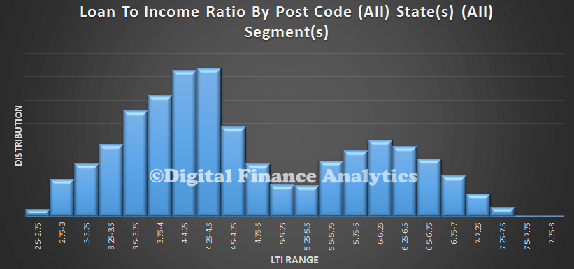
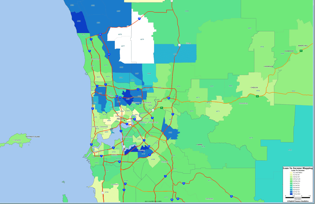
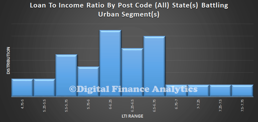
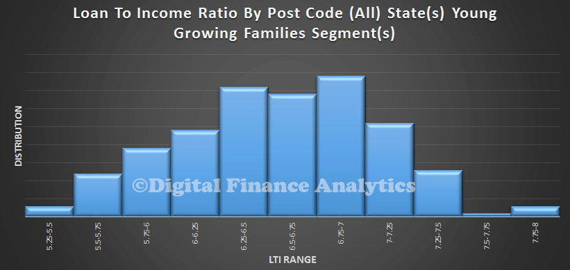
However, looking at TAS, we see some interesting variations. There the LTI’s are higher, reflecting lower incomes relative to somewhat lower house prices. We have adjusted the sample to take account of the smaller populations.

LTITASWA again shows variation, with a significant spread of higher LTI loans than the average.

LTIWA
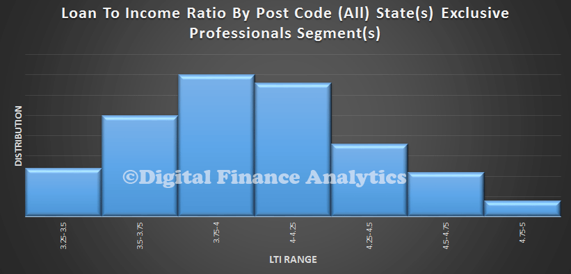
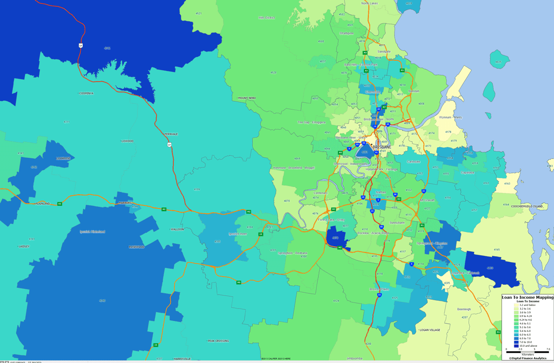
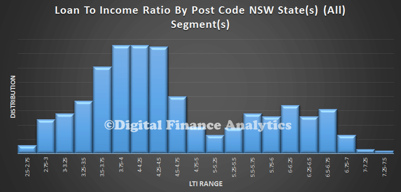
QLD shows greater concentration at lower LTI’s but then a second smaller peak at the upper end.

LTIQLD
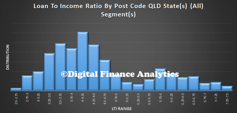
SA has quite a spike around 4.5 times, and a second peak around 6.5, again reflecting lower income levels in that state.

LTISA
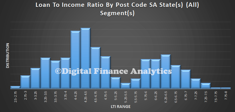
If we then start to look at segments, we find that affluent group, Exclusive Professionals, has a consistently lower LTI, compared with…

LTIAffluent… Battlers …

LTIBattlers… And the Young Growing Families. Many of the First Time Buyers are in this segment. Effective LTI’s above 7 times are significantly extended.

LTIYoung I won’t go through all the other segments now, but the analysis suggests to me that the LTI metric is significant, and a good leading indicator of risks in the system. Remember interest rates are at rock bottom at the moment, so households can keep their heads above water. But as we know rates may rise, and unforeseen events may change individual circumstances.   Households with such high LTI’s have very little wriggle room.  As the interim FSI report said “Since the Wallis Inquiry, the increase in housing debt and banks’ more concentrated exposure to mortgages mean that housing has become a significant source of systemic risk”. “Higher household indebtedness and the greater proportion of mortgages on bank balance sheets mean that an extreme event in the housing market would have significant implications for financial stability and economic growth”.