A Perspective On Investor Loans

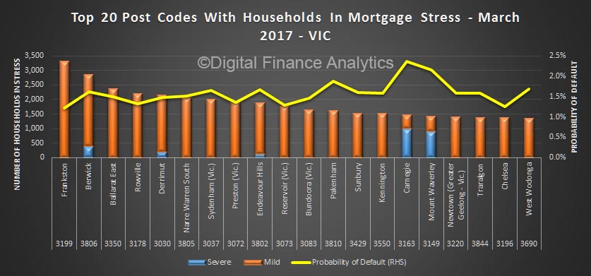
Using data from our household surveys, we can look at investor loans by our core master household segments. These segments allow us to explore some of the important differences across groups of borrowers.  We believe granular analysis is required to see what is really going on.

Today we look at the distribution of these segments by loan to value (LVR) and amount borrowed and also compare the footprint of loans via brokers, and by loan type.

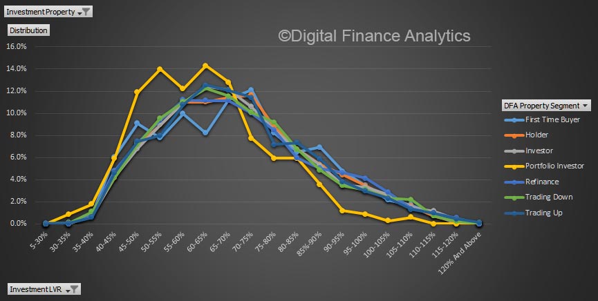
Looking at LVR first, there is a consistent peak in the 60-70% LVR range, with portfolio investors (those with multiple investment properties) below the trend above 70%.

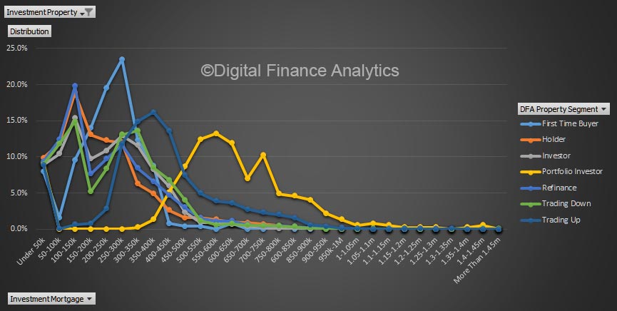
However, the plot of loan values shows that portfolio investors are on average borrowing much more, thanks to the multiple leverage across properties. A small number of portfolios are north of $1.4 million.

Investors who borrow with the help of a mortgage broker, on average is more likely to get a larger loan.

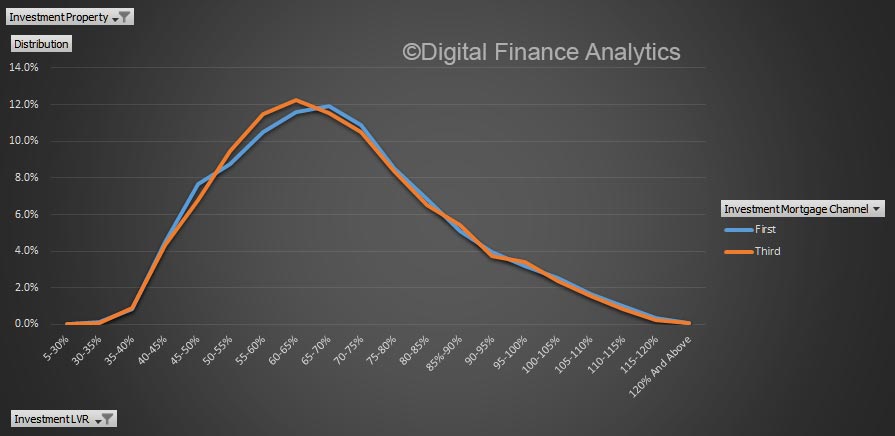
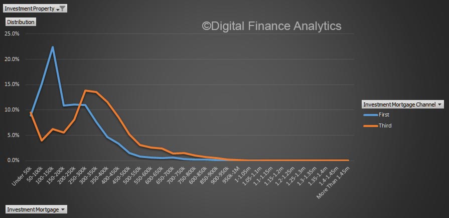
But there is very little difference in the relative LVR by channel.

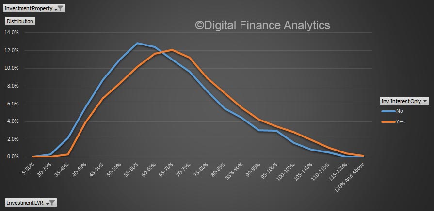
On the other hand, interest only loans will tend to be at a higher LVR.

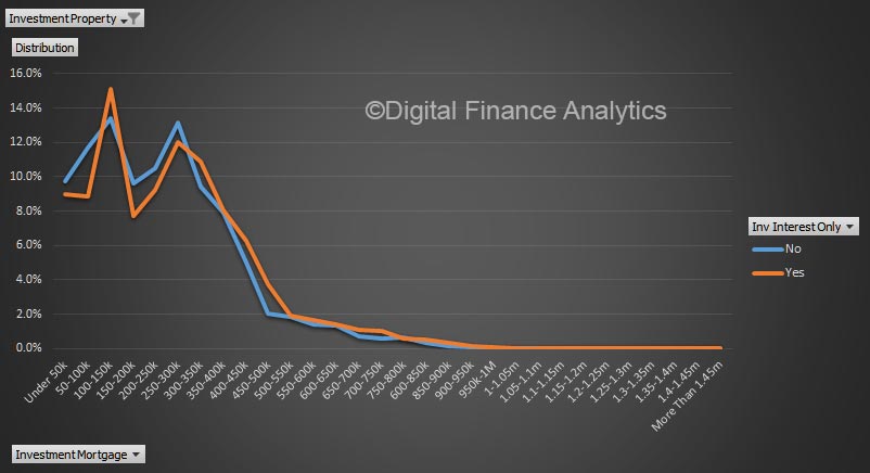
The average balance of interest only loans is also higher, especially in the $400-600k value range.

Microprudential analysis reveals interesting insights! The loan type and segment are better indicators of relative risk than LVR or origination channel.

Household Finance Security Index Higher Again In February

We have published the February 2017 edition of the Digital Finance Analytics Household Finance Confidence index (FCI) today, which shows a further small rise from the January 102.7 to 103.4. This is above the long term neutral setting, and after a significant dip in the past couple of years, the FCI is maintaining positive momentum.

However, the positive boost in predominately centered on momentum in the property market, with both owner occupied and investment property holders in positive territory, whilst those excluded from the property market, including renters and those living with family or friend get none of the upside, so their financial security is degrading further. This highlights the risks if the property market momentum were to reverse, and the bind that regulators face at the moment – do you keep the current settings and allow the market to continue to run, or tighten and risk reversing household sentiment and thus spending?

The state by state picture shows how uneven the confidence is, with households in the eastern states significantly more positive that in WA or SA.  WA grinds down, thanks to the pressure on the economy there, falling home prices and flat to falling incomes. Will the election result today make a difference?

Finally, here is the scorecard, which shows that real income in under pressure (up 1%), costs of living are rising (up 1%), concerns about debt levels are up a little (thanks to recent rate increases) but net worth is being bolstered by strong home price growth and rising stock markets.  The property sector is firmly linked to household confidence, and vice-versa.

By way of background, these results are derived from our household surveys, averaged across Australia. We have 26,000 households in our sample at any one time. We include detailed questions covering various aspects of a household’s financial footprint. The index measures how households are feeling about their financial health. To calculate the index we ask questions which cover a number of different dimensions. We start by asking households how confident they are feeling about their job security, whether their real income has risen or fallen in the past year, their view on their costs of living over the same period, whether they have increased their loans and other outstanding debts including credit cards and whether they are saving more than last year. Finally we ask about their overall change in net worth over the past 12 months – by net worth we mean net assets less outstanding debts.

Property Investors Show Stronger Buying Intentions

The ABS data today showed that investor lending in January was very strong. Our weekly household surveys ask about buying intentions – a forward looking estimate based on whether they are likely to transact in the next 12  months.

We have an indication earlier in the year from our weekly tracker than perhaps investors were getting cold feet – there was talk of changes to negative gearing, lifting rates and slower home price growth. Last week the buying signals were back to normal, as investors relished in the recent strong home price growth, and Government statements that negative gearing was safe. Despite slow rental income growth it is all about capital gains.

Now here is the latest chart, with the January loan volumes also added and the latest intentions plotted. Investors are still piling into the market – expect strong auction results this weekend. Intentions are stronger than ever!

No, Housing Affordability Is Hitting Households Across ALL States

CoreLogic posted an interesting blog today, in which the redoubtable Cameron Kusher says “It is really important to note that the housing affordability challenges are largely a Sydney and Melbourne phenomena”.

Now, I have to say, that just not chime with our household finance analysis. Whilst I agree affordability issues are partly a function of home price movements, other factors are in play. We discussed the distribution of those unable to afford to enter the market recently. You can read our post here.

A detailed analysis of household finances, and expectations show the affordability issues is spread across the states. It would be a mistake to address affordability in just NSW and VIC. In fact if you do, you risk excluding more from other states. You need a national plan.

He is right though when he says:

From a political perspective, politicians do not want to see the cost of housing falling.  We are taught that deflation is undesirable and deflation in the value of the country’s most valuable asset class would have a much broader impact on the economy.  Keep in mind as well that every property that is rented is owned by someone, some are owned by Government but most rental properties are owned by private citizens.

Supply and demand side reforms will be no easy feat and will require cooperation from all levels of government.


Latest Greater Perth Mortgage Stress Mapping

We now look across to the west, with mortgage stress modelling across WA, and mapping in Greater Perth. Read about our approach here.

The postcode with the higher number of households in mortgage stress in WA is Merriwa 6030, a suburb of South Western, Heartlands and  about 35 kms from Perth.  The average age here is 35 years and 40.6% of households have a mortgage. Some are in severe stress here.

Next is Samson, 6163, a suburb of Perth, Southern Suburbs, about 14 kms from the CBA and the federal electorate of Fremantle.  The average age here is 45 years and 36.8% of households have a mortgage.

Third is Carey Park, 6230, a suburb of South Western, South West, WA, and about 157 kms from Perth. 28.3% of households have a mortgage.

Next is Innaloo, 6018, a suburb of Perth, Other Western Suburbs and about 10 kms from the CBD. The average age here is 35 years and 32.8% of homes are mortgages. There are a number of households in serve stress here.

Meadow Springs follows on 6210, is a suburb of South Western, Heartlands, and about 61 kms from Perth. The average age is 37 years and 39.5% of households have a mortgage. Some are in serve stress here.

Note Wembley, 6014, a suburb of Perth about 5 kms from the CBD. The average age is 34, and 31.6% of households have a mortgage, but here there are the highest number in severe stress across Greater Perth.

Here is the geo-mapping for Greater Perth. The Blue areas are the post codes with the highest number of stressed households.

Latest Greater Melbourne Mortgage Stress Mapping

We turn our attention to VIC and Greater Melbourne with the latest mortgage stress mapping. Read about our approach here.

We are looking at owner occupied loans, with data to 1st March 2017.

First here are the top twenty post codes across Victoria with the largest numbers of households in mortgage stress.

Frankston, 3199 heads the list and is suburb of Melbourne on the Mornington Peninsula about 39 kms from the CBD. More than 30% of households have a mortgage here, and the average age is 38 years old.

Next is Berwick, 3806, a suburb of Melbourne, South East and about 41 kms from the CBD. More than 52% of households have a mortgage and the average age is 35 years. Berwick has a relatively higher proportion of severely stressed households (shown by the blue bar above). These households are in more immediate danger of potential default.

Third is Ballarat East, 3350, a suburb of South Western Victoria, Ballaratt, and about 99 kms from Melbourne. More than 30% of households here have a mortgage and the average age is 38 years.

Fourth is Rowville, 3178, a suburb of Melbourne, South East and about 26 kms from Melbourne. The average age is 36 years and 54% of households have a mortgage.

Fifth is Derrimut, 3030, a suburb of Melbourne, Geelong, and 18 kms from the CBD. The average age is 29 years and more than 70% of households have a mortgage. Note again the number of severely stressed households in the district.

Finally, note Carnegie, 3163, a suburb of Melbourne, East and about 11 kms from the CBD. 28% of households have a mortgage, and the average age is 35 years, but there are more severely stressed households here, than stressed. We think this is an indication of potential relatively higher risks.

Here is a stress geo-map for the areas around Greater Melbourne. The Blue areas shows the highest stress counts.

Next time we will look at Greater Perth.

Latest Greater Brisbane Mortgage Stress Mapping

We continue our series on mortgage stress mapping by looking at our results across QLD, with a focus on Brisbane. You can read about our approach to mortgage stress modelling here.

Harristown 4350 leads the list with more than 4,000 households caught. Harriston is about 109 kms from Brisbane near Toowoomba. Around and 28% have a mortgage. The average age is 37 years old.

Next is Manunda 4870, a suburb of Cairns, and about 1391 kms from Brisbane. The average age of the people in Manunda is 38 years of age and 21% of households have a mortgage.

Third is Geebung 4034, a suburb of Brisbane about 11 kms from the CBD. The average age of the people in Geebung is 37 years of age and 38% of households have a mortgage.

Here is the mortgage stress geo-map for the area around Brisbane.  The blue areas show those post codes with higher number of stressed households.

Next time we look at Victoria.

Nearly 2M Households Locked Out Of Property Market

The latest data from our households surveys highlights the core problem facing many Australian households at this time. There are nearly 2 million households who are unable to purchase their own home.

Across the states, 33% reside in NSW, 26% in VIC, 20% in QLD and 11% in WA.

We can segment these households using our core analytics. Around 8% of these we classify as “first time buyers”, who are actively seeking and saving to purchase; 28% we identify as “want to buy”, who are saving with the hope to buy in the future; and 64% as “property inactive”, who for all intents and purposes are not actively seeking to enter the market at the moment. This inactive group continues to grow relative to the general population. All three groups are likely to be renting, living family or friends, or in other less permanent housing options.

We can also split these down across the states. From example, in NSW there are 228,000 households actively trying to get into the market, 185,000 in VIC, 158,000 in QLD and 85,000 in WA.  This provides important insights into the size of the housing problem in the country.

This is an critical additional perspective, which we need to bear in mind as we consider the 20% of existing households with a mortgage who are in some degree of mortgage stress at the moment and the 30% of households who hold investment property.

Once again, this is a big, systemic issue which needs mature and joined up policies to address the core elements that have combined to make such an intractable problem. Changing settings at the margins will not be sufficient to rectify an inter-generational emergency.

Households who do not hold property are significantly less confident finally speaking, as results from our household finance confidence security index show.


This Week The Investor Intention Indicator Is Down Again

We just got the results back from this week’s household surveys, and yes, we went straight to the investor intention to transact series. It is down again, now for the fourth straight week, and continues the trend we reported last week. Whilst “a swallow does not make a summer”, it could be a leading indicator of trouble ahead.

If the data is correct, the current home sales momentum is likely to slow in coming months.

The Property Imperative 8 Now Available

The latest and updated edition of our flagship report “The Property Imperative” is now available with data to end February 2017. This eighth edition updates the current state of the market by looking at the activities of different household groups using our recent primary research, and other available data. It features recent work from the DFA Blog and also contains new original research.

In this edition, we look at mortgage stress and defaults across both owner occupied and investment loans, housing affordability and the updated impact of “The Bank of Mum and Dad” on first time buyers.

We also examine the latest dynamics in the property investment sector including a review of portfolio investors, and discuss recent leading indicators which may suggest a future downturn.

The overall level of household debt continues to rise and investment loans are back in favour at the moment, though this may change. Here is the table of contents.

1       Introduction. 
2       The Property Imperative – Winners and Losers. 
2.1         An Overview of the Australian Residential Property Market.
2.2         Home Price Trends. 
2.3         The Lending Environment. 
2.4         Bank Portfolio Analysis. 
2.5         Broker Shares And Commissions. 
2.6         Market Aggregate Demand.
3       Segmentation Analysis. 
3.1         Want-to-Buys. 
3.2         First Timers.
3.3         Refinancers.
3.4         Holders. 
3.5         Up-Traders.
3.6         Down-Traders. 
3.7         Solo Investors. 
3.8         Portfolio Investors.
3.9         Super Investment Property. 
4       Mortgage Stress and Default.
4.1         State And Regional Analysis. 
4.2         Stress By Household Profile. 
4.3         Stress By Property Segments.
4.4         Stress By Household Segments. 
4.5         Post Code Level Analysis.
4.6         Top 100 Post Codes And Geo-mapping. 
5       Interest Rate Sensitivity. 
5.1         Owner Occupied Borrowers. 
5.1.1          Sensitivity by Loan Value. 
5.2         Cumulative Sensitivity. 
5.2.1          Owner Occupied Borrowers. 
5.2.2          Investment Loan Borrowers. 
5.2.3          Owner Occupied AND Investment Loan Borrowers. 
6       Housing Affordability And Hot Air.

Request the free report [61 pages] using the form below. You should get confirmation your message was sent immediately and you will receive an email with the report attached after a short delay.

Note this will NOT automatically send you our ongoing research updates, for that register here.

[contact-form to=’mnorth@digitalfinanceanalytics.com’ subject=’Request for The Property Imperative Report 8′][contact-field label=’Name’ type=’name’ required=’1’/][contact-field label=’Email’ type=’email’ required=’1’/][contact-field label=’Email Me The Report’ type=’radio’ options=’Yes Please’ required=’1′ /][contact-field label=’Comment If You Like’ type=’textarea’/][/contact-form]