The Loan To Income Mess

Some time back we reported on the results of our household surveys, looking especially at the loan to income (LTI) data. This was prompted by the Bank of England’s move to limit banks abilities there to lend higher LTI loans. At the time we showed that at an aggregate level, LTI’s in Australia were higher than in the UK, yet despite this, there was no evidence of any local move to curb higher LTI borrowings, other than vague warnings from the regulators more recently. There is little relevant data published by the regulators on this important metric.

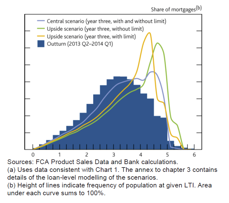
Today we delve into to the LTI data series in more detail.  Interestingly the control of LTI’s was the preferred macroprudential tool of choice by BIS and others. The UK recommendation was to ensure that mortgage lenders do not extend more than 15% of their total number of new residential mortgages at Loan to Income ratios at or greater than 4.5 times.

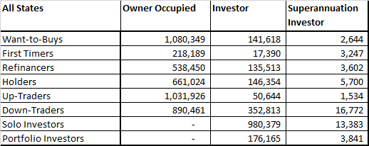
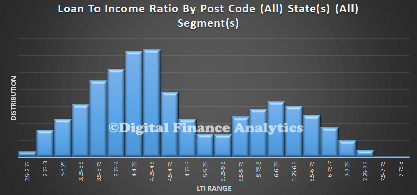
In our surveys we ask about a households mortgage loan, and its total gross income. From this we can derive an LTI ratio.

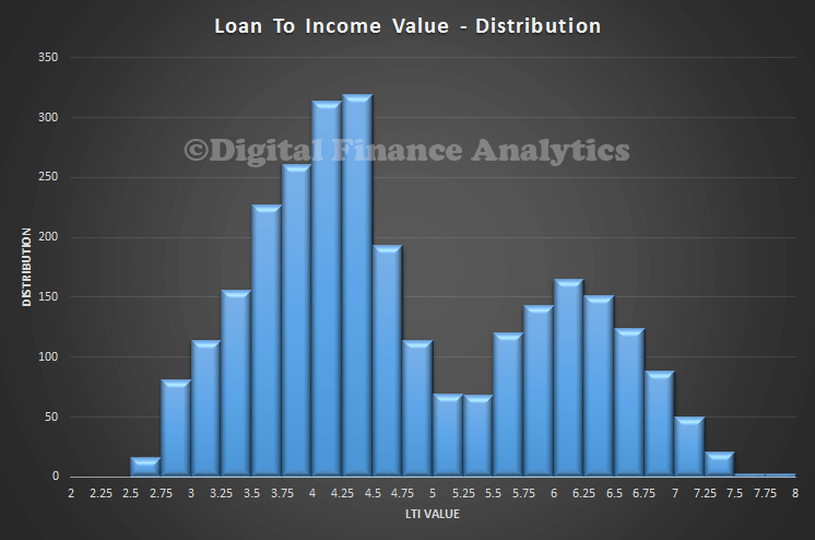
So, to recap. this is the current picture of LTI, averaged across post codes for all household segments, and all states. There is a peak around 4.5 times, and a second peak above 6 times.

LTIAllStates
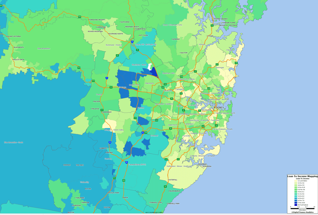
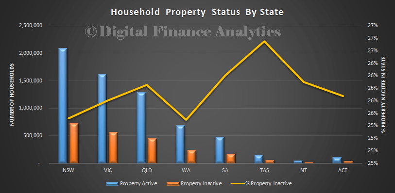
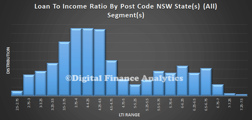
Now, we can break the data out by state, and household segment, using the DFA survey data. The state specific data for NSW largely mirrors the national average.

LTINSWHowever, looking at TAS, we see some interesting variations. There the LTI’s are higher, reflecting lower incomes relative to somewhat lower house prices. We have adjusted the sample to take account of the smaller populations.

LTITAS
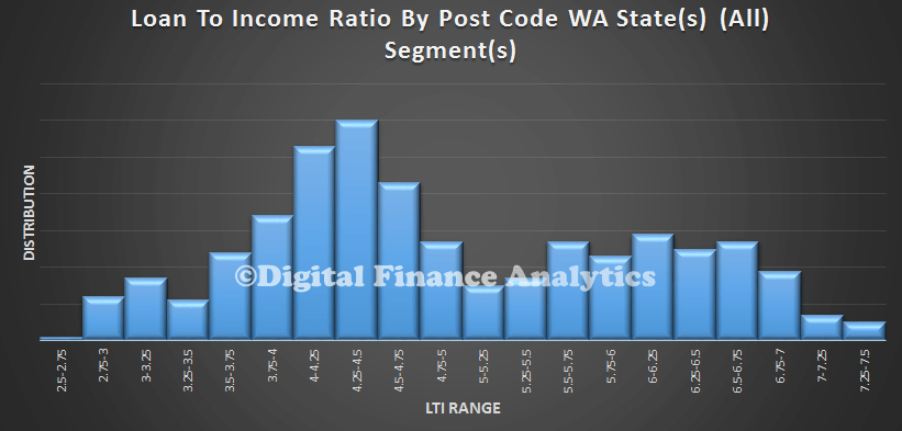
WA again shows variation, with a significant spread of higher LTI loans than the average.

LTIWA
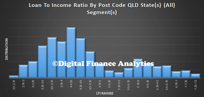
QLD shows greater concentration at lower LTI’s but then a second smaller peak at the upper end.

LTIQLD
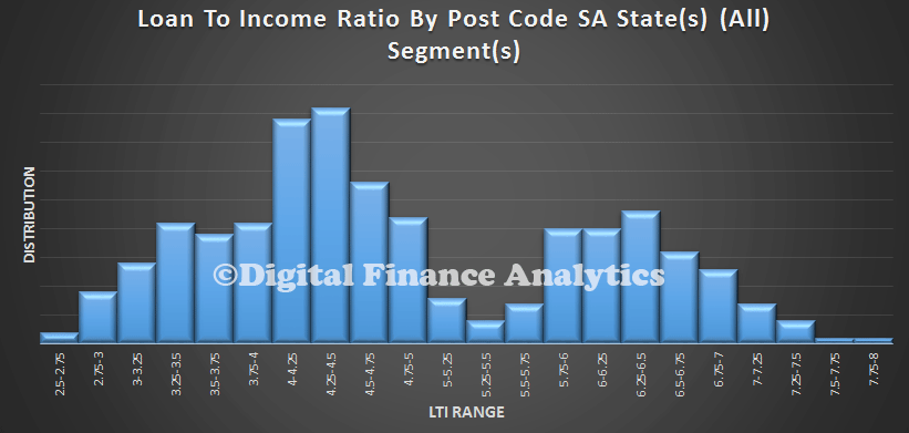
SA has quite a spike around 4.5 times, and a second peak around 6.5, again reflecting lower income levels in that state.

LTISA
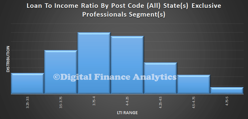
If we then start to look at segments, we find that affluent group, Exclusive Professionals, has a consistently lower LTI, compared with…
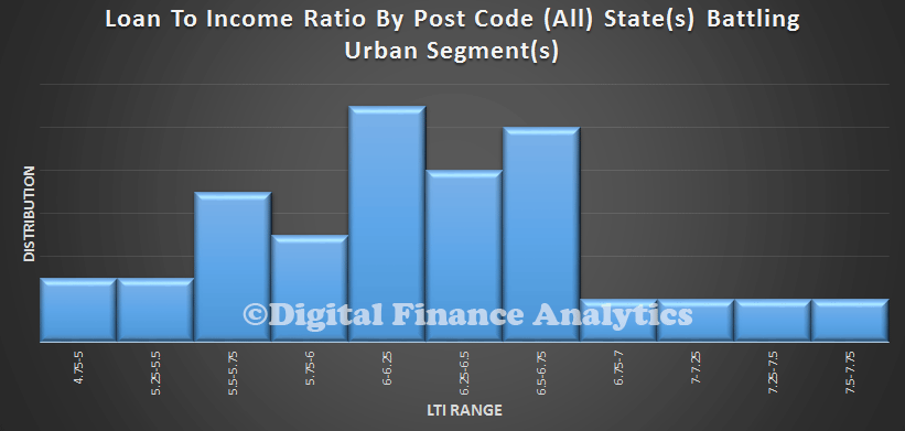
LTIAffluent… Battlers …

LTIBattlers
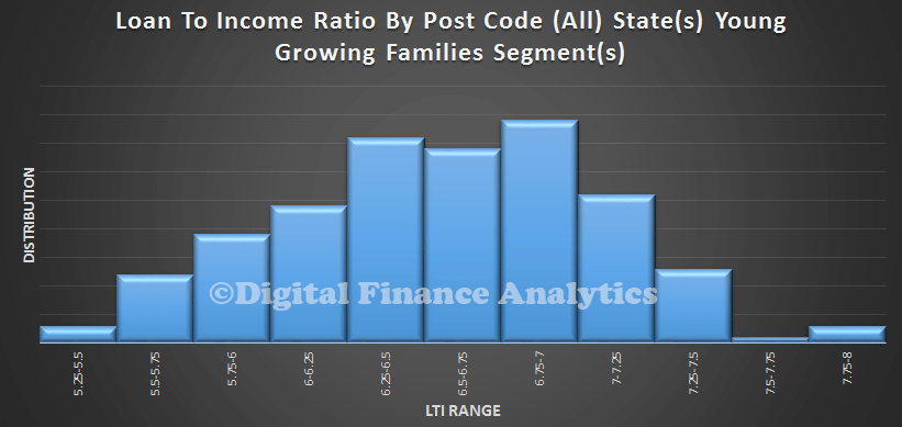
… And the Young Growing Families. Many of the First Time Buyers are in this segment. Effective LTI’s above 7 times are significantly extended.

LTIYoung I won’t go through all the other segments now, but the analysis suggests to me that the LTI metric is significant, and a good leading indicator of risks in the system. Remember interest rates are at rock bottom at the moment, so households can keep their heads above water. But as we know rates may rise, and unforeseen events may change individual circumstances.   Households with such high LTI’s have very little wriggle room.  As the interim FSI report said “Since the Wallis Inquiry, the increase in housing debt and banks’ more concentrated exposure to mortgages mean that housing has become a significant source of systemic risk”. “Higher household indebtedness and the greater proportion of mortgages on bank balance sheets mean that an extreme event in the housing market would have significant implications for financial stability and economic growth”.


Australian Household Loan To Income Ratios Are Worse Than In The UK

As we highlighted recently, the Bank of England is supporting the imposition of loan to income (LTI) ratios on banks in the UK, as a way to manage risks in the housing sector. So today, we start to explore loan to income data in Australia, captured though our rolling programme of household surveys. We start with some average national data, then look at the NSW picture in more detail. The UK recommendation, was to ensure that mortgage lenders do not extend more than 15% of their total number of new residential mortgages at Loan to Income ratios at or greater than 4.5. This recommendation applies to all lenders which extend residential mortgage lending in excess of £100 million per annum.

So whats the Australian data? We start by looking at the average LTI by postcode. The histogram shows the average LTI by household, calculated at a postcode level, and including all households with a mortgage. Income means the gross annual income, before tax or other deductions. We see that the LTI varies between 2.25 and 8. This is the ratio of household income to the size of the mortgage. We see a peak around 4.25-4.5 times, and a second peak at 6.25. Newer loans are more represented in this second peak.

Loan to income is a good indicator, because it isolates movements in house prices altogether from the data. The rule of thumb when I was working in the bank as a lender was to take 3 times the first income, and add one times the second income as a measure of the loan which was available to a household. Although rough, it was not too bad. Since then, lending rules have changed and criteria stretched. This ability to lend more has in turn led to higher house price inflation, thanks to supply/demand dynamics.

Australia-LTI-Average The current data from the UK shows that LTI’s there are spread between 0 and 6. Interestingly, we see that in their forward scenarios they suggest an emerging second peak around an LTI of 5 times. So LTI’s in Australia are more stretched than in the UK. The regulators here do not report LTI data regularly. This is a significant gap. LTI2We can map relative LTI average to post code. Here is the Sydney example, which highlights that there is a significant geographic concentration of high LTI loans in the western suburbs of Sydney.

Sydney-LTIThere is, further, a correlation between higher LTI loans and Mortgage Stress. Here is the stress data for Sydney.

NSW-Mortgage-StressThese are concerning indicators. In addition as we dig into the data we find that the second peak in the LTI data relates to younger buyers, often first time purchasers. They are highly leveraged into the property market, and are surviving thanks to the very low interest rates available today. If rates rise, this could be a problem. This suggests that the loan to income situation in Australia is more adverse than the UK scene. Whilst we note the UK regulator is acting, there is no macro-prudential intervention in Australia.  There should be.

Later we will present additional data across the other major centres, and examine in more detail those who are recent purchasers.

Investors Still Good To Go – Tax Breaks Ahoy!

Today we look at property investor trends in our household surveys series. We have been following the strong growth in investment lending, so was interested to see what property investors were thinking. Their appetite to invest appears to be slowing as we showed in our earlier post. Looking at those who are thinking about transacting, we find they are still attracted by the potential appreciation of property values, and the tax efficient nature of these investments. Low finance rates are a little less important, whilst getting returns better than deposits was up.

InvestorTransactDFAJun14Turning to the SMSF property investment area, the drivers are quite similar, although the potential for tax efficient investments is significant. They are also attracted by the leverage they can obtain.

InvestorSMSFTransactDFAJun14We have seen some interesting shifts relating to where potential SMSF property investors are getting their advice. The role of real estate agents has diminished in recent months (perhaps in reaction to the strong warnings from ASIC?) whilst mortgage brokers and internet forums and other sites have become more significant. We also see increasing personal knowledge guiding the trustees.

InvestorSMSFAdvisortDFAJun14Our last data point relates to the proportion of superannuation which is aligned to residential or commercial property. The most significant move was in the 10-20% range.

InvestorSMSFDistDFAJun14

How Household Property Buying Intentions Have Changed Since 1995

Today we continue our series on the latest results from our households surveys. Following our recent posts, we had several people ask about trends around some of the metrics we use. We have been running these surveys since 1995. So in this post we present a summary of trends from 1995 onwards. It provides an interesting perspective on how households have changed their behaviour in recent years.

IntentionsDFAJun14To explain the data, the bars show the rising trend in those households who are property inactive (inactive because they do not own property, and do not intend to in the foreseeable future). We show the percentage as a raw split, and also an adjusted split, to take account of population growth across states. The ratio of active to inactive households varies across individual states, and across geographic bands within states.

We also show the proportion of households who said they intended to transact in the next 12 months, and also their expectations, at the time, of house price movements for the next 12 months. Intention to transact was sitting at around 15% of households, until it fell as a result of the GFC. Since that time, it has powered ahead, and is significantly above long term trend – though note the recent fall. Turning to the proportion of households expecting property prices will rise in the coming 12 months, this is more variable, although the long term average prior to the GFC was close to 50%. If fell significantly in 2008 and 2009, before recovering, and reaching a high of 80% in 2013. It is still above long term trend, though falling slightly.

This data highlights the significant demand pressures on the property market, and helps to explain the high prices being achieved, although our interpretation is that the peak is now passed.

Next time we will consider households considering investment property.


Trading Up and Trading Down – Latest Survey Results

We continue our series on the results from our latest household surveys. Today we look at those seeking to trade up, and trade down. These are important segments, as they are both shaping the market.

Looking at up-traders first, these are households looking to sell to buy a larger property. Over one million households fall into this category. There are a number of reasons why households might do this, more space is the single most significant, then comes consideration of the investment potential of their property. Other reasons include life-style changes or job changes. From a trend perspective, the investment aspects of property have become slightly more important.

UpTradersDFAJun14Turning to down-traders, there are about 1.2m households looking to sell with the prospect of buying a smaller property, and/or an investment property. Increased convenience is the most significant reason to move, followed by the wish to release capital for retirement, and next, a switch to an investment property. Other reasons to trade down include illness, death of spouse, and unemployment. From a trend perspective, the demand to release capital for retirement is stronger, whilst unemployment is less significant now. Down traders are less bullish on future property price growth than other sectors. Only 30% of down traders think prices will rise in the next 12 months, whereas across the market 60%+ of households think prices will rise further in coming months.

DownTradersDFAJun14We can look in more detail at households over 60 years. The largest group resides in New South Wales, then Victoria.

State60+DFAJun14Within this group, we find a considerable number of down traders, most of whom are looking to down shift into a smaller place for owner occupation, although some prefer investment properties.

DownTraders60+DFAJun14We can look at where and what they want to buy. We find that the most significant demand from down traders over 60 years is for property closer to the city, and that more than half of these households prefer a unit. About 6% would consider property in a retirement village setting.

DownTradersPropertyType60+DFAJun14We find that certain factors will strongly influence over 60 down-traders considering a retirement village. Here are some of the most important. Price is the most significant factor, followed by access and facilities.

DownTradersRetirementV60+DFAJun14Next time we will look at investors.

Latest First Time Buyer Intentions

We continue updating our findings from our household surveys. Today we look at households who desire to enter the market. We highlighted yesterday that there are more people excluded from the market, but what of those who would like to buy? We start with a summary of households by type. This is the national picture, by segment:

CountChartDFAJun14Here is the data which highlights the large number of want to buys, and the relative small number of first time buyers (defined as those actively seeking). We will discuss the other segments later.

CountDFAJun14Looking at the want to buys, we see the most significant barrier is the level of house prices, in trend terms this is becoming an even more significant issue. Whilst fears of unemployment have fallen a little, concerns about future interest rate rises are up a little and costs of living continue to be a barrier for some.

WanttoBuysDFAJun14Turning to first time buyers, we see high house prices stand out as a constraining factor, whilst finding a place to buy has eased, a little.

FTBDFAJun14We found that there has been a swing towards units, and further from the city. We also see a rise in those who are unsure of what or where to purchase. This is a national picture, and there is considerable state variation which I won’t cover here.

FTBTypeDFAJun14We see some first time buyers continue to consider an investment property alternative, as a way to at least get on the property ladder, even if its in an area in which they do not wish to reside. They are most likely to consider an investment property around edge of the city. Even here they may well be competing with overseas investors!

FTBLocaleDFAJun14Finally, today, we look at which segments are most likely to use a mortgage broker. First time buyers are a little more likely, and well over 50 per cent would consider a broker.

BrokersDFAJun14Next time we will look at some of the other segments.

Property Inactive Households Rise Again, As Market Outlook Slows

Today we start a series on our updated household surveys, which will in due course feed into our next edition of the Property Imperative, due be released later in the year. The current edition, is still available, but there are some significant changes in household intentions since then.

We run our surveys continually, and so incorporate new data each week. The results we will discuss relate to data up to 13th June. We start by looking at the mix of households who are property active and inactive. We define property active households as those who either own, or intend to own a property to live in, or are investing in property, or both. We find that 25.88% of households are inactive. These households will rent, live with family or friends, or have other housing arrangements.

InactivePieDFAJun14Looking at the inactive status trend, we see that more households than ever are excluded from the property market.

InactiveDFAJun14We also see some state variations, with the highest proportion of inactive households founds in Tasmania and South Australia, whilst households in Western Australia, then New South Wales and Victoria have a lower mix of those inactive. That said, the absolute numbers are still increasing in these states too. This is the continuation of a long term trend.

StateInactiveDFAJun14So, next we turn to the active households and begin to look at the more detailed data. We start by looking across our segments, later we will dive more deeply into specific segmental analysis. We start with saving activity trends over time. We see that first time buyers (defined as those seeking to buy for the first time) are still saving hard, but other segments are less inclined or less able to save to purchase a property. Want to buy households (defined as those who would like to buy, but who cannot), are less likely to save than in 2013.

Saving-DFAJun14 Looking at transaction intentions over the next 12 months, we see a significant fall in those investors expecting to enter the market. First time buyers are still being squeezed out, and those seeking to refinance an existing loan are now slightly less likely to transact. Down traders are still active (these are households seeking to sell to buy a smaller property, to release capital, or other factors), though we detect a slowing here too. Therefore we predict that demand for property will decline from recent levels in coming months. This is especially the case in New South Wales and Victoria.

Transact12MonthsDFAJun14 Looking next at borrowing intentions, we see that property investors and up traders are most likely to seeking funding. First time buyers are needing to borrow more also, though as highlighted above they are less likely to transact. Therefore we expect to see some ongoing demand for investment housing funding, but at lower levels than those we saw last year. Funding for owner occupation will likely grow more slowly.

BorrowMore-DFAJun14

Finally, today we look at house price growth expectations. Overall expectation are still quite bullish, but we see a general small fall in the households who believe that house prices will rise in the next 12 months. Down traders are the least bullish.

PrceExpectations12MonthsDFAJun14So our initial findings highlight that we expect momentum in the property market to ease in coming months, even before any interest rate rise. In fact we think that the fall in momentum may postpone potential rate rises, and may begin to turn expectations towards a rate cut, especially if the proposed budget cuts are passed, and the international political scene gets more unstable.

Next time we will start to look at segment specific factors, as each segment exists in its own micro market, and dynamics are quite different.

Rampant Mortgage Discounting Available, For Some!

We just updated our latest household survey responses, and today I update our findings on mortgage discounting. We last covered bank margins in May, and highlighted the selective discounting in play as funding costs ease. People who do not switch will not be enjoying the best rates. One question in our survey asks new borrowers the discount they achieved from standard rates. We have been maintaining this data for a number of years. We are interested in the discount achieved on average from the standard headline rate. Both the mean discount and range of discounts has been increasing significantly.

First, here is the latest discount data, plotted against the RBA cash rate (the light blue line). We see that the mean average is close to 1% off standard rates. This is a record high. The darker blue line plots the discount achieved.

DiscountJun

What is even more interesting is the spread or range of discounts achieved. Here we chart the low and high mean spreads. We see that the range is wider than its been since before the GFC.

DiscountJun-RangeBanks continue to be selective about the business they want to write, and are offering significant discounts off their standard rates to some customers. Other customers, including most first time buyers are not achieving the same outcome on rates, with significantly lower discounts achieved. We see the highest discounts been offered by some players for investment loans, and other for larger loans, especially at lower LVRs. If your loans has a higher LVR the discount on average is lower.

However, it is clear that the discount achieved partly depends on how firmly prospective borrowers negotiate. Those who don’t ask, won’t get. My message is, in the current low credit growth environment, banks are more than willing to lend. They cannot necessarily relax lending standards to power growth, thanks to the recent broadsides from the RBA and APRA, so they are willing to go out of their way to grab good business, and discounting is the lever of choice. A word of warning to borrowers though, make sure these offers are not just introductory rates, else you might get a rude shock later when the “special” rate morphs back to a higher and uncompetitive normal rate.