The Property Imperative 7th Edition Is Available

The latest edition of our flagship report “The Property Imperative” is now available. The seventh edition updates the current state of the market by looking at the activities of different household groups using our recent primary research, blogs and other available data.

In this edition, we look at household debt servicing ratios, a critical indicator of potential mortgage stress in a low income growth environment. We focus on the impact of “The Bank of Mum and Dad” on first time buyers.

We also examine the latest dynamics in the property investment sector and discuss the future of commissions in financial services.

property-imperative-7-faceIn summary, the rate of mortgage loan growth is slowing, but the overall level of household debt continues to rise and investment loans are back in favour.

Request the free report [49 pages] using the form below. You should get confirmation your message was sent immediately and you will receive an email with the report attached after a short delay.

Note this will NOT automatically send you our ongoing research updates, for that register here.

[contact-form to=’mnorth@digitalfinanceanalytics.com’ subject=’Request for The Property Imperative Report 7′][contact-field label=’Name’ type=’name’ required=’1’/][contact-field label=’Email’ type=’email’ required=’1’/][contact-field label=’Email Me The Report’ type=’radio’ options=’Yes Please’ required=’1′ /][contact-field label=’Comment If You Like’ type=’textarea’/][/contact-form]

First Time Buyers Ever More Reliant On “The Bank of Mum and Dad”

As we continue our look at the results from our household surveys, we turn to first time buyers. They are still active in the market, though struggling with high home prices and tighter lending criteria. Last month the number of owner occupied first time buyers fell.

One significant factor in the mix is the extent of help to purchase from parents or other family members – the proverbial “Bank of Mum and Dad”. More than half of first time buyers are now seeking such help, and the average value has lifted to more than $83,000. The trend since 2010 is pretty stark. Those without access to family money are at a significant disadvantage.

bank-mum-and-dad-sept-2016-smLooking in more detail at the type of help, direct assistance with a deposit now accounts for more than 40%, whilst around 20% of first time buyers receive some help to meet ongoing mortgage repayments. In contrast, the proportion of families offering a bank guarantee is falling, along with making general gifts. Others get help with general expenses, especially child care costs, or purchase transaction costs.

bank-mum-and-dad-sept-2016-2 This inter generational shift of wealth is enabled by the accumulated value gained by older households as they ride the property price boom. Some will refinance to draw capital out for their kids. Sometimes this is used to help these first time buyers to purchase an investment property.

From our surveys we also find that as many first time buyers are being driven by the expectation of future capital growth as finding a place to live. They are also aware of the tax advantages, and the relative costs of renting.

survey-sep-2016-ftb-driversNo surprise then the biggest barriers to purchase are high home prices (more than 50%) and finding a place to buy (24%).

survey-sep-2016-ftb-barriersMore than 23% say they are not sure where they will buy, though nationally a suburban house is still the first choice.

survey-sep-2016-ftb-buyHowever, in the eastern states, high prices lead to more households going for a unit, or to purchase an investment property.

survey-sep-2016-ftb-whereOur first time buyer tracker shows that a significant proportion of first time buyers are going direct to the investment sector. The ABS reported the number of OO first time buyers fell last month. In original terms, the number of first home buyer commitments as a percentage of total owner occupied housing finance commitments fell to 14.1% in July 2016 from 14.3% in June 2016. The number fell from 8,486 to 7,586, down more than 10%.  The average loan size was $335,600, 0.2% higher than last month.

home-lenidng-all-ftb-july-2016-absNext time we look at down traders.

Mortgage Refinance Momentum Remains Strong

Continuing our examination of the latest household survey results, today we look at the refinance segment. This sector of the market is poorly understood, not least because refinance of investment loans are not separately reported in the official statistics.  However, yesterday we got some insights from the new RBA Governor’s handout pack.

It shows that currently more than 30% of all home loan approvals are for refinancing (and this data includes estimates of investor refinancing). This is an all time high.

Graph 12: Refinancing Approvals

Actually, the average term for a home loan is dropping, to below 4 years, and a quarter of the book is churning each year. Here is the reason.

Graph 11: Variable Housing Interest Rates

New loans are being deeply discounted, (compared with rates being paid by loan holders). The RBA says:

The spread between the benchmark SVRs and the lowest available advertised rates has increased in recent years. The difference reflects both advertised and unadvertised discounts. It is not unusual for the discounts to be up to 1½ percentage points. Changes in discounts only affect new borrowers (and not the existing stock of mortgages).

This discounting is supported by lower funding costs.

Graph 13: Cash Rate and Funding Costs

As a result, bank net interest margins are largely unchanged.

Graph 1: Net Interest Margin

The gap is being closed by lower deposit interest rates (other than for long-dated term deposits which the RBA says accounts for about 2% of bank funding only).

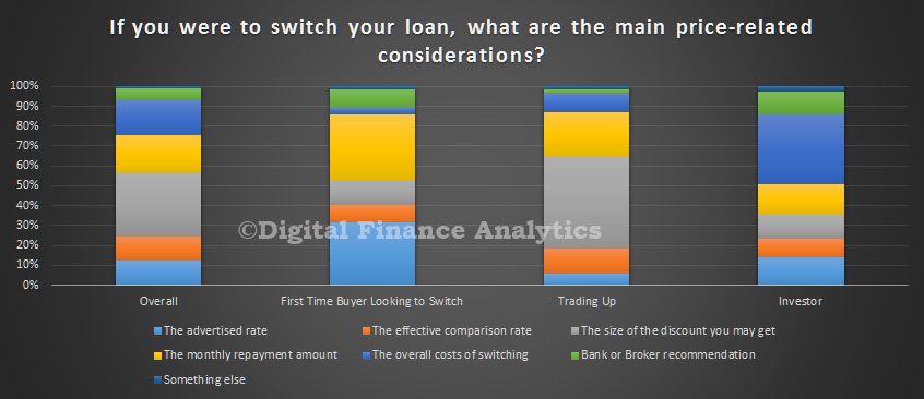
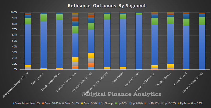
So against this backcloth, the 1.3 million households in the refinance segment are seeking to refinance, driven by the desire to reduce monthly payments (38%), better rates (18%) or to lock in an attractive fixed rate (17%). Poor service only accounts for a small proportion of the transactions.

survey-sep-2016-refinanceIf we analyse the drivers by loan size, we see that brokers are tending to be more proactive when the loan is larger, and here refinance is more about releasing cash than just a lower rate. Indeed, much of this cash release is going back into the investment property sector, as we discussed yesterday.

survey-sep-2016-refinance-driversOverall, households with loans in the $250-500k band are most likely to refinance.

survey-sep-2016-re-sizeLarger loans are more likely to be refinanced to an interest only loan.

survey-sep-2016-ref-rtpe So refinancing activity is supporting market momentum. Though total dwelling transfers are down, as shown by the ABS data, released this week, remember that a refinanced transaction would not necessarily be counted.

This chart, using ABS data, shows the total transfers of all dwellings (houses and other) and we see a fall in total transfers from Sept 2015, a peak of more than 120,000 to below 100,000 per quarter. Mapping the main centres, and smoothing the data a little, we see that Brisbane fell 10%, Melbourne 9% and Sydney 6%. So beware using this data to argue that housing momentum is easing, it is not that simple. The latest data may also be revised later by the ABS.

transfers-sep-2016So, refinancing is an important element in understanding the current dynamic, and there are more households in the market now for a refinanced deal than a year ago. This explains the adverts “has your home loan got a 3 in front of it?” as shown below….

ybr-advert

Investors Betting On The Property Market

As we look across our latest household research, today we home in on property investors. We showed yesterday there is strong demand from both portfolio investors (those with multiple investment properties) and from solo investors (those with one or two properties). These segments are being motivated by the tax efficiency of the investment (36%), ongoing expectation of property capital growth (25%, compared with 28% a year ago), attractive overall returns compared with deposit accounts (18%) and low financing interest rates (14%). Overall, these drivers have been consistent through the last property boom cycle.

survey-sep-2016-invDrilling into solo investors, we see the same focus on tax efficiency (30%) and the lure of higher returns compared with bank deposits (35%). Indeed, as cash rates have fallen, we have see more switching from cash to property, one of the trends supporting the market.

survey-sep-2016-solo-invThere are a number of barriers to investors, apart from the obvious one of having already bought a property (43%), around 16% of investors are having difficulty getting the funding they need (16% compared with 4% a year ago) as lenders tighten their underwriting standards and income ratios. Fear of changes to regulation have receded from 21% a year back to 11% now. So essentially the main brake on property transactions is tighter standards. Property supply does not appear to be a problem.

survey-sep-2016-inv-barriersWe see a continued rise in SMSF investors adding property to their portfolio, with around 4% of funds holding residential property.  Once again tax efficiency (31%) and appreciating capital values (25%) are the main drivers, supported by low financing rates (15%).

survey-sep-2016-super-invThe proportion of property in a SMSF varies, with 20-40% being the most popular option.

survey-sep-2016-smsf-distFinally, it is worth noting that SMSF trustees are getting their investment property advice mainly from internet sites or forums (21%) or mortgage brokers (24%, compared with 21% a year ago). They also rely on their own knowledge (16%), Accountants (15%) or real estate agents (11%).  Mortgage brokers appear to be more in favour now as a source of guidance.

survey-sep-2016-trustee-adviceSo, in summary the investment sector is still strong, driven by the market fundamentals of expected capital growth and tax benefits, supported by ultra-low interest rates. Tightening underwriting standards make it harder for some to get the finance they require. However, we conclude the property investment boom is still largely intact.

It is worth also reiterating our earlier observation that many prospective investors are being drawn to the eastern states, irrespective of where they live. These “honey pots” are drawing in the bulk of transactions.

Demand For Property “Safe As Houses”

As we finalise the next edition of the Property Imperative, we turn to the latest survey results, looking at household attitudes to property. The growth in volume of loans may be down a little, but their appetite for property is still strong. Recent auction results also underscore this. Today we compare the cross-segment survey responses, before in later posts diving into the more detailed results.

A quick reminder, we use the results from our 26,000 household surveys, and segment the results as described in the “segment cookbook“.

First we look at home price expectations.  Overall households are quite bullish on future capital growth, with portfolio investors most confident (68% expect a rise), 67% of solo investors and 58% of up traders expecting further gains. More than half of holders, and first time buyers also think prices will rise. Down traders are the least positive, here 20% think prices will continue to rise. There were some state variations, but we won’t discuss that here, other than to say NSW and VIC seem most bullish.

survey-sep-2016-pricesDemand for finance is also quite strong, with 92% of portfolio investors looking to borrow more (up from 87% a year ago) and 58% of solo investors up from 51% a year ago also seeking to borrow. Looking at first time buyers, 64% are seeking to borrow, compared with 60% a year ago. Those who are refinancing and borrowing more is also up, 38% compared with 30% a year ago.

survey-sep-2016-borrowInvestors, down traders and refinancers are most likely to transact in the next 12 months. 67% of portfolio investors are looking to buy another property, 49% of solo investors, and 40% of refinancers are in the market. The proportion of first time buyers continues to sit around 9%.  As we will see in later posts, there are more barriers to getting a loan now, thanks to tighter underwriting standards.

survey-sep-2016-transactFirst time buyers are saving hard (despite low deposit account rates and flat incomes), 76% compared with 72% a year ago. The proportion of want to buys (not actively seeking to buy) who are saving is down from 21% a year ago to 19% now. The combination of high prices, tighter lending standards and limited incomes all work against them.

survey-sep-2016-savingFinally, in the overview, those seeking to refinance are most likely to use a mortgage broker (79%, compared with 75% a year ago), then first time buyers (61%) and portfolio investors (51%). Holders apart, down traders are the least likely to seek assistance from a mortgage broker.

survey-sep-2016-use-brokerSo, we are still seeing strong demand for property. The question is whether there is supply of property, and mortgages to meet the demand. Our results also confirm that property investors are back in the game.

New DSR Comparisons Confirms High Australian Household Debt

Australian households have the third highest, and rising debt service ratio, when compared to a wide range of advanced western economies, according to new data released by the Bank for International Settlements (BIS).

This is a timely update from BIS who calculated DSR’s for households and non-financial companies using data from countries national accounts. You can read about their approach here.

The comparative results are interesting, especially give low global interest rates. There are significant variations and the last results are to March 2016.

Australia is near the top of the DSR scores at 15.1, well behind Netherlands and just below Norway. Many other advanced economies are much lower. However, we also see a different trajectory in Australia, with stronger growth here, compared with a static or falling pattern elsewhere.

This is further evidence of the household debt problem here. Of course we had cash rate cuts later in the year, but debt has continued to rise, and our estimate is average household DSR currently sits around 16. If we are right, the rising trajectory has continued.

dsr-bis-mar-2016You can read our more detailed DSR analysis of Australian households, where we discuss the profile across postcodes.

Household Financial Security Confidence Improves Again

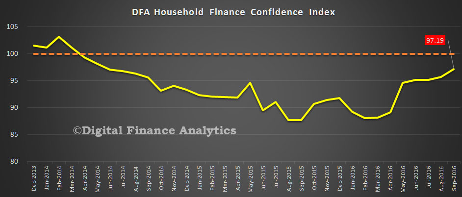
The latest edition of the Digital Finance Household Finance Confidence Index, to end August is released today. Overall the index rose again, from 95.1 to 95.8.

Household costs were relatively contained, whilst many received a boost from the RBA cash rate cut. Some savers were able to take advantage of higher term deposit rates, although others saw their returns on cash deposits falling further. Income growth remained static, but net worth improved thanks to rises in the value of property and shares. Overall the index remains below a neutral setting, but some households in some states are now well into positive territory.

fci-aug-2016 The cash rate cut helped to propel the confidence of those with owner occupied and investment property, while those who are property inactive did not show the same rise. In addition, the more recent positive home price rises bolstered property investors.

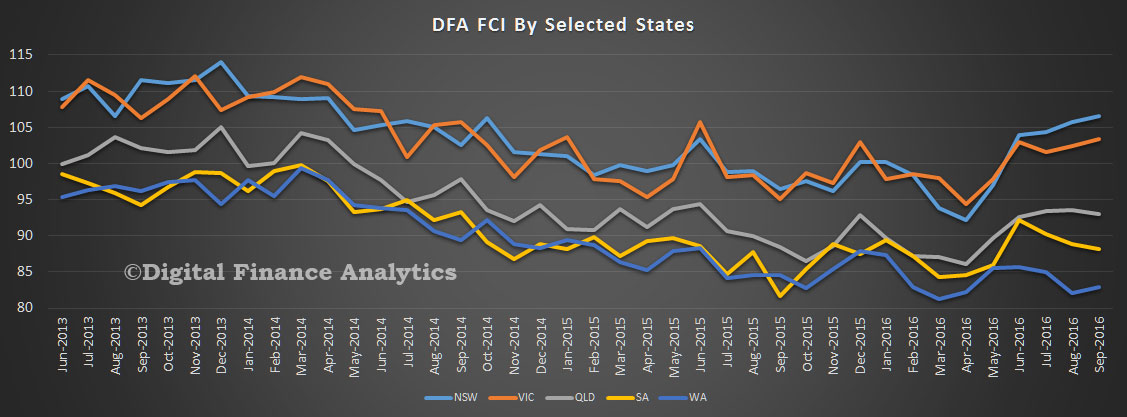
fci-aug-2016-ptyThe state variations continue to widen, with households in NSW and VIC well into positive territory, whilst those in WA languish.

fci-aug-2016-statesBy way of background, these results are derived from our household surveys, averaged across Australia. We have 26,000 households in our sample at any one time. We include detailed questions covering various aspects of a household’s financial footprint. The index measures how households are feeling about their financial health. To calculate the index we ask questions which cover a number of different dimensions. We start by asking households how confident they are feeling about their job security, whether their real income has risen or fallen in the past year, their view on their costs of living over the same period, whether they have increased their loans and other outstanding debts including credit cards and whether they are saving more than last year. Finally we ask about their overall change in net worth over the past 12 months – by net worth we mean net assets less outstanding debts.


Debt Servicing Ratio 3D Mapping Highlights Mortgage Hot Spots

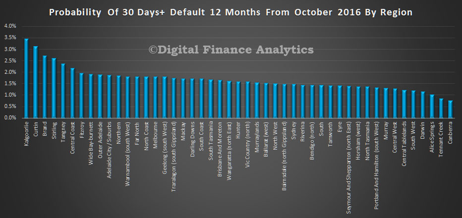
Continuing our detailed analysis of mortgage LVR, DST and LTI across Australia, using data from our houshold surveys, today we feature a 3D map of relative Debt Service Ratios (DSR) by postcode. There are some interesting variations. The greater the height, the higher the DSR.

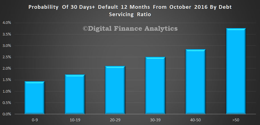
As we said in our earlier post, DSR is is the ratio between gross household income and the amount paid on the mortgage. More specifically, the DSR is defined as the ratio of interest payments plus amortisations to income. As such, the DSR provides a flow-to-flow comparison – the flow of debt service payments divided by the flow of income. We think the DSR is an important lens to look at households debt footprint, but the ratio is highly sensitive to interest rates because as interest rates fall, the ratio improves. Current DSR ratios are often seen as reasonable because of the current ultra low rates, but of course that tells us nothing about the impact of rising rates later. The average DSR is 16.8, but there is a very wide spread.

oz-dsr-sept-2016


All Lenders Are Not The Same

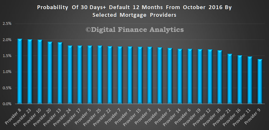
In the latest of our series on deep home loan segmentation, using DSR, LTI and LVR we compare the averages across a number of lender portfolios. The chart shows the average from a range of 20 or so lenders in our surveys, including banks, non-banks, credit unions and building societies. We have selected lenders to give an indication of the spread of the results, but have masked the individual brands. For some, the average LVR in the portfolio is sitting north of 80%, whilst others are below 60%. The highest DSR is averaging at 32, whilst the lowest in 7.8. The highest LTI is on average 7.3, compared with 2.6 for the lowest.

lender-dsr-dtiThese findings underscore that underwriting criteria do vary, risks in the portfolio will also vary, and the mix of business does change across the market.

Another view is the average loan value in the portfolio. Once again we found a surprising range of values, from just below $600k, down to $180k. Many factors influence the average of course, including lending policy, type of loan, time on book, how much households have paid ahead, and other factors.

lender-portfolioHere is a split of average balances by lender of loans paid ahead and those who are not.

lender-portfolio-paid-aheadWe see that households who are paying ahead generally have lower loan balances (reflecting differences in the LVR, LTI and DSR status). This chart provides more insight.

lender-portfolio-paid-ahead-compThose who have paid ahead have a lower LTI (2.7 compared with 6.0), lower DSR (9.5 compared with 19.6) but a slightly higher LVR. The portfolio averages are LTI 5.1, DSR 16.9 and LVR 68%.

Another interesting lens is the mortgage discounts being achieved by households, compared with LVR, LTI and DSR. It appears the best discounts are being made on LVR’s below 80%, but LTI and DSR have less bearing on the achieved rates. A low DSR or LTI does not necessarily translate into a bigger discount – something which lenders may want to reconsider, given the relative risks involved.

discount-dsr-dti

Household Cash Flows and Monetary Policy

The RBA released the September 2016 edition of the Bulletin today. The article “The Household Cash Flow Channel of Monetary Policy by Helen Hughson, Gianni La Cava, Paul Ryan and Penelope Smith is interesting, but possibly flawed.

It looks at the impact of households when the cash policy rate is changed. Lower interest rates can encourage households to save less and bring forward consumption from the future to the present (the inter-temporal substitution channel).

Lower interest rates can also lift asset prices, such as housing prices, and the resulting increase in household wealth may encourage households to spend more (the wealth channel). Additionally, lower interest rates reduce the required repayments of borrowing households with variable-rate debt, resulting in higher cash flows and potentially more spending, particularly for households that are constrained by the amount of cash they have available. At the same time, lower interest rates can reduce the interest earnings of lending households, which may, in turn, lead to lower cash flows and less spending for these households. These last two channels together are typically referred to as ‘the household cash flow channel’.

The analysis in this article focuses on a fairly narrow definition of the cash flow channel. It examines the direct effects of interest rates on interest income and expenses, but abstracts from monetary policy changes that have an indirect cash flow effect by influencing other sources of income, such as labour or business income.

rba-sep-2016-1Household disposable income, or cash flow, comprises wages and salaries, property income (including interest paid on deposits) and transfers, less taxes and interest payments on debt. The household sector in Australia holds more interest bearing debt than interest earning assets. Indeed, households have increased their debt holdings at a rapid pace since the early 1990s, mainly due to an increase in mortgage debt. For the household sector as a whole, the level of household debt now exceeds the level of directly held interest earning deposits by a significant margin. However, since the mid 2000s, slower growth in household debt and increases in interest-earning deposit balances (including balances held in mortgage offset accounts) has led to a decline in net interest bearing debt. This means that the household sector is a net payer of interest. Household net interest payments increased through the 1990s and early 2000s, mainly reflecting the rise in net household debt, but trended down from 2007 as interest rates and net debt declined.

The data shown above do not account for interest earning assets held in managed superannuation accounts, which have increased substantially since the early 1990s. The majority of these assets cannot be accessed until retirement.

This article finds evidence for both the borrower and lender cash flow channels, but the borrower channel is estimated to be the stronger channel of monetary transmission. One reason for this is that while there are roughly similar shares of borrower and lender households in the Australian economy, the average borrower holds two to three times as much net debt as the average lender holds in net liquid assets. Another reason is that the sensitivity of spending to changes in interest-sensitive cash flow is estimated to be larger for borrowers than for lenders based on statistical analysis using household-level data.

Overall, the estimates suggest that the cash flow channel is an important channel of monetary transmission; the central estimates indicate that lowering the cash rate by 100 basis points is associated with an increase in aggregate household income of around 0.9 per cent, which would, in turn, increase household expenditure by about 0.1 to 0.2 per cent through the cash flow channel.

We have a couple of issues with their analysis. First, recent events have shown that when the cash rate is cut, the benefit is not necessarily passed through to households, thanks to weak competition in the banking sector. When it is, the benefit is often not equally shared between borrowers and savers, and not all savers benefit equally. In fact, looking at the trends in recent years, savers have been taken to the cleaners, as banks repair and protect their margins. So benefits are overstated.

The second issue is households will be impacted by the confidence surrounding a rate move. If they become less confident, they will be less likely to spend, preferring to save for later. So a rate cut often lowers household spending – this is one of the significant reversals we have seen recently – and central banks are still trying to get to grips with the implications. The link between low interest rates and household spending, yet alone broader economic growth appears broken.

So, whilst the article is a good attempt, we think it overstates the benefits of cash rate cuts in the current cycle.