All Lenders Are Not The Same

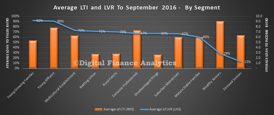
In the latest of our series on deep home loan segmentation, using DSR, LTI and LVR we compare the averages across a number of lender portfolios. The chart shows the average from a range of 20 or so lenders in our surveys, including banks, non-banks, credit unions and building societies. We have selected lenders to give an indication of the spread of the results, but have masked the individual brands. For some, the average LVR in the portfolio is sitting north of 80%, whilst others are below 60%. The highest DSR is averaging at 32, whilst the lowest in 7.8. The highest LTI is on average 7.3, compared with 2.6 for the lowest.

lender-dsr-dti
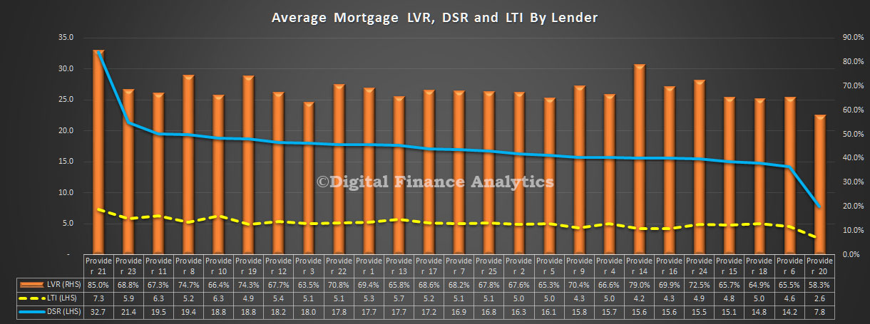
These findings underscore that underwriting criteria do vary, risks in the portfolio will also vary, and the mix of business does change across the market.

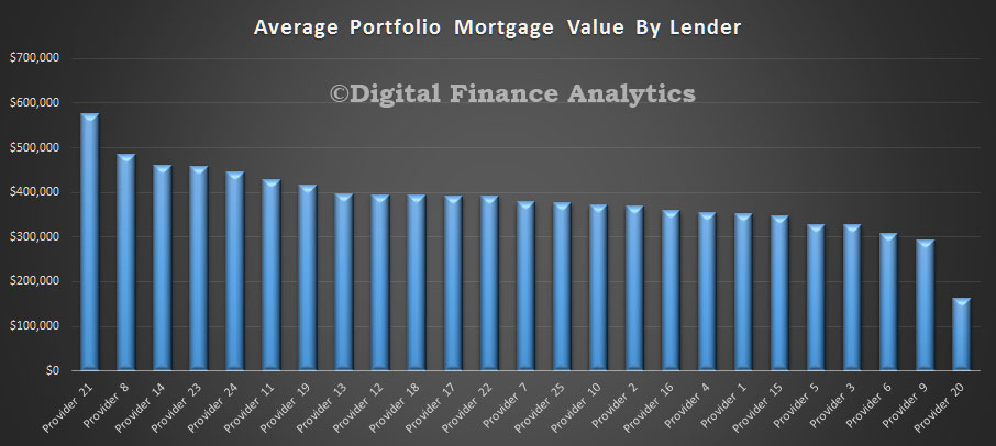
Another view is the average loan value in the portfolio. Once again we found a surprising range of values, from just below $600k, down to $180k. Many factors influence the average of course, including lending policy, type of loan, time on book, how much households have paid ahead, and other factors.

lender-portfolioHere is a split of average balances by lender of loans paid ahead and those who are not.

lender-portfolio-paid-ahead
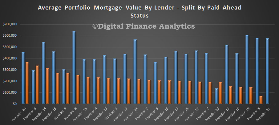
We see that households who are paying ahead generally have lower loan balances (reflecting differences in the LVR, LTI and DSR status). This chart provides more insight.

lender-portfolio-paid-ahead-comp
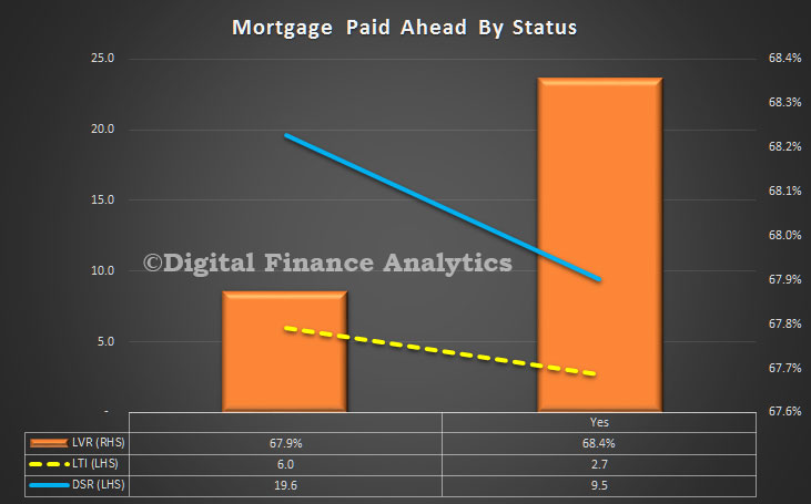
Those who have paid ahead have a lower LTI (2.7 compared with 6.0), lower DSR (9.5 compared with 19.6) but a slightly higher LVR. The portfolio averages are LTI 5.1, DSR 16.9 and LVR 68%.

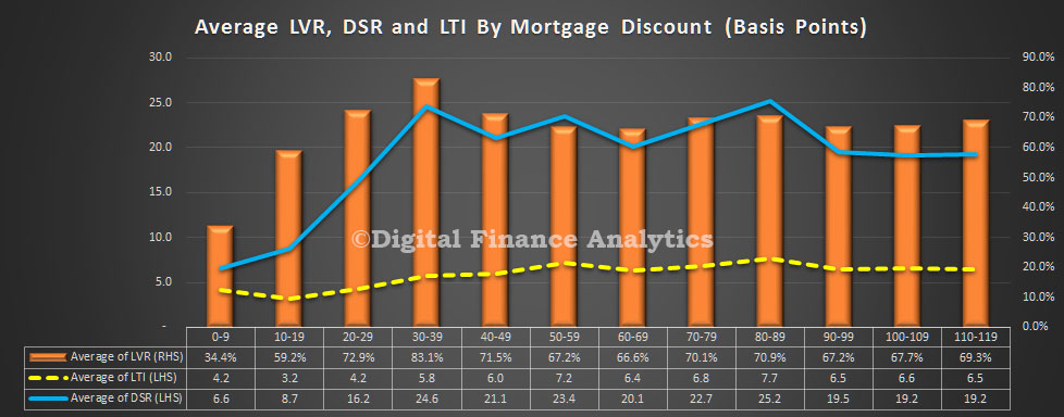
Another interesting lens is the mortgage discounts being achieved by households, compared with LVR, LTI and DSR. It appears the best discounts are being made on LVR’s below 80%, but LTI and DSR have less bearing on the achieved rates. A low DSR or LTI does not necessarily translate into a bigger discount – something which lenders may want to reconsider, given the relative risks involved.

discount-dsr-dti

Household Cash Flows and Monetary Policy

The RBA released the September 2016 edition of the Bulletin today. The article “The Household Cash Flow Channel of Monetary Policy by Helen Hughson, Gianni La Cava, Paul Ryan and Penelope Smith is interesting, but possibly flawed.

It looks at the impact of households when the cash policy rate is changed. Lower interest rates can encourage households to save less and bring forward consumption from the future to the present (the inter-temporal substitution channel).

Lower interest rates can also lift asset prices, such as housing prices, and the resulting increase in household wealth may encourage households to spend more (the wealth channel). Additionally, lower interest rates reduce the required repayments of borrowing households with variable-rate debt, resulting in higher cash flows and potentially more spending, particularly for households that are constrained by the amount of cash they have available. At the same time, lower interest rates can reduce the interest earnings of lending households, which may, in turn, lead to lower cash flows and less spending for these households. These last two channels together are typically referred to as ‘the household cash flow channel’.

The analysis in this article focuses on a fairly narrow definition of the cash flow channel. It examines the direct effects of interest rates on interest income and expenses, but abstracts from monetary policy changes that have an indirect cash flow effect by influencing other sources of income, such as labour or business income.

rba-sep-2016-1Household disposable income, or cash flow, comprises wages and salaries, property income (including interest paid on deposits) and transfers, less taxes and interest payments on debt. The household sector in Australia holds more interest bearing debt than interest earning assets. Indeed, households have increased their debt holdings at a rapid pace since the early 1990s, mainly due to an increase in mortgage debt. For the household sector as a whole, the level of household debt now exceeds the level of directly held interest earning deposits by a significant margin. However, since the mid 2000s, slower growth in household debt and increases in interest-earning deposit balances (including balances held in mortgage offset accounts) has led to a decline in net interest bearing debt. This means that the household sector is a net payer of interest. Household net interest payments increased through the 1990s and early 2000s, mainly reflecting the rise in net household debt, but trended down from 2007 as interest rates and net debt declined.

The data shown above do not account for interest earning assets held in managed superannuation accounts, which have increased substantially since the early 1990s. The majority of these assets cannot be accessed until retirement.

This article finds evidence for both the borrower and lender cash flow channels, but the borrower channel is estimated to be the stronger channel of monetary transmission. One reason for this is that while there are roughly similar shares of borrower and lender households in the Australian economy, the average borrower holds two to three times as much net debt as the average lender holds in net liquid assets. Another reason is that the sensitivity of spending to changes in interest-sensitive cash flow is estimated to be larger for borrowers than for lenders based on statistical analysis using household-level data.

Overall, the estimates suggest that the cash flow channel is an important channel of monetary transmission; the central estimates indicate that lowering the cash rate by 100 basis points is associated with an increase in aggregate household income of around 0.9 per cent, which would, in turn, increase household expenditure by about 0.1 to 0.2 per cent through the cash flow channel.

We have a couple of issues with their analysis. First, recent events have shown that when the cash rate is cut, the benefit is not necessarily passed through to households, thanks to weak competition in the banking sector. When it is, the benefit is often not equally shared between borrowers and savers, and not all savers benefit equally. In fact, looking at the trends in recent years, savers have been taken to the cleaners, as banks repair and protect their margins. So benefits are overstated.

The second issue is households will be impacted by the confidence surrounding a rate move. If they become less confident, they will be less likely to spend, preferring to save for later. So a rate cut often lowers household spending – this is one of the significant reversals we have seen recently – and central banks are still trying to get to grips with the implications. The link between low interest rates and household spending, yet alone broader economic growth appears broken.

So, whilst the article is a good attempt, we think it overstates the benefits of cash rate cuts in the current cycle.

Home Loan Insights From Deep Segmentation

As we continue our journey into the depths of home loan segmentation analysis, using LTV, DSR and LTI ratios, we begin to see some insightful patterns emerging. Today we delve into our deep segmentation models.

We start by looking across the states and have sorted the results by DSR (Debt Servicing Ratio), as this is the most insightful lens, in our view. Households in NSW have the highest DSR, no surprise perhaps because home prices have risen strongly – so mortgages have grown – at a time when incomes have not. Remember DSR is based on current low interest rates, should they rise, the DSR will also raise. NSW also holds the prize for the highest average Loan to Income ratio, again because of the rise in market values, and mortgages. However, the average Loan to Value ratio is sitting at around 68%, compared with 72% in WA. DSR and LTI are the better indicators of potential risk, compared with LVR which only really comes into play as a factor if trying to sell into a downturn.

state-dsr-dtiNext we look at age bands. Younger households have on average higher DSR’s, and LVR’s. But it is worth highlighting that the highest LTI’s are residing in older households, because here whilst LVR’s are lower, limited incomes mean they are more exposed. We are seeing a significant rise in the number of households who still have a mortgage to pay off as they enter retirement.

age-dsr-dtiIf we look at the picture by $50k income bands we see that the highest LVR’s, LTI’s and DSR’s rest with households whose income is in the range $50-100k. Interestingly, LVR’s do not vary that much by income band, but both LTI’s and DSR’s improve with income. This is because more wealthy households are able to buy more expensive property, and service larger loans. Remember these cuts tell us nothing about the relative number of households or loans in each income band.

income-dsr-dti That analysis shows more than 46% of households with a mortgage have an income of $50-100k, and 26% have an income of $100-150k, whereas only 0.29% have an income of over $500k.

income-distTurning on our zonal segmentation, we see that households living in the inner suburbs have the highest DSR. This is because home prices are higher here, compared with outlying areas. Households in the regional and rural areas tend to have, on average, lower DSR, LTI and LVRs.

zones-dsr-dti  More than 12% of households live in the inner suburbs, compared with 26% in the outer suburbs and 22% in the urban fringe.

zone-countstSo to our master household segmentation. We use this to separate households based on a range of demographic indicators – which have proved reliable over many years. Young Growing families have the highest DSR (18.3) and the highest LVR (92.5%). Many have bought quite recently and are leveraged to the max. It is worth looking at the various measures across these segments as there are some fundamentally different things in play with different risk outcomes and sensitivities.

segment-dsr-dtiFinally, for today we look at the data through the lens of our technographic segmentation. We classify households into digital natives, migrants and luddites. The descriptions are self-explanatory, in that natives have always been digitally aligned, whereas migrants have adopted digital channels and luddites are resisting. Interestingly, natives have a higher DSR, LVR and LTI, compared with the other segments. This is because on average they are younger, and more likely to be in the main urban areas.

Such segmentation is important because Fintech’s need to understand where their potential markets are. We featured uno yesterday, a relatively new digital alternative to brokers. Digital natives would be directly in their sights.

techno-dsr-dtiNext time we will look at DSR, LVR and LTI by individual lenders – there are some interesting variations.

So Where Are DSR’s Highest?

As we continue our analysis of household mortgage debt, and having described the ratios we are using (Loan to Value (LVR), Loan to Income (LTI) and Debt Servicing Ratio (DSR)) we can drill into the more specific data slices. Today we look across the top ten locations by DSR.

complex-sept-2016We see at once that some of the highest DSR ratios are found in some of the more affluent suburbs – such as Torak (VIC) and the lower north shore in NSW. In these locations, home prices are very high, and as a result households have extended their borrowings – with high LVRs, DSRs and DTIs. This suggests that those will more ability to borrow and service large mortgages are most in debt.

We can then look at each state in more detail. For example, here is NSW.

complex-sept-2016-nswAs we go down the list we begin to see a more mixed set of locations figuring in the top 10, though generally still closer to the CBD. We see somewhat similar pictures in WA, QLD and VIC.

complex-sept-2016-wa complex-sept-2016-qld complex-sept-2016-vicOf course averages can be misleading, as we see a small number of mortgages well above $1m. We also see a high penetration of interest only loans, and recent refinancing events. Provided interest rates remain low, and incomes are solid, the risks are probably relatively well contained. It would be a different matter if home prices slipped significantly.

As we go into more detail in later posts, we will identify some other factors are creating more risks within the portfolio.

Understanding Household Income, Wealth and Property Footprints

Today we commence the first in a new series of posts which examines household wealth, income, property and mortgage footprints. We will look at the latest trends in LVR and LTI; highly relevant given the tightening standards being applied in other countries, including Norway and New Zealand. We will be using data from our rolling household surveys, up to 9th September 2016.

Today we paint some initial pictures to contextualize our subsequent more detailed analysis, which will flow eventually into the next edition of the Property Imperative, due out in October 2016.

To start the analysis we look at the relative distribution of our master household segments. You can read about our segmentation approach here.

segment-distNext we show the relative household income and net worth by our master segments. The average household across Australia has an estimated annual income of $103,500 and an average net worth (assets less debts) of $600,600; the bulk of which is property related.

segments-income-and-wealthThere are wide variations across the segments. The most wealthy segment has an average annual income of more than eight times the least wealthy, and more than ten times the relative net worth.

Across the states, the ACT has the highest average income and net worth, whilst TAS has the lowest income (half the income), and NT the lowest net worth (third the net worth).

states-income-and-wealthProperty owners are better placed, with significantly higher incomes and net worth, compared with those renting or in other living arrangements. Those with a mortgage have higher incomes, but lower net worth relative to those who own their property outright.

propertys-income-and-wealthThe loan to value (LVR) and loan to income (LTI) ratios vary by segment.

lti-and-lvr-by-segmentYoung growing families, many of whom are first time buyers, have the higher LVR’s whilst young affluent have the higher LTI’s (along with some older borrowers). Bearing in mind incomes are relatively static, those with higher LTI’s are more leveraged, and would be exposed if rates were to rise.

Finally, we see that many loans have been turned over, or refinanced relatively recently, so the average duration of a mortgage is under 4 years.

inceptionThere is a relatively small proportion of much older dated loans which we have excluded from the chart above. Nearly a quarter of all loans churned in 2015, and 2016 shows the year to date count.

Next time we will look at LTI and LVR data in more detail.

The Top Digital Suburbs Around Perth

As we continue our series on Australia’s top digital suburbs, today we look at WA, and the region around Perth. The top postcode is 6210, which includes Coodanup, Dudley Park, Erskine, Falcon, Greenfields, Halls Head, Madora Bay, Mandurah, Meadow Springs, San Remo, Silver Sands, and Wannanup around 65 kms from Perth.

The location of digitally active households is becoming an increasingly important question, as mobile penetration and use climbs. It fundamentally changes the optimal marketing approach and channel strategy.

Using data from our household surveys we track the proportion of households with a preference for using digital devices – especially smartphones – for their banking interactions and other online activities. The latest data, which will flow in due course to our next edition of the Quiet Revolution – our channel analysis report – shows that there are large numbers of digitally savvy consumers and small businesses who want more digital, and less branch. They want a “mobile first” offering.

To illustrate this we map the current branch representation around Brisbane, based on the latest APRA points of Presence report.

branch-mapping-waThen we mapped the number of households by digital segments – identifying those seeking a mobile first solution – to postcodes.  There is a striking mismatch between the two.

digital-footprint-perthHere is the top 10 listing by number of digitally aligned – mobile first – households across SA. They vary by segment, age, zone and region.

digital-suburbs-waThis information is useful to anyone wishing to engage with these households because it highlights where the centre of gravity for online initiatives should be focussed. The point is that although households are in the digital world, they still have a geographic centre. Digital still has a geographic sense.

Looking at the banks, it seems that they are not heeding the geographic concentration of mobile first households, and nor are they fully comprehending the changes afoot. We think it likely there will be significant stranded costs in the branch network, and insufficient focus on “mobile first”banking offerings.

Households are leading the way.

Next time we will reveal the top ten digital suburbs across Australia.

The Top Digital Suburbs Around Adelaide

As we continue our series on Australia’s top digital suburbs, today we look at SA, and the region around Adelaide. The top postcode is 5159, which includes Aberfoyle Park, Chandlers Hill, Flagstaff Hill and Happy Valley in South Australia. The area is about 17 kms from Adelaide.

The location of digitally active households is becoming an increasingly important question, as mobile penetration and use climbs. It fundamentally changes the optimal marketing approach and channel strategy.

Using data from our household surveys we track the proportion of households with a preference for using digital devices – especially smartphones – for their banking interactions and other online activities. The latest data, which will flow in due course to our next edition of the Quiet Revolution – our channel analysis report – shows that there are large numbers of digitally savvy consumers and small businesses who want more digital, and less branch. They want a “mobile first” offering.

To illustrate this we map the current branch representation around Brisbane, based on the latest APRA points of Presence report.

branch-mapping-saThen we mapped the number of households by digital segments – identifying those seeking a mobile first solution – to postcodes.  There is a striking mismatch between the two.

digital-footprint-adelaideHere is the top 10 listing by number of digitally aligned – mobile first – households across SA. They vary by segment, age, zone and region.

digital-suburbs-adelaideThis information is useful to anyone wishing to engage with these households because it highlights where the centre of gravity for online initiatives should be focussed. The point is that although households are in the digital world, they still have a geographic centre. Digital still has a geographic sense.

Looking at the banks, it seems that they are not heeding the geographic concentration of mobile first households, and nor are they fully comprehending the changes afoot. We think it likely there will be significant stranded costs in the branch network, and insufficient focus on “mobile first”banking offerings.

Households are leading the way.

Next time we will look at the state of play in Perth and then reveal the top ten digital suburbs across Australia.

Top Digital Suburbs In Brisbane Region

We continue our series looking at Australia’s top digital suburbs by looking at households in QLD. The top postcode is 4670, in the Bundaberg region about 297 kms from Brisbane. In fact across the state, there are a number of regional hot spots where digital usage is very high.

The location of digitally active households is becoming an increasingly important question, as mobile penetration and use climbs. It fundamentally changes the optimal marketing approach and channel strategy.

Using data from our household surveys we track the proportion of households with a preference for using digital devices – especially smartphones – for their banking interactions and other online activities. The latest data, which will flow in due course to our next edition of the Quiet Revolution – our channel analysis report – shows that there are large numbers of digitally savvy consumers and small businesses who want more digital, and less branch. They want a “mobile first” offering.

To illustrate this we map the current branch representation around Brisbane, based on the latest APRA points of Presence report.

Branch-Mapping-QLD Then we mapped the number of households by digital segments – identifying those seeking a mobile first solution – to postcodes.  There is a striking mismatch between the two.

Digital-Footprint-BrisbaneHere is the top 10 listing by number of digitally aligned – mobile first – households across QLD. They vary by segment, age, zone and region.

Dig-Footpring-List-QLDThis information is useful to anyone wishing to engage with these households because it highlights where the centre of gravity for online initiatives should be focussed. The point is that although households are in the digital world, they still have a geographic centre. Digital still has a geographic sense.

Looking at the banks, it seems that they are not heeding the geographic concentration of mobile first households, and nor are they fully comprehending the changes afoot. We think it likely there will be significant stranded costs in the branch network, and insufficient focus on “mobile first”banking offerings.

Households are leading the way.

Next time we will look at the state of play in Adelaide and subsequently explore developments in other regions, before revealing the top ten digital suburbs across Australia.

The Top Digital Suburbs In Melbourne

We continue our series on where most digitally active households reside. Today we look in the Melbourne district. The largest number of digitally active households reside in the post code of 3977 which includes Botanic Ridge, Cannons Creek, Cranbourne, Cranbourne East, Cranbourne North, Cranbourne South, Cranbourne West, Devon Meadows, Devon Meadows, Five Ways, Junction Village, Junction Village, Sandhurst and Skye.

The location of digitally active households is becoming an increasingly important question, as mobile penetration and use climbs. It fundamentally changes the optimal marketing approach and channel strategy.

Using data from our household surveys we track the proportion of households with a preference for using digital devices – especially smartphones – for their banking interactions and other online activities. The latest data, which will flow in due course to our next edition of the Quiet Revolution – our channel analysis report – shows that there are large numbers of digitally savvy consumers and small businesses who want more digital, and less branch. They want a “mobile first” offering.

To illustrate this we map the current branch representation, based on the latest APRA points of Presence report.

Branch-Mapping-VICThen we mapped the number of households by digital segments – identifying those seeking a mobile first solution – to postcodes.  There is a striking mismatch between the two.

Digital-Footprint-MelbourneHere is the top 10 listing by number of digitally aligned – mobile first – households in VIC. They vary by segment, age, zone and region.

Digital-Mapping-VICThis information is useful to anyone wishing to engage with these households because it highlights where the centre of gravity for online initiatives should be focussed. The point is that although households are in the digital world, they still have a geographic centre. Digital still has a geographic sense.

Looking at the banks, it seems that they are not heeding the geographic concentration of mobile first households, and nor are they fully comprehending the changes afoot. We think it likely there will be significant stranded costs in the branch network, and insufficient focus on “mobile first”banking offerings.

Households are leading the way.

Next time we will look at the state of play in Brisbane and subsequently explore developments in other regions, before revealing the top ten digital suburbs across Australia.

The Top Digital Suburbs In The Sydney Region

Where do most digitally active households reside? This is becoming an increasingly important question, as mobile penetration and use climbs. It fundamentally changes the optimal marketing approach and channel strategy.

Using data from our household surveys we track the proportion of households with a preference for using digital devices – especially smartphones – for their banking interactions and other online activities. The latest data, which will flow in due course to our next edition of the Quiet Revolution – our channel analysis report – shows that there are large numbers of digitally savvy consumers and small businesses who want more digital, and less branch. They want a “mobile first” offering.

To illustrate this we have mapped the number of households by digital segments – identifying those seeking a mobile first solution – to postcodes. Then we also map the current branch representation, based on the latest APRA points of Presence report. There is a striking mismatch between the two.

Lets take the Sydney area as an example.  Below is the branch representation, with the largest number of branches in the Sydney CBD, and a smattering across the region.

Branch-Footprint-SydneyNow looking at the representation of mobile first households, we see a very large number in Sydney CBD, as well as hot spots across the Sydney basin.

Digital-Footprint-SydneyHere is the top 10 listing by number of digitally aligned – mobile first – households in NSW. They vary by segment, age, zone and region.

Dig-Table-SydneyThis information is useful to anyone wishing to engage with these households because it highlights where the centre of gravity for online initiatives should be focussed. The point is that although households are in the digital world, they still have a geographic centre. Digital still has a geographic sense.

Looking at the banks, it seems that they are not heeding the geographic concentration of mobile first households, and nor are they fully comprehending the changes afoot. We think it likely there will be significant stranded costs in the branch network, and insufficient focus on “mobile first”banking offerings.

Households are leading the way.

Next time we will look at the state of play in Brisbane and subsequently explore developments in other regions, before revealing the top ten digital suburbs in Australia.