Higher Auction Clearances Confirmed

According to CoreLogic, based on preliminary results, the combined capital city clearance rate rose this week, from 75.4 per cent last week to 77.9 per cent.

This week, the clearance rate across the capitals is higher than one year ago, when 69.9 per cent of reported capital city auctions cleared. There were 2,093 capital city auctions held over the week, similar to the 2,062 last week, but lower than one year ago, when, despite lower clearance rates, the spring market was in full force, with over 2,500 auctions held across the combined capitals. This week last year represented the 7th consecutive week of capital city auction volumes being over the 2,000 mark, while over the past seven weeks, only three weeks have seen more than 2,000 auctions across the capitals.


20160919-capital-city
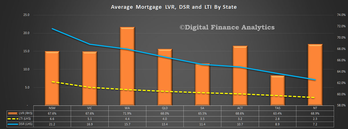
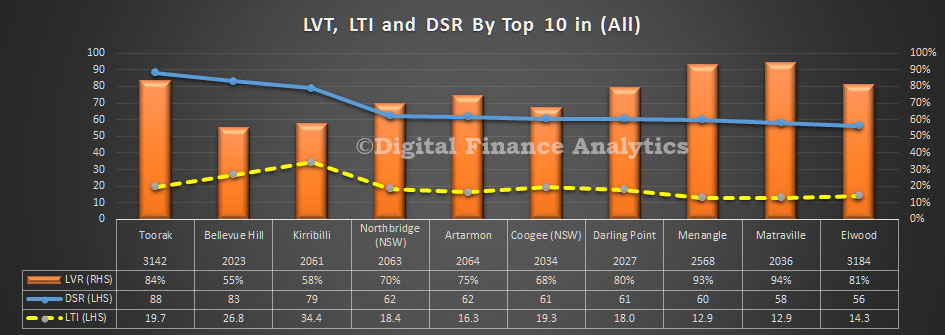
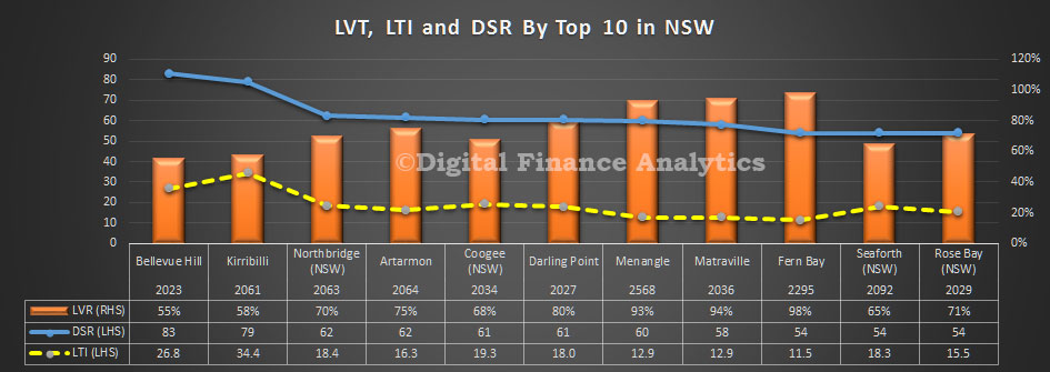
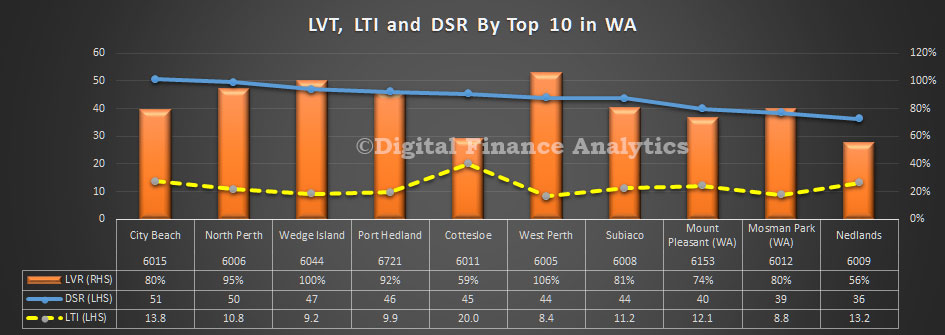
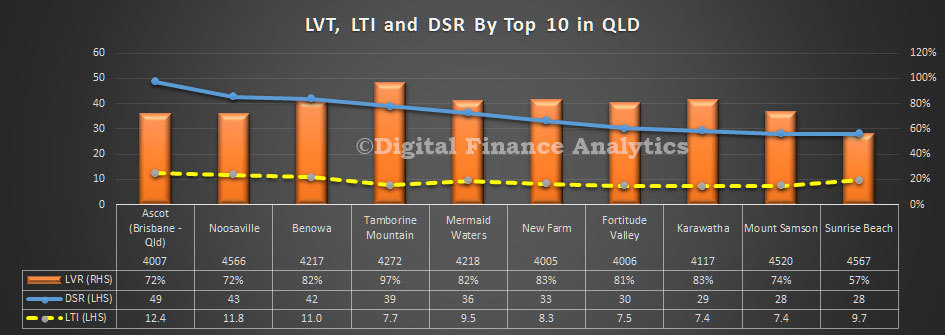
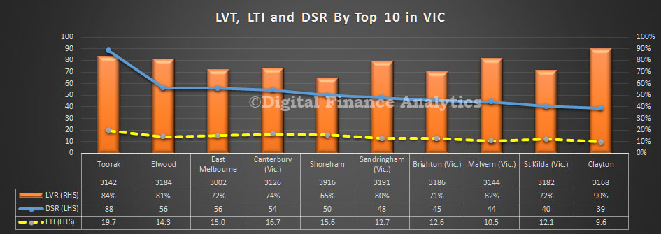
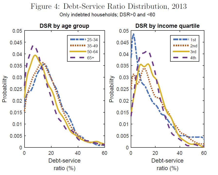
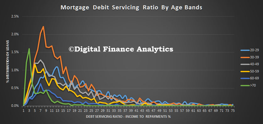
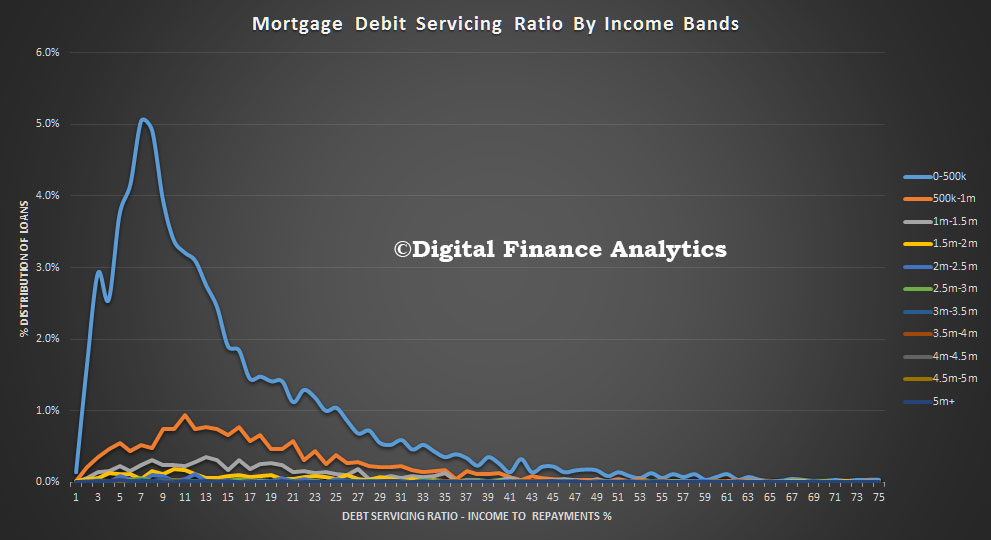
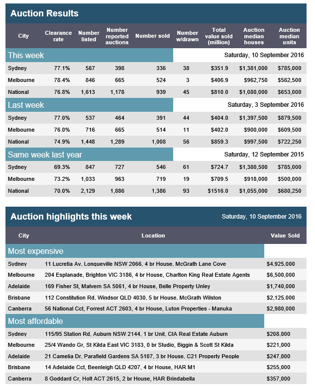
This aligns with the APM data already posted, though there are some variations.
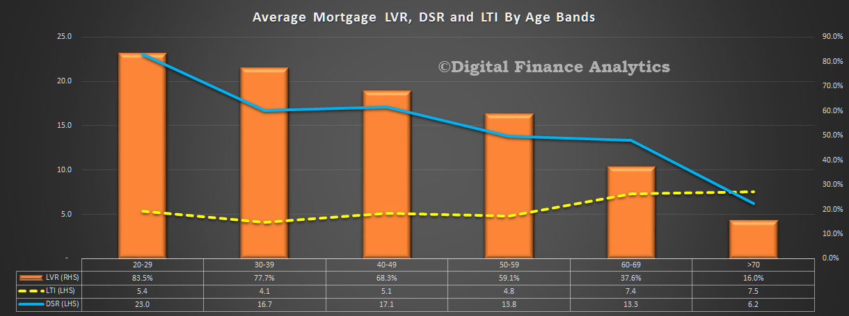
Probability of Mortgage Default – Latest Estimates in 3D

As we finish our series on deep analysis of mortgages by LVR, DSR and LTI, we have incorporated the latest household survey data into our probability of mortgage default modelling by post code.  The national average is 1.3%, but it rises to more than 3% in some places.

We take the DSR, LTI and LVR data, and overlay the mortgage stress and state-level economic indicators to estimate the likely relative probability of mortgage default.  We also overlay assumptions on the RBA’s cash rate, expected mortgage rates, income growth and employment. This all gets mashed to derive a percentage estimate of default by post code.

We have mapped this into a 3D view, which clearly shows that the higher levels of default in coming months will emanate from QLD and WA, as the mining sector rotation continues. On the other hand, NSW and VIC are relatively benign as ultra-low interest rates continue to protect many households with large mortgages. The greater the height of the post code, the higher the risk of default.

prob-default-sept-2016One striking final conclusion. If you compare this picture with the DSR 3D view from yesterday, you will see that DSR and probability of default are only somewhat linked. There are a bunch of other factors which shape the likely loss outcomes.


How Airbnb is reshaping our cities

From The Conversation.

Infrastructure in our cities – let’s call it the hardware – remains much the same as ever, but the software – the way we use it – is transforming rapidly. One piece of that software, Airbnb, is dramatically reshaping the world’s cities.

The digital platform allows citizens to find and rent short-term accommodation from other citizens. Airbnb has the potential to rupture the traditional spatial relationship between tourist and local, making our cities more vibrant and diverse places to live in and to visit.

The question is: what opportunities and dangers does the platform present? What are the implications of repurposing existing residential infrastructure for short-term accommodation? What happens when the global “sharing economy” meets a city’s suburbs?

Lessons from an early adopter

Melbourne was an early adopter of Airbnb. It is also one of the top 10 cities for global travellers on Airbnb. What insights can be gathered from its experience?

According to Airbnb, three-quarters of listings worldwide are outside major hotel districts. Airbnb has three types of property listings: entire homes, private rooms and shared rooms.

Concentration of Airbnb entire-house rentals in Melbourne. Jacqui Alexander & Tom Morgan, Author provided

Entire homes make up over half the total number of Melbourne’s metropolitan listings. Data collected in January 2016 reveals that their distribution is relatively consistent with that of hotels and licensed accommodation, which exist in large concentrations in the CBD and inner city. Many hosts who list entire homes lease or sublet when they go away.

In Australia, tenants require permission from their landlord to sublet, so there is little risk for the landlord if they follow due process. But analysis by website Inside Airbnb indicates that about 75% of entire-house listings in Melbourne are available for over 90 days per year. Hosts with multiple properties manage about a third of all the entire-house listings in Melbourne. These operators hold an average of three properties, but some have dozens. Through Airbnb, these brokers are turning existing housing infrastructure into informal, distributed hotels while saving on capital costs, overheads and wages.

Globally, the Airbnb phenomenon has been blamed for driving up rents, accelerating gentrification and displacing local residents by reducing available housing stock. In Melbourne, the boom in high-density development in the CBD has resulted in an excess of homogeneous apartment dwellings. Bedrooms without natural light, as well as insufficient floor area, outdoor space and storage space, characterise many of these developments, rendering them effectively unlivable for long-term residents. But these properties are attractive to itinerant tenants seeking affordable inner city accommodation.

Concentration of Airbnb shared-room rentals in Melbourne. Jacqui Alexander & Tom Morgan, Author provided

Shared rooms in Melbourne constitute only about 2% of all listings, but they are almost exclusively confined to the CBD. Box Hill (14 kilometres east of Melbourne), and Maidstone/ Braybrook (eight kilometres west of Melbourne) are secondary outlying hotspots. The majority of CBD listings are around new apartment towers near Southern Cross Station (at the western end of the CBD) and RMIT University.A number of already small two-bedroom apartments in the Neo200, Upper West Side and QV1 towers are operating as gendered dormitories. These often sleep eight, with four to a room. Overloading these apartments creates potential fire-safety and hygiene-compliance issues.

Short-term letting via sites like Airbnb allows investors to earn up to three times the amount they’d receive in rent (the average cost to rent an entire home is AU$189 per night). Travellers benefit from competitive accommodation rates, cooking facilities, convenient locations and access to private pools and gymnasiums intended for residents.

Airbnb acknowledges that professional hosts with multiple listings are exploiting the so-called sharing economy, but has not yet taken steps to regulate this. Governments would do well to implement the long-awaited and much-needed minimum design standards for apartments to curb the construction of developments in the city that fail to cater for residents or which are purpose-built for the Airbnb market (a few local examples are already emerging).

Beyond the obvious need to protect the amenity of citizens, protection of the liveliness and heterogeneity of the city is essential to maintain the kind of “authentic” experience that appeals to Airbnb users in the first place. Melbourne is beginning to follow the trajectory of international cities like London where the investor market, fuelled by capital gains tax exemptions, has pushed residents further and further out. Dispersing the concentration of entire-house and private-room rental is vital.

Concentration of Airbnb private room rentals in Melbourne. Jacqui Alexander & Tom Morgan, Author provided

More promising is the dispersed pattern of private rooms in Melbourne. These represent around 45% of listings across the city. While private rooms are still concentrated in and around the CBD, diffuse listings across Melbourne’s middle-ring suburbs realise Airbnb’s ambition to enable access to the everyday spaces of cities. This pattern makes sense given the mismatch between Australian house sizes, which remain the largest in the world, and changing household structures – most significantly, the decline of the nuclear family. An increase in housing diversity in the middle-ring suburbs is likely to facilitate more entire-house listings in these areas in the future.

We are also seeing evidence of Airbnb driving housing diversity. Annexed and granny-flat configurations are commonly listed in suburbs close to the Melbourne CBD like Brunswick and Caulfield. Loose-fit arrangements like these provide more flexibility to cater to both residents and visitors, and the by-product is slow but genuine “bottom-up” densification.

Government incentives for this kind of small-scale development would help to make this a viable (and, for many, welcome) alternative to densification through high-rise apartment development.

In 2015, Tourism Victoria entered into an agreement with Airbnb Melbourne to promote buzzing inner-city suburbs Fitzroy and St Kilda as “sharing economy” hotspots. But the cost of renting in these suburbs is already exorbitant. Fitzroy was named the second-most-expensive suburb in Melbourne for apartment rental in 2015.

Instead, policymakers could encourage disruption in the suburbs that would benefit both sides.

What can be done to capture local benefits?

Airbnb claims that tourists who use the platform “stay longer and spend more”. Through taxation and additional revenue from the sharing economy, governments could fund more extensive and efficient transport networks to service both locals and visitors. Extending transport infrastructure would support the intensification of distributed neighbourhoods and maximise intermingling between tourists and locals.

Airbnb rentals in Perth. Jacqui Alexander, Author provided

Bottom-up densification could also be a way forward for Perth. The distribution of Airbnb accommodation towards Perth’s coastal suburbs highlights potential in this space: here, tourism-specific and local infrastructure can converge. This is an exciting prospect for a state that positions itself as a unique travel destination.

Airbnb emerges from the same cultural tendency as the pop-up shop and interim-use place activation. Built environment professionals must recognise it as an urban issue and lead with a framework for targeted, productive disruption.

Airbnb can increase the density of people within existing building stock, while dispersing the positive effects of the tourist economy. This requires more imagination from planners and designers, who first and foremost must consider the interests of individual citizens, whether they are renters or home owners.

Can Airbnb be a part of the solution of increasing urban infill without compromising a minimum standard of living?


The Conversation is co-publishing articles with Future West (Australian Urbanism), produced by the University of Western Australia’s Faculty of Architecture, Landscape and Visual Arts. These articles look towards the future of urbanism, taking Perth and Western Australia as its reference point. You can read other articles here.

Debt Servicing Ratio 3D Mapping Highlights Mortgage Hot Spots

Continuing our detailed analysis of mortgage LVR, DST and LTI across Australia, using data from our houshold surveys, today we feature a 3D map of relative Debt Service Ratios (DSR) by postcode. There are some interesting variations. The greater the height, the higher the DSR.

As we said in our earlier post, DSR is is the ratio between gross household income and the amount paid on the mortgage. More specifically, the DSR is defined as the ratio of interest payments plus amortisations to income. As such, the DSR provides a flow-to-flow comparison – the flow of debt service payments divided by the flow of income. We think the DSR is an important lens to look at households debt footprint, but the ratio is highly sensitive to interest rates because as interest rates fall, the ratio improves. Current DSR ratios are often seen as reasonable because of the current ultra low rates, but of course that tells us nothing about the impact of rising rates later. The average DSR is 16.8, but there is a very wide spread.

oz-dsr-sept-2016


Today’s Auction Results ….

APM Pricefinder preliminary auction clearance results once again confirms the appetite for property, especially in Sydney. Nationally the clearance rate was 79% on 1,595 listings, compared with 74.5% on 1,610 last week. A year ago it was 68.9% on 2,089.  Again we see higher clearances on lower volumes, but sales are being closed.

apm-17-sep-2016-1Sydney hit 85.1%, the highest across the country on 567 listings, whilst Melbourne continues to have more property listed but a lower clearance rate.  Adelaide cleared 78% of 62 listed and Brisbane cleared 49% of 107 listed. Canberra results are still to come in.

apm-17-sep-2016

Home Loan Insights From Deep Segmentation

As we continue our journey into the depths of home loan segmentation analysis, using LTV, DSR and LTI ratios, we begin to see some insightful patterns emerging. Today we delve into our deep segmentation models.

We start by looking across the states and have sorted the results by DSR (Debt Servicing Ratio), as this is the most insightful lens, in our view. Households in NSW have the highest DSR, no surprise perhaps because home prices have risen strongly – so mortgages have grown – at a time when incomes have not. Remember DSR is based on current low interest rates, should they rise, the DSR will also raise. NSW also holds the prize for the highest average Loan to Income ratio, again because of the rise in market values, and mortgages. However, the average Loan to Value ratio is sitting at around 68%, compared with 72% in WA. DSR and LTI are the better indicators of potential risk, compared with LVR which only really comes into play as a factor if trying to sell into a downturn.

state-dsr-dtiNext we look at age bands. Younger households have on average higher DSR’s, and LVR’s. But it is worth highlighting that the highest LTI’s are residing in older households, because here whilst LVR’s are lower, limited incomes mean they are more exposed. We are seeing a significant rise in the number of households who still have a mortgage to pay off as they enter retirement.

age-dsr-dtiIf we look at the picture by $50k income bands we see that the highest LVR’s, LTI’s and DSR’s rest with households whose income is in the range $50-100k. Interestingly, LVR’s do not vary that much by income band, but both LTI’s and DSR’s improve with income. This is because more wealthy households are able to buy more expensive property, and service larger loans. Remember these cuts tell us nothing about the relative number of households or loans in each income band.

income-dsr-dti That analysis shows more than 46% of households with a mortgage have an income of $50-100k, and 26% have an income of $100-150k, whereas only 0.29% have an income of over $500k.

income-distTurning on our zonal segmentation, we see that households living in the inner suburbs have the highest DSR. This is because home prices are higher here, compared with outlying areas. Households in the regional and rural areas tend to have, on average, lower DSR, LTI and LVRs.

zones-dsr-dti  More than 12% of households live in the inner suburbs, compared with 26% in the outer suburbs and 22% in the urban fringe.

zone-countstSo to our master household segmentation. We use this to separate households based on a range of demographic indicators – which have proved reliable over many years. Young Growing families have the highest DSR (18.3) and the highest LVR (92.5%). Many have bought quite recently and are leveraged to the max. It is worth looking at the various measures across these segments as there are some fundamentally different things in play with different risk outcomes and sensitivities.

segment-dsr-dtiFinally, for today we look at the data through the lens of our technographic segmentation. We classify households into digital natives, migrants and luddites. The descriptions are self-explanatory, in that natives have always been digitally aligned, whereas migrants have adopted digital channels and luddites are resisting. Interestingly, natives have a higher DSR, LVR and LTI, compared with the other segments. This is because on average they are younger, and more likely to be in the main urban areas.

Such segmentation is important because Fintech’s need to understand where their potential markets are. We featured uno yesterday, a relatively new digital alternative to brokers. Digital natives would be directly in their sights.

techno-dsr-dtiNext time we will look at DSR, LVR and LTI by individual lenders – there are some interesting variations.

So Where Are DSR’s Highest?

As we continue our analysis of household mortgage debt, and having described the ratios we are using (Loan to Value (LVR), Loan to Income (LTI) and Debt Servicing Ratio (DSR)) we can drill into the more specific data slices. Today we look across the top ten locations by DSR.

complex-sept-2016We see at once that some of the highest DSR ratios are found in some of the more affluent suburbs – such as Torak (VIC) and the lower north shore in NSW. In these locations, home prices are very high, and as a result households have extended their borrowings – with high LVRs, DSRs and DTIs. This suggests that those will more ability to borrow and service large mortgages are most in debt.

We can then look at each state in more detail. For example, here is NSW.

complex-sept-2016-nswAs we go down the list we begin to see a more mixed set of locations figuring in the top 10, though generally still closer to the CBD. We see somewhat similar pictures in WA, QLD and VIC.

complex-sept-2016-wa complex-sept-2016-qld complex-sept-2016-vicOf course averages can be misleading, as we see a small number of mortgages well above $1m. We also see a high penetration of interest only loans, and recent refinancing events. Provided interest rates remain low, and incomes are solid, the risks are probably relatively well contained. It would be a different matter if home prices slipped significantly.

As we go into more detail in later posts, we will identify some other factors are creating more risks within the portfolio.

How Best To Look At Mortgage Serviceability

There are at least three key ratios we consider when examining households and their mortgage commitments.  Today we discuses these in the light of data from our surveys, which follows on from yesterdays post.

Loan to Value (LVR) calculations tell us about the proportion of a property owner by the home owner, versus the bank.

lvr-summaryHigher loan to value ratios are a sign of potential financial instability, because if prices were to fall the borrower could be left with a mortgage bigger than the value of the property. In Australia, LVR’s higher than 80% will normally require extra lender mortgage insurance, and this in turn has changed the shape of the market. The average marked to market LVR is 68%. Many lenders rely on the LVR at loan inception and use this data in their risk models.

Of course in Australia, home prices have been rising strongly in some states, though we have seen some falls in value in WA recently. Some regulators have imposed specific loan to value limits on lenders, for example the Reserve Bank of New Zealand.  However, LVR ratios have limitations, because as the value of the property rises, the LVR falls. In a strongly rising market, this may mask issues within the portfolio. Recently the proportion of high LVR loans being written has been falling as regulators turn up the heat. However APRA only reports scanty aggregated data.

Loan to income (LTI) ratios tell us about the households borrowing footprint. The higher the income ratio, the higher the risk.

lti-summaryOver time the average LTI has risen from around three times income to more than five times income. This illustrates the extra leverage households have been able to create in response to strongly rising prices as lending standards have been relaxed. Some regulators have started to limit high LTI loans. For example the Bank of England.  LTI is sensitive to rising property prices and larger mortgages as well as static or falling incomes. There is no regular LTI reporting in Australia.

The third is the debt servicing ratio (DSR). This is the ratio between gross household income and the amount paid on the mortgage. The DSR is defined as the ratio of interest payments plus amortisations to income. As such, the DSR provides a flow-to-flow comparison – the flow of debt service payments divided by the flow of income. We think the DSR is an important lens to look at households debt footprint, but the ratio is highly sensitive to interest rates because as interest rates fall, the ratio improves. Current DSR ratios are often seen as reasonable because of the current ultra low rates, but of course that tells us nothing about the impact of rising rates later. The average DSR is 16.8, but there is a very wide spread. In 2015 the BIS published some relative benchmarks and found that Australia was at around 16 one of the highest in the developed world. DSR is the recommended macroprudential measure. There is no regular DSR reporting in Australia.

dsr The Bank of Canada has recently been looking at DSR. Here is an example of their findings in their home market.

canadian-dsr-summaryWe can look at age and income distribution in Australia.We see that a significant proportion of younger households have a DSR in excess of 20. Older households have on average lower DSR’s.

dsr-ageLike Canada, lower income households tend to have higher DSR’s.

dsr-incomeOne important point to consider is whether the ratio should take account of other repayments – such as credit cards – or other living expenses. Most DSR calculations do not factor in other elements, although thanks to regulatory pressure, lenders are now more conservative in their underwriting criteria when it comes to assessing true income.

Next time we will dive further into these metrics by looking across our household segments. The results are surprising.


Preliminary auction clearance rates ease slightly to 76.4 per cent

CoreLogic says so far this week, 1,683 capital city auction results have been reported to CoreLogic, resulting in a preliminary auction clearance rate of 76.4 per cent across the combined capital cities.

This week, 2,026 total auctions were held across the capital cities, higher than last week, when 1,899 auctions were held, but remaining lower than one year ago when 2,654 capital city properties went under the hammer.  Clearance rates are still tracking above 70 per cent, which they have done since the last week in July.  This week’s preliminary clearance rate is down slightly from last week’s clearance rate of 77.1 per cent, which was the highest clearance rate recorded for the year to date.  At the same time last year the clearance rate was 71.2 per cent.

20160912-capital-city

Strong Auction Clearance Results Again Today

The preliminary data from APM PriceFinder suggests another strong set of results, with strong clearance rates, on higher listings (though volume was down compared with this time last year). Melbourne cleared 78.4% compared with 77% last week, and 73.2% last year. Nationally, the clearance rate was 76.8% compared with 74.9% last week, on 1,613 listings compared with 1,448 last week. The same week last year cleared 70% from 2,129 properties.

apm-auctions1-10-sep-2016

In Brisbane, 54% of the 110 listings sold, whilst in Adelaide, 77% of the 46 listings cleared and in Canberra, 78% of the 44 listings sold. Sydney cleared 77.1% of 567 properties, compared with 77% of 537 last week and 69.3% of 847 properties a year ago.  Further confirmation there is still momentum in the market.

apm-auctions-10-sep-2016