In the Opening Statement to House of Representatives Standing Committee on Economics today, Glenn Stevens made the following points:
- not only are funding costs low, but banks want to lend and are competing to do so more actively than they have for some years;
- net worth per household has risen by about $120,000 over the past two years;
- the community’s monetary assets have risen by around 13 per cent – over $180 billion – over the same period;
It is worth reflecting on the fact the main reason for the increase in net worth is a bounce in the stock market, and lift in capital values of property, thanks to rising prices. After all real income is falling for many. In addition, the average hides the differences.
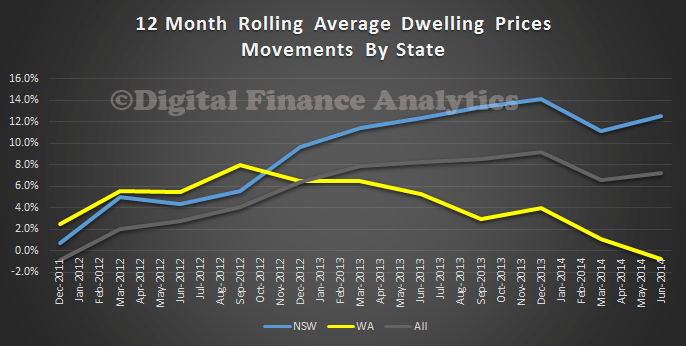
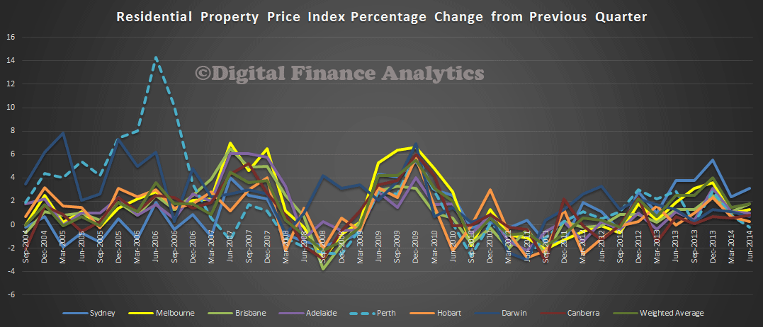
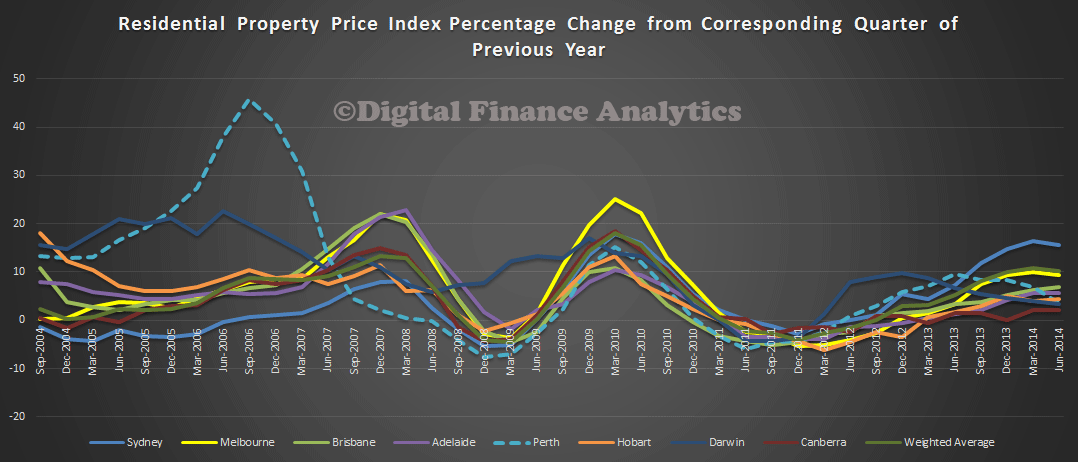
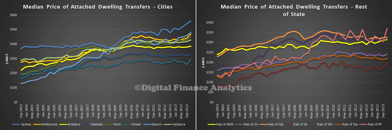
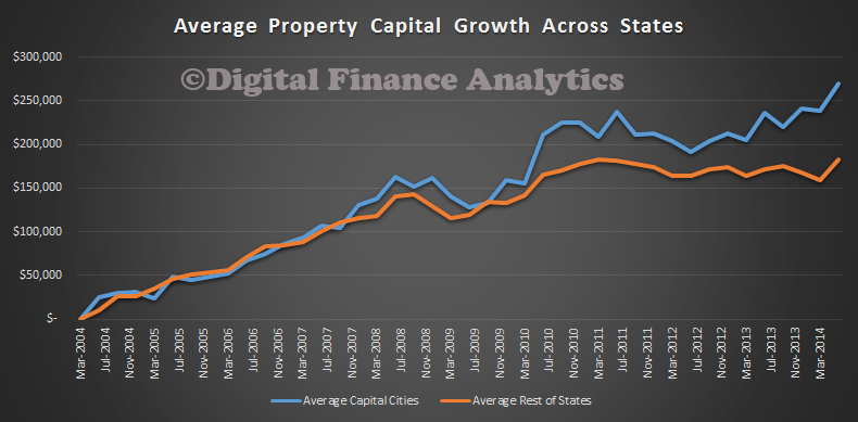
We have been looking at capital growth for the average household, across the states, and between the main urban centres and the rest of rest of the state. From our surveys we have been able to assess the relative growth in the value of property, over time, by marking property to market and comparing that with its purchase price. The chart below shows the relative growth in net capital value of property since 2004 (where our surveys start). It subtracts the original purchase price from the current value, to give a theoretical capital or wealth value. It shows that in the early 2000’s there was a similar level of growth in the cities and regional centres, but that more recently it has diverged. In the past 2 years, the average capital appreciation in the urban centres was $79,000, whereas in the regional centres, it was just $18,000.
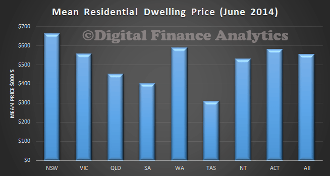
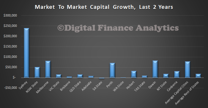
 However there are significant variations across the states. In Sydney, households in the past 2 years, have on average enjoyed a lift in net worth of more than $230,000 thanks to price hikes, whereas Brisbane, Adelaide, and regional areas in SA and TAS have not experienced much of an increase at all.
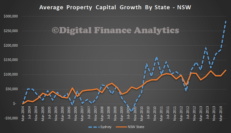
 Looking at the longer term trends, across states, the situation gets even more interesting. Of course people have bought in at different times, but we can plot the overall capital growth trend. For example, In NSW, a household who bought in Sydney in 2004 and held the property would on average be nearly $300,000 better off now. If they had bought in early 2012, though they could have nearly earnt the same gain! All the action has been in the last couple of years, in Sydney itself. There have been a more gentle lift in regional NSW. Note that I have not corrected for inflation in any of the current calculations, if I did, the regional centres in NSW would have stood still.
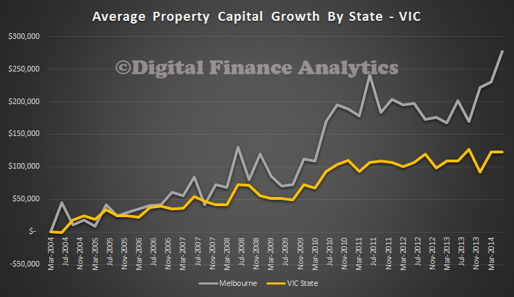
 In VIC, the situation is somewhat similar. It is worth noting that compared to NSW, the correction in 2009 was less severe.
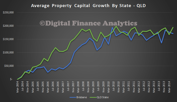
 Turning to QLD, there has been no capital growth in either Brisbane, or the regional centres since 2010. If you were to correct for inflation, it would be going backwards.
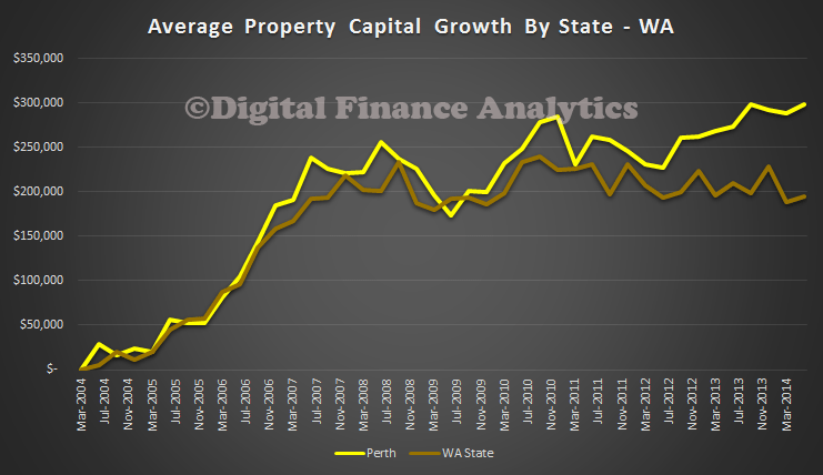
 In WA, growth peaked in 2010 in Perth, with a further small peak recently, whilst in the regional centres, values are falling in real terms, before inflation. We compared Perth and Sydney recently, in more detail.
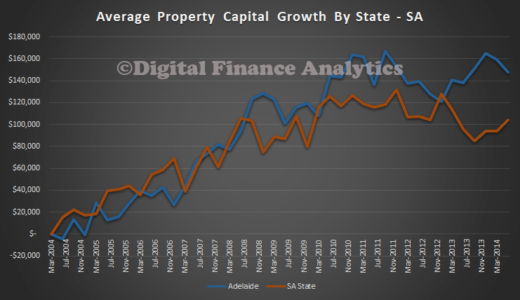
 Looking at SA, growth in Adelaide is back to 2011 levels, but in the regional areas, growth is still lower than in 2010.
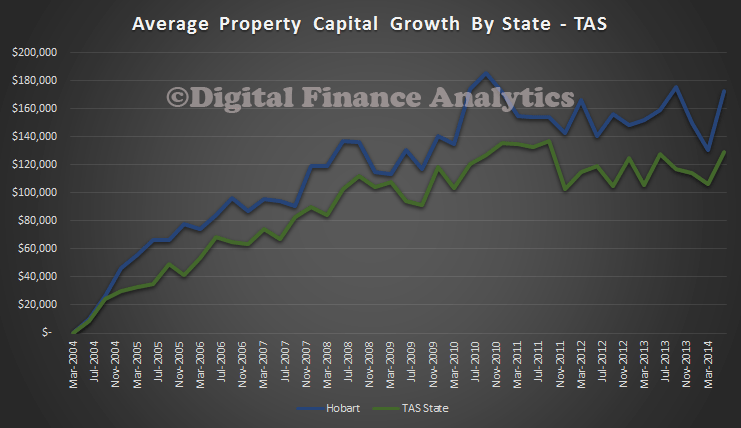
 In TAS, since a peak in 2010, both Hobart and regional centres are flat, before inflation.
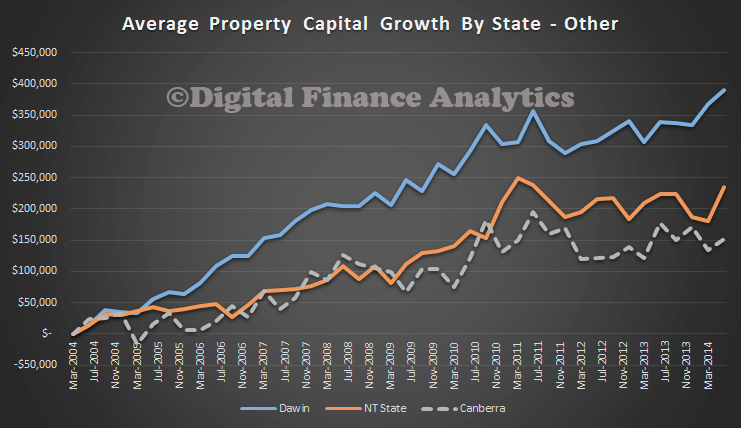
 Finally, we look at the remaining states. Growth in Darwin has been sustained, whilst regional NT and Canberra are flatter since 2011.
 So, my conclusion is simple, some households especially in Sydney and Melbourne, may be experiencing the wealth effect halo of smugness, but many households across other states and regional centres are not enjoying capital growth. Indeed, for many there has been a reduction in true value, before inflation since 2011. It is unlikely therefore that we will see a sudden surge of consumer spending activity in response to the housing boom (which is not uniform across the country as we have shown). It is really a Sydney and Melbourne boom. The RBA may be waiting for a long time if they are expecting households to start spending big.

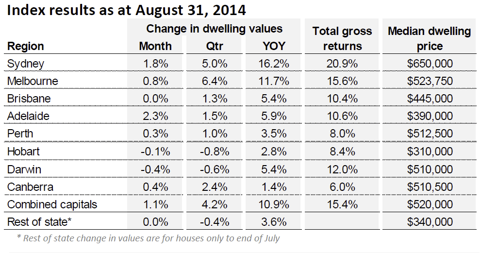
 Median house and unit prices are highest in Sydney, with Perth, Darwin and Canberra ahead of Melbourne. The statistics are calculated across houses and units sold over the most recent four week period.
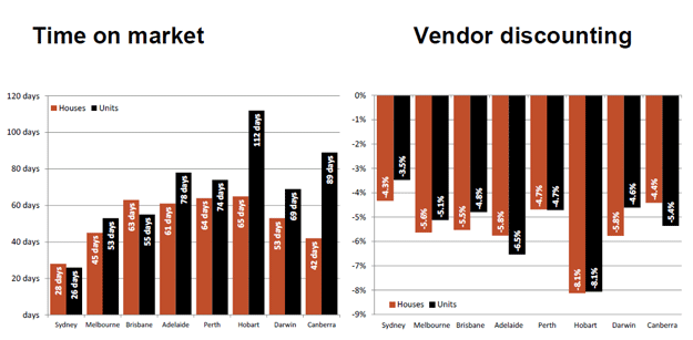
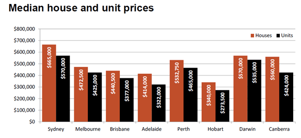 ‘Time on market’ is simply the average number of days between when a property is first listed for sale and the contract date. The rate of vendor discounting is the average percentage difference between the original listing price and the final selling price.