
The RBA updated their E2 – Selected Household Ratios today to the end of December 2017.
This series used data from the Australian Bureau of Statistics (which were recently adjusted to remove the impact of superannuation on the data), plus some RBA supplied data. The series is updated each quarter.
We will walk though these charts, as they highlight some of main and concerning dynamics around household finances.
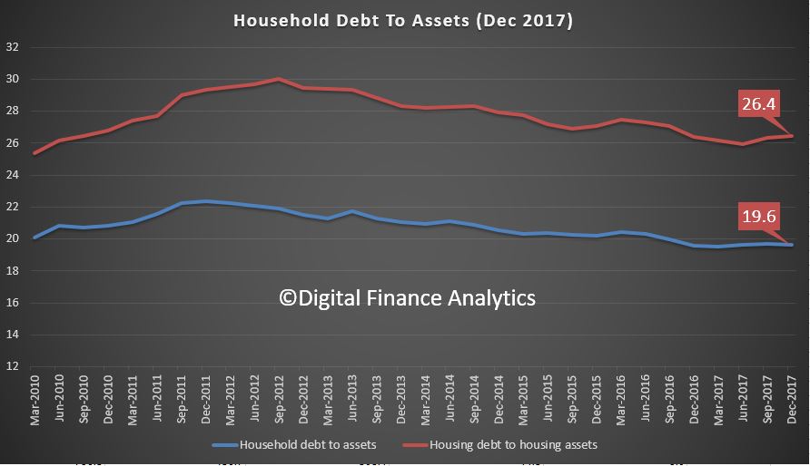
First, here is the plot of Ratio of household debt to household assets, and the Ratio of housing debt to housing assets. Both are moving up a little, reflecting stronger loan growth, relative to asset prices and home prices.
 Corelogics home price index to end March also out today showed prices in most of the main centes are slipping. They said:
Trends across the March quarter showed that capital city home values were 0.9% lower over the March quarter, while values across the regional markets have tracked 1.1% higher. Focusing on the capital cities, six of the eight capital cities have recorded a fall in values over the first quarter of 2018, ranging from a 1.8% drop in Sydney values to a 0.1% fall in Darwin.
Sydney unit values are up 1.9% over the past twelve months, while house values are down 3.8%. Similarly in Melbourne, unit values are 6.6% higher over the past twelve months while house values are up just 4.9%.
So this means that ahead, we expect prices to slide relative to the debt outstanding, thus, these ratios will go higher. Household with property have had their balance sheets flattered by the appreciating capital growth, but these same balance sheets will now fall under greater pressure.
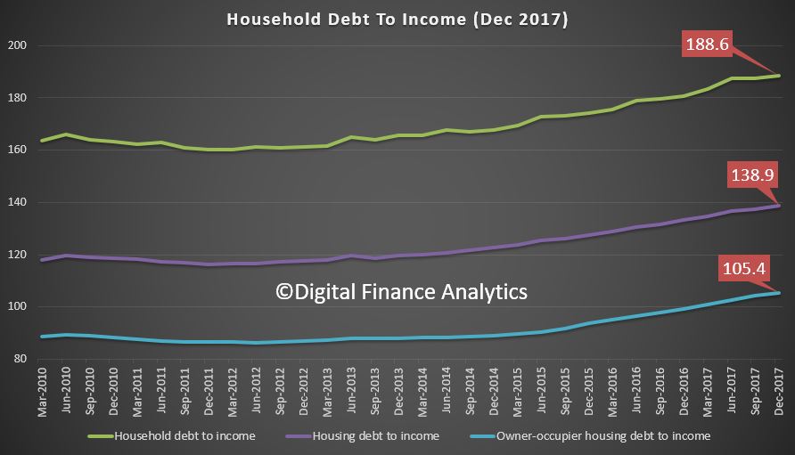
The second chart shows the household debt to income ratios, including Ratio of housing debt to housing assets, Ratio of housing debt to annualised household disposable income and Ratio of owner-occupier housing debt to annualised household disposable income. All these are rising, and have been since 2012. During that time, lending to households has been very strong, whilst incomes have been stalling, and in real terms falling into reverse. To me this is a very concerning metric because it shows that greater leverage households have and so the exposure to rising rates.
 The RBA, in their statement today when they left the cash rate unchanged – said:
The housing markets in Sydney and Melbourne have slowed. Nationwide measures of housing prices are little changed over the past six months, with prices having recorded falls in some areas. In the eastern capital cities, a considerable additional supply of apartments is scheduled to come on stream over the next couple of years. APRA’s supervisory measures and tighter credit standards have been helpful in containing the build-up of risk in household balance sheets, although the level of household debt remains high.
So, they are aware of the high debt, but APRA’s moves will only help new loans, now being written, they will not assist the many households with loans written on the earlier looser standards. This is the real pinch point, and we estimate that now 950,000 households are in mortgage stress to end March, a new record – watch out for our detailed analysis of mortgage stress in a few days.
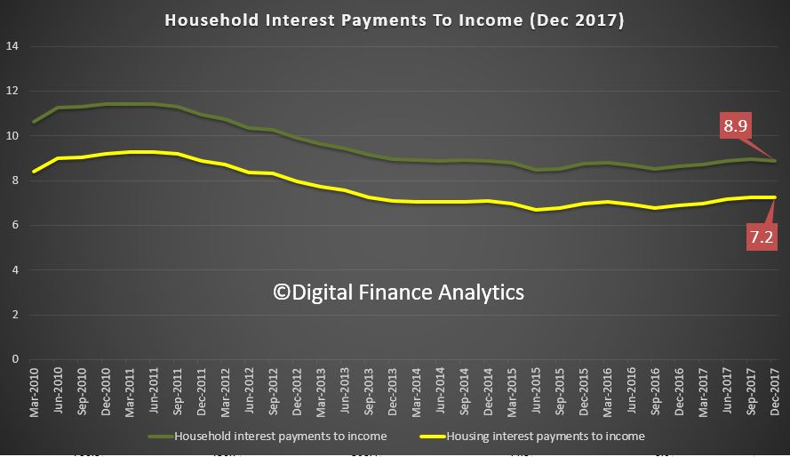
Finally, here are two ratios from the RBA, Ratio of interest payments on housing and other personal debt to quarterly household disposable income AND Ratio of interest payments on housing debt to quarterly household disposable income. So far I have not been able to find out how these are calculated by the way.
The standard RBA argument is that the low interest rates mean the proportion of income, on average required to service a loan is lower than in 2011, thanks to the very low interest rates.
 Compare the chart above with the next one. Here are the indicative interest rates from the RBA, (F5) from 2011 onward.
 The fall in rates is significant – for example the variable discounted rate in 2011 was 7.05%, now it is 4.45%, so down 2.6%, according to the RBA data.
But the housing interest payment ratio in contrast is 7.2 compared with 9.2 in 2011, so down just 2%. But translate these to percentage changes and whilst interest rates have dropped by 58.4%, repayments dropped by only 27% over the same period because the average loan is now larger so payments are relatively larger relative to income. So again, we see the impact of large loans on household balance sheets. This is a massive difference.
And of course the final piece of the puzzle is the impact of rates rising from here. Our sensitivity analysis suggests that 1% rate rise would tip well more than one million households into difficulty, and the impact on the interest payment to income ratio would therefore be significant.
Households are leveraged to the hilt. We may have tighter controls on lending now (some would say this is debatable given the active non-bank sector). But the die is cast for people with large existing mortgages, flat incomes, rising rates and household expenses growing.
Combined these charts tell a sorry tale.