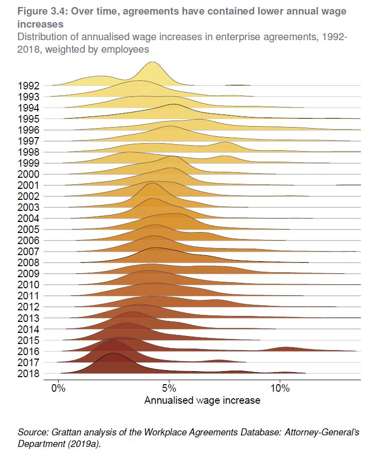
No free lunch: higher super means lower wages uses
administrative data on 80,000 federal workplace agreements made between
1991 and 2018 to show that about 80 per cent of the cost of increases
in super is passed to workers through lower wage rises within the life
of an enterprise agreement, typically 2-to-3 years. And the longer-term
impact is likely to be even higher.
‘This trade-off between more
superannuation in retirement but lower living standards while working
isn’t worth it for most Australians,’ says the lead author, Grattan’s
Household Finances Program Director, Brendan Coates.
‘This new empirical analysis reinforces
that the planned increase in compulsory super, from 9.5 per cent now to
12 per cent July 2025, should be abandoned. Most Australians are already
saving enough for their retirement.’
The paper directly measures the
super-wages trade-off for nearly a third of Australian workers – those
on federal enterprise agreements. But it shows that other workers are
also likely to bear the cost of higher compulsory super in the form of
lower wages growth.
Despite the claims of some in the
superannuation industry, it is unlikely that future super increases will
be different from past increases.
It’s true that wages growth has slowed in
recent years, but nominal wages are still growing by more than 2 per
cent a year, so employers have plenty of scope to slow the pace of wages
growth if compulsory super contributions are increased.
And none of the plausible explanations for
lower wages growth – whether slower growth in productivity,
technological change, globalisation, an under-performing economy, or
weaker bargaining power among workers – helps explain why employers
would foot any more of the bill for higher compulsory super this time
around.
If employers aren’t willing to offer large
pay rises today, it’s hard to imagine why they would pay for higher
super. In fact, if workers’ bargaining power has fallen, employers are
even less likely to pay for higher compulsory super than in the past.
Grattan’s 2018 report, Money in retirement: more than enough, found that the conventional wisdom that Australians don’t save enough for retirement is wrong.
Now this working paper finds that the conventional wisdom that higher super means lower wages is right.
‘Together, these findings demand a rethink of Australia’s retirement incomes system,’ Mr Coates says.
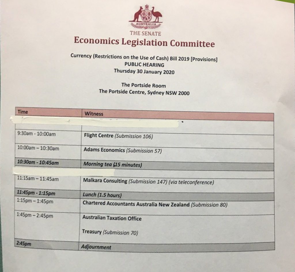
The Cash Restrictions Bill just keeps giving as Economist John Adams and Analyst Martin North reveal a dirty secret.
With a few days before the Senate Economics Legislation Committee delivers their report following the recent hearings, what does this say about the political processes which drives our legislative machine? No wonder the proposed Bill is a mess..
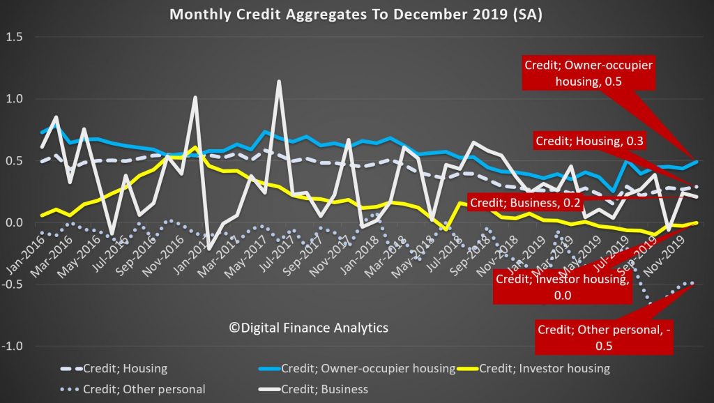
Looking at the RBA data first, over the past month housing credit stock (the net of new loans, repaid loans and existing loans) rose by 0.3%, driven by owner occupied housing up 0.5%, while investment loans slide just a little, but rounded to zero. Personal credit slid another 0.5% while business credit rose 0.2% compared with the previous month. These monthly series are always noisy, and they are also seasonally adjusted by the RBA, so there is plenty of latitude when interpreting them.
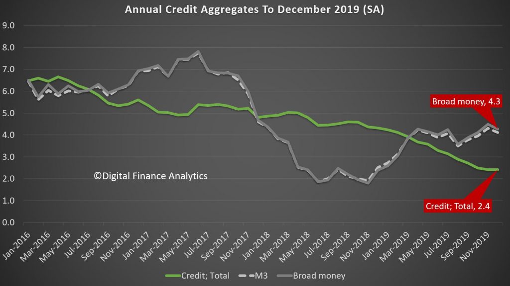
But overall, total credit grew by 0.2% over the month, while the broad measure of money rose just 0.1%.
The three month derived series helps to spotlight the key movements over the past few years. Credit growth for owner occupation rose 1.4%, and it has been rising a little since the May election, and the loosening of lending standards by APRA, and lower rates later. Its low point was a quarterly rise of 1% a few months ago. Investment lending continues to shrink, at 0.1%, but the rate of decline has eased from September, again thanks to loser lending standards. However this also reflects a net loan repayment scheme that many households, in the current tricky environment are on. Personal lending is still shrinking, falling at 1.6%, though the rate of slowing is reversing from a low of minus 1.8%. Business credit is o.4%, but has been falling since October where it stood at 1.8%, reflecting a serious downturn in business confidence and demand for credit. For businesses, the economic backdrop has been a challenging one. The global economy is sluggish and household spending is soft. In this environment business investment in the real economy has lost momentum across the non-mining sectors – weighing on credit demand. Rolling total credit for 3 months is 0.6%, up from a low of 0.5% a couple of months back.
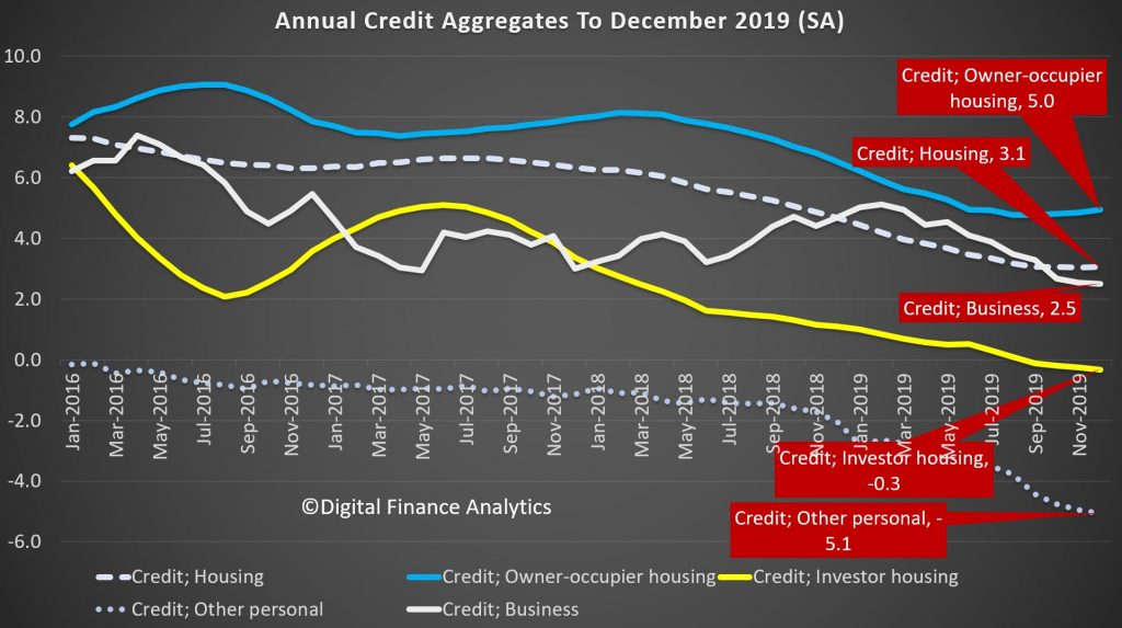
Turning to the annualised data series, housing credit is at 3.1% up from 3.03% last month. Annual owner occupied housing is up 5% from a low of 4.7% in August, while investor loans are down 0.3%, which is the largest fall we have ever seen. Personal credit is 5.1% lower, and that is another record low, while business credit grew by 2.5% on an annual basis, which is the lowest its been for years.
As a result, total credit grew 2.4%, which is the lowest level of growth since 2010, following the global financial crisis. Credit growth has progressively eased after peaking at 6.7% during the 2015/16 financial year. Key to the slowdown was the housing downturn as the cycle matured and lending conditions tightened. On the other hand, broad money is growing at 4.3%, and is significantly higher than last year, which we attribute to the positive terms of trade (thanks to iron ore prices and commodity volumes and RBA open market operations).
So while sentiment bounced after the May Federal election, which removed uncertainty around tax policy for the sector, as the RBA has lowered rates since June by a total of 75bps, with further cuts likely and APRA easing mortgage serviceability assessments; growth is anemaic, and of course sentiment is now in the gutter, thanks to the bushfires, coronavirus, and lack of income growth. While many analysts are predicting a bounce in credit in 2020, and a sentiment turnaround, pressure on global commodity prices and weak international tourism, as well as the drought are likely to take their toll.
We are also seeing more applications for mortgages being received, but also higher rejection rates, so we will see if this will really lead to stronger credit. And given such weak credit, we still question the veracity of the CoreLogic price series, which seems to exist in a different world. Our data supports much weaker average home price growth.
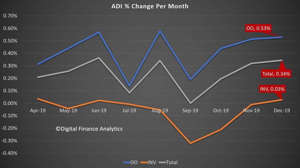
Turning to the APRA Bank series, the total value of mortgages lent (in original terms) grew by 0.34%, which is stronger than the market (0.3%), suggesting that the banks may be clawing back some business from the non-bank lenders, who have been quite active over the past couple of years. Within that owner occupied loans rose by 0.53% in the month, while investment loans grew 0.3%. The rate of growth remains slow.
The total stock of loans did rise, up around $5 billion dollars to $1.09 trillion for owner occupied loans, and up only slightly to $644 billion, giving total exposures of $1.74 trillion, a record. The mix of investment loans fell to a low of 36.9%.
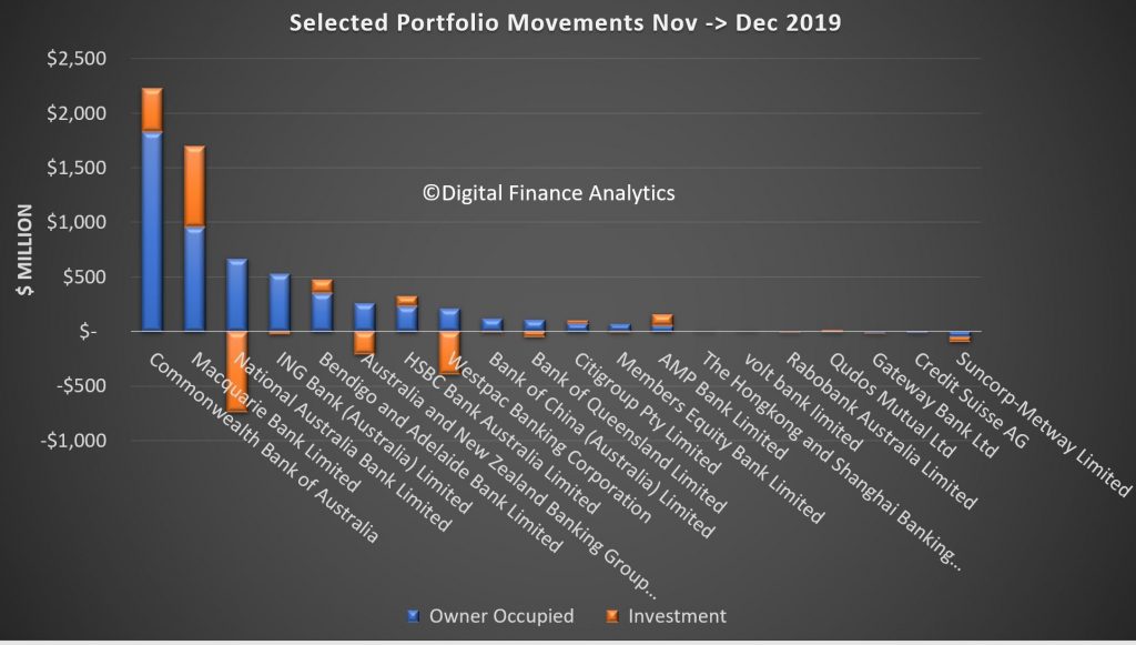
Finally we can examine the portfolio movements by individual lender, which reveals that, according to the data submitted by lenders (which may include some adjustments) CBA grew their portfolio the strongest, up more than $2.2 billion, including both owner occupied and investor loans, followed by Macquarie which continues to drive investor lending very hard, while NAB, Westpac and ANZ grew their owner occupied loans, while dropping their investor lending balances. Bendigo Bank, AMP and HSBC were also active in growing their investor loans. Neo-lender Volt Bank made an appearance in our selected list, while Suncorp dropped the value of both their owner occupied and investor loans. This highlights that lenders are steering quite different paths in their underwriting and marketing strategies. Time will tell whether the new loans being written are more risky.
And in closing, its interesting to note APRA’s release today saying that
The Australian Prudential Regulation Authority (APRA) will expand its quarterly property data publication to include new and more detailed statistics on residential mortgage lending.
In a letter to authorised deposit-taking institutions (ADIs) today, APRA confirmed the next edition of its Quarterly Authorised Deposit-taking Institution Property Exposures (QPEX) publication would include additional aggregate data on residential property exposures and new housing loan approvals.
The decision is part of APRA’s to move towards greater transparency, and will enable more in-depth market analysis by industry analysts, media and other interested parties.
The updated QPEX publication will also feature:
• reporting of additional sector-level statistics for the ‘Mutual ADI’ category; and
• clarified definitions for reported items, specifically for unreported loan-to-value ratios.
APRA Executive Director of Cross-Industry Insights and Data Division, Sean Carmody said: “APRA’s updated Corporate Plan commits us to increasing transparency of both our own operations and the industries we regulate. One of the key ways we can do that is by releasing more of the data we collect.
“With the ADI sector heavily reliant on commercial and residential property lending, enhancing QPEX will translate to greater transparency and sharper insights into one of the most crucial contributors to the economy.”
Consultation is continuing separately on a proposal for quarterly publication data sources to become non-confidential. This would mean that more of the underlying data may be disclosed to the public on a dis-aggregated basis. While this consultation remains open, APRA will continue to publish industry and peer group aggregate data, and mask data in QPEX where an individual entity’s confidential information could be revealed.
The next QPEX will be published on 10 March 2020 for the December 2019 reference period.
We believe that the dis-aggregated data should indeed be released – because sunlight remains the best disinfectant to quote Supreme Court Justice Louis Brandeis. Compared with the disclosures in other markets, Australia is so behind the times, on the pretext of confidentially. So we endorse the need for more granular data to help separate the lending sheep from the lending goats.
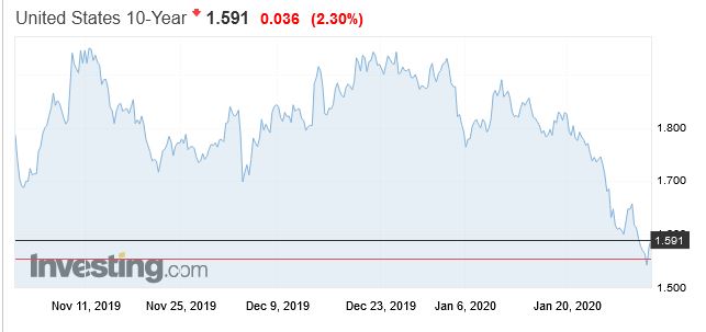
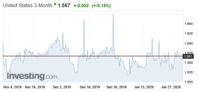
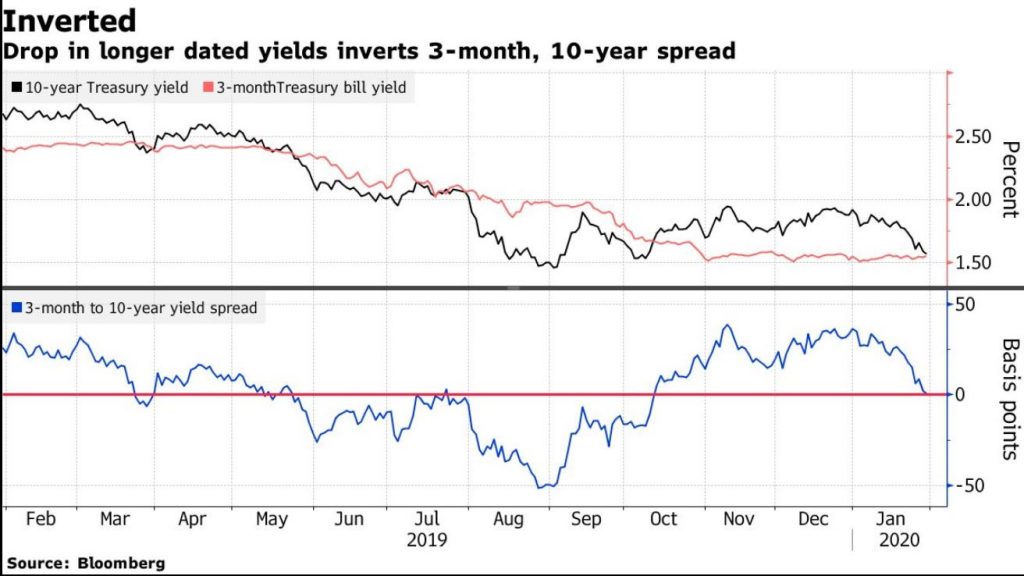
The fears relating to the coronavirus and weakish consumer sentiment from the US, plus the Feds hold decision turned the tables on the US yield curve overnight, with the 3-month rate 2 basis points higher than the 10-year at one point. Its slightly positive now… but this is a sign of uncertainty.
Plus a measure of core U.S. inflation released on Thursday showed price pressures slowed to an annualized 1.3% in the fourth quarter from 2.1%, a weaker figure than analysts had expected. And below the Fed’s target.
The dip will be seen as some as a warning signal because it has inverted before each of the past seven U.S. recessions. The last inversion was at the height of the trade war.
But it also is driven by the thought that the Fed may need to pump more liquidity into the market, despite the assurance they were planning to ease back their open market operations in the next few months. This means buying more treasuries out along the curve. – Price up means yields fall.
Clearly, investors are looking for some form of safety and buying Treasuries out the curve is really the only way to do it.
And Bloomberg says that falling yields also triggered other market dynamics which are exacerbating the move. Convexity hedging — when mortgage portfolio managers buy or sell bonds to manage their duration exposure — is back in play. As yields fall, they make purchases.
The
sequence of a swift drop in yields and curve flattening unleashing
convexity-linked forces that re-starts the cycle is a recurring feature
of the Treasury market .
A massive wave of convexity-related hedging in the swaps market
in March helped send 10-year yields to levels then not seen since 2017.
That came after the Fed took an abrupt shift away from policy
tightening they had been doing in 2018. The Fed went on to cut rates
three times over all of 2019.
Other factors may be at work now as well. Structural demand for long-dated Treasuries — linked to liability-driven investment and hedging from foreign investors including Taiwanese insurers — has helped to drive the curve flatter, according to Citigroup Inc.
We think its too soon to know whether this is an over-reaction, but once again it underscores markets are on a hair trigger. So expect more volatility ahead.
We look at what the economists are saying about the potential impact. Tourism and exports are likely to be hit – and these are significant to the Australian economy. More broadly, will global growth be hit?
Nucleus Wealth’s Head of Investment Damien Klassen, Tim Fuller, and Dr. Steven Hail discuss cover “MMT: coming to a politician near you!”
Dr. Hail holds a PhD in Economics and is a lecturer in the topic at the University of Adelaide, where he uses a modern monetary frame to understand macroeconomic issues.
Topics on the agenda included: background on Modern Monetary Theory, countries closest to considering MMT and how Australia could potentially employ it, MMT’s relationship to Bonds & Inflation, legistlative hurdles in the way and much, much more
The information on this podcast contains general information and does not take into account your personal objectives, financial situation or needs. Past performance is not an indication of future performance. Damien Klassen and Tim Fuller are an authorised representative of Nucleus Wealth Management. Nucleus Wealth is a business name of Nucleus Wealth Management Pty Ltd (ABN 54 614 386 266 ) and is a Corporate Authorised Representative of Nucleus Advice Pty Ltd – AFSL 515796.
On 29 January, the World Health Organization said that China’s coronavirus has infected nearly 6,000 people domestically so far, with an additional 68 confirmed cases in 15 other countries. The primary impact is on human health. However, the risk of contagion is affecting economic activity and financial markets. The immediate and most significant economic impact is in China but will reverberate globally, given the importance of China in global growth as well as in global company revenue. By sector, the coronavirus will likely have the largest negative impact on goods and services sectors within and outside of China that rely on Chinese consumers and intermediary products. Via Moody’s.
China’s annual GDP growth forecast unchanged so far, but composition could shift
In our baseline, we expect the outbreak to have a temporary impact on China’s economy and for annual GDP growth in China to remain in line with our forecast of 5.8% in 2020. However, the composition of growth will likely shift because of a dampening of consumption in the first quarter, potentially offset by stimulus measures. Nonetheless, there is still a high level of uncertainty around the length and intensity of the outbreak, and we will review our forecasts as conditions evolve.
Following the outbreak of Severe Acute Respiratory Syndrome (SARS) in 2003, growth and financial markets in China weakened significantly, but for only a short period. An offsetting rebound limited the overall negative effects on annual growth. But the SARS episode is not a perfect comparison, since the composition of the Chinese economy has changed appreciably since 2003.
Over the past 16 years, the contribution of consumption to China’s economic growth has risen significantly. Therefore, the impact of the coronavirus through the consumption channel may well be higher now. If there is indeed a sharp slowdown in consumption, we would expect macroeconomic policy to be eased in response. This could lead to a shift in the drivers of growth in 2020.
The virus will likely have an effect on the revenue of China’s discretionary travel, transportation, lodging, restaurants, retail and services sectors. However, the impact on offline retail sales could be smaller compared with the weakness following the SARS outbreak because of the rapid shift to online sales in China over the past decade. Non-discretionary consumer demand related to the healthcare sector and medical equipment will likely surge.
Chinese authorities have been proactive in taking quarantine measures to contain the infection, including closing public transportation in some cities and conducting screening in major transportation centers. These measures help contain the spread of infection and promote early treatment, although they add costs and constrain economic activity.
Among the challenges of containing the coronavirus include that it can be contagious during the incubation period, and many of those infected or potentially infected traveled ahead of the Lunar New Year. The next few weeks will be vital for determining the extent of infection and the effectiveness of the quarantine measures.
Loss of productivity will likely weigh on domestic supply as a result of sickness, furloughs, and potential delays in manufacturing production given the government’s decision to extend the Lunar New Year holiday. This situation will likely also reduce private investment, but this effect will be secondary to the effect on consumer spending, and will also depend on the macroeconomic policy response.
Hubei province will bear the brunt of economic impact
The outbreak began in Wuhan, the capital of Hubei province and the key transportation and industrial hub in central China. The economic effects on the local area will be significant. Hubei province had expected to record a regional economic growth rate of up to 7.8% in 2020 according to the local authorities, 200 basis points higher than our forecast for China’s total economy. As China’s ninth-most populous and seventh-highest province by GDP, a slowdown in economic activity will pose significant repercussions for the country as a whole.
Hubei’s role in linking China’s eastern coastal area with the central and western regions will extend the ripple effect on neighboring cities and provinces with a higher reliance on service sectors and with higher population densities.
China’s size and interconnectedness amplifies global impact
The fear of contagion risk is already evident in global financial markets. In addition, the negative spillover will also affect countries, sectors and companies that either derive revenue from or produce in China. China has an even higher share in world growth and is even more closely connected with the rest of the world than during the SARS episode. If the outbreak spreads significantly outside China, the burden on healthcare sectors in other affected countries will potentially increase. The revenue of companies and sectors that rely on Chinese demand will be affected as that demand dampens.
The outbreak will also potentially have a disruptive effect on global supply chains. Global companies operating in the affected area may face output losses as a result of the evacuation of workers. Companies operating outside China that have a strong dependence on the upstream output produced from the affected area will also be under pressure because of possible supply chain disruptions resulting from temporary production delays.
Other Asian-Pacific economies are vulnerable to a decline in tourism from China
The outbreak will take a toll on tourism sectors elsewhere in the region, and places outside the region that receive tourists from China. The initial outbreak occurred a few weeks before the Lunar New Year, which has increasingly become a popular time to travel. China has imposed travel bans on outbound group tours to contain the spread of the virus. The fear of contagion could dampen consumer demand and affect tourism, travel, trade, and services in Hong Kong, Macao, Thailand, Japan, Vietnam and Singapore, which have been the top destinations of Chinese tourists in recent years.
China’s National Immigration Administration recorded outbound travel grew about 12% year-on-year to 6.3 million trips during the 2019 Lunar New Year. Following the SARS outbreak, tourism fell sharply in most of these economies, particularly in Singapore and Hong Kong, which were also subject to a relatively high number of infections. We expect the risk of potential negative spillovers to domestic tourism in neighboring countries to be higher than during SARS because Chinese nationals now make up the largest share of visitors to other Asia-Pacific economies. The timing is particularly bad for Japan as it seeks to rebound from the dip in consumption, and presumably real GDP growth, in the last quarter of 2019 following a sales tax hike.