FactCheck: GetUp! on the impact of US corporate tax cuts on wages

From The Conversation.

Debate continues over the Turnbull government’s proposal to cut the corporate tax rate from 30% to 25% for businesses with turnover of more than A$50 million.

One major point of contention is the possible effect of the tax cuts on Australian wages.

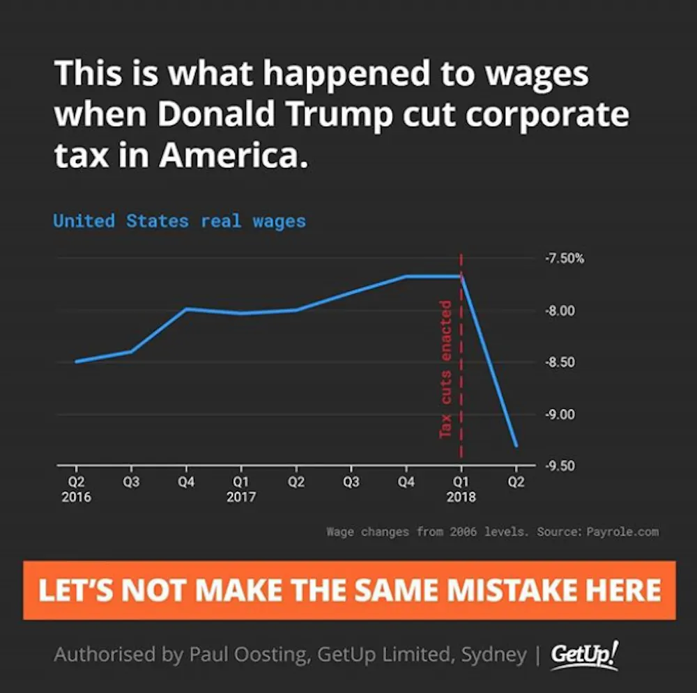
A social media post shared by lobby group GetUp! Australia argued against the tax cuts, suggesting that US real wages fell after the Trump administration cut corporate tax rates from 35% to 21%.

Let’s take a closer look.

Checking the source

The Conversation requested sources and comment from GetUp! to support the data used in the graph, and the suggestion that there had been a causal relationship between the enactment of corporate tax cuts in the US and a reduction in real wages.

We first found the graph in Bloomberg in this article by economics blogger and former Assistant Professor of Finance at Stony Brook University, Noah Smith.

The underlying data comes from the Payscale Real Wage Index – adjusted for inflation. We noted that percentage change since 2006 is an unorthodox Y axis for a wages graph, but that’s what the Payscale Index tracks.

We added the marker of the corporate tax rate being cut in the United States, which while passed in Q4 [the fourth quarter] of 2017, came into effect in Q1 [the first quarter] of 2018.

Note that in the Instagram image, we attributed Payrole.com as the source, instead of Payscale.com. This was a drafting error on our part.

Proponents of corporate tax cuts both in the US and Australia have asserted that there is a causal relationship between a lower corporate tax rate and higher wages (see US example and Australian example). The graph we posted in Instagram demonstrates that, in the US experience, that has not been the case.

This suggests that there is no causal relationship between a lower corporate tax rate and higher wages, and that cutting the corporate tax rate based on an expected flow on effect to wages would be a mistake.


Verdict

The social media post shared by GetUp! Australia, which could be read by many as suggesting that US corporate tax cuts caused wages to fall, is problematic and potentially misleading for two reasons.

Firstly: charts constructed with data from the US Bureau of Labor Statistics suggest that the chart used by GetUp! overestimates the drop in wage growth in the US between the first and second quarters of 2018.

According to the Bureau of Labor Statistics data, wage growth over that period declined slightly (rather than significantly), or was moderately positive, depending on the measure used.

Secondly, and most importantly: the chart used by GetUp! can’t conclusively establish any causal relationship between the enactment of US corporate tax cuts in January 2018 and any drop in wage growth.

While the chart does not support the argument that corporate tax cuts cause higher wages, it also cannot conclusively reject it.


What does the GetUp! chart show and suggest?

The social media post shared by GetUp! has the title: “This is what happened to wages when Donald Trump cut corporate tax in America.”

It shows a line chart with the heading: “United States real wages.” The reference to “real wages” means the index has been adjusted for inflation. A note below the chart says the wage changes are relative to 2006 levels.

The line chart depicts US real wages rising from minus 8.50% of 2006 levels in Q2 2016, to minus 7.70% in Q1 2018. A vertical line marks the point in Q1 2018 when the tax cuts were enacted. The line then shows a drop to minus 9.30% of 2006 levels in Q2 2018.

A reader could quite easily interpret the chart as meaning the enactment of corporate tax cuts in the US had an immediate and negative effect on real wage growth.

The subtitle reads: “Let’s not make the same mistake here.”

Are the data used in the chart appropriate?

As noted by GetUp! in their response to The Conversation, the source for the data used in the chart is Payscale, not payrole.com, as stated in the post.

Payscale is a US commercial company that provides information about salaries. The company publishes a quarterly wage index based on its own data, which it says is based on more than 300,000 employee profiles in each quarter, capturing the total cash compensation of full time employees in private industry and education professionals in the US.

Given the commercial nature of Payscale data, I don’t have access to their primary dataset, and can only rely on the description of the methodology reported on their website. I have no reason to doubt the validity of the data and/or the methodology.

I do, however, suggest that presenting the data in the form of percentage changes from 2006 is not ideal for an assessment of wage dynamics around the time of the enactment of corporate tax cuts.

In their response to The Conversation, GetUp! did acknowledge that “percentage change since 2006 is an unorthodox Y axis for a wages graph”.

It would be more informative to present the data as percentage changes between one quarter and the same quarter of the previous year, or between two consecutive quarters. I have done this in the two charts below, using the data publicly available from Payscale.

The story is qualitatively similar to that shown in the chart presented by GetUp!. Therefore, we can say that – based on the Payscale data – real wages seem to have dropped between the first and second quarters of 2018.

Is Payscale the best source for this kind of analysis?

While there is no reason to believe that the Payscale data are incorrect, it is worth considering a more standard statistical source.

Earnings data for the US are available from a variety of institutions. The difficulty, in this case, is that there are many different statistical definitions of earnings and wages depending on which sectors, geographical areas, and types of employees are observed.

One of the most commonly used definitions is the “average hourly earnings of production and non-supervisory employees on private payrolls”, with monthly data supplied by the US Bureau of Labor Statistics.

Using these data, I have recomputed changes in real wages (adjusted for inflation) between one quarter to the same quarter of the previous year and between two consecutive quarters.

These two charts based on US Bureau of Labor Statistics data tell a different story from the charts based on the Payscale data.

In particular, the change in wages between the first and second quarters of 2018 is moderately positive (+0.4%) rather than significantly negative (minus 1.7% based on the Payscale data).

The drop in wages between the second quarter of 2017 and the second quarter of 2018 is also less sharp (minus 0.11%, compared to minus 1.4% from the Payscale data).

These differences may be determined by the different coverage and/or statistical definitions used by Payscale and the US Bureau of Labor Statistics to measure wages and compensation.

The story the GetUp! chart suggests: is it correct?

The combination of the words and the image could suggest to some that there was a causal relationship between the enactment of corporate tax cuts and a drop in real wages in the US.

But the chart used in the post isn’t suited to provide any evidence on causality.

That’s because changes in real wages can be determined by a variety of economic factors, such as changes in the makeup of the labour force and business cycle fluctuations. A chart like the one published by GetUp! can’t possibly isolate the impact of just one factor.

The observation that wage growth dropped around the time of the enactment of the corporate tax cuts doesn’t automatically imply that this drop was caused by the tax cuts. At best, a correlation between the two events can be established, not a causal effect.

We also need to keep in mind that the relationship between tax cuts and wages is likely to involve time lags. The effect of corporate tax cuts on wages, or any other economic variable, takes time to feed through the economic system and to show up in the data. This reinforces the argument that the chart demonstrates correlation, rather than causality.

Having said that, while the data used cannot provide evidence for the argument that corporate tax cuts lead to lower wages, it cannot conclusively reject the argument, either. – Fabrizio Carmignani


Blind review

The GetUp! chart is captioned: “This is what happened when Donald Trump cut corporate tax in America.” Strictly speaking, GetUp! don’t actually claim that the corporate tax cut caused the wage to fall, but it is certainly what the reader is led to believe.

The author has identified the key problem with the GetUp! chart, which is that there is no evidence that the fall in real wages was caused by the enactment of corporate tax cuts. In fact, the chart provides no evidence to either support or reject the premise that a corporate tax cut would have any effect on wages.

The alternative data sourced by the author from the US Bureau of Labor Statistics cast some doubt on the accuracy of the data used by GetUp!, yet this is a distraction from the main argument that neither chart proves causality between corporate tax cuts and wage growth.

As the author says, there are many factors that influence real wage growth. Some examples include changes in the skills and experience of the working population, changes in government expenditure, and of course, changes to tax policy. It would be a mistake to attribute the recent decline in US wages to any single factor, such as the cut to the corporate tax rate.

This is why economic modelling is so powerful. In a “laboratory”, economic modellers can build two versions of the world: one with a tax cut and one without. With all other things held equal, the only differences between these two worlds must be a consequence of the tax cut.

Economic modelling produced by Victoria University’s Centre of Policy Studies (and of which I was an author) finds that despite stimulating growth in pre-tax real wages, a company tax cut would cause a fall in the average incomes of the Australian population.

So while this FactCheck shows that the wage chart from GetUp! is inconclusive, my view (based on the Victoria University modelling) is that company tax cuts could be a “mistake” where wages are concerned. – Janine Dixon

Author: Fabrizio Carmignani Professor, Griffith Business School, Griffith University; Reviewer: Janine Dixon Economist at Centre of Policy Studies, Victoria University

June Home Lending Flows Take A Dive

The ABS released their Housing Finance data to June 2018 today.

They reported that the trend estimate for the total value of dwelling finance commitments excluding alterations and additions fell 0.7%. Owner occupied housing commitments fell 0.2% and investment housing commitments fell 1.8%. In seasonally adjusted terms, the total value of dwelling finance commitments excluding alterations and additions fell 1.6%.

The proportion of loans for investment purposes, excluding refinance, was 41.4%, down from 53% in 2015. The proportion of refinanced owner occupied loans was 19.7%, similar to the past couple of months.

Looking at the changes month on month, owner occupied purchase of new dwellings fell 0.3%, while owner occupied purchase of established dwellings rose 0.1%, or $14,2 million.  Investment construction  lending rose 1.3%, or $14 million, borrowing for investment purposes by individuals fell 1.8%, down $154 million and investment by other entities fell 5.1% of $45.7 million. Refinance of owner occupied loans fell 0.9% or $53 million.

Overall around $31 billion of loan flows were written, down 0.7% in trend terms.

In original terms, the number of first home buyer commitments as a percentage of total owner occupied housing finance commitments rose to 18.1% in June 2018 from 17.6% in May 2018.

The number of loans fell 762 compared to last month, to 9,541. Within that we still some rises in NSW and VIC compared with a year ago, thanks to the recent FTB grants.  The proportion of loans written at fixed rates fell again.

Out First Time Buyer Tracker, which includes an estimate of first time buyers going direct to the investment sector continued at a low level, compared with a year ago.

Two final slides, first the original data showing the portfolio of loans outstanding at the banks registered an overall rise of $8 billion, and a fall in the proportion of loans for investment purposes to 33.7%, the lowest level for several years.

And the mix across states of owner occupied loans shows the strongest growth in Tasmania and Queensland, and falls in loan volumes most announced in ACT and Western Australia.

So the tighter lending conditions continue to bit, with investors less likely to get a loan. Some of this relates to demand (or lack of it) but also is being driven by the tighter lending requirements.

This is clearly seen in our surveys, where the number of rejected applications have risen significantly. This is especially true for those seeking to refinance an existing loan, including interest only loans.

The net portfolio growth, of around $9 billion, or 0.5% in the month in original terms, so overall lending remains quite strong, despite the weaker flows.

Household Financial Pressure Tightens Some More

Digital Finance Analytics (DFA) has released the July 2018 mortgage stress and default analysis update. The latest RBA data on household debt to income to March reached a new high of 190.1[1], and CBA today said in their results announcement ”there has been an uptick in home loan arrears as some households experienced difficulties with rising essential costs and limited income growth, leading to some pockets of stress”.

So no surprise to see mortgage stress continuing to rise. Across Australia, more than 990,000 households are estimated to be now in mortgage stress (last month 970,000). This equates to 30.4% of owner occupied borrowing households. In addition, more than 23,000 of these are in severe stress. We estimate that more than 57,900 households risk 30-day default in the next 12 months. We expect bank portfolio losses to be around 2.7 basis points, though losses in WA are higher at 5.1 basis points.  We continue to see the impact of flat wages growth, rising living costs and higher real mortgage rates.

Martin North, Principal of Digital Finance Analytics says “households remain under pressure, with many coping with very large mortgages against stretched incomes, reflecting the over generous lending standards which existed until recently. Some who are less stretched are able to refinance to cut their monthly repayments, but we find that the more stretched households are locked in to existing higher rate loans”.

“Given that lending for housing continues to rise at more than 6% on an annualised basis, household pressure is still set to get more intense. In addition, prices are falling in some post codes, and the threat of negative equity is now rearing its ugly head”.

“The caustic formula of coping with rising living costs – notably child care, school fees and fuel – whilst real incomes continue to fall and underemployment is causing significant pain. Many households have larger mortgages, thanks to the strong rise in home prices, especially in the main eastern state centres, and now prices are slipping. While mortgage interest rates remain quite low for owner occupied borrowers, those with interest only loans or investment loans have seen significant rises. Many are dipping into savings to support their finances.”

Recent easing interest rate pressures on the banks has decreased the need for them to lift rates higher by reference to the Bank Bill Swap Rates (BBSW), despite the fact that a number of smaller players have done so already.

Our analysis uses the DFA core market model which combines information from our 52,000 household surveys, public data from the RBA, ABS and APRA; and private data from lenders and aggregators. The data is current to end June 2018. We analyse household cash flow based on real incomes, outgoings and mortgage repayments, rather than using an arbitrary 30% of income.

Households are defined as “stressed” when net income (or cash flow) does not cover ongoing costs. They may or may not have access to other available assets, and some have paid ahead, but households in mild stress have little leeway in their cash flows, whereas those in severe stress are unable to meet repayments from current income. In both cases, households manage this deficit by cutting back on spending, putting more on credit cards and seeking to refinance, restructure or sell their home.  Those in severe stress are more likely to be seeking hardship assistance and are often forced to sell.

Probability of default extends our mortgage stress analysis by overlaying economic indicators such as employment, future wage growth and cpi changes.  Our Core Market Model also examines the potential of portfolio risk of loss in basis point and value terms. Losses are likely to be higher among more affluent households, contrary to the popular belief that affluent households are well protected.

The outlined data and analysis on mortgage stress does not occur in a vacuum. The revelations from the Royal Commission into Misconduct in the Banking, Superannuation and Financial Services Industry (the Commission) have highlighted deep issues in the regulatory environment that have contributed to the household debt “stress bomb”. However, most of the media commentary on the regulatory framework has been superficial or poorly informed. For example, several commentators have strongly criticised the Australian Securities and Investments Commission (ASIC) for not doing enough but have failed to explain what ASIC has in fact done, and what it ought to have done.

The Commission has highlighted major concerns regarding the law and practice of responsible lending. North has published widely on responsible lending law, standards and practices over the last 3-4 years, and continues to do so. Her latest work (which is co-authored with Therese Wilson from Griffith University) outlines and critiques the responsible lending actions taken ASIC from the beginning of 2014 until the end of June 2017. This paper was published by the Federal Law Review, a top ranked law journal, this month. A draft version of the paper can be downloaded at https://ssrn.com/author=905894.

The responsible lending study by North and Wilson found that ASIC proactively engaged with lenders, encouraged tighter lending standards, and sought or imposed severe penalties for egregious conduct. Further, ASIC strategically targeted credit products commonly acknowledged as the riskiest or most material from a borrower’s perspective, such as small amount credit contracts (commonly referred to as payday loans), interest only home loans, and car loans. North suggests “ASIC deserves commendation for these efforts but could (and should) have done more given the very high levels of household debt. The area of lending of most concern, and that ASIC should have targeted more robustly and systematically, is home mortgages (including investment and owner occupier loans).”

Reported concerns regarding actions taken by the other major regulator of the finance sector, the Australian Prudential Regulation Authority (APRA), have been muted so far. However, an upcoming paper by North and Wilson suggests APRA (rather than ASIC) should be the primary focus of regulatory criticism. This paper concludes that “APRA failed to reasonably prevent or constrain the accumulation of major systemic risks across the financial system and its regulatory approach was light touch at best.”

Stress by The Numbers.

Regional analysis shows that NSW has 267,298 households in stress (264,737 last month), VIC 279,207 (266,958 last month), QLD  174,137 (172,088 last month) and WA has 132,035 (129,741 last month). The probability of default over the next 12 months rose, with around 11,000 in WA, around 10,500 in QLD, 14,500 in VIC and 15,300 in NSW.

The largest financial losses relating to bank write-offs reside in NSW ($1.3 billion) from Owner Occupied borrowers) and VIC ($943 million) from Owner Occupied Borrowers, which equates to 2.10 and 2.7 basis points respectively. Losses are likely to be highest in WA at 5.1 basis points, which equates to $744 million from Owner Occupied borrowers.

Top Post Codes By Stressed Households

[1] RBA E2 Household Finances – Selected Ratios March 2018

You can request our media release. Note this will NOT automatically send you our research updates, for that register here.

[contact-form to=’mnorth@digitalfinanceanalytics.com’ subject=’Request The July 2018 Stress Release’][contact-field label=’Name’ type=’name’ required=’1’/][contact-field label=’Email’ type=’email’ required=’1’/][contact-field label=’Email Me The July 2018 Media Release’ type=’radio’ required=’1′ options=’Yes Please’/][contact-field label=”Comment If You Like” type=”textarea”/][/contact-form]

Note that the detailed results from our surveys and analysis are made available to our paying clients.

Poor price information in the home loan market

The Productivity Commission report into Competition in The Financial Services Sector has shone a light on home loan pricing, and especially the fact that it is almost impossible for consumers to effectively compare products and prices. We think this is deliberate obfuscation by the industry. So today we look at home loan pricing section of the report in more detail.

The so called standard variable rate (SVR) is the starting point. This is an artificial price, an interest rate that each lender sets by taking into account their cost of funds, operating costs and target profit margins. Lenders make reference to their own SVR when pricing home loans and advertising home loan interest rates. They use it as their benchmark rate to which a margin may be added or (more usually) subtracted when making offers to consumers. Linking actual home loan interest rates to an SVR in this way allows lenders to easily increase or decrease prices on all variable rate loans on their books in response to changes in business or regulatory conditions.


The SVR provides a useful mechanism for each bank to control its entire book of variable rate mortgages while price discriminating between customers. While SVRs are individually set by each bank, they are public information and the SVRs set by different ADIs are closely related.

But the SVR is a source of misinformation for consumers The SVR is the advertised price of a home loan. But it is not the true market price, for almost anyone. Moreover, this ‘rate’ provides consumers with little useful information. It does not provide a meaningful price benchmark for the consumer regarding the actual price of home loans being offered in the market, as most home loans are priced below the SVR.

Almost no-one has to pay the SVR. In addition, customers might not have full information about the products and prices offered by other providers, preventing them from making an informed choice. For instance, transparency in the small business and home loan markets can be poor given the prevalence of unadvertised discounts to the standard variable rate, in many cases negotiated directly. Under these circumstances a customer will have difficulty determining the competitive price without incurring large search costs.

Looking at unpublished data on actual home loan interest rates, the PC found that, the overall discounting relative to the SVR is more prevalent among major lenders, discounting is slightly more widespread for loans issued to investors compared to owner-occupiers; this is more pronounced for non-major lenders. The shares of investor and owner-occupier loans at or below the SVR issued by non-major lenders have been similar in more recent years.

This strongly suggest there is no ‘discount’, just a hidden price that varies between consumers at the discretion of the lender. ASIC noted “that pricing and comparative pricing of mortgages is somewhat opaque at the moment, partly because the standard variable rate is not what a lot of people get, and it’s hard to know whether the discount you’re getting is the same as the discount other people are getting.”

These unpublished discretionary discounts can apply to a substantial portion of loans — for example, NAB submitted that, as at June 2017, discretionary pricing was being applied to up to 70% of new NAB-branded home loans. With the majority of successful home loan applicants offered a lower rate than the SVR, this suggests that the discretionary ‘discounts’ being offered by lenders, including those offered as part of a home loan package, are potentially being used to lull consumers into feeling good about accepting the offer without further negotiation on price or other aspects of the home loan.

In 2017 Deloitte noted that the long-term average discount on lenders’ back books was about 70 basis points. The ACCC reported that discounts on the headline interest rate on home loans by the four largest banks range from 78 to 139 basis points, over the period of 30 June 2015 to 30 June 2017. For major banks, the gap between SVRs and actual interest rates has increased over time. While only some of this gap is likely due to discounts on SVR, the gap nevertheless is in line with ASIC’s finding that, for most banks, the discount margin for home loans was larger in 2015 than in 2012. Similarly, RBA research found that interest rate discounts increased between 2014 and 2017, with home loan discounts higher for newer and larger loans.

In addition to most consumers paying below the SVR, it is difficult for consumers to reliably discover the actual price for the loan they anticipate seeking, as few of the discounts offered to consumers are public. While anecdotes, apps and websites abound, there is no benchmark against which to genuinely judge the market price. Information about individually-negotiated or discretionary discounts are usually not published. The ACCC noted that ‘lenders know the size of discounts they are prepared to offer and the type of borrowers they are prepared to offer them to but this information is not publicly available’.

Furthermore, since the decision criteria for discretionary discounts vary across lenders, borrowers may find it difficult to identify and assess the discounts for which they are eligible. But the potential savings from the total discounts are significant with borrowers potentially saving almost $4000 in the first year of the loan — highlighting the need for price transparency.

Despite the empirical evidence to the contrary, CBA sought to claim that the information available is indicative of the rate received. The PC says the “CBA’s linkage of advertised rates, comparison websites and the actual end rates paid by customers implies an ease of access to information that cannot be observed in practice”.

To the contrary, brokers in discussion with the Commission confirmed that consumers are generally only able to be certain of the actual size of their ‘discount’ once they have formally had their home loan application assessed. For a complex product, the idea of starting again, if the offer is unattractive, is a substantial barrier to pro-competitive customer behaviour (despite potentially being the best course of action). A consumer’s main focus is buying the property; the home loan facilitates this goal.

Next, bundling increases complexity of pricing. Many financial institutions offer package home loans: a bundle of products that usually includes a home loan, a transaction, offset or savings account, a credit card, and some types of insurance.

Consumers are attracted to home loan packages as lenders offer ‘discounts’ on the interest rate, including the SVR, or waive fees on some or all of the components of the package. However, bundling of a number of products into a home loan package can obscure the price of individual products making it difficult for consumers to assess the value of each individual component. It can also lock consumers into ongoing use of products that become less competitive over time as financial circumstances change).

The RBA said that “product bundling and a lack of transparency in the pricing of mortgages (with the prevalence of large unadvertised discounts in interest rates from advertised standard variable rates), are impediments to competitive outcomes”.

But this means that comparison rates are meaningless. The National Consumer Credit Protection Act requires that when advertising home loan products, lenders provide a comparison rate that includes the interest rate as well as most fees and charges. The purpose of comparison rates is to allow consumers to compare products with different fees and charges.

However, comparison rates are calculated using SVRs as the base interest rate. While comparison rates could potentially improve the competitiveness of the home loan market, they are only as useful as the interest rates on which they are based. As discussed above, for more than 90% of customers, SVRs (or the advertised rate) are not the market rate.

ASIC highlighted that the comparison rate is based on the advertised rate, not on the rate that people get when they either talk to a broker or a lender. So again, it’s not a very good guide as to whether the rate you are being offered is a good rate. It also doesn’t include other things that, you know, affect the cost of the loan like LMI, because the requirement is that a comparison rate include mandatory fees, but not contingent fees, and LMI, being a contingent fee is not included within the comparison rate.

The P&N Bank also noted the lack of relevance of the comparison rate: “While the home loan comparison rate methodology was a way of demonstrating comparability across product rates and fees, we acknowledge that it may not reflect real life scenarios based on borrower type, LVR, actual loan terms/amounts — or how pricing strategies are applied over the duration of that loan.  And a submission from Home Loan Experts, a specialist mortgage broker, further noted the lack of understanding of comparison rates among consumers “We have not seen a customer use comparison rates or one that understands them. They are largely ignored by the industry and customers alike. For this reason, we recommend scrapping them altogether. And finally Canstar noted additional problems with the comparison rate — the assumptions used in formulating the rate are no longer representative of the lending market (including the loan.

SO when you are buying a home loan, the rate you get is frankly rigged, and you will never know whether you really ever got a good deal. That might help support bank profits, but once again consumers are being taken to the cleaners, and the regulators appear happy to support the poor customer outcomes. Frankly this is a disgrace,

RBA Holds As Expected.

At its meeting today, the Board decided to leave the cash rate unchanged at 1.50 per cent.

The global economic expansion is continuing. A number of advanced economies are growing at an above-trend rate and unemployment rates are low. Growth in China has slowed a little, with the authorities easing policy while continuing to pay close attention to the risks in the financial sector. Globally, inflation remains low, although it has increased in some economies and further increases are expected given the tight labour markets. One uncertainty regarding the global outlook stems from the direction of international trade policy in the United States.

Financial conditions remain expansionary, although they are gradually becoming less so in some countries. There has been a broad-based appreciation of the US dollar over recent months. In Australia, money-market interest rates are higher than they were at the start of the year, although they have declined somewhat since the end of June. These higher money-market rates have not fed through into higher interest rates on retail deposits. Some lenders have increased mortgage rates by small amounts, although the average mortgage rate paid is lower than a year ago.

The Bank’s central forecast for the Australian economy remains unchanged. GDP growth is expected to average a bit above 3 per cent in 2018 and 2019. This should see some further reduction in spare capacity. Business conditions are positive and non-mining business investment is continuing to increase. Higher levels of public infrastructure investment are also supporting the economy, as is growth in resource exports. One continuing source of uncertainty is the outlook for household consumption. Household income has been growing slowly and debt levels are high. The drought has led to difficult conditions in parts of the farm sector.

Australia’s terms of trade have increased over the past couple of years due to rises in some commodity prices. While the terms of trade are expected to decline over time, they are likely to stay at a relatively high level. The Australian dollar remains within the range that it has been in over the past two years.

The outlook for the labour market remains positive. The vacancy rate is high and other forward-looking indicators continue to point to solid growth in employment. Employment growth continues to be faster than growth in the working-age population. A further gradual decline in the unemployment rate is expected over the next couple of years to around 5 per cent. Wages growth remains low. This is likely to continue for a while yet, although the improvement in the economy should see some lift in wages growth over time. Consistent with this, the rate of wages growth appears to have troughed and there are increased reports of skills shortages in some areas.

The latest inflation data were in line with the Bank’s expectations. Over the past year, the CPI increased by 2.1 per cent, and in underlying terms, inflation was close to 2 per cent. The central forecast is for inflation to be higher in 2019 and 2020 than it is currently. In the interim, once-off declines in some administered prices in the September quarter are expected to result in headline inflation in 2018 being a little lower than earlier expected, at 1¾ per cent.

Conditions in the Sydney and Melbourne housing markets have continued to ease and nationwide measures of rent inflation remain low. Housing credit growth has declined to an annual rate of 5½ per cent. This is largely due to reduced demand by investors as the dynamics of the housing market have changed. Lending standards are also tighter than they were a few years ago, partly reflecting APRA’s earlier supervisory measures to help contain the build-up of risk in household balance sheets. There is competition for borrowers of high credit quality.

The low level of interest rates is continuing to support the Australian economy. Further progress in reducing unemployment and having inflation return to target is expected, although this progress is likely to be gradual. Taking account of the available information, the Board judged that holding the stance of monetary policy unchanged at this meeting would be consistent with sustainable growth in the economy and achieving the inflation target over time.

Update on financial advice institutions’ fees for no service refund programs

ASIC says AMP, ANZ, CBA, NAB and Westpac have now paid or offered customers $222.3 million in refunds and interest for failing to provide advice to customers while charging them ongoing advice fees. This represents a further $6.4m in payments and offers from these institutions since the last ASIC media release (17-438MR) on the fees for no service (FFNS) project, which provided compensation figures as at 31 October 2017.

In addition, ASIC is overseeing FFNS remediation programs by other Australian financial services (AFS) licensees that have identified potential FFNS failings, including Bendigo Financial Planning Ltd, Police Financial Services Ltd (trading as BankVic), State Super Financial Services Australia Limited (trading as StatePlus), and Yellow Brick Road Wealth Management Pty Ltd. The total amount now paid or offered to customers across both groups of licensees is $259.6m.

ASIC is also aware that five AFS licensees or institutions have provisioned for future remediation payments, with four of these to date providing to ASIC amounts for future remediation (see below in notes). If all of these provisions are paid in full, FFNS remediation may exceed $850m.

The table provides compensation payments and estimates reported to ASIC as at 30 June 2018. Some institutions’ total estimates have changed since ASIC’s previous media release as they have further investigated the compensation required and, in some cases, identified additional failures needing remediation.

Group Compensation paid or offered (1) Estimated future compensation (2) Total estimate
AMP $5,010,637 $370,000 (3) $5,380,637
ANZ $50,793,257 $8,443,300 (4) $59,236,557
CBA $118,040,178 $25,274,717 $143,314,895
NAB $5,690,797 $1,019,623 (5) $6,710,420
Westpac $6,896,237 Not yet available (6) $6,896,237
Bendigo $0 $2,500,000 $2,500,000
StatePlus $37,223,999 Not yet available (7) $37,223,999
Yellow Brick Road $0 $101,477 $101,477
Total (personal advice failures) $223,655,105 $37,709,117 $261,364,222
NULIS Nominees (Australia) Ltd $35,900,408 (8) 67,000,000 (9) $102,900,408
Total (personal and general advice failures) $259,555,513 $104,709,117 $364,264,630

Source: Data reported by the AFS licensees to ASIC as at 30 June 2018.

Removal of trail would reduce competition, warns AFG

From The Adviser.

Abolishing trailing commissions for mortgage brokers would reduce competition, drive up home loan rates and make banks the “unintended beneficiaries”, the Australian Finance Group has warned.

Speaking after the release of the Productivity Commission’s final report on competition in the Australian financial system, which recommended that the government remove trail commissions, the aggregator warned that such a move could be counterproductive and potentially lead to reduced competition in the financial system.

AFG CEO David Bailey cautioned that any move to ban trailing commissions for mortgage brokers would have the impact of consolidating the lending base of the banks, stating: “This is ironic given the tone of the majority of the final report. Consumers have been voting with their feet in greater numbers for over 20 years and increasingly use brokers for better service and less costly, better-suited home loans.

“Mortgage brokers are encouraged through trailing commission to stay with customers for the life of their loan, to review products and add value. It is in the business interest of brokers to work for their clients through the years to help them continue to gain better finance outcomes as circumstances change.

“Banning the incentive to work with customers for longer durations would have a detrimental impact on the very services that brokers help provide — greater competition.”

Mr Bailey echoed the thoughts of several other heads of industry by highlighting that ASIC’s review of broker remuneration ultimately found no reason to remove trail commissions, adding: “The current structure is not broken. The removal of trail will simply hand more power to the major banks and non-major lenders and consumers will pay the price.

“Since the ASIC broker remuneration review, our industry has come together to address the recommendations from the data-driven ASIC report.

“Excellent progress has been made and a good consumer outcome has been defined. All members of the Combined Industry Forum are actively engaged in addressing the proposals raised by the regulator.

“In light of this progress, momentum-based decisions which ignore the full ramifications of such a move need to be carefully considered.”

The head of AFG went on to say that brokers are filling vital roles in areas that the banks had vacated, and particularly help vulnerable customers, first home buyers and those with complex borrowing needs.

“Providing assistance in these areas takes a lot of time — time that the bigger lenders are often not prepared to give.”

Mr Bailey highlighted that AFG had provided the Productivity Commission with evidence of the savings brokers make for their customers through ongoing contact over the life of a loan, stating that it was “disappointing” the commission “did not give sufficient weight to this evidence”.

“We invite them again to spend time with some AFG brokers to understand the value a demonstrated level of contact with a customer can deliver,” Mr Bailey said.

He concluded: “The last thing Australian consumers deserve is higher prices for lending products and less competition where banks can drive up costs for existing customers.

“We can’t afford to jettison 20 years of competitive experience without giving regard to the findings of other reviews and ensuring a stable, dynamic, customer-focused lending environment remains.”

Has Australia’s net debt doubled under the current government?

From The Conversation.

On Q&A, shadow minister for finance Jim Chalmers claimed that “under the current Government, we have had net debt double”. Is that right?

Checking the source

In response to The Conversation’s request, a spokesperson for Chalmers provided the following sources:

According to the government’s Monthly Financial Statements, in September 2013 (the month of the 2013 federal election), net debt was under A$175 billion (A$174,577m).

Net debt reached more than A$350 billion in December 2017 (A$350,245m), and was above A$350 billion in January 2018 (A$353,359m), and March 2018 (A$350,717m).

Also, on the government’s own budget numbers, net debt for this financial year is A$349.9 billion (2018-19 Budget, BP1 3-16, Table 3).

So whether you look at the government’s Monthly Financial Statements or its budget, we’ve had net debt double under this government.

Chalmers told The Conversation:

The Liberals used to bang on about a so-called “budget emergency” and a “debt and deficit disaster”, but you don’t hear a peep from them anymore.

Not only has net debt doubled on the Liberals’ watch, but gross debt has crashed through half a trillion dollars for the first time ever, and their own budget papers expect it to remain well above half a trillion dollars every year for the next decade.


Verdict

Shadow minister for finance Jim Chalmers quoted his numbers (broadly) correctly when he said that “under the current government we have had net debt double”.

As at July 1, 2018, the budget estimate of net debt in Australia was about A$341.0 billion, up from A$174.5 billion in September 2013, when the Coalition took office. That’s an increase of A$166.5 billion, or roughly 95%.

To put that in context, in Labor’s last term (2007-13, a period that included the Global Financial Crisis), net debt rose by about A$197 billion – around A$30 billion more than has been the case under the current Coalition government.

It’s worth remembering that over time, a government’s debt position will reflect deficits (or surpluses) of past governments.


What is ‘net debt’?

Gross debt is the total amount of money a government owes to other parties. Net debt is gross debt, adjusted for some of the assets a government owns and earns interest on.

Not all government assets are included in the calculation of net debt. For example, the equity holdings of Australia’s sovereign wealth fund – the Future Fund – are excluded.

It’s worth noting that net debt doesn’t give the full picture of a government’s balance sheet.

If the government borrows A$1 (by issuing bonds) to buy A$1 worth of equity (investment in another asset), net debt will rise. That’s because bond issuance (debt) will rise by A$1, without an accompanying increase in investments that pay interest.

In Australia’s case, this distinction is relevant, because the government currently has about A$50 billion of investments in shares (which aren’t considered interest bearing for accounting purposes), and around A$50 billion in equity in public sector entities (like schools, hospitals and infrastructure).

Over time, a government’s debt position will reflect deficits of past governments, with budget deficits increasing the total debt, and surpluses reducing it.

Has net debt doubled under the current government?

The chart below shows net debt for Australia from 2001-02 to 2018-19. The 2017-18 and 2018-19 numbers are estimates, but all earlier numbers are actual net debt numbers.

As you can see from the chart, net debt has risen under both Coalition and Labor governments since 2008.

The Department of Finance publishes Australian Government Monthly Financial Statements, which can be used to get a picture of net debt levels during election months.

On July 1, 2007, in the final year of the Howard Coalition government, net debt was minus A$24.2 billion. The government’s financial assets, such as those held in the Future Fund, were greater than government bonds on issuance, putting the government in a net asset (positive) position.

At the time of the election of the Labor government in November 2007, Australia’s net debt position was still negative (at minus A$22.1 billion) – meaning the government held A$22.1 billion more than it owed. By July 1, 2013, in the final months of the last Labor government, net debt had risen to A$159.6 billion.

The Liberal-National Coalition won the federal election held on September 7, 2013. At September 30, net debt was A$174.5 billion (meaning that net debt rose by about A$5 billion per month in the three months before the 2013 election).

As at July 1, 2018, the budget estimate of net debt in Australia was about A$341.0 billion. That’s roughly a 95% rise since the Coalition took office in 2013, making Chalmers’ statement about net debt having doubled under the current government broadly correct.

What can we take from this?

In terms of economic management, not a great deal.

Rather than being concerned about the level of debt, most economists would be concerned about the level of debt relative to gross domestic product (GDP), or the size of the population. On these measures, the rises in net debt under the current government have been less significant.

Let’s take the net debt to GDP ratio.

It rose from about 11.3% in September 2013 (when the Coalition was elected), to 18.3% in July 2016, at which point the ratio roughly stabilised. The net debt to GDP ratio now stands at 18.6% and is predicted to fall in the next few years.

It’s also worth noting that during Labor’s most recent period of government, net debt rose by around A$197 billion – about A$30 billion more than has been the case under the current Coalition government.

My own research on the effects of political parties in Australia on the economy found that, historically, economic growth and other important economic outcomes have had little to do with which party is in power. – Mark Crosby

Blind review

The author has a done a very competent job in analysing Jim Chalmers’ statement regarding net debt under the current government.

What the analysis shows is how complex the issue is, and that the argument over which major party is the better economic manager cannot be encapsulated simply by one number.

The net debt figures can be interpreted in a number of different ways, pointing to different assessments of a particular government’s economic management.

As the author notes, the net debt position depends not just on the current government’s actions, but also on the legacy inherited from previous governments. That’s because debt is used to finance borrowings, which are largely the result of previous governments’ fiscal policies.

An assessment of a government’s macro-economic management depends on analysis of several different factors, of which debt is only one. –Phil Lewis

Author: Mark Crosby Associate Professor of Economics, Monash University;
Reviewer: Phil Lewis Professor of Economics, University of Canberra

MLC kept super members in the dark on fees

MLC and its trustee, NULIS, failed to tell superannuation members they could dial back their “plan service fees” to zero, the royal commission has heard, via InvestorDaily.


The royal commission’s public hearings into the superannuation sector began yesterday, with NAB executive Paul Carter standing in the witness box.

Counsel assisting Michael Hodge pursued a line of questioning about MLC MasterKey’s plan service fee (PSF), which the company announced it would be “turning off” on 27 July.

Mr Hodge established that once a member was transferred from MasterKey Business Super (MKBS) to MasterKey Personal Super (MKPS), they could call up their adviser to agree on a different fee.

“The member has the ability to negotiate that fee directly with their linked adviser in the personal plan,” Mr Carter said.

After establishing that the agreed-upon fee could be “zero”, Mr Hodge asked what happened if the adviser didn’t agree.

“The member is in control, and so the member if they deem that they would like the fee to be zero, the fee will be zero,” Mr Carter said.

However, Mr Hodge said there was an “issue” with the product disclosure statements (PDSs) produced by NAB/MLC — namely, that they failed to explain to members the fee could be reduced to zero.

“One of the issues that we identified was that the disclosure to members about their ability to dial that fee all the way to zero should have been clearer,” Mr Carter said.

“It had language along the lines of this fee can be negotiated between the member and the adviser.”

To which Mr Hodge responded: “You’ve used the word ‘negotiated’, but there’s no negotiation, is there? The member can just say, ‘I don’t want to pay this any more.’”

NULIS, the trustee for MLC/NAB, announced on 27 July that it would stop charging PSFs from September 2018.

“Do you know why it can’t stop charging those fees until September of this year?” Mr Hodge asked.

“No, I don’t,” Mr Carter replied.