CPI rose 0.6 per cent in the June quarter 2019

The Consumer Price Index (CPI) rose 0.6 per cent in the June quarter 2019, according to the latest Australian Bureau of Statistics (ABS) figures. This follows no movement (0.0 per cent) in the March quarter 2019.

  • All groups CPI seasonally adjusted rose 0.7%.
  • The trimmed mean rose 0.4%, following a rise of 0.3% in the March quarter 2019.
  • Over the twelve months to the June quarter 2019, the trimmed mean rose 1.6%, following a rise of 1.6% over the twelve months to the March quarter 2019.
  • The weighted median rose 0.4%, following a rise of 0.1% in the March quarter 2019.
  • Over the twelve months, the weighted median rose 1.2%, following a revised rise of 1.4% over the twelve months to the March quarter 2019.

The most significant price rises in the June quarter 2019 were automotive fuel (+10.2 per cent), medical and hospital services (+2.6 per cent), international holiday travel and accommodation (+2.7 per cent) and tobacco (+2.4 per cent).

Prices for fruit and vegetables (-2.8 per cent), domestic holiday travel and accommodation (-1.5 per cent) and electricity (-1.7 per cent) fell this quarter.

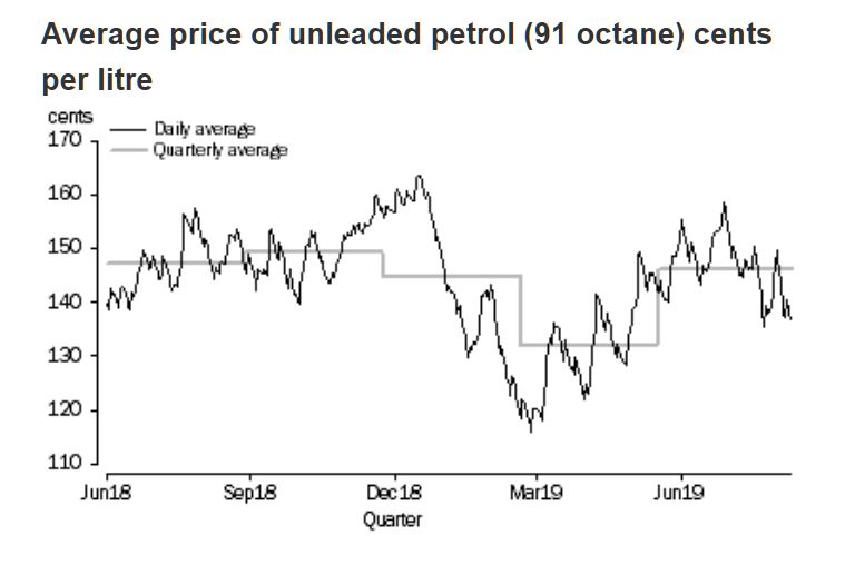
ABS Chief Economist, Bruce Hockman said: “Automotive fuel prices rose 10.2 per cent in the June quarter 2019. This rise had a significant impact on the CPI, contributing half of the 0.6 per cent rise this quarter. Automotive fuel prices returned to levels recorded in late 2018 after falling 8.7 per cent in the March quarter 2019.”

Inflation varied across the major centres. In Sydney we saw a large rise in fuel costs, putting the result in the range being experienced by Perth and Darwin.

Main Positive Contributors

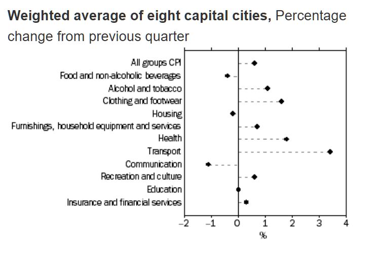
  • Transport (+3.4%) driven by higher world oil prices and retail fuel margins resulting in an increase in automotive fuel (+10.2%). Automotive fuel rose in all capital cities this quarter, ranging from Canberra (+1.7%) to Sydney (+11.8%).
  • Health (+1.8%) due to the cyclical increase in Private Health Insurance premiums in the medical and hospital services (+2.6%) from 1 April. Medical and hospital services rose in all capital cities, ranging from Canberra (+1.8%) to Adelaide (+3.8%).

Main Negative Contributors

  • Food and non-alcoholic beverages (-0.4%) driven by an improved supply of fruit and vegetables with autumn/winter produce coming into season, and bananas returning to normal prices following adverse weather conditions in Queensland last quarter. Perth exhibited a smaller fall than the other cities due to localised drought conditions affecting fruit and vegetable supply.
  • Housing (-0.2%) driven by utilities (-1.0%), new dwelling purchase for owner-occupiers (-0.2%), and continued weakness in rents (0.0%). Utilities fell in all cities excluding Perth (0.0%) and Darwin (+0.1%), ranging from Hobart (-0.1%) to Brisbane (-3.2%).

The CPI rose 1.6 per cent through the year to the June quarter 2019, after increasing 1.3 per cent through the year to the March quarter. Mr Hockman said: “Annual growth in the CPI continues to be subdued due to falls in a number of administered prices. Through the year, utility prices have fallen 0.2 per cent and child care has fallen 7.9 per cent following the introduction of the Child Care Subsidy package in July 2018.”

US CPI Is Understated

From Zerohedge.

The “muzzle” on reported inflation has policymakers and analysts perplexed.

As Joseph Carson, former director of economic research at Alliance Bernstein writes in his follow up to a “New Working Theory on Inflation“, numerous economic explanations and theories have been offered, and policymakers are considering making changes to their operating price-targeting framework. Yet, before any decisions are made policymakers should consider all of the factors that could be keeping a “muzzle” on published inflation.

Here are two:

First, a little more than 20 years ago the Bureau of Labor Statistics (BLS) introduced a number of new measurement techniques in the estimation of consumer inflation (see Boskin Commission). So the current business cycle, which started in 2009, is the second consecutive cycle in which these new procedures have been employed.

Statistical changes have been made to account for product substitution, a greater degree of quality changes in products and services and faster introduction of new outlets or ways in which people shop. The introduction of new variables in the estimation of inflation alters the pattern and at various times the rate of change as well.

Prior to their implementation, analysts and government statisticians estimated that the potential reduction in core inflation from all of these statistical changes would range from one-half to a full percentage point. Yet, all of those estimates were looking backwards and there is no guidance from the statistical agencies of the scale of the reduction in reported inflation after implementation.

Odds are high that the impact on reported inflation varies year to year, with some years at the upper end of range of estimate and others at the lower end. Nonetheless, to overlook the impact from changes in measurement would be shortsighted, especially since changes in consumer price of a few tenths of a percent or more do matter a lot when inflation is low, and readings below the 2% target could be misconstrued as a failure of monetary policy, which in turn “forces” the Fed to maintain an unnecessarily easy monetary policy, which results in asset bubbles and wealth inequality, when in fact the only applicable consideration is that the BLS and the Dept of Labor are measuring inflation incorrectly.

Second, research conducted by the Federal Reserve staff has found that the shift in the measurement of shelter costs two decades ago to only use only prices from rental market and exclude those from the owners housing market systematically removed the largest single “driver” of cyclical inflation, while it also simultaneously reduced the volatility in reported inflation.

The significance of these findings has not received as much attention as they should. Removing the largest single driver of cyclical changes in inflation means that reported inflation nowadays does not exhibit the same sensitivity to economic growth and interest rates, as was the case in previous cycles. Accordingly, one of the reasons why the trade-off between changes in unemployment and reported inflation has been so benign in the last 20 years is due to changes in price measurement.

The missed signal from housing inflation was readily apparent in the 2000s when core inflation peaked at a relatively modest 2.5% even though house price increases were recording double-digits increases. In previous business cycles in which house prices recorded gains north of 10% core inflation readings were two or three times higher. In the current cycle, house price increases have run ahead of rent increases, but not to same extent as was the case in the 2000s.

As Carson concludes, these findings strongly suggest that price measurement issues are important to consider when looking at trends in the reported inflation data. For all of the conceptual changes and measurement issues the key question policymakers should be asking is whether the “muzzle” on reported inflation still makes it a useful benchmark for the price-targeting framework. The fact that currently constructed published price measure miss modern day inflation in the asset markets strongly suggests policy may need a new working definition of inflation before they contemplate any changes to the price-target framework.

That’s the theory. Now, courtesy of Bloomberg, here is a dramatic observation of the practical implications of erroneous inflation measurements, which suggests that the US government is under-representing arguably the most important aspect of the consumer price inflation basket, that of food, by as much as 40%.

When Bloomberg’s Cameron Crise encountered the dataset that is used to compute elements of the CPI that is in turn used by the Fed to determine monetary policy (and more often than not, results in asset price bubbles) he decided to compare how this theoretical price compares to real world prices.

Ignoring such volatile series as cell phones or haircut prices, he instead focused on groceries, and specifically cereals and bakery products, “the kind where you can buy the same thing in every grocery store in the country.” He notes that there are six components to this subindex:

  • all-purpose flour,
  • long-grain rice,
  • white bread,
  • wheat bread,
  • pasta
  • chocolate chip cookies.

Then, to figure out what the real world prices are (i.e. not the “extorionate prices we pay in greater New York”), he signed up for supermarket delivery services in Columbus, Ohio, and Murfreesboro, Tennessee, because “while they may not represent the exact national average, they nevertheless seem like a reasonable proxy for middle America.”

Once the representative middle-America venues had been picked , a selection was made of an identical basket of six goods, converting them to a unit price per pound ala the CPI basket. And while the products chosen “aren’t bargain-basement” value” generics, they aren’t premium foodstuffs either.” The results, as Crise, notes, “were pretty compelling.”

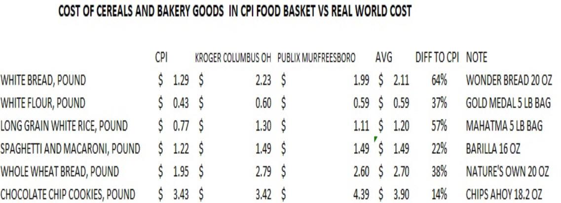
As the table below shows, the CPI is chronically misrepresenting the price of every product in the food basket, with the gap between the government “price” and the average real-world price ranging from 14% in the case of chocolate chip cookies, to as much as 64% for a pound of white bread.

Overall, in the specific case of cereals and bakery goods, the difference between the CPI price for the basket of six core food products, and the average price of the same products in Ohio and Tennessee, is a whopping 39%. This same execrise extended to all other goods and services in the basket would reveal a similar bias to misrepresenting prices to the downside relative to reality.

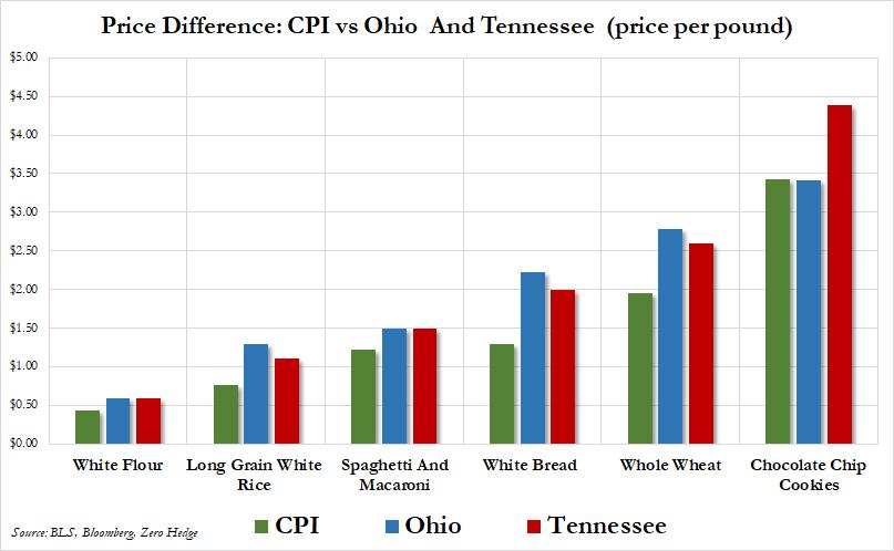
Here again are the results, represented visually.

The critical problem represented above is that while the Fed believes that the CPI calculation is accurate, and thus Americans can be subject to far looser monetary policy as the FOMC believes they are paying far less, the reality is that monetary conditions have to be far tighter for reality to catch down with the BLS’s woefully incorrect price assumptions.

And keep in mind, the example above represents what middle-America is paying. The prices for these goods along the east or west seaboard would be substantially higher, resulting in a far greater underpricing of reality by the BLS.

As Crise observes: “while there was one instance where the real world cost matches the bureaucratic estimate, for the most part food – or at least this kind of food – is a lot more expensive than the bean counters would have you believe.

And his conclusion: “perhaps if the Fed wants to see higher inflation, they should just send a few staff economists to the “social Safeway” in Georgetown.”

A CPI Donut This Quarter

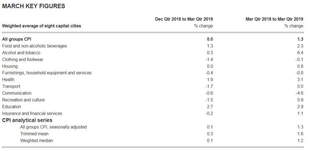
The Consumer Price Index (CPI) recorded no movement (0.0 per cent) in the March quarter 2019, according to the latest Australian Bureau of Statistics (ABS) figures. This follows a rise of 0.5 per cent in the December quarter 2018.

This just shows how far the real economy is from the CPI calculations, and the RBA is way off in its policy settings, and expectations!

The March quarter 2019 CPI was a result of price rises in a number of goods and services being fully offset by a number of price falls. This was consistent across most of the capital cities.

The most significant rises in the March quarter were vegetables (+7.7 per cent), secondary education (+4.2 per cent) and motor vehicles (+2.4 per cent). Drought and adverse weather conditions continue to reduce the supply of a selection of fruits and vegetables.

These rises were offset by falls in automotive fuel (-8.7 per cent), domestic holiday, travel and accommodation (-3.8 per cent) and international holiday, travel and accommodation (-2.1 per cent). Lower world oil prices at the end of 2018 saw automotive fuel prices fall 6.1 per cent in January, before rising in February and March, 4.2 per cent and 5.2 per cent respectively.

The CPI rose 1.3 per cent per cent through the year to the March quarter 2019, after increasing 1.8 per cent through the year to the December quarter 2018.

SYDNEY (-0.1%)

The main contributors to the fall in Sydney are automotive fuel (-8.6%), domestic holiday, travel and accommodation (-4.5%) and international holiday, travel and accommodation (-2.6%). Rents (-0.2%) also fell this quarter due to higher vacancy rates reflecting an increase in the supply of rental properties. The fall is partially offset by rises in vegetables (+9.1%), secondary education (+5.6%) and motor vehicles (+3.0%).


MELBOURNE (+0.1%)

The main contributors to the rise in Melbourne this quarter are vegetables (+7.5%), secondary education (+4.0%) and motor vehicles (+2.5%). The rise is partially offset by falls in automotive fuel (-9.1%) and new dwelling purchase by owner-occupiers (-1.2%). The fall in new dwelling purchase by owner-occupiers is due to increased competition as demand declines in the detached dwellings market.


BRISBANE (+0.1%)

The main contributors to the rise in Brisbane are vegetables (+8.1%), motor vehicles (+2.2%) and medical and hospital services (+1.8%). The rise is partially offset by falls in automotive fuel (-8.1%), domestic holiday, travel and accommodation (-6.0%) and international holiday, travel and accommodation (-2.0%).


ADELAIDE (+0.1%)

The main contributors to the rise in Adelaide this quarter are vegetables (+6.1%), pharmaceutical products (+4.2%) and fruit (+3.7%). The rise is partially offset by falls in automotive fuel (-7.8%) and domestic holiday, travel and accommodation (-3.1%).


PERTH (-0.1%)

The main contributors to the fall in Perth this quarter are automotive fuel (-8.8%) and domestic holiday, travel and accommodation (-5.5%). The fall is partially offset by rises in medical and hospital services (+1.4%), pharmaceutical products (+5.2%), vegetables (+4.8%) and secondary education (+2.6%).


HOBART (-0.2%)

The main contributors to the fall in Hobart this quarter are automotive fuel (-10.2%) and domestic holiday, travel and accommodation (-3.4%). The fall is partially offset by rises in rents (+1.6%), pharmaceutical products (+6.5%) and vegetables (+4.5%).


DARWIN (-0.8%)

The main contributors to the fall in Darwin this quarter are automotive fuel (-14.3%) and domestic holiday, travel and accommodation (-11.2%). The fall is partially offset by rises in vegetables (+7.5%), pharmaceutical products (+5.0%) and other financial services (+1.6%). The fall in domestic holiday, travel and accommodation is due to the low tourist season in Darwin.


CANBERRA (+0.1%)

The main contributors to the rise in Canberra this quarter are vegetables (+8.4%), medical and hospital services (+2.2%) and secondary education (+4.6%). The rise is partially offset by falls in automotive fuel (-9.4%) and domestic holiday, travel and accommodation (-4.1%).


CPI rose 0.5 per cent in the December quarter 2018

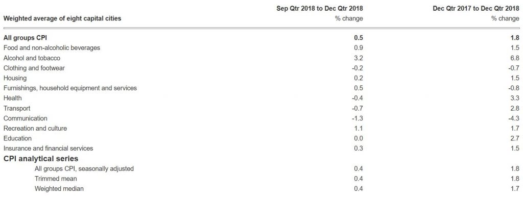
The ABS reports that the Consumer Price Index (CPI) rose 0.5 per cent in the December quarter 2018, which follows a rise of 0.4 per cent in the September quarter.

This means that inflation, on the official measures remains BELOW the RBA’s target range of 2-3%, at 1.8% and may suggest more of a bias towards cutting the cash rate (as we have been suggesting for some time).

Of course the “official” figures bear little resemblance to the real lived experience of many households – and the rental proxy for housing in the figures is understating the real expense of many with mortgages. In fact, one reason why the RBA policy levers look pretty sick is the fact that TRUE inflation in real households is closer to 3.5%, on average and for some even higher. They dropped the cash rate too far and now cannot recover.

The upshot is real net disposable income, after expenditure on necessities is all but shot for many, given the anemic wages growth. This explains why household financial confidence is falling away, as we reported before.

This is how the ABS broke the figures down.

The most significant rises in the December quarter are tobacco (+9.4 per cent), domestic holiday travel and accommodation (+6.2 per cent), fruit (+5.0 per cent), new dwellings purchased by owner-occupiers (+0.4 per cent) and furniture (+1.8 per cent). The rise is partially offset by falls in automotive fuel (-2.5 per cent), audio visual and computing equipment (-3.3 per cent), wine (-1.9 per cent) and telecommunications equipment and services (-1.5 per cent).

While automotive fuel rose 3.3 per cent in October, falls in November and December of 10.8 per cent and 5.0 per cent respectively resulted in a decrease across the quarter of 2.5 per cent.

The CPI rose 1.8 per cent through the year to the December quarter 2018, after increasing 1.9 per cent through the year to the September quarter.

ABS Chief Economist, Bruce Hockman said: “Annual growth in the CPI remains below 2 per cent in the December quarter 2018, with annual growth in tradables inflation of just 0.6 per cent, while non-tradables inflation rose 2.4 per cent. Over the past four years, annual growth in the CPI has only risen above 2 per cent in two of the past 16 quarters.”

Why The Consumer Price Index Is Flawed

From The Conversation.

Officially, Australia’s rate of inflation is 1.9%.

It’s the lowest it has been on a sustained basis since the 1950s and early 1960s.

But try to tell that to anyone and they will laugh at you, or worse.

The Bureau of Statistics is careful to say that the consumer price index isn’t a measure of living costs.

It creates that slightly differently, producing a collection of less-reported indexes that were updated this week.

On these measures, over the past year living costs have climbed 2% for households headed by an employee, 2.2% for households headed by Australians on most types of benefits, 2.3% for households headed by age pensioners, and also 2.3% for households headed by self-funded retirees.

The main difference between the consumer price index and the living cost indexes is that “living costs” include interest paid on mortgages whereas “consumer prices” do not.

Regardless, most of us would be pretty certain that even on these measures, what’s reported is too low.

We’re irrational

In part, this is because we are not rational. As Nobel Laureate Richard Thaler has pointed out, we often engage in “mental accounting”.

In general this means we notice losses more than gains. In this context, it means we focus more on the things that have gone up in price than on those that have gone down or remained unchanged.

Also, our mental basket of goods is generally not the same as the basket of goods the bureau measures, even though it should be.

It’s not our basket

Four times a year in multiple locations throughout each capital city the bureau attempts to collect information about the prices of the thousands of goods (and some services) that make the “basket” it thinks represent they typical household’s purchases.

The basket is divided into about 100 subgroups; things such as bread, milk, eggs, fruit, men’s footwear, women’s footwear, men’s clothes, women’s clothes, restaurant meals, electricity and so on.

Because it can’t price everything, it zeros in on a few representative items within each category.

For meat and fish the ABS includes beef sausages (1kg) and pink salmon (210g can). For processed fruit and vegetables it includes sliced pineapple (450g can) and frozen peas (500g pkt).

If you buy something different, the exact changes in the prices you pay won’t be fed into either the consumer price index or your living cost index, but the indexes are likely to move in line with your living costs in any case.

Things get left out

Many things are missing from the index, among them recreational drugs, gambling and prostitution.

Being bean counters, rather than priests, the bureau says it excludes these sorts of items on practical rather than moral grounds.

Gambling is excluded as it is difficult to establish the service or utility that households derive from gambling, and thus to determine an appropriate price measure. Recreational drugs and prostitution are both excluded as it is very difficult and indeed dangerous to obtain estimates of prices and expenditures, or to measure quality change.

Other things are excluded because their prices are deemed to be too volatile. The price of bank deposits and loans was removed from the main index a few years back.

And goods keep getting better

Where our views about prices are most likely to differ from the bureau’s is where goods get better.

The bureau factors quality improvements into the measures prices it reports. If, for instance, your next mobile phone costs as much as your last one but includes extra features such as more memory or an improved camera, the ABS will report that it has fallen in price.

This sort of adjustment for quality makes sense when adjusting down the price of a can of baked beans because it has been replaced by one slightly bigger, but is a grey area when it comes to improved features.

If the speed of the chip on your next laptop doubles, does that really mean the laptop is twice as good as the old one and should be said to have halved in price? Or should its price be recorded as having fallen by a lesser amount, or not at all seeing as the price hasn’t changed and it remains a standard laptop?

Often older models with lesser features are often no longer available. It’s impossible to buy a cheaper replacement.

The CPI is infrequent

The Reserve Bank is worried about the frequency of the index. It comes out only once a quarter, and up to a month after the quarter has finished.

Every developed country other than Australia and New Zealand releases its index monthly.

Given that the bank considers changing interest rates once every month, and given that the consumer price index is one of the two key measures it uses to guide its decisions (the other is the unemployment rate), a quarterly index leaves it somewhat in the dark and (when things are changing fast) potentially dangerously misled.

The bureau responds that it is prepared to release its index monthly, if it is paid to do it.

The ABS is persuaded there would be a significant benefit from more timely and responsive economic management if a CPI of equivalent quality to the current quarterly index were available monthly. Additional funding will be required to meet the costs involved in compiling a monthly index.

It’s just what we need – bureaucratic blackmail.

But it’s improving

On the positive side, new technologies have allowed more accurate price collection to make the index more precise. A key innovation is the rise of so-called “scanner data”, tracking expenditures at checkouts based on the prices people actually pay.

Scanner data has been used since 2014 and is now responsible for about one quarter of the prices reported. Field officers compile much of the rest using hand-held devices to type in prices they read off supermarket shelves.

The move to scanner data was spearheaded by the work of my UNSW School of Economics colleague Professor Kevin Fox.

There is a prospect of it becoming more widespread as more and more purchases are made with debit and credit cards and with point-of-sale software on devices such as tablets at coffee shops.

And important

Whether or not we like what it says, the consumer price index is important and lies behind much of what we do.

A whole range of government payments and duties are indexed to it – these change when the consumer price index changes. Benefits such as Newstart and family payments are indexed as are excise duties such as those on petrol and beer.

Even the private sector relies on the consumer price index to adjust payments under contracts such as rental agreements or construction charges.

Collecting it is an enormous and painstaking exercise.

Governments of both stripes would do well to remember that when next they think of cutting the bureau’s budget.

Author: Richard Holden Professor of Economics and PLuS Alliance Fellow, UNSW

The RBA On Inflation

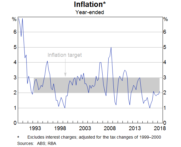
The inflation rate is currently just over 2 per cent (Graph 1). This is consistent with the inflation target for the Reserve Bank agreed between the Governor and the Treasurer. However, that follows a period where inflation has been a little below target for a number of quarters. While inflation has averaged 2½ per cent since the inflation target was introduced, over the past three years it has averaged 1.8 per cent (Table 1).

Graph 1
Graph 1: Inflation


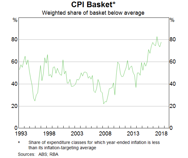
How broad based has the recent decline in inflation been? In 2016, only around one-quarter of the CPI basket had an inflation rate of above 2.5 per cent. In the June quarter this had risen but only to 40 per cent. To look at it another way, in recent quarters around 80 per cent of the basket had an inflation rate below its inflation-targeting average (Graph 2).

Graph 2
Graph 2: CPI Basket


There are a number of macroeconomic forces at work that have contributed to these outcomes, but today I am going to focus on some of the individual price developments that underpin the aggregate inflation outcome. I will examine pricing dynamics at a more disaggregated level and how these dynamics have changed in recent years. An understanding of these changing dynamics and what might be behind them is useful in assessing the outlook for inflation. Important drivers of recent lower outcomes include competition in the retail sector, historically low increases in rents, low wages growth and slower growth in some administered prices.

Table 1: Inflation by Component(a)
Effective weight Average since 1993 Average since 2015
Retail 30 1.2 −0.1
Consumer durables(b) 15 0.1 −0.8
Food(c) 7 2.4 −0.1
Fruit and vegetables 2 3.2 1.1
Alcoholic drinks 4 2.7 1.6
Non-alcoholic drinks 1 2.3 −0.5
AVC and telecommunications equipment 4 −2.8 −4.7
Housing(d) 17 3.0 1.9
New dwelling purchase 8 3.5 2.8
Rents 7 2.9 0.7
Dwelling maintenance and repair 2 2.2 2.2
Administered prices 19 4.4 3.8
Utilities 4 4.5 4.2
Education 4 5.1 3.2
Health 5 4.3 4.0
Other administered 5 4.0 3.6
Market services(e) 18 2.9 2.0
Tobacco 3 8.4 13.9
Automotive fuel 3 3.3 6.7
Holiday travel and accommodation 6 2.2 0.8
Headline CPI(f) 100 2.5 1.8
Trimmed mean(f) 70 2.6 1.8
(a) Adjusted for the tax changes of 1999-2000
(b) Excludes audio, visual and computing equipment
(c) Excludes fruit, vegetables, meals out and takeaway food
(d) Excludes administered prices
(e) Excludes domestic travel and telecommunications equipment and services
(f) Excludes interest charges and indirect deposit and loan facilities
Sources: ABS; RBA


Housing

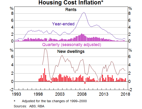
The cost of housing services has a large weight in the CPI, with the weight about equally split between the cost of building a new home and the cost of renting (Graph 8). There have been quite divergent dynamics in each of these two components in recent years.

Graph 8
Graph 8: Housing Cost Inflation

New dwelling costs

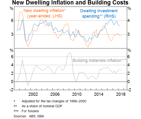
New dwelling cost inflation, which has an 8 per cent weight in the CPI basket, has tended to move closely with the residential building cycle over time (Graph 9). However, despite the historically high level of activity in housing construction over recent years, new dwelling cost inflation has been running at a bit below its long-run average. During the late 2000s, new dwelling cost inflation was higher than it is currently because the residential construction sector was competing for materials and labour with the resources sector in the midst of its investment boom. This competition for inputs has clearly abated. Wages growth in housing construction has been generally contained except for some particular skills such as bricklayers, in part because workers have been moving from the resources sector as projects there finished and also reflecting the general slow pace of wages growth in the economy. Reports from liaison suggest that competition for inputs between public infrastructure projects and high-rise residential developments has put some upward pressure on new dwelling cost inflation in Sydney and Melbourne. This includes competition for labour such as engineers and project managers, as well as competition for materials such as concrete. Liaison contacts suggest that firms have also been able to limit cost inflation by switching to lower-cost building materials.

Graph 9
Graph 9: New Dwelling Inflation and Building Costs

Rents

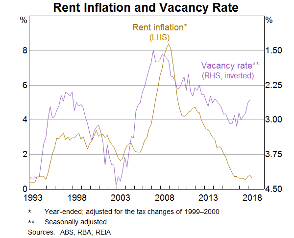
The pace of rent inflation has been falling since 2008, and year-ended rent inflation is around its lowest level since the mid 1990s. This has been a considerable drag on inflation: rental inflation was nearly 3 percentage points lower per annum in the past three years than in the previous twenty, which has reduced aggregate inflation by nearly 0.2 percentage points per annum in recent years.

The decline in rent inflation can be attributed to a mix of supply and demand side developments. As mentioned, housing construction activity has grown strongly in recent years, which has increased the supply of rental properties. Growth in the housing stock has outstripped population growth since 2014, which put downward pressure on rents.  Furthermore, rents are changed relatively infrequently and can be indexed to CPI inflation, so there is a self-reinforcing dynamic to this too.

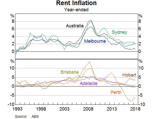
The national rent inflation series masks considerable variation across capital cities. Rent inflation has been much lower in Perth than in other capital cities in recent years, indeed rents have been falling in Perth at quite a rapid rate for a number of years. The vacancy rate in Perth – that is, the share of properties that are vacant and available to rent – has more than doubled since 2008.

But slower growth in rents is not just a Perth story. Rent inflation in Sydney and Melbourne has slowed considerably in recent years reflecting the substantial additions to the dwelling stock in these cities, and notwithstanding the faster population growth, particularly in Melbourne. Rents are flat in Brisbane and Adelaide. Only in Hobart are rents growing at a high rate.

We expect the pace of rent inflation to increase gradually over the next couple of years. The vacancy rate has declined over the last year, and newly advertised rent growth has increased. However, it will take some time for the flow of new rents to materially affect the stock of rents captured in the CPI.

Graph 10
Graph 10: Rent Inflation and Vacancy Rate
Graph 11
Graph 11: Rent Inflation

Costs Of Living Rise 2.1% Over Past Year

The latest CPI data from the ABS today for June 2018 shows that the Index (CPI) rose 0.4 per cent in the June quarter 2018, according to the latest Australian Bureau of Statistics (ABS) figures. This follows a rise of 0.4 per cent in the March quarter 2018.

The most significant price rises this quarter are automotive fuel (+6.9 per cent), medical and hospital services (+3.1 per cent), and tobacco (+2.8 per cent). These rises are partially offset by falls in domestic holiday travel and accommodation (-2.7 per cent), motor vehicles (-2.0 per cent) and vegetables (-2.9 per cent).

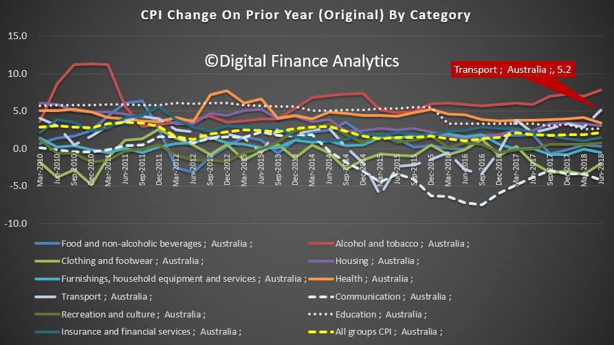
In annual terms,  transport rose 5.2%, and tobacco by 7.8%. The annual rate was 2.1%, having increased 1.9 per cent through the year to March quarter 2018. Most of this annual growth is due to strength in fuel, electricity and tobacco.

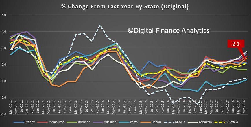
For the June quarter 2018, the All Groups annual percentage change of the Weighted Average of the Eight Capital Cities is +2.1 per cent. Sydney rose 2.1 per cent, Melbourne rose 2.5 per cent, Brisbane rose 1.7 per cent, Adelaide rose 2.7 per cent, Perth rose 1.1 per cent, Hobart rose 2.4 per cent, Darwin rose 1.2 per cent, and Canberra rose 2.8 per cent.

In fact, this is a weak result, the trimmed mean falls below the lower bounds of the RBA target at 1.9%. Yet in some categories households are reporting BIG rises in costs of living. Electricity, Fuel, Health Care costs are bearing down – and frankly the CPI does seem disconnected from the real life experience of many.

Costs are still outpacing income growth, for many households, so net, net they are going backwards, still.

Petrol prices stable to March, but now hitting four-year highs

According to the ACCC, Drivers feeling the pinch of high petrol prices should use price cycle information and fuel price websites and apps to shop around, as petrol prices in some cities reached their highest levels in almost four years in May.

Average petrol prices in Australia’s five largest cities (Sydney, Melbourne, Brisbane, Adelaide and Perth) remained broadly stable in the March quarter 2018, according to the ACCC’s latest quarterly petrol report, released today.

However since April, growing concerns about risks to global crude oil supplies have caused international oil prices, and local retail petrol prices, to jump dramatically, peaking in May.

“Consumers have recently been paying around $1.60 for petrol. These prices are higher than any time since mid-2014 in some cities,” ACCC Chairman Rod Sims said.

“Unfortunately, the international factors pushing up wholesale petrol prices mean that these higher prices are being passed on to Australian motorists at the petrol bowser.”

The ACCC reports the increase in retail petrol prices since the March quarter 2018 has been influenced by a number of factors, including the agreements in late-2016 by the Organisation of Petroleum Exporting Countries (OPEC) cartel and some other producing countries to cut crude oil production.

This has been compounded by recent concerns about risks to international crude oil supplies including: a potentially spreading conflict in the Middle East; renewed US sanctions against Iran; and falling crude oil output due to the political and economic crisis in Venezuela.

“With prices reaching four-year highs, it’s more important than ever that consumers who can, take advantage of the fuel websites and apps freely available to find the cheapest petrol prices in their area,” Mr Sims said.

“For example, yesterday lunchtime, the available fuel websites and apps indicated that the range between the highest and lowest priced sites was over 20 cents per litre (cpl) in Sydney and Adelaide, around 15 cpl in Brisbane and Perth and around 10 cpl in Melbourne.”

“While consumers cannot do much about rising international prices, they can shop around to find their lowest local price. Our first industry report showed that retailers’ prices are not the same—retailers do price differently and have different strategies to get you to fill up with them.”

The March quarter report noted that a couple of fuel price data providers announced high consumer use of their services in the quarter. In January, the Western Australian Government announced that in December 2017 the FuelWatch website reached a record of over a million hits, which was the highest number of monthly hits since its inception in 2001.

In March, 7-Eleven announced that over one million people had downloaded its fuel app since its launch in 2016.

“There are plenty of apps consumers can download for free that tell them where the cheapest petrol is in their area. We encourage consumers to use these apps, along with the analysis and reports about fuel prices, to shop around and find the best deals,” Mr Sims said.

The March quarter report also found that average gross retail margins in the five largest cities in the March quarter 2018 were 12.4 cents per litre (cpl), a decrease of 1.8 cpl from the previous quarter. However, they remain 4.4 cpl above their real long-term average since the ACCC began monitoring them in the September quarter 2002 (8.0 cpl).

Petrol prices in Brisbane remained the highest of the five largest cities in the March quarter 2018. The quarterly average retail petrol price in Brisbane was 138.2 cpl, which was 3.4 cpl higher than the average across the other four largest cities.

CPI Mixed, Housing Up

The latest ABS data, out today shows that the Consumer Price Index (CPI) rose 0.4 per cent in the March quarter 2018, the latest Australian Bureau of Statistics (ABS) figures reveal. This follows a rise of 0.6 per cent in the December quarter 2017.

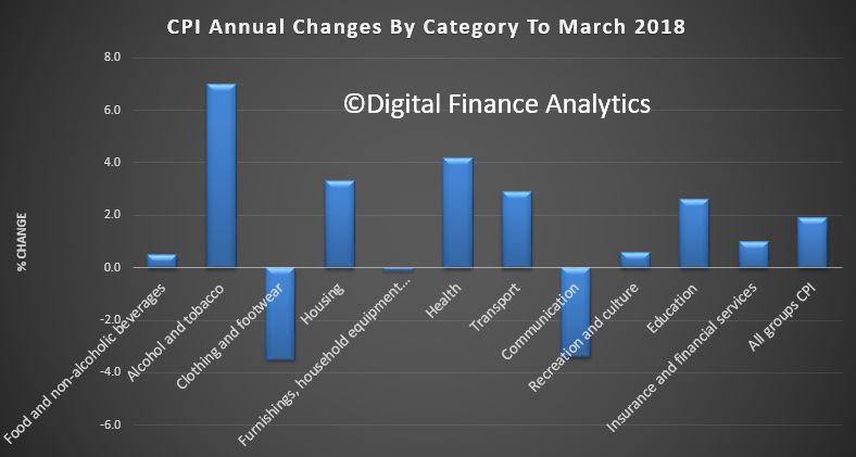
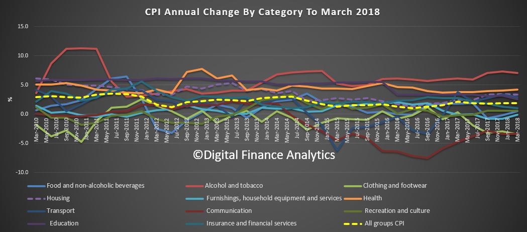
The CPI rose 1.9 per cent through the year to the March quarter 2018 having increased 1.9 per cent through the year to the December quarter 2017. Housing was more than 3% over the past year and health costs more than 4%.

The most significant price rises this quarter are secondary education (+3.3%), gas and other household fuels (+6.0%), pharmaceutical products (+5.6%), vegetables (+3.7%) and medical and hospital services (+1.5%). These price rises were partially offset by falls in international holiday travel and accommodation (-2.4%), audio, visual and computing media and services (-6.1%) and furniture (-2.8%).

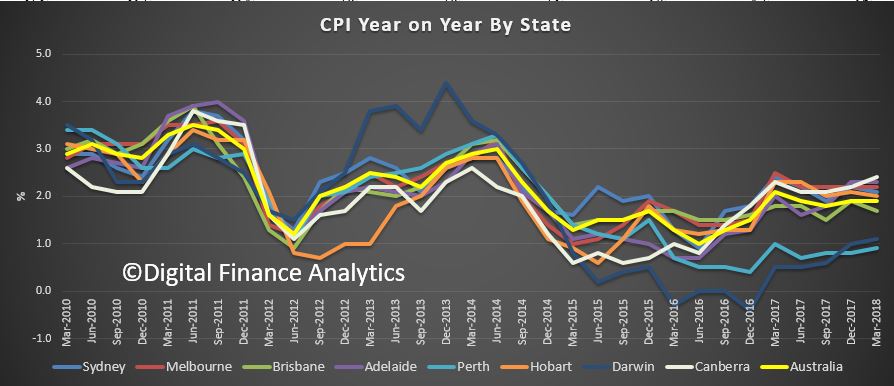
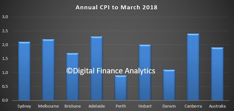
Looking across the states, the 1.9% average masks significant variations, with Sydney and Melbourne above 2% and Canberra 2.4%.

For the March quarter 2018, the All Groups annual percentage change of the Weighted Average of the Eight Capital Cities is +1.9 per cent. Sydney rose 2.1 per cent, Melbourne rose 2.2 per cent, Brisbane rose 1.7 per cent, Adelaide rose 2.3 per cent, Perth rose 0.9 per cent, Hobart rose 2.0 per cent, Darwin rose 1.1 per cent, and Canberra rose 2.4 per cent.

We think “real life” prices increases are significantly higher, due to the impact of housing and health costs in particular.


US Inflation Up 0.5% In January

More evidence of inflation lurking in the US economy, as the headline rate for January was higher than expected. This gives more support to the view the FED will indeed lift interest rates.

The Consumer Price Index for All Urban Consumers (CPI-U) increased 0.5 percent in January on a seasonally adjusted basis, the U.S. Bureau of Labor Statistics reported today. Over the last 12 months, the all items index rose 2.1 percent before seasonal adjustment.

The seasonally adjusted increase in the all items index was broad-based, with increases in the indexes for gasoline, shelter, apparel, medical care, and food all contributing. The energy index rose 3.0 percent in January, with the increase in the gasoline index more than offsetting declines in other energy component indexes. The food index rose 0.2 percent with the indexes for food at home and food away from home both rising.

The index for all items less food and energy increased 0.3 percent in January. Along with shelter, apparel, and medical care, the indexes for motor vehicle insurance, personal care, and used cars and trucks also rose in January. The indexes for airline fares and new vehicles were among those that declined over the month.

The all items index rose 2.1 percent for the 12 months ending January, the same increase as for the 12 months ending December. The index for all items less food and energy rose 1.8 percent over the past year, while the energy index increased 5.5 percent and the food index advanced 1.7 percent.