There were three FOI’s released by the RBA late last Friday – we look them over to get a read on their approach to home prices. Truth is, they want them higher, despite the inequality and risks resulting.
CONTENT
0:00 Start 0:30 Introduction 1:36 Impact Of Policy On Savers 10:45 Reporting 13:20 Inequality 21:36 Conclusions And Wrap-Up 24:22 Outro
We now know the Bureau of Statistics did quite a bit of
soul-searching before producing the bland and ultimately misleading
press release headed “Inequality Stable Since 2013-14” last month.
Late last week we pointed to the odd way in which the release included no data to back up the claim, and how journalists from the ABC and Sydney Morning Herald and Age quickly discovered the statistics it purported to summarise actually showed wealth inequality climbing.
On Wednesday in The Guardian,
Paul Karp revealed the contents of documents released under freedom of
information laws that shed light on the creation of the press release.
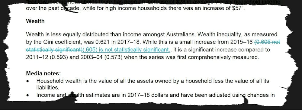
An earlier draft had pointed to a “significant increase” in wealth inequality compared with 2011–12 and 2003–04.
The phrase “significant increase” didn’t survive the editing process.
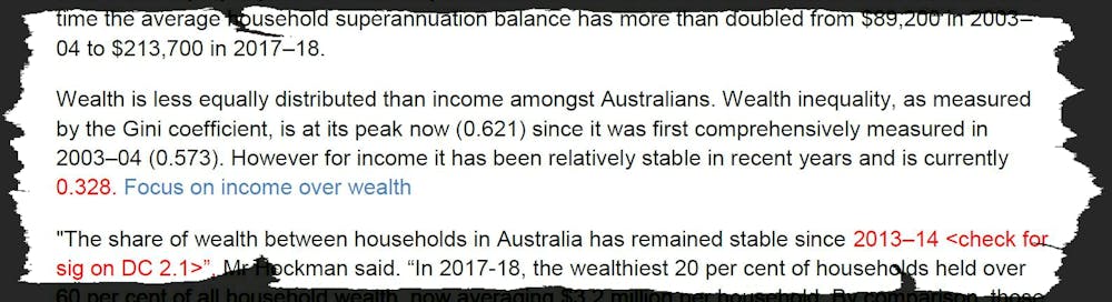
A reference to a measure of wealth inequality being “at its peak”
since it was first comprehensively measured in 2003-04 was also removed
after a direction to “focus on income over wealth”.
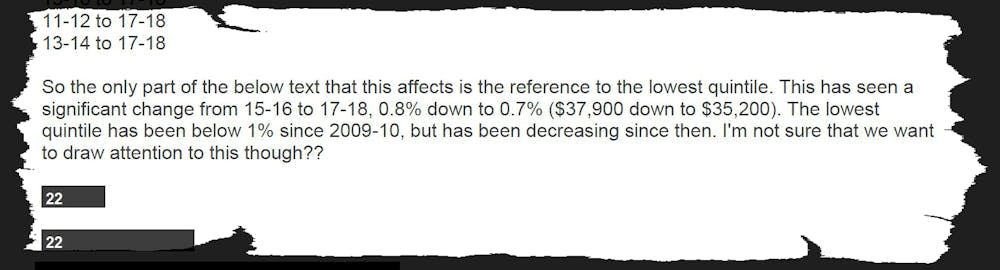
Another email noted there has been “a significant (downward) change”
in the wealth share of the bottom fifth of households, but added: “I’m
not sure that we want to draw attention to this though??”
The Bureau responded to the Guardian article on Wednesday, saying it
had not attempted to misrepresent the data, and that it prepared the
press releases “internally with no external influence”.
It’s not only the Bureau of Statistics that has found it difficult to draw attention to increasing wealth inequality.
In August last year the Productivity Commission released what it called a stocktake of the evidence on inequality, titled “Rising Inequality?”.
It wasn’t so much a “stocktake of the evidence” as a showcase of new
specially assembled evidence that conflicted with a wider body of
evidence that shows wealth inequality increasing.
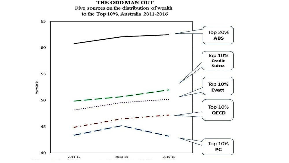
The Commission’s contribution presented the wealth shares for the top 10% of Australian households only.
These came not from publicly available data, but from “confidential
unit record files” made available to approved users by the Australian
Bureau of Statistics.
We have presented the microdata in its raw form below, alongside four other well-established and widely published series.
The striking feature is that every line except the Productivity Commission’s shows inequality increasing since 2011.
The data from both Credit Suisse (on which Oxfam bases its research) and the Evatt Foundation
suggest that the top 10% now own more than half the nation’s household
wealth, and the Organisation for Economic Co-operation and Development’s
47.2% is just a little less.
The Productivity Commission is an outlier in finding the top 10% own
closer to 40%. Its finding that the share has been falling between
2013-14 and 2015-16 makes it even more of an outlier.
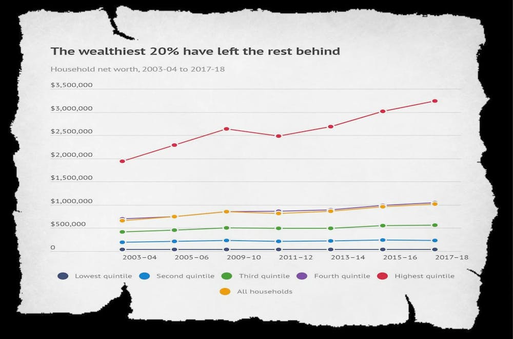
Beyond the bland headline, the latest statistics from the Bureau confirm our analysis of growing wealth inequality.
The Commission’s results are implausible
Our suspicions were aroused when the Productivity Commission’s
results appeared to be incompatible with the Bureau’s published
findings, of which they were a subset.
The Bureau’s data showed the share of wealth held by the top 20%
climbing, while the Commission’s series showed the share held by the top
10% falling – implying that the share of the next top 10% must have
been climbing quite a lot.
The divergence strained credulity. There are no advantages in
accumulating wealth that apply to households in the second top decile
that do not apply with at least equal force to those in the top decile.
Without an outside explanation (such as an extra tax applying only to
the top 10%) the result is so improbable as to seem impossible.
Other data available from the Bureau at the time showed that the
ratio of the wealth of households 10% from the top to the wealth of
those 10% from the bottom had climbed, while at the same time the
Commission found the wealth share of the top 10% overall had fallen.
Unfortunately, the Commission gave pride of place to its own findings
over and above more conventional findings, and used a question mark in
the title of its paper “Rising Inequality?” to imply that it might not be.
As we wrote here last week, wealth inequality and its effects matter. Australians need the truth about how much it is growing.
Authors: Christopher Sheil, Visiting Senior Fellow in History, UNSW; Frank Stilwell, Emeritus Professor, Department of Political Economy, University of Sydney
“the point of the estimates is that the various caps on the scheme (10,000 loan cap, income and house prices) are likely to be the binding constraint on the amount of loans provided rather than the scheme’s equity funding”.
To provide some context:
Based on ABS numbers, in the year to February there were 110,000 loans to first home buyers. The average loan size in February to FHB was $337,412. Usual caveats apply to these data.
Using the average loan size to FHB and assuming the scheme covers 15 per cent, the government will guarantee around $50,000 per loan. If the scheme has $500 million in funding, this implies
– 9,879 loans if the scheme holds reserves covering 100 per cent of its commitments. – 49,395 loans with 20 per cent reserves. – 98,790 loans with 10 per cent reserves. – 197,583 loans with 5 per cent reserves.
Average loan size data are biased downwards, so can use average house prices instead as arguably an upper bound. In the December quarter ABS average house prices were $650,000. 15 per cent of this is $97,500.
– 5,128 loans if the scheme holds reserves covering 100 per cent of its commitments. – 25,641 loans with 20 per cent reserves. – 51,282 loans with 10 per cent reserves. – 102,564 loans with 5 per cent reserves.

 Blog")