Housing affordability deteriorated further over the March 2017 quarter

From Core Logic.

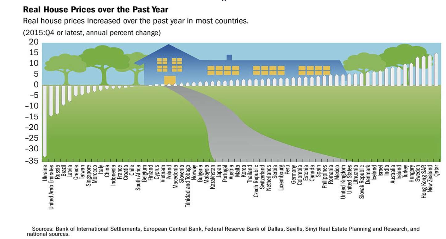
With dwelling values rising at a faster pace than household incomes, housing affordability has worsened over the first quarter of 2017.  CoreLogic measures housing affordability across four measures and three of these four measures have seen affordability deteriorate over the quarter.

The four affordability measures that CoreLogic calculate are:

  1. Dwelling price to household income ratio – essentially how many years of gross annual household income are required to purchase a property outright
  2. Years to save a deposit – how many years of gross annual household income are required for a 20% deposit
  3. Serviceability – calculating mortgage repayments on an 80% loan to value ratio (LVR) mortgage utilising the standard variable mortgage rate and a 25 year mortgage, what proportion of gross annual household income is required to service a mortgage
  4. Dwelling rent to household income – the proportion of gross annual household income required to pay the rent

The measures we look at utilise median household incomes which have been modeled by the Australian National University (ANU).

As at March 2017, the national price to income ratio was recorded at 7.3 compared to 7.2 a year earlier, 6.4 five years earlier and 6.1 a decade ago.  Looking at houses and units, the ratios were recorded at 7.4 and 6.7 respectively at March 2017.

It would have taken 1.5 years of gross annual household income for a deposit nationally at the end of the March 2017 quarter.  This is compared to 1.4 years a year earlier, 1.3 years five years ago and 1.2 years a decade ago.  If saving for a house it would take 1.5 years of the median household income for a deposit compared to 1.3 years of income for a unit.

The calculation of the proportion of household income required to service a mortgage is very sensitive to mortgage rates.  At the end of March 2017, the discounted variable mortgage rate for owner occupiers was 4.55% and a mortgage required 38.9% of a household’s income.  A year earlier mortgage rates were 4.85% and the mortgage used 39.6% of the household income.  Five years ago, mortgage rates were 6.7% and a decade ago they were 7.45% and households required 42.2% and 42.8% of their household income respectively to service a mortgage.  Further to this you can see that the proportion of household income required to service a mortgage peaked at 51.0% in June 2008 when mortgage rates were 8.85%.  Houses currently require 39.39% of a household’s income to service a mortgage compared to units requiring 36.0%.

The final affordability measure looks at the alternative to taking out a mortgage, renting, looking at the rent to income ratio.  The rent to income ratio has been more stable compared with measures related to purchasing a home or servicing a mortgage, as it is more limited by growth in household incomes.  In March 2017, the ratio was recorded at 29.6% compared to 30.4% a year earlier, 29.1% five years earlier and 25.8% a decade ago.  At the end of March 2017 the ratio was recorded at 29.6% for houses and units.

The above table highlights each of the four housing affordability measures across the Greater Capital City Statistical Areas (GCCSA) regions as at March 2017.  Capital cities are generally more expensive across all measures than regional markets despite household incomes generally being higher in capital cities.  Sydney is the least affordable housing market across most measures.  Sydney’s price to income ratio is significantly higher than all other regions analysed.  Furthermore, the serviceability calculation shows that despite mortgage rates being at close to historic low levels, a Sydney property owner is utilising 45% of their household income to service their mortgage.

This data provides a snapshot of how housing affordability is tracking across the country, and it highlights how in Sydney and Melbourne in particular it is deteriorating as dwelling values have risen over recent years. Another important point to note is that lower mortgage rates make servicing debt easier however, it doesn’t make it easier to overcome the deposit hurdle, particularly given fairly sluggish household income growth over recent years.  The data also suggests that servicing a mortgage remains more expensive than paying for rental accommodation although the gap has narrowed as interest rates have fallen.

It is important to look at a range of housing affordability measures and analyse them over time to get a true understanding of the housing affordability challenges.  Over recent years affordability on a price to income and saving for a deposit basis has deteriorated in Sydney and Melbourne however it is relatively unchanged or slightly improved in most other capital cities.  On the other hand, as mortgage rates have fallen servicing a mortgage has required a lower proportion of household income which in turn has allowed some owners to reinvest or increase their spending elsewhere.

Property prices continue to soar in an already hot market

From The NewDaily.

Latest property price figures have given home owners reason to celebrate and first home buyers even more reason for despair.

Latest data from CoreLogic Home shows prices in Australia’s main cities have leapt 3.7 per cent since the start of the year, with Sydney and Melbourne predictably higher than the national average.

Residential prices in the already-hot Sydney market jumped 5.3 per cent since January 1, with the median price hitting $950,000, and the median price for units now $740,000.

Melbourne property prices have risen 4.4 per cent this year, with the median house price at $710,000 and the unit price at $525,000.

Perth was the only capital where prices have fallen, down 1.1 per cent.

Meanwhile, Hobart remains the cheapest market with median house prices at $365,000 and unit prices at $306,500.

The news comes a week after former Liberal leader John Hewson declared Australia was experiencing a property bubble and also follows a Reserve Bank statement noting there had been “a build-up of risks associated with the housing market”.

The bank referred to rising property prices in Melbourne and Sydney, the “considerable” number of apartments coming onto the market over the next few years, resurgent growth in investor lending, and household debt rising faster than household income.

CoreLogic also reported that the proportion of settled auctions — a key benchmark of demand — was also up.

The national auction clearance rate jumped to 77.1 per cent in the week to March 26, from 74.1 per cent the previous week and well up from the 70.9 per cent in the same week in 2016.

But home buyers could soon find themselves squeezed from two sides, as interest rates rise for both owner-occupiers and investors.

“There’s only one way for interest rates to go in my reading, and that’s up,” Martin North, analyst with Digital Finance Analytics, told The New Daily.

“I’ve believed for some time that by the end of the year interest rates on owner occupied housing loans will rise by 25 to 50 basis points and for investor housing it will be between 75 to 100 basis points. That is irrespective on any moves the Reserve Bank might make on rates.”

The escalation that has seen mainland capital house prices rise 13.1 per cent in a year and as much as 19.8 per cent in Sydney is putting pressure on buyers despite low rates.

“Around 20 per cent of all owner-occupiers are suffering mortgage stress, and if rates were to rise one percentage point that would rise to 24 per cent, Mr North said.

CoreLogic’s data also showed that there were 3147 auctions last week— the second highest so far in 2017, and up from 2916 the previous week.

 – with AAP

Home Prices Up Again

The CoreLogic November Hedonic Home Value Index results out today show a rise in dwelling values across every capital city excluding Melbourne over the month. Capital city dwelling values rose by 0.2% in November as the housing growth cycle clicked over 4.5 years of growth.

Darwin was the best performing capital city: +3.7%, whilst the weakest was Perth, down -1.1%.

corelogic-nov16

The soft performance across the combined capital city reading was attributable to a 1.5% fall in the Melbourne index, while all other capital cities recorded a positive month-on-month result.

The combined regional areas of Australia showed a weaker result with house values falling by 0.2% over the month.

On an annual basis, every capital city except for Perth is now showing a positive annual trend in dwelling value growth. The highest annual growth rate is evident in Sydney and Melbourne where dwelling values are now 13.1% and 11.3% higher respectively, reflecting a steeper upwards trajectory in growth over the second half of the year. The Hobart and Canberra markets have also seen some acceleration in growth rate trends with dwelling values up 8.5%, and 8.4% respectively over the past twelve months.

Currently the national growth cycle has been in play for 4.5 years, with capital city dwelling values rising by 42.2% over the cycle to date.

Disaggregating this growth figure highlights the diversity in market conditions with Sydney and Melbourne at one end of the spectrum experiencing an increase in dwelling values over this period of 67.3% and 46.3% respectively, while at the other end of the spectrum, Perth and Darwin values have broadly declined since 2014. Perth values are 6.9% higher since the cycle commenced in June 2012, while Darwin values are 13.8% higher over this period.

It appears that higher unit supply is progressively weighing down the capital gains across Melbourne’s unit sector, with annual capital gains tracking at 3.9% for Melbourne units compared with a 12.2% annual gain in Melbourne house values. A similar trend can be seen in Brisbane, where the supply of units across key inner city regions is also high. Brisbane house values were up 4.3% over the past twelve months compared with a 0.9% fall in unit values.

Rental yields reached a new record low in November across the combined capitals index due to dwelling values continuing to rise at a faster pace than weekly rental rates.The average gross rental yield across combined capital city dwellings is now recorded at 3.2%,down from 3.5% a year ago and 4.1% five years ago.

Sydney and Melbourne share the lowest yield profile for detached housing, with an average of 2.8% in both cities, while the gross yield on Sydney units has fallen well below Melbourne’s at 3.8%.

Sydney on The UBS Bubble List

Sydney is on the latest UBS housing bubble list. They say real housing prices peaked in the second half of 2015 after an increase of 45% since mid-2012. Since then, prices have corrected by a low single-digit. Sydney sits alongside London, Stockholm, Munich and Hong Kong. The UBS Global Real Estate Bubble Index is designed to track the risk of housing bubbles in global financial centers.

ubs-bubble

The Australian residential market is influenced by a rapidly growing foreign demand (in particular, Chinese), which has tripled in value over the last three years. Increasing supply and further tax measures to reduce foreign housing investments may end the price boom rather abruptly.

Vancouver tops the index in 2016. Bubble risk also seems eminent in London, Stockholm, Sydney, Munich and Hong Kong. Deviations from the long-term norm point to overvalued housing markets in San Francisco and Amsterdam. Valuations are also stretched, but to a lesser degree, in Zurich, Paris, Geneva, Tokyo and Frankfurt. In contrast, Singapore, Boston, New York and Milan are fairly valued, while Chicago’s housing market remains undervalued relative to its own history.

Out of touch with fundamentals House prices of the cities within the bubble risk zone have increased by almost 50% on average since 2011. In the other financial centers, prices have only risen by less than 15%. This gap is out of proportion to differences in local economic growth and inflation rates.

Elevated risk of a price correction

The discrepancies have emerged out of a mix of optimistic expectations, capital inflows from abroad and loose monetary policy. The weak economic foundations of the latest price boom make the housing markets in those cities vulnerable.

A change in macroeconomic momentum, a shift in investor sentiment or a major supply increase could trigger a rapid decline in house prices. Investors in overvalued markets should not expect real price appreciation in the medium to long run.

Sydney‘s housing market has been overheating since the city became a target for Chinese investors several years ago. While Sydney showed the lowest index score of all our covered APAC cities in 2012, the market now ranks in the bubble risk category and tops all other cities in the region.


Home Prices Rebound To June 2016; Worth $6 Trillion

Sydney property prices rose in June quarter 2016 after six months of falls, according to figures released today by the Australian Bureau of Statistics (ABS).

Prices for established houses in Sydney rose 3.2 per cent and attached dwellings rose 2.0 per cent.

Residential property prices fell in Perth and Darwin, while prices rose in all other capital cities.

abs-june-2016-house-prices-trendMelbourne recorded the strongest through the year growth of 8.2 per cent, followed by Canberra at 6.0 per cent.

Established house prices for the eight capital cities rose 2.3 per cent and attached dwellings rose 1.4 per cent in the June quarter 2016.

abs-june-2016-house-pricesThe total value of Australia’s 9.7 million residential dwellings increased $138.3 billion to $6.0 trillion. The mean price of dwellings in Australia is now $623,000.

Global House Price Index Falls – IMF

The IMF Quarterly Update includes an update of the Global House Price Index.  In Australia, the aggregate house price index has been rising in a strong but volatile pattern for the past twenty-five years, and has enjoyed a particularly strong burst of growth since 2013. However, house prices in Perth—surrounded by major mining and petroleum industries and known for providing services to these industries—are declining.

After sixteen quarters of inching upwards, the global house price index shows a small downtick. But it is too soon to tell if this is a reversal in trend.

IMF-Apr-01Over the past year, many more countries have registered house price increases than declines. Australia is the eighth highest (well behind New Zealand!)

IMF-Apr-16-02Credit growth has also remained strong in many countries, though the overall correlation with house price growth at present is modest. Australia is twelfth, behind USA and Norway.

IMF-Apr-16-03Among OECD countries, house prices have grown faster than incomes ( Australia ninth highest) and rents since 2010 in about half the countries (Australia twelfth highest).

IMF-Apr-16-04IMF-Apr-16-05The decline in commodity prices does not seem to be affecting national house prices but is having some effect in regions and cities within countries.

IMF-Apr-16-06