Treasury has advised the number of Job Keeper supported employees is around 3 million, not 6.5 million as estimated due to errors, and the programme will be $60 billion cheaper!
We started to run some additional questions in our household surveys from January, and have been tracking the spreading impact of the economic shutdown as it spread in response to the virus. Last night we ran a live event where we discussed the main findings and answered questions, but we are also posting some of the analysis today. First here is the show:
In our surveys we asked two questions. First, have household finances been impacted by the virus/economic slow down, and second, how. Overall 36% of households have been adversely impacted by COVID from a finance perspective. However this does vary by industry, for example, more than 40% of those in education have taken a hit, whereas those in the legal profession are at 20%. Protective services was high, thanks to the closure of transport hubs and other public spaces.
60% of households in rental accommodation have been adversely impacted, compared with 22% of property owners.
27% of those with a mortgage are impacted compared with 18% of those who are property owners without a mortgage.
Lower income households are more adversely impacted. Half of those earning less than $50k a year and one third earning between $50-100k are impacted. This is also consistent with Grattan research. This is because many of these jobs are part-time, gig, or zero hours, and lower paid.
There are some state variations, with 40% of households in NSW adversely impacted, compared with 26% in NT. 35% of households in QLD and 37% in VIC are hit, and ACT was above WA, just.
When we examine the nature of the impact, we found that job losses were driving more than 25% of those with a mortgage, followed by income reduction due to less hours, or less pay. There were some differences between those holding a mortgage and those not (though at the margin).
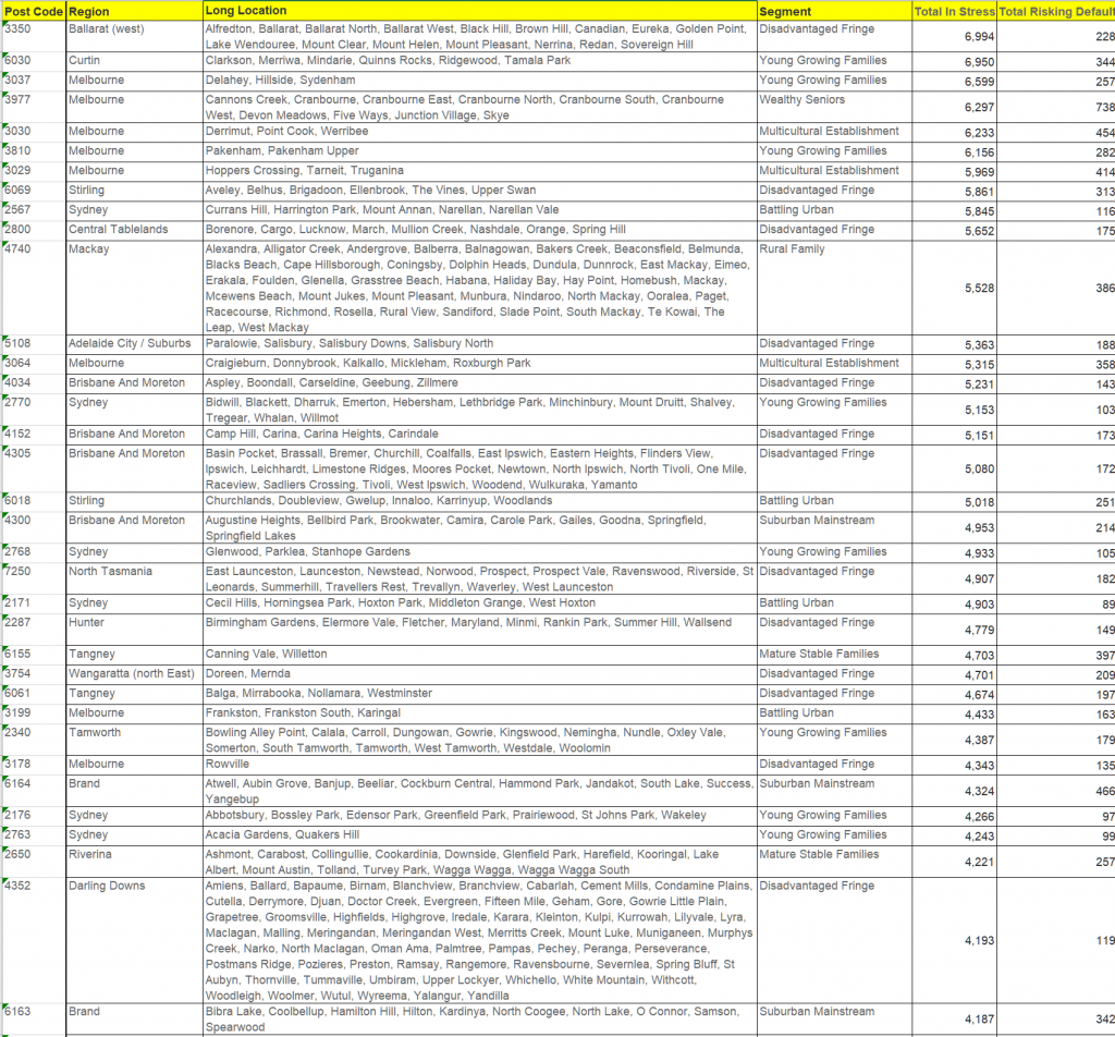
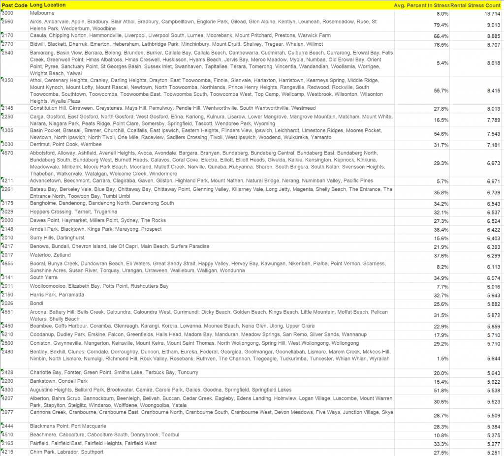
Because of the nature of the DFA survey, which is run to a post code level, we were able to identify those post codes with the largest counts of households impacted by COVID, financially speaking. We found that Toowoomba 4350 has the largest number of households impacted in the country, followed by Mackay 4740, Bundaberg 4670, Liverpool 2170, Mandurah 6210, Werribee 3030 and Cranbourne 3977. This underscores that COVID is hitting household finances areas across the country, not just in the main urban centres. Or to put it another way, even areas with low infection rates are being severely financially impacted.
We have mapped both the number of households in each post code, and the percentage of households in each post code adversely impacted financially. There are some important differences. For example, in Sydney, post codes in western Sydney have higher absolute counts, but the relative proportion of households hit is higher in the more affluent eastern suburbs, despite having lower densities.
We completed similar mapping for the other major centres. Brisbane
Nine News asked me to run some analysis on potential forced property sales, which they ran in Perth, Melbourne and Sydney yesterday. Today I wanted to add some extra detail from our analysis and explain how we established the baseline and share some heat maps for some of the major urban centres.
This is not an exact science, but the input data is from our rolling 52,000 surveys. One element in the survey is intention to transact – either to buy or sell, and the reason to transact. We also of course have cash flow analysis which is used for our regular mortgage stress analysis. For the record stress has risen significantly, as another 200,000 households fell into stress since February (even allowing for the various Government support schemes).
Forced sales are often narrowly defined as those initiated by lenders for debt recovery. The good news is that so far only a small number of these are in train. But the forced sales landscape is wider and is centred on the “fear of not getting out”
Property investors have had issues for a long time with real rentals falling, greater rental supply, and the recent shutting of Airbnb type lets. So for many, they are facing at least significant falls in receipts, or worse vacant property. They are also still dealing with the change of finance arrangements (though these are undone to more lose assessments it seems) and the need to have a repayment plan for the loan. The saving grace was the more recent rises in values, in some areas with houses doing better than units. But the expectation now is for significant property value drops, raising the risk of negative equity, or worse. Our surveys also suggest that some investors are unable, at least so far, to get repayment holidays from lenders. Thus the imperative to sell, even into a falling market explains the reason why we estimate around 8% of property investors are seeking to exit and quickly before values fall further. And some of these do not have mortgages, but simply want to save appreciated paper capital values.
Owner occupied property owners can access the banks’ schemes for repayment deferral more easily, though this appears subject to specific terms and conditions and some need to provide evidence of the health crisis impacting their finances. Many are going to ride out the current property cycle fall, though those with higher mortgages (including the 95% first time buyer schemes) will face the real prospect of the negative equity trap. But only about 2% of households are looking to sell under the current duress.
We are already seeing a rise in property listings across the country.
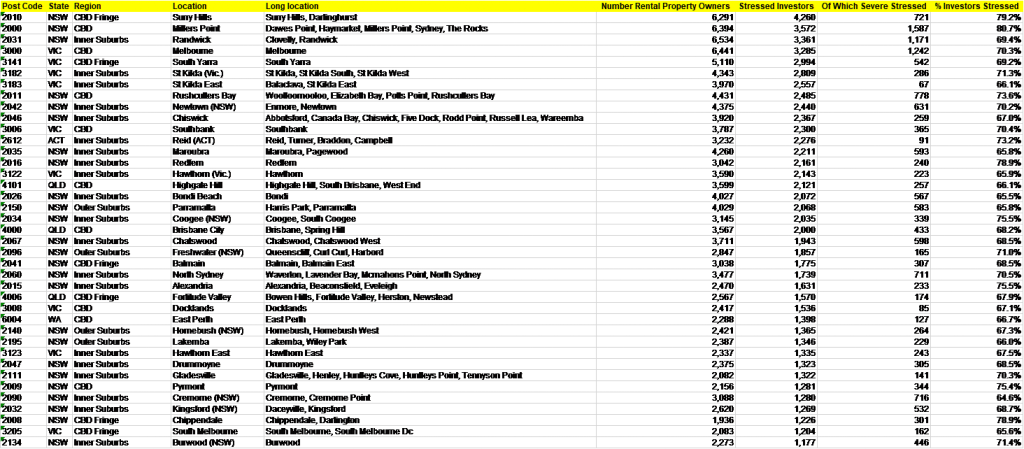
We have completed the analysis for some of the major urban centres, and the results are revealing. The post code with the largest number of potential forced sales in 3977, Cranbourne in Victoria. Here around 3,000 households are caught, with around 1,750 being property investors and 1,258 owner occupiers. Those following our modelling will recognise this post code as one of our most stressed, driven by high levels of new developments and recent purchases, by households who had above average incomes. Many new migrants live in the areas too.
Another new development area on the outskirts of Perth is second post code, 6065, which includes Hocking and Tapping, are next, with 2,500 investment properties likely to be up for forced sale.
Third on the list is Brisbane postcode 4300, which includes Brookwater and Springfield, with 2,220 investors seeking to exit and 190 owner occupiers.
Next is 4350, around Toowoomba, another high stress district, 1,780 property investors now looking to get out.
Fifth is central Melbourne 3000, with 1,690 property investors, almost exclusively in the high-rise sector of the market.
Sixth is 6164, in Perth, covering the areas around Success and Hammond Park, with 1,360 property investors and 309 owner occupied; and seventh is Sydney post code 2145, which includes Westmead and Greystanes with 920 property investors and 640 owner occupiers.
We have mapped each of the main geographies, and listed the top post codes in each state.
We will run the analysis again next month and see what trends are emerging.
For variable-rate mortgages, older loans typically have higher interest rates than new loans, even for borrowers with similar characteristics. This means that existing borrowers who are able to refinance with another lender or negotiate a better deal with their existing lender can achieve interest savings. This box examines the extent to which borrowers with older mortgages pay higher interest rates and considers the drivers of this. From the RBA Statement On Monetary Policy.
Interest rates are higher on older loans
The difference in interest rates between new and outstanding variable-rate home loans increases with
the age of the loan. Just under half of all variable-rate home loans in the Reserve Bank’s
Securitisation Dataset were originated four or more years ago. Currently, these loans have an interest
rate that is around 40 basis points higher than new loans (Graph C.1). For a loan balance of
$250,000, this difference implies an extra $1,000 of interest payments per year.
Some of the difference in rates between older and newer mortgages can be explained by a shift in the
mix of different types of variable-rate mortgages over time. In particular, the share of interest-only
and investor loans in new lending has declined noticeably in recent years and these tend to have higher
interest rates than other loans. Nevertheless, even within given types of mortgages, older mortgages
still tend to have higher interest rates than new mortgages. The right-hand panel of
Graph C.1 shows this for principal-and-interest owner-occupier loans, which account for around
55 per cent of mortgages. Moreover, higher interest rates for older loans has been a feature
of variable-rate mortgages for several years (Graph C.2).
There is strong competition for new borrowers
In part, the variation in interest rates paid by different borrowers reflects their creditworthiness or
the riskiness and features of loans. In addition, it reflects the different interest rates offered by
different lenders. However, the time at which the mortgage was taken out also has an important influence
on the interest rate paid. This reflects the tendency for competitive pressures to be strongest for new
and other borrowers who are in the process of shopping around for a loan.
The discounts that borrowers receive have increased in recent years
Very few borrowers actually pay interest rates as high as the standard variable rates (SVRs) published
by lenders. While SVRs are the reference rates against which variable-rate loans are priced, lenders
also advertise a range of interest rates that are materially lower than their SVRs.[1], [2] In addition, most individual borrowers are offered,
or may be able to negotiate, further discounts on the interest rate applied to their loan. For instance,
the major banks’ ‘package’ mortgage interest rates for owner-occupier loans currently
attract a discount of around 50–100 basis points to SVRs.[3] The lowest advertised rates
are around 100 basis points lower than those package rates, and a few borrowers receive even larger
discounts.
Indeed, in recent years, the average discounts relative to SVRs offered by major banks on new
variable-rate mortgages have grown, widening from around 100 basis points in 2015 to more than
150 basis points in 2019 (Graph C.3). By increasing the discounts on rates for new or
refinancing borrowers over time, rather than lowering SVRs, banks are able to compete for new borrowers
without lowering the interest rates charged to existing borrowers. So the rise in the average
differential between SVRs and interest rates charged on outstanding variable-rate loans reflects the
increased discounting on more recently originated loans. The discounts borrowers receive on loans are
usually fixed over the life of the loan, although they can be renegotiated. Indeed, interest rates
charged on outstanding variable-rate loans have declined by more than SVRs in recent times in part
because well-informed borrowers have been able to negotiate a larger discount with their existing
lender, without the need to refinance their loan.
In January 2020, the Reserve Bank began publishing more detailed monthly data on mortgage interest
rates paid by households on new and existing mortgages (see ‘Box D: Enhancing the
Transparency of Interest Rates’), which may help more households to make better-informed choices
about their mortgages.
Endnotes
Lenders usually advertise a number of SVRs; often
the applicable rate will depend on whether the property will be used for an owner-occupied or
investment purpose, and whether the borrower elects to repay the principal of a loan or the interest
only. [1]
For more information see RBA (2019),
‘Box D: The Distribution of Variable Housing Interest Rates’, Statement on
Monetary Policy, November, pp 59–60. [2]
A typical package mortgage has additional features
beyond a ‘basic’ mortgage, such as an offset account, but will attract a higher fee. It
may be offered in conjunction with discounts on other products, such as credit cards and insurance
policies.
Australia
is one of the most fire-prone countries on earth and bushfires can cause
widespread devastation. In the right conditions a small fire can quickly become
a massive one if not quickly controlled. When weather, topography, vegetation
and fuel combine to defeat the best efforts of firefighters, bushfires can
cause millions of dollars in damage and claim lives. Climate change is making
the effects worse and we are of course in the middle of a serious natural
disaster now, with more than 1,500 homes lost and around 20 deaths, plus people missing. Yet even as events grind on, in the absence of
rain, the totals are likely to rise ahead. I have had a number of people ask me for my
views of the broader economic and social impacts on communities and the country.
So today we begin to make some initial estimates. It will be a big number, and
may in fact risk that $5b surplus the Treasury was expecting for this year. We cannot yet be definitive, as the firestorms
are still raging.
For starters, the Insurance Council of Australia says Insurers have received claims worth A$297m since October, relating to almost 4,300 claims and they expect the number will grow significantly. They already declared a catastrophe in 236 postcodes across four states, including areas on the east coast stretching from East Gippsland to the Gold Coast. Expect Insurance premiums to rise.
These
claims include 2,306 claims, worth an estimated A$182.6m, from fires on the New
South Wales Mid-North Coast and Queensland. In October, the Rappville bushfire
in New South Wales resulted in 200 claims costing an estimated $25 million,
while the bushfires that raged in southeast Queensland and northern New South
Wales in September cost $20 million. The Bunyip bushfires in eastern Victoria
in March resulted in 432 claims and $31.9 million worth of losses.
But previous
fire tragedies in Australia have run into the billions.
When
bushfires ripped through the heart of Victoria on that scorching Saturday a
decade ago, the impact was likened to 1500 Hiroshima-style bombs exploding
across the state. That was one of the world’s worst bushfire events ever recorded
till then. It claimed 173 lives, burnt 450,000 hectares of land, (one sixth of
the current fire footprint) and destroyed 2,000 homes and 1,500 buildings.
While the initial and obvious cost of the devastation was estimated, the more
hidden and enduring economic loss is still being counted.
Researchers
within the Deakin Business School’s Department of Economics and Centre of
Energy, looked at the income effects of the Black Saturday bushfires on the
people who lived in the disaster-hit areas.
They argued this was a key indicator of economic resilience because the
ability to bounce back to pre-disaster income levels shows an aspect of the
individual’s resilience to disasters. They looked in detail at different
demographic groups such as gender, age, low income, middle income, high income
individuals, homeowner status and how individuals in each sector were affected
across 37 Statistical Area-2s (SA2), which are medium-sized general-purpose
areas that represent a community that interacts together socially and
economically, roughly corresponding to postcodes. The percentage of burnt areas
in a given SA2 ranged between 0.1 and 72.2 per cent. And they used the census data to analyse the
results and they showed the Black Saturday bushfires caused significant adverse
economic effects on the incomes of those living in the disaster areas. While
incomes of males and female were affected there was a steeper decline in female
income (14 per cent vs 9 per cent), individuals in the low-income group were
most vulnerable with an 18 per cent drop. While the income of employed people
fell significantly (8 per cent), there was no significant income effect on
unemployed individuals, presumably because they continued to receive their
entitlements. Looking at the incomes of different age groups, they found it was
the 25-45 age group who experienced the most negative and significant income
losses following the disaster. Home renters suffered an average income loss of
14 per cent but the income decline for homeowners was much less. In terms of
the industry sector of employment, they found those who worked in agriculture
lost 31 per cent of their income; the retail sector 13 per cent and the tourism
sector 12 per cent. However, individuals working in health care gained 8 per
cent probably because they worked overtime. In economics literature, this is
known as the creative destruction effect of disasters.
Finally,
individuals who moved out of the disaster zones are associated with a 19 per
cent decline in their incomes. These results confirm the need to dig deeper
beyond aggregate and community trends and investigate the effects at the
individual level. They drew four major
implications from their research. First, while average income effect is
informative, the story is in the detail. Individual demographic groups and
sectors of employment point to sizeable economic vulnerabilities. Second,
disaster recovery and relief assistance arrangements could be enhanced by
considering an individual’s vulnerabilities with a view to enhancing their
economic resilience. In other words, there is room to rethink how we build a
sustainable disaster recovery model on limited budgets. Third, the migration
effects of the Black Saturday bushfires are substantial. Bushfires are
frightening and devastating. They found that the Black Saturday bushfires had
permanent effects on an individual’s location decisions in terms of moving out
and not returning. This finding is also supported by anecdotal evidence. Finally,
the social effects were extremely negative and resulted in significant adverse
mental health effects. Reduced incomes and financial capabilities were critical
factors behind deteriorating mental health of the individuals who lived in the
disaster zones.
Then
there are medical bills from the fires and smoke haze could also run into the
hundreds of millions. For example, SGS Economics and Planning suggests
disruptions caused by the fire and smoke haze could cost Sydney as much as
A$50m a day. We run the risk of Sydney, and Australia more broadly no longer
being known for its beautiful harbours and beaches, but for its awful pollution
and bush fires. Already, in regional areas, many small businesses rely on the
summer holiday trade which has been decimated.
Other evidence
underscores the costs which include significant, and often long-term, social
impacts including death and injury and impacts on employment, education,
community networks, health and wellbeing. For example, Tasmania faced A$25m in health costs from
bushfires and smoke haze at the beginning of 2019, but then the current crisis
was on a much bigger scale.
As well
as the psychological trauma, health impacts are likely to long term, from being
forced to breath poor smoke-laden air, stress and other impacts. Around a third
of the Australian population has been impacted, with prolonged, episodic
exposure and sometimes extreme health impacts.
Between
1967 and 1999, bushfires in Australia resulted in 223 deaths and 4,185
injuries, at a total cost of $654 million. While total insurance and other
costs from bushfires were less than from floods, severe storms, tropical
cyclones or earthquakes during the period of analysis, bushfires claimed more
lives than any of these other disasters. More people were injured by bushfires
than all other disasters combined and bushfires created 48 per cent of the
total death and injury cost from natural disasters in Australia.
Some
bushfires are truly devastating. The 1939 Black Friday fires in Victoria burned
almost two million hectares, claimed 71 lives and destroyed more than 1,000
homes, including entire townships. In adjusted terms, these fires cost some $3
billion. On 1983 Ash Wednesday fires in Victoria and South Australia claimed 75
lives, more than 2,000 homes and over 400,000 hectares of country. Total
property losses were estimated to be over $400 million back then. Today they would
be closer to $2.5 billion.
A royal
commission called after the Black Saturday fires in 2009 put the cost at
A$4.4bn. That included insurance claims, which the Insurance Council of
Australia said totalled about A$1.2bn. In today’s terms, that would be closer
to $6 billion dollars, and the land so far raised this time around is around 6
times that of those 2009, which would give a gross hit around $36 billion. Reconstruction will likely take more than 3
years.
More
broadly, Deloitte Access Economics partner Kathryn Matthews said Australia
would face mounting costs from the increasing prevalence of natural disasters.
In a 2017 report the total economic cost of natural disasters, and not just
bushfires, was estimated to reach $39 billion per year by 2050.
Even the
Australia Institute said natural disasters cost Australia $13 billion per year
and that will only increase with the increase in frequency and severity of
these climate disasters.
They suggest slapping a levy on Australia’s coal and gas industry companies
to help pay for the skyrocketing costs of climate-change driven disasters such
as bushfires. A one-dollar levy on core oil and gas produced in Australia could
raise $1.5 billion annually – essential income for a national climate disaster
fund. But Treasurer Josh Frydenberg isn’t convinced. The federal government
will not be introducing a disaster levy,” he said in a statement to AAP.
The 2019 Consumer Pulse Report from financial comparison site Canstar surveyed over 2,000 Australians to get insight into current trends and how they’re likely to play out into the future. Via Australian Broker.
According to the data, less Australians
are worried about mortgage interest rate movements than in years
previous. Just 7% named it as their biggest financial concern for the
year ahead in 2019 as compared to 9% last year.
However, concern over debt as a whole has
risen, with 7% naming mounting debt levels as their leading concern for
the year ahead as compared to 5% in 2018.
Just over a quarter (26%) of Australians
reported they spend more than they earn, don’t save regularly and don’t
limit their debts. The average debt outside of property loans rests at
$48,809.
The respondents communicated credit cards
are their biggest downfall, giving way to “accidental debt” through
spending rather than the considered decision of taking out a loan and,
without the discipline of a fixed repayment plan, it tends to linger
longer.
Of those surveyed, 67% said their debt is
in the form of a credit card, 17% a car loan, 16% a personal loan, 10%
buy now pay later, and 20% other.
Nearly half (43%) of those with debt say they think about it on a daily basis.
Nearly a quarter (24%) doesn’t have any
savings at all – the same percentage as in 2018, showing a lack of
improvement in savings habits. Of those not saving, close to three
quarters (74%) indicated they live pay cheque to pay cheque.
Younger generations continue to live at
home longer while they save for their financial goals, be it a holiday, a
car or a home, with respondents saying adult children should move out
by the age of 34.
Home loan repayments as a percentage of
the average income are now at a similar level as they were before the
Global Financial Crisis (GFC); however, the RBA cash rate is
approximately one-tenth of the pre-GFC cash rate, meaning repayments
have been reduced.
Canstar expects worry to intensify when interest rates start to rise, and says now is the time to be getting a good deal.
Thanks to rises in the valuation of shares, and a bounce in property values, on paper households are now more wealthy, with the value of total assets growing faster than borrowing, and aided by overall population growth. Households were net lenders of $54.3b, depositing $23.8b and accruing $16.1b in net equity in reserves of pension funds (superannuation).
According to data released by the Australian Bureau of Statistics, household net worth (wealth) increased $318.0b (3.0%) in September quarter 2019, driven by a $322.3b increase in total assets, partly offset by a $4.3b increase in total liabilities.
The increase in total assets was driven by residential land and dwellings. The value of residential land and dwellings increased 2.9%, driven by total holding gains of $174.4b. This represents the first quarter of real holding gains on residential land and dwellings following six consecutive quarters of losses.
Household wealth per capita has increased $10,698.6 to $428,573.5, the largest increase since December 2016. With quarterly growth in household wealth at its highest in nearly two years, through the year growth in household wealth has made a recovery from the negative results seen over the 2018-19 year.
The value of household financial assets increased 2.3%, a moderate result relative to the record growth in the previous two quarters. This reflects smaller holding gains on financial assets, while net financial transactions were steady. While holdings in pension fund assets are at a high of 55.6% of total household financial assets, the share of deposits remain at a nine year low of 19.5%. This is in line with record low interest rates as the RBA board reduced the cash rate a further 25 basis points at its July meeting, following a 25 basis point cut in June.
Graph 1. Household net worth through the year growth
The growth in financial asset was driven by superannuation assets, which are made up of reserves of pension funds and unfunded superannuation claims. Reserves of pension funds increased $68.3b, of which $52.2b were due to positive revaluations as 77.1% of reserve assets were invested in shares, and therefore influenced by the performance the Australian stock market.
Household liabilities grew 0.2% and is the softest growth since March quarter 1993. Total household sector liabilities were $2,471.7b, 92% of which were long term loans. The growth in long term loans of 0.3% was due to weakness in owner occupier loans, and falls in investor, unincorporated business and fixed term loans.
Long term loans by authorised deposit taking institutions (ADIs) and securitisers made up $3.3b of the transactions of the long term loans. Net transactions in long term loans from rest of world (-$2.0b) detracted from growth. Short term loan borrowing by households decreased 2.3%, with net transactions of -$18b driven by households paying off their short term loans with ADIs. Net transactions in short term loans borrowed from ADIs is the strongest negative result for a September quarter in five years.
Household transactions in net worth were $61.8b. Financial transactions were the largest component contributing $54.1b, driven by a net acquisition of financial assets of $53.5b, and partly offset by a net incurrence of liabilities of -$0.6b. Net capital formation contributed $7.7b to household transactions in net worth and was driven by land and dwellings ($9.4b), partly offset by other non-financial assets (-$1.7b).
Household debt to assets ratios
The household debt to assets ratio gives an indication of the extent to which the overall household balance sheet is geared. The household debt to assets ratio decreased from 18.9 to 18.5, as growth in household assets (2.5%) outgrew household debt (0.2%).
The mortgage debt to residential land and dwellings ratio decreased from 29.2 to 28.6, indicating the value of residential land and dwellings outgrew mortgage debt. The decrease in the ratio is driven by the strongest increase in the value of residential land and dwellings since December quarter 2016, combined with the weakest growth in mortgage debt since September quarter 2013.
The household debt to liquid assets ratio reflects the ability of households to quickly extinguish debts using liquid assets (currency and deposits, short and long term debt securities, and equity). The household debt to liquid asset ratio decreased from 112.0 to 110.0, as growth in household liquid assets (2.1%) outweighed growth in household debt (0.2%). Growth in liquid assets was driven by increases in household deposit assets which contributed 1.1 percentage points to the 2.1% increase. Growth in household debt was weak, driven by a 0.3% increase in long term loan borrowing.
Graph 2. Mortgage debt to residential land and dwellings ratio breakdown
The wealth effect
Household net saving increased from -$3.3b to $10.7b in September quarter 2019. The $13.9b increase was drivenby
an increase in gross disposable income ($45.5b), partly offset by
increases in final consumption expenditure ($3.6b) and consumption of
fixed capital ($0.3b). The increase in gross disposable income was
driven by a $11.9b increase in dividends received and a $23.5b decrease
in income tax payable.
Household gross disposable income adjusted for other changes in real net
wealth (wealth effect) increased from $467.6b to $529.2b and household
net saving adjusted for other changes in real net wealth increased from
$165.1b to $222.8b. The increases in gross disposable income and
household net saving when adjusted for other changes in net wealth are
due to total real holding gains of $181.1b, the strongest result since
March quarter 2017.
Graph 3. Net saving plus other changes in real net wealth, original
Demand for credit Demand for credit ($42.8b) continued to slow this quarter, following 2018-19 which had the weakest annual demand for credit since 2012-13. Demand for credit this quarter was driven by the public sector, with subdued demand by the private sector and households. Households’ demand for credit (-$1.3b) was negative for the first time since March quarter 1993. Net bond issuances by National general government were $12.1b, while state and local general government borrowed $8.9b. While other private non-financial corporations borrowed $10.4b, equity raising by the sector was only $1.0b.
Demand for credit by household continues to be impacted by the slowing growth in loans for residential property, reflecting the weak housing market. Households transactions in loans were negative for the first time since December quarter 2014, with $12.2b of household loans being securitised. Growth in owner occupier loan balances continued to soften, while investor loans balances fell. Household short term loan balances also continued to drop.
Demand for credit by other private non-financial corporations was the second weakest demand in 7 years ( first being December 2018). This is in line with the lowest equity raising by the sector since December quarter 2012. National general government’s demand for credit was the highest since June quarter 2017, corresponding with a strong increase in net bond issuances this quarter. State and local general government’s demand for credit was the highest since June quarter 2012, driven by loans from central borrowing authorities, with the sector’s credit demand over the past year the strongest since 2012.
Graph 1. Demand for credit
Valuations increases in bonds and equities drive credit market outstanding
Despite subdued demand for credit over the past year, significant
valuation increases have pushed through the year growth in credit market
outstanding of non-financial domestic sectors to 5.7%. Strong price
increases in the Australian stock market and falling bond yields,
particularly over the last 3 quarters, were the main contributors to the
growth.
Credit market outstanding rose 1.3% this quarter, following last
quarter’s 2.3% increase. There were significant valuation increases in
the equity of other private non-financial corporations and government
bonds, reflecting the rise in the Australian stock market and falling
bond yields during the quarter.
Graph 2. Credit market outstanding
National investment falls in September quarter
National investment decreased by $5.1b to $110.5b this quarter.
Graph 1. Total capital formation, current prices
The general government sector invested $16.7b over the quarter, down
from $23.8b in June. A fall is typical for the September quarter.
Household investment decreased by $0.5b, falling to $38.4b overall. This
was driven by declines in machinery and equipment and dwelling
investment, partly offset by an increase in ownership transfer costs.
Private non-financial corporations investment increased by $3.5b this
quarter to $46.5b. This was driven by a build up of inventories leading
into the Christmas period.
Australia continues to be a net lender
National net lending was $7.7b in September quarter 2019 as gross saving of $119.1b was used to fund national investment.
During the quarter, residents acquired $19.7b of shares and other equity
issued by the rest of world, with non-money market financial investment
funds and pension funds acquiring $11.3b and $8.2b respectively. The
rest of the world borrowed $20.9b in loans from domestic authorised
deposit taking institutions (ADIs).
ADIs settled $20.9b of their derivative contracts with rest of the
world. The rest of the world acquired $17.4b of shares and other equity
issued by residents.
Graph 2. Net financial investment (net lending (+) / net borrowing (-))
Non-financial corporations were net borrowers of $7.7b, driven by loan
borrowings ($17.6b) and issuance of equity ($4.8b) partly offset by
maturities of $3.7b in debt securities.
The general government was a net borrower of $17.9b, driven by issuances
of long term debt securities ($11.8b) and loan borrowings ($9.3b).
Households were net lenders of $54.3b, depositing $23.8b and accruing
$16.1b in net equity in reserves of pension funds (superannuation).