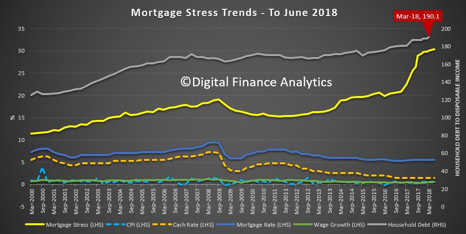
Despite the “good news” from the GDP numbers yesterday, our latest mortgage stress report, to end August 2018 continues to track higher.
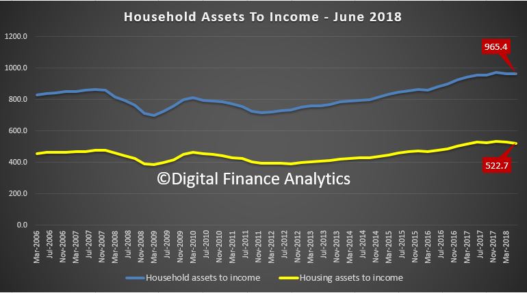
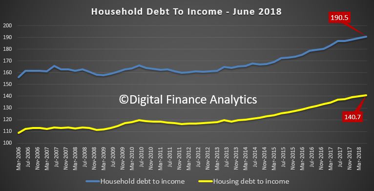
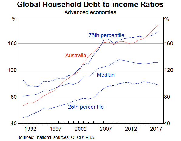
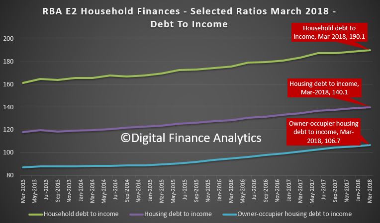
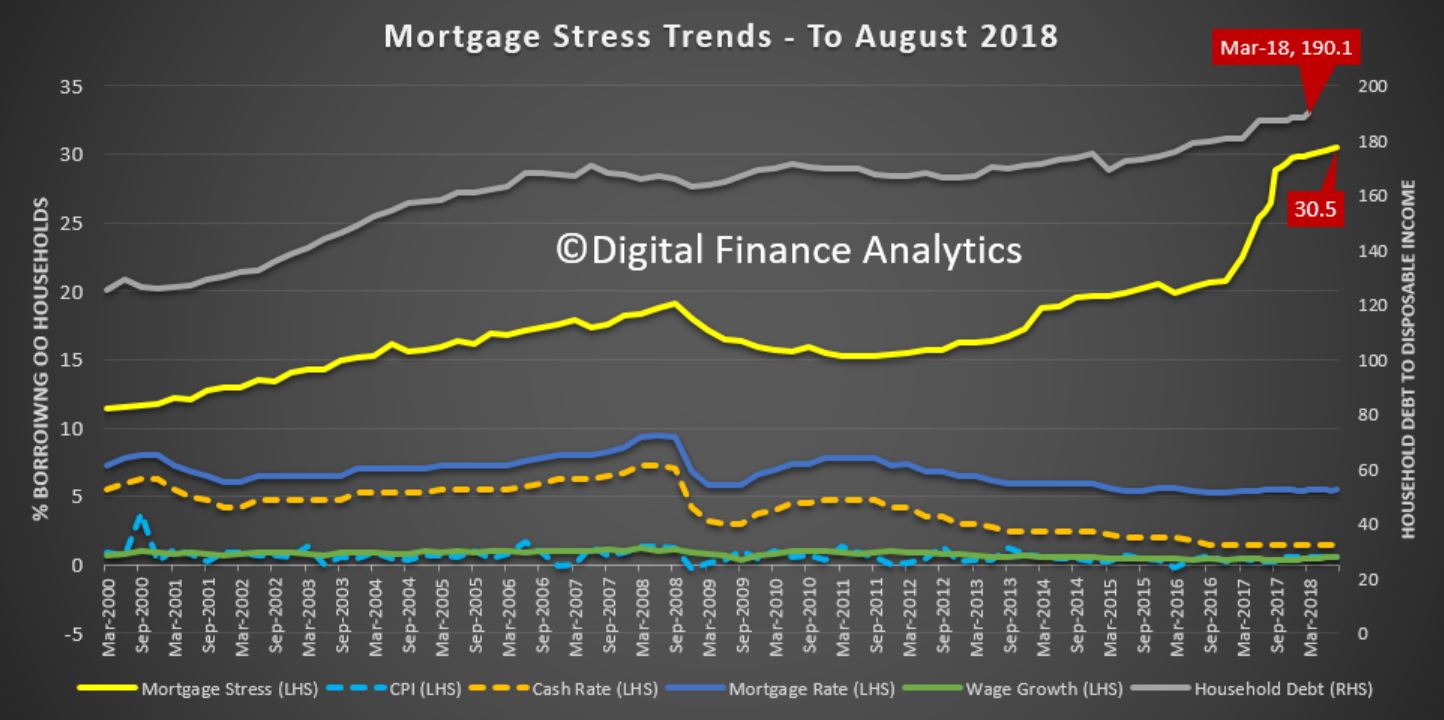 The latest RBA data on household debt to income to March reached a new high of 190.1[1]. On Tuesday, the RBA said ”One continuing source of uncertainty is the outlook for household consumption. Household income has been growing slowly and debt levels are high”; and last week “the main risks to financial stability will most likely continue to relate to credit quality. Notably, banks’ large exposure to a potential deterioration in housing loan performance is expected to remain a key issue”.
Our analysis of household finance confirms this and the latest responsible lending determinations also highlight the issues.
So no surprise to see mortgage stress continuing to rise. Across Australia, more than 996,000 households are estimated to be now in mortgage stress (last month 990,000). This equates to 30.5% of owner occupied borrowing households. In addition, more than 23,000 of these are in severe stress. We estimate that more than 59,000 households risk 30-day default in the next 12 months. We continue to see the impact of flat wages growth, rising living costs and higher real mortgage rates. Bank losses are likely to rise a little ahead.

Recent events, such as the lift in some mortgage rates, the latest council rate demands, rising fuel costs and flat incomes continue to hit home”. In addition, as home prices are falling in some post codes, the threat of negative equity is now rearing its ugly head.
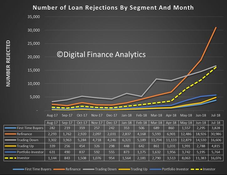
The fact that significant numbers of households have had their potential borrowing power crimped by lending standards belatedly being tightened, and are therefore mortgage prisoners, is significant. As we reported recently, up to 40% of those seeking to refinance are now having difficulty. This is strongly aligned to those who are registering as stressed. These are households urgently trying to reduce their monthly outgoings.
 Continued rises in living costs – notably child care, school fees and fuel – whilst real incomes continue to fall and underemployment is causing significant pain. Many are dipping into savings to support their finances. The June 2018 household savings ratio, just reported, shows a further fall, at 1%. The ABS says [2] “moderate growth in household disposable income coupled with strength in household consumption resulted in a decline in the household saving ratio to 1.0 per cent, recording its lowest rate since December 2007”.
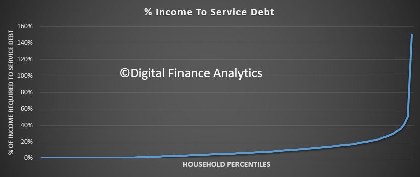
Our analysis uses the DFA core market model which combines information from our 52,000 household surveys, public data from the RBA, ABS and APRA; and private data from lenders and aggregators. The data is current to end August 2018. We analyse household cash flow based on real incomes, outgoings and mortgage repayments, rather than using an arbitrary 30% of income.
Households are defined as “stressed” when net income (or cash flow) does not cover ongoing costs. They may or may not have access to other available assets, and some have paid ahead, but households in mild stress have little leeway in their cash flows, whereas those in severe stress are unable to meet repayments from current income. In both cases, households manage this deficit by cutting back on spending, putting more on credit cards and seeking to refinance, restructure or sell their home. Those in severe stress are more likely to be seeking hardship assistance and are often forced to sell.
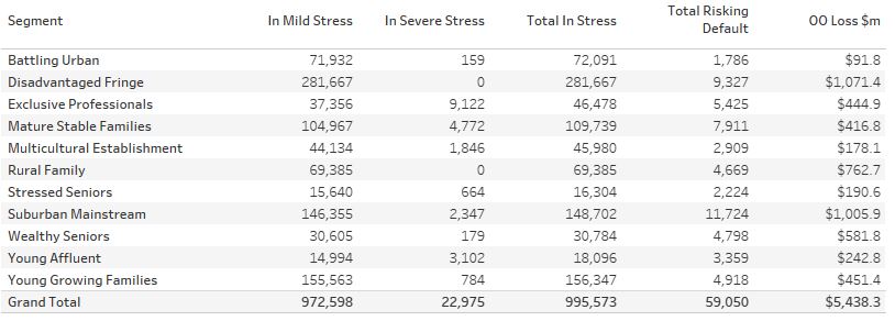
Probability of default extends our mortgage stress analysis by overlaying economic indicators such as employment, future wage growth and cpi changes. Our Core Market Model also examines the potential of portfolio risk of loss in basis point and value terms. Losses are likely to be higher among more affluent households, contrary to the popular belief that affluent households are well protected. This is shown in the segment analysis below:
 Stress by The Numbers.
Regional analysis shows that NSW has 270,612 households in stress (267,298 last month), VIC 270,551 (279,207 last month), QLD 175,102 (174,137 last month) and WA has 134,333 (132,035 last month). The probability of default over the next 12 months rose, with around 11,200 in WA, around 10,800 in QLD, 14,700 in VIC and 15,800 in NSW.
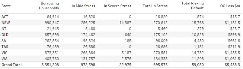 The largest financial losses relating to bank write-offs reside in NSW ($1.1 billion) from Owner Occupied borrowers) and VIC ($1.43 billion) from Owner Occupied Borrowers, though losses are likely to be highest in WA at 5.1 basis points, which equates to $744 million from Owner Occupied borrowers.
The Numbers in Context (Responsible Lending).
As indicated in our report last month, mortgage stress does not occur in a vacuum. The revelations from the Royal Commission into Misconduct in the Banking, Superannuation and Financial Services Industry (the Commission) have highlighted deep issues in the regulatory environment that have contributed to the household debt “stress bomb”. The Commission will report on an interim basis this month and its commentary on the finance sector and the regulatory structure are likely to be scathing.
Gill North, a principal of DFA and a professor of law at Deakin University “does not expect the Commission to propose major reforms to the responsible lending rules. Instead, she predicts the Commission will consider a range of mechanism to enhance compliance with the existing rules. Conversely, Gill expects the Commission will recommend significant reforms to the law governing mortgage brokers, including some form of best interest duty that requires credit intermediaries to prioritise the interests of the customer when potential conflicts arise.”
The Commission is unlikely to change the responsible lending rules because these regimes have been successfully enforced by ASIC, including actions against the largest banks. For example, in early 2018, a case against the Australia and New Zealand Banking Group was successful, and on the 4th September an action against Westpac was settled prior to the commencement of the court hearing.
In the case against ANZ, the Federal Court found that in respect of 12 car loan applications from three brokers, ANZ failed to take reasonable steps to verify the income of the consumer and relied solely on purported pay slips in circumstances where ANZ knew that the pay slips were a type of document that was easily falsified. The Court indicated that ‘income is one of the most important parts of information about the consumer’s financial situation in the assessment of unsuitability, as it will govern the consumer’s ability to repay the loan’.
The litigation against Westpac concerned the use of an automated decision system to assess home loans during the period December 2011 and March 2015. Under this automated system, Westpac used a benchmark Household Expenditure Measure when assessing approximately 50,000 home loans, instead of actual expense information, and in these instances, the actual expenses were higher than the benchmark estimate. In addition, for approximately 50,000 home loans, Westpac used the incorrect method when assessing a consumer’s capacity to repay a home loan at the end of the interest-only period. Westpac has admitted contraventions of the National Consumer Credit Protection Act 2009 (Cth) and the parties have submitted a statement of agreed facts to the Federal Court.
These cases and other responsible lending actions consistently confirm the need for all lenders to collect and verify a customer’s actual income and expenses. The nature and scope of these obligations are highlighted in ASIC’s Regulatory Guide 209 on responsible lending conduct. This regulatory guide indicates that the obligation for lenders to make reasonable inquiries is scalable and the steps required will vary. For example, more extensive inquiries are necessary when potential negative consequences for the consumer are great, the credit contract has complex terms, the consumer has limited capacity to understand the contract, or when the consumer is a new customer.
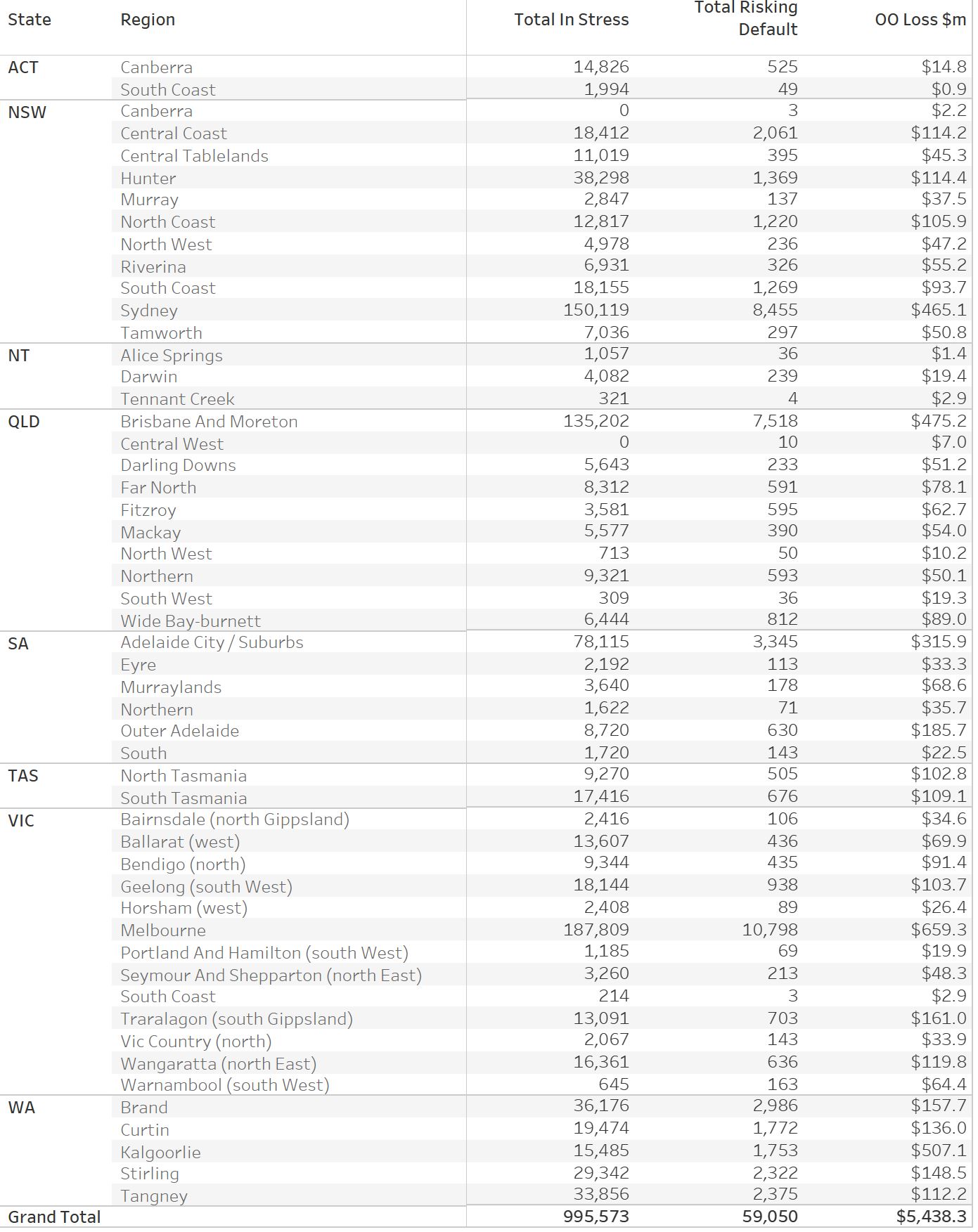
A Fuller Regional Breakdown is Set out Below.
[2] 5206.0 Australian National Accounts: National Income, Expenditure and Product
[1] RBA E2 Household Finances – Selected Ratios March 2018
You can request our media release. Note this will NOT automatically send you our research updates, for that register here.
[contact-form to=’mnorth@digitalfinanceanalytics.com’ subject=’Request The August 2018 Stress Release’][contact-field label=’Name’ type=’name’ required=’1’/][contact-field label=’Email’ type=’email’ required=’1’/][contact-field label=’Email Me The August 2018 Media Release’ type=’radio’ required=’1′ options=’Yes Please’/][contact-field label=”Comment If You Like” type=”textarea”/][/contact-form]
Note that the detailed results from our surveys and analysis are made available to our paying clients.