How superannuation discriminates against middle income earners

From The Conversation

While all workers benefit from the 9% superannuation guarantee, those on middle incomes benefit significantly less than lower and upper incomes, according to my research.

I ran simulations on the financial assets accumulated over a working life, comparing this to what would have been earned on the same amount saved but invested outside the superannuation system and earning the same rate of return. I’ve added back the last few words here as this is an important assumption in my analysis

People on low, middle and high incomes are all better off under the superannuation guarantee levy. This is due largely to the concessional tax rate (a flat 15%) on income earned in the super fund.

But lower income earners see a lifetime gain 9% higher than for the medium earner. The high income earners receive a gain 8% greater than those on medium incomes.

Ghosts in the system

About 80% of Australian government spending on cash benefits to individuals and families is subject to means-testing. This includes the low income superannuation tax offset (LISTO), as well as unemployment benefits, pensions and family tax benefits.

LISTO provides a refund of the 15% tax paid on the super contributions. It is a way of compensating low earners for the greater sacrifice they make in forgoing current spending in favour of superannuation saving.

However, means-testing of the LISTO and other cash benefits is a double-edged sword. It may promote some level of fairness, but it can also discourage work through high effective marginal tax rates.

This is because benefits are phased out or cut completely once income reaches a certain threshold, costing the person a benefit they had been entitled to. This is essentially the same as paying a tax.

Means-testing of the LISTO is one way in which our compulsory superannuation levy (SGL) discriminates against middle income earners. Only employees with a taxable income up to A$37,000 are eligible for the refund and it’s capped at A$500 per year.

The super tax offset is lost once taxable income exceeds A$37,000, creating a jump in the effective marginal tax rate paid. This means, according to my simulations, the superannuation guarantee levy provides significantly greater gains to low income earners than middle earners over a working lifetime.

And there are a lot of low income earners. In 2016, roughly 2.9 million employees (28% of all employees) were eligible for the LISTO. This figure is probably an underestimate, as the ABS data used here refers to cash earnings while LISTO is based on taxable income.

The top 20%, or 2 million earners, also gain more than middle earners from their superannuation. This is due to the flat 15% tax on super fund earnings, which represents a significant drop from the marginal tax rate that the high income earner would pay for equivalent savings outside superannuation.

A person with taxable income over A$180,000 will pay 47 cents in tax for every additional dollar earned over A$180,000. But the tax payable on additional income from superannuation earnings is just 15%. This represents a 32% concession (47% minus 15%).

What we could do differently

There is no reason why the superannuation guarantee levy should discriminate against one income group over another. We already have a public pension scheme to support retirement of low income earners – there is no need for superannuation to do this.

New Zealand’s super system, KiwiSaver, offers a great example. KiwiSaver is an “opt out” model of superannuation. Employees are automatically enrolled when they are first employed but they can choose to withdraw their savings.

And unlike Australia’s superannuation guarantee, KiwiSaver allows members to suspend their contributions for between three months and five years after one year of membership. KiwiSaver funds can also be withdrawn to buy an owner-occupied house, provided certain requirements are met.

The flexibility afforded by KiwiSaver means that low income earners are not forced to save through superannuation. In turn this means there is less reason to have tax concessions like LISTO to compensate low earners.

The absence of means-testing benefits in Kiwisaver also avoids the high effective marginal tax rates that act as a disincentive to earn higher income through employment.

KiwiSaver contributions and returns are taxed the same as other savings. This eliminates the gains to high earners from the concessional rate of tax on super fund earnings enjoyed in Australia.

The combination of these KiwiSaver features is that neither the low or high earners are advantaged relative to middle earners.

This is one of several aspects where the New Zealand system of taxation and government benefits is superior to Australia’s in terms of disincentives and complexity, while still allowing New Zealand to have slightly less inequality than Australia.

Author: Ross Guest, Professor of Economics and National Senior Teaching Fellow, Griffith University

How incomes, taxes and benefits work out for Australians

From The Conversation.

The Australian Bureau of Statistics has just released its latest analysis of the effects of government benefits and taxes on household income. Overall, it shows government spending and taxes reduce income inequality by more than 40% in Australia. Disparities between the richest and poorest states are also greatly reduced.

The ABS analysis provides the most up-to-date (to 2015-16) and comprehensive figures on the impacts of government spending and taxes on income distribution. As well as direct taxes and social security benefits, it estimates the impact of “social transfers in kind” – goods and services that the government provides free or subsidises. These include government spending on education, health, housing, welfare services, and electricity concessions and rebates.

The figures also include a wide range of indirect taxes. Among these are GST, stamp duties and excises on alcohol, tobacco, fuel and gambling.

The 2015-16 results are the seventh in a series published every five to six years since 1984. The methodology is based on similar studies by the UK Office of National Statistics since the 1960s. The latest UK analysis coincidentally also came out on Wednesday.

How do the calculations work?

The ABS analyses income distribution in a number of stages.

First, it calculates the distribution of “private income”. This includes wages and salaries, self-employment, superannuation, interest, dividends and income from rental properties, among other items. It also includes net imputed rent from owner-occupied dwellings and subsidised private rentals.

Next the ABS adds social security benefits, such as the Age Pension, unemployment and family payments, to give “gross income”.

Then it deducts direct taxes – primarily income tax – to give “disposable income”.

The next stage is to add the estimated value households derive from government services. This is mainly the value of public health care and education spending.

The final stage is to deduct the estimated value of indirect taxes.

So what are the impacts on income inequality?

It is possible to calculate measures of economic inequality at different stages in this process. By implication, the difference between inequality measures is the result of the different government policies taken into account.

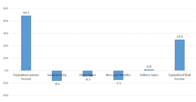
Figure 1 shows the Gini coefficient, which ranges between zero – where all households have exactly the same income – and 100% – where one household has all of the income. The Gini coefficient for private income in 2015-16 was 44.2. The addition of social security benefits, which mainly increase the incomes of low-income groups, reduces the coefficient by 8.1 percentage points.

Deducting income taxes – which are progressive – further reduces inequality by 4.5 points. Government non-cash benefits reduce the Gini coefficient by nearly as much as the social security system. However, indirect taxes slightly increase income inequality.

The Gini coefficient for final income is 24.9. So, compared to a coefficient of 44.2 for private income, government spending and taxes reduce overall income inequality by more than 40%.

Figure 1: Effects of government spending and taxes on income inequality, measured by Gini coefficient Australia 2015-16. Data source: ABS Government Benefits, Taxes and Household Income, Australia, 2015-16, Author provided

While most of the reduction in inequality is due to government spending, taxes are obviously important to pay for this spending.

The social security system reduces income inequality (and poverty) because Australia targets benefits to the poor more than in any other high-income country.

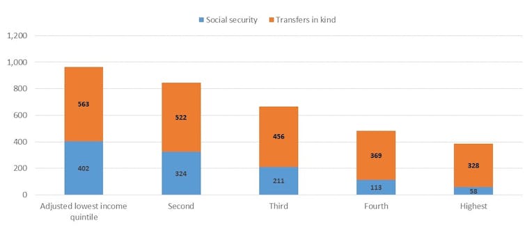
Figure 2 shows the distribution of social security benefits and government services across income groups, from the poorest 20% to the richest 20% of households. The poorest 20% receive about seven times as much in benefits as the richest 20%. The average for OECD countries is close to one, with rich and poor receiving about the same amount.

Figure 2: Distribution of social spending ($ per week) by equivalised disposable household income quintiles, Australia 2015-16. Data source: ABS Government Benefits, Taxes and Household Income, Australia, 2015-16, Author provided

Government spending on social services is also progressively distributed. This spending is considerably greater than social security spending and includes both Commonwealth and state spending on education and health.

The poorest 20% receive about 70% more in non-cash benefits than do the richest. This is not due to income-testing. Instead, it’s largely a result of the greater value of public health spending on hospitals and Medicare for older people, who tend to be in the bottom half of the income distribution.

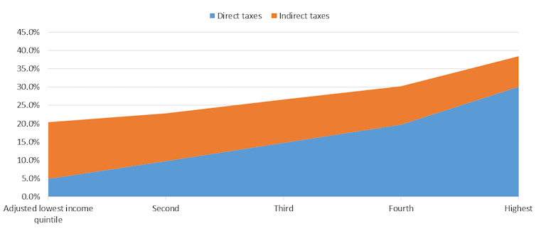
Taxes, of course, work to reduce income inequality, as high-income groups pay a higher share than low-income groups. Figure 3 shows that the poorest 20% pay about 5% of their disposable income in direct taxes, while the richest 20% pay about 30% of their disposable income.

In contrast, indirect taxes – particularly those on tobacco and gambling – are regressive. Low-income groups pay more than high-income groups as a share of their disposable income. However, the undesirable effects of smoking and gambling on the wellbeing of low-income households need to be borne in mind.

When direct and indirect taxes are added together the overall tax system is less progressive, but the richest 20% still pay nearly twice as much of their disposable income as do the poorest 20%.

Figure 3: Distribution of direct and indirect taxes (% of disposable income) by equivalised disposable household income quintiles, Australia 2015-16. Data source: ABS Government Benefits, Taxes and Household Income, Australia, 2015-16, Author provided

Redistribution also happens between age groups and states

In addition to reducing inequalities between income groups, government spending and taxes redistribute across age groups. Government spending is much higher for households of Age Pension age than for younger households. This is because of both the Age Pension and older households’ use of the healthcare system.

For example, households where the reference person is 75 or older receive on average just over $1,000 a week in government spending but pay about $180 a week in direct and indirect taxes. Households with a person aged 45 to 54 pay the highest taxes on average – about $800 per week – and on average receive about $620 a week in social spending.

There is also redistribution across states and territories. For example, average private income is about 65% higher in Western Australia than in Tasmania. However, on average, Western Australian households receive about two-thirds of the social security benefits that Tasmanian households get. This reduces the disparity in gross income to about 45%.

Western Australian households pay about twice as much in income taxes as Tasmanians, reducing the disparity to 35%. Households in the West receive only about 3% more in spending on social services than in Tasmania, which reduces the disparity in average incomes to 28%. West Australian households also pay about 20% more in indirect taxes than Tasmanian households (although as a percentage of disposable income, this is a higher share in Tasmania).

These figures suggest that while the financing of fairly equal social services across most parts of Australia reduces inequality between states, the income tax and social security systems also significantly reduce disparities. This is because income tax and social security are national systems and because Tasmania is the poorest state largely due to the higher share of age pensioners in its population.

Overall, this publication provides an invaluable picture of how government spending and taxes affect household economic well-being. Its results are relevant not only to the political debate about tax cuts, but also to long-term policy development to prepare Australia for an ageing population.

Author: Peter Whiteford, Professor, Crawford School of Public Policy, Australian National University

We are witnessing a slowly deflating property bubble, for now

From The Conversation.

In a week that was fairly light on data releases, let’s return to Australia’s perennial favourite topic – house prices. Painful though it may be for existing property owners who are selling, we are witnessing what a bubble slowly deflating back to reality looks like.

Data released Tuesday showed that across Australia’s eight capital cities prices fell 0.7% in the first quarter of 2017. Sydney was hardest hit, with prices down 1.2%. Melbourne and Brisbane experienced 0.6% declines and Perth prices were down 0.9%.

Price declines were more subdued over the previous 12 months, or were even still up over the period. Sydney prices were down 0.5% on the year, but Melbourne prices were still up strongly (6.2%) and Brisbane showed 1.6% annual growth. Perth, where prices have been under pressure for some time, registered a 1.5% fall over the last year.

This downward price pressure is consistent with a reduction in auction clearance rates documented by CoreLogic. Last week, clearance rates averaged 56.9% across the country and just 55.8% in Sydney and 58.7% in Melbourne. Compare this to a year ago when the capital city average was 66.7%, Sydney was at 68.0% and Melbourne at 71.0%. And this doesn’t even factor in that auction volumes have dropped this year.

So here’s the deal. Fewer people are trying to sell their residential properties. Those that try are having less success in doing so. Those that do succeed are getting lower prices.

Yet it pays to take a longer-term view. As the minutes of the last RBA board meeting noted:

… housing prices were still 40% higher in Sydney and Melbourne than at the beginning of 2014, while housing prices in Perth had fallen by around 10% over the same period.

The big question is whether the housing market will continue to deflate slowly, or whether there is going to be an abrupt “pop”.

A big correction to property prices would require a major trigger. The most likely candidate for that trigger is interest-only loans.

More and more attention is finally being paid to dangers caused by Australia’s profligate use of such loans. As I wrote last year, at the peak a staggering 40% of residential mortgages in Australia were interest only.

The Australian Prudential Regulation Authority (APRA) stepped in last year, capping new interest-only loans at 30% of new loans. That, along with a tightening of underwriting standards by banks, has led to a sharp drop in such loans.

The latest figures put the proportion of interest-only loans at 15.2% of new issuances.

The RBA has been pushing an upbeat story about how this shakes out. As they tell it, the A$120 billion a year of interest-only loans coming due will be smoothly transitioned to principal-and-interest loans for most people.

Well, perhaps. I certainly hope so.

But for many people this transition will involve increases in monthly repayments of 30-40%. At a time when wages growth has been persistently sluggish, many people don’t have much wiggle room.

Interest-only loans typically have a five-year term and then need to be refinanced or become principal-and-interest loans. For a whole lot of folks, an interest-only rollover ain’t going to happen. Worse, the largest volumes of interest-only loans were written in 2013-2016.

So we are about to see a three-year wave of shifts to principal-and-interest loans.

Worse still, the loans originated in those years were heavily mediated by mortgage brokers whose incentives were all about moving volume, not quality. Widely cited research from investment bank UBS about the prevalence of so-called “liar loans” gives one every reason to be really worried about the ability of these borrowers to make a mortgage payment that has increased by a third or more per month.

And the rosy scenario the RBA keeps pushing involves look at the average buffer and embedded equity that households have. But that misses the economics 101 point that it is the marginal borrower that determines equilibrium prices, not the average.

If I’m selling hot dogs I don’t care what the average person is willing to pay for a hot dog, I care what the last person I might sell to is willing to pay, for she determines the price.

And, in a moment of gaping honesty eight weeks ago, the RBA’s Chris Kent highlighted the difference between the average and marginal borrower, saying:

… about half of owner-occupier loans have prepayment balances of more than six months of scheduled payments. While that leaves half with only modest balances, some of those borrowers have relatively new loans.

It doesn’t matter than some of them are new borrowers – other than that they bought at the height of the bubble, making them more susceptible to financial stress than other borrowers. The fact is that a whole bunch of folks are on the wire. If their payments go up they are going to struggle to make them. And if a lot need to sell at once then, as they say at NASA, “Houston, we have a problem.”

The air may fizzle out of the Australian balloon, or it may burst violently. Either way we should be asking hard questions about why APRA waited so late to act on interest-only loans, liar loans and underwriting standards in general. Very hard, very public questions.

Author: Richard Holden, Professor of Economics and PLuS Alliance Fellow, UNSW

Commonwealth Bank’s $700 million fine will end up punishing its customers

From The Conversation.

The Commonwealth Bank of Australia (CBA) this week agreed to pay a record penalty to settle its violations of anti-money laundering and counter-terrorism financing laws. The A$700 million fine plus legal costs will become final upon the approval of the Federal Court.

The deal was met with market approval, and has allowed regulators to claim victory. Given the public’s current hostility to banks in the wake of revelations from the Banking Royal Commission, politicians also joined the bandwagon and applauded CBA’s loss.

What if the penalty is a sign of mob justice, rather than just deserts? And given the scale of the payout, will the fine also end up further punishing customers and shareholders?

Answering these questions requires a close look at the case. CBA was alleged to have violated the Anti-Money Laundering and Counter-Terrorism Financing Act 2006, in several specific ways.

First, it introduced Intelligent Deposit Machines (IDMs) without conducting an independent risk assessment and/or instituting mitigation procedures to tackle money-laundering. Unlike older ATMs, IDMs process cash deposits and make the funds available for transfer immediately. Clearly, criminals could use these features to launder cash gained through crime. CBA wrongly believed that its existing ATM monitoring processes covered these risks.

Second, it was warned about these risks and could have minimised money laundering by imposing daily limits on accounts. CBA refused.

Third, CBA failed to provide transaction reports within 10 business days for cash deposits greater than A$10,000. This violation referred to 53,506 transactions totalling about A$625 million. The failure was due to a coding error – the software was not updated to pick up a new code created for IDM deposits.

Fourth, CBA failed to report transactions with a pattern of money-laundering – apparently misunderstanding its legal obligations.

Fifth, CBA failed to report suspicions about identity fraud – for example, in relation to eight money-laundering syndicates. Therefore, AUSTRAC and law enforcement were unaware of “several million dollars of proceeds of crime mostly connected with drug importation and distribution” that passed into accounts held by CBA.

Sixth, CBA was deficient in monitoring accounts despite warnings from law enforcement – 778,370 accounts were not monitored. CBA was slow to act even after suspicious accounts were terminated, facilitating money-laundering.

Clearly these are significant violations. However, the statement of facts agreed by AUSTRAC and CBA state that the bank did not deliberately or intentionally violate its legal obligations under the relevant laws.

Considering that CBA’s violations were inadvertent, due to technical glitches, and attributable to a mistaken belief about existing systems satisfying legal obligations, the A$700 million fine might be excessive.

International comparisons

By international standards, the fine seems to be very high. This week the UK Financial Conduct Authority fined the British division of India’s Canara Bank £896,100 (A$1.58 million) for “consistent failure” in its money-laundering controls, and for failings “affecting almost all aspects of its business”.

The FCA said the bank’s failings “potentially undermine the integrity of the UK financial system by significantly increasing the risk that Canara could be used for the purposes of domestic and international money laundering, terrorist financing and those seeking to evade taxation or the implementation of sanction requirements”.

In the United States, the Justice Department fined US Bancorp US$528 million (A$694 million) for criminal violations of money-laundering laws and for concealing its behaviour from regulators.

CBA’s fine is far higher than Canara’s punishment for similar violations, and roughly on a par with the sanction meted out to US Bancorp – albeit the latter was for more serious criminal wrongdoing. It is also comparable to the US$665 million (A$874 million) penalty imposed on HSBC (plus US$1.26 billion in sacrificed profits). Unlike CBA, HSBC was punished for “willfully failing” to maintain proper money-laundering controls.

Yet the proceeds from HSBC’s violations stretching back to the 1990s were staggering: at least US$881 million in laundered drug money; a failure to monitor more than US$670 billion in wire transfers and over US$9.4 billion in purchases of physical US dollars from HSBC Mexico; some US$660 million in sanctions-prohibited transactions; and evidence of deliberate sanctions violations by processing transactions to parties in Iran, Cuba, Burma, Sudan, and Libya.

A fair punishment?

The size of CBA’s penalty seems to be more in line with banks that have deliberately flouted money-laundering laws, rather than the smaller punishments handed to banks that did so unintentionally. It is tempting to conclude that this is influenced by the current prevailing mood to “send a message” to financial institutions.

What’s more, we cannot necessarily assume that the fine will act as a deterrent. The penalty is not paid by the CBA staff who acted wrongly; it is paid by the bank, ultimately by the shareholders.

Similarly, the cost of managing enhanced scrutiny and investing in additional compliance machinery will be passed on to customers in the form of higher charges and fees. Likewise, if banks become excessively cautious because of apprehensions about overenforcement, that will impact services and reduce profitability – again harming innocent people.

The punishment must always fit the crime. Excessive punishment is counterproductive and creates additional victims.

If the purpose was really to tackle wrongdoing, the CBA staff who were responsible for the violations should have been identified and penalised.

The A$700 million fine is good for political posturing but will hurt customers and shareholders the most. Bank-bashing has a cost, and it is paid by ordinary people, not politicians.

Author: Sandeep Gopalan, Pro Vice-Chancellor (Academic Innovation) & Professor of Law, Deakin University

Criminal charges against banking ‘cartels’ show Australia is getting tough on competition law

From The Conversation.

A two-year probe by Australia’s consumer watchdog has resulted in criminal charges against ANZ, Citigroup and Deutsche Bank, as well as six of their senior executives, over alleged “cartel-like” behaviour.

The case, brought by the Commonwealth Director of Public Prosecutions (CDPP) after an investigation by the Australian Competition and Consumer Commission (ACCC), is the second prosecution of its kind to be brought in Australia since competition laws were tightened almost a decade ago.

The banks and six investment bankers are charged with cartel conduct related to the sale of A$2.5 billion worth of unsold ANZ shares to investors in August 2015. The ACCC alleges that senior executives from the three banks colluded in the way they dealt with these shares.

The exact details of the alleged criminal conduct will only become clear at a Sydney court hearing on July 3, 2018.

What is cartel behaviour?

Cartels are forms of anti-competitive conduct where cartel participants decide to stop competing and start colluding. Australian civil law has banned cartels for decades. But the practice only became a criminal offence in 2010. Only its serious forms are subject to criminal law; civil law still governs the rest.

Cartels can take different forms. In the most common instance, participants collude by setting their prices. Other forms include: output restrictions; dividing markets among cartel participants on mutually agreed terms; and bid-rigging, in which a commercial contract is decided in advance but other operators put in sham bids to give the appearance of competition.

There is one primary reason why businesses or executives would stop competing and start colluding: profit. In short, cartel participants cheat to get more money, creating higher prices and lower output in the process. This disadvantages consumers, the economy and society at large.

But proving criminal collusion in a court is harder than it might seem.

Beyond reasonable doubt

Although we need to wait for the case to unfold to find out more, what we can tell at this stage is that the ACCC and the CDPP perceive the alleged conduct as serious enough for it to constitute a criminal case. Criminal cases are harder to prove than civil cases. Cartel collusion must be proved beyond reasonable doubt, and the evidence has to show that the individuals involved knew (or believed) that they were colluding.

What these charges also show is that the ACCC and the CDPP are prepared to go after the most powerful corporations and their executives for alleged cartel-like conduct. This is an enormously important step for deterrence, because criminal charges are naturally more attention-grabbing than civil lawsuits.

Charging high-ranking bank executives will potentially make the deterrent more effective still, because high-ranking executives set the cultural tone for their organisations.

Research has shown that significant prison time – or the threat of it – for individuals is a more effective deterrent than civil penalties; especially if the penalties are not high enough, as was argued in the recent OECD report on corporate penalties for cartels in Australia. The report showed that the penalties applied in Australia were low in comparison with competition law regimes in the European Union and the United States.

Just the beginning?

This is the second Australian criminal case of cartel conduct – the first involved a Japanese company shipping cars to Australia. We can reasonably expect more of these kinds of charges in the future, given that the laws are only eight years old and investigations of this type typically take years to reach fruition. (The alleged cartel conduct in the latest case took place in August 2015, almost three years ago.)

There are differences in investigation procedures between criminal and civil cases, to ensure that collected pieces of evidence are admissible in a criminal proceeding. It is ultimately the CDPP’s (and not the ACCC’s) decision whether or not to prosecute.

The final step is for criminal proceedings to be prosecuted. The first cartel criminal case, which concerned the shipping industry, can be perceived as successful, with two global shipping companies pleading guilty.

It is still early days for Australia in terms of tracking down and punishing examples of cartel behaviour via criminal prosecutions. But the latest developments suggest that Australia is prepared to follow the example of the world leader in successful cartel-related criminal prosecutions: the United States.

The US criminal regime is one of the oldest in the world, having existed since 1890. The US boom of cartel-related criminal cases began in the late 1990s with the lysine cartel and the vitamin cartel and with the first foreign national being sentenced to imprisonment in July 1999. One of the first criminal cartel investigations inspired the production of the 2009 movie The Informant!.

The numbers further illustrate the success of the US criminal prosecutions. For instance, 27 corporations and 82 individuals were charged in the fiscal year 2011. Australia has a long way to go before it can match those numbers.

Author: Barbora Jedlickova, Lecturer, School of Law, The University of Queensland

Airbnb regulation needs to distinguish between sharing and plain old commercial letting

From The Conversation.

Airbnb and other short-term letting websites have been a hot topic of debate for some time. In New South Wales, it seems the state government is on the verge of announcing a new short-term letting policy. Our research suggests about a quarter of Airbnb properties in the city are essentially commercial short-term letting operations.

But as cities like Berlin and Barcelona have learned, regulating these platforms is not always easy. Enforcing restrictions against individual hosts can be costly. Airbnb has also challenged regulations limiting short-term letting.

At the same time, there has been a lot of hype about platforms like Airbnb as leaders of a new “sharing economy”. This has made some governments wary of interfering with a potentially lucrative economic driver.

How do you tell if it’s sharing or business?

To ensure these new platforms are regulated effectively, it’s important that we understand exactly what they do, and the impacts they’ve having. Despite Airbnb’s efforts to promote itself as being all about sharing, there’s actually a mix of activities happening on its platform. In a new research paper, we examined these different activities, to better identify how Airbnb is being used and whether the platform should be viewed as a “sharing economy” superstar.

Overall, we found that in late 2016, about a quarter of Sydney’s Airbnb listings were best viewed as short-term letting businesses, rather than examples of the sharing economy in action. The figure was greater for other global cities we looked at – 26% in New York, 28% in London and Hong Kong, and a hefty 49% in Paris.

So how did we reach this conclusion? To start, we needed a definition of the “sharing economy”. We took this to mean economic activity involving the sharing of excess capacity in an asset or service, which is driven by a sharing attitude.

We then took a close look at listing data from the five cities and identified two categories of use:

  1. House sharing, which includes advertising part of a house (a private or shared room) or a whole house for a small portion of the year (up to 90 days). These uses suggest that the property is otherwise meeting someone’s permanent housing needs.
  2. Traditional short-term lets, meaning properties permanently offered for short-term rental, thus preventing their use as long-term housing. This includes properties available or booked for more than 90 days per year, and those where the host has multiple listings.

By categorising listings this way, we get a clearer sense of whether Airbnb is really being used to share spare housing capacity, or to run commercial rental accommodation.

Unfortunately, Airbnb keeps tight control over data about the use of its platform. This makes it challenging to quantify these uses.

To get around this, a few organisations have scraped and collated data from Airbnb’s website. While much existing research uses a dataset from Inside Airbnb, our research complements this work by using a dataset produced by the company AirDNA. While neither dataset is perfect, together they provide an increasingly clear picture of Airbnb’s impact.

What did our research find?

Our findings show a significant share of Airbnb hosts are using the platform to engage in economic activity that existed long before Airbnb did – that is, dwellings are used as serviced apartments, B&Bs or holiday rentals. This is commercial activity, not sharing. These properties aren’t just “excess” unused housing space and there’s no “sharing attitude” involved.

While commercial properties are not the majority of listings, other research suggests that this activity nonetheless generates a larger proportion of Airbnb’s income than home-share activity. In many cities this activity is also already subject to planning laws and land-use regulations about “tourist accommodation”. This means these Airbnb listings are potentially in breach of existing laws.

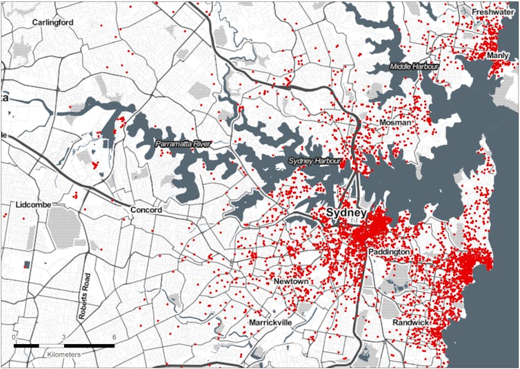
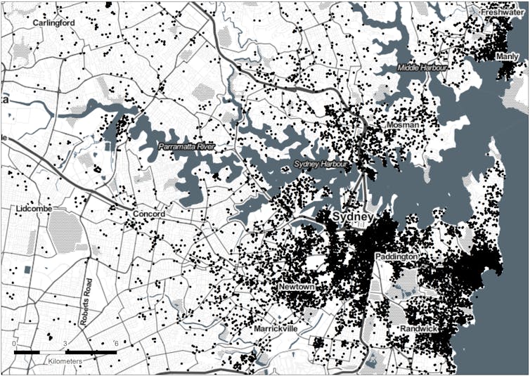
Furthermore, by mapping the Sydney listings we can see that while these traditional short-term lets were only about a quarter of listings, they were overwhelmingly concentrated in suburbs with very tight rental markets.

LOCATION OF TRADITIONAL SHORT-TERM LETTING

LOCATION OF HOUSE SHARING

Another factor is the rapid growth of Airbnb since late 2016. Australia now has 87% more listings than in late 2016. That’s a lot of properties in popular neighbourhoods that might otherwise be long-term rentals. So not only is this commercial activity not “sharing” at all, it’s also potentially pushing renters into shared living elsewhere, by reducing the amount of available rentals.

What does this mean for regulation?

So where does this leave our regulators? In our view, any policy decision needs to account for the different uses of these platforms, and be particularly focused on the impact of commercial short-term letting. While house sharing also raises concerns – particularly in apartment complexes – it at least fits the “sharing economy” model and arguably provides some of the shared financial, social and environmental benefits sharing economy supporters claim.

At the same time, regulators need to act on the lack of transparency in debates about platforms like Airbnb. Without good data, it will be tough for regulators to target their efforts at the most problematic aspects of new technologies. As we conclude in our research paper:

If Airbnb is genuinely committed to the ideal of ‘sharing’, as it regularly claims, it should share its data with regulators, even if it is not made publicly available. Airbnb’s unwillingness to do so (to date) indicates its sharing rhetoric is more of a sales pitch than a guiding philosophy.

Authors: Laura Crommelin, Research Lecturer, City Futures Research Centre, UNSW; Chris Martin, Research Fellow, City Housing, UNSW; Laurence Troy, Research Fellow, City Futures Research Centre, UNSW

The world’s economic crisis-fighting mechanisms are dangerously inadequate

From The Conversation.

It was only in January that the International Monetary Fund (IMF) was celebrating the strength of the global economy, heralding “the broadest synchronised global growth upsurge since 2010”.

How quickly things have changed.

Argentina has since sought a bailout from the IMF, Turkey is facing a potential currency crisis, Indonesia is seeing investors flee, alarm bells are sounding for Italy and Spain, China’s debt remains a serious concern, and the only thing more uncertain than the fallout from Brexit is the outcome of Donald Trump’s trade war.

It’s time to review the world’s capacity to respond to crises.

The “global financial safety net” refers to the mishmash of global, regional and bilateral institutions and mechanisms designed to help countries facing economic and financial crises and to prevent these problems from spreading.

The most well-known institution is the IMF, which has around US$1 trillion in crisis-fighting resources. The World Bank, with around US$263 billion, has provided assistance in previous crises.

There is also a range of regional mechanisms, such as Asia’s Chiang Mai Initiative Multilateralisation agreement (with US$240 billion) and the European Stability Mechanism (with US$600 billion). Bilateral currency swap arrangements, under which one country’s central bank can exchange its currency for that of another, are also an important part of the safety net.

Make no mistake, the safety net is big. In total it has about US$4.6 trillion in crisis-fighting firepower, seven times what it was in 1980. But this large number can be misleading and, as I argue in a recent working paper at Brookings, is both inadequate and causing a dangerous sense of complacency.

First, not all of this money is immediately available. Some of it is tied up in existing programs (such as in Greece) and central bank governors interviewed for my research (including former US Federal Reserve chairs Janet Yellen and Ben Bernanke, and current Reserve Bank of Australia governor Philip Lowe) warned that many currency swap lines would not be made available during a crisis. This shrinks the safety net to US$2.5 trillion.

Second, not all resources are available to all countries. The European Stability Mechanism won’t help you if you live in Latin America. And if your country wasn’t offered a swap line with a major central bank, well, that’s tough luck.

The size of the safety net depends entirely on the country. It is twice as large for some G20 countries as for others, or four times as large if you include foreign exchange reserves (which are more accurately described as domestic resources rather than part of the global safety net).

This fragmentation has made the safety net patchier, slower and less consistent, making crises costlier. Many countries have fallen between the cracks, particularly emerging economies such as Turkey and Argentina, which don’t have strong institutions or resilient capital markets like the ones operating in the United States, Canada or Australia.

Recent research has sought to assess the safety net’s adequacy by exploring what crises might occur in the future. But instead of trying to predict these things, I pose a simple question: can the safety net provide at least the same level of support today that has been required of it in the past?

To find out, I war-gamed three regional crises – the Asian financial crisis, the European debt crisis and the Latin American debt crisis – and six country-specific crises in Argentina, Turkey, Ecuador, Russia, Mexico and Chile. While financial systems are more resilient today than they were back then, my analysis produced some alarming results.

While the safety net works well for country-specific crises, it struggles to cope with widespread shocks. Providing the same level of support today that was provided during the Asian financial crisis would exhaust all currency swap lines, all regional mechanisms, all regional development banks and the entire World Bank, and would require exceptional access to the IMF’s resources. If the European debt crisis occurred today, the entire global financial safety net would be exhausted.

Second, most crises now require access to multiple components of the safety net. The IMF is no longer capable of providing assistance alone. Countries increasingly rely on regional mechanisms which, in Asia, have never been tested and, in Latin America, are small.

Third, despite the growth in non-global resources, countries often still have to go to the IMF. This means there must be seamless co-ordination of multiple institutions during a crisis, something the IMF warns (and recent history shows) is a “very strong assumption”.

Finally, most of these results hold even when foreign exchange reserves are included. There are also many alarming developments on the horizon. Foreign exchange reserves are declining, particularly in China, and the IMF’s resources will halve by 2022 unless the US Congress approves extra funding and countries like China agree to reloan the IMF money, despite getting no additional voting power. The 63 policymakers I interviewed suggest that neither is likely.

What can be done?

In the short term, countries must to bolster the IMF’s temporary resources and strengthen co-operation between safety-net institutions. Central banks must clarify whether swap lines are available in a crisis and, where possible, extend them to cover more economies.

In the long term, the IMF’s centrality in the safety net must be reaffirmed. It needs larger, permanent funding and more flexible lending arrangements.

The lead-up to the 2008 crisis was characterised by a dangerous sense of complacency. That complacency should not be allowed to take hold again.

Author: Adam Triggs, Research fellow, Australian National University

The Coalition’s income tax cuts will help the rich more, but in a decade everyone pays more anyway

From The Conversation.

Does the Coalition’s tax plan favour high earners over those with lower incomes?

Depending whom you listen to, the tax cuts, unveiled in last month’s federal budget, lead to either a flatter, more regressive tax system under which low-income earners will be even worse off relative to high earners, or the opposite, with a progressive outcome. It can’t be both.

While there are tax cuts proposed from July this year, the most substantial cuts are planned for 2022-23 and then 2024-25. As this is several years away, it becomes tricky to analyse their likely impact.

The main issue is wage inflation, which in turn leads to “bracket creep”. We tend to think about the change in terms of what it means for today’s incomes, but that’s not realistic. An annual income today of A$80,000 will be around A$110,000 by 2027-28 if the government’s wage projections prove to be accurate.

Using our model of the Australian tax and welfare system, PolicyMod, we projected the incomes of each person in the 20,000 families in the underlying model survey data (the Australian Bureau of Statistics’ Survey of Income and Housing 2015-16).

We did this for each year until 2028-29, using the federal budget’s wage assumptions. We then used this to forecast the outcome of the proposed tax cuts, and compared it with the effects of maintaining current tax rates.

Our results are remarkably similar to the forecasts of Treasurer Scott Morrison. He has projected a total tax cut between 2018-19 and 2028-29 of A$143 billion, whereas our model puts this figure at A$140 billion.

Whose tax is being cut?

Who will actually receive these tax cuts, and will they really benefit? Our modelling shows around 50% of the adult population pays income tax in a given year. So clearly the benefit goes to the top half of the taxable income distribution.

What’s more, if the tax cuts are only returning bracket creep for many taxpayers, then they are not really tax “benefits”, because they will not make those people better off in real terms.

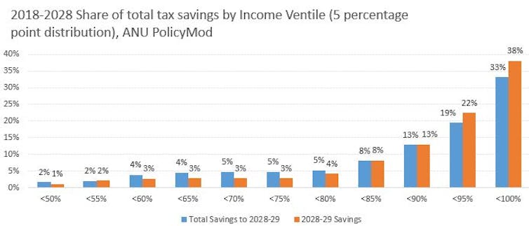
This is clearly shown in the chart below, where the bottom 50% of taxable income individuals will have a negligible share of tax savings. Around 33% of total savings between 2018-19 and 2028-29 go to people in the top 5% of incomes. In 2028-29 it is 38%.

If this were the end of the story, we might conclude that the tax cuts are grossly unfair. But it’s not quite as simple as that, because people with the highest taxable incomes are not necessarily the “wealthiest” people.

A more reasonable test considers whether the income tax cuts are real or “imagined”. If they are real, average tax rates should be lower. The fairness of the tax cuts can then be judged by the share of the tax burden across the income distribution.

If high earners are paying a larger share of tax than low and middle earners, then we have a more progressive tax system. A less progressive system, in contrast, is a flatter system – although not necessarily a totally flat income tax rate.But determining whether the proposals are progressive or regressive still doesn’t fully answer the question of whether they are “fair”.

Fair tax hikes for all?

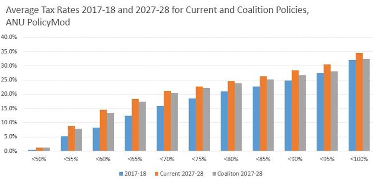
The chart below shows that tax rates will increase for all income groups, although they will rise more slowly if the Coalition’s tax plan is delivered. Crucially, higher earners will feel this difference most keenly. By 2027-28, the top 5% of earners average tax rate will be 2.1 percentage points lower than under the current regime, whereas for the bottom 50% the difference is just 0.2%.

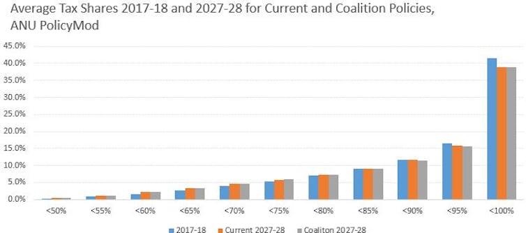
Another way of looking at progressivity is to consider the share of tax paid. The chart below shows that under the current policy trajectory, higher-income groups pay a lower share of tax in future years compared with 2017-18. This occurs naturally due to bracket creep, which tends to impact low- and middle-income people more than those with very high incomes.

In the current financial year the top 10% of earners pay 58% of personal income tax. By 2027-28 this is projected to fall to 54.8% if the tax regime remains unchanged. Under the Coalition’s tax plan it is only marginally lower still, at 54.3%.

Anyway, it is purely hypothetical to extrapolate the current tax regime as far ahead as 2027-28. It is highly likely that future governments will change the tax code for a range of reasons, including overcoming bracket creep.

Note also that some “low-income” people may live in high-income households. However, our earlier analysis looking at households rather than individual earners also suggests that the Coalition’s tax proposal is marginally less progressive than the current system.

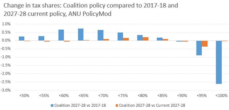
The chart below shows that the Coalition’s tax policy will have only a limited impact on the tax shares at different income levels by 2027-28. Perhaps a more relevant comparison is with the current tax shares for 2017-18, where a clearer pattern emerges of low- and middle-income earners paying a larger share of taxation.

The upshot is that the Coalition’s policy only partly overcomes bracket creep, with taxes still set to increase overall in the long term. The proposed policy does slightly more to overcome bracket creep for higher-income individuals. But it also locks in a higher tax share for those on low and middle incomes, and a lower share of the tax burden for higher earners.

On that basis, the proposals will lead to a slightly less progressive income tax regime than the one we currently have. But it will still be a long way short of a flat tax, and pretty much everyone looks set to be paying more income tax a decade from now.

Authors: Ben Phillips, Associate Professor, Centre for Social Research and Methods, Australian National University; Matthew Gray, Director, ANU Centre for Social Research and Methods, Australian National University

Italy is broke, and the markets have lost all faith in its elected politicians

From The Conversation.

We are now in another full-scale European crisis.

The results of Italy’s general election on March 4 were problematic. Roughly one-fifth of Italians voted for the populist Northern League party of Matteo Salvini, and one-third backed the Five Star Movement, a eurosceptic, anti-establishment party founded by standup comedian Beppe Grillo.

Salvini has responded to the refugee crisis by saying that Italy needs “a mass cleaning – home by home, street by street, neighbourhood by neighbourhood”. Grillo, meanwhile, has championed the idea of celebrating “V-Days” – short for the Italian vaffanculo (the various English translations all begin with an expletive and end with either “off” or “you”) – taking aim at the political elite as part of an eccentric grab bag of largely anti-capitalist policy ideals.

Setting aside the bizarre prospect of a coalition between the far right and the loopy left, as a prospective government the pair do not bode well for Italy or Europe. Although officially disavowing any move to exit the Eurozone, they almost surely would have sought to do so. That would have triggered an automatic exit from the European Union, perhaps inevitably nicknamed “Quitaly”.

Italy, and the European experiment with it, might have bled out slowly.

But when Italian President Sergio Mattarella refused to allow the putative coalition to form government in its currently proposed form, all hell broke loose.

With a second election now on the cards, the spread on two-year Italian bonds quickly jumped to around 300 basis points over German bonds. That’s the market suggesting a staggering risk of default.

Yesterday Mattarella tried to calm things down by suggesting that he could appoint an interim technocratic government, giving Salvini and Five Star’s current leader, Luigi Di Maio, more time to produce a list of ministers that he could live with.

That’s probably the right thing to do, but it’s tough to get the toothpaste back in the tube. The markets are spooked. It will take a lot more than the prospect of securing a coalition government between two lunatic-fringe parties bent on getting Italy out of the euro to calm things down.

Greece is the word

Italy is Europe’s third-largest economy and it has public debt of €2.3 trillion. A bank run on the Italian economy, similar to what happened in Greece in 2015, would be a cataclysm that would likely be impossible to stop without Italy exiting the euro.

The seeds of Italian populism were fairly predictable in the wake of the great recession. Italy’s unemployment rate doubled to more than 12% and is still at 10.9%. Youth unemployment peaked at a 42.7% in 2014 and remains around 35%. GDP fell by more than 7% per year at an annualised rate and only turned positive in 2014. Real GDP is still below its 2007 level. Italy’s current GDP growth of 1.5% is the lowest in the Eurozone.

The question is what to do about it. Radical spending promises that can’t possibly be fulfilled without totally blowing the government’s books are not the answer. Having them delivered by an unstable government comprised of a loose coalition of warring tribes is less encouraging still.

On the other hand, fresh elections will just spook the markets even more.

Right now, Mattarella’s proposed technocratic government looks like the least worst option. There is an open question about how long it should govern for, but a reasonable starting point would be three years. That might give it time to get the Italian economic ship back upright. Enough time to take some tough decisions. This, of course, simply cannot be guaranteed under the constitution, so all Mattarella can do is install it and hope that the prospect of stability becomes self-reinforcing.

That is the kind of government that former Greek finance minister Yanis Varoufakis would hate, given his fierce resistance to the austerity imposed on Greece by its creditors. And I’m sure it will take about five seconds for me to be labelled a Washington Consensus, IMF-loving neoliberal for suggesting it. It would certainly attract plenty of criticism in Italy, given the strong anti-establishment sentiment that created this crisis in the first place.

But, to use the language of bankruptcy, the bottom line is that Italy is in political and economic Chapter 11. It is broke. It’s not technically insolvent just yet. But it will be, as they say in debt contracts, “but for the passage of time”.

It’s time to bring in the receivers to restructure. There needs to be serious microeconomic and labour-market reform, of the kind Emmanuel Macron is trying to implement in France. There also needs to be some attempt to get the debt under control. Lowering the interest rate through increased confidence would be a good start.

This would also help the rest of Europe. Perhaps there is some hope that German Chancellor Angela Merkel would be grateful, and thus more amenable to assistance measures for Italy. She certainly could not be less well disposed to help out than at present.

Author: Richard Holden, Professor of Economics and PLuS Alliance Fellow, UNSW

Australia’s foreign real estate investment boom looks to be over

From The Conversation.

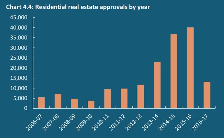
Australia’s Foreign Investment Review Board (FIRB) reported this week that foreign residential real estate approvals dropped significantly in the 2016-17 period.

Whereas 2015-16 saw 40,149 approvals granted, totalling A$72.4 billion, the figure for the following year was just 13,198 approvals, totalling A$25.2 billion. On these numbers, the foreign property investment boom looks to be over.

This is bad news for the property and financial industries, who are already feeling the pressure of weak household income growth, tighter lending restrictions on local borrowers, and a slowing in housing market activity in key Australian cities.

FIRB suggests that declining demand from China is a factor in the overall decline in overseas approvals. Chinese demand may have been weakened by a range of factors, including the new FIRB application fees, Chinese overseas direct investment capital controls, and the changing global economy.

But if the cycle is moving from boom towards bust, we have learned several things along the way.

Lesson 1: We still need more data

In 2014 the House of Representatives Standing Committee on Economics undertook an inquiry into foreign investment in residential real estate. It acknowledged the growing public disquiet about the level of this foreign investment, adding that:

…there is no accurate or timely data that tracks foreign investment in residential real estate. No one really knows how much foreign investment there is in residential real estate, nor where that investment comes from.

Four years on, FIRB is still flagging the limitations of data collection and analysis. Without fine-grained data, it’s hard to forecast how much, if at all, the injection of foreign capital can push up local house prices.

The latest figures come with a caveat. The approvals data represent potential investment, rather than actual investment. There are key differences between the two. Potential investors might, for example, seek approval for multiple properties while only intending to buy one of them.

We need the government to collect more extensive and detailed data on individual foreign real estate investment, and make it publicly available. This needs to cover more than approvals data at the city level, but data on investment levels in neighbourhoods or even individual housing developments.

Lesson 2: People on the property ladder are less hostile to foreign buyers

Data from Sydney reveals widespread concern about foreign investment. Almost 56% of Sydneysiders believed foreign investors should not be allowed to buy residential real estate in Sydney. Only 17% of respondents in our study thought the government’s regulation of foreign housing investment was effective.

Just over half of Sydneysiders say they would not want Chinese investors buying properties in their suburb. And 78% thought foreign investment was driving up housing prices in greater Sydney.

Yet those who have real estate investments were more likely to support foreign investment than those who don’t. This suggests that Sydneysiders with equity in the housing market, such as homeowners or investors, might view foreign buyers pushing up housing values as positive. And they might fear that the new decline in foreign investment might depress their assets.

Lesson 3: Housing is built with specific buyers in mind

When Chinese real estate investment started to rise significantly in 2013-14, property developers scrambled to model this new emerging market. The real estate media rushed to map out where Chinese investors were keenest to buy, and how best to design and market property developments to this new foreign client base.

In early 2012, Larry Schlesinger quoted the demographer Bernard Salt as saying:

The growing numbers of Chinese and Indian migrants in Australia means property investors need to consider the cultural sensitivity of the residential property they purchase to ensure they maximise the resell value.

Between 2013 and 2017, property developers, both local and foreign, regularly contacted me to ask if I had any up-to-date research on foreign investors’ consumer preferences and market forecasts. I did not. But there was no shortage of advice out there, covering everything from feng shui-informed housing design to the key needs of foreign university students.

Some global real estate agents suggested to their clients that they could buy an Australian home to accommodate their child while they were studying at an Australian university, and then use the capital gain from the property sale to pay back the tuition fees.

Many property developers were formulating medium- to long-term development pipelines that included the foreign capital and consumer preferences of foreign investors. It is unclear, now, whether much of this housing stock will ever be built. If it is, will it suit the changing future needs of our cities, or address our ongoing housing affordability problems?

In other words, what sorts of properties will be left as the legacy of the recent foreign real estate investment mania?

Lesson 4: Racialised housing debates are simplistic and harmful

We need to take care not to conflate domestic Chinese-Australian buyers with international Chinese investors. Much of the media coverage of the new report features stereotyped images of Asian families buying an Australian home. But given the foreign investment rules and logistics involved, these pictures are far more likely to depict Chinese-Australians than foreigners.

Understanding the long-term migration and education plans of the investors is important too. Different investor groups will interact with the city in different ways, and their impact on society can be vastly different too. For example, super-rich absentee investors will have a different impact on neighbourhood life compared with that of middle-class migrants or international students.

If the federal government wants to court foreign investment, then better education about the possible risks and benefits of individual foreign real estate investment is needed. Our research suggests that the government’s pro-foreign investment stance must be accompanied with strategies to protect intercultural community relations in Australia.

Lesson 5: The boom-bubble-bust cycle goes on

In 1982, Maurice Daly wrote in his classic book Sydney Boom, Sydney Bust that the:

…fluctuation in property prices recorded for Sydney have been caused by the forces linking the city to the Australian economy and to the remainder of the world.

Daly charted the influx of foreign people and capital into Sydney between 1850 until 1981, as wealth was channelled through the financial services sector and into urban real estate. Along the way, he observed that one “group to attract the abuse of the general population were the Chinese”.

Domestic and foreign real estate investment have long been connected to the financial services industries, and the built environment is central to creating and storing surplus capital. Australian cities continue to be heavily influenced by global money today.

A key lesson is that domestic and foreign housing booms, bubbles and busts are thus better understood as cycles within our housing and financial system, rather than as a set of short-term ruptures to this system.

We need to think about the collective impacts of domestic and foreign real estate investment over the long-term in our cities if we are serious about addressing housing inequality.

Author: Dallas Rogers, Program Director, Master of Urbanism. School of Architecture, Design and Planning, University of Sydney