How the U.S. Debt-to-GDP Ratio Has Changed

From The St. Louis Fed On The Economy Blog.

The new incoming president and Congress will likely engage in vigorous discussions about economic policies, including ones that will impact the national debt.

This post will give a thumbnail report on the recent history of this important macroeconomic indicator.

Economists typically measure the size of the national debt as the ratio of the total publicly held federal debt to the current level of the gross domestic product (GDP). By looking at only publicly held debt, the measure excludes government bonds owned by the government itself, such as those in the Social Security Administration’s portfolio. In scaling the debt by GDP, the resulting ratio accounts for the fact that a larger economy may more easily sustain a larger debt.

In the six or so years preceding the most recent recession, the debt-to-GDP ratio was relatively constant, around 34 percent. Although stable, it still sat relatively close to its post-World War II era peak experienced in the mid-1990s.

This stability was upset dramatically with the onset of the recession. The federal debt increased largely because falling incomes led to lower tax receipts. Also, unemployment and poverty rose, which increased the cost of social insurance programs such as Medicaid and unemployment insurance. The figure below shows average increases in the debt-to-GDP ratio for the past 10 years. (Each year is as of the second quarter.)

debt gdp ratio

In the two years containing the 2007-09 recession, the debt-to-GDP ratio grew by about 16 percentage points. By the second quarter of 2009, this ratio equaled 50 percent.

Following the recession, there was no (at least successful) effort to bring this ratio down. Instead, a number of factors, including the implementation of the $840 billion American Recovery and Reinvestment Act, caused the debt-to-GDP ratio to increase at a rapid pace. Between 2009:Q2 and 2012:Q2, the ratio increased by 6.2 percentage points on average per year.

In the following three years, a dramatic slowdown in the growth rate of the debt-to-GDP ratio returned. It grew by 1.4 percentage points on average per year over that period.

This relatively slow pace of increase seems to have quickened over the past year. Between 2015:Q2 and 2016:Q2, the ratio increased by 2.9 percentage points. During that one-year period, the debt-to-GDP ratio crossed the 75 percent level for the first time in most Americans’ lifetimes. 2016 put the ratio at its highest value since the WWII drawdown.

Debt, The Key to 2017?

From The Burning Platform Blog.

It is fascinating to me no one seems all that worried about the systematically dangerous levels of global debt supporting essentially bankrupt governments, banks and consumers. Global debt stood at $142 trillion at the end of 2007, just prior to a worldwide financial meltdown, caused by too much bad debt in the financial system.

To “fix” this problem, central bankers around the globe ramped up their electronic printing presses to hyper-drive and created another $57 trillion of debt by mid-2014. They haven’t taken their foot off the gas since. Today, global debt most certainly exceeds $225 trillion and has surpassed 300% of global GDP. Rogoff and Reinhart made a pretty strong case that when debt to GDP exceeds 90%, disaster will follow.

Global debt issuance reached a record $6.6 trillion in 2016, with corporations accounting for $3.6 trillion – most of which was used to buy back their stock at all-time highs. What could possibly go wrong? The level of normalcy bias amongst financial “experts”, the intelligentsia, and the common man is breathtaking to behold. We are in the midst of the mother of all bubbles, never witnessed in the history of mankind, and we pretend everything is normal, with no consequences for our reckless disregard for honesty, rational thinking, or simple math.

The 2000 dot.com bubble and the 2008 housing bubble were one dimensional. This mother of all bubbles required the global coordination and unprecedented irresponsible intervention of the US Federal Reserve, the European Central Bank (ECB), the Bank of Japan (BOJ), the Bank of England (BOE) and the Swiss National Bank (SNB) to lead the world to the brink of monetary disaster. The highly educated theorists running these central banks have created tens of trillions in unpayable debt while suppressing interest rates to zero or below at the behest of their Deep State masters.

The result is simultaneous bubbles in stocks, bonds and real estate. The pin destined to pop all the bubbles is slightly higher interest rates. The 1% increase in the 10 Year Treasury is already causing havoc in the housing market, the bond market and is hammering pension funds. With the hundreds of trillions in globally interconnected derivatives primed to detonate, 2017 could be an explosive year.

Here are a few things I think could happen in 2017 on the [US] economic front:

  • The national debt stands at $19.9 trillion and will reach $20 trillion before Obama departs. With spending on automatic pilot and tax revenue in decline, the national debt will reach $21 trillion in 2017. With most of the debt financed short-term, the increase in rates will ratchet the interest on the debt from $433 billion to over $550 billion.
  • With the CPI increasing by over 3% in the first few months of the year, the Fed will continue to raise rates, and the 10 Year Treasury will breach the 3% level.
  • Home prices have surpassed the 2006 peak, even though existing home sales are still 20% below 2006 levels and housing starts are 50% below 2006 levels. The entire “recovery” has been engineered by the Fed and Wall Street at the high end of the market. With mortgage rates up 1% already, the further increase will result in existing home sales and housing starts falling by 20% in 2017 and home prices falling by 5% to 10%.

  • The short-term OPEC agreement will allow oil prices to move back to $60 per barrel, further eating into consumer discretionary spending. Desperate fracking companies needing cash flow to service their debt will ramp up. Bankrupt or near bankrupt countries like Venezuela, Mexico, and Iran will also increase production. With a slowing global economy and surging supply, prices will collapse again into the $40s in the second half of the year.
  • Holiday sales for the bricks and mortar retailers will be reported in January as lukewarm at best. By February, the store closing announcements will reach into the hundreds. Sears will finally declare bankruptcy and shutter at least 50% of their stores. Mall developers will begin to declare bankruptcy as vacancies and rising interest rates create a perfect storm.
  • Consumer debt will reach the previous high of $1 trillion, as subprime student loan and auto debt continues to accumulate at an astounding pace. The spigot for student loans is likely to be tightened under Trump, with over 25% of the loans effectively in default. Auto sales (if you can call six year financing and 40% leases, sales) peaked in 2016. Millions of auto buyers are underwater on their loans, subprime auto loans are going into default quicker than you can say Cadillac Escalade, and higher interest rates will price out more potential suckers.
  • The faux jobs recovery is running out of steam. With non-existent wage growth, surging costs for rent, health care, energy, and credit cards tapped out, American families will hunker down and reduce spending further. With consumer spending accounting for 68% of GDP, this will lead to an official recession by the middle of 2017.
  • All the recent surveys showing consumer confidence soaring and optimism for 2017 are based on nothing but hope. The promises of a Trump administration will not come to fruition until 2018 at the earliest. He will meet resistance from Democrats across the board and resistance amongst his own party. His grand plans for massive tax cuts and spending increases will run into the reality of $1 trillion annual deficits. As reality sets in, and recession arrives, the unwarranted optimism will fade rapidly. Tax cuts will be tempered by reduced spending plans.
  • The USD hitting fourteen year highs against the basket of worldwide currencies does not bode well for bringing manufacturing jobs back to make America great again. The reason for the strong dollar is because we are the best looking horse in the glue factory. With Europe and Japan promoting negative interest rates and the Fed slowly raising rates, the dollar will continue to rise. This will hurt our manufacturing businesses, increase our $500 billion annual trade deficit further, and depress the profits of our global corporations.

With rising inflation, rising interest rates, stagnant wages, falling corporate profits, stock valuations at all-time highs, and corporations no longer able to finance stock buy backs at no cost, the stock market will finally hit the wall after a seven year bull market. This last surge of euphoria, based on nothing but Trumpmania sweeping Wall Street, will constitute the final blow-off. The market is currently valued to provide nominal returns of less than 1% over the next twelve years and is likely to experience an abrupt sell-off of 50% in the near future. I believe the near future will be 2017. I think the powers that be will be testing Trump’s mettle in his first year to see if he’ll play ball and do their bidding.

A Tale of Two Housing Markets: Hot and Not So Hot

From Of Two Minds Blog.

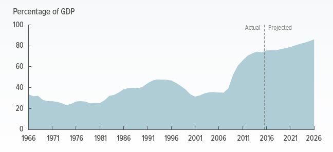
A hot housing market is hot for reasons beyond low mortgages interest rates. It is explained by islands of concentrated capital, GDP growth and talent which combined act as magnets that attract global capital and talent, even as prices notch higher. Though this is a US example, similar arguments are relevant closer to home!

If we had to guess which areas will likely experience the smallest declines in prices and recover the soonest, which markets would you bet on?

Though housing statistics such as average sales price are typically lumped into one national number, this is extremely misleading: there are two completely different housing markets in the U.S. One is hot, one is not so hot.>Just as importantly, one may stay relatively hot while the other may stagnate or decline.

All real estate is local, of course; there are thousands of housing markets if we consider neighborhoods, hundreds if we look at counties, cities and towns and dozens if we look at multi-city metro regions.

But consider what happens to average sales prices when million-dollar home sales are lumped in with $100,000 home sales. The average price comes in around $500,000– a gross distortion of both markets.

Here’s a real-world example of what has happened in hot markets over the past 20 years. The house in question is located in a bedroom community suburb in the San Francisco Bay Area metro area. The home was built in 1916 and has 914 square feet, no garage and a small lot. It sold in 1996 for $135,000. This was a bit under neighborhood prices due to the lack of garage and small size, but nearby larger homes sold in the $145,000 to $160,000 range. The house was sold in 2004 for $542,000, and again in 2008 for $575,000. It is currently valued at $720,000. The neighborhood average is $900,000. According to the Bureau of Labor Statistics inflation calculator, inflation since 1997 has added 50% to the cost of living: $1 in 1997 equals $1.50 in 2016.

Adjusted for inflation of 2.5% annually, calculated cumulatively, the home would be worth a shade over $220,000 today. Long-term studies have found that housing tends to rise about 1% above inflation annually, so if we add 1% annual appreciation (3.5% calculated cumulatively over the 20 years), the home would have appreciated about $47,000 above and beyond inflation, bringing its value to $268,000–almost double the purchase price.

But being in a hot market, this little house appreciated a gargantuan $450,000 above and beyond inflation and long-term appreciation of 1% annually. Those who bought in hot markets are $500,000 richer than those who bought in not-so-hot markets.

Another house I know in a hot metro market sold for $438,000 in 1997 and is currently valued at $1.4 million. The owners picked up substantially more than $500,000 in bonus appreciation.

Or how about a home that sold for $607,000 in 2010 and is now valued at $960,000? (Note that I have picked neighborhoods and metro areas I have known for decades, so I can verify the current valuations are indeed in the real-world ballpark.)

Inflation alone added about $60,000 to the value since 2010; the $300,000 appreciation above and beyond inflation is pure gravy for the owners.

It’s easy to dismiss these soaring valuations as credit-driven bubbles that will eventually pop, but that narrative misses the enormous differences in regional incomes and GDP expansion. The little 900 square foot house that’s barely worth $100,000 in most of the country may well fetch $700,000 in hot markets for far longer than we might expect if it is in a metro area with strong GDP and wage growth.

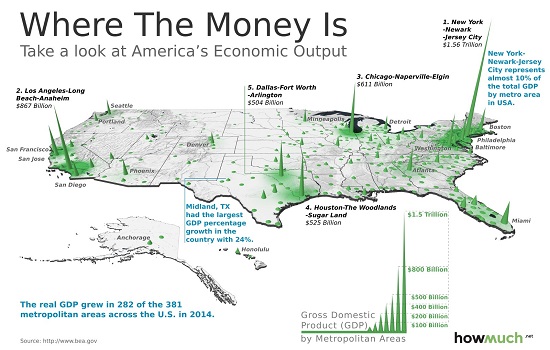
To understand why, look at these three maps of the U.S. The first reflects the GDP generated within each county; the second shows real growth in GDP by region, and the third displays the wages of the so-called “creative class”–those with high-demand skillsets, education and experience.

The spikes reflect enormous concentrations of GDP. This concentrated creation of goods and services generates jobs and wealth, and that attracts capital and talent. These are self-reinforcing, as capital and talent drive wealth/value creation and thus GDP.

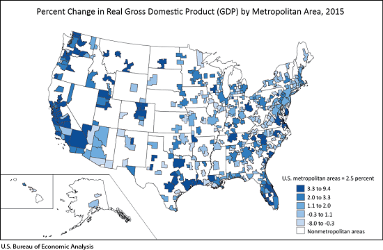
Unsurprisingly, there is significant overlap between regions with high GDP and strong GDP expansion. The engines of growth attract capital and talent.

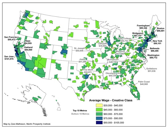
Creative class wages are highest in the regions with strong GDP expansion and concentrations of GDP, capital and talent. Attracting the most productive workers requires hefty premiums in pay and benefits, as well as interesting work and opportunities for advancement.

That people will make sacrifices to live in these areas should not surprise us–including paying high housing costs. This willingness to pay high housing costs attracts institutional and overseas investors, a flood of capital seeking high returns that further pushes up the cost of housing.

The rising cost of money will impact all housing. So will recession. But if we had to guess which areas will likely experience the smallest declines in prices and recover the soonest, which markets would you bet on?

Markets that are “cheap” because wages are low and opportunities scarce, or high-cost areas with high wages and concentrations of the factors that drive growth and innovation?

The point is that hot housing markets are hot for reasons beyond low interest rates for mortgages. These islands of concentrated capital, GDP growth and talent are magnets that attract global capital and talent, even as prices notch higher.

Bank EPS Misses On Deck

From Zero Hedge.

Wondering how the blow out in interest rates is impacting commercial banks, which just happen to have hundreds of billions in duration exposure in the form of various Treasury and MBS securities, not to mention loans, structured products and of course, trillions in IR swap, derivatives and futures? Wonder no more: the Fed’s weekly H.8 statement, and specifically the “Net unrealized gains (losses) on available-for-sale securities” of commercial banks, gives a glimpse into the pounding that banks are currently experiencing. In short: it has been a bit of a bloodbath.

After hitting a recent high of $34 billion in gains three months ago when interest rates were still near 2016 lows, the reported amount of net unrealized gains has tumbled, and from a gain it has turned into a loss of $14 billion as of the week ended December 14. On a 4-week rolling basis, the change amounts to $37 billion in losses, the biggest monthly drop since the 2013 Taper Tantrum.

This may not be the end of it: as the next chart below shows, commercial banks are holding just shy of an all time high of $747 billion in Treasuries and other non-MBS securities, a number which rises to $2.43 trillion if one includes all Treasury and agency securities on commercial bank balance sheets.

Should rates keep rising, the “unrealized” losses will keep building.

Where on the bank income statement do these losses appear? As we explained the last time this was an issue, in the aftermath of the 2013 Taper Tantrum, it comes down to the the Available For Sale (AFS) line, which runs through the Accumulated Other Comprehensive Income line.

It means that the November and December spike in rates will hammer those banks which hold their bond portfolios as AFS, and thus are subject to Mark to Market and ultimately flow through the P&L.

It also means that the shorthand to get a sense of how substantial the MTM losses from bond holdings will be is to look at the massacre that is going on in the AFS line and extrapolate it to all other levered commercial bank (and hedge fund) rate exposure. Expect math PhD-programmed algos that determine the marginal momentum of the S&P to figure this out some time over the next 2-3 weeks once banks begin reporting results which “unexpectedly” are well below expectations, especially since instead of steepening, the Net Interest Margin line has remained very much unchanged, and if anything, has modestly flattened, failing to offset the losses from bank holdings of rate-sensitive securities.

The End Is in Sight for the U.S. Foreclosure Crisis

From The St. Louis Fed.

The extended period of historically elevated rates of extreme mortgage distress and defaults in the U.S. housing market, better known as “the foreclosure crisis,” has faded from view as the economy continues its slow recovery. A deeper look at mortgage performance data from the Mortgage Bankers Association suggests the crisis has ended in some states, while it is not quite over yet for the nation as a whole. However, the end is near. The condition of current mortgage borrowers considered as a group—nationwide or state by state—is once again comparable to the period just before the Great Recession and the onset of the foreclosure crisis.

As explained below, we identify the fourth quarter of 2007 as the beginning of the nationwide foreclosure crisis; we judge that it had not yet ended as of the third quarter of 2016. Based on current trends, we expect it should end in early 2017. This nearly 10-year nationwide foreclosure crisis will have been longer and deeper than anything we’ve seen since the Great Depression. As many as 10 million mortgage borrowers may have lost their homes.

Some states and regions have experienced severe recessions and housing crises worse than the nation as a whole, while others have suffered less. The result is a wide range of foreclosure-crisis experiences. Among the seven states that make up the Eighth Federal Reserve District, we conclude that only Missouri and Tennessee have exited their foreclosure crises as of the third quarter of 2016 when judged by a national standard; Arkansas likely will follow soon. Meanwhile, Illinois, Indiana, Kentucky and Mississippi may be a year or more away from exiting. If we take into account long-standing differences in mortgage conditions across states, our conclusions are more favorable. Only Illinois has failed to return to its own pre-crisis level and, even there, the end of the foreclosure crisis appears imminent.

Using Data to Define the Start and End of the Foreclosure Crisis

We define the recent foreclosure crisis as the period during which the share of mortgages that are seriously delinquent (90 days or more past due) or in foreclosure in a particular state or nationwide was above the worst level experienced in recent memory (i.e., not including the Great Depression).2 To recognize secular changes in mortgage practices and performance—in particular, steadily rising levels of outstanding mortgage debt and a proliferation of new types of mortgages—we calculate a crisis threshold for the nation and for individual states as the combined rate of serious delinquency plus foreclosure inventory that first exceeds its own five-year moving average by an amount greater than any previously experienced in the data.

We define the end of a foreclosure crisis as the first quarter in which the combined rate drops below its initial crisis reading.

The Foreclosure Crisis at a National Level

Mortgage Bankers Association data show that the U.S. foreclosure crisis started in the fourth quarter of 2007, when the combined rate reached 2.81 percent, a level that exceeded its five-year moving average by 0.67 percentage points, more than any other previous level. Given that the combined rate stood at 3.2 percent in the third quarter of 2016, this suggests that the nationwide foreclosure crisis has not yet quite ended. However, based on the rate of decline in recent quarters, the data-defined end of the crisis on a national scale is likely to occur as soon as the first quarter of 2017. Indeed, comparable data from Lender Processing Services, as shown in the recently released Housing Market Conditions report from the St. Louis Fed, also suggest the foreclosure crisis is nearing its end.

It Has Been a Long, Hard Slog

However it is defined, the mortgage foreclosure crisis will go down as one of the worst periods in our nation’s financial history. For the nation as a whole, the crisis will have lasted almost a decade—about as long as the Great Depression. For most states in the Eighth District, the slightly shorter duration of their foreclosure crises, when measured against their own data trends, has been offset by higher average rates of serious mortgage distress seen even in non-crisis periods.

The conclusion that the foreclosure crisis has been a long, miserable experience for many is unavoidable. And many Americans continue to suffer lasting financial, emotional and even physical pain as a result of their experiences during this time. However, a look at the data today shows that, at least, the end is in sight.

The Fed Admits The Good Old Days Are Never Coming Back

From Zero Hedge.

The dots that the FOMC members contribute to the plot indicate their expectations for the federal funds rate.

Technically, it’s what they think rates should be, not a prediction of what rates will be on those dates. Is that a forecast? You can call it whatever you like. I think “forecast” is close enough.

But before we analyze the whatever-you-call-it, let’s look back at the not-so-distant past.

Here’s a rate history of the last 16 years:

I’ve highlighted this fact before, but it’s worth mentioning again: In 2007, less than a decade ago, the fed funds rate was over 5%. So were the interest rates for Treasury bills, CDs, and money market funds.

People were making 5% on their money, risk-free. It seems like ancient history now, but that year marked the end of a halcyon era of ample rates that most of us lived through.

The chart below shows historical certificate of deposit rates—but remember, you could put your money in a money market fund and do better than the six-month certificate of deposit yield, back in 2007.

Today’s young Wall Street hotshots have never seen anything like that. To them, the jump from 0.5% to 0.75% must seem like a big deal. It’s really not. If the chart above were a heart monitor readout, we would say this patient is now dead and that last blip was an equipment glitch.

The point to all this is that these near-zero rates to which we have all adapted are by no means normal or necessary to sustain a vibrant economy.

We’ve done fine with much higher rates before. They are even beneficial in some ways—they give savers a return on their cash, for instance. But there are likely to be consequences once we embark on this rate-increase cycle.

The FOMC cast members are all old enough to remember those bygone days of higher rates as well as I do. So, we would think they might at least foresee a return to normalcy at some point in the future.

Not so.

The FOMC members see nothing of the sort

Here is the official dot plot published by the FOMC. (I have included their preferred heading so that no one complains about my calling it a forecast, even though that’s what it is.)

Each dot represents the assessment of an FOMC member. That group includes all the Fed governors and the district bank presidents. All 17 of them submit dots, including the presidents of districts who aren’t in the voting rotation right now. There would be 19 dots if the two vacant governor seats had been filled.

That flat set of dots under 2016 represents a rare instance of Federal Reserve unanimity: They all agree where rates are right now. (See, consensus really is possible.) The disagreement sets in next year. For 2017, there’s one lone dot above the 2.0% line, but the majority (12 of 17) are below 1.5%.

Nevertheless, it will be a much different year than this one if they follow through. The dots imply that the fed funds rate will rise a total of 75 basis points next year.

Presumably, that would be three 25 bps moves, but they can split it however they want. They could ignore their expectations completely, too. This time last year, the FOMC said to expect a 100 bps rise, or four rate hikes, in 2016. We got only one.

Follow the dots on out and you see that their assessments trend a little higher in the following two years, and then we have the “longer run” beyond 2019. Most FOMC participants think rates at 3% or less will be appropriate as we enter the 2020s.

The most hawkish dot is at 3.75%.

Think about what this means

Today’s FOMC can imagine raising rates only to the point they fell to about halfway through their 2007–2008 easing cycle. They see no chance that overnight rates will reach 5% again. None.

Here is another view of the same data, that shows how the dots shifted.

Looking at each set of red (September) and blue (December) dots, we see only a slightly more hawkish tilt than we saw three months ago. The “Longer Term” sets are almost identical—two of the doves moved up from the 2.5% level, while the two most hawkish hung tight at 3.75% and 3.50%.

That word hawkish is relative here. By 2007 standards, these two voters are doves. But, Toto, I’ve a feeling we aren’t in 2007 anymore.

Inflation, Interest Rates and ‘the Politics of Rage’

From Knowledge At Wharton.

Donald Trump will soon be sworn in as president after promising less regulation, tougher trade policies and more government spending on things like infrastructure, which could spur growth. But coupled with tax cuts, such moves could also expand government debt. At the same time, populist pressure similar to what put Trump in office is afoot in England and some European countries, pressing governments to turn inward and spend for the benefit of people who have felt left out by globalization.

Taken together, it looks like a formula that would lead to higher inflation, which in most developed countries has languished at below-average levels since the financial crisis.

In the U.S., a strengthening economy is already leading The Federal Reserve to pledge to continue to raise interest rates. The Fed is targeting an inflation rate of  2% — it’s currently about 1.7% and has been even lower in recent years. This month, the Commerce Department revised up GDP numbers for the third quarter – from 3.2% to 3.5% (annualized) — pointing to faster-than-expected growth.

The Fed’s hawkish stance is a sea change from only a few months ago, when there was much wringing of hands about growth and inflation being too low, says Wharton finance professor Itay Goldstein. “All of a sudden people are talking about infrastructure [spending] and cutting taxes and things that could lead to new growth and growing inflation.”

Politics and Inflation

Mark Zandi, chief economist at Moody’s Analytics, has predicted higher inflation and interest rates, more government debt and slower economic growth under Trump policies, and some other experts warn about the dangers of rejecting trade and international cooperation if the so-called “politics of rage” persist.

While most everyone wants stronger economic growth, some observers worry that anger among voters in various countries about the benefits of globalization could cause some developed countries to turn inward in ways that could hinder economic progress. They point to parallels between Trump’s win and the British vote last June to leave the European union, as well as movements in several European countries that signify disfavor with open trade and immigration policies, and a preference for protectionism and populism.

“Both the Trump and Brexit campaigns evoked fear and anger at immigration, free trade, and globalization and multi-cultureness more generally,” says Dan Kselman, academic director of the IE School of International Relations in Madrid, adding that, “both represent not so much the victory of a political party or a clear political platform, but rather rejection of the status quo political elite from both major parties, seen as corrupt and disconnected.”

If the result of that rejection is policies that favor more government spending on programs popular with the public, economies could grow. But Trump-style policies could be damaging as well, some economists say.

Wharton professor Kent Smetters has said that Trump has talked of reducing tax rates, especially for higher-income people — but also  for businesses – that would stimulate the economy in the short run. The Penn Wharton Budget Model shows the impact of various assumptions. “In the short run, it creates some stimulus, but over the long run, you lose a lot of revenue,” said Smetters, a Wharton professor of business economics and public policy, of Trump’s business tax cut proposals.

The risk to the U.S. economy is that the tax cuts will lead the government to increase borrowing and thus further balloon public debt, which could compete with private capital for household savings and international capital flows, depending on whether the overall economy is at full capacity. In the Penn Wharton Budget Model, the short-term gains turn negative over time, and in fact become “very negative” over 10 years, Smetters noted.

Goldstein sees some of the same political and social trends in Europe that won Trump the election in the U.S., with many people thinking globalization has gone too far and that it puts international interests ahead of national ones. “I certainly think it’s a broad phenomenon. It’s not just the U.S. and U.K.,” he says. “There is clearly a backlash.”

Kselman adds, “Donald Trump has promised to repeal the Affordable Care Act, which gave millions of lower class and lower-middle class Americans access to health insurance. He has pledged to adopt traditional trickle-down economic policies, such as the reduction of corporate taxation, that have contributed to increasing American budget deficits, increasing international debt, and the increasing marginalization of the American industrial working class.”

As such, Kselman continues, “Donald Trump’s economic policies are not likely to help the working-class whites who carried him to office.”

US Payments Landscape Changing Fast

From 2012 to 2015, US credit and debit (including prepaid and non-prepaid) card payments continued to gain ground in the payments landscape, accounting for more than two-thirds of all core noncash payments in the United States, according to a Federal Reserve study of U.S. non-cash payments. Automated clearinghouse (ACH) payments grew modestly over the same period, and check payments declined at a slower rate than in the past.

The 2016 Federal Reserve Payments Study, which presents 2015 payments data, found that the number of domestic core noncash payments totaled an estimated 144 billion–up 5.3 percent annually from 2012. The total value of these transactions increased 3.4 percent over the same period to nearly $178 trillion.

Other key findings:

  • Card payments grew 19.9 billion from 2012 to 2015, led by non-prepaid debit card payments which grew by 12.4 billion, and credit card payments, which grew by 6.9 billion. Prepaid card payments grew by less than 1 billion.
  • Remote card payments, sometimes called card-not-present payments, reached 19 percent of card payments in 2015, an increase of less than 4 percent compared with 2012. Gains in remote cards’ share of total card payments were mitigated by substantial growth of in-person card use.
  • Credit card and non-prepaid debit card payments nearly tied for first place in growth by number from 2012 through 2015, both growing by roughly 8 percent over the period.
  • The number of general-purpose card payments initiated with a chip-based card increased substantially from 2012, growing by more than 230 percent per year, but amounted to only a roughly 2 percent share of total in-person general-purpose card payments in 2015, during a broad industry effort to roll out chip card technology.
  • In 2015, the proportion of general-purpose card fraud attributed to counterfeiting was substantially greater as a share of total card fraud in the United States compared with countries where chip technology has been more completely adopted. Nonetheless, the total share of remote fraud is already substantial (46 percent) compared to its share in total card payments (19 percent).
  • The number of ACH payments is estimated to have grown to 23.5 billion in 2015, with a value of $145.3 trillion. ACH payments grew at an annual rate of 4.9 percent by number and 4 percent by value from 2012 to 2015.
  • Check payments fell at an annual rate of 4.4 percent by number or 0.5 percent by value from 2012 to 2015. For the first time since the descent began in the mid-1990s, check payments posted a slowing in the rate of decline.

“The data collected for the 2016 study was substantially expanded,” said Mary Kepler, senior vice president of the Federal Reserve Bank of Atlanta, which sponsored the study.

“This reflects an increased desire within the payments industry for additional fraud-related information,” she said. “A limited amount of fraud information was ready for release today, and further results will be released in 2017 as the complete data set is more fully reviewed and analyzed.”

Beginning in 2017, some survey data will be collected annually, rather than every three years, to enhance the value of the study, Kepler added.

“Payment industry participation drives the quality of the study’s results,” Kepler said. “The Federal Reserve appreciates the industry’s response in 2016 and looks forward to working with selected participants for the annual data collection getting underway in the first quarter of 2017.”

US GDP Higher In Q3

Real US gross domestic product increased at an annual rate of 3.5 percent in the third quarter of 2016, according to the “third” estimate released by the Bureau of Economic Analysis. In the second quarter, real GDP increased 1.4 percent.

The GDP estimate released today is based on more complete source data than were available for the “second” estimate issued last month. In the second estimate, the increase in real GDP was 3.2 percent. With this third estimate for the third quarter, nonresidential fixed investment, personal consumption expenditures (PCE), and state and local government spending increased more than previously estimated, but the general picture of economic growth remains the same.

Real GDP: Percent Change from Preceding Quarter

Real gross domestic income (GDI) increased 4.8 percent in the third quarter, compared with an increase of 0.7 percent in the second. The average of real GDP and real GDI, a supplemental measure of U.S. economic activity that equally weights GDP and GDI, increased 4.1 percent in the third quarter, compared with an increase of 1.1 percent in the second.

The increase in real GDP in the third quarter primarily reflected positive contributions from PCE, exports, private inventory investment, nonresidential fixed investment, and federal government spending that were partly offset by negative contributions from residential fixed investment. Imports, which are a subtraction in the calculation of GDP, increased.

The acceleration in real GDP in the third quarter primarily reflected an upturn in private inventory investment, an acceleration in exports, a smaller decrease in state and local government spending, an upturn in federal government spending, and a smaller decrease in residential investment, that were partly offset by a smaller increase in PCE and an acceleration in imports.

Current-dollar GDP increased 5.0 percent, or $225.2 billion, in the third quarter to a level of $18,675.3 billion. In the second quarter, current dollar GDP increased 3.7 percent, or $168.5 billion.

The price index for gross domestic purchases increased 1.5 percent in the third quarter, compared with an increase of 2.1 percent in the second quarter (table 4). The PCE price index increased 1.5 percent, compared with an increase of 2.0 ercent. Excluding food and energy prices, the PCE price index increased 1.7 percent, compared with an increase of 1.8 percent.

Why Trump’s “Border Tax Proposal” Is The “Most Important Thing Nobody Is Talking About”

From Zero Hedge.

While the market, and various pundits and economists have been mostly focused on the still to be disclosed details of Trump’s infrastructure spending aspects of his fiscal plan, “one of the least talked about but possibly most important tax shifts in the history of the United States” is, according to DB, House Speaker Paul Ryan’s and President-elect Trump’s “border tax adjustment” proposal.

This is part of the “Better Way” reform package and also figures prominently in the writings of senior Trump administration officials.

What is it?

Put simply, the proposal would tax US imports at the corporate income tax rate, while exempting income earned from exports from any taxation. The reform would closely mirror tax border adjustments in economies with consumption-based VAT tax systems. If enacted, the plan will likely be extremely bullish for the US dollar. What’s more, it would have a transformational impact on the US trade relationship with the rest of the world. Consider the below:

A “border tax adjustment” would, roughly speaking, be equivalent to a 15% one-off devaluation of the dollar. Imports would be 20% more expensive, because corporates would have to pay the new 20% corporate tax rate on their value. Exports would be roughly 12% “cheaper”, because for every $33 of earnings earned from $100 of exports (we use the 33% gross margin of the S&P), there would be a 12% tax cost ($33 earnings*35% current tax rate) that would no longer be imposed on corporates. Taking the average impact on the prices of exports and imports is equivalent to a 15% drop in the dollar.

A border tax adjustment would be very inflationary. The price of exports doesn’t affect the US consumption basket so would have no impact on CPI. However, the cost of imports would go up by 20%, which based on a simple relationship between import PPI and US inflation would be equivalent to a 5% rise in the CPI. Corporates may of course choose to absorb part of the rise in import costs in their profit margins. But either way, the order of magnitude is large.

A border tax adjustment would be very positive for the US trade balance. Similarly to the dollar calculations, a border tax adjustment would be equivalent to an across the board import tariff of 20% and an export subsidy of 12%. Keeping all else constant and applying standard trade elasticity impact parameters to an average of the two estimates results in a more than 2% drop in the trade deficit equivalent to more than 400bn USD, or equivalently, an almost complete closing of the US trade deficit.

In other words, should the “border tax proposal” pass, it would not only send inflation soaring, while eliminating the US trade deficit – a long-time pet peeve of Trump – it would also be the trade-equivalent of a 15% USD devaluation, even as it leads to an offsetting surge in the actual value of the dollar.

To be sure, there are uncertainties related to all estimates above. First, there is a question mark on whether a border tax adjustment based on a territorial corporate tax system (as opposed to VAT) would be allowable under WTO rules. The question is highly complex, but senior Trump advisers have stated they would be willing to take the issue to the WTO.

It is also not clear what types of goods the new tax would cover – the broader the coverage the bigger the impact and vice versa.

Second, the impact on trade highlighted above should be considered an upper bound, as the post-crisis responsiveness of current account balances to relative price shifts has proven to be much lower.

Still, it is hard to argue that such a fundamental shift in tax treatment of US exports and imports would not have a material impact on trade relations and flows with the rest of the world. More importantly, Saravelos argues, the second-order impact of “re-shoring” may be more material given that US corporate activity has been disadvantaged due to the current unfavorable tax treatment of offshore profits.

* * *

Taking all of the above into account, the academic literature is unambiguous in its conclusion that the dollar should rally strongly in the event a “border tax adjustment” is put in place. An appreciating dollar would be a natural response to an improving US trade balance and the competitiveness gains achieved by the shift in the relative prices of exports over imports. In extremis, the dollar would rally by 15% to fully offset the price changes caused by the tax. This analysis is partial however, with the knock-on consequences on the Fed, US corporate off-shoring and global trade relations likely making the impact even more material.

Deutsche Bank concludes that combined with potential changes to the treatment of unrepatriated earnings, “the proposed changes to the US corporate tax code could be one of the most important shifts in US tax and international trade policy in a generation.”

We wholeheartedly agree with DB’s assessment in this particular case.