A Deep Dive Into Mortgage Discounts

We have been highlighting the battle for market share, and the varying discounts which are available to some. Today we deep dive into the world of discounts, drawing data from our market model. We conclude that households, on average, get better discounts which using  a broker, discounts for investment loans are more generous, and reconfirm that more affluent households get the best deals. We also see that competition and deep discounts are making many loans unprofitable to the banks who make them (taking fully absorbed costs into account). As such, the current deep discounts are unsustainable.

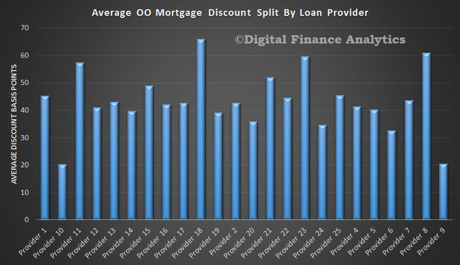
We start by looking at the average discounts in basis points individual loan providers are offering. Some are significantly more aggressive than others. We have hidden the real names of the lenders concerned. We see that there are more banks offering owner occupied loans than investment loans. The best average discount for an investment loan is from provider 9.

Invetsment-Loans-Discount-By-Provider

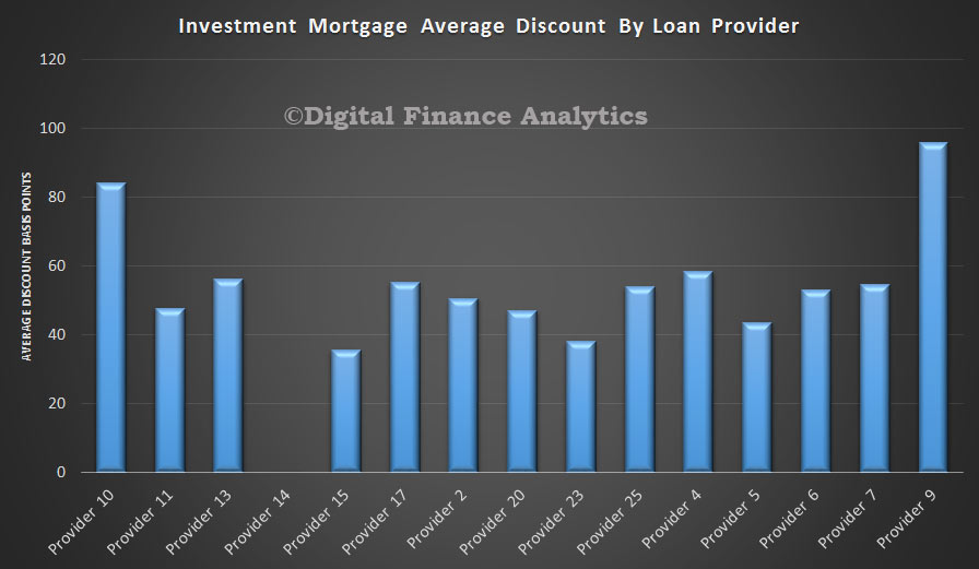
Some of the owner occupied providers are quite generous in their discounts, but generally investment loans get bigger discounts at the moment.

OO-Discounts-By-Provider

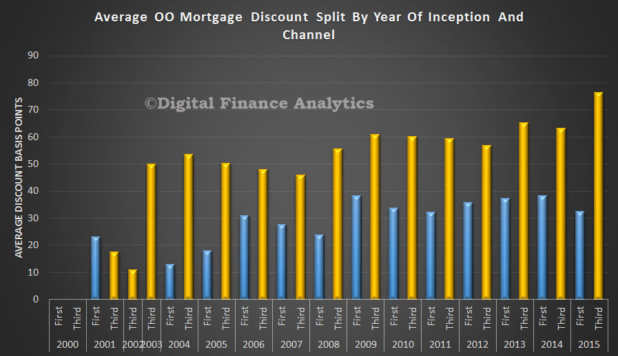
Looking at channel of origination, and year of inception of the loans, we see that consistently third party (broker) loans get bigger discounts, and that the discounts have been growing in recent years.  In the owner occupied sector, discounts for loans via the branch (first party) are slightly lower in 2015.

OO-Mortgage-Discount-By-Year-and-Channel-APr-2015

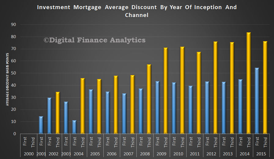
In the investment loan sector, we see a trend of growing discounts in recent years, with third party originated loans getting a better deal.

INvestment-Discounts-By-Year-and-Channel

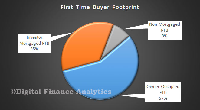
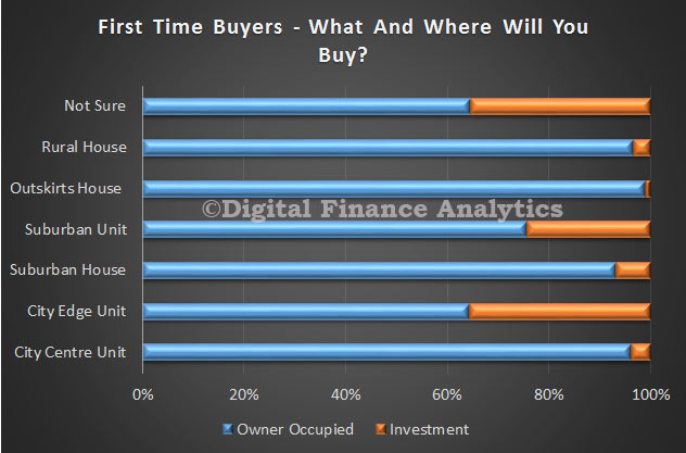
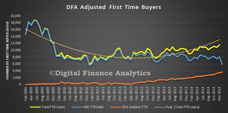
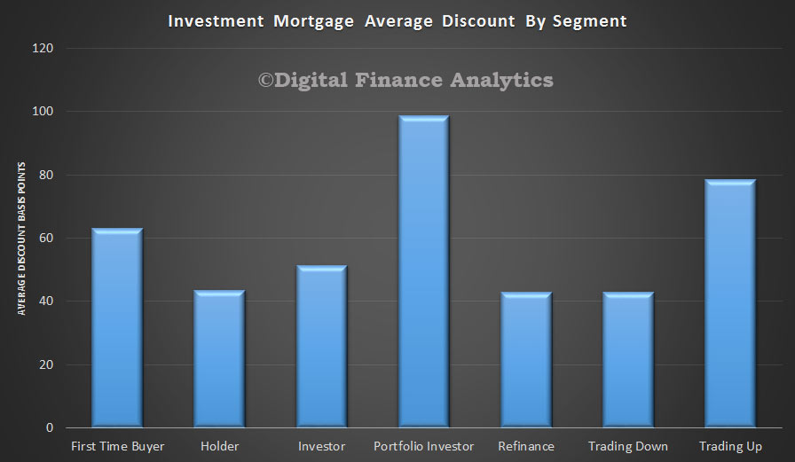
Turning to the DFA property segments, in the investment loan category, we see that portfolio investors are getting the very best discounts, whilst first time buyers are not doing so well, but they are slightly ahead of holders, refinance and trading down households.

Investment-DIscount-By-Pry-Segment-Apr-2015

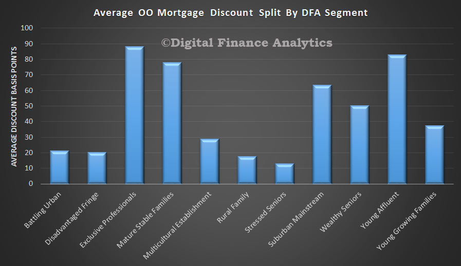
Looking at our master household segments, we see that the wealthy – professionals and young affluent get the best deals. Those with less bargaining power do not do so well.

Investment-Discounts-By-Segment-Apr-2015

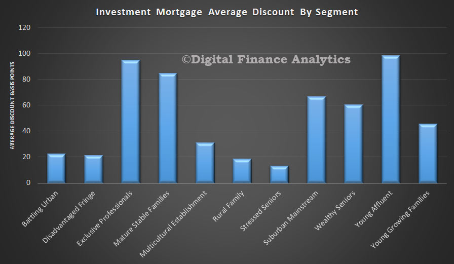
This is true of both investment mortgages (above) and owner occupied mortgages below, though we see that in the latter case, the discounts are slightly less generous.

OO-Discounts-By-Segment-Apr-2015

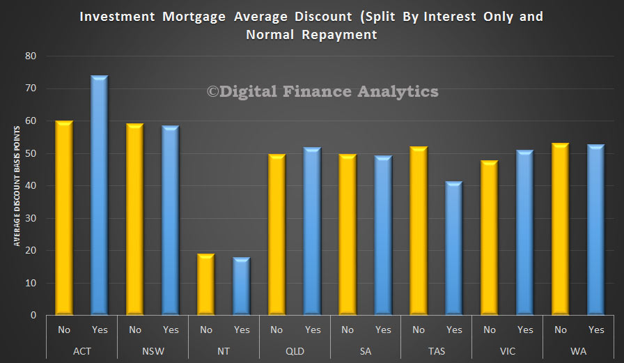
We also see that interest only loans command a larger discount in some states, especially in ACT. Others are more line ball.

Investment-Discounts-Apr-2015

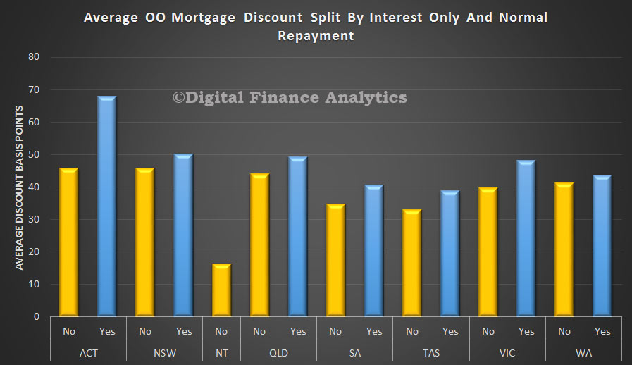
In comparison interest only owner occupied loans can consistently command a larger discount, than normal repayment loans, but as highlighted already these discounts are on average a little lower than in the investment sector.

OO-Discounts-Apr-2015So what is the profit impact of these discounts? DFA has calculated the relative profit of each loan and using an index we can display the relative profit contribution in cash terms. For owner occupied loans, up until 2013, most years were net profitable to the lenders. We note that this changed in 2014 and 2015 as discounts expanded, and competition increased. Overall in cash terms they are making a slight net loss on some loans written now.  This is partly explained by the one off costs of setting up a new loan, and initial broker commissions. As loans age, they on average become more profitable.

The investment loan profit footprint is very interesting, as here we see a consistent fall in the profit index since 2010, with the largest drops in 2014 and 2015. This is explained partly by the significant growth in volumes, and the deeper discounting. Again, older loans become more valuable. Most banks would calculate an amortised cost of origination, spread over a number of years, but we prefer a true cash view.

We conclude from this that recent loans for many providers (especially those less efficient) will be loosing money initially, and the portfolio will be supported by the older more profitable loans. We also think that discounts are unsustainable at current levels, and will see them come off over the next few months.

Top LVR and LTI Households By Post Code

We have now finished updating the DFA market model, to take account of the latest DFA survey data, and market data. So we can look across specific households, segments and locations. Specifically we have been looking at average loan to income (LTI – income after tax but before interest) and loan to value (LVR – current outstanding loan compared with marked to market property value. The data covers all outstanding loans, not just new loans. The results are fascinating. This analysis is focusing on owner occupied property, though we also have rich data on investment property, and we may come to this later. This should help to answer the question, recently posted to DFA, where are the highest LVR and LTI areas? The DFA model has more then 100 elements, so we are just pulling out a few relevant items for this post.

To start, we look at the state summaries. We see that the highest LVR (orange line) can be found in the ACT, whilst the highest LTI is in NSW. The former is explained by the concentration of low risk salaried public servants in Canberra, and high house prices relative to income in Sydney.

LVR-and-LTI-By-StateUsing the DFA property segmentation, we see that the highest LVRs on average sits with first time buyers and is above 80%, whilst those trading up have an average below 60%. On the other hand, LTIs are on average, more stretched for households other than first time buyers (as we will see later there are wide variations), whilst other segments have higher LTI, reflecting falling incomes and other factors, including loan draw-downs and recent refinancing.

LVR-and-LTI-By-SegmentsIf we then look across all the locations, we see LVR’s above 93% on average in places like Stawell (Horsham (west), VIC; Jarrahdale (Tangney), WA; Merbein (Vic Country (north), VIC; and Badgingarra (Kalgoorlie) WA. The highest LTI ratios are in Ultimo (Sydney) NSW; Barnawartha (Wangaratta (north East)), VIC; and Matraville (Sydney) NSW. The average LTI does vary significantly, from just over two time income to nearly eight times.

All-Australia-Top-LVR-and-LTIIf we then dive more deeply into NSW, the top LVR ratios are found in Ultimo, Edmondson Park, Matraville and Northmead. High LTI ratios are found in Ultimo, Alexandria, Holsworthy and Roselands. So from a potential risk perspective, Ultimo has the highest score attached to it at the moment in the state. There are many new buildings going up there of course, mostly high-rise apartments, coupled with high turnover and competition between owner occupiers and investors.

NSW-Top-LVRs-March-2015Finally, for today, we map the top LVR’s in Sydney. We see significant high LVR mortgages in the eastern suburbs, as well as the inner west, southern, north western and western areas. In this map we cut off data below 78% LVR.

NSW-LVRs-March-2015

Latest DFA Survey – First Time Buyers Motivations and Barriers

We continue our series using data from the latest DFA segmented household surveys. First time buyers are more than ever becoming property speculators. Whilst we have already quantified the number of first time buyers and first time investors in the market,

FTBFootprintMar2015 today we look at their underlying motivations. So, looking at these trends there are some striking observations. We see that the prospect of potential capital gains, is now the highest rated driver at 32%, whilst the desire for somewhere to live is  just 28%. We see the prospect of gaining tax advantage is growing, now up to 10%, whilst the advantage of a First Home Owner Grant (FHOG) is falling away as these grants become less accessible. Fewer buyers now expect to pay less than renting, whilst the prospect of greater security remains about the same.

FTBMotivationsMar2015The biggest barrier to purchase are clearly current prices. This translates into too higher mortgages, or too bigger savings requirements to get into the market. The bank of “Mum and Dad” remains a prime source of funding. Fear of unemployment has diminished, whilst the problem of finding a place to buy has increased (now 22%).  The impact of potential interest rates reduced slightly, in response to the RBA cut, and expectation of lower rates for longer. Many now assume rates will stay low for at least three years, and they plan on this basis.

FTBBarriersMar2015Looking at where they will buy, 20% of potential first time buyers are not sure where to purchase. Across all Australia a suburban home is still the most desired property type, but in Sydney, a unit is much more the expectation now, mostly on the urban fringe, or inner suburbs.

FirstTimeBuyersWhereMar2015If we look at the split between owner occupied and investor first time buyers, we see investors are predominately going after units, either on the edge of the City (inner suburbs – e.g. in Sydney Hurstville, Wolli Creek), or suburban units.

FirstTimeBuyersTypeMar2015So putting this together, we conclude that first time buyers are reacting to the current house price boom in logical ways. They are however being infected by the notion that property is about wealth building, rather than somewhere to live. This notion, which served previous generations quite well (once they were on the property escalator), may be tested if interest rates rise later, or property prices fall from their current illogical stratospheric levels. The overriding result from the survey is the first time buyers are very fearful of missing out, and that delaying potential entry into the market will simply make it less affordable later.  This is why we expect to see a continued rise in the number of first time investor buyers.

Latest DFA Survey – Investor Motivations

Continuing our series of updates from our latest household surveys, today we look at the latest investment property trends. Looking at solo investors first (using the DFA segmentation) we see the main drivers to transact relate to the continued potential for appreciating property values and the tax efficient nature of the investment. We also see an expectation of higher returns than deposits. This all explains why property investment is so hot. It is, from an investment perspective, for many, the best game in town. The average age for a first time property investor continues to fall, and now stands at 38 years, partly reflecting the rise of first time buyer investors, as we featured recently.

SoloInvMar2015Turning to potential barriers which may stop investors transacting, current prices are not seen as a critical issue – only 18% said this was a turn-off. Whilst 45% had already transacted, there is still significant potential for further purchases, especially in the Sydney and Melbourne markets. We also see that whilst there is some recognition of potential changes to regulation (relating to LVR hurdles, interest only, and gearing), less than one third of investors are worried by this. Finally, only 15% were worrying about potential budget changes, we saw a spike after the budget last year, we may see the same again in our post budget survey.  Nearly half expect to select an interest only loan.

InvBarriersMar2015Investing via a super fund is still a minority sport, though some investors are getting advice from internet forums, or mortgage brokers. We estimate about 3.5% of SMSF have an investment property in their fund, and a further 3% are actively considering this investment route.

SMSFAdvisorsMar2015Those who are thinking of a SMSF transaction continue to be attracted by tax efficient outcomes and appreciating property values. These drivers match the broader investment sector quite well as we showed above.

SuperInvMar2015Finally we look at portfolio investors. This is becoming an ever more important sector, because the capital gains and imcone from current properties are being used to leverage further investment, to crease a self-sustaining (some would say critical mass) proposition. The proportion with a holding of 10 properties or more is steadily increasing. Again, these investors are driven by tax efficiency and appreciating property values and also an expectation of better returns than deposits.  One trend we detected in this segment is the rise in the number of portfolio investors who now see property investment as their main source of income, it has essentially become their job.

PortfolioInvMar2015 Next time we will look at some of our other segment findings.

NZ Loan To Income Ratios Higher

The Reserve Bank of NZ released a report today “Vulnerability of new mortgage borrowers prior to the introduction of the LVR speed limit: Insights from the Household Economic Survey.” The paper uses household level data for New Zealand to assess the vulnerability of new mortgage loans to owner-occupiers between 2005 and 2013.

They modelled financial vulnerability, considering:

  • Does the household have adequate cash flow to support mortgage borrowing?
  • How large is the equity buffer of the household?

Their analysis suggests a move towards more stretched debt-to-income ratios between the 2008-10 and 2011-13 cohorts.

RBNZ-LTIThey highlighted that most banks will lend at much higher DTIs to high income borrowers than low income borrowers. Owner occupiers with an income of greater than $80,000 do account for almost half of high DTI lending in the 2011-13 cohort. However, this is significantly lower than their share of total lending of around 70 percent. By number, such households account for only 30 percent of owner occupiers with a high DTI.19 Subject to the caveat that our sample of high DTI borrowers is relatively small, this suggests that owner-occupiers with a high DTI are more likely to have an income below $80,000 than those with a low DTI (despite banks’ preference to supply high DTI loans to high income households).

They found an increase in typical DTI multiples compared to earlier years, in addition to the well-known rise in the share of high-LVR lending. The proportion of borrowers with both a high-DTI and a high-LVR also increased sharply and was higher than prior to the GFC. These results are consistent with an increase in the vulnerability within the 2011-13 cohort, although the quantum of lending undertaken and the tail of very high DTI borrowers both remained smaller than prior to the GFC.

Note that an assessment of the vulnerability of other borrower types – including investors and owner occupiers that have not recently bought – is left for future work.

Latest DFA Survey – House Prices Expected To Rise [Still]

Today we continue our analysis of the DFA household survey data to March 2015 by looking at the cross segment comparative data. We use the DFA segment definitions and have updated our models to take account of changes in population, and property purchase type. The proportion of households who are excluded from property rose again, and the investment sector continues to grow strongly. The current distribution of households by segment are shown below.

HouseholdsMar2015There is still significant expectation that house prices will continue to rise in the next 12 months, despite the recent gains, though Sydney centric households are most bullish. Investors have high expectations, and as we will see when we drill into this segment, capital gains are top of mind. Down traders are relatively less confident of prices continuing to rise, which explains why this segment still wants to sell now, to crystalise recent gains.

PricesRiseMar2015Looking at plans over the next 12 months, more investors are piling in, so we would expect to see this translate into further momentum in the investment sector. Last month more than half of loans were for investment purposes.

TransactMar2015In terms of borrowing plans, investors, up-traders and first time buyers are the most likely to borrow. Those down traders who are thinking of grabbing an investment property are quite likely to gear, to take advantage of tax breaks.

BorrowMore-Mar2015We see that up-traders, first time buyers and want to buys are most likely to be saving to buy, although the lower returns on deposits are proving to be a real problem for many.

Buy-Mar2015Finally, segments have different propensities to use a mortgage broker. Whilst refinancers, and first time buyers are most likely to use a broker, we also see a continued rise in the number of portfolio investors using a broker. However we see in the survey data a high level of dissatisfaction from this segment with the quality and range of advice from brokers as their needs are more complex, and many brokers tend to focus on simple binary transactions. We think there is an opportunity for brokers to better tailor their services to portfolio (a.k.a. more sophisticated) customers.

BrokerMar2015Next time we will look at the segment specific data drawn from the surveys.

First Time Buyer Investors On The March

The ABS published their Housing Finance to January 2015. Total lending for housing (both investment and owner occupied lending) lifted the stock 0.6% to $1.37 trillion. Investment rose 0.8% and owner occupied loans rose 0.5% in the month. Investment loans are close to 34.5% of all loans, a record.

ADILendingStockJan2015Looking at the changes in volumes by type, we see that the purchase of existing dwellings is rising, but refinancing, construction of new dwellings and purchase of new dwellings are down.

TrendChangeByTypeJan2015Looking across the states, momentum is rising in just two states, NSW and TAS. All other states are slowing.

StateTrendMovementsJan2015Turning to first time buyers, using the revised ABS data (method changed last month) and DFA survey data, we see that whilst first time buyers for owner occupation fell slightly (14.3% to 14.2% of all owner occupied loans), an additional 4,000 loans were written by first time buyers going direct to the investment sector. Much of this is centered on Sydney. As a result the cumulative first time buyer count is rising, with more than 21% of all loans effectively to first time buyers. You can read more analysis on this important trend here.

DFAFTBLoansJan2015This is another reason why no further assistance should be offered to “help” first time buyers into the market. It would be a waste of money.


Stress Testing Households – RBA Paper

The RBA published a Research Discussion Paper “Stress Testing the Australian Household Sector Using the HILDA Survey”.  They use data from the Household, Income and Labour Dynamics in Australia (HILDA) Survey to quantify the household sector’s financial resilience to macroeconomic shocks.

Given high household indebtedness, large mortgages and high house prices, estimating the potential impact of changes to interest rates and unemployment are important. Especially so when so much of banks lending is property related, and capital ratios are lower than pre-GFC. DFA of course models mortgage stress in our own surveys, so we have an interest in this work.

Their model suggests that through the 2000s the household sector remained resilient to scenarios involving asset price, interest rate and unemployment rate shocks, and the associated increases in household loan losses under these scenarios were limited. Indeed, the results suggest that, despite rising levels of household indebtedness in aggregate, the distribution of household debt has remained concentrated among households that are well placed to service it. In turn, this suggests that aggregate measures of household indebtedness may be misleading indicators of the household sector’s financial fragility. The results also highlight the potential for expansionary monetary policy to offset the effects of increases in unemployment and decreases in asset prices on household loan losses.

Our perspective is that the household analysis they are using is not granular enough to get at the differential stress across households, and how potential interest rate rises or unemployment will impact. In addition, interest rates are low today, so it is not possible to extrapolate from events in 2000’s. Given the larger loans, adverse interest rate movements will impact harder and faster, especially amongst households with high loan to income ratios. Therefore the results should not be used as justification for further easing of monetary policy.

Some additional points to note:

The stress-testing model uses data from the HILDA Survey, is a nationally representative household-based longitudinal study collected annually since 2001. The survey asks questions about household and individual characteristics, financial conditions, employment and wellbeing. Modules providing additional information on household wealth (‘wealth modules’) are available every four years (2002, 2006 and 2010). So some data elements are not that recent.

As they rely on information from the HILDA Survey’s wealth modules, they had to impute responses to minimise the number of missing responses and thus increase the sample size. The total sample size for each year is around 6 500 households. Individual respondent data were used to estimate probabilities of unemployment; this part of the model is based on a sample of around 9 000 individuals each year. DFA uses 26,000 households each year, our sample is larger.

How then do they estimate potential household stress? Their model uses the financial margin approach where each household is assigned a financial margin, usually the difference between each household’s income and estimated minimum expenses. This is different from a ‘threshold’ approach, where each household is assumed to default when a certain financial threshold is breached (for example, when total debt-servicing costs exceed 40 per cent of income). DFA captures data on the precursors of stress, and models the cash flow changes as unemployment and interest rates move. We also model the cumulative impact of stress which builds over time (typically households survive for 18-24 months, before having to take more drastic action).

Looking at the potential economic shocks, they examined how an increase in interest rates leads to an increase in debt-servicing costs for indebted households, by lowering their financial margins. Interest rate rises tend to increase the share of households with negative financial margins, and thus the share of households assumed to default. Interest rate shocks are assumed to pass through in equal measure to all household loans.

Falling asset prices have no effect on the share of households with negative financial margins. They assume that a given asset price shock applies equally to all households.

A rise in the unemployment rate causes the income of those individuals becoming unemployed to fall to an estimate of the unemployment benefits that they would qualify for, lowering the financial margins of the affected households. Their approach uses a logit model to estimate the probability of individuals becoming unemployed. This means that unemployment shocks in the model will tend to affect individuals with characteristics that have historically been associated with a greater likelihood of being unemployed.

In their most extreme example, households in the middle of the income distribution and renters are the most affected. Households with younger heads are also affected, while household with older heads are not especially affected in any year, suggesting that the increase in indebtedness among these households through the 2000s did not significantly expose the household sector to additional risks. Households with debt are more likely to be impacted by the scenario than those without debt. However, of those households with debt, the impact of the scenario is greatest on those with relatively little debt.

Their results from the hypothetical scenario suggest that the household sector would have remained fairly resilient to macroeconomic shocks during the 2000s, and that the households that held the bulk of debt tended to be well placed to service it, even during macroeconomic shocks. However, based on this scenario, the effect of macroeconomic shocks appears to have increased over the 2000s. This suggests that household vulnerability to shocks may have risen a little. This might be because some households were in a less sound financial position following the global financial crisis (for instance, because the labour market had weakened and the prices of some assets had declined). As a consequence, shocks of a magnitude that previously would have left these households with a positive financial margin and/or sufficient collateral so as not to generate loan losses for lenders may, following the crisis, have been large enough to push these households into having a negative financial margin and/or insufficient collateral.

The results imply that expected losses (under the scenario outlined) on banks’ household loans were equivalent to a little less than 10 per cent of total bank capital (on a licensed ADI basis), assuming that eligible collateral consists of housing assets only. This result assumes that banks have already provisioned for pre-stress losses, but this may not always be the case, as the deterioration in asset quality may surprise some institutions or may take place before objective evidence of impairment has been obtained. Assuming pre-stress losses are not provisioned for, potential losses as a share of total bank capital roughly double. It is important to reiterate that these estimates are simplistic and could differ to actual losses incurred in reality under this scenario by a large margin. For example, some of these loan losses may be absorbed by lenders mortgage insurance.

Household Savings Intentions in 2015

We have updated our savings intentions data, using results from our latest household surveys. Today we outline the main findings from the research. Using the DFA property segmentation, we can compare the relative value of savings across the segments, and compare this distribution with last year. In addition, we expect savings rates to be cut further next year.

RelativeSavings2014We see that Down-Traders hold the largest relative share of savings, up from 32% last year to 38% this year. All other segments are at the same relative values as last year, or at lower levels. This highlights that people looking to sell and move to smaller properties are hold the most significant savings.

In this analysis, savings includes balances in current accounts, call and term deposit accounts, and other liquid savings vehicles, but excludes property, shares are superannuation.

Looking at savings intentions, we see that Down-Traders are expecting to save more next year (55%), and only 5% are expecting to be savings smaller amounts. Investors, Portfolio Investors and Refinancers are more likely to be saving less next year. Want to Buys and First Time Buyers are also quite likely to do the same next year.

SavingsIntentions2015We can also look at the relative distribution of saving and investment vehicles by type. For some, the main vehicle is statutory superannuation, whereas for some other groups, bank deposits and cash management accounts are more significant. We also highlight the importance of pre-paying the mortgage for some segments.

SavingsByType2014At this point, we introduce our master household segments, and show the relative savings distribution across these segments. By far the largest balances are held by the Exclusive segment, followed by Self-Funded Retirees. The chart shows the relative distribution, with the yellow box showing the 50% distribution bounding.

SavingsBalancesDistWe also see some trends by looking across segments over time. Exclusive and Stables household segments are seeing balances increasing, whereas Seniors and Self-Funded Retirees are seeing balances falling. In our analysis we saw that these older groups are especially feeling the impact of lower savings rates.

SavingsChangeYOY2014Another way to look at the savings scene, is to examine the motivations for savings. The chart below shows the relative distribution by age bands. Significantly, many households in the 20-30 and 30-40 age ranges are not saving at all. Older households are more likely to be saving for growth, whereas the oldest households are most likely to be saving for income.

Savings-Motivations-201465% of younger households are most likely saving for a specific event (e.g. holiday, car, wedding) or for a rainy day. We see that saving for property purchase peaks in the 30-40 years age group.

We believe that households will continue to be cautious in 2015, and that will savings rates continuing to fall, we will see many saving more, not less. The RBA remains keen to encourage households to spend more, but the research shows that saving remains important for those with the largest balances, and many are stress by costs of living rising, savings rates falling, and therefore are expecting to save less.

This is the last post for 2014. Thanks to all those who follow, read and comment on the DFA Blog. We will be back early in 2015, with fresh insight and updated surveys. Meantime happy holidays.

Half Of Households Not Confident They Get Best Financal Deals – ASIC

According to a recent ASIC survey, about half of Australians are NOT confident they are getting the best deal when making important financial decisions. They found that:

  • 57% of population with credit card (7,112,000) are NOT confident that they are getting the best deal on their credit cards
  • 45% of population with a mortgage (3,609,000) are NOT confident that they are getting the best deal on their mortgage
  • 48% of population who have superannuation (7,107,000) are NOT confident that they have it sorted.

Australians don’t often seek independent expert advice when making important financial decisions.

  • 84% of people with credit cards did not seek independent expert advice on the matter
  • 54% of people with a mortgage did not seek independent expert advice on the matter
  • 67% of people who set up a super did not seek independent expert advice on the matter

This demonstrates that many consumers don’t know where to go for independent information or how to make the best choice and find out what’s important in choosing a credit card, mortgage or superannuation. Nearly all Australians (92%) think it would be useful if all Australians had access to a free and independent source of help on financial matters such as managing their money or how to reach their financial goals. Looking at the product specific findings:

  • Credit cards : 57% (7,112,000) of Australians are unsure or don’t think they have the best deal on their credit cards. 84% of people (9,540,000) who have credit cards did not seek independent expert advice on the matter. Of those who have credit cards:
  • GENERAL: 84% of people with a credit card get no independent advice on credit cards yet 25% are confident they didn’t get a good deal; and 33% are either NOT confident, or don’t know if they got a good deal
  • YOUTH: Less 25 to 49 year olds (37%) are confident they are getting the best deal on their credit card than 16-24 year olds (42%). The highest numbers of confident people are in the 65+ age group but still 45% of them are unsure
  • AN ISSUE FOR 25 to 49 YEAR OLDS: Less 25-49 year olds than any other age group are confident that they think they’re getting the best deal out of their credit cards. Reasons for this are likely to be due to a very high proportion of the 25-49 year age group have a mortgage. Only 27% don’t have a mortgage compared to 72% of 50+ or 87% of 16-24. Hypothesis they may be more aware of the LOW rate of mortgages compared to credit cards, or that they should bundle CC into mortgage offer. Other age group’s confidence that they are getting the best deal on their credit cards is: 65+ are 55%; 50+ are 49%; 16-24 are 42%; 25-49 are 37%. (Average is 43%, so 25 to 49s are below average).
  • STATE: More people in SA (32%) are confident that they DON’T have a good deal on their credit card, than in any other state. Less Victorians/Tasmanians likely to think they don’t have a good deal (22%)
  • GENDER: Women feel less confident then men that they are getting the best deal on their credit card (47%) to (53%)
  • ADVICE: Among those who had sought independent expert advice when getting a credit card half (54%) were confident that they were getting the best deal possible on their credit cards, compared to 34% of those who didn’t seek independent advice.
  • Mortgage: With 46% of people with a mortgage (3,609,000) NOT confident that are getting the best deal on their mortgage, there is a large portion of the population that lacks this assurance. Over half those with mortgages did not seek independent advice (54%). Young first home buyers seek less advice on mortgages than any other age group and are the least confident that they got the best deal on their mortgage. 65% of 18-24 year olds with a mortgage say they’re unsure or don’t think they got the best deal on their mortgage. Conversely, 25-49 year old home buyers were the most likely to seek independent advice (56%) and are more confident than any other age group that they got the best deal on their mortgage. People living outside capital cities were less likely to have sought independent expert advice when choosing a mortgage (37% vs 52%)
  • YOUTH: Fewer 16-24 year olds (35%) are confident they got the best deal on their mortgage, compared to any other age group. 25 to 49 year olds (57%) are highest. Average is 55%
  • YOUTH: Far more 16-24 year olds (36%) are confident they have did NOT get the best deal on their mortgage compared to 20% for 25-49 year olds. Average is 21%
  • YOUTH: Yet fewer 16-24 year olds (27%) than any other age group sought independent advice about their mortgage. Average is 46%; 25-49 year olds (56%); 50+ are 31% and 65+ are 23%
  • 25 to 49 YEAR OLDS: More 25-49 year olds (56%) got advice than any other age group, compared to the average (42%)
  • ADVICE: 54% of people who have a mortgage did not seek independent advice.
  • Superannuation: Approximately half of Australians (48% or 7,107,000) are NOT confident they have their super sorted out. Though this statistic improves with age, there are still 29% of the population (1,505,000) aged 50+ who have NOT sorted their super or don’t know if it is. 67% of people (9,413,000) who last joined a superannuation fund did not seek independent expert advice. But among those that did, 67% were confident their superannuation was sorted out, compared to only 49% of all Australians who feel this confidence. It can be inferred that those who got advice, received value and confidence out of it.
  • AGE: Under 50s were much less likely to be confident their super was sorted, compared to other age groups; 16-24 at 39% and 25-49 at 41% and 50+ at 72%
  • STATE: More people in Victoria//Tasmania are likely to feel confident they have their super sorted than in any other state. Average is 52%. Victoria/ACT is 57% compared to 48% across all other states
  • ADVICE: Under 50s were less likely to have sought independent expert advice when choosing a super fund, compared to other age groups; 16-24 at 14%, 25-49 at 28%. The average of ALL people whether or not they have superannuation is 26%. The average of those with super is 33%.