A quick one, covering the upcoming 60 Minutes programme on Channel Nine Sunday, our live stream event next Tuesday, 18th September 2018, and the launch of our Capital Markets series today.
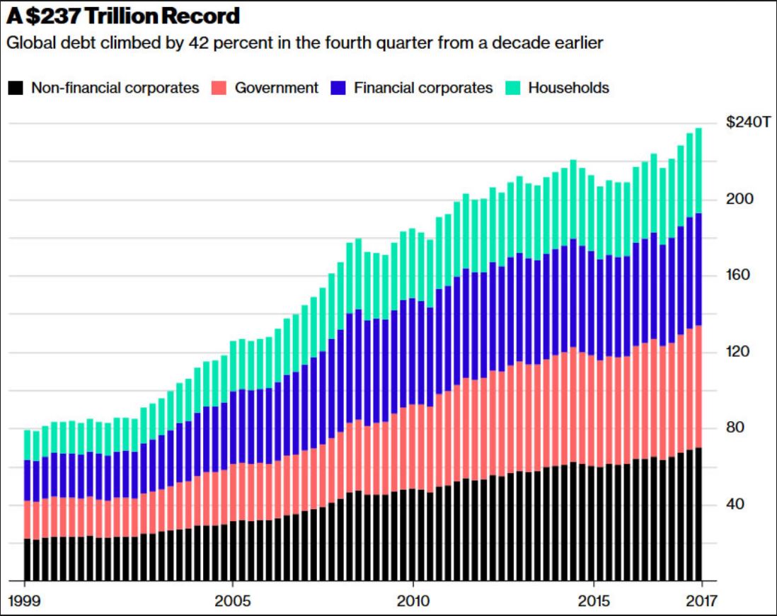
I was in London in 2008 when Lehman Brothers collapsed, 10 years ago. The sense at the time was that the financial system was teetering on the brink as stocks crashed, and liquidity dried up. Banks and other Financial Instructions just stopped trusting each other. We perhaps escaped the worse possible outcomes, but looking back, in fact the financial system is even today still under pressure, and some would say we have not really learnt the hard lessons of the great recession as it’s called.
Dave Lafferty, who is Natixis Investment Managers chief market strategist penned an really interesting piece which discusses the lessons investors might have learned 10 years after the collapse of Lehman Brothers, via InvestorDaily. I want to take you through his commentary and add my own points as we go though.
He starts by saying that It’s often said that you should never let a good crisis go to waste. As we approach the 10 year anniversary of the seminal event of the global financial crisis – the collapse of Lehman Brothers – investors may wonder if we’ve learned anything from past mistakes. Through the varying lenses of policymakers, investors and markets, the answer is decidedly mixed.
Without question, policymakers around the globe have made some headway, particularly in the area of bank vulnerability. While concentration risk among the major global banks has actually grown since the crisis, broadly speaking, leverage and trading risk are down while equity and capital ratios are up. Large bank failures remain a risk, particularly in the European periphery and emerging markets, but the gradual de-risking of banks should make the system less vulnerable to contagion in the next Lehman-like crisis.
Where policymakers have made less progress is on the monetary front. Other than the US Fed, the other major central banks remain in crisis mode today, unable to lift rates or unwind their massive quantitative easing programs. Balance sheets are bloated to the tune of $15 trillion with still close to $8 trillion in negative-yielding sovereign bonds, reducing the stimulative firepower of the major central banks to counteract the next recession or crisis. In the end, it may be fortunate that banks have ramped up their ability to absorb losses because central banks certainly have less power to prevent them.
Coming on the heels of the tech and telecom bust of 2000-2001, the plunge in risk assets during the GFC represented the second bear market in eight years for many investors. In addition to rethinking their equity expectations, Lehman’s collapse highlighted a new risk: that systemically important institutions might be too big, too interconnected, or too complex to save. Millennial investors coming of age in the 2000s may never look at equities the way the Baby Boomers did growing up in the bull market of the 1980s and ’90s. The common refrain in the wake of Lehman was that investors cared more about the “return of their capital, not the return on their capital”. While some scar tissue has built up, investors have been forever altered.
Ten years of Zero Interest Rate Policy and Negative Interest Rate Policy have pushed them grudgingly out the risk spectrum and back into equities, but there is little doubt investor risk tolerance has been fundamentally altered. Investors are more skittish and therefore more likely to bail when volatility rears its head again. “Buy and hold” has gone from a trusted maxim to a sad platitude that many investors can no longer embrace.
Finally, as investors have changed, so have the markets. Because the failure of Lehman was equal parts credit crisis and liquidity crisis, investors have come to demand both better protection and more liquidity in their investments. Wall Street, asset managers and global banks have been more than willing to develop new products and strategies promising to reduce volatility, manage downside exposure, or reduce correlation to falling markets. Assets in these products number in the trillions and include all manner of strategies that either use volatility as an input to reduce exposure or short volatility outright.
The common theme of these strategies, to one degree or another, is to reduce risk into falling markets, which may exacerbate the sell-off – as seen in February’s volatility tantrum. While we believe these strategies play an important role in tailoring appropriate client portfolios, it represents a modern-day tragedy of the commons whereby investors’ demands for better downside protection actually creates selling pressure and downside volatility when the crisis finally comes.
Historical analysis of any crisis is likely to be inconclusive and provide few solutions. There can only be so much learned from looking back when every new crisis is sewn from different seeds. All participants and policymakers can do is hope that the system is more flexible and therefore less fragile when the next crisis hits.
On this score, we can only conclude that things have changed very little from the days of Lehman. While consumers are in no worse shape, corporate and sovereign debt levels have only risen since the crisis, sustained solely by artificially low interest rates. Banks have found some religion with respect to building equity capital, but much of the leverage has simply moved to the bond markets. Meanwhile, old fashioned value investors who were willing to catch the falling knife are few and far between, replaced by quants and algos who will sell (or go short) at the first sign of trouble. The Lehman collapse brought about many positive changes, but in the end, the global financial system appears no less brittle today than a decade ago.
My view is the it will be US corporate bonds which will be the point of failure as the FED lifts rates in the months ahead. So history may not repeat, but it may well rhyme!
Welcome to the first in a new series of videos and posts in which we discuss the capital markets. It’s important to understand how these markets work because they are such a large element in the financial system, with bonds and other funding instruments, and the mix of derivatives together dominating the markets – and by the way, the risks in the system too. As you will know from our earlier posts, the total value of derivatives in the system globally dwarfs the value of the real economy.
You might like to know that I spent a number of years working in a major bank where I taught capital markets to their senior executives, because they had been subject to a major financial crash during which it became clear that the senior executives in the company had NO idea about how the markets really worked, and the inherent risks which they were taking. Some would say little has changed.
In this introduction I will discuss what we are going to explore in the series, over the weeks ahead. I am not assuming any prior knowledge of the topic in these shows, so we will start out quite simply, but by the end of the series we will be touching on some really complex, yet interesting concepts. So do come along for the ride. And I should explain that I called the series “Capital Markets 201” because this is going to be more, much more than a simple 101 overview.
So today, to start, I am going to outline the structure of the series and offer a definition of “Capital Markets”.
The capital markets are simply a market place where buyers and sellers engage in the trade of financial securities like bonds, stocks, and other instruments. This buying/selling may be undertaken by participants as diverse as banks, other financial institutions, companies, government entities and even individuals. The market may exist within a country, and internationally, with the bulk of the transactions relating to Australia for example, being off-shore.
These markets help to channel surplus funds from savers to institutions which then invest them, and many of these trades are in longer-term securities, though as we will see later sort-term funding and also a complex set of derivatives are also important in the sector.
Finally, capital market consists of primary markets and secondary markets. Primary markets deal with trade of new issues of stocks and bonds, and other securities, whereas secondary markets deals with the exchange of existing or previously-issued securities. Another important division in the capital market is made on the basis of the nature of security traded, i.e. stock market and bond market.
Finally, as well as trading in the underlying securities there are many flavours of derivative. A derivative is a contract between two parties which derives its value/price from an underlying asset. The most common types of derivatives are futures, options, forwards and swaps. Generally stocks, bonds, currency, commodities and interest rates form the underlying asset.
So to the structure of our series of programmes.
We are going to start in the next video with the concept of the time value of money. It’s essential to understand that capital markets are essentially all about manipulating cash flows. So we need to know about how to assess cash flows, and develop some basic language to describe them. We will also touch on concepts such as compound interest, current and future value, and internal rates of return.
Next we will look at the treasury operations in banks and other large corporations, and discuss the concept of disintermediation, where companies behave like banks in their own right. We will also meet archetypical “Belgium Dentists” and where they put their money.
After that, we will start looking at the individual instruments which make up the Capital Markets armoury. So we will look at bonds and other funding instruments, and how they work, and the different flavours which are out there. These instruments are the bedrock of the capital markets, so we will look at who might buy and sell such instruments.
Once we understand how bonds work, we can then start to explore the more complex derivatives areas of the capital markets.
We will look at futures and options contracts and how they work. This is a big area and we will look at both contracts relating to physical commodities like corn and pork bellies as well as financial contracts.
We will take a deep dive into interest rate and currency swaps and options, an area which I find really interesting. And there are a number of other variants which we will also touch on.
Then towards the end of the series we will start looking at financial engineering, where these various products are put to work. I will look for example at securitisation (I was involved in some of the early transactions in the 1990’s).
And as we bring the series to a close we will look at the risks in the system, the way the markets are regulated, or not, and some of the gaps in reporting and disclosure.
So buckle up, and enjoy the ride. And by the way, I will run a couple of live Q&A events as we progress through the series, and I will also try and answer questions as we go though, so do post any you may have.
Watch out for the next episode – The Time Value of Money – coming soon.
And by the way, if you value the content we produce please do consider joining our Patreon programme, where you can support our ability to continue to make great content. Here is the link, and it’s in the comments below.
APRA today published a letter relating to the Committed Liquidity Facility which is available to just 15 of the banks in Australia (The LCR banks). These have the back-stop option of calling on funds from the RBA to buttress their liquidity in case of need – so they can meet their obligations under the Basel III regime.
For a fee, if used, these banks essentially have a safety net in times of distress. Now APRA has outlined the arrangements for next year. Of course the other lenders have to operate without these supports.
More evidence of a lack of a level playing field in the system, and how the regulators are supporting the big end of town. No surprise then that big players are regarded by the markets as too big to fail.
But as Australian Government debt is hurtling beyond $500 billion, I have to say their so called justification – lack of liquidity in the local securities (mainly Australian Government Securities and securities issued by the borrowing authorities of the states and territories) is wearing a bit thin.
Why is this facility needed at all?
This is what APRA said today:
The Australian Prudential Regulation Authority (APRA) is today releasing aggregate results on the Committed Liquidity Facility (CLF) established between the Reserve Bank of Australia (RBA) and certain locally incorporated ADIs that are subject to the Liquidity Coverage Ratio (LCR).
APRA implemented the LCR on 1 January 2015. The LCR is a minimum requirement that aims to ensure that ADIs maintain sufficient unencumbered high-quality liquid assets (HQLA) to survive a severe liquidity stress scenario lasting for 30 calendar days. The LCR is part of the Basel III package of measures to strengthen the global banking system.
In December 2010, APRA and the RBA announced that ADIs subject to the LCR will be able to establish a CLF with the RBA. The CLF is intended to be sufficient in size to compensate for the lack of sufficient HQLA (mainly Australian Government Securities and securities issued by the borrowing authorities of the states and territories) in Australia for ADIs to meet their LCR requirements. ADIs are required to make every reasonable effort to manage their liquidity risk through their own balance sheet management before applying for a CLF for LCR purposes.
Committed Liquidity Facility for 2019
All locally incorporated LCR ADIs were invited to apply for a CLF amount to take effect on 1 January 2019. All fifteen ADIs chose to apply. Following APRA’s assessment of applications, the aggregate Australian dollar net cash outflow (NCO) of the fifteen ADIs was estimated at approximately $381 billion. The total CLF amount allocated for 2019 (including an allowance for buffers over the minimum 100 per cent requirement) is approximately $243 billion.
The CLF will enable participating ADIs to access a pre-specified amount of liquidity by entering into repurchase agreements of eligible securities outside the Reserve Bank’s normal market operations. To secure the Reserve Bank’s commitment, ADIs will be required to pay ongoing fees. The Reserve Bank’s commitment is contingent on the ADI having positive net worth in the opinion of the Bank, having consulted with APRA.
The facility will be at the discretion of the Reserve Bank. To be eligible for the facility, an ADI must first have received approval from APRA to meet part of its liquidity requirements through this facility. The facility can only be used to meet that part of the liquidity requirement agreed with APRA. APRA may also ask ADIs to confirm as much as 12 months in advance the extent to which they will be relying on a commitment from the Bank to meet their LCR requirement.
The Fee
In return for providing commitments under the CLF, the Bank will charge a fee of 15 basis points per annum, based on the size of the commitment. The fee will apply to both drawn and undrawn commitments and must be paid monthly in advance. The fee may be varied by the Bank at its sole discretion, provided it gives three months notice of any change.
Eligible Securities
Securities that ADIs can use under the CLF will include all securities eligible for the Reserve Bank’s normal market operations. In addition, for the purposes of the CLF, the Reserve Bank will allow ADIs to present certain related-party assets issued by bankruptcy remote vehicles, such as self-securitised residential mortgage-backed securities (RMBS). This reflects a desire from a systemic risk perspective to avoid promoting excessive cross-holdings of bank-issued instruments. Should the ADI lack a sufficient quantity of residential mortgages, other ‘self-securitised’ assets may be considered, with eligibility assessed on a case-by-case basis.
The Reserve Bank has discretion to broaden the eligibility criteria and conditions for the various asset classes at any time. The Bank will provide one years notice of any decision to narrow the criteria for the facility.
Interest Rate
For the CLF, the Bank will purchase securities under repo at an interest rate set 25 basis points above the Board’s target for the cash rate, in line with the current arrangements for the overnight repo facility.
Margining
The initial margins that the Reserve Bank will apply to eligible collateral will be the same as those used in the Bank’s normal market operations. Consistent with current practice, each day the Bank will re-value all securities held under repurchase agreements at prevailing market prices.
Termination
Subject to the ADI having positive net worth, the Reserve Bank will give at least 12 months notice of any intention to terminate the CLF. The Bank’s commitment to any individual ADI will lapse if the fee is not paid.
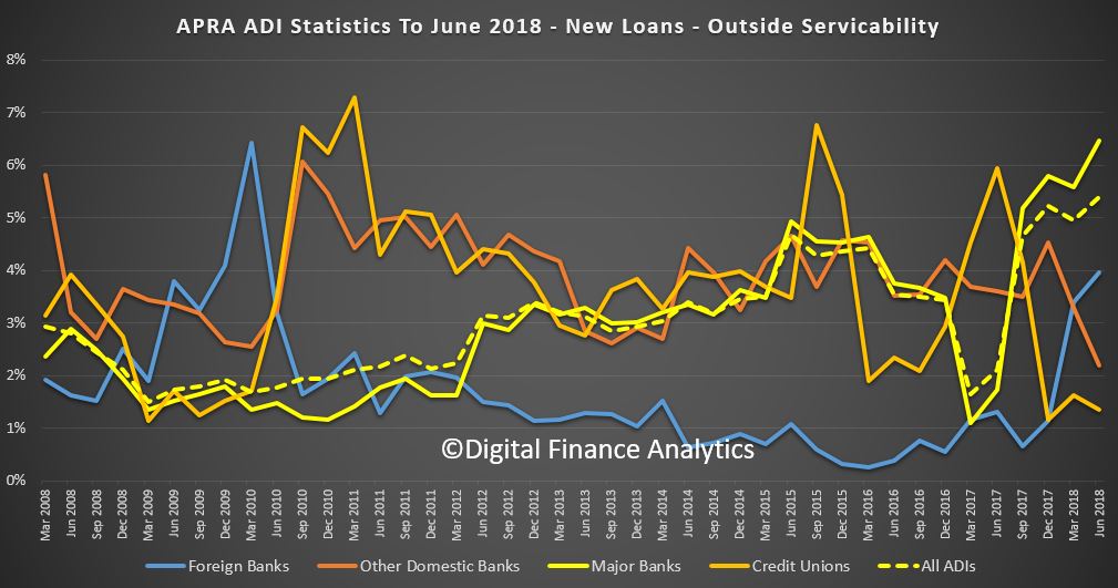
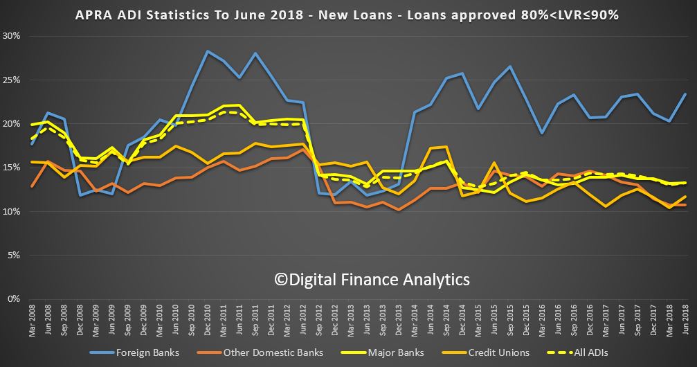
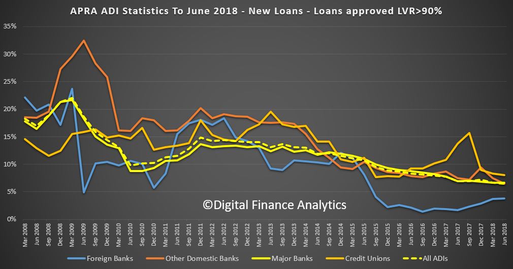
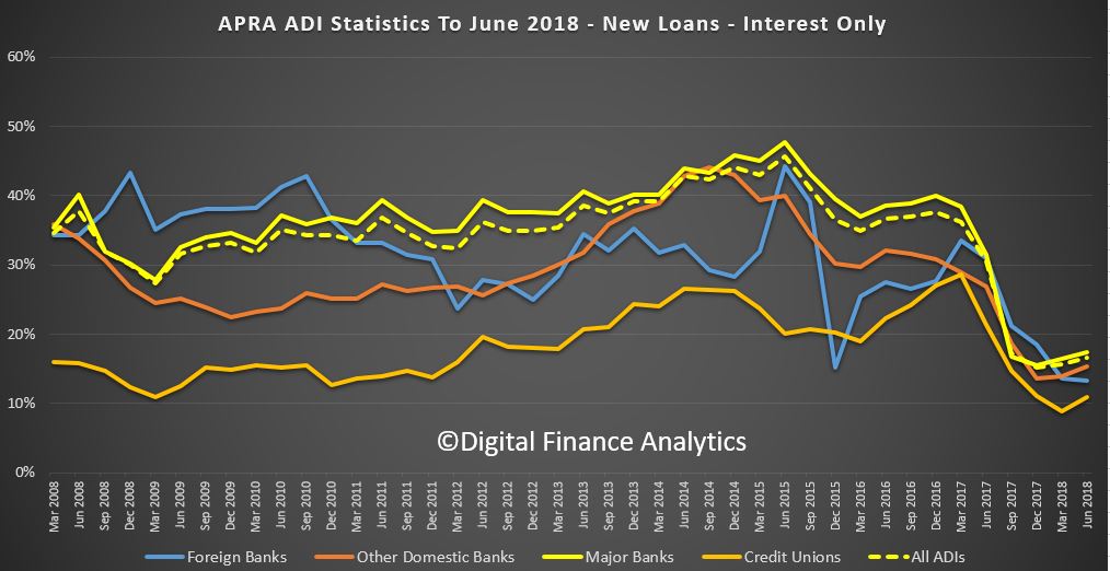
APRA release their quarterly property exposure lending stats for ADI’s today. There are some interesting data points, and some concerning trends and loosening of standards recently. I will focus on the new loan flows in this post.
First the rise in loans outside serviceability continues to rise, now 6% of major banks are in this category a record, reflecting first tightening of lending standards, but second also their willingness to break their own rules! This should be ringing alarms bells. APRA?
Foreign Banks are writing the greater share (relative percentage) of 80-90% LVR loans. Other lenders tracking lower.
Foreign Banks are lending more 90+ LVR loans in relative percentage terms.
New investor loans are moving a little higher for Credit Unions and Major Banks, suggesting a growth in volumes.
The share of interest only loans dropped below 20% but is now rising a little, as lenders seek to grow their books.
APRA says:
ADIs’ residential term loans to households were $1.62 trillion as at 30 June 2018. This is an increase of $86.6 billion (5.6 per cent) on 30 June 2017. Of these:
owner-occupied loans were $1,076.4 billion (66.4 per cent), an increase of $76.7 billion (7.7 per cent) from 30 June 2017; and
investor loans were $544.0 billion (33.6 per cent), an increase of $9.9 billion (1.9 per cent) from 30 June 2017.
Note: ‘Other ADIs’ are excluded from all figures.
ADIs with greater than $1 billion of residential term loans held 98.9 per cent of all such loans as at 30 June 2018. These ADIs reported 5.9 million loans totalling $1.60 trillion. Of these:
the average loan size was approximately $272,000, compared to $261,000 as at 30 June 2017 and
$461.3 billion (28.8 per cent) were interest-only loans.
New housing loan approvals
ADIs with greater than $1 billion of residential term loans approved $378.1 billion of new loans in the year ending 30 June 2018. This is a decrease of $5.9 billion (1.5 per cent) on the year ending 30 June 2017. Of these new loan approvals:
owner-occupied loan approvals were $260.6 billion (68.9 per cent), an increase of $10.6 billion (4.3 per cent) from the year ending 30 June 2017;
investment loan approvals were $117.5 billion (31.1 per cent), a decrease of $16.6 billion (12.4 per cent) from the year ending 30 June 2017:
$51.1 billion (13.5 per cent) had a loan-to-valuation ratio (LVR) greater than 80 per cent and less than or equal to 90 per cent, a decrease of $3.4 billion (6.2 per cent) from the year ending 30 June 2017;
$25.8 billion (6.8 per cent) had a LVR greater than 90 per cent, a decrease of $3.6 billion (12.2 per cent) from the year ending 30 June 2017; and
$61.2 billion (16.2 per cent) were interest-only loans, a decrease of $74.4 billion (54.9 per cent) from the year ending 30 June 2017.
RBA Assistant Governor, Financial System, Michele Bullock discussed household debt in a recent speech. She concludes that “Household debt in Australia has risen substantially relative to income over the past few decades and is now at a high level relative to international peers. This raises potential vulnerabilities in both bank and household balance sheets. While the risks are high, there are a number of factors that suggest widespread financial stress among households is not imminent. It is nevertheless an area that we continue to monitor closely”. She included comments on households in regional areas, who are often overlooked in discussion.
She shows that housing debt is the main issue, that risks vary across households (and income bands), and that on an international comparison basis we are right up there. Household debt-to-income ratio has increased more than for many other countries.
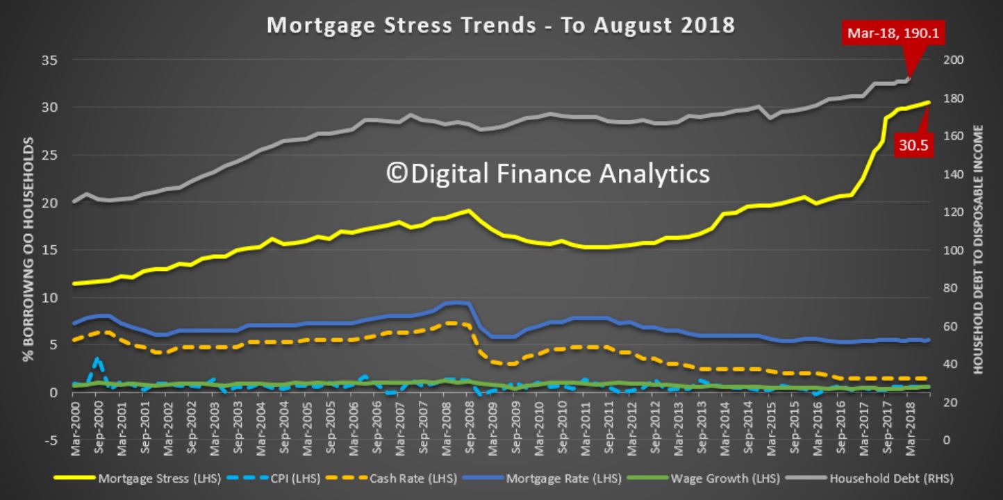
Also she cites HILDA data up to wave 16. The fieldwork for this report was conducted between 2001 and 2016. So not very current in my view! Perhaps the current risks are higher thanks to continued poor lending practice, flat incomes and rising costs. Our mortgage stress data suggests this.
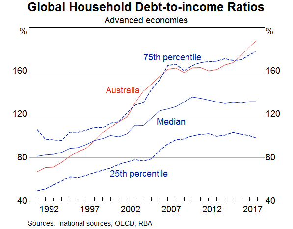
Household debt in Australia has been rising relative to income for the past 30 years (Graph 1). This graph shows the total household debt-to-income for Australia from the early 1990s until this year. Over that time it has risen from around 70 per cent to around 190 per cent. There are three distinct periods. The first, from the early 1990s until the mid-2000s, saw the debt-to-income ratio more than double to 160 per cent. Then there was a period from around 2007 to 2013 when the ratio remained fairly steady at 160 per cent. Finally, since 2013, the debt-to-income ratio has been rising again, reaching 190 per cent by 2018.
Graph 1
Australia has not been unique in seeing debt-to-income ratios rise. The median debt-to-income ratio for a range of developed economies has also risen over the past 30 years. But the Australian debt-to-income ratio has risen more sharply. In fact, Australia has moved from having a debt-to-income ratio lower than around two thirds of countries in the sample to being in a group of countries that have debt-to-income ratios in the top quarter of the sample. This suggests that there are both international and domestic factors at play when it comes to debt-to-income ratios.
There are two key international factors that have tended to increase the ability of households in developed countries, including Australia, to take on debt over the past few decades. The first is the structural decline in the level of nominal interest rates over this period, partly reflecting a decline in inflation but also a decline in bank interest rate margins as a result of financial innovation and competition. With lower interest payments, borrowers could service a larger loan. The second is deregulation of the financial sector. Through this period, the constraints on banks’ lending were eased significantly, allowing credit constrained customers to access finance and banks to expand their provision of credit.
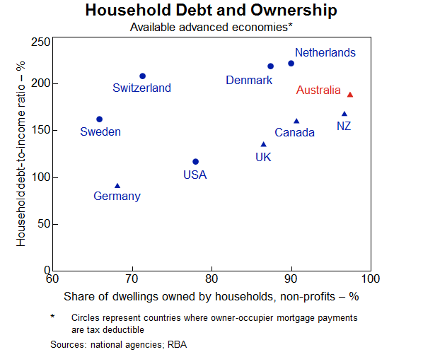
But as noted, in Australia the household debt-to-income ratio has increased more than for many other countries. The increase in household debt over the past few decades has been largely due to a rise in mortgage debt. And an important reason for the high level of mortgage debt in Australia is that the rental stock is mostly owned by households. Australians borrow not only to finance their own homes but also to invest in housing as an asset. This is different to many other countries where a significant proportion of the rental stock is owned by corporations or cooperatives (Graph 2). This graph shows for a number of countries the share of dwellings owned by households on the bottom axis and the average household debt-to-income ratio on the vertical axis. There is a clear tendency for countries where more of the housing stock is owned by households to have a higher household debt-to income-ratio.
Graph 2
Potential vulnerabilities
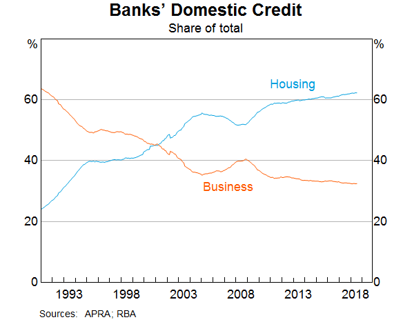
This high level of household debt relative to income raises two potential vulnerabilities. First, because mortgage lending is such an important part of bank balance sheets in Australia, any difficulties in the residential mortgage market could translate to credit quality issues for banks (Graph 3). And since all of the banks have very similar balance sheet structures, a problem for one is likely a problem for all. This graph shows the share of banks’ domestic credit as a share of total credit over the past couple of decades. Australian banks have substantially increased their exposure to housing over this period and housing credit now accounts for over 60 per cent of banks’ loans. So the Australian banking system is potentially very exposed to a decline in credit quality of outstanding mortgages.
Graph 3
The risk that difficulties in the residential real estate market translate into stability issues for the financial institutions, however, appears to be currently low. The Australian banks are well capitalised following a substantial strengthening of their capital positions over the past decade. While lending standards were not bad to begin with, they have nevertheless tightened over the past few years on two fronts. The Australian Prudential Regulation Authority (APRA) has pushed banks to more strictly apply their own lending standards. And APRA has also encouraged banks to limit higher risk lending. Lending at high loan-to-valuation ratios has declined as a share of total loans, providing protection against a decline in housing prices for both banks and households. And for loans that continue to be originated at high loan-to-valuation ratios, the use of lenders’ mortgage insurance protects financial institutions from the risk that borrowers are unable to repay their loans. Overall, arrears rates on housing loans remain very low.
But the second potential vulnerability – from high household indebtedness – is that if there were an adverse shock to the economy, households could find themselves struggling to meet the repayments on these high levels of debt. If they have little savings, they might need to reduce consumption in order to meet loan repayments or, more extreme, sell their houses or default on their loans. This could have adverse effects on the real economy – for example, in the form of lower economic growth, higher unemployment and falling house prices – which could, in turn, amplify the negative shock.
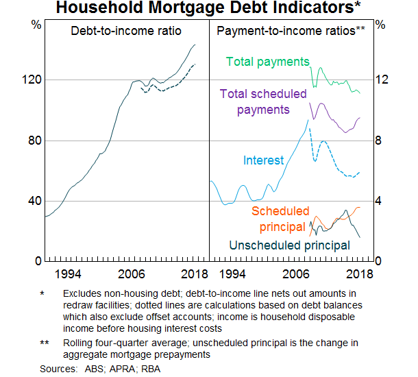
So what do the data tell us about the ability of households to service their debt? This graph shows the ratio of household mortgage debt to income (a subset of the previous graph on household total debt) on the left hand panel and various serviceability metrics on the right hand panel (Graph 4). The mortgage debt-to-income ratio shows the same pattern as total household debt-to-income – rising up until the mid-2000s then steadying for a few years before increasing again from around 2013. The dashed line represents the total mortgage debt less balances in ‘offset’ accounts. This shows that taking into account these ‘buffers’, the debt-to-income ratio has still risen, although not by as much. So households in aggregate have some ability to absorb some increase in required repayments.
Graph 4
In terms of serviceability, interest payments as a share of income rose sharply from the late 1990s until the mid-2000s reflecting both the rise in debt outstanding as well as increases in interest rates. Interest payments as a share of disposable income doubled over this period. Since the mid-2000s, however, interest payments as a share of income have declined as the effect of declines in interest rates have more than offset the effect of higher levels of debt. Indeed even total scheduled payments, which includes principal repayments, are lower than they were in the mid-2000s, as the rise in scheduled principal as a result of larger loans was more than offset by the decline in interest payments.
The risks nevertheless remain high and it is possible that the aggregate picture is obscuring rising vulnerabilities for certain types of households. Interest payments have been rising as a share of income in recent months, reflecting increases in interest rates for some borrowers, particularly those with investor and interest-only loans. Scheduled principal repayments have also continued to rise with the shift towards principal-and-interest, rather than interest-only, loans. There are therefore no doubt some households that are feeling the pressure of high debt levels. But there are a number of reasons why the situation is not as severe as these numbers suggest.
First, the economy is growing above trend and unemployment is coming down. While incomes are still growing slowly, good employment prospects will continue to support households meeting their repayment obligations. Second, as noted earlier, households have taken the opportunity over the past decade to build prepayments in offset accounts and redraw facilities. In fact, despite the continuing rise in scheduled repayments, actual repayments relative to income have remained quite steady as the level of unscheduled repayments of principal has declined and offset the rise in scheduled repayments. Third, as noted earlier, lending standards have improved over the past few years, resulting in an improvement in the average quality of both banks’ and households’ balance sheets. Much slower growth in investor lending, and declining shares of interest-only and high-loan-to-valuation lending have also helped to reduce the riskiness of new lending. And at the insistence of the regulator, banks have been tightening their serviceability assessments. In addition, strong housing price growth in many regions over recent years will have lowered loan-to-valuation ratios for many borrowers. As noted earlier, arrears rates remain very low.
The discussion above has focussed on the average borrower but what about the marginal borrower? For example, will the tightening standards result in some households being constrained in the amount they can borrow with flow-on effects to the housing market and the economy? Our analysis suggests that while we should remain alert to this possibility, it seems unlikely to result in a widespread credit crunch. The main reason is that most households do not borrow the maximum amount anyway so will not be constrained by the tighter standards. While the changes to lending standards have tended to reduce maximum loan sizes, this has primarily affected the riskiest borrowers who seek to borrow very close to the maximum loan size and this is a very small group. Most borrowers will still be able to take out the same sized loan.
It has also been suggested that the expiry of interest-only loan terms will result in financial stress as households have to refinance into principal-and-interest loans that require higher repayments. Again, this is worth watching, but borrowers have been transitioning loans from interest-only to principal-and-interest for the past couple of years without signs of widespread stress. Our data suggest that most borrowers will either be able to meet these higher repayments, refinance their loans with a new lender, or extend their interest-only terms for long enough to enable to them to resolve their situation. There appears to be only a relatively small share of borrowers that are finding it hard to service a principal-and-interest loan, which is to be expected given that over recent years, serviceability assessments for these loans have been based on the borrower’s ability to make principal-and-interest repayments. So far, the evidence suggests that the transition of loans from interest-only to principal-and-interest repayments is not having a significant lasting effect on banks’ housing loan arrears rates.
The distribution of household debt
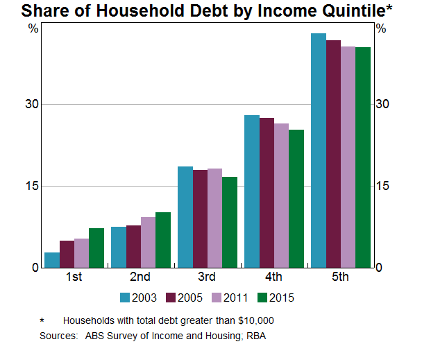
So far, I have focussed on data for the household sector as a whole. But an important aspect of considering the risks inherent in household debt is the distribution of that debt. If most of the debt is held by households with lower or less stable income for example, it will be more risky than if a substantial amount of the debt is held by households with higher or more stable income. In this respect, the data suggest that we can have some comfort. This graph shows the shares of household debt held by income quintiles – the bottom 20 per cent of incomes, the next 20 per cent and so on up to the top 20 per cent of incomes (Graph 5). And it shows how these shares have changed from the early 2000s until 2015, the latest period for which the data are available. Around 40 per cent of household debt is held by households that are in the top 20 per cent of the income distribution and this share has remained fairly steady for the past 20 years. Furthermore, households in the second highest quintile account for a further 25 per cent of the debt. So in total two-thirds of the debt is held by households in the top 40 per cent of the income distribution. Nevertheless, around 15 per cent of the debt is held by households in the lowest two income quintiles. Whether or not this presents risks is not clear. Retirees are typically captured in these lower income brackets and if this debt is connected with investment property from which they are earning income, it may not be particularly risky.
Graph 5
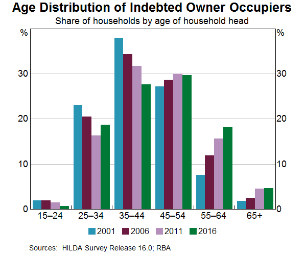
Another potential source of risk in the distribution of debt is the age of the head of the household. As noted, a regular, stable income is important for servicing debt so people in the middle stages of their careers typically have better capacity to take on and service debt. The next graph shows the shares of debt for various age groups for owner occupiers, and how they have moved over the past couple of decades (Graph 6).
Graph 6
Households in which the head is between the ages of 35 and 54 account for around 60 per cent of the debt. But there does appear over time to be a tendency for a higher share of owner occupier debt to be held by older age groups. In part, the growing share reflects structural factors like lower interest rates. More importantly, it is not clear whether the higher share of debt increases the risk that these households will experience financial stress. On the one hand, it might indicate that in recent years, people have been unable to pay down their debt by the time they retire. If they continue to have large amounts of debt at the end of their working life, they might therefore be vulnerable. On the other hand, people are now remaining in the workforce for longer, possibly a response to better health and increasing life expectancies. They also hold more assets in superannuation and have more investment properties. This improves their ability to continue to service higher debt. And there is no particular indication that older people have higher debt-to-income or debt servicing ratios than younger workers.
So while the economy wide household debt-to-income ratio is high and rising, the distribution of that debt suggests that a large proportion of it is held by households that have the ability to service it. It nevertheless bears watching.
Regional dimensions
I thought I would finish off with some remarks about regional versus metropolitan differences. From a financial stability perspective, we are mainly focussed on the economy as a whole. But we still need to be alert to pockets of risk that have the potential to spill over more broadly. These risks may have important regional dimensions, particularly to the extent that individual regions have less diversified industrial structures and are thus more vulnerable to idiosyncratic shocks. One recent example has been the impact of the downturn in the mining sector on economic conditions in Western Australia, and the subsequent deterioration in the health of household balance sheets and banks’ asset quality. The potential for the drought in eastern Australia to result in household financial stress is another.
Data limitations make it difficult to drill down too far into particular regions. So I am going to focus here on a general distinction between metropolitan areas and the rest of Australia. As noted above, there tends to be a relationship between debt and housing prices. As housing prices rise, people need to borrow more to purchase a home and with more ability to borrow, people can bid up the prices of housing. So one place to look for a metro/regional distinction might be housing prices.
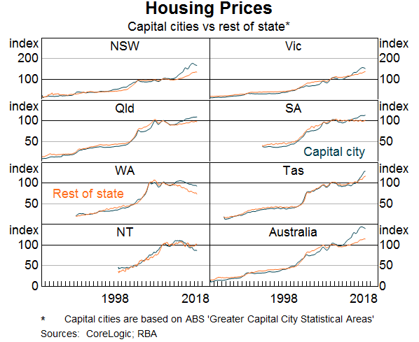
While there is clearly a difference in the absolute level of housing prices in cities and regional areas, over the long sweep, movements in housing prices in the regions have pretty much kept up with those in capital cities (Graph 7). This graph shows an index of housing prices for each of the states broken down into capital city and rest of the state. While there are periods where growth in housing prices diverge, most obviously in NSW and Victoria in recent years, they follow a very similar pattern. This partly reflects the fact that some cities that are close to the capitals tend to experience similar movements in house prices as the capitals.
Graph 7
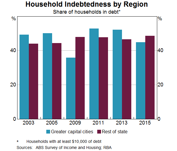
What about housing debt in regional areas? The data suggest that the incidence of household indebtedness is broadly similar in the capital cities and in the regions (Graph 8). In 2015, the latest year for which we have data, around 50 per cent of regional households were in debt compared with around 45 per cent of households in capital cities. But in previous years this was reversed. At a broad level, the proportion of households in debt seems fairly similar.
Graph 8
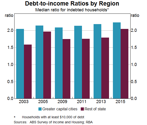
Incomes and housing prices tend to be lower on average in regional areas than cities so we might expect debt to also be lower. But how do debt-to-income ratios compare? This next graph shows debt-to-income ratios for cities and regional areas at various points over the past 15 years (Graph 9). In general, average debt-to-income ratios for indebted households in capital cities tend to be a bit higher than those for indebted households in regional Australia. But it is not a huge difference and it mostly reflects the fact that people with the highest incomes – and therefore, higher capacity to manage higher debt-to-income ratios – tend to be more concentrated in cities. In general, it seems that regional households’ appetite for debt is very similar to that of their city counterparts.
After CBA and ANZ followed Westpac in hiking variable mortgage rates, we were all watching for NAB’s reaction. Well today that came with confirmation that they will keep rates on hold for now. So their rate will still be 5.24%.
NAB chief executive Andrew Thorburn said today:
“We are listening and acting differently… We need to rebuild the trust of our customers, and by holding our NAB Standard Variable Rate longer, we help our customers for longer. By focusing more on our customers, we build trust and advocacy, and this creates a more sustainable business.”
NAB say the decision benefits more than 930,000 NAB customers. If NAB had increased its SVR by 15 basis points, the average home loan customer with a $300,000 loan would have paid an extra $28 each month, or $336 a year, on their repayments. A customer with a $500,000 home loan would have paid an extra $47 each month, or $564 per year, on their repayments.
The next round of banks reports are due late October/early November, with ANZ reporting its full-year financial results on October 31, followed by NAB on November 1 and Westpac on November 5.
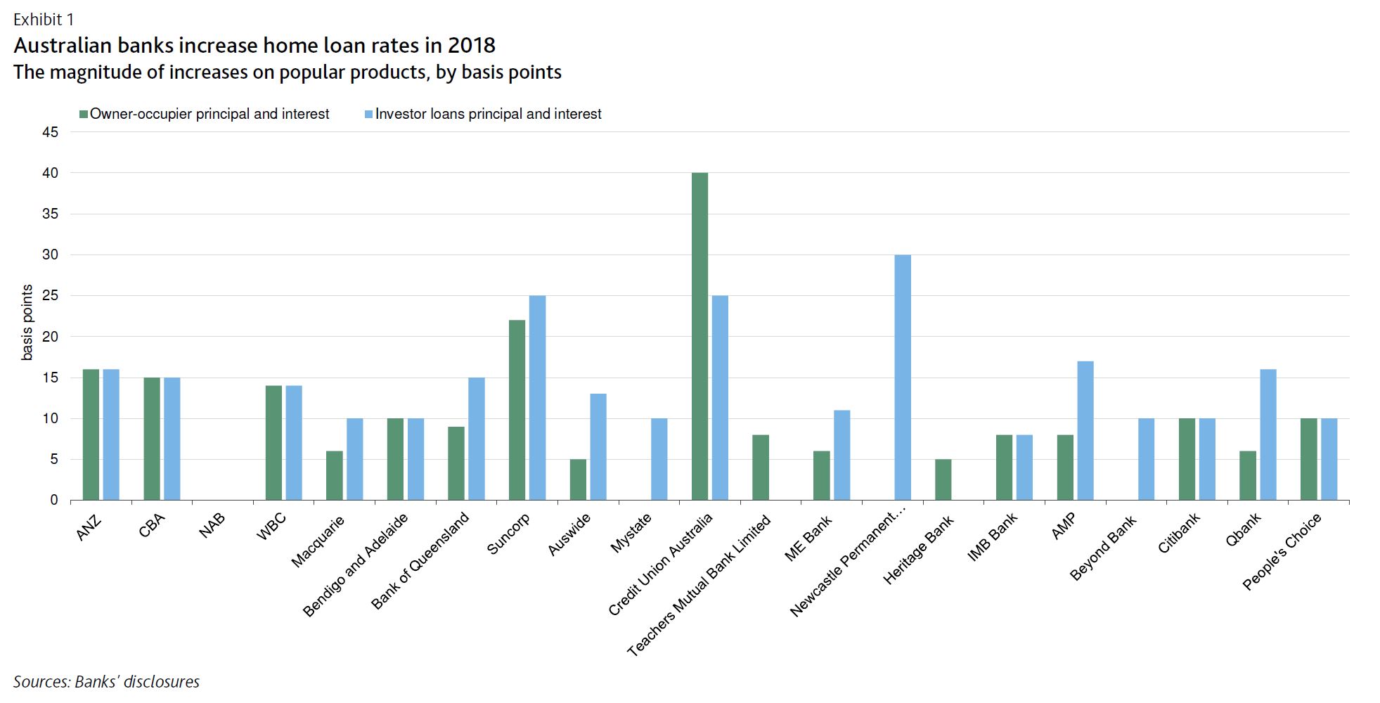
On 6 September, the Australia and New Zealand Banking Group (ANZ) and the Commonwealth Bank of Australia (CBA) raised their home loan rates by 16 and 15 basis points respectively, following a similar move by Westpac Banking Corporation (WBC), which raised its rates by 14 basis points on 29 August.
The increases in home loan rates are credit positive for Australia’s major banks, which include ANZ, CBA, the National Australia Bank (NAB) and WBC, because they underline the strong pricing power of the banks, which is a key factor supporting their profitability. These interest rate rises will help mitigate the negative effects of rising wholesale funding costs, slower credit growth, and higher regulatory and compliance costs.
The rate increases by the major banks follow similar announcements earlier in 2018 by small and midsize Australian banks. The increases in home loan lending rates have been a response to higher wholesale funding costs, which have been rising since the start of 2018, for banks reliant on this type of funding.
The rate increases have been concentrated in variable-rate home loan products, which are more popular in Australia than fixed-rate loans. For banks with lower levels of wholesale funding than the majors, these have generally been around 10 basis points for owner-occupier principal and interest loans, and higher for riskier products such as investor and interest-only loans.
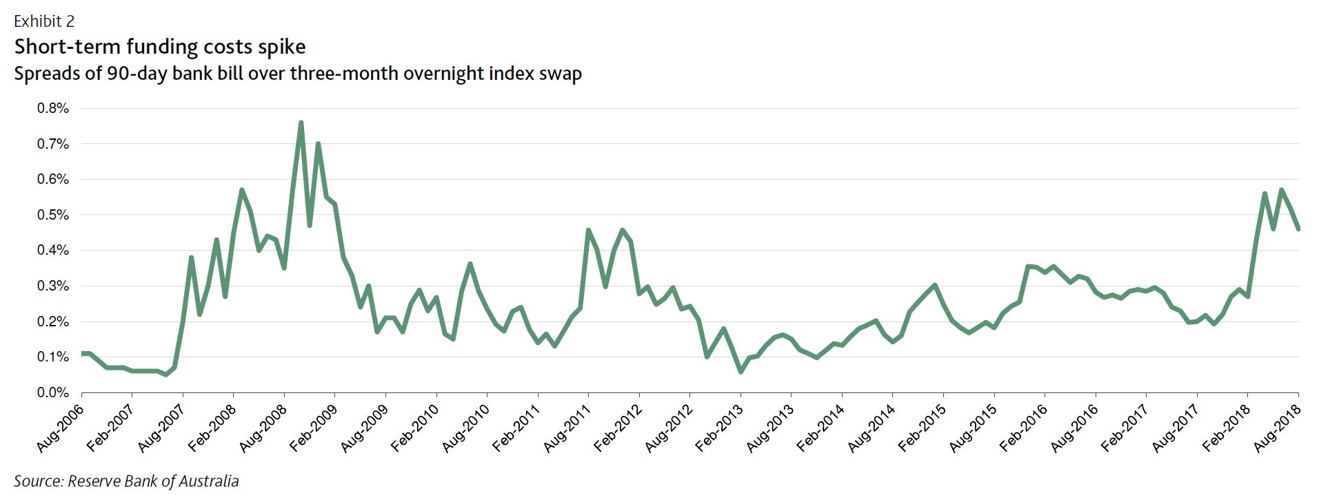
Higher home loan rates will offset higher wholesale funding costs, with short-term funding costs being particularly affected in 2018 (Exhibit 2).
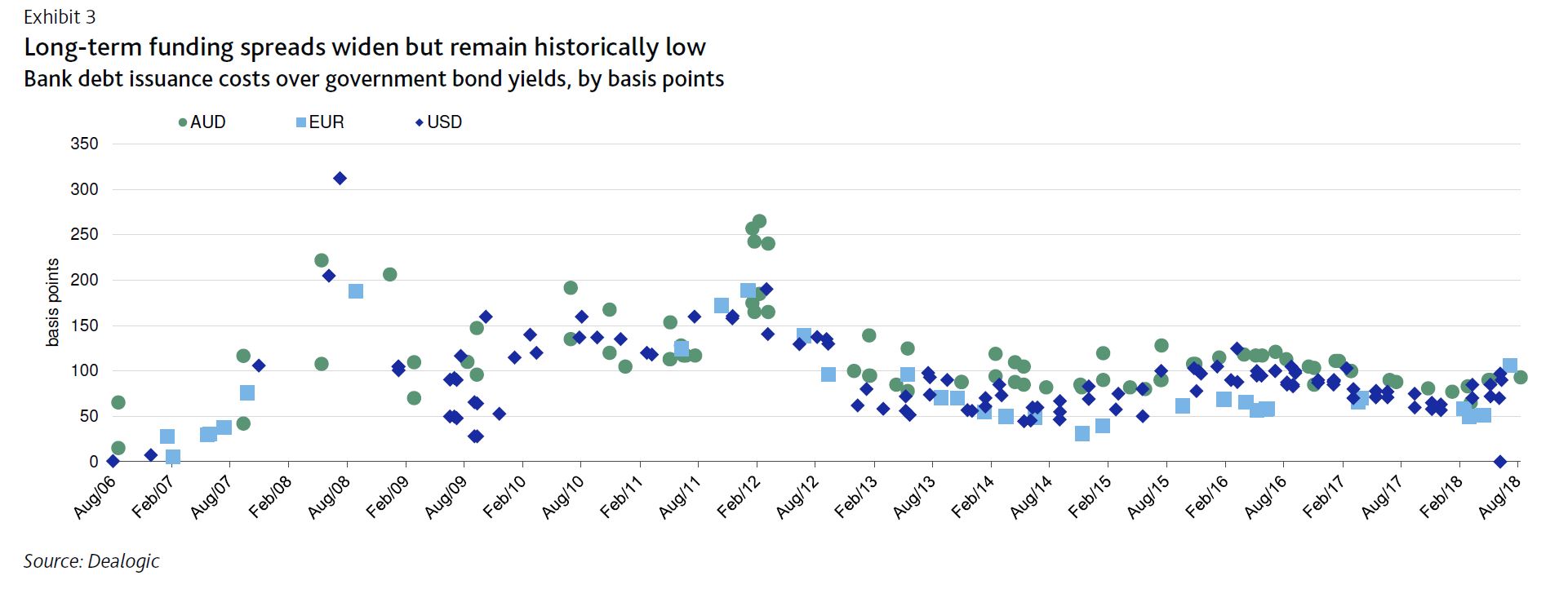
Long-term debt issuance costs have increased proportionally less and, importantly, remain low by historical comparison (Exhibit 3). That said, we expect debt issuance costs to continue to increase as global interest rates rise. This will increase banks’ overall cost of funding as banks replace cheaper, wholesale maturities with more expensive debt.
The rate increases demonstrate that, despite intense political scrutiny and Australia’s Royal Commission into Misconduct in the Banking, Superannuation and Financial Services Industry, which had primarily fallen on the major banks, they still retain pricing power.
Before the rate increase announcements by the major banks, it appeared that their pricing power had been somewhat constrained while the Royal Commission was ongoing because, historically, they have been the first movers on home loan rates. However, in 2018 it has been mortgage rate increases by smaller banks that have paved the way for the major banks to follow.
From an asset-quality perspective, despite the very high level of household leverage in Australia, we do not expect the current round of home loan rate hikes to result in a significant increase in loan delinquencies or credit costs. That is because labour market conditions, which are a strong indicator of mortgage performance, are likely to remain favourable, underpinned by solid economic growth forecasts, trade tensions notwithstanding.
Additionally, the increases in home loan rates are small compared with buffers built into home-loan serviceability assessments.
Australian banks commonly assess borrowers’ repayment abilities based on a minimum interest rate of 7.25%, which is well above an average home loan rate of around 5.25% posted by Australian banks over the past three years.
Moreover, collateral quality will remain strong, despite ongoing house price corrections in Sydney and Melbourne. The average loan-value ratio for Australian bank home loan portfolios remains at around 50%.