I discuss the current economic settings and expectations for future rate cuts and home prices on 6PR Perth with Gareth Parker.

Digital Finance Analytics (DFA) Blog
"Intelligent Insight"
I discuss the current economic settings and expectations for future rate cuts and home prices on 6PR Perth with Gareth Parker.

I was asked to comment on the property downturn and those being impacted by extended contracts. The time allocated was reduced (the previous segment was a Trump impersonator…!!!) which tells you something about relative priorities.
This shows the set-up, the cross, and the packing up. Lots of waiting around.
Having looked at the on-line property data, we go further and ask about what a “true value” might actually be. The answer may shock you.
Residential property prices fell 2.4 per cent in the December quarter 2018, according to figures released today by the Australian Bureau of Statistics (ABS). The total value of Australia’s 10.3 million residential dwellings fell by $133.1 billion to $6.7 trillion. The mean price of dwellings in Australia is now $651,100, and falling.
Plus the number of home transfers complete are trending down as sales volumes decline, and stock rises.
Chief Economist for the ABS, Bruce Hockman said: “Australia’s two largest cities continue to lead the fall in property prices. These falls follow a period of solid growth, where prices in Sydney rose 68 per cent and Melbourne rose 54 per cent, over the five years to December quarter 2017.”
Sydney property prices fell 3.7 per cent in the December quarter 2018 and have continued to fall since September quarter 2017, while Melbourne property prices recorded the fourth consecutive quarter of falls (-2.4 per cent).
Here are the annual trends. Hobart and Canberra are still in poisitve territory (but falling).
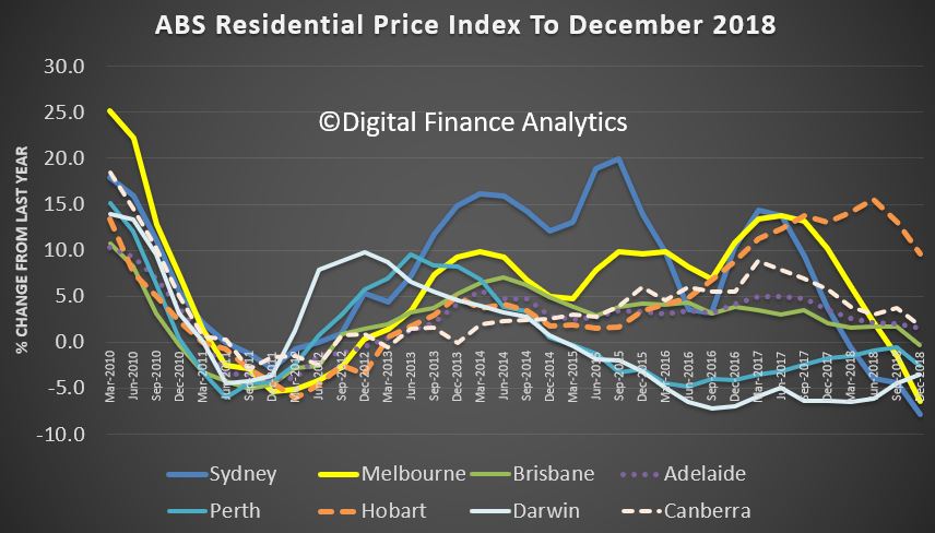
Mr. Hockman said: “While property prices are falling in most capital cities, a tightening in credit supply and reduced demand from investors and owner occupiers have had a more pronounced effect on the larger property markets of Sydney and Melbourne.”
Through the year growth in residential property prices fell 5.1 per cent in the December quarter 2018. Falls were recorded in Sydney (-7.8 per cent), Melbourne (-6.4 per cent), Darwin (-3.5 per cent), Perth (-2.5 per cent) and Brisbane (-0.3 per cent).
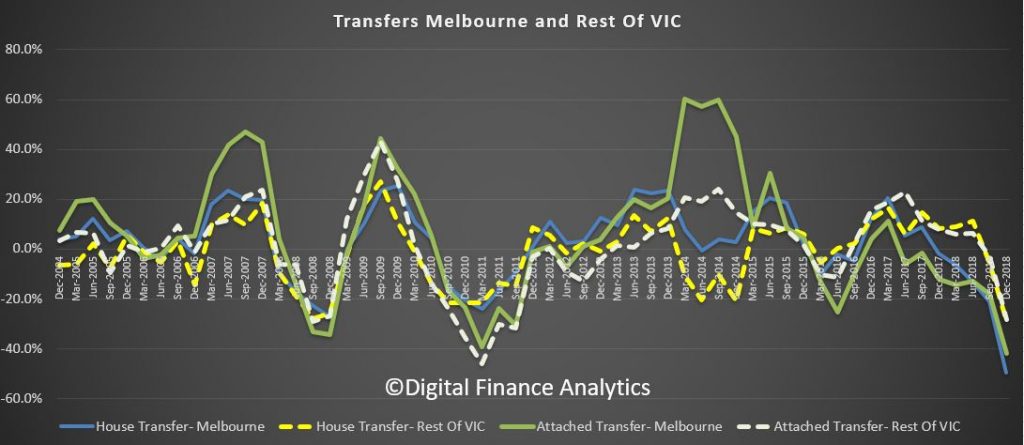
We also see continuing falls in the number of home transfers (the end result of sales). The last quarter of 2018 is still preliminary, but the trends are pretty clear now. Falls in Melbourne appear the most significant.
But Sydney is not far behind.
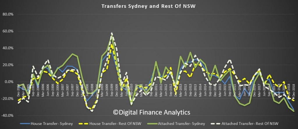
Other states also appear weaker (even Hobart, Adelaide and Canberra). Expect more home price falls ahead.
now $651,100.
We review the latest from LF Economics on home prices, and include a segment on Sunrise today where I discuss the trajectory of property valuations.

Housing prices are falling in Sydney and Melbourne, so housing must be becoming more affordable – right?
The annual growth of house prices has been slowing consistently for more than a year in Australia’s largest cities. Prices finally started falling in the latter part of last year. The decline began much earlier in Perth and Darwin. Prices in most other cities, with the exception of Hobart, have been more stable.
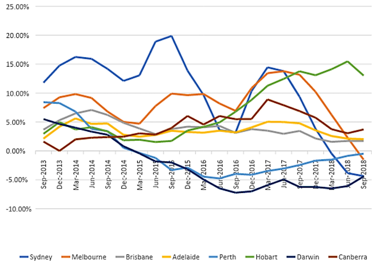
A rise in house prices is a mixed blessing. For those whose employment and savings strategies have helped them become home owners, price inflation is a good thing – the value of the house rises while the mortgage debt stays the same, or falls. For others, the savings and income targets for owning a home become ever more elusive.
So this should mean falling house prices are bad for home owners and good for aspiring home owners, right? In practice, things don’t work out quite like this, for several reasons.
Provided they are financially “liquid” (they have a job and can cope financially), home owners have a secret weapon: they don’t have to sell.
Research shows housing markets tend to operate in periods of “frenzy” alternating with periods of relative inactivity. Lots of people try to capitalise and trade up in a hot market. Once markets cool, people tend to stay where they are and wait for prices to improve.
For aspiring home owners, this is bad news. Although prices might be falling, fewer people are vacating their houses. This reduces the supply of houses on the market at lower prices.
House markets adjust to economic cycles, although these adjustments tend to be exaggerated and are prone to overshooting. The global financial crisis is an obvious example of an extreme correction when asset values plummeted.
The current dip in house prices in Australia is almost certainly a milder adjustment. However, even minor adjustments in the housing market are associated with adjustments elsewhere in the economy, particularly in labour markets.
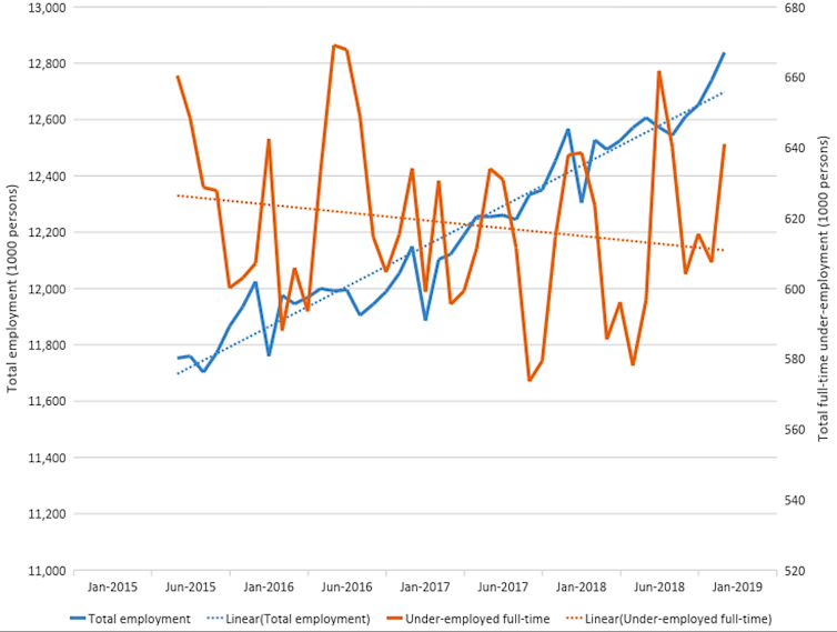
The graph below shows the national trends in employment and underemployment over the past three years. Although total employment has been growing, the reported level of underemployment (a measure of the desire of workers to work more hours than they do) was also growing for much of 2018. Low wages growth and limited working hours do not help when people are already struggling to afford a house.
The supply of finance in mortgage markets also depends on the economic cycle. Unfortunately, falling house prices and a deteriorating economic outlook tend to translate to tighter lending conditions.
So while housing prices might be falling in our biggest cities, at the same time it’s becoming harder to get a home loan. The number of first home buyer dwellings financed fell by more than 5% in the year to November 2018.
Change in the total number of properties sold is also a useful leading indicator, meaning that transactions data tend to signal a change in market conditions long before average prices begin to change. The chart below shows the year-on-year growth in transactions peaked in the third quarter of 2017.
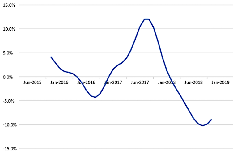
The growth in transactions began slowing, then became negative in the early months of 2018. These changes occurred much earlier than the plateau, then fall, in prices in late 2018.
The outlook is never certain, but it is worth noting that prices very rarely stabilise or begin growing while the transaction volume is still declining.
Like many sectors of the economy, housing markets are cyclical. But what makes the housing market different is the historical fact that periods of falling prices are much less frequent than periods of rising prices. The market will soon return to its long-run unsustainable trajectory of rising prices and declining affordability.
During the current price adjustment, housing affordability may appear to improve slightly. But low wages growth and limited working hours, coupled with lending restrictions, combine to make it just as hard for first home owners to enter the market.
Current circumstances create opportunity elsewhere in the housing system. In particular, modestly falling prices coupled with lenders issuing fewer mortgages to owner-occupiers create fertile conditions for private residential investors. Times like this tend to favour cash buyers rather than those who need to scrape together a deposit and secure a mortgage before they can buy a house.
Paradoxically, then, declining house prices are no better for housing affordability than rising prices.
Author: Chris Leishman, Professor of Housing Economics, University of Adelaide
A quick segment on the upcoming programme on channel Nine.
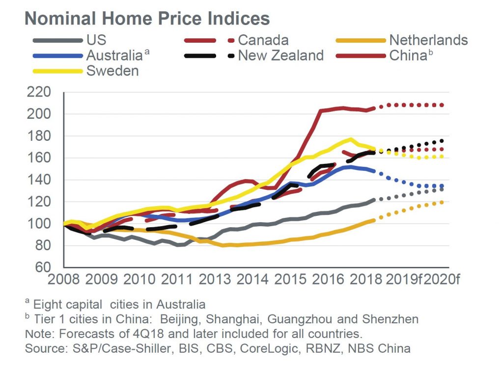
Fitch published their Global Home Housing And Mortgage Outlook for 2019. The story appears to one of falling values in some major centres and more uncertainty economically and politically. For Australia, they expect a national peak-to-trough home price drop of 12% in Australia with Sydney and Melbourne posting larger declines in 2019.

They say overheated home prices in several major cities have been a key theme in recent years. But prices fell or stalled in 2018 in Melbourne, Stockholm, Sydney, Toronto and Vancouver due to government actions to reduce foreign purchases, macro-prudential measures and/or stretched affordability. Fitch Ratings forecasts home prices to fall in Australia and Sweden in 2019 before stabilising in 2020, modest corrections in China and South Korea, and stalled growth in Canada. We have also seen regulators actively managing markets through the tightening and loosening of lending rules.
High Household Debt Amplifies Risks
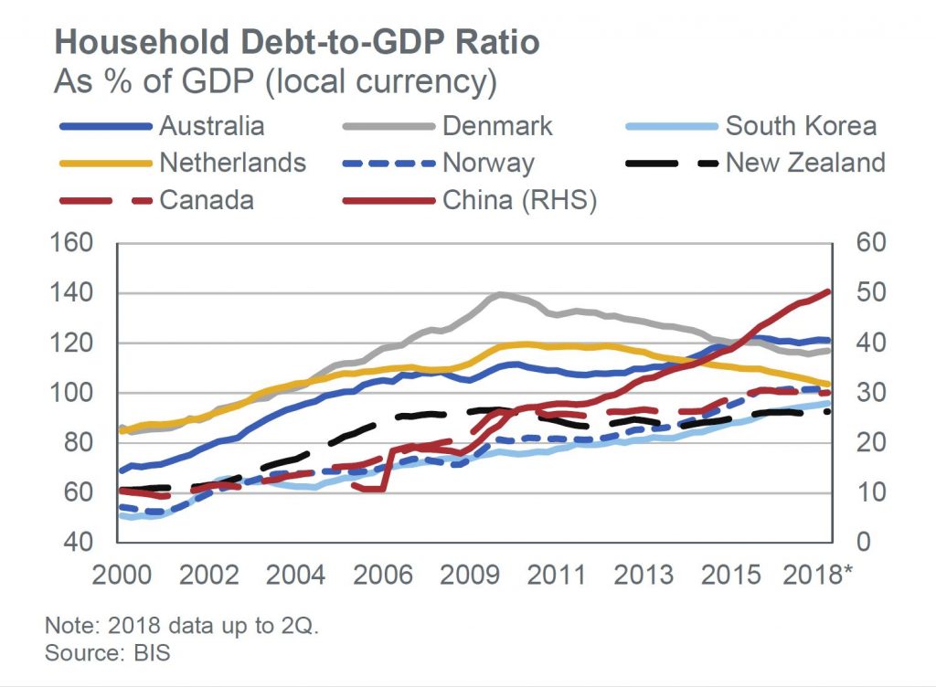
Fitch says household debt-to-GDP ratios are at or over 100% in Australia, Canada, Denmark, the Netherlands and Norway, and over 85% in New Zealand, South Korea, Sweden and the UK. High household debt makes the wider economies more vulnerable to shocks in the financial sector and borrowers more exposed to downturns. Household debt growth has stalled in Denmark and the Netherlands due to affordability constraints and regulatory intervention. The household debt-to-GDP ratios in Australia,
Canada and Norway have stabilised after sharp growth while they have continued to grow in China and South Korea, albeit at a slower pace.
Political Uncertainty Affects Housing
Fitch highlights several cases of political risks in the report, including Brexit, a political appointment to oversee Fannie Mae and Freddie Mac, and new governments in Latin America. Their impact varies: our no-deal Brexit scenario analysis suggests price drops in the UK and much slower price growth in Ireland while uncertainty is already contributing to price falls in London; less government participation in the US mortgage market could
increase mortgage pricing and lead some lenders to reduce product offerings; in Brazil, there is uncertainty regarding the new government’s ability to enact market-friendly policies that would support home price growth.
Cracks Appear in Economic Growth Outlook
Fitch notes in its Global Economic Outlook that cracks are starting to appear in the global growth picture, with China and the eurozone slowing, further rate increases expected in the US, stubbornly low core inflation in the eurozone and Japan, and the dollar’s strength putting pressure on emerging markets.
These factors contribute to Fitch’s view that economic growth is slowing, albeit to a moderate degree and in many cases from a position of strength. However, our macroeconomic outlooks to 2020 for the 24 countries in this report are still mainly stable or improving, which supports our mostly stable housing and mortgage market evaluations.
Arrears Concerns Beyond 2020
Fitch does not forecast material increases in arrears in 2019 and 2020 for any country in the report. We expect the impact from weaker growth and generally slow mortgage rate rises to be relatively benign. But there is downside pressure in the medium term from rising rates, fading fiscal stimulus in the US and weaker growth in China, in the context of still high global debt. A faster-than-expected tightening in global financial conditions could worsen mortgage performance.
Mixed Impact from Rising Rates
The speed of mortgage rate rises will vary with North America expected to post the fastest increases and Japan and the eurozone the slowest. The impact will depend on whether mortgages have long-term fixed rates and the macroeconomic backdrop. Highly leveraged markets with large numbers of variable-rate loans, such as Australia, Norway, Sweden and the
UK, could see marked deterioration in loan performance should rates rise quickly. Markets with long-term fixed-rate loans, such as Belgium, France, Latin America, the Netherlands and the US, may see lenders gradually increase their appetite for higher-risk borrower and loan characteristics as their profitability suffers and competition intensifies.
Price Declines Set to Continue In Australia
Fitch forecasts a national home price decline of an additional 5% in 2019 before above-trend GDP growth and strong net migration should stabilise prices in 2020. The peak-to-trough decline of 6.7% as of December 2018 has been driven by lower investor demand reflecting macro-prudential limits on interest-only and investment lending, and tighter enforcement
of lending standards.
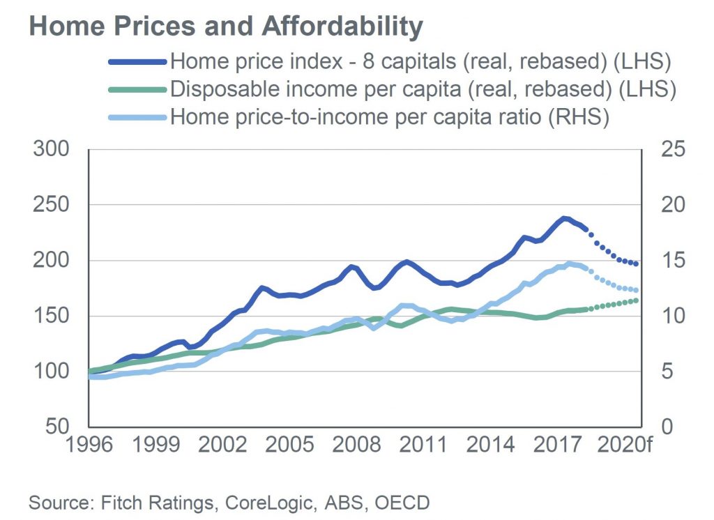
They expect price declines to continue at a similar pace in 2019 in Sydney and Melbourne, where larger falls have occurred (peak-to-trough declines of 11.1% and 7.2%, respectively, as of December 2018). The most expensive quartile of properties has experienced the largest declines with falls of 9.5%.
GDP Growth Supports Performance
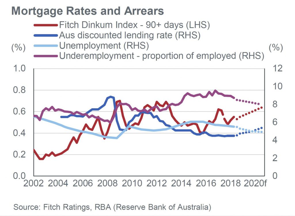
They forecast loans in arrears over 90 days to increase slightly to 70bp by 2020. Properties in possession will take longer to sell as home prices fall, so loans will remain delinquent for longer. Early-stage mortgage arrears (30 to 90 days in arrears) will be broadly stable in 2019 at 60bp even though lenders have modestly raised mortgage rates for investment and interest only loans despite no policy rate increases. Mortgage performance will be supported by slowing but still solid economic growth, decreasing unemployment and only gradually rising policy and mortgage rates. Risks remain, stemming from the highest household-debt-to-GDP ratio in this
report at 121% as of 2Q 2018.
Credit Growth to Remain Low
Housing credit growth is projected to ease further in 2019 to 3.5% from 5.1% yoy growth in October 2018. This is due to tightened macro-prudential limits and a more conservative interpretation of regulatory guidelines for mortgage servicing in light of the Royal Commission into Misconduct in the Banking, Superannuation and Financial Services Industry. Fitch believes
the commission’s final recommendations, due in February, may further reduce credit availability.
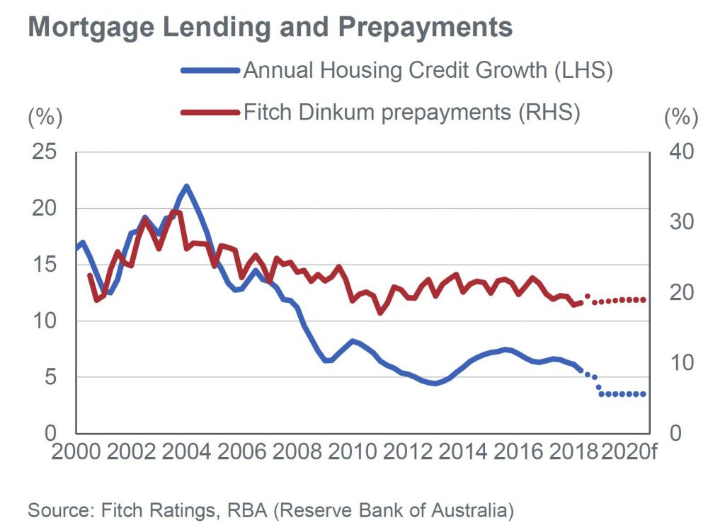
Investment loan origination has been hit by a limit to investment loan growth of 10% (introduced in 2014 and removed in July 2018 for lenders that can prove they have met regulatory requirements for the past six months) and a limit of interest-only origination to 30% of new lending (introduced in 2017 and removed from January 2019 for lenders that have
met regulatory requirements for the past six months) along with foreign investor levies and taxes from state governments.
The ABS released their Residential Property Price Index series yesterday.
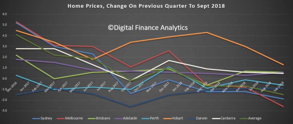
They said that the price index for residential properties for the weighted average of the eight capital cities fell 1.5% in the September quarter 2018. The index fell 1.9% through the year to the September quarter 2018.
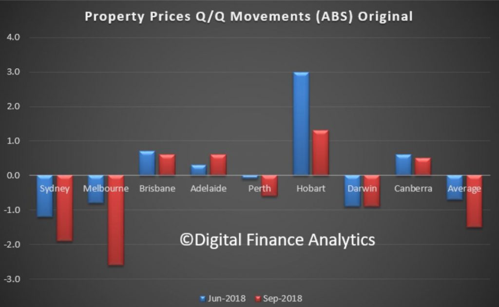
The capital city residential property price indexes fell in Melbourne (-2.6%), Sydney (-1.9%), Perth (-0.6%) and Darwin (-0.9%), and rose in Brisbane (+0.6%), Adelaide (+0.6%), Hobart (+1.3%) and Canberra (+0.5%).
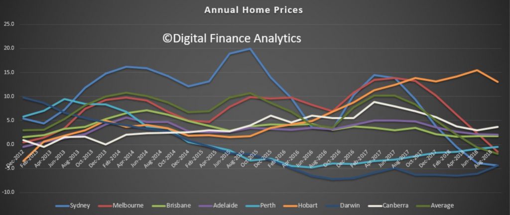
Annually, residential property prices fell in Sydney (-4.4%), Darwin (-4.4%), Melbourne (-1.5%), Perth (-0.5%) and rose in Hobart (+13.0%), Canberra (+3.7%), Adelaide (+2.0%) and Brisbane (+1.7%).
The total value of residential dwellings in Australia was $6,847,057.2m at the end of the September quarter 2018, falling $70,148.6m over the quarter.
The mean price of residential dwellings fell $9,700 to $675,000 and the number of residential dwellings rose by 40,900 to 10,143,700 in the September quarter 2018.
Of course these averages do not tell the true picture, because the movements are not uniform across a state. In some post codes now we are seeing falls of more than 20% from the previous peak, elsewhere prices are holding more steadily. However, given credit availability drives home prices, and credit is harder to come by, we should expect more falls ahead. Then the question becomes, is a soft landing feasible? I have to say that all the cycles I have examined never ended softly, so it would be a first, if it did happen.
But there is another point to consider. Major banks use internal risk models to calculate the amount of capital they hold against mortgage loans. Other banks use more standard approaches.
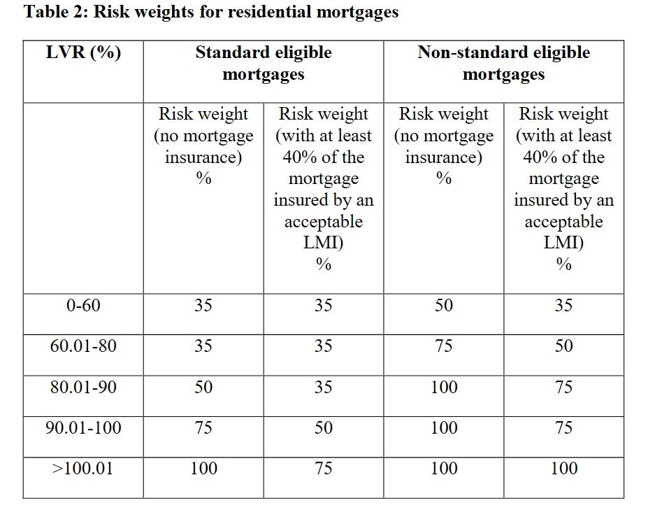
The calculation is driven by a range of factors, but LVR is one element. Here is the APRA risk weights table. The point is a loan with an LVR at 80% has a risk weight of 50%, but the same loan at 90% LVR requires 75%, and 100% LVR 100% weighting. In other words, the capital doubles between 80 and 100% LVR!
At some point quite soon now banks will need to re-baseline their mortgage books. When property prices were rising, they would do this quite regularly to reduce the capital requirement. The reverse is also true.
The governing APRA document says “The ADI must also revalue any property offered as security for such loans when it becomes aware of a material change in the market value of property in an area or region”. Have banks started to revalue their portfolios and up their risk weights in the light of these falls? This is also, by the way, why economists attached to the major banks have an interest in playing down potential home price falls.
APRA says “the valuation may be based on the valuation at origination or, where relevant, on a subsequent formal revaluation by an independent accredited valuer. The determination of the appropriate risk weight is also dependent upon mortgage insurance provided by an acceptable lenders mortgage insurer (LMI)”. Of course many lenders now have access to Automated Valuation Models from players such as CoreLogic.
So now the question becomes, how much more capital will the banks have to put aside to take account of falling prices, who will bear the cost, and will APRA back down on its capital requirements which insist the banks hold more capital ahead? I expect more weakness in bank share prices as the impact of this hits home. As home prices fall further the impact will be magnified.
Edwin Almeida, our property market insider discusses the factors which have led to poor urban planning, and the impact this is having on the property market, and households.
Please consider supporting our work via Patreon
Please share this post to help to spread the word about the state of things….
