Digital Finance Analytics (DFA) has released the April 2019 mortgage stress and default analysis update. Once again, it’s the continuing story of pressure on households as ongoing wages growth is not offsetting costs of living, and mortgage repayments and total debt continues to rise. Recent bank reporting highlights the elevated risks in the household sector as this all plays out.
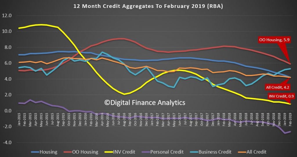
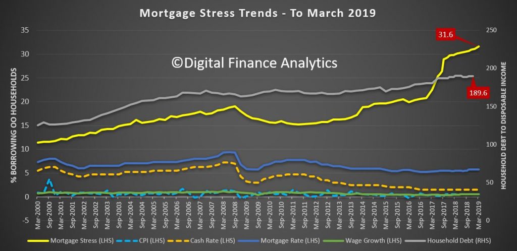
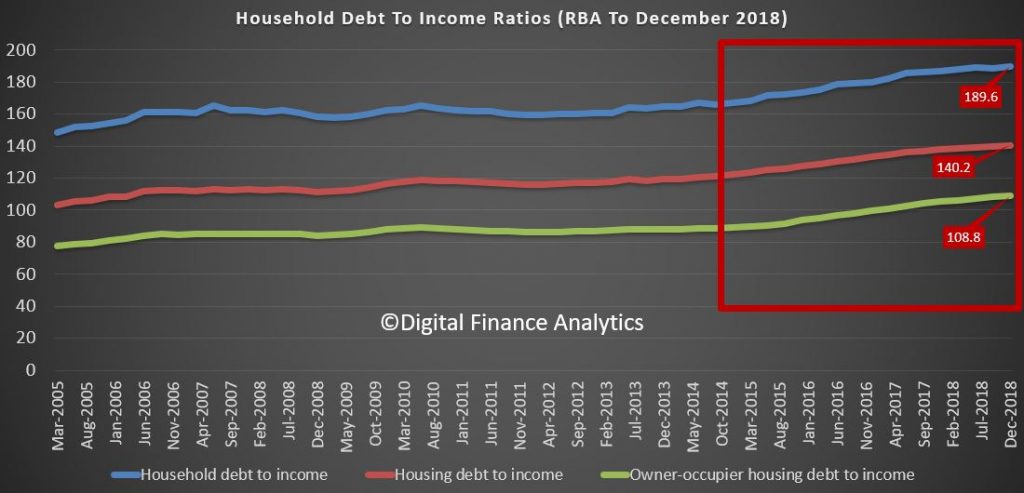
The latest RBA data on household debt to income to December rose to 189.6[1], and remains highly elevated. Plus, the housing debt ratio continues to climb to a new record of 140.2, according to the RBA. This shows that household debt to income is still increasing.
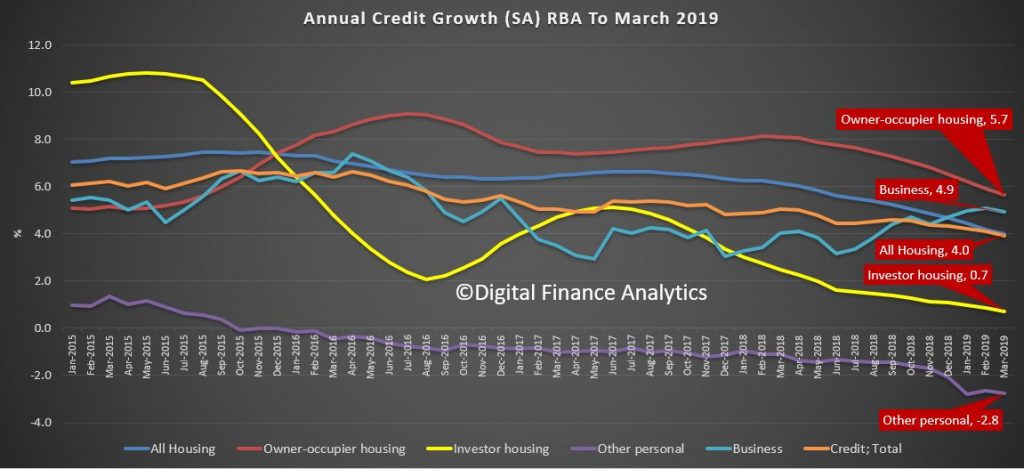
This is confirmed by the latest financial aggregates to end March recently released by the RBA, with owner occupied lending still growing significantly faster than inflation at 5.7%.
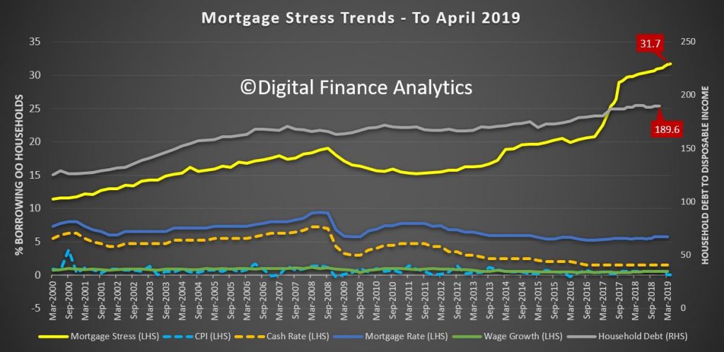
This high debt level, in the context of broader financial pressure, helps to explain the fact that mortgage stress continues to rise.
Across Australia, more than 1,050,450 households are estimated to be now in mortgage stress (last month 1,044,666), another new record. This equates to more than 31.7% of owner-occupied borrowing households. In addition, more than 30,413 (27,775 last month) of these are in severe stress. We estimate that more than 70,149 (last month 66,700) households’ risk 30-day default in the next 12 month. This is as the impact of flat wages growth, rising living costs and higher real mortgage rates hit home. Bank losses are likely to rise a little ahead.
Our analysis uses the DFA core market model which combines information from our 52,000 household surveys, public data from the RBA, ABS and APRA; and private data from lenders and aggregators. The data is current to the end of April 2019. We analyse household cash flow based on real incomes, outgoings and mortgage repayments, rather than using an arbitrary 30% of income.
Households are defined as “stressed” when net income (or cash flow) does not cover ongoing costs. They may or may not have access to other available assets, and some have paid ahead, but households in mild stress have little leeway in their cash flows, whereas those in severe stress are unable to meet repayments from current income. In both cases, households manage this deficit by cutting back on spending, putting more on credit cards and seeking to refinance, restructure or sell their home. Those in severe stress are more likely to be seeking hardship assistance and are often forced to sell.
Despite reassurances that household finances are fine, the pressures are rising, thanks to an accumulation of larger mortgages compared to income whilst costs are rising, and incomes remain static. Housing credit growth is still running significantly faster than incomes and inflation and continued rises in living costs – notably child care, healthcare costs, school fees and electricity prices are causing significant pain. Many households are depleting their savings to support their finances or are trying to refinance.
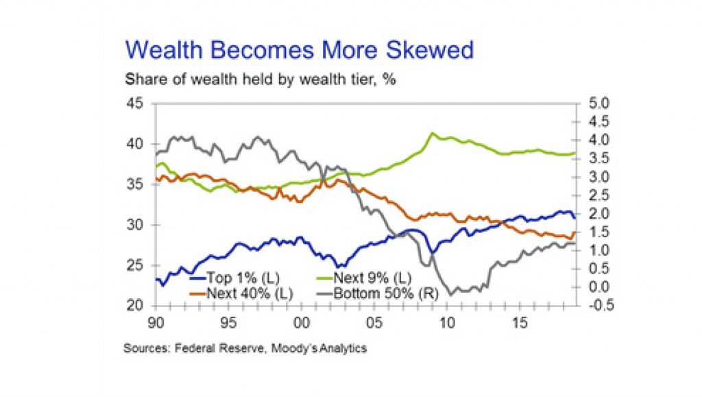
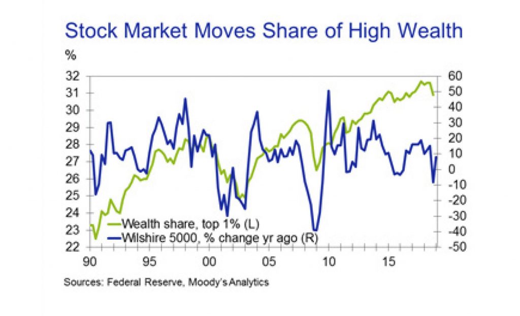
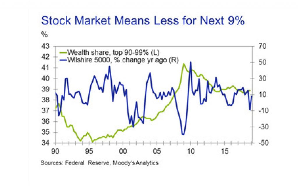
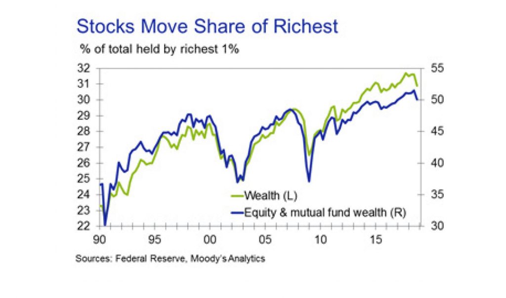
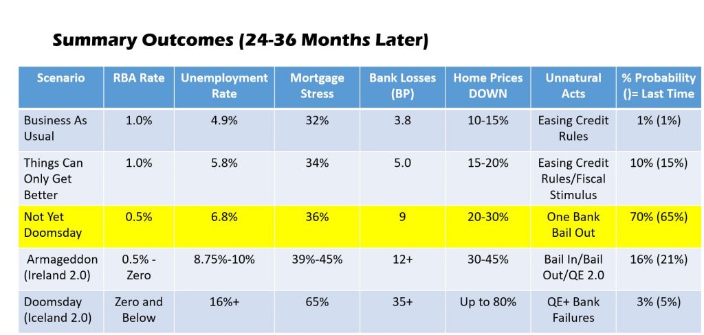
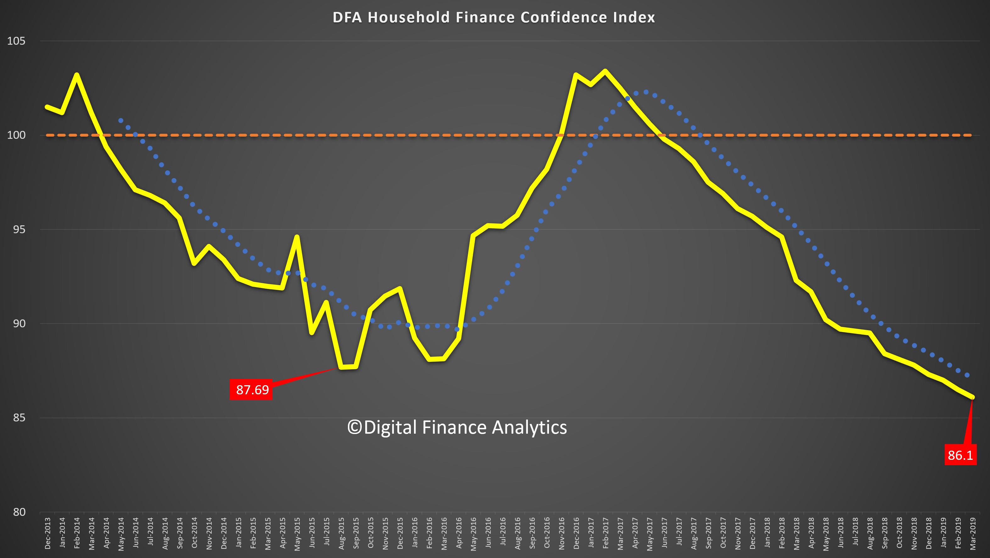
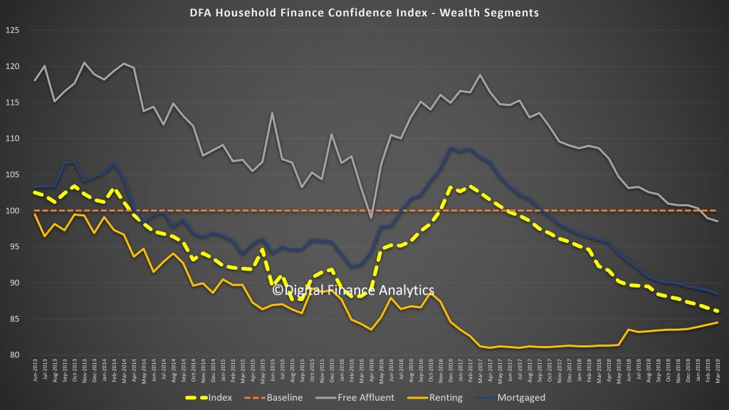
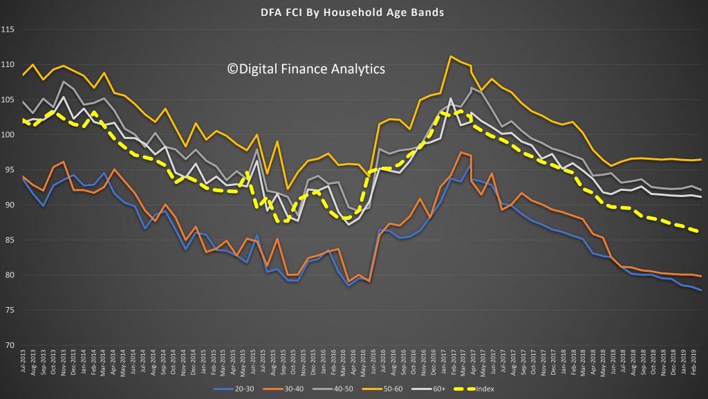
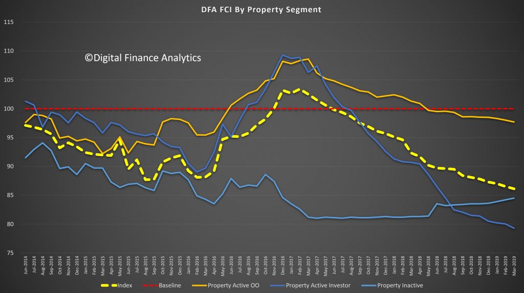
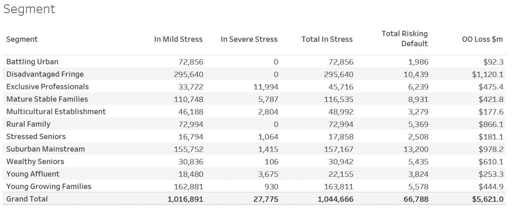
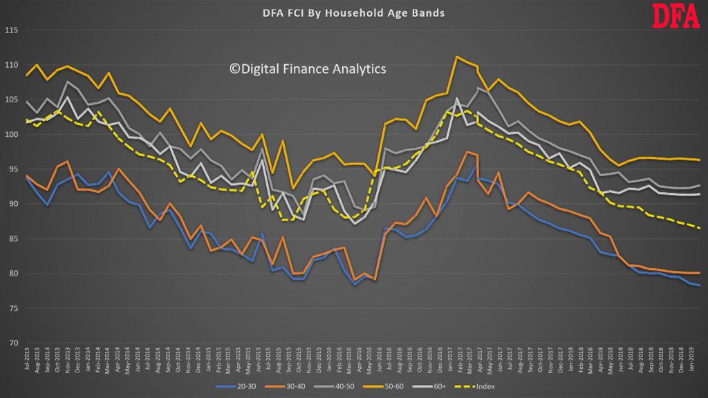
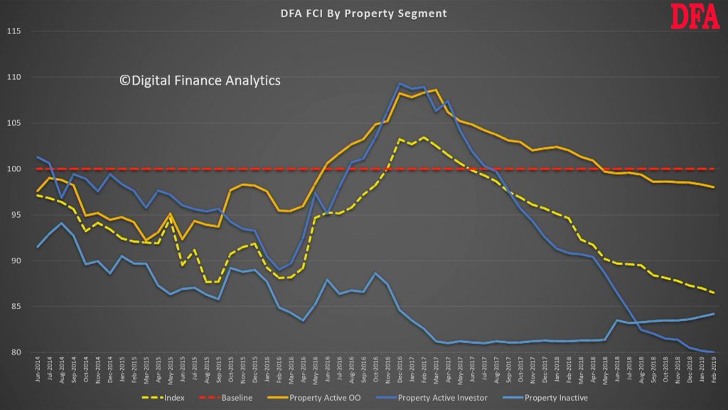
Probability of default extends our mortgage stress analysis by overlaying economic indicators such as employment, future wage growth and cpi changes. Our Core Market Model also examines the potential of portfolio risk of loss in basis point and value terms. Losses are likely to be higher among more affluent households, contrary to the popular belief that affluent households are well protected. This is shown in the segment analysis below:
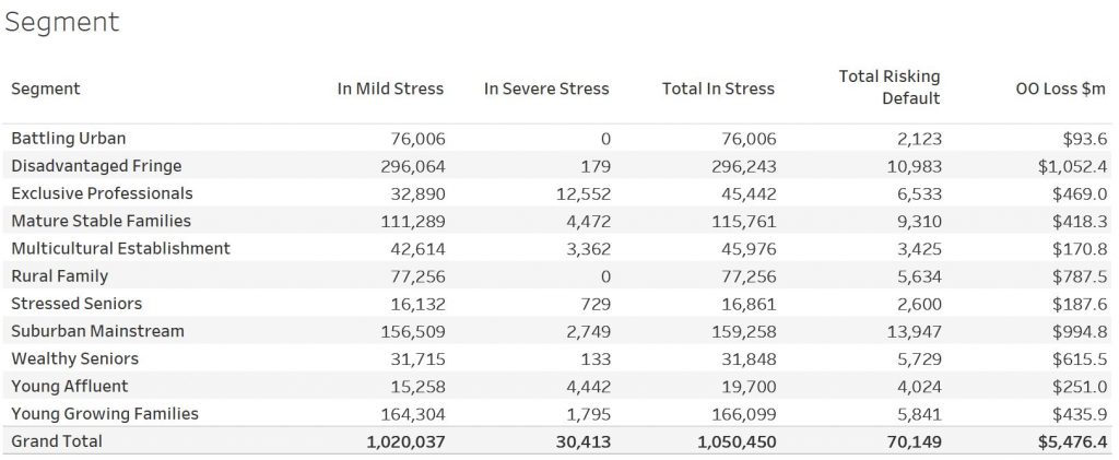
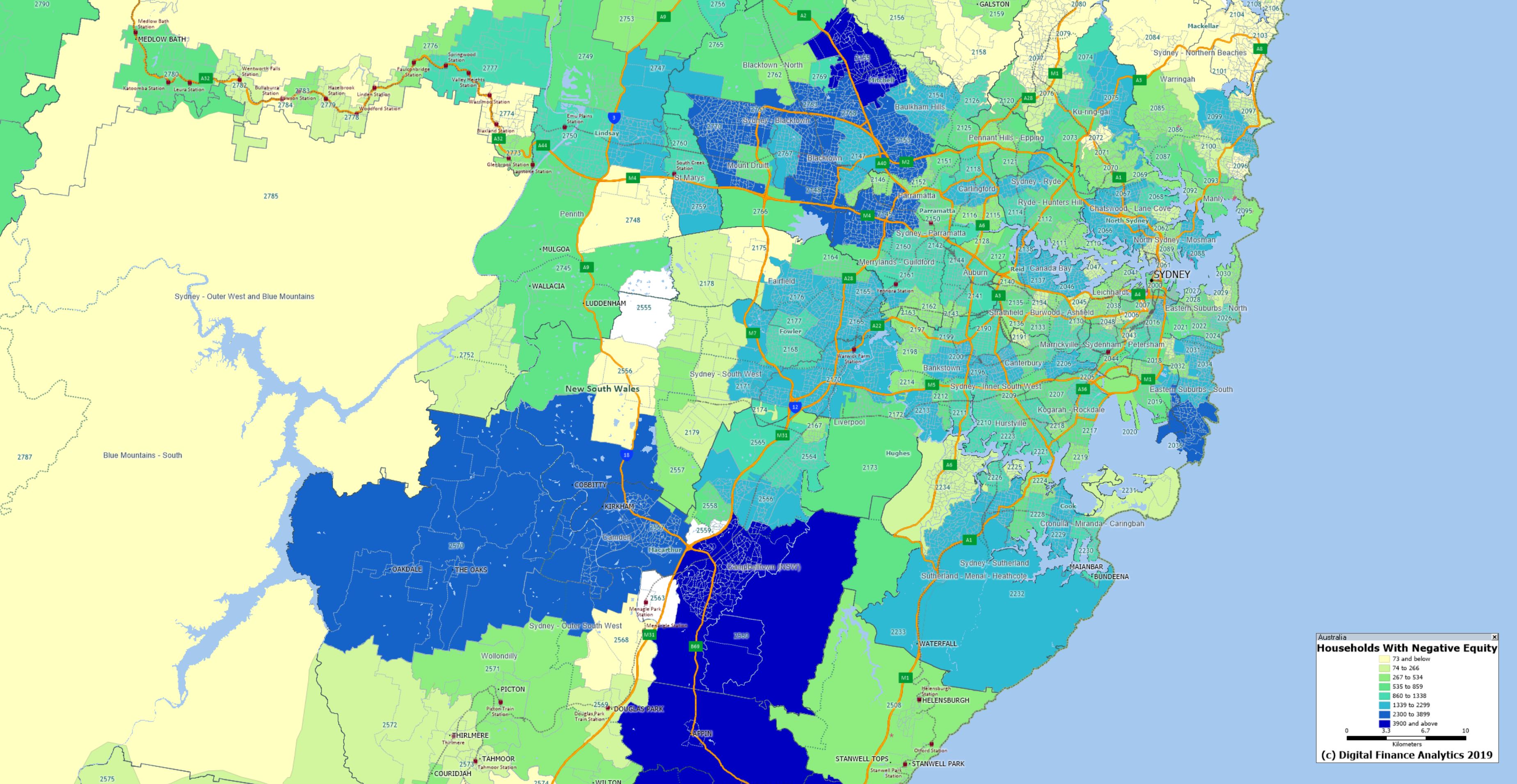
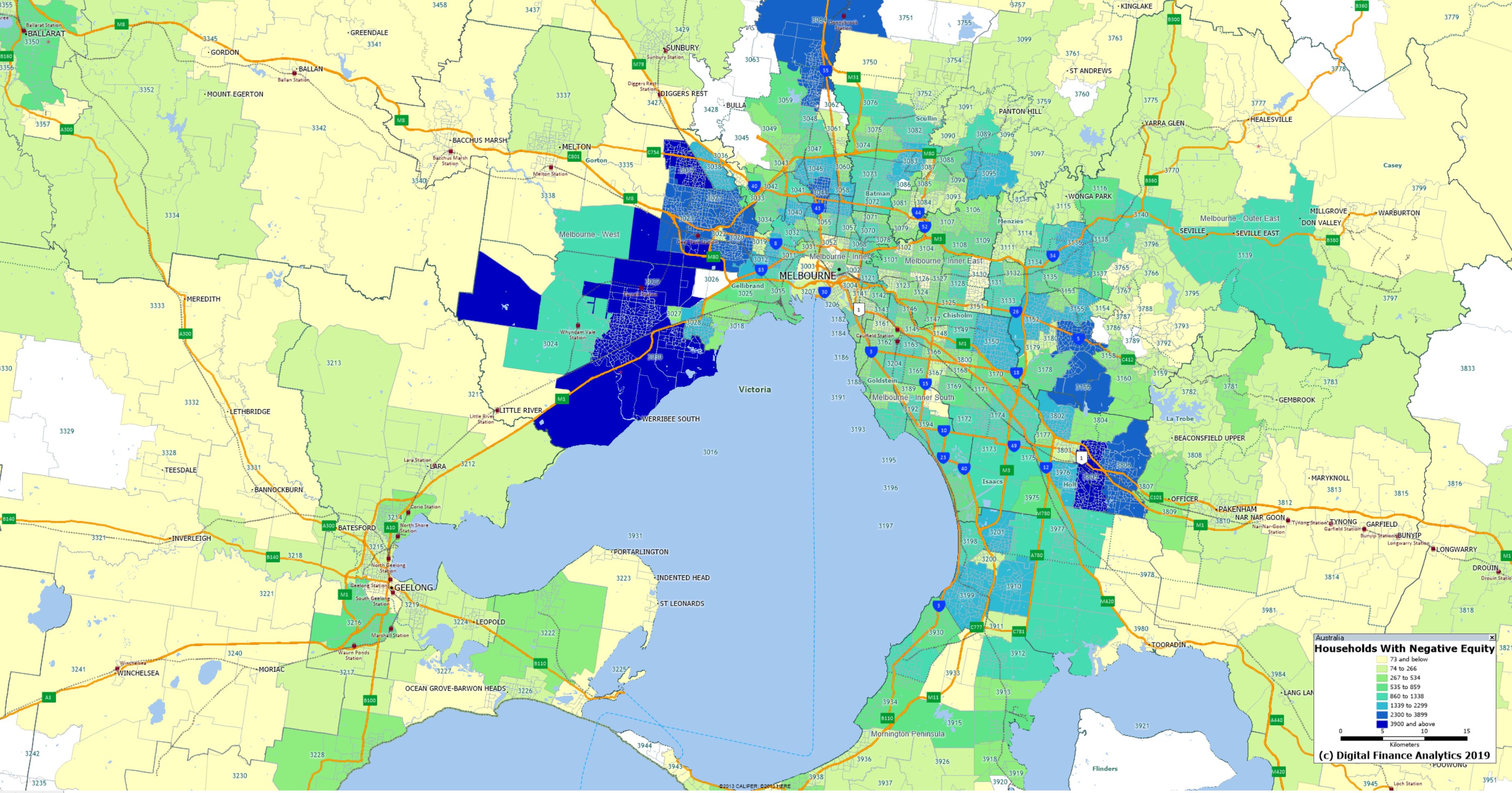
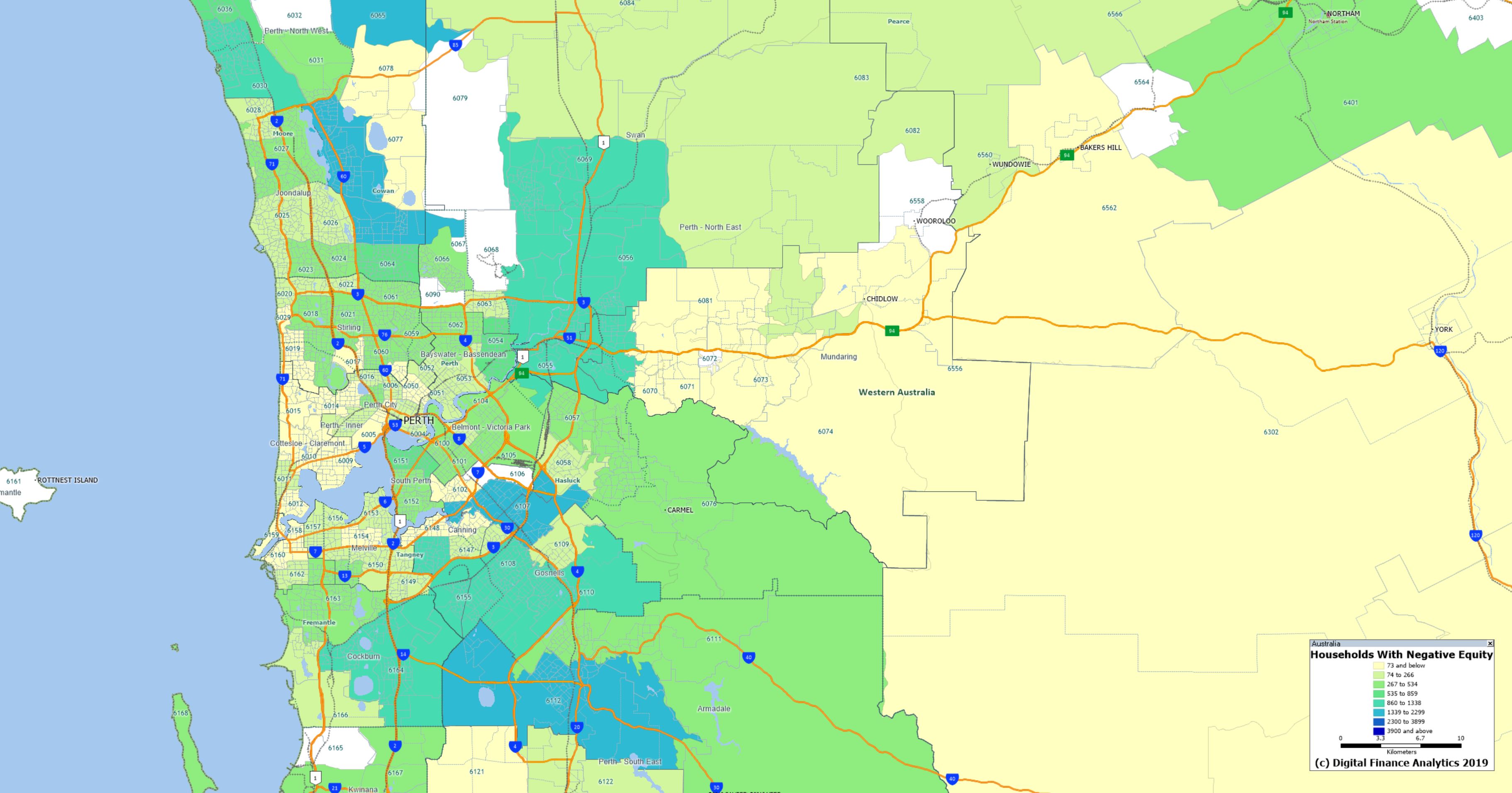
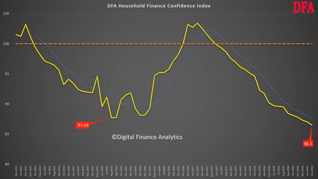
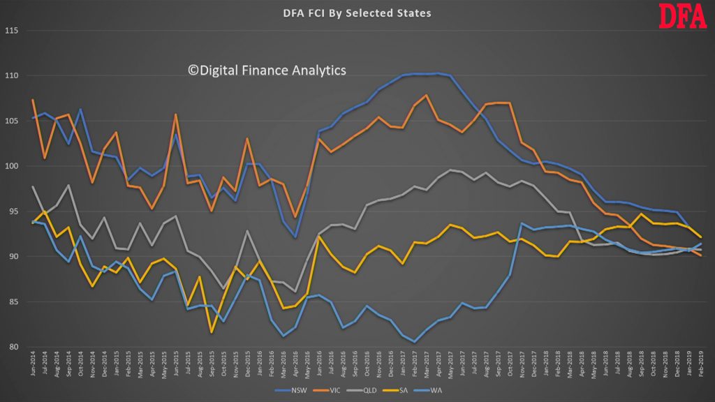
Stress by the numbers.
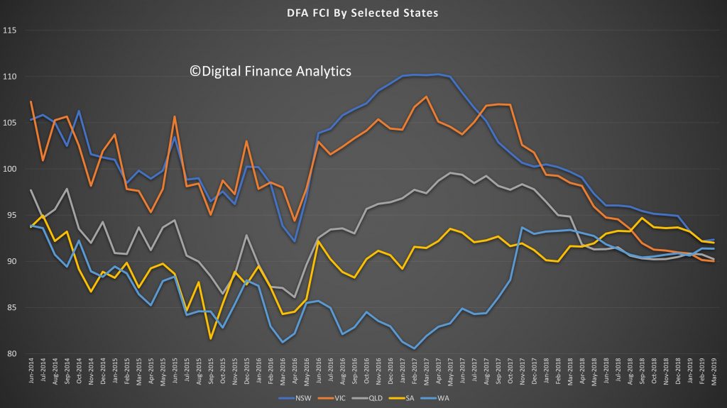
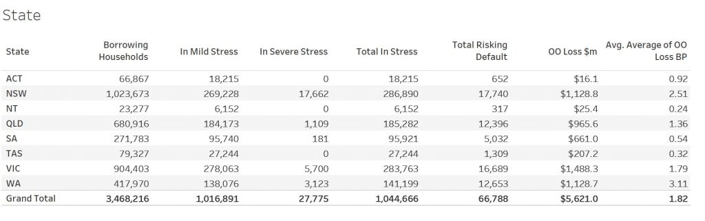
Regional analysis shows that NSW has 284,014 households in stress (286,890 last month), VIC 292,114 (283,753 last month), QLD 184,037 (185,282 last month) and WA has 140,836 (141,199 last month). The probability of default over the next 12 months rose, with around 13,135 (12,600 last month) in WA, around 12,936 (12,400 last month) in QLD, 17,611 (16,700 last week) in VIC and 18,703 (17,700 last month) in NSW.
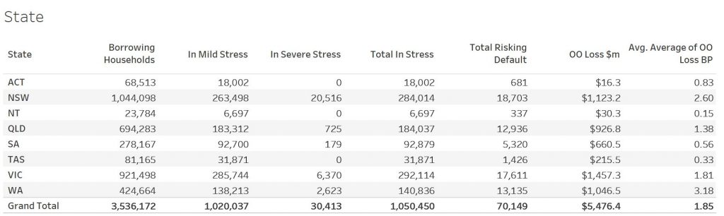
The largest financial losses relating to bank write-offs reside in NSW ($1.1 billion) from Owner Occupied borrowers) and VIC ($1.46 billion) from Owner Occupied Borrowers, though losses are likely to be highest in WA at 3.1 basis points, which equates to $1,046 million from Owner Occupied borrowers.
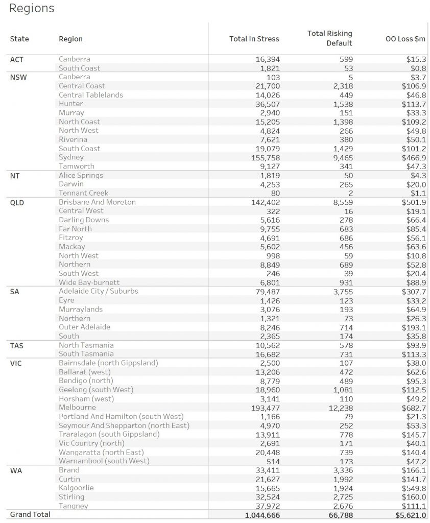
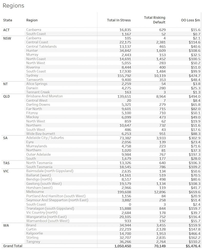
Here is a regional breakdown.
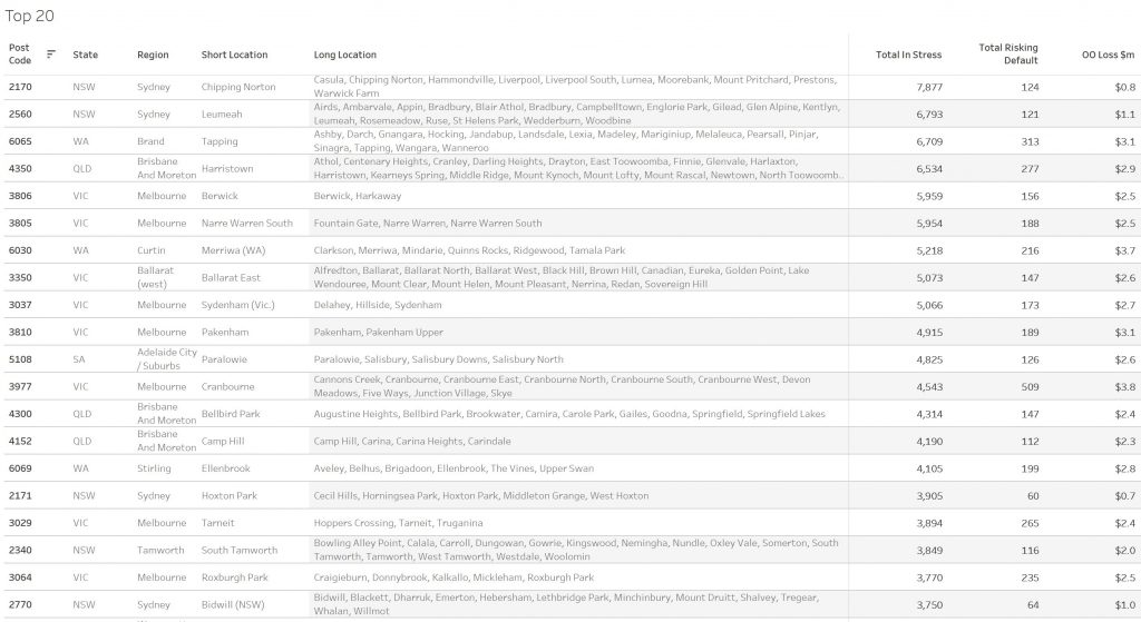
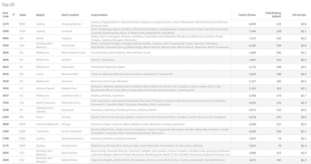
Here are the top postcodes sorted by number of households in mortgage stress.
Handling Mortgage Stress
Households who are in financial difficulty should not ignore the signs. Though many do. And trying to refinance to solve the problem often ends up just postponing the inevitable.
We think there are some simple steps households can take:
Step one is to draw up a budget, so you can see where the money is coming and going. From our research, only half of households have any budget. This means you can then make decisions about what is most important, and what can be foregone. Select and prioritise.
Step two is to talk with your lender, as they have a legal obligation to assist is case of hardship. Yet many households avoid having that conversation, hoping the problem will cure itself. I have to say, in the current low-income growth, high cost environment, that is unlikely. And remember rates are likely to rise at some point.
Step three. Work out what would happen if mortgage rates rose
by say half or one percent. Pass that across your budget and examine the
impact. Then you will really know where you stand. Then plan accordingly.
[1] RBA E2 Household Finances – Selected Ratios December 2018
You can request our media release. Note this will NOT automatically send you our research updates, for that register here.
[contact-form to=’mnorth@digitalfinanceanalytics.com’ subject=’Request The April 2019 Stress Release’][contact-field label=’Name’ type=’name’ required=’1’/][contact-field label=’Email’ type=’email’ required=’1’/][contact-field label=’Email Me The April 2019 Media Release’ type=’radio’ required=’1′ options=’Yes Please’/][contact-field label=”Comment If You Like” type=”textarea”/][/contact-form]
Note that the detailed results from our surveys and analysis are made available to our paying clients.