Its All About Momentum – The Property Imperative Weekly 16 Dec 2017

This week, it’s all about momentum – home prices are sliding, auctions clearance rates are slipping, mortgage standards are tightening and brokers are proposing to lift their business practices – welcome to the Property Imperative Weekly, to 16 December 2017.

Watch the video, or read the transcript. In this week’s edition we start with home prices.

The REIA Real Estate Market Facts report said median house price for Australia’s combined capital cities fell 0.8 per cent during the September quarter. Only Melbourne, Brisbane and Hobart recorded higher property prices and Darwin prices fell the most sharply, dropping 13.8 per cent.

The ABS Residential Property Price Index (RPPI) for Sydney fell 1.4 per cent in the September quarter following positive growth over the last five quarters. Hobart now leads the annual growth rates (13.8%), from a lower base, followed by Melbourne (13.2%) and Sydney (9.4%). Darwin dropped 6.3% and Perth 2.4%. For the weighted average of the eight capital cities, the RPPI fell 0.2 per cent and this was the first fall since the March quarter 2016. The total value of Australia’s 10.0 million residential dwellings increased $14.8 billion to $6.8 trillion. The mean price of dwellings in Australia fell by $1,200 over the quarter to $681,100.

So, further evidence of a fall in home prices in Sydney, as lending restrictions begin to bite, and property investors lose confidence in never-ending growth. So now the question becomes – is this a temporary fall, or does it mark the start of something more sustained? Frankly, I can give you reasons for further falls, but it is hard to argue for improvement anytime soon.  Melbourne momentum is also weakening, but is about 6 months behind Sydney. Yet, so far prices in the eastern states are still up on last year!

CoreLogic said continual softening conditions are evident across the two largest markets of Melbourne and Sydney. This week across the combined capital cities, auction volumes remained high with 3,353 homes taken to auction  and achieving a preliminary clearance rate of 63.1 per cent The final clearance rate last week recorded the lowest not only this year, but the lowest reading since late 2015/ early 2016 (59.5 per cent).

The employment data from the ABS showed a 5.4% result again in November. But there are considerable differences across the states, and age groups. Female part-time work grew, while younger persons continued to struggle to find work. Full-time employment grew by a further 15,000 in November, while part-time employment increased by 7,000, underpinning a total increase in employment of 22,000 persons. Over the past year, trend employment increased by 3.1 per cent, which is above the average year-on-year growth over the past 20 years (1.9 per cent). Trend underemployment rate decreased by 0.2 pts to 8.4% over the quarter and the underutilisation rate decreased by 0.3 pts to 13.8%; both still quite high.

The HIA said there have been a fall in the number of new homes sold in 2017. New home sales were 6 per cent lower in the year to November 2017 than in the same period last year. Building approvals are also down over this time frame by 2.1 per cent for the year. The HIA expects that the market will continue to cool as subdued wage pressures, lower economic growth and constraints on investors result in the new building activity transitioning back to more sustainable levels by the end of 2018.

The HIA also reported that home renovation spending is down, again thanks to low wage growth and fewer home sales by 3.1 per cent. A further decline of a similar magnitude is projected for 2018.

Moody’s gave an interesting summary of the Australian economy. They recognise the problem with household finances, and low income growth. They expect the housing market to ease and mortgage arrears to rise in 2018. They also suggest, mirroring the Reserve Bank NZ, that macroprudential policy might be loosened a little next year.

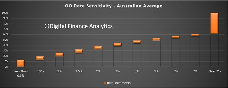
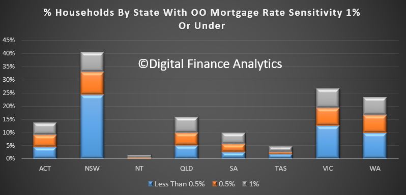
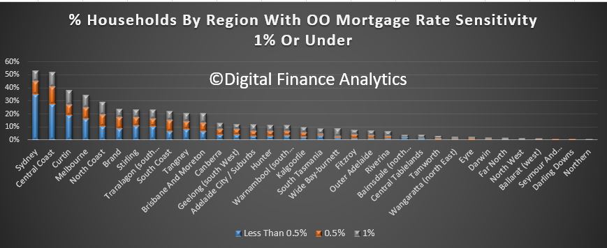
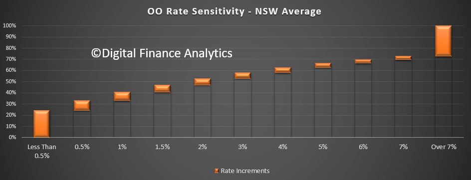
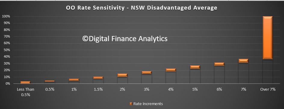
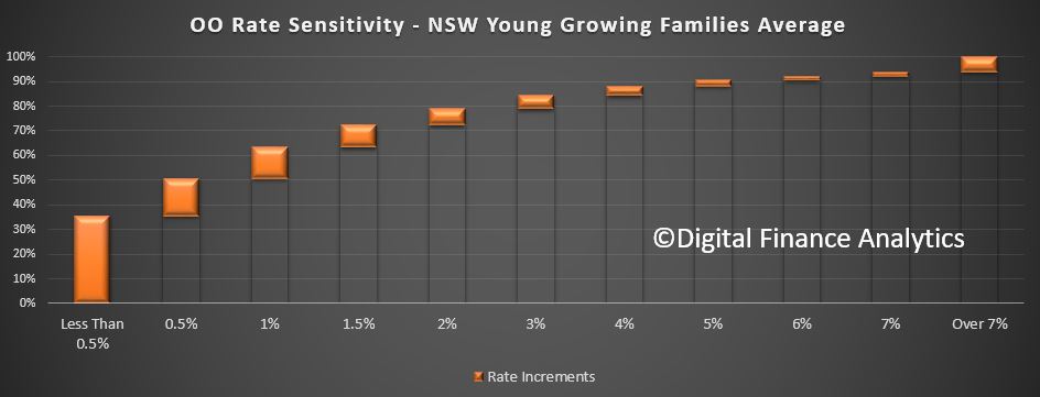
I have to say, given credit for housing is still running at three times income growth, and at very high debt levels, we are not convinced! I find it weird that there is a fixation among many on home price movements, yet the concentration and level of household debt (and the implications for the economy should rates rise), plays second fiddle. Also, the NZ measures were significantly tighter, and the recent loosening only slight (and in the face of significant political measures introduced to tame the housing market). So we think lending controls should be tighter still in 2018.

The latest ABS lending finance data  for October, showed business investment was still sluggish, with too much lending for property investment, and too much additional debt pressure on households. If we look at the fixed business lending, and split it into lending for property investment and other business lending, the horrible truth is that even with all the investment lending tightening, relatively the proportion for this purpose grew, while fixed business lending as a proportion of all lending fell. I will repeat. Lending growth for housing which is running at three times income and cpi is simply not sustainable. Households will continue to drift deeper into debt, at these ultra-low interest rates. This all makes the RBA’s job of normalising rates even harder.

HSBC, among others, is suggesting a further fall in home price momentum next year, writing that slowdowns in the Sydney and Melbourne housing markets will continue to weigh on national house price growth for the next few quarters. They expect only a slow pace of cash rate tightening and some relaxation of current tight prudential settings as the housing market cools.

Despite this, most analysts appear to believe the next RBA cash rate move will be higher and ANZ pointed out with employment so strong, there is little expectation of rate cuts in response to easing home prices. In addition, the FED’s move to raise the US cash rate this week to a heady 1.5% despite inflation still running below target, will tend to propagate through to other markets later. More rate rises are expected in 2018.  The Bank of England held theirs steady, after last month’s hike.

The UK Property Investment Market could be a leading indicator of what is ahead for our market. But in the UK just 15% of all mortgages are for investment purposes (Buy-to-let), compared with ~35% in Australia.  Yet, in a down turn, the Bank of England says investment property owners are four times more likely to default than owner occupied owners when prices slide and they are more likely to hold interest only loans. Sounds familiar? According to a report in The Economist,  “one in every 30 adults—and one in four MPs—is a landlord; rent from buy-to-let properties is estimated at up to £65bn a year. But yields on rental properties are falling and government policy has made life tougher for landlords. The age of the amateur landlord may be over”.

In company news, Genworth, the Lender Mortgage Insurer announced that it had changed the way it accounts for premium revenue. ASIC had raised concerns about how this maps to the pattern of historical claims. Genworth said that losses from the mining sector where many of the losses occur, do so at a late duration, and improvements in underwriting quality in response to regulatory actions, along with continued lower interest rates, extended the average time to first delinquency. As a result, Net Earned Premium (NEP) is negatively impact by approximately $40 million, and so 2017 NEP is expected to be approximately 17 – 19 per cent lower than 2016, instead of the previous guidance of a 10 to 15 per cent reduction.

CBA was in the news this week, with AUSTRAC alleging further contraventions of Australia’s anti-money laundering and counter-terrorism financing legislation. The new allegations, among other things, increase the total number of alleged contraventions by 100 to approximately 53,800. CBA contests a number of allegations but admit others.  eChoice, in voluntary administration, has been bought by CBA via its subsidiary Finconnect Australia, saying the sale will allow eChoice’s employees, suppliers, brokers, lenders and leadership team to continue to operate and deliver for customers. Finally, CBA announced that, from next year, it will no longer accept accreditations from new mortgage brokers with less than two years of experience or from those that only hold a Cert IV in Finance & Mortgage Broking, in a move intended to “lift standards and ensure the bank is working with high-quality brokers who are meeting customers’ home lending needs.”

The Combined Industry Forum, in response to ASIC’s Review of Mortgage Broker Remuneration has come out with a set of proposals. The CIF defines a good customer outcome as when “the customer has obtained a loan which is appropriate (in terms of size and structure), is affordable, applied for in a compliant manner and meets the customer’s set of objectives at the time of seeking the loan.” Additionally, lenders will report back to aggregators on ‘key risk indicators’ of individual brokers. These include the percentage of the portfolio in interest only, 60+ day arrears, switching in the first 12 months of settlements, an elevated level of customer complaints or poor post-settlement survey results. Now this mirrors the legal requirement not to make “unsuitable” loans, but falls short of consumer advocates, such as CHOICE, who wanted brokers to be legally required to act in the best interests of consumers, in common with financial planners. But both the CBA and CIF moves indicate a need to tighten current mortgage broking practices, as ASIC highlighted, which can only be good for borrowers.  By the end of 2020, brokers will also be given a “unique identifier number”.

ASIC says Westpac will provide 13,000 owner-occupiers who have interest-only home loans with an interest refund, an interest rate discount, or both. The refunds amount to $11 million for 9,400 of those customers. The remediation follows an error in Westpac’s systems which meant that these interest-only home loans were not automatically switched to principal and interest repayments at the end of the contracted interest-only period.

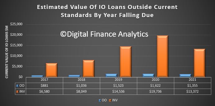
We featured a piece we asked Finder.com.au to write on What To Do When The Interest-only Period On Your Home Loan Ends. There is a sleeping problem in the Australian Mortgage Industry, stemming from households who have interest-only mortgages, who will have a reset coming (typically after a 5-year or 10-year set period). This is important because now the banks have tightened their lending criteria, and some may find they cannot roll the loan on, on the same terms. Interest only loans do not repay capital during their life, so what happens next?

The House of Representatives Standing Committee on Economics released their third report on their Review of the Four Major Banks.  They highlight issues relating to IO Mortgage Pricing, Tap and Go Debt Payments, Comprehensive Credit and AUSTRAC Thresholds. The report recommended that the ACCC, as a part of its inquiry into residential mortgage products, should assess the repricing of interest‐only mortgages that occurred in June 2017, and whether customers had been misled. While the banks’ media releases at the time indicated that the rate increases were primarily, or exclusively, due to APRA’s regulatory requirements, the banks stated under scrutiny that other factors contributed to the decision. In particular, banks acknowledged that the increased interest rates would improve their profitability.

So, in summary plenty of evidence home prices are slipping, and lending standards are under the microscope. We think home prices will slide further, and wages growth will remain sluggish for some time to come, so more pressure on households ahead.  You can hear more about our predictions for 2018 in our upcoming end of year review, to be published soon, following the mid-year Treasury forecast.

Meantime, do check back next week for our latest update, subscribe to receive research alerts, and many thanks for watching.


Wages Growth, Under The Skin, Is Concerning

The Treasury published a 66-page report late on Friday – “Analysis of Wage Growth“.

It paints a gloomy story, wage growth is low, across all regions and sectors of the economy, subdued wage growth has been experienced by the majority of employees, regardless of income or occupation, and this mirrors similar developments in other developed western economies. Whilst the underlying causes are far from clear, it looks like a set of structural issues are driving this outcome, which means we probably cannot expect a return to “more normal” conditions anytime some. This despite Treasury forecasts of higher wage growth later (in line with many other countries).

We think this has profound implications for economic growth, tax take, household finances and even mortgage underwriting standards, which all need to be adjusted to this low income growth world.

Here are some of the salient points from the report:

On a variety of measures, wage growth is low. Regional mining areas have experienced faster wage growth, but wage growth has slowed in both mining and non-mining regions. Wage growth has been fairly similar across capital cities and regional areas, although the level of wages is higher in the capital cities.

The key driver of wage growth over the long-term is productivity and inflation expectations. This means that real wage growth – wage growth relative to the increase in prices in the economy – reflects labour productivity growth. However, fluctuations across the business cycle can result in real wage growth diverging from productivity growth. There are two ways of measuring real wages. One is from the producer perspective and the other is from the consumer perspective. Producers are concerned with how their labour costs compare to the price of their outputs.

Consumers are concerned with how their wages compare with the cost of goods and services they purchase.

Generally, consumer and producer prices would be expected to grow together in the long-term, so the real producer wage and real consumer wage would also grow together. Consumer and producer prices diverged during the mining investment boom due to strong rises in commodity export prices. The unwinding of the mining investment boom and spare capacity in the labour market are important cyclical factors that are currently weighing on wage growth.

It is unclear whether these cyclical factors can explain all of the weakness in wage growth. Many advanced economies are also experiencing subdued wage growth. In particular, labour productivity growth has slowed in many economies. However, weaker labour productivity growth seems unlikely to be a cause of the current period of slow wage growth in Australia. Over the past five years, labour productivity in Australia has grown at around its 30-year average annual growth rate.

Wage growth is weaker than the unemployment rate implies. There may be more spare capacity than implied by the employment rate. [Is The Phillips curve broken?]. Labour market flexibility is a possible explanation for the change in the relationship between wage growth and unemployment, and the rise in the underemployment rate. Employers may be increasingly able to reduce hours of work, rather than reducing the number of employees when faced with adverse conditions. This may be reflected in elevated underemployment.

It is difficult to draw firm conclusions on the effect of structural factors on wage growth, given they have been occurring over a long timeframe and global low-wage growth is a more recent phenomenon. Three key trends are the increasing rates of part-time employment, growth in employment in the services industries, and a gradual decline in the share of routine jobs, both manual and cognitive, and a corresponding rise in non-routine jobs.
Both cyclical and structural factors can affect growth in real producer wages and labour productivity, so such factors can also affect the labour share of income. Changes in the labour share of income occur as a result of relative growth in the real producer wage and labour productivity. Since the early 1990s, the labour share of income has remained fairly stable. Nonetheless, different factors have placed both upward and downward pressure on the labour share of income.

An examination of wage growth by employee characteristics using the Household Income and Labour Dynamics in Australia (HILDA) survey and administrative taxation data suggests that recent subdued wage growth has been experienced by the majority of employees, regardless of income or occupation. Workers with a university education had higher wage growth than those with no post-school education over the period 2005-2010, but have since experienced lower wage growth than individuals with no post-school education.

An examination of wage growth by business characteristics using the Business Longitudinal Analysis Data Environment (BLADE) suggests that higher-productivity businesses pay higher real wages and employees at these businesses have also experienced higher real wage growth. Larger businesses (measured by turnover) tend to be more productive, pay higher real wages and have higher real wage growth. Capital per worker appears to be a key in differences in labour productivity and hence real wages between businesses, with more productive businesses having higher capital per worker.

Wage growth is low across all methods of pay setting. In recent years, increases in award wages have generally been larger than the overall increase in the Wage Price Index. At the same time, award reliance has increased in some industries while the coverage of collective agreements has fallen. There are a range of reasons for the decline in bargaining including the reclassification of some professions, the technical nature of bargaining, natural maturation of the system and award modernisation which has made compliance with the award system easier than before.

Australian Debt Servicing Ratios Higher and More Risky

The Bank for International Settlements released their updated Debt Service Ratio (DSR) Benchmarks overnight. A high DSR has a strong negative impact on consumption and investment.

Australia (the yellow dashed line) is second highest after the Netherlands. We are above Norway and Denmark, and the trajectory continues higher. Further evidence that current regulatory settings in Australia are not correct. As the BIS said yesterday, such high debt is a significant structural risk to future prosperity.

The DSR reflects the share of income used to service debt and has been found to provide important information about financial-real interactions. For one, the DSR is a reliable early warning indicator for systemic banking crises.

The DSRs are constructed based primarily on data from the national accounts. The BIS publishes estimated debt service ratios (DSRs) for the household, the non-financial corporate and the total private non-financial sector (PNFS) using standardised data inputs for 17 countries.

BIS Special Feature On Household Debt

The Bank for International Settlements has featured the issues arising from high household debt in its December 2017 Quarterly Review. They call out the risks from high mortgage lending, high debt servicing ratios, and the risks to financial stability and economic growth.  All themes we have already explored on the DFA Blog, but it is a well argued summary. Also note Australia figures as a higher risk case study.  Here is a summary of their analysis.

Central banks are increasingly concerned that high household debt may pose a threat to macroeconomic and financial stability.  This special feature seeks to highlight some of the mechanisms through which household debt may threaten both macroeconomic and financial stability.

Australia is put in the “High and rising” category.  The debt ratio now exceeds 120% in both Australia and Switzerland.  Mortgages make up the lion’s share of debt (between 62 and 97%).  In Australia mortgage debt has risen from 86% of household debt in 2007 to 92% in 2017.

High household debt can make the economy more vulnerable to disruptions, potentially harming growth. As aggregate consumption and output shrink, the likelihood of systemic banking distress could increase, since banks hold both direct and indirect credit risk exposures to the household sector.

They say  the size of household debt burdens matters too. This is best measured by the ratio of interest payments and amortisation to income – the debt service ratio (DSR).   They say that rising household debt can reflect either stronger credit demand or an increased supply of credit from lenders, or some combination of the two. In Australia, for instance, heightened
competition among lenders seems to have resulted in a relaxation of lending standards.  In addition, the interest rate sensitivity of a household’s debt service burden is likely to matter. High debt (relative to assets) can make a household less mobile, and hence less able to adjust by finding a new or better job in another town or region. Homeowners may be tied down by mortgages on properties that have depreciated in value, especially those that are underwater (ie worth less than the loan balance).

These household-level observations have implications for aggregate demand and aggregate supply. From an aggregate demand perspective, the distribution of debt across households can amplify any drop in  consumption. Notable examples include high debt concentration among households with limited access to credit (ie close to borrowing constraints) or less scope for self-insurance (ie low liquid balances).

Since poorer households are more likely to face these credit and liquidity
constraints, an economy’s vulnerability to amplification can be assessed by looking at the distribution of debt by income and wealth.  In Australia, households in the top income brackets tend to have substantially higher debt ratios than those at the bottom of the distribution (eg in 2014, the top two quintiles had debt ratios of about 200%, while the bottom two had ratios of about 50%. [Note this is based on OLD 2014 HILDA data, and debt to higher income households has risen further since then!]

In countries where household debt has risen rapidly since the crisis, and where the majority of mortgages are adjustable rate, DSRs are already above their historical average, and would be pushed yet further away by higher interest rates.

From an aggregate supply perspective, an economy’s ability to adjust via labour reallocation across different regions can weaken if household leverage grows over time. In such an economy, a fall in house prices – as may be associated with interest rate hikes – would saddle a number of households with mortgages worth less than the underlying property. A share of these “underwater” homeowners might also lose their jobs in the ensuing contraction. In turn, their unwillingness to realise losses by selling their property at depressed prices may prolong their spell of unemployment by preventing them from taking jobs in locations that would require a house move.

Elevated levels of household debt could pose a threat to financial stability, defined here as distress among financial institutions. These exposures relate not only to direct and indirect credit risks, but also to funding risks. There is some evidence that this may be occurring in Australia, where high-DSR households are more likely to miss mortgage payments.

The indirect exposure to household debt arises from any increase in credit risk linked to households’ expenditure cuts. These are bound to have a broader impact on output and hence on credit risk more generally. Deleveraging by highly indebted households could induce a recession so that banks’ non-household loan assets are likely to suffer. Financial stability may also be threatened by funding risks . The network of counterparty relationships could become a channel for the transmission of stress, as any decline in the value of one bank’s cover pool could rapidly affect that of all the others.

They conclude:

Central banks and other authorities need to monitor developments in household debt. Several features of household indebtedness help to shape the behaviour of aggregate expenditure, especially after economic shocks. The level of debt and its duration – as well as whether debt has financed the acquisition of illiquid assets such as housing – all play a role in determining how far an individual household will cut back its consumption. Aggregating up, the distribution of debt across households can amplify these  adjustments. In turn, such amplification is more likely if debt is concentrated among households with limited access to credit or less scope for selfinsurance. Since these households are also likely to be poorer households, keeping track of the distribution of debt by income and wealth can help indicate an economy’s vulnerability to amplification.

Wallowing In Debt

The long comparative data series from the Bank for International Settlements provides a useful and well documented relative comparisons across countries and over time.  They are careful to compare like with like!

The data on household debt relative to GDP is one of the most significant – “Credit to Households and NPISHs from All sectors at Market value – Percentage of GDP – Adjusted for breaks”.  Here is a set comparing Australian Household Debt with USA, Canada, New Zealand and Hong Kong and Ireland. Australian households are wallowing in debt (no wonder mortgage stress is so high), even relative to Canada (where home prices have now started to fall), Hong Kong (where prices are in absolute terms higher), and New Zealand (where the Reserve Bank there has been much more proactive in tacking the ballooning debt). See also the plunge in debt in Ireland, still trying to deal with the collapse which followed the GFC in 2007.

If we then add in the range of other economies (which I accept makes the chart more complex), we find that only Switzerland has a higher ratio. Even those Scandinavian countries with high ratios and high home prices are below Australia. Interesting then that household wealth, according to the recent survey, was highest in Switzerland, then Australia, thanks to high home values (but of course supported by very high debt).

We appear to have settings which simply are allowing this debt to continue to accumulate – and over the weekend the QLD election campaign included promises of yet more assistance to first time buyers worth $30m, further stoking the debt pyre.

Where Rate Rises Will Hit The Hardest

It seems that eventually mortgage rates will rise in Australia, as global forces exert external pressure on the RBA, and as the RBA tries to normalise rates (at say 2% higher than today). Timing is, of course, not certain.

But it is worth considering the potential impact. While our mortgage stress analysis takes a cash flow view of household finances, our modelling can look at the problem another way.

One algorithm we have developed is a rate sensitivity calculation, which takes a household’s mortgage outstanding, at current rates, and increments the interest rate to the point where household affordability “breaks”.  We use data from our household survey to drive the analysis.

We have just run this analysis with data to end October 2017. We will explore the top line results, and then drill into some NSW specific analysis.

So we start with the average across the country. We find that around 10% of households would run into affordability issues with less a 0.5% hike in mortgage rates,  and around another 8% would be hit if rates rose 0.5%, and a larger number would be added to the “in pain” pile, giving us a total of around 25% of households across the country in difficulty if rates went 1% higher. [Note that the calculation does not phase the rate increases in]. Around 40% of households would be fine even if rates when more than 7% higher.

We can run a similar calculation at a state level. The chart below shows the relative impact on less than 0.5%, 0.5% and 1% rate rises, giving a cumulative total.  We find that around 40% of households in NSW would have a problem, compared with 27% in VIC and 24% in WA.

We can also take the analysis further, to a regional view across the states. This reveals that the worst impacted areas would be, in order, Greater Sydney, Central Coast, Curtain and Greater Melbourne. These are all areas where home prices relative to income are significantly extended, thus households are highly leveraged.

Now lets look further at NSW. Here is the NSW footprint, including all the rate increase bands. More than 30% are protected even if rates are 7% or more higher.

We can look at the type of households, using our segmentation modelling.  Many will expect households in the disadvantaged areas of Greater Sydney to be worst hit by rate rises. This however is not the case, simply because they have smaller mortgages, lenders have lent cautiously, and because these households are use to handling difficult cash flows. Despite this, around 8% of households would be hit hard by a 1% rise in mortgage rates, enough to be a problem, but probably a lower proportion than would be expected.

However, young growing families have more of an issue (this will include a number of first time buyers), with around 35% in difficulty in the case of just a small rise, and more than 60% at risk at 1% higher than today.  Loans are relatively large compared with incomes (which are not rising faster than cpi).

But the segment with the most significant exposure is the Young Affluent household group. These households, which also includes some first time buyers, have larger incomes, but also larger mortgages, and are leveraged significantly, such that more than 70% of this group would struggle with a small rise. More than 85% would have issues with a 1% rate rise.

Many of these households have bought new high-rise apartments in the inner suburban ring, for example around Bondi, Wolli Creek and Hurstville.

So, in a rate increase scenario, we think specific households and locations will be disproportionately hit. The banks should be incorporating this type of analysis in their risk scenario models and underwriting standards. We think some are still lending too generously. The ~7.25 rate floor is not enough to protect borrowers or  the bank.


Another Nice Mess – The Property Imperative Weekly – 11 Nov 2017

In our latest weekly update, we explore how that RBA is caught between stronger global economic indicators, and weaker local conditions, and what this means for local households, the property market and banks.

Welcome to the Property Imperative weekly to 11th November 2017. Read the transcript or watch the video.

We start this weeks’ digest with the latest results from the banking sector.

CBA’s 1Q18 Trading Update reported a rise in profit, and volumes, as well as a lift in capital. Expenses were higher, reflecting some provisions relating to AUSTRAC, but loan impairments were lower. WA appears to be the most problematic state. Their unaudited statutory net profit was around $2.80bn in the quarter and their cash earnings was $2.65bn in the quarter, up 6%. Both operating income and expense was up 4%.

Westpac’s FY17 results were a bit lower than expected, impacted by lower fees and commissions, pressure on margins, the bank levy and a one-off drop to compensate certain customers.  Despite a strong migration to digital, driving 59 fewer branches and a net reduction of ~500 staff, expenses were higher than expected. There has been a 23% reduction in branch transactions over the past two years in the consumer bank, once again highlighting the “Quiet Revolution” underway and the resulting problem of stranded costs. Treasury had a weak second half. But the key point, to me, is that around 70% of the bank’s loan book was in one way or another linked to the property sector, so future performance will be determined by how the property market performs. Provisions were lower this cycle, and at lower levels than recent ANZ and NAB results. WA mortgage loans have the highest mortgage arrears but were down a bit.

Looking at mortgage defaults across the reporting season, there were some significant differences. Some, like Westpac, indicated that WA defaults in particular are easing off now, while others, like ANZ and Genworth, are still showing ongoing rises. This may reflect different reporting periods, or it may highlight differences in underwriting standards. Our modelling suggests that the rate of growth in stress in WA is indeed slowing, but it is rising in NSW (see the Nine TV News Segment on this which featured our research) and VIC; and there is an 18 to 24-month lag between mortgage stress and mortgage default. So, in the light of expected flat income growth, continued growth in mortgage lending currently at 3x income, rising costs of living and the risk of international funding rates rising too, we think it is too soon to declare defaults have peaked. One final point, many households have sufficient capital buffers to repay the bank, thanks to ongoing home price rises. Should prices start to fall, this would change the picture significantly.

Banks have enjoyed strong balance sheet growth in recent years as they lend ever more for mortgages, at the expense of productive business lending. A number of factors have driven the housing boom including population and income growth for the past 25 years, a huge fall in interest rates and increases in the tax advantages to property investment through negative gearing and the halving of the capital gains tax level.

Fitch Ratings says the banks’ had solid results for the 2017 financial year, supported by robust net interest margins and strong asset quality. However, Australia’s four major banks will face earnings pressure from higher impairment charges and lower revenue growth in their 2018 financial year, and cost control to remain an important focus. They benefitted from the APRA inspired repricing of mortgages, and from lower impairment charges. Fitch said that mortgage arrears have increased modestly from low bases in most markets – Western Australia has had more noticeable deterioration – and they expect this trend to continue in FY18 due in part to continued low wage growth and an increase in interest rates for some types of mortgages.

The latest household finance data from the ABS confirms what we already knew, lending momentum is on the slide, and first time buyers, after last month’s peak appear to have cooled. With investors already twitchy, and foreign investors on the slide, the level of buyer support looks anaemic. Expect lots of “special” refinance rates from lenders as they attempt to sustain the last gasp of life in the market.

The number of new loans to first time buyers was down 6.3%, or 630 on last month. We also see a fall in fixed loans, down 14%.  The DFA sourced investor first time buyers also fell again, down 4%. More broadly, the flow of new loans was down $19 million or 0.06% to $33.1 billion. Within that, investment lending flows, in trend terms, fell 0.52% or $62.8 million to $12.1 billion, while owner occupied loans rose 0.32% or $47.7 million to $15.0 billion.  So investment flows were still at 44.6% of all flows, excluding refinances. Refinances comprise 17.9% of all flows, down 0.07% or $3.9 million, to $5.9 billion.

Auction volumes were also lower this past week, partly because of the Melbourne Cup festivities, and CoreLogic’s latest data suggests a slowing trend, more homes listed, and further home price falls in Greater Sydney. As a result, we expect home lending to trend lower ahead.

The MFAA says there has been a boom in mortgage brokers, but this may be unsustainable, given lower mortgage growth.  The snapshot, up to March 2017, shows that the number of brokers was estimated to be 16,009, representing 1 broker for every 1,500 in the population and they originated around 53% of new loans.  Overall the number of brokers rose 3.3% but net lending grew only 0.1%. As a result, the average broker saw a fall in their gross annual income. Also, on these numbers, brokers cost the industry more than $2 billion each year!

We published data on the dynamic loan-to-income data (LTI) from our household surveys. Currently we estimate that more than 20% of owner occupied mortgage loans on book have a dynamic LTI of more than 4 times income. Some LTI’s are above 10 times income, and though it’s a relatively small number, they are at significantly higher risk. Looking at the data by state, we see that by far the highest count of high LTI loans resides in NSW (mainly in Greater Sydney), then VIC and WA. Younger households have a relatively larger distribution of higher LTI loans. Reading across our core segmentation, we see that Young Affluent, Exclusive Professional and Multi-Cultural Establishment are the three groups more likely to have a high dynamic LTI. We also see a number of Young Growing Families in the upper bands too. As many lenders also hold the transaction account for their mortgage borrowers, it is perfectly feasible to build an algorithm which calculates estimated income dynamically from their transaction history, and use this to estimate a dynamic LTI. This would give greater insight into the real portfolio risks, compared with the blunt instrument of LVR. It is less misleading that LTI or LVR at origination.

The latest edition of our Household Financial Security Confidence Index to end October shows households are feeling less secure about their finances than in September. The overall index fell from 97.5 to 96.9, and remains below the 100 neutral setting. We use data from our household surveys to calculate the index.  While households holding property for owner occupation remain, on average, above the neutral setting, property investors continue to slip further into negative territory, as higher mortgage rates bite, rental returns slide and capital growth in some of the major markets stalls.  Property inactive households remain the most insecure however, so owning property in still a net positive in terms of financial security. There are significant variations across the states. VIC households continue to lead the way in terms of financial confidence, and WA households are moving up from a low base score. However, households in NSW see their confidence eroded as prices slide in some post codes (the average small fall as reported does not represent the true variation on the ground – some western Sydney suburbs have fallen 5-10% in the past few months). Households in QLD and SA on average have held their position this month. Confidence continues to vary by age bands, although the average scores have drifted lower again. Younger households are consistently less confident, compared with older households, who tend to have smaller mortgages relative to income, and more equity in property and greater access to savings.

As expected the RBA held the cash rate again this week, for the 15th month in a row.  The RBA’s statement on Monetary Policy highlighted the tension between stronger global growth, reflected in expected rising interest rate benchmarks in several countries, including the USA; and weaker inflation and growth in Australia. As a result, pressure to lift the cash rate here appears lower than before. Underlying inflation is expected to remain steady at around 1¾ per cent until early 2019, before increasing to 2 per cent. The revised CPI weightings now announced by the ABS, will tend to reduce the inflation numbers in the next release. The RBA suggests growth will be lower for longer though is still holding to a 3% growth rate over their forecast period, They also highlighted the impact of stagnant wage growth and high household debt once again.

If rates do stay lower for longer here, it may benefit households already suffering under mountains of mainly housing related debt, but put pressure on the dollar and terms of trade, as rates overseas climb, sucking investment dollars away from Australia and lifting funding costs. Some are suggesting that the gap between income and credit growth, 2% compared with 6% over the past year, will require the RBA to lift the cash rate sooner, and ANZ for example is still forecasting rate hikes in 2018.

International conditions are on the improve, and many assume the rises in benchmark cash rates will be slow and steady. However, A GUEST post on the unofficial Bank of England’s “Bank Underground” blog makes the point, by looking at data over the past 700 years, that most reversals after periods of interest rate declines are rapid. When rate cycles turn, real rates can relatively swiftly accelerate. The current cycle of rate decline is one of the longest in history, but if the analysis is right, the rate of correction to more normal levels may be quicker than people are expecting – and a slow rate of increases designed to allow the economy to acclimatize may not be possible.  Not pretty if you are a sovereign or household sitting on a pile of currently cheap debt!

So, we see on one side global conditions improving, with interest rates set to rise, while locally economic indicators are weakening suggesting the RBA may hold the cash rate lower for longer. This is creating significant tension, and highlights the dilemma the regulators face. But as we said before, this is a problem of their own making, as they dropped rates too far, and did not recognise the growing risks in the housing sector soon enough. So, already on the back foot, we expect to see some further targeted regulatory intervention, and we expect the cash rate to stay lower for longer, until the international upward pressure swamps the local situation. We think this may be much sooner than many, who are now talking of no rate change for a couple of years.  Meantime households with large loans, little income growth and facing rising costs will continue to spend less, tap into savings, and muddle though. Not a good recipe for future growth, and economic success. As Laurel and Hardy used to say ” Well, here’s another nice mess you’ve gotten me into!”

And that’s the Property Imperative Weekly to 11th November 2017. If you found that useful, do leave a comment, subscribe to receive future updates, and check back next week.

Mortgage stress soars to record highs as borrowers struggle with jumbo loans

From The Australian Financial Review.

The number of Australian families facing mortgage distress has soared by nearly 20 per cent in the past six months to more than 900,000 and is on track to top 1 million by next year, according to new analysis of lending repayments and household incomes.

That means net incomes are not covering ongoing costs in nearly 30 per cent of the nation’s households, up from about 25 per cent in May, the analysis by Digital Finance Analytics, an independent commentator, shows.

Stagnant incomes, rising costs, unemployment, the likelihood that rates are more likely to rise than fall mean the number of families struggling to make ends meet is expected to continue increasing, the analysis shows.

Lenders’ recent attempts to build market share by lowering underwriting standards is also expected to begin appearing in the numbers as households struggle to repay jumbo loans, it shows.

“Risks in the system will continue to rise,” Martin North, DFA principal, said. “The numbers of households impacted are economically significant,” “Mortgage lending is still growing at three times income. This is not sustainable.”

Brendan Coates, a fellow at the Grattan Institute, a public policy think tank, said: “Even a relatively small rise in the interest rates paid by households would crimp their spending.

“If interest rates increase by 2 percentage points,  mortgage payments on a new home will be less affordable than at any time in living memory, apart from a brief period around 1989 — an experience that scarred a generation of home-owners.”

Nearly 22,000 households, of which 11,000 are professionals or young affluent, are facing severe distress, which means they are unable to meet mortgage repayments from current income and are having to manage by cutting back spending, putting more on credit cards, refinance, or sell their home.

About 52,000 households risk 30-day default in the next 12 months, up 3000 from the previous month. A lender, or creditor, can issue a default notice to a borrower behind on debt.

Bank portfolio losses are expected to be around 3 basis points, rising to about 5 basis points in Western Australia.

Mr Coates said: “Growing household debt has made the Australian economy more vulnerable. But the debt situation is not as worrying as the aggregate figures suggest.

“Most debt is held by higher income households and Reserve Bank research shows that relatively few households have high loans-to-total-assets ratios.

“Stagnating house prices — still the most likely scenario over the next couple of years — wouldn’t be enough to significantly trouble the banks.”

Rather than a banking crisis, higher debts could cause a  rapid fall in household spending in the event of a downturn, he said.

“Household consumption accounts for well over half of gross domestic product. Recent Reserve Bank of Australia research shows that households with higher debts are more likely to reduce spending if their incomes fall,” he said.

Economists generally argue mortgage stress, stagnant income growth and low inflation  mean the Reserve Bank will be unlikely to raise interest rates any time soon.

But that could change if there was another disruption to international financial markets, such as the 2008 shock, which sharply increased banks’ funding costs and raised mortgage rates.

Household Debt Grinds Higher

The ABS published some revisions to their Household Income and Wealth statistics.

Two data series stood out for me. First, more households are in debt today, compared with 2005-6, and second more households have debts at more than three times their income.

Here is the plot of the proportion of households with debt, by income quintile. In 2003-4, 72.9% of all households had debt, and this rose to 73.6% in 2015-16, up 0.7% across the series.

But, those on lower incomes have borrowed harder, with 50% in the bottom income range borrowing, compared with 44.6% in 2003-4, a rise of 5.4%. The second lowest saw a rise of 2.2%, up from 64.5 to 66.7. On the other hand, the highest quintile saw a fall from 91.8% in 2003-4 to 89.2% in 2015-16, down 2.6%.

The ABS also said that in 2005-6 the proportion of households with debt more than three times income was 23.9%, while in 2015-16 it was 27.2%, up 3.3%.

This underscores the issue we face, debt is higher, and more lower income families are more stretched. Sure, net worth may be higher now, but the debt (mostly mortgage debt) is the problem. As we saw last week, most of the growth in wealth is associated with home prices. Should they reverse, then this looks very wobbly.


National Accounts 2016-17 Highlights Reliance On Property

The ABS released their National Accounts for 2016-17. Overall, we see why the RBA cut rates to let property prices run hot. Without property, the economy would have been shot. But of course, getting back on a more even keel is now much more difficult and much of household wealth is attached to inflated property prices; and rates are likely to rise.

In summary:

  • growth was 2%, the lowest since 2008-9
  • wages rose 2.1%, the weakest since 1991-2
  • household consumption was the strongest growth driver at 1.22pp
  • growth in household expenditure as measured in current price terms was 3.0%, the lowest on record
  • the household saving ratio was at its lowest point (4.6%) in nine years
  • households borrowed an additional $990 billion over the 10 year period from 2006-07, mainly mortgages
  • the value of land and dwellings owned by households increased by $2,930 billion over the same period
  • land and dwellings owned by households increased by $621 billion through 2016-17
  • despite slow wage growth, household gross disposable income plus other changes in real net wealth increased $456.6 billion, or 32.6%, in 2016-17,  largely due to a $306.5 billion appreciation in the value of land held by households.

Here is the ABS summary data:

The Australian economy expanded by 2.0% in chain volume terms in 2016-17. This is the 26th consecutive year of economic growth, but the lowest rate of growth since 2008-09.

Optimal growing conditions saw the agriculture industry make a robust contribution to economic growth, largely on the back of a bumper wheat crop and higher meat sales, which returned the highest annual income to farmers on record. Mining was the beneficiary of elevated commodity prices, but the industry’s growth in volume terms was subdued. Most of the expansion in mining came from oil and gas extraction, reflecting additional capacity coming online. Service-based industries also contributed to growth, highlighting the economy’s transition to service delivery.

Household consumption expanded moderately in volume terms. Gross fixed capital formation fell for the fourth successive year, albeit only marginally, despite continuing strength in dwelling investment in 2016-17. New engineering construction continued to slide as the impact of the recent mining construction boom fades.

Weak wage growth resulted in compensation of employees rising 2.1%, the weakest annual rise since 1991-92. This, combined with a fall in social assistance benefits received by households during the year, caused the household saving ratio to fall to 4.6%, its lowest level since 2007-08.

Price pressures in the domestic economy remained weak throughout 2016-17. Subdued domestic prices and wages drove the weakest annual rise in household consumption, in current price terms, on record. The terms of trade grew for the first time in 5 years, reflecting elevated prices received for key export commodities such as coal and iron ore. These prices boosted mining company profits, real net national disposable income, and overall export revenues, which sharply narrowed the current account deficit.

The Australian economy’s overall financial position improved during 2016-17, borrowing less in net terms from the rest of the world in any year since 2001-02. In current prices Australia’s net worth at 30 June 2017 is estimated at $11,377 billion.

AUSTRALIAN ECONOMY GROWS BY 2.0%

Australian Gross Domestic Product (GDP) grew by 2.0% in the 2016-17 year. This represents a 0.1pp upward revision from the annualised 2016-17 GDP estimates published in the June quarter national accounts. GDP per capita increased 0.4% as the Australian population grew by 1.5%.

GDP and GDP per capita, Volume measures
Graph shows GDP and GDP per capita, Volume measures

CONSUMPTION DRIVES ECONOMIC GROWTH IN 2016-17

Economic growth in 2016-17 was largely driven by consumption. Government consumption contributed 0.8pp to GDP growth, while household consumption contributed 1.2pp to growth. Gross fixed capital formation made no contribution to growth, with the impact of public sector capital expansion being cancelled out by the decline in private works. Net exports contributed 0.1pp.

CONTRIBUTIONS TO GDP(E) GROWTH, Volume measures
Graph shows CONTRIBUTIONS TO GDP(E) GROWTH, Volume measures
Contributions may not add to GDP growth due to the statistical discrepancy.

HOUSEHOLD CONSUMPTION WEAK IN CURRENT PRICE TERMS

While household consumption contributed solidly to GDP growth in volume terms, growth in household expenditure as measured in current price terms of 3.0% is the lowest on record.

HOUSEHOLD FINAL CONSUMPTION EXPENDITURE, Current prices
Graph shows HOUSEHOLD FINAL CONSUMPTION EXPENDITURE, Current prices

MINING INVESTMENT CONTINUES TO FALL

In 2016-17, mining investment fell by 23.7%. This was the fourth consecutive fall in mining investment, with the level of investment now 58.1% lower than it was in 2012-13. The impact the fall in mining investment has had on GDP has been partially offset by investment in dwellings, which grew 5.2% in 2016-17.

Private sector gross fixed capital formation for non-mining industries grew 2.2% in 2016-17. Investment in non-mining is 15.1% higher than in 2012-13, with the strength being led by the information, media and telecommunications industry.

PRIVATE CAPITAL INVESTMENT, Current prices
Graph shows PRIVATE CAPITAL INVESTMENT, Current prices

SERVICES AND AGRICULTURE DRIVE GROWTH IN 2016-17 AS THE COMPOSITION OF AUSTRALIAN GROSS VALUE ADDED (GVA) CONTINUES TO SHIFT

In 2016-17, good growing conditions resulted in a large increase in the output of the Agriculture industry, contributing 0.4 percentage points to the yearly GDP growth in chain volume terms, the largest contribution from Agriculture in ten years. Health Care and Social Assistance, Professional Scientific and Technical Services and Financial and Insurance Services industry all contributed at least 0.3 percentage points to GDP growth this year.

This is consistent with the longer term trend being observed with these three industries along with Mining and Construction making up the largest share of the overall economy in 2016-17. This is in contrast to the 1996-97 year in which Manufacturing, Financial and Insurance Services and Public Administration and Safety were the top three contributors.

INDUSTRY SHARES OF GVA – Selected industries, Current prices

GVA at basic prices of industries as a proportion of total GVA at basic prices

COMPENSATION OF EMPLOYEES SHARE OF TOTAL FACTOR INCOME FALLS

In 2016-17, the compensation of employees (COE) share of total factor income fell to 52.8%. This share is still higher than the lowest level recorded, but continues the long term decline from 57.1% in 1984-85. The series has been more volatile in the past 7-8 years with swings in the terms of trade impacting overall factor income.

The profit share (based on gross operating surplus) of total factor income was 26.5% for the 2016-17 year. This increase is due to the higher profits received by the mining industry this year due to the increase in the terms of trade. The current year share is less than the peak of 28.9% in 2008-09 but still higher than the 22.0% share observed in the mid-1980s. The profit share of total factor income should not be interpreted as a direct measure of ‘profitability’ for which it is necessary to relate profits to the level of capital assets employed.

WAGES SHARE OF TOTAL FACTOR INCOME
Graph shows WAGES SHARE OF TOTAL FACTOR INCOME


PROFITS SHARE OF TOTAL FACTOR INCOME
Graph shows PROFITS SHARE OF TOTAL FACTOR INCOME

CHANGES TO INDUSTRY COMPENSATION OF EMPLOYEES OVER TIME

The industry share of COE has changed significantly over time. The Health Care and Social Assistance and Professional, Scientific and Technical Services industries had the largest proportion of total COE in 2016-17. The Manufacturing industry made up the highest share of COE in 1996-97 but this share has now fallen to 7.3%.

INDUSTRY SHARES OF COE – Selected industries, Current prices
Graph shows INDUSTRY SHARES OF COE - Selected industries, Current prices

HOUSEHOLD SAVING RATIO DECLINES

The household saving ratio was at its lowest point (4.6%) in nine years in 2016-17. This fall in net saving as a proportion of net disposable income can be attributed to slower growth in COE as well as a reduction in social assistance benefits received. The result this year is not isolated, and continues the downward trend seen in the past five years.

HOUSEHOLD SAVING RATIO
Graph shows HOUSEHOLD SAVING RATIO

GDP CHAIN PRICE INDEX GROWTH DRIVEN BY STRONG EXPORT PRICES

The GDP chain price index grew by 3.8% in 2016-17. Strength in export prices (specifically coal and metal ore) drove this result. The domestic final demand chain price index rose 0.8% in 2016-17, which is the lowest reading of domestic price pressure since 1996-97.

CHAIN PRICE INDEXES
Graph shows CHAIN PRICE INDEXES

MARKET SECTOR MULTIFACTOR PRODUCTIVITY INCREASES

Market sector multifactor productivity (MFP) grew 0.6% in 2016-17. This result reflects a 1.9% increase in GVA and a 1.3% increase in labour and capital inputs. On a quality adjusted hours worked basis, MFP rose 0.3%, reflecting changes in labour composition. These changes were due to educational attainment and work experience.

On an hours worked basis, labour productivity grew 1.0%. On a quality adjusted hours worked basis, labour productivity grew 0.5%.

MARKET SECTOR PRODUCTIVITY, Hours worked basis
Graph shows MARKET SECTOR PRODUCTIVITY, Hours worked basis

LOW INTEREST RATES ENTICE HOUSEHOLDS TO INVEST IN DWELLINGS AND LAND

Interest rates have been at historically low levels for a number of years, which has reduced the pressure on households in terms of the proportion of income spent paying interest on mortgages. Interest on dwellings accounted for 3.7% of total gross household income in 2016-17, compared to 5.3% in 2006-07.

Households borrowed an additional $990 billion over the 10 year period from 2006-07, while the value of land and dwellings owned by households increased by $2,930 billion over the same period. Land and dwellings owned by households increased by $621 billion through 2016-17, boosted by the recent additions in dwelling stock.

In 1988-89, the value of dwellings and land held by households was 5.1 times the value of household borrowing. By 2006-07 this ratio was at 3.3, and it has been reasonably stable since. In 2016-17, land and dwellings owned by households covered their borrowing 3.1 times.

HOUSEHOLD INTEREST PAYABLE ON DWELLINGS – Relative to total gross household income, Current prices
Graph shows HOUSEHOLD INTEREST PAYABLE ON DWELLINGS - Relative to total gross household income, Current prices


HOUSEHOLD LAND AND DWELLING ASSETS – Relative to loans, Current prices
Graph shows HOUSEHOLD LAND AND DWELLING ASSETS - Relative to loans, Current prices

HOUSEHOLD INCOME AND WEALTH

Despite slow wage growth, household gross disposable income plus other changes in real net wealth increased $456.6 billion, or 32.6%, in 2016-17. This was largely due to a $306.5 billion appreciation in the value of land held by households.

Living standards and economic wellbeing are supported by wealth as well as income. Gross disposable income grows at a fairly constant rate over time, but its rate of growth has slowed in recent years. However, households reap gains and incur losses from holding assets, such as land, dwellings, equities and accumulated saving, which also bears on consumption patterns.

HOUSEHOLD INCOME AND WEALTH, Current prices
Graph shows HOUSEHOLD INCOME AND WEALTH, Current prices