According to the latest from The St.Louis Fed On The Economy Blog, individuals who were in financial distress five years ago were about twice as likely to be in financial distress today when compared with an average individual.
Many households have experienced financial distress at least one time in their life. In these situations, households miss payments for different reasons (unemployment, sickness, etc.) and eventually file bankruptcy to discharge those obligations.
In a recent working paper, I (Juan) and my co-authors Kartik Athreya and José Mustre-del-Río argued that financial distress is not only quite widespread but is also very persistent. Using Federal Reserve Bank of New York Consumer Credit Panel/Equifax data, we reported that individuals who were in financial distress five years ago were about twice as likely to be in financial distress today when compared with an average individual.1
Consumer Bankruptcy
In this post, we focus our attention on a very extreme form of financial distress: consumer bankruptcy. We obtained financial distress data from the Survey of Consumer Finances (SCF), conducted by the Board of Governors. The data span from 1998 to 2016 with triennial frequency, and the respondents who are younger than 25 or older than 65 have been trimmed.2
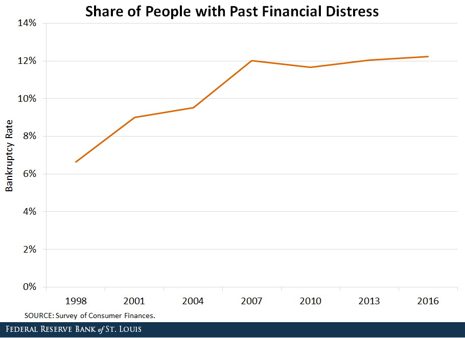
We first measured the share of households that had previously experienced an episode of financial distress by looking at people who filed for bankruptcy five or more years ago.3 The figure below shows that the share of households with past financial distress increased from approximately 6.6 percent in 1998 to 12.2 percent in 2016.
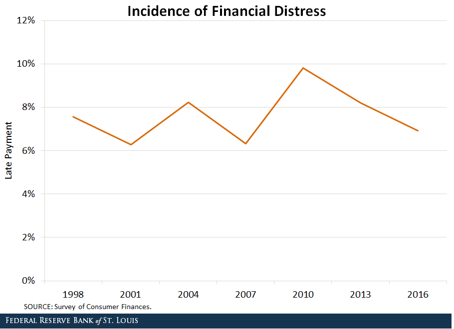
We then measured current financial distress by computing the share of households that delayed their loan payment on the year the survey was conducted.4 (We recognize that this measure is less extreme, as only a share of households that are late making payments will end up in bankruptcy.)5
The figure below shows that while there are minor fluctuations in the share of households with late payments throughout the sample period, the numbers remained around 8 percent.
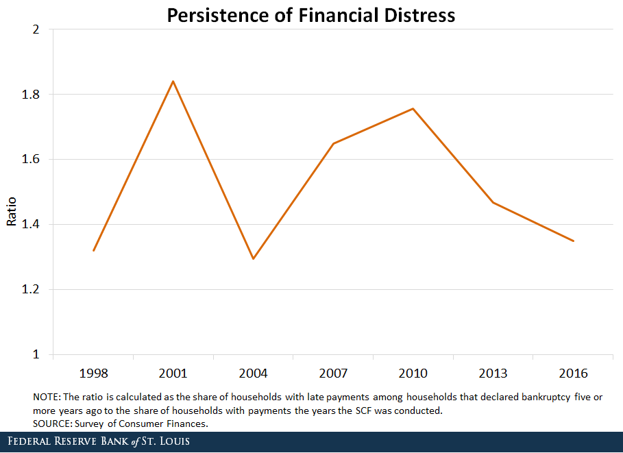
Finally, we created a ratio to measure the persistence of financial distress. It compares the share of households with late payments among households that declared bankruptcy five or more years ago to the share of households with late payments the year the SCF was conducted.
If financial distress was not persistent at all, both shares would be equal, and the ratio would be one. Thus, a value greater than one indicates the persistence of financial distress. The figure below shows the evolution of the persistence of financial distress over the years.
The ratio fluctuates around 1.5, implying that the households that have encountered an episode of financial distress in the past are 1.5 times more likely to delay payment today, compared to average households.
US Industrial production rose 0.7 percent in April for its third consecutive monthly increase according to data from the Federal Reserve.
The rates of change for industrial production for previous months were revised downward, on net; for the first quarter, output is now reported to have advanced 2.3 percent at an annual rate. After being unchanged in March, manufacturing output rose 0.5 percent in April. The indexes for mining and utilities moved up 1.1 percent and 1.9 percent, respectively. At 107.3 percent of its 2012 average, total industrial production in April was 3.5 percent higher than it was a year earlier. Capacity utilization for the industrial sector climbed 0.4 percentage point in April to 78.0 percent, a rate that is 1.8 percentage points below its long-run (1972–2017) average.
Market Groups
The rise in industrial production in April was supported by increases for every major market group. Consumer goods, business equipment, and defense and space equipment posted gains of nearly 1 percent or more, while construction supplies, business supplies, and materials recorded smaller increases.
Within consumer goods, the output of nondurables rose nearly 1 1/2 percent in April, as both consumer energy products and non-energy nondurable consumer goods posted increases. The output of durable consumer goods declined about 1/2 percent, mostly because of a sizable drop in automotive products. The advance in business equipment resulted from gains for information processing equipment and for industrial and other equipment, while the rise in materials was led by an increase for energy materials.
Industry Groups
Manufacturing output moved up 0.5 percent in April; for the first quarter, the index registered a downwardly revised increase of 1.4 percent at an annual rate. In April, the indexes for durables and nondurables each gained about 1/2 percent, while the production of other manufacturing industries (publishing and logging) rose nearly 1 percent. Among durables, advances of more than 1 percent were posted by machinery; computer and electronic products; electrical equipment, appliances, and components; and aerospace and miscellaneous transportation equipment. The largest losses, slightly more than 1 percent, were recorded by motor vehicles and parts and by wood products. The increase in nondurables reflected widespread gains among its industries.
The output of mining rose 1.1 percent in April and was 10.6 percent above its year-earlier level. The increase in the mining index for April reflected further gains in the oil and gas sector but was tempered by a drop in coal mining.
In April, the index for utilities advanced 1.9 percent. The output of electric utilities was little changed, but the output of gas utilities jumped more than 10 percent as a result of strong demand for heating due to below-normal temperatures.
Capacity utilization for manufacturing rose to 75.8 percent in April, a rate that is 2.5 percentage points below its long-run average. Increases were observed in all three main categories of manufacturing. The operating rates for durables and nondurables each moved up about 1/4 percentage point, and the rate for other manufacturing rose about 3/4 percentage point. Utilization for mining rose about 1/2 percentage point and remained above its long-run average; the rate for utilities jumped more than 1 percentage point.
The Fed held this month, but is still talking about more adjustments later in the year.
The Dow closed lower as the market digested the inflation commentary.
Information received since the Federal Open Market Committee met in March indicates that the labor market has continued to strengthen and that economic activity has been rising at a moderate rate. Job gains have been strong, on average, in recent months, and the unemployment rate has stayed low. Recent data suggest that growth of household spending moderated from its strong fourth-quarter pace, while business fixed investment continued to grow strongly. On a 12-month basis, both overall inflation and inflation for items other than food and energy have moved close to 2 percent. Market-based measures of inflation compensation remain low; survey-based measures of longer-term inflation expectations are little changed, on balance.
Consistent with its statutory mandate, the Committee seeks to foster maximum employment and price stability. The Committee expects that, with further gradual adjustments in the stance of monetary policy, economic activity will expand at a moderate pace in the medium term and labor market conditions will remain strong. Inflation on a 12-month basis is expected to run near the Committee’s symmetric 2 percent objective over the medium term. Risks to the economic outlook appear roughly balanced.
In view of realized and expected labor market conditions and inflation, the Committee decided to maintain the target range for the federal funds rate at 1-1/2 to 1-3/4 percent. The stance of monetary policy remains accommodative, thereby supporting strong labor market conditions and a sustained return to 2 percent inflation.
In determining the timing and size of future adjustments to the target range for the federal funds rate, the Committee will assess realized and expected economic conditions relative to its objectives of maximum employment and 2 percent inflation. This assessment will take into account a wide range of information, including measures of labor market conditions, indicators of inflation pressures and inflation expectations, and readings on financial and international developments. The Committee will carefully monitor actual and expected inflation developments relative to its symmetric inflation goal. The Committee expects that economic conditions will evolve in a manner that will warrant further gradual increases in the federal funds rate; the federal funds rate is likely to remain, for some time, below levels that are expected to prevail in the longer run. However, the actual path of the federal funds rate will depend on the economic outlook as informed by incoming data.
After nearly a half century of unlimited dollar creation, multiple bubbles and busts…the current asset reflation has been the most spectacular…but alas, perhaps too successful.
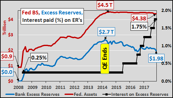
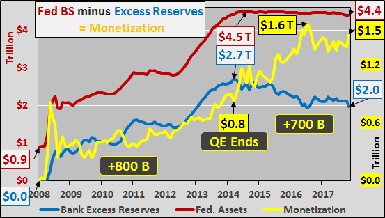
The Fed’s answer to control or restrain this present reflation is raising interest rates to stem the flow of business activity, lending, and excessive leverage in financial markets. But in the Fed’s post QE world, a massive $2 trillion in private bank excess reserves still waits like a coil under tension, ready to release if it leaves the Federal Reserve. Thus, the only means to control this centrally created asset bubble is to continuously pay banks higher interest rates (almost like paying the mafia for protection…from the mafia) not to return those dollars to their original owners or put them to work. With each successive hike, banks are paid another quarter point to take no risk, make no loan, and just get paid billions for literally doing nothing.
The chart below shows the nearly $4.4 trillion Federal Reserve balance sheet, (acquired via QE, red line), nearly $2 trillion in private bank excess reserves (blue line), and the interest rate paid on those excess reserves (black line). While the Fed’s balance sheet has begun the process of “normalization”, declining from peak by just over a hundred billion, bank excess reserves have fallen by over $700 billion since QE ended. So what?
The difference between the Federal Reserve balance sheet and the excess reserves of private banks is simply pure monetization (the yellow line in the chart below). This is the quantity of dollars that were conjured from nothing to purchase Treasury’s and mortgage backed securities from the banks. But instead of heading to the Fed to be held as excess reserves, went in search of assets, likely leveraged 2x’s to 5x’s (resulting anywhere from $3 trillion to $7.5+ trillion in new buying power).
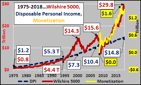
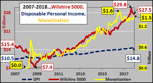
From world war II until 1995, equities were closely tied to the disposable personal income of the American citizens (DPI representing total annual national income remaining after all taxation is paid, blue line). However, since ’95 lower and longer interest rate cuts have induced extreme levels of leverage and debt. The Fed actions have created progressively larger asset bubbles more divergent from disposable personal income at peak…but falling below DPI during market troughs. But after the ’07 bubble, the pure monetization found its way into the market with spectacular effect. As the chart below shows, the Wilshire 5000 (representing the market value of all publicly traded US equities, red line) has deviated from the basis of US spending, US total disposable income (the total amount of money left nationally after all taxes are paid, blue line).
In the chart below, the growth in monetization has acted as a very nice leading indicator for equities. As each successive pump of new money left the Federal Reserve and entered found its way to the market in search of assets, assets subsequently reacted. Likewise, each drawdown in monetization saw a similar pullback in equities.
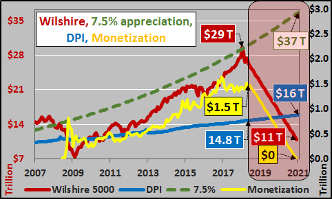
What happens next? The Federal Reserve plans to systematically reduce its balance sheet via raising interest rates on excess reserves. This is to incent and richly reward the largest of banks to maintain these trillions at the Federal Reserve. As the chart below shows, theoretically this means the monetized money is set to continue evaporating, and assuming it was highly levered, then the unwind and volatility of deleveraging should only continue to worsen.
And…if the Federal Reserve is true to its word and even halves its balance sheet while banks maintain the excess reserves at the Fed, then all the digitally conjured $1.5 trillion is set to be “un-conjured”. Again, assuming the monetized monies were at least somewhat levered, the unwind of that leverage will continue to produce a chaotic and volatile slide in markets. As the chart below suggests, if US equities (and broader assets) follow the unwind of the monetization, then equities are likely on their way back down to and through their natural support line, disposable personal income. Conversely, I’ve included the 7.5% long term anticipated market appreciation for reference (green dashed line). Quite a spread between those differing views on future asset valuations.
Of course, the “data dependent” Fed could change its mind, or perhaps banks will continue to pull those excess reserves and put them to work (with growing leverage) rather than take the risk-free money from the Fed…either way this is something worth watching.
An excellent FED post which discusses the decoupling of home ownership from home price rises. We think the answer is simple: the financialisation of property and the availability of credit at low rates explains the phenomenon.
In the aftermath of WWII, several developed economies (such as the U.K. and the U.S.) had large housing booms fueled by significant increases in the homeownership rate. The length and the magnitude of the ownership boom varied by country, but many of these countries went from a nation of renters to a nation of owners by around the late 1970s to mid-1980s.
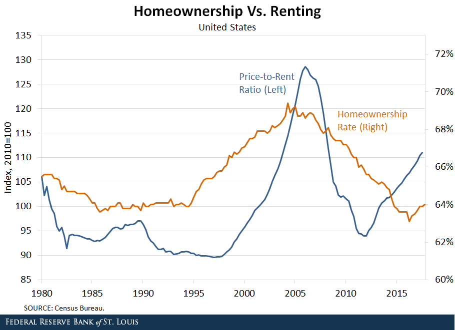
Historically, the cost of buying a house, relative to renting, has been positively correlated with the percent of households that own their home. From 1996 to 2006, both the price of houses and the homeownership rate increased in the U.S. This increasing trend ended abruptly with the global financial crisis that drove house prices and homeownership rates to historically low levels.
It is reasonable to expect prices and homeownership to move in the same direction. A decrease in the number of people who want to buy homes to live in could lead to a decrease in both prices and homeownership. Similarly, an increase in the number of people buying homes to live in could lead to an increase in both prices and homeownership.
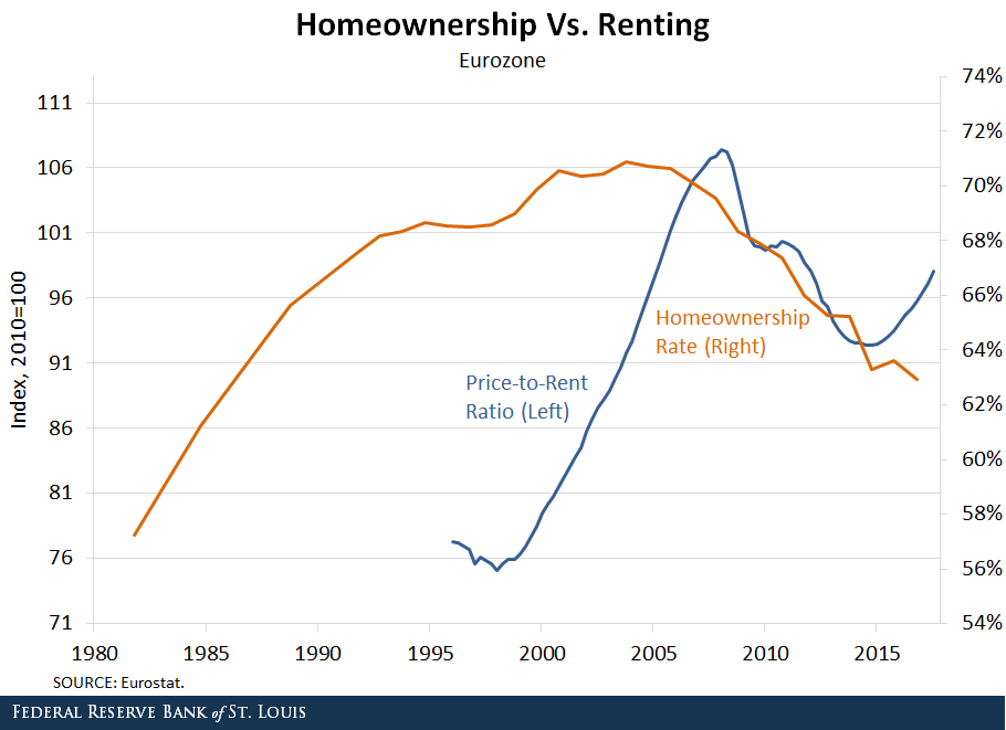
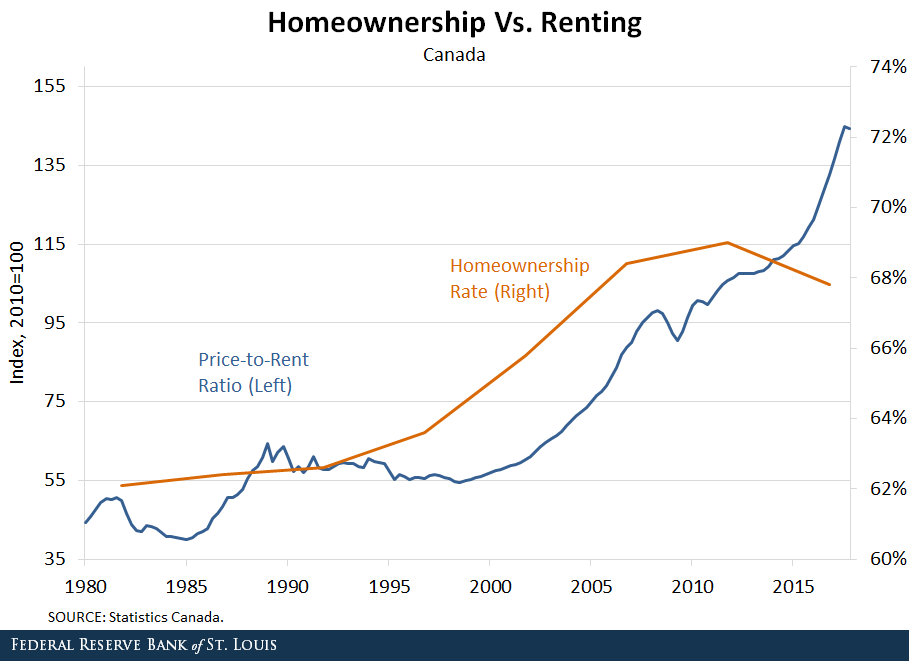
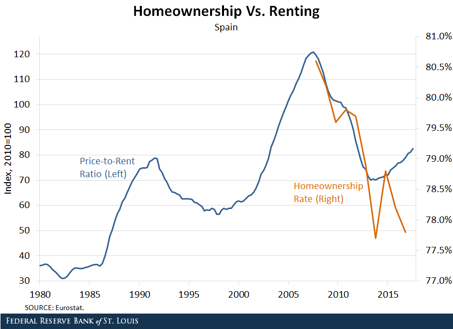
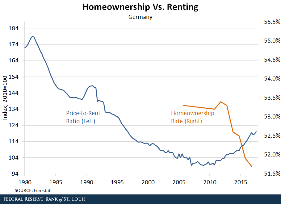
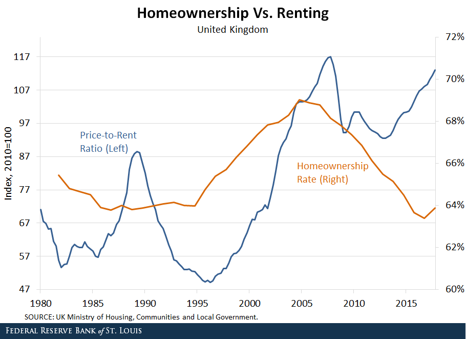
However, recent evidence indicates that the cost of buying a home has increased relative to renting in several of the world’s largest economies, but the share of people owning homes has decreased. This pattern is occurring even in countries with diverging interest rate policies. It is important to delve into this fact and try to find potential explanations. (For trends in homeownership rates and price-to-rent ratios for several developed economies, see the figures at the end of this post.)
Increasing Cost of Housing
The price-to-rent ratio measures the cost of buying a home relative to the cost of renting. Factors like credit conditions or demand for homes as an investment asset affect the price of houses but not the price of rentals. These and other factors cause the price-to-rent ratio to move.
Over the period 1996-2006, the cost of buying a home grew more quickly than the cost of renting in many large economies. For example, the price-to-rent ratio in the U.S. increased by more than 30 percent between 2000 and 2006. Even larger increases occurred in the U.K. and France, where the price-to-rent ratio rose by nearly 80 percent over the same period.
The price-to-rent ratio declined in the wake of the housing crisis in the U.S., the eurozone, Spain and the U.K., but in the past few years, it has started to increase again. The price of houses is again increasing more quickly than the price of rentals.
Decreasing Homeownership
However, the homeownership rate has not increased along with the price-to-rent ratio. The homeownership rate (the percent of households that are owner-occupied) has fallen in several large economies:
In the U.S., the homeownership rate fell from around 69 percent before the recession to less than 64 percent in 2016.
In the U.K., the rate fell from nearly 69 percent to around 63 percent.
The homeownership rates in Germany and Italy have also fallen.
Diverging Policies
The pattern of increasing house prices and decreasing homeownership has occurred even in countries with diverging monetary policies:
By 2016, the Federal Reserve had ended quantitative easing and had begun raising rates in the U.S.
In contrast, the Bank of England and the European Central Bank continued quantitative easing throughout 2016 and reduced rates.
Nonetheless, the homeownership rate continued to fall in the U.S., the U.K. and many parts of Europe, while the price-to-rent ratio continued to increase.
Housing Supply
Several factors could be driving the decoupling of the price-to-rent ratio and the homeownership rate. From the housing supply side, there is a trend toward decreased construction of starter and midsize housing units.
Developers have increased the construction of large single-family homes at the expense of the other segments in the market. From 2010 to 2016, the fraction of new homes with four or more bedrooms increased from 38 percent to 51 percent.
This limited supply, particularly for starter homes, could result in increased prices for those homes and fewer new homeowners. One possible factor is regulatory change. The National Association of Home Builders claims that, on average, regulations account for 24.3 percent of the final price of a new single-family home. Recent increases in regulatory costs could have encouraged builders to focus on larger homes with higher margins. Supply may be just reacting to developments in demand that we discuss next.
Housing Demand
From the demand side, there are three leading explanations, which are likely complementary and self-reinforcing:
Changes in preferences toward homeownership
Changes in access to mortgage credit
Changes in the investment nature of real estate
Preferences for homeownership may have changed because households who lost their homes in foreclosure post-2006 may be reluctant to buy again. Also, younger generations may be less likely to own cars or houses and prefer to rent them.
Demand for ownership has also decreased because credit conditions are tighter in the post-Dodd Frank period.
Real Estate Investment
The previous demand arguments can explain why the price-to-rent ratio dropped post-2006. As rents grew relative to home prices, together with the low returns of safe assets, rental properties became a more attractive investment. This attracted real estate investors who bid up prices while depressing the homeownership rate.
Moreover, builders increased their supply of apartments and other multifamily developments. From 2006 to 2016, single-family construction projects declined from 81 percent to 67 percent of all housing starts.
There are several types of real estate investors:
“Mom and dad” investors looking for investment income
Foreign investors who have increased real estate prices in many of the major cities of the world
Institutional landlords like Invitation Homes or American Homes 4 Rent
In fact, since 2016 the real estate industry group has been elevated to the sector level, effective in the S&P U.S. Indices.
In addition, the widespread use of internet rental portals such as Airbnb and VRBO has increased the opportunity to offer short-term leases, increasing the revenue stream from rental housing.
There are several potential explanations, but more research is needed to determine the cause of the decoupling of house prices from homeownership rates and what it means for the economy.
Authors: Carlos Garriga, Vice President and Economist; Pedro Gete, IE Business School; and Daniel Eubanks, Senior Research Associate
In another sign of weakening banking supervision, the FED proposes new rules to “tailor leverage ratio requirements“. Tailoring appears to mean reduce!
The Federal Reserve Board and the Office of the Comptroller of the Currency (OCC) on Wednesday proposed a rule that would further tailor leverage ratio requirements to the business activities and risk profiles of the largest domestic firms.
Currently, firms that are required to comply with the “enhanced supplementary leverage ratio” are subject to a fixed leverage standard, regardless of their systemic footprint. The proposal would instead tie the standard to the risk-based capital surcharge of the firm, which is based on the firm’s individual characteristics. The resulting leverage standard would be more closely tailored to each firm.
The proposed changes seek to retain a meaningful calibration of the enhanced supplementary leverage ratio standards while not discouraging firms from participating in low-risk activities. The changes also correspond to recent changes proposed by the Basel Committee on Banking Supervision. Taking into account supervisory stress testing and existing capital requirements, agency staff estimate that the proposed changes would reduce the required amount of tier 1 capital for the holding companies of these firms by approximately $400 million, or approximately 0.04 percent in aggregate tier 1 capital.
Enhanced supplementary leverage ratio standards apply to all U.S. holding companies identified as global systemically important banking organizations (GSIBs), as well as the insured depository institution subsidiaries of those firms.
Currently, GSIBs must maintain a supplementary leverage ratio of more than 5 percent, which is the sum of the minimum 3 percent requirement plus a buffer of 2 percent, to avoid limitations on capital distributions and certain discretionary bonus payments. The insured depository institution subsidiaries of the GSIBs must maintain a supplementary leverage ratio of 6 percent to be considered “well capitalized” under the agencies’ prompt corrective action framework.
At the holding company level, the proposed rule would modify the fixed 2 percent buffer to be set to one half of each firm’s risk-based capital surcharge. For example, if a GSIB’s risk-based capital surcharge is 2 percent, it would now be required to maintain a supplementary leverage ratio of more than 4 percent, which is the sum of the unchanged minimum 3 percent requirement plus a modified buffer of 1 percent. The proposal would similarly tailor the current 6 percent requirement for the insured depository institution subsidiaries of GSIBs that are regulated by the Board and OCC.
In a further sign of loosening of rules in the US, the Board of Governors of the Federal Reserve System, the Federal Deposit Insurance Corporation, and the Office of the Comptroller of the Currency issued a final rule that increases the threshold for commercial real estate transactions requiring an appraisal from $250,000 to $500,000.
They say the increased threshold will not pose a threat to the safety and soundness of financial institutions. “Commenters opposing an increase to the commercial real estate appraisal threshold asserted that an increase would elevate risks to financial institutions, the banking system, borrowers, small business owners, commercial property owners, and taxpayers. Several of these commenters asserted that the increased risk would not be justified by burden relief”.
The agencies originally proposed to raise the threshold, which has been in place since 1994, to $400,000, but determined that a $500,000 threshold will materially reduce regulatory burden and the number of transactions that require an appraisal. The agencies also determined that the increased threshold will not pose a threat to the safety and soundness of financial institutions.
The final rule allows a financial institution to use an evaluation rather than an appraisal for commercial real estate transactions exempted by the $500,000 threshold. Evaluations provide a market value estimate of the real estate pledged as collateral, but do not have to comply with the Uniform Standards of Professional Appraiser Practices and do not require completion by a state licensed or certified appraiser.
The final rule responds, in part, to concerns financial industry representatives raised that the current threshold level had not kept pace with price appreciation in the commercial real estate market in the 24 years since the threshold was established and about regulatory burden during the Economic Growth and Regulatory Paperwork Reduction Act review process completed in March 2017.
Has the FED’s increased recent debt monetisation enabled US banks to lend out more money than they otherwise would? This is an important question, given the current round of rate tightening, and the potential impact down stream. So a recent article from the St. Louis On The Economy Blog makes interesting reading.
One can think of the government as issuing three types of nominal liabilities:
Currency
Central bank reserves
Treasury debt
Historically, currency and central bank reserves are considered money, whereas Treasury debt is not. Hence, to finance the deficit—the difference between government revenue and expenditures—the government needs to borrow money. The burden of finance is reduced if the central bank transforms high-interest government debt into low-interest reserves. The act of converting debt into money is often labeled “debt monetization.”
Reserves and the Money Supply
The creation of reserves increases the supply of base money. The reserves of chartered banks are held at the central bank and play an important role in the banking system.
In particular, banks finance a variety of investments by creating their own form of money—demand deposit liabilities, such as checking accounts—which are convertible on demand for currency. Note that private banks do not lend reserves: They lend the liabilities they create, and these liabilities are then convertible into currency at the discretion of “depositors” (those who have demand deposit accounts with banks).
Banks are motivated to keep some minimum level of reserves on hand to meet everyday redemption requests for currency and to settle their obligations with other banks on the interbank market for federal funds.
Spurring Lending
But because the interest earned on reserves is typically low (historically, zero), banks are motivated to increase their lending to the point that their demand deposit liabilities can no longer be safely increased, lest they fail to meet their obligations for redemption and settlement. In this way, debt monetization can increase the total money supply, which includes currency, reserves and bank deposit liabilities.
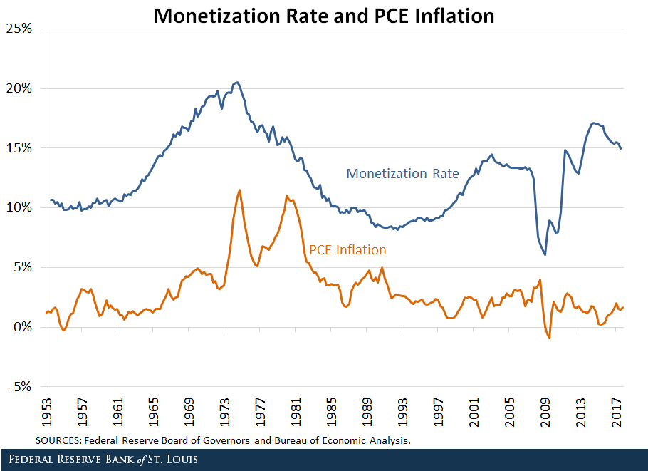
The figure below plots the percent of debt held by the Federal Reserve—the monetization rate—against personal consumption expenditures (PCE) inflation.
From 1953 to 1974, the monetization rate increased hand-in-hand with inflation, with both peaking near the end of 1974. The positive correlation between the two indicators during this span seems consistent with the expectation that debt monetization puts upward pressure on inflation.
From 2009 to 2017, the monetization spiked up at an even faster rate. However, this time the inflation rate stayed more or less constant. Why might the former episode of monetization have been inflationary while the latter was not?
The Interest Rate Spread
When the Fed buys a large amount of federal debt, as it did during these two time periods, it injects a large amount of reserves into the banking system to pay for those purchases. Commercial banks have two options of what to do with these additional reserves:
Use them to make more loans to customers
Hold onto them
All else equal, banks will pick whichever option is more profitable, which depends on (among other things) the spread between the interest rate it can charge on consumer/business loans and the interest rate it earns by holding reserves. The larger the spread, the more profitable it is for a bank to lend, and the more likely that a bank increases its lending.
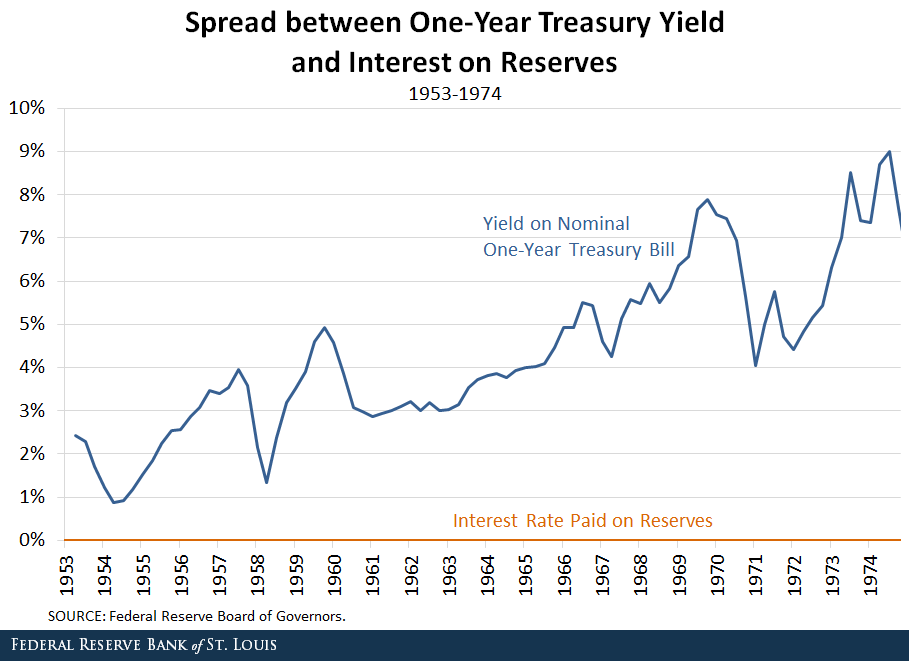
Monetization of the Debt: Then
The figure below plots the spread between the yield on a one-year Treasury bill (a measure of short-term interest rates) and the interest rate paid on reserves from 1953 to 1974.
As the Fed ramped up its debt monetization during this span, the average rate of interest on a one-year Treasury bill was about 5 percent, and the interest rate paid on reserves was literally zero.
With the spread between interest rates so large, banks had more incentive to use their newfound reserves to make loans than to hold onto them. These loans would then create money, which would boost the money supply and have inflationary effects. While several factors led to the Great Inflation of the 1970s, the gradual rise in the monetization rate was likely a significant one.
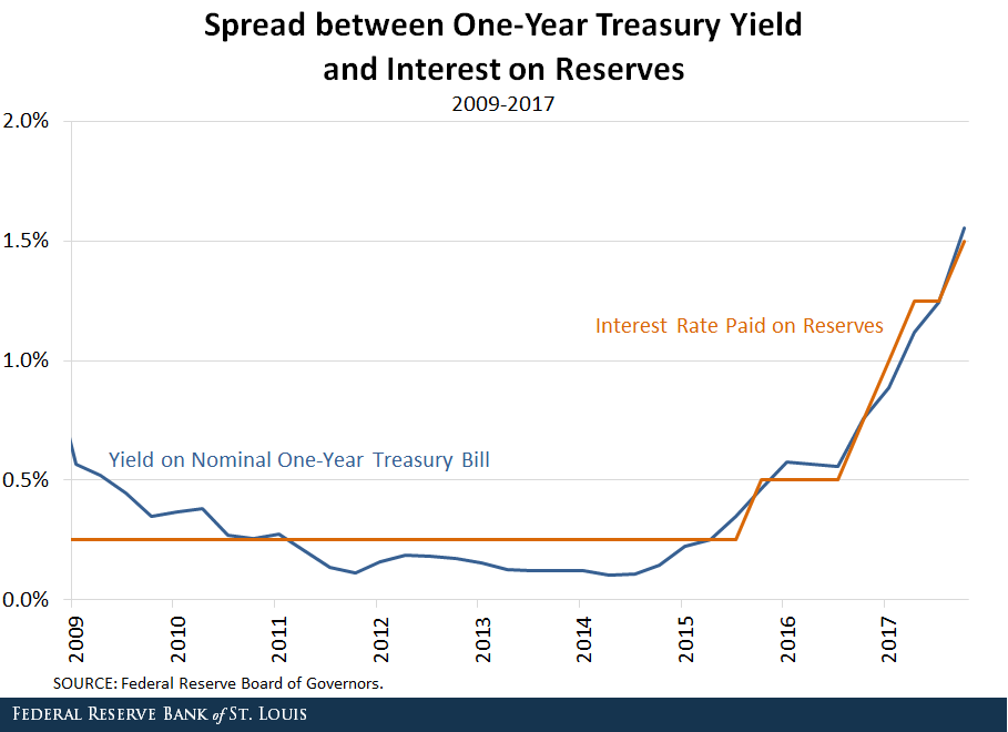
Tightening of the Spread
However, the interest rate spread has narrowed significantly in recent years for several reasons:
Since the financial crisis of 2007-08, the federal funds rate target has been near zero, keeping short-term interest rates low throughout the economy.
The demand for federal debt rose greatly after the start of the crisis, pushing bond prices up and bond yields down.
Beginning in 2008, the Fed began to pay interest on reserves held by its member banks.
Monetization of the Debt: Now
As shown in the next figure, during the spike in debt monetization from 2009 to 2017, the spread between short-term interest rates and the interest paid on reserves was essentially zero.
Unlike during the first scenario, banks now had no incentive to use their newfound reserves to increase their lending. After all, it would be just as profitable to hold onto those reserves. In fact, at times the spread was even negative, making it more profitable to hold reserves.
As such, there was little to no upward pressure on prices. The Fed’s increased debt monetization didn’t lead banks to lend out more money than they otherwise would. Contrary to the episode from 1953 to 1974, banks could make a profit holding onto reserves, which doesn’t create new money and ultimately doesn’t have the same inflationary effects as increased lending does
But the article also highlights a fundamental fallacy, namely that deposits leads loans. Actually, we now know this is incorrect, and that banks can create loans first, which flow TO deposits. So the fundamental assumption they make seems incorrect. Therefore, their conclusions may be suspect! In addition, we know US consumer debt is still very high now at 80% of US GDP! More importantly, it reduces the potential impact central bank have on the economy in terms of credit availability.
Today we examine the recent Financial Market Earthquakes and ask, are these indicators of more trouble ahead?
Welcome to the Property Imperative Weekly to 24th March 2018. Watch the video or read the transcript.
In this week’s review of property and finance news we start with the recent market movements and consider the impact locally.
The Dow 30 has come back, slumping more than 1,100 points between Thursday and Friday, and ending the week in correction territory – meaning down more than 10% from its recent high.
The volatility index – the VIX which shows the perceived risks in the financial markets also rose, up 6.5% just yesterday to 24.8, not yet at the giddy heights it hit in February, but way higher than we have seen for a long time – so perceived risks are higher.
And the Aussie Dollar slipped against the US$ to below 77 cents from above 80, and it is likely to drift lower ahead, which may help our export trade, but will likely lead to higher costs for imports, which in turn will put pressure on inflation and the RBA to lift the cash rate. The local stock market was also down, significantly. Here is a plot of the S&P ASX 100 for the past year or so. We are back to levels last seen in October 2017. Expect more uncertainty ahead.
So, let’s look at the factors driving these market gyrations. First of course U.S. President Donald Trump’s signed an executive memorandum, imposing tariffs on up to $50 billion in Chinese imports and in response the Dow slumped more than 700 points on Thursday. There was a swift response from Beijing, who released a dossier of potential retaliation targets on 128 U.S. products. Targets include wine, fresh fruit, dried fruit and nuts, steel pipes, modified ethanol, and ginseng, all of which could see a 15% duty, while a 25% tariff could be imposed on U.S. pork and recycled aluminium goods. We also heard Australia’s exemptions from tariffs may only be temporary.
Some other factors also weighed on the market. Crude oil prices rose more than 5.5% this week as following an unexpected draw in U.S. crude supplies and rising geopolitical tensions in the middle east. Crude settled 2.5% higher on Friday after the Saudi Energy Minister said OPEC and non-OPEC members could extend production cuts into 2019 to reduce global oil inventories. Here is the plot of Brent Oil futures which tells the story.
Bitcoins promising rally faded again. Earlier Bitcoin rallied from a low of $7,240 to a high of $9175.20 thanks to easing fears that the G20 meeting Monday would encourage a crackdown on cryptocurrencies. Finance ministers and central bankers from the world’s 20 largest economies only called on regulators to “continue their monitoring of crypto-assets” and stopped short of any specific action to regulate cryptocurrencies. So Bitcoin rose 2% over the past seven days, Ripple XRP fell 8.93%and Ethereum fell 14.20%. Crypto currencies remain highly speculative. I am still working on my more detailed post, as the ground keeps shifting.
Gold prices enjoyed one of their best weeks in more than a month buoyed by a flight-to-safety as investors opted for a safe-haven thanks to the events we have discussed. However, the futures data shows many traders continued to slash their bullish bets on gold. So it may not go much higher. So there may be no relief here.
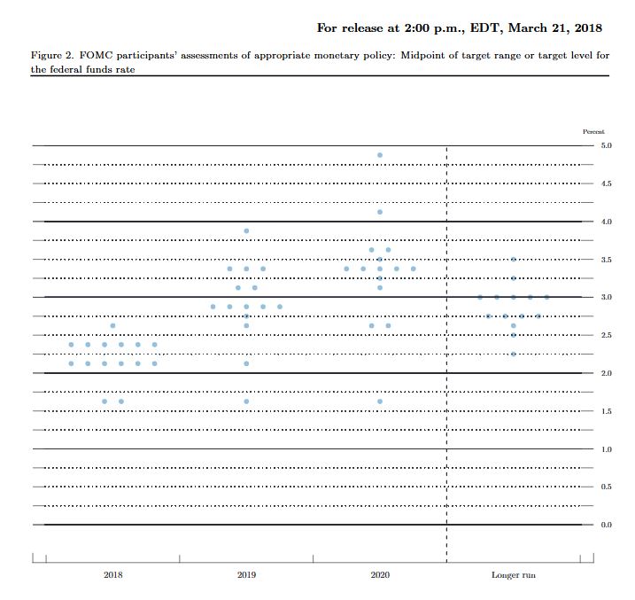
Then there was the Federal Reserve statement, which despite hiking rates by 0.25%, failed to add a fourth rate hike to its monetary policy projections and also scaled back its labour market expectations. Some argued that the Fed’s decision to raise its growth rate but keep its outlook on inflation relatively unchanged was dovish. Growth is expected to run at 3%, but core inflation is forecast for 2019 and 2020 at 2.10%. They did, however, signal a faster pace of monetary policy tightening, upping its outlook on rates for both 2019 and 2020. You can watch our separate video blog on this. The “dots” chart also shows more to come, up to 8 lifts over two years, which would take the Fed rate to above 3%. The supporting data shows the economy is running “hot” and inflation is expected to rise further. This will have global impact. The era of low interest rates in ending. The QE experiment is also over, but the debt legacy will last a generation.
All this will have a significant impact on rates in the financial markets, putting more pressure on borrowing companies in the US, and the costs of Government debt. US mortgage interest rates rose again, a precursor to higher rates down the track.
Moodys’ said this week, that the U.S.’ still relatively low personal savings rate questions how easily consumers will absorb recent and any forthcoming price hikes. Moreover, the recent slide by Moody’s industrial metals price index amid dollar exchange rate weakness hints of a levelling off of global business activity.
The flow on effect of rate rises is already hitting the local banks in Australia. To underscore that here is a plot of the A$ Bill/OIS Swap rate, a critical benchmark for bank funding. In fact, looking over the past month, the difference, or spread has grown by around 20 basis points, and is independent from any expectation of an RBA rate change. The BBSW is the reference point used to set interest rates on most business loans, and also flows through to personal lending rates and mortgages.
As a result, there is increasing margin pressure on the banks. In the round, you can assume a 10 basis point rise in the spread will translate to a one basis point loss of margin, unless banks reduce yields on deposit accounts, or lift mortgage rates. Individual banks ae placed differently, with ANZ most insulated, thanks to their recent capital initiatives, and Suncorp the most exposed.
In fact, Suncorp already announced that Variable Owner Occupier Principal and Interest rates will rise by 5 basis points. Variable Investor Principal and Interest rates will increase by 8 basis points, and Variable Interest Only rates increase go up by 12 basis points. In addition, their variable Small Business rates will increase by 15 basis points and their business Line of Credit rates will increase by 25 basis points. Expect more ahead from other lenders. The key takeaway is that funding costs in Australia are going up at a time when the RBA is stuck in neutral. It highlights how what happens with rates and in money markets overseas, and particularly in the US, can have repercussions here – repercussions that many are possibly unprepared for.
Locally, the latest Australian Bureau of Statistics showed that home prices to December 2017 fell in Sydney over the past quarter, along with Darwin. Other centres saw a rise, but the rotation is in hand. Overall, the price index for residential properties for the weighted average of the eight capital cities rose 1.0% in the December quarter 2017. The index rose 5.0% through the year to the December quarter 2017.
The capital city residential property price indexes rose in Melbourne (+2.6%), Perth (+1.1%), Brisbane (+0.9%), Hobart (+3.9%), Canberra (+1.7%) and Adelaide (+0.6%) and fell in Sydney (-0.1%) and Darwin (-1.5%). You can watch our separate video on this, where we also covered in more detail the January 2018 mortgage default data from Standard & Poor’s. It increased to 1.30% from 1.07% in December. No area was exempt from the increase with loans in arrears by more than 30 days increasing in January in every state and territory. Western Australia remains the home of the nation’s highest arrears, where loans in arrears more than 30 days rose to 2.44% in January from 2.08% in December, reaching a new record high. Conversely, New South Wales continues to have the lowest arrears among the more populous states at 0.98% in January. Moody’s is now expecting a 10% correction in some home prices this year.
According to latest figures released by the Australian Bureau of Statistics (ABS), the seasonally adjusted unemployment rate increased to 5.6 per cent and the labour force participation rate increased by less than 0.1 percentage points to 65.7 per cent. The number of persons employed increased by 18,000 in February 2018. So no hints of any wage rises soon, as it is generally held that 5% unemployment would lead to higher wages – though even then, I am less convinced.
The latest final auction clearance results from CoreLogic, published last Thursday showed the final auction clearance rate across the combined capital cities rose to 66 per cent across a total of 3,136 auctions last week; making it the second busiest week for auctions this year, compared with 63.3 per cent the previous week, and still well down from 74.1 per cent a year ago. Although Melbourne recorded its busiest week for auctions so far this year with a total of 1,653 homes taken to auction, the final auction clearance rate across the city fell to 68.7 per cent, down from the 70.8 per cent over the week prior. In Sydney, the final auction clearance rate increased to 64.8 per cent last week, from 62.2 per cent the week prior. Across the smaller auction markets, clearance rates improved in Brisbane, Perth and Tasmania, while Adelaide and Canberra both returned a lower success rate over the week. They say Geelong was the best performing non-capital city region last week, with 86.1 per cent of the 56 auctions successful. However, the Gold Coast region was host to the highest number of auctions (60). This week they are expecting a high 3,689 planned auctions today, so we will see where the numbers end up. I am still digging into the clearance rate question, and should be able to post on this soon. But remember that number, 3,689, because the baseline seems to shift when the results arrive.
As interest rates rise, in a flat income environment, we expect the problems in the property and mortgage sector to show, which is why our forward default projections are higher ahead. We will update that data again at the end of the month. Household Financial Confidence also drifted lower again as we reported. It fell to 94.6 in February, down from 95.1 the previous month. This is in stark contrast to improved levels of business confidence as some have reported. Our latest video blog covered the results.
Finally, The Royal Commission of course took a lot of air time this week, and I did a separate piece on the outcomes yesterday, so I won’t repeat myself. But suffice it to say, we think the volume of unsuitable mortgage loans out there is clearly higher than the lenders want to admit. Mortgage Broking will also get a shake out as we discussed on the ABC this week. And that’s before they touch on the wealth management sector!
We think there are a broader range of challenges for bankers, and their customers, as I discussed at the Customer Owned Banking Association conference this week. There is a separate video available, in which you can hear about what the future of banking will look like and the importance of customer centricity. In short, more disruption ahead, but also significant opportunity, if you know where to look. I also make the point that ever more regulation is a poor substitute for the right cultural values. At the end of the day, a CEO’s overriding responsibility is to define the right cultural values for the organisation, and the major banks have been found wanting. A quest for profit at any cost will ultimately destroy a business if in the process it harms customers, and encourages fraud and deceit. You simply cannot assume banks will do the right thing, unless the underlying corporate values are set right. Remember Greenspans testimony after the GFC, when he said “I made a mistake in presuming that the self-interests of organisations, specifically banks and others, were such that they were best capable of protecting their own shareholders and their equity in the firms.”
The Fed lifted, as expected. The “dots” chart also shows more to come. The supporting data shows the economic is running “hot” and inflation is expected to rise further. This will have global impact. The era of low interest rates in ending. The QE experiment is also over, but the debt legacy will last a generation.
This chart is based on policymakers’ assessments of appropriate monetary policy, which, by definition, is the future path of policy that each participant deems most likely to foster outcomes for economic activity and inflation that best satisfy his or her interpretation of the Federal Reserve’s dual objectives of maximum employment and stable prices.
Each shaded circle indicates the value (rounded to the nearest ⅛ percentage point) of an individual participant’s judgment of the midpoint of the appropriate target range for the federal funds rate or the appropriate target level for the federal funds rate at the end of the specified calendar year or over the longer run.
Information received since the Federal Open Market Committee met in January indicates that the labor market has continued to strengthen and that economic activity has been rising at a moderate rate. Job gains have been strong in recent months, and the unemployment rate has stayed low. Recent data suggest that growth rates of household spending and business fixed investment have moderated from their strong fourth-quarter readings. On a 12-month basis, both overall inflation and inflation for items other than food and energy have continued to run below 2 percent. Market-based measures of inflation compensation have increased in recent months but remain low; survey-based measures of longer-term inflation expectations are little changed, on balance.
Consistent with its statutory mandate, the Committee seeks to foster maximum employment and price stability. The economic outlook has strengthened in recent months. The Committee expects that, with further gradual adjustments in the stance of monetary policy, economic activity will expand at a moderate pace in the medium term and labor market conditions will remain strong. Inflation on a 12-month basis is expected to move up in coming months and to stabilize around the Committee’s 2 percent objective over the medium term. Near-term risks to the economic outlook appear roughly balanced, but the Committee is monitoring inflation developments closely.
In view of realized and expected labor market conditions and inflation, the Committee decided to raise the target range for the federal funds rate to 1-1/2 to 1-3/4 percent. The stance of monetary policy remains accommodative, thereby supporting strong labor market conditions and a sustained return to 2 percent inflation.
In determining the timing and size of future adjustments to the target range for the federal funds rate, the Committee will assess realized and expected economic conditions relative to its objectives of maximum employment and 2 percent inflation. This assessment will take into account a wide range of information, including measures of labor market conditions, indicators of inflation pressures and inflation expectations, and readings on financial and international developments. The Committee will carefully monitor actual and expected inflation developments relative to its symmetric inflation goal. The Committee expects that economic conditions will evolve in a manner that will warrant further gradual increases in the federal funds rate; the federal funds rate is likely to remain, for some time, below levels that are expected to prevail in the longer run. However, the actual path of the federal funds rate will depend on the economic outlook as informed by incoming data.
Voting for the FOMC monetary policy action were Jerome H. Powell, Chairman; William C. Dudley, Vice Chairman; Thomas I. Barkin; Raphael W. Bostic; Lael Brainard; Loretta J. Mester; Randal K. Quarles; and John C. Williams.